
Search results for "Observational study" in Home Design Ideas
 Black + Vernooy Architects
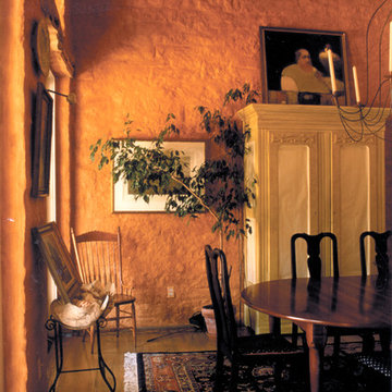
Inspired by the owners' travels in the Mediterranean region yet rooted firmly in Texas soil, this single family residence is designed to provide a secluded, comfortable environment for observing nature, relaxing, entertaining, living, and working. The oddly shaped site determined a house that is removed from the street, resulting in a long drive through a wooded area that leads to the gently sloping house site. The house is designed around a large, central public living area. The basic "H" shaped plan reaches out to define the entry court as well as the rear yard area. The building can only be seen in small vignettes as one moves around and through it, and is finally understood from inside the main room. The public space is central to the plan, where rooms overlay and flow through and into one another. Private rooms are tucked away in more remote parts of the site. The guest bedrooms are located at a slightly lower level, and a remote study, reached by a ship's ladder, overlooks the main living area and enjoys its own roof terrace. The central part of the house is designed as a solid, strong, "original" building to which other wings are added as if built over time. The client desired that the house appear to be of no discernible style or period, and seem older rather than newer.
Built By: Dalgleish Construction Co.
Photography By: Paul Bardagjy
 Goodall Custom Cabinetry
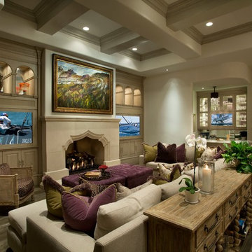
Living room - traditional formal dark wood floor living room idea in Phoenix with beige walls, a standard fireplace and a media wall
 Klopf Architecture
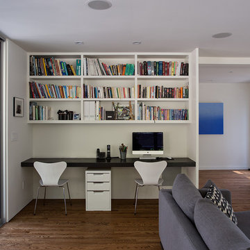
Sebastian and Tanja DiGrande's quest for natural light and open, modern design led them to Klopf Architecture in San Francisco. Working hand-in-hand with homeowner/designer Tanja DiGrande, Klopf collaborated on a modern addition to the rear of a traditional-style home. The idea was to depart from the original style completely to draw a distinction between the original house and any later additions, as well as observe a very minimal, clean, gallery-like modern style against which changing daylight, art, furniture, and of course the people provide the color and motion.
With its dark gray stuccoed walls, dark steel railing, and floor-to-ceiling windows, the exterior of the addition is at the same time an open, modern box as well as a receding volume that acts almost as a backdrop for the house, receding visually out of respect for the original home. From the interior, windows bring in nature and views from all around the lush property. They also allow views of the original house. Up on the roof deck the views magnify. The owners use a boom and crank to bring up food and drinks when entertaining!
Inside, the simple clean-lined spaces showcase the couple’s minimal, modern taste. The open bathroom epitomizes the clean, minimal style of the addition. On the exterior, steel elements bring a more industrial modern feeling to the addition from the rear.
Klopf Architecture Project Team: John Klopf, AIA, Geoff Campen, and Angela Todorova
Co-Designer: Tanja DiGrande
Contractor: Jose Ramirez & J-C General Contractors Inc.
Photography ©2015 Mariko Reed
Location: Orinda, CA
Year completed: 2014
Find the right local pro for your project
 Jack Calderone
This bedroom and full bathroom are part of an adventuresome project my wife and I embarked upon to create a complete apartment in the basement of our townhouse. We designed a floor plan that creatively and efficiently used all of the 385-square-foot-space, without sacrificing beauty, comfort or function – and all without breaking the bank! To maximize our budget, we did the work ourselves and added everything from thrift store finds to DIY wall art to bring it all together.
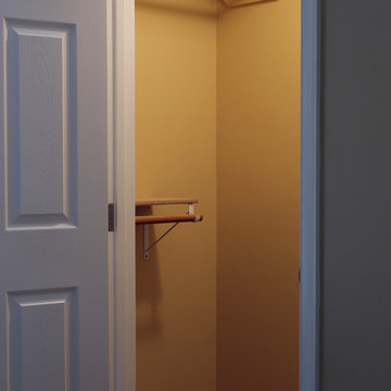
A partial double closet bar adds a little extra space while still leaving room for longer hanging clothes.

 contact7524
This stained glass window was created as part of our signature Aspen Stained Glass line. These windows look beautiful in cottage style or contemporary homes and are a great way for outdoor enthusiasts to celebrate their love of nature. The textured appearance of the glass provides the homeowners with a high level of privacy and comfort.
 User
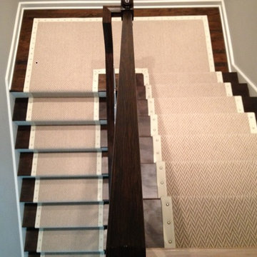
UserWool Patterned Field Carpet with Linen Wide Binding & Chrome Upholstery Nails
Mid-sized transitional carpeted u-shaped staircase photo in Chicago with carpeted risers
Mid-sized transitional carpeted u-shaped staircase photo in Chicago with carpeted risers
 Jessica Cain
Jessica Cain © 2018 Houzz
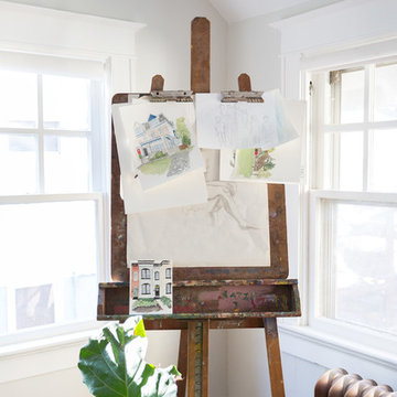
Mid-sized country freestanding desk home studio photo in Kansas City with gray walls and a standard fireplace
Mid-sized country freestanding desk home studio photo in Kansas City with gray walls and a standard fireplace
Sponsored
Columbus, OH

Hope Restoration & General Contracting
Columbus Design-Build, Kitchen & Bath Remodeling, Historic Renovations

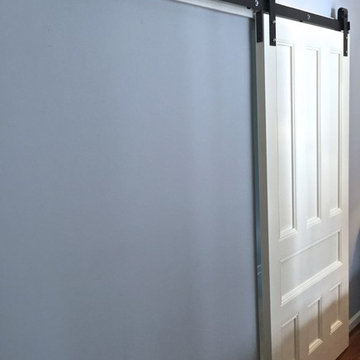
 Harpeth River Woodworks
Harpeth River Woodworks
Example of a mid-sized country master medium tone wood floor bedroom design in Nashville with blue walls
Example of a mid-sized country master medium tone wood floor bedroom design in Nashville with blue walls
 Stonelace Designs
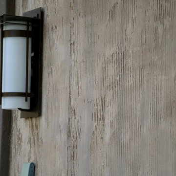
Originally, the exterior of the Napa ranch residence was a standard knocked down stucco finish. We covered over the entire exterior of the house with a natural plaster product that has been made in Italy for centuries, known as Rialto or Vero. This product is a combination of slaked lime mixed with 60% reconstituted crushed marble dust. Quarried from the legendary Carrara marble mines. The finish itself is a vertically combed striated texture embedded into the plaster. While it cures, a transparent group of patinas are applied to the stone-like plaster substance to create a look of an aged villa.

 Greystone Homes LLC
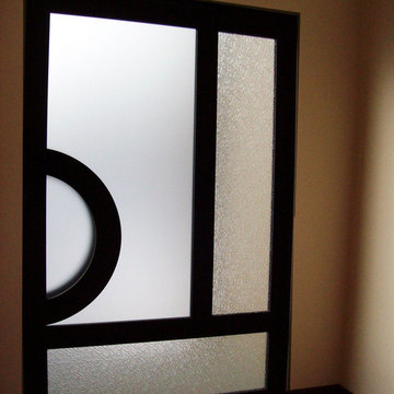
Unique pivot front door with frosted glass.
Front door - large contemporary dark wood floor front door idea with beige walls and a glass front door
Front door - large contemporary dark wood floor front door idea with beige walls and a glass front door
Sponsored
Columbus, OH
Hope Restoration & General Contracting
Columbus Design-Build, Kitchen & Bath Remodeling, Historic Renovations
 Custom Surface Solutions
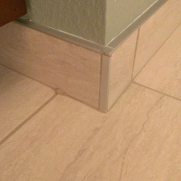
Custom Surface Solutions (www.css-tile.com) - Owner Craig Thompson (512) 430-1215. This project shows new 12 x 24 tile installed vertically with offset layout pattern on wall and floor. Includes shower box with linear glass accent tile back and vertical glass accent band. Tile edges are finished with Schluter Jolly satin aluminum profile edge trim.

 Shoa Gallery
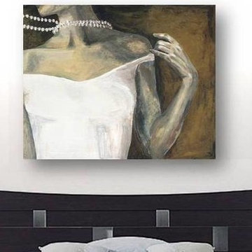
Contemporary Parisian style artwork in a bedroom setting.
Example of a minimalist bedroom design in Los Angeles
Example of a minimalist bedroom design in Los Angeles
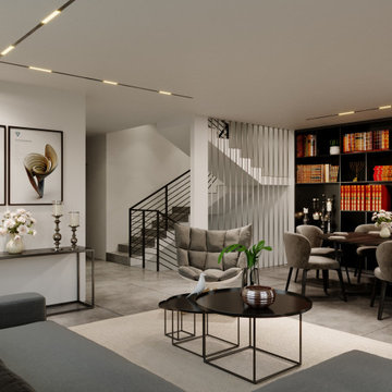
 Ferriss - Architectural Renderings
Top 10 house planning mistakes
Mistake # 1: placing wet areas away from communications.
Architects always foresee in advance the placement of wet areas in the immediate vicinity of communications, so you should not move the kitchen or bathrooms to more distant distances.
Mistake # 2: arrangement of living rooms and kitchens in rooms without natural light.
A person needs natural light when he is reading, studying or preparing food. Therefore, you should not plan living spaces, including the kitchen, in rooms without windows. Premises without natural light are mainly dressing rooms, storage rooms and bathrooms.
Mistake # 3: exit the bathroom to the living room or dining room.
Doors to bathrooms and utility rooms cannot open into public areas - living room or dining room. With such a planning decision, you will inconvenience guests and households, because no one will be able to enter or leave the premises unnoticed.
Mistake # 4: having one entrance to the house.
Plan 2-3 entrances to your home with each one serving a specific role. For example, through the front door you will meet guests, the entrance from the courtyard facade - to exit to the site in order to go around the house. The third entrance should lead from the street to the boiler room. Technicians enter through it and the equipment is replaced.
Mistake # 5: neglecting entrance hallways.
Do not plan grand halls and lounges when entering a house. Be sure to organize hallways with dressing rooms or spacious wardrobes.
Mistake # 6: placing a guest bathroom far from the entrance.
The concept of "guest bathroom" speaks for itself. To get into it, your friends do not need to go through all the rooms on the ground floor. Therefore, do not place it far from the front door.
Mistake # 7: Insufficient number of bathrooms on the floor.
One bathroom is not enough for a floor, especially if it is a bedroom. For the convenience of households and guests, each bedroom should be equipped with a separate bathroom.
Mistake #8: lack of an economic block.
In houses of any number of stores on the first or basement floor, a pantry with a sink should be provided for storing cleaning equipment, for storing vegetables or solid fuel. In this case, the exit from the storeroom to the floor must be isolated from the living rooms.
Mistake # 9: arrangement of walk-through living rooms.
Do not make the living room a walk-through, even if you plan to equip an office or living room in it. You and your guests will feel uncomfortable because the multiple doors leading to other rooms make the room look like a reception.
Mistake # 10: the wrong size of the corridors.
The width of the passage corridors should be at least 120 cm. First of all, the rule should be observed for the safety of residents and according to the rules of fire safety measures. An important role is played by ensuring sufficient ventilation of the premises: if the corridor is narrow and long, then there will be either a constant draft or stale air.
Also, in a narrow aisle, it will be extremely difficult to bring in and take out large-sized furniture or equipment. And the doors that open into the corridor should not block the passage, as a traumatic situation may arise.
If you have any polls that are not covered by this topic - write to us, we will be happy to advise you.
https://www.ferriss.co/

 Woodwerd
Woodwerd
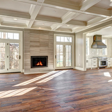
Inspiration for a large contemporary open concept family room remodel in Austin with gray walls
Inspiration for a large contemporary open concept family room remodel in Austin with gray walls

4