
Search results for "Observing" in Home Design Ideas
 Renovisions
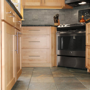
This kitchen had not been renovated since the salt box colonial house was built in the 1960’s. The new owner felt it was time for a complete refresh with some traditional details and adding in the owner’s contemporary tastes.
At initial observation, we determined the house had good bones; including high ceilings and abundant natural light from a double-hung window and three skylights overhead recently installed by our client. Mixing the homeowners desires required the skillful eyes of Cathy and Ed from Renovisions. The original kitchen had dark stained, worn cabinets, in-adequate lighting and a non-functional coat closet off the kitchen space. In order to achieve a true transitional look, Renovisions incorporated classic details with subtle, simple and cleaner line touches. For example, the backsplash mix of honed and polished 2” x 3” stone-look subway tile is outlined in brushed stainless steel strips creating an edgy feel, especially at the niche above the range. Removing the existing wall that shared the coat closet opened up the kitchen to allow adding an island for seating and entertaining guests.
We chose natural maple, shaker style flat panel cabinetry with longer stainless steel pulls instead of knobs, keeping in line with the clients desire for a sleeker design. This kitchen had to be gutted to accommodate the new layout featuring an island with pull-out trash and recycling and deeper drawers for utensils. Spatial constraints were top of mind and incorporating a convection microwave above the slide-in range made the most sense. Our client was thrilled with the ability to bake, broil and microwave from GE’s advantium oven – how convenient! A custom pull-out cabinet was built for his extensive array of spices and oils. The sink base cabinet provides plenty of area for the large rectangular stainless steel sink, single-lever multi-sprayer faucet and matching filtered water dispenser faucet. The natural, yet sleek green soapstone countertop with distinct white veining created a dynamic visual and principal focal point for the now open space.
While oak wood flooring existed in the entire first floor, as an added element of color and interest we installed multi-color slate-look porcelain tiles in the kitchen area. We also installed a fully programmable floor heating system for those chilly New England days. Overall, out client was thrilled with his Mission Transition.
 Black + Vernooy Architects
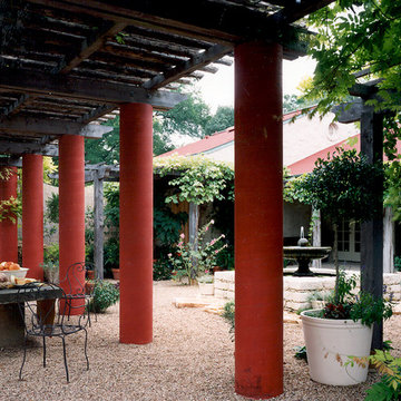
Inspired by the owners' travels in the Mediterranean region yet rooted firmly in Texas soil, this single family residence is designed to provide a secluded, comfortable environment for observing nature, relaxing, entertaining, living, and working. The oddly shaped site determined a house that is removed from the street, resulting in a long drive through a wooded area that leads to the gently sloping house site. The house is designed around a large, central public living area. The basic "H" shaped plan reaches out to define the entry court as well as the rear yard area. The building can only be seen in small vignettes as one moves around and through it, and is finally understood from inside the main room. The public space is central to the plan, where rooms overlay and flow through and into one another. Private rooms are tucked away in more remote parts of the site. The guest bedrooms are located at a slightly lower level, and a remote study, reached by a ship's ladder, overlooks the main living area and enjoys its own roof terrace. The central part of the house is designed as a solid, strong, "original" building to which other wings are added as if built over time. The client desired that the house appear to be of no discernible style or period, and seem older rather than newer.
Built By: Dalgleish Construction Co.
Photography By: Paul Bardagjy
 Klopf Architecture
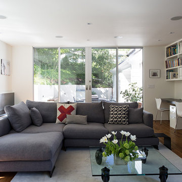
Sebastian and Tanja DiGrande's quest for natural light and open, modern design led them to Klopf Architecture in San Francisco. Working hand-in-hand with homeowner/designer Tanja DiGrande, Klopf collaborated on a modern addition to the rear of a traditional-style home. The idea was to depart from the original style completely to draw a distinction between the original house and any later additions, as well as observe a very minimal, clean, gallery-like modern style against which changing daylight, art, furniture, and of course the people provide the color and motion.
With its dark gray stuccoed walls, dark steel railing, and floor-to-ceiling windows, the exterior of the addition is at the same time an open, modern box as well as a receding volume that acts almost as a backdrop for the house, receding visually out of respect for the original home. From the interior, windows bring in nature and views from all around the lush property. They also allow views of the original house. Up on the roof deck the views magnify. The owners use a boom and crank to bring up food and drinks when entertaining!
Inside, the simple clean-lined spaces showcase the couple’s minimal, modern taste. The open bathroom epitomizes the clean, minimal style of the addition. On the exterior, steel elements bring a more industrial modern feeling to the addition from the rear.
Klopf Architecture Project Team: John Klopf, AIA, Geoff Campen, and Angela Todorova
Co-Designer: Tanja DiGrande
Contractor: Jose Ramirez & J-C General Contractors Inc.
Photography ©2015 Mariko Reed
Location: Orinda, CA
Year completed: 2014
Find the right local pro for your project
 Klopf Architecture
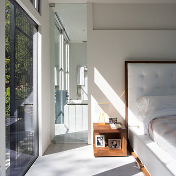
Sebastian and Tanja DiGrande's quest for natural light and open, modern design led them to Klopf Architecture in San Francisco. Working hand-in-hand with homeowner/designer Tanja DiGrande, Klopf collaborated on a modern addition to the rear of a traditional-style home. The idea was to depart from the original style completely to draw a distinction between the original house and any later additions, as well as observe a very minimal, clean, gallery-like modern style against which changing daylight, art, furniture, and of course the people provide the color and motion.
With its dark gray stuccoed walls, dark steel railing, and floor-to-ceiling windows, the exterior of the addition is at the same time an open, modern box as well as a receding volume that acts almost as a backdrop for the house, receding visually out of respect for the original home. From the interior, windows bring in nature and views from all around the lush property. They also allow views of the original house. Up on the roof deck the views magnify. The owners use a boom and crank to bring up food and drinks when entertaining!
Inside, the simple clean-lined spaces showcase the couple’s minimal, modern taste. The open bathroom epitomizes the clean, minimal style of the addition. On the exterior, steel elements bring a more industrial modern feeling to the addition from the rear.
Klopf Architecture Project Team: John Klopf, AIA, Geoff Campen, and Angela Todorova
Co-Designer: Tanja DiGrande
Contractor: Jose Ramirez & J-C General Contractors Inc.
Photography ©2015 Mariko Reed
Location: Orinda, CA
Year completed: 2014
 Renovisions
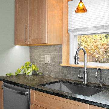
This kitchen had not been renovated since the salt box colonial house was built in the 1960’s. The new owner felt it was time for a complete refresh with some traditional details and adding in the owner’s contemporary tastes.
At initial observation, we determined the house had good bones; including high ceilings and abundant natural light from a double-hung window and three skylights overhead recently installed by our client. Mixing the homeowners desires required the skillful eyes of Cathy and Ed from Renovisions. The original kitchen had dark stained, worn cabinets, in-adequate lighting and a non-functional coat closet off the kitchen space. In order to achieve a true transitional look, Renovisions incorporated classic details with subtle, simple and cleaner line touches. For example, the backsplash mix of honed and polished 2” x 3” stone-look subway tile is outlined in brushed stainless steel strips creating an edgy feel, especially at the niche above the range. Removing the existing wall that shared the coat closet opened up the kitchen to allow adding an island for seating and entertaining guests.
We chose natural maple, shaker style flat panel cabinetry with longer stainless steel pulls instead of knobs, keeping in line with the clients desire for a sleeker design. This kitchen had to be gutted to accommodate the new layout featuring an island with pull-out trash and recycling and deeper drawers for utensils. Spatial constraints were top of mind and incorporating a convection microwave above the slide-in range made the most sense. Our client was thrilled with the ability to bake, broil and microwave from GE’s advantium oven – how convenient! A custom pull-out cabinet was built for his extensive array of spices and oils. The sink base cabinet provides plenty of area for the large rectangular stainless steel sink, single-lever multi-sprayer faucet and matching filtered water dispenser faucet. The natural, yet sleek green soapstone countertop with distinct white veining created a dynamic visual and principal focal point for the now open space.
While oak wood flooring existed in the entire first floor, as an added element of color and interest we installed multi-color slate-look porcelain tiles in the kitchen area. We also installed a fully programmable floor heating system for those chilly New England days. Overall, out client was thrilled with his Mission Transition.
 Klopf Architecture
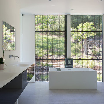
Sebastian and Tanja DiGrande's quest for natural light and open, modern design led them to Klopf Architecture in San Francisco. Working hand-in-hand with homeowner/designer Tanja DiGrande, Klopf collaborated on a modern addition to the rear of a traditional-style home. The idea was to depart from the original style completely to draw a distinction between the original house and any later additions, as well as observe a very minimal, clean, gallery-like modern style against which changing daylight, art, furniture, and of course the people provide the color and motion.
With its dark gray stuccoed walls, dark steel railing, and floor-to-ceiling windows, the exterior of the addition is at the same time an open, modern box as well as a receding volume that acts almost as a backdrop for the house, receding visually out of respect for the original home. From the interior, windows bring in nature and views from all around the lush property. They also allow views of the original house. Up on the roof deck the views magnify. The owners use a boom and crank to bring up food and drinks when entertaining!
Inside, the simple clean-lined spaces showcase the couple’s minimal, modern taste. The open bathroom epitomizes the clean, minimal style of the addition. On the exterior, steel elements bring a more industrial modern feeling to the addition from the rear.
Klopf Architecture Project Team: John Klopf, AIA, Geoff Campen, and Angela Todorova
Co-Designer: Tanja DiGrande
Contractor: Jose Ramirez & J-C General Contractors Inc.
Photography ©2015 Mariko Reed
Location: Orinda, CA
Year completed: 2014
 Klopf Architecture
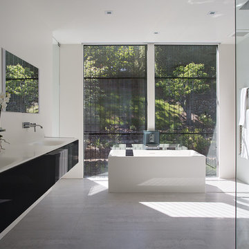
Sebastian and Tanja DiGrande's quest for natural light and open, modern design led them to Klopf Architecture in San Francisco. Working hand-in-hand with homeowner/designer Tanja DiGrande, Klopf collaborated on a modern addition to the rear of a traditional-style home. The idea was to depart from the original style completely to draw a distinction between the original house and any later additions, as well as observe a very minimal, clean, gallery-like modern style against which changing daylight, art, furniture, and of course the people provide the color and motion.
With its dark gray stuccoed walls, dark steel railing, and floor-to-ceiling windows, the exterior of the addition is at the same time an open, modern box as well as a receding volume that acts almost as a backdrop for the house, receding visually out of respect for the original home. From the interior, windows bring in nature and views from all around the lush property. They also allow views of the original house. Up on the roof deck the views magnify. The owners use a boom and crank to bring up food and drinks when entertaining!
Inside, the simple clean-lined spaces showcase the couple’s minimal, modern taste. The open bathroom epitomizes the clean, minimal style of the addition. On the exterior, steel elements bring a more industrial modern feeling to the addition from the rear.
Klopf Architecture Project Team: John Klopf, AIA, Geoff Campen, and Angela Todorova
Co-Designer: Tanja DiGrande
Contractor: Jose Ramirez & J-C General Contractors Inc.
Photography ©2015 Mariko Reed
Location: Orinda, CA
Year completed: 2014

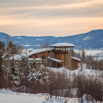
 Amaron Folkestad GC Steamboats Builder
Amaron Folkestad General Contractors Steamboat Springs Custom Builder, Photo byTim Murphy Photography
Minimalist exterior home photo in Denver
Minimalist exterior home photo in Denver
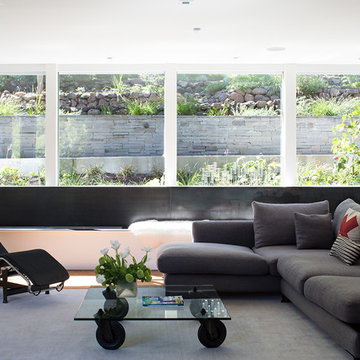 Klopf Architecture
Sebastian and Tanja DiGrande's quest for natural light and open, modern design led them to Klopf Architecture in San Francisco. Working hand-in-hand with homeowner/designer Tanja DiGrande, Klopf collaborated on a modern addition to the rear of a traditional-style home. The idea was to depart from the original style completely to draw a distinction between the original house and any later additions, as well as observe a very minimal, clean, gallery-like modern style against which changing daylight, art, furniture, and of course the people provide the color and motion.
With its dark gray stuccoed walls, dark steel railing, and floor-to-ceiling windows, the exterior of the addition is at the same time an open, modern box as well as a receding volume that acts almost as a backdrop for the house, receding visually out of respect for the original home. From the interior, windows bring in nature and views from all around the lush property. They also allow views of the original house. Up on the roof deck the views magnify. The owners use a boom and crank to bring up food and drinks when entertaining!
Inside, the simple clean-lined spaces showcase the couple’s minimal, modern taste. The open bathroom epitomizes the clean, minimal style of the addition. On the exterior, steel elements bring a more industrial modern feeling to the addition from the rear.
Klopf Architecture Project Team: John Klopf, AIA, Geoff Campen, and Angela Todorova
Co-Designer: Tanja DiGrande
Contractor: Jose Ramirez & J-C General Contractors Inc.
Photography ©2015 Mariko Reed
Location: Orinda, CA
Year completed: 2014
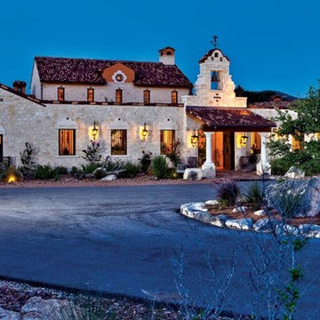
 Catrina's Ranch Interiors
It was in every way, Ramsey says, a once-in-a-lifetime professional and personal experience. “My favorite part of this project was the glow on John and Betty’s faces upon the completion of the hacienda,” she says. “They became not only satisfied clients, but friends for life. It was very challenging but so rewarding.” Helping her and the Martins embrace the home’s challenges was Kendrick, who has been in the design business for more than 40 years. Despite her long career, Kendrick admits to being speechless when she first viewed the ranch’s blueprints and renderings. “The central courtyard had a bell tower over the front entrance gate — a real one,” she says. “The main house had an observation tower that overlooked the dammed-up river and a picturesque view of heaven on earth. There was a magnificent outdoor kitchen off of an enormous porch. This home was to have all the bells and whistles, with unimaginable details, while sparing no expense.”
All three women embraced the challenges of creating the Kemosabe Ranch abode, including designing and building 58 chandeliers and sconces, dozens of custom doors and cabinets, two fully tricked-out kitchens — one inside, one out — and myriad accessories such as candle holders. Regardless of a proposed element’s complexity, like the hammered copper panels in the cabinet doors, Kendrick’s response was the same: “No problem.”
Betty Martin is as apt to talk reverently about all of the craftsmen, contractors and suppliers who worked on her home’s features, from the 10-foot Mexican limestone fountain in the courtyard to the outdoor fossil art wall, as she is to want to bask in the grandeur of the finished project. That’s not surprising, given its scope to rival that of the Taj Mahal. But having been so intimately involved in the process has given her an even greater sense of pride in ownership of her dazzling dwelling. “It’s hard for me to pick out the part of the project that I love the most,” she says.
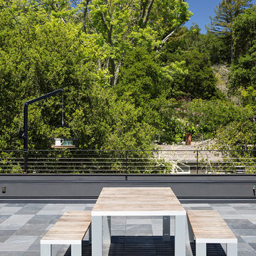 Klopf Architecture
Sebastian and Tanja DiGrande's quest for natural light and open, modern design led them to Klopf Architecture in San Francisco. Working hand-in-hand with homeowner/designer Tanja DiGrande, Klopf collaborated on a modern addition to the rear of a traditional-style home. The idea was to depart from the original style completely to draw a distinction between the original house and any later additions, as well as observe a very minimal, clean, gallery-like modern style against which changing daylight, art, furniture, and of course the people provide the color and motion.
With its dark gray stuccoed walls, dark steel railing, and floor-to-ceiling windows, the exterior of the addition is at the same time an open, modern box as well as a receding volume that acts almost as a backdrop for the house, receding visually out of respect for the original home. From the interior, windows bring in nature and views from all around the lush property. They also allow views of the original house. Up on the roof deck the views magnify. The owners use a boom and crank to bring up food and drinks when entertaining!
Inside, the simple clean-lined spaces showcase the couple’s minimal, modern taste. The open bathroom epitomizes the clean, minimal style of the addition. On the exterior, steel elements bring a more industrial modern feeling to the addition from the rear.
Klopf Architecture Project Team: John Klopf, AIA, Geoff Campen, and Angela Todorova
Co-Designer: Tanja DiGrande
Contractor: Jose Ramirez & J-C General Contractors Inc.
Photography ©2015 Mariko Reed
Location: Orinda, CA
Year completed: 2014
 Klopf Architecture
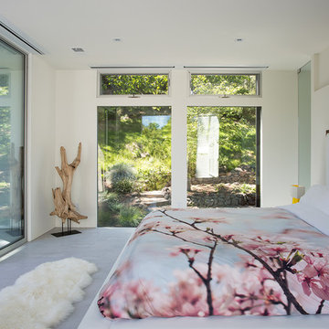
Sebastian and Tanja DiGrande's quest for natural light and open, modern design led them to Klopf Architecture in San Francisco. Working hand-in-hand with homeowner/designer Tanja DiGrande, Klopf collaborated on a modern addition to the rear of a traditional-style home. The idea was to depart from the original style completely to draw a distinction between the original house and any later additions, as well as observe a very minimal, clean, gallery-like modern style against which changing daylight, art, furniture, and of course the people provide the color and motion.
With its dark gray stuccoed walls, dark steel railing, and floor-to-ceiling windows, the exterior of the addition is at the same time an open, modern box as well as a receding volume that acts almost as a backdrop for the house, receding visually out of respect for the original home. From the interior, windows bring in nature and views from all around the lush property. They also allow views of the original house. Up on the roof deck the views magnify. The owners use a boom and crank to bring up food and drinks when entertaining!
Inside, the simple clean-lined spaces showcase the couple’s minimal, modern taste. The open bathroom epitomizes the clean, minimal style of the addition. On the exterior, steel elements bring a more industrial modern feeling to the addition from the rear.
Klopf Architecture Project Team: John Klopf, AIA, Geoff Campen, and Angela Todorova
Co-Designer: Tanja DiGrande
Contractor: Jose Ramirez & J-C General Contractors Inc.
Photography ©2015 Mariko Reed
Location: Orinda, CA
Year completed: 2014
 Almesedoors
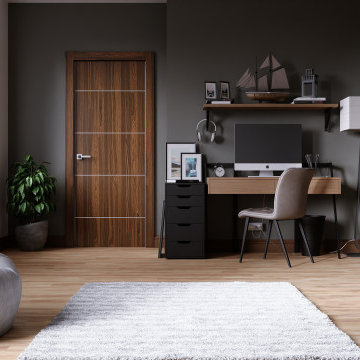
THE DOOR NAME ORIGIN - "ALLUMINIO ELIVIA VERTICAL WOOD GRAIN 4HS"
Of all the interior door models in the Elivia collection, this one is perhaps the most unapologetically elegant. Why? Hmm … That which is self-evident can be the most difficult to explain. Is it because it is built using the latest breakthroughs in interior door making technology? Look at the finish: the process of applying it utilizes something called “stretching” by professionals, which is to say that instead of simply slapping the finish on top of the interior door’s surface, our company fuses (for lack of a better word) the materials (on molecular level, no less), the result being that the finished product is more warp-resistant, scratch-resistant, and fade-proof than any interior door put together in the past. This is especially important in climates known for their high humidity levels. Yes, but this has more to do with engineering than aesthetics, right? Okay, so, is this interior door super-elegant because ... Show more!
FINISH: WALNUT
When it comes to interior door finishes, walnut may not be king per se, since “different folk have different views,” as the poet said, and it behooves a proper collection of finishes to be thoroughly democratic; but, but … you could view walnut as an important majority leader descended from royalty – like, say, Louis Napoleon back when he was still an elected official and not, as he eventually came to style himself, Napoleon III.
Strictly speaking, a walnut is the seed of a drupaceous nut, and not a true nut in the botanical sense. It is native to Persia (walnut oil is a staple in Iranian cuisine to this day) and North America, even though approximately one half of the world’s production today is done in China.
That said, one of its more historically curious uses would be the production of ink and dyes. Those are made, or used to be made, at least, from the husk surrounding the nut. The ink could be used to produce drawings – or darken paper to make it look older. It has (as it turned out by the by) excellent archival properties. It was used liberally by many capable and honest artists in the past.
A keen observer of the human condition, a Florentine named Leonardo da Vinci never left his house (which featured some pretty interesting interior doors, but that’s a story for another day) … never left it without a vial – and a sketch book.
As he took leisurely strolls around the streets and piazzas, he observed folks – socializing, arguing, fighting, striking bargains, and gossiping. Let us mention in passing – and this is merely an opinion, mind you – that his sketches seem to be a great deal livelier than his portraits, which for the most part adhere to the epoch’s somewhat mawkish standards and the algebraic, rather than harmonious, approach to depicting humans. The perpetual beguiling mystery of Mona Lisa’s smile is undoubtedly magnificent, but it is the Tuscan polymath’s quick yet amazingly insightful drawings that give us an idea – oftentimes a very comprehensive one – of what everyday life was truly like in Florence in the Sixteenth Century. An old man gloating at someone’s misfortune, two passionate merchants arguing over the price of some highly important delivery, a young woman lamenting the lack of decent men whom a reasonable person could view as husband material, and on and on – it’s all there in Leonardo’s sketches characterized by masterful lines and elegant shading despite the obvious – and necessary – impetuosity of each sketch. So precious and brilliant are those casual masterpieces that, had the scientifically inclined fellow eliminated the need for outdoor sketching by inventing photography, it would have been an historian’s immeasurable gain, certainly, but also an art lover’s great loss.
The idea behind our Walnut Finish is to invoke in the interior door owner a feeling of timeless historicity. Some things change, but others are forever. Stability is an important quality in an interior door, is it not?
Rembrandt van Rijn, who also used walnut ink extensively, was a studio artist, with only a few outdoor paintings in his legacy. Truth be told, he was a better draftsman than Leonardo, at least as far as technique goes (don’t let this get around). Well. He lived a century later and had the benefit of all the development art had undergone since the great Italian master. Just like these interior doors – your interior doors – are a huge improvement on anything that was available only twenty years ago, never mind a hundred years ago.
The “oscillation” of Rembrandt’s line, the delightful shift from the descriptive to the aesthetic stroke, makes his production in that category quite unique. Upon reaching artistic maturity, the stubborn Dutch master began to shun the unbroken contour line, which caused a lot of trouble for his drawings a century later, when dealers and collectors who wished to “update” his sketches to fit the current fashion had the audacity to “complete” Rembrandt’s pen-and-inks. Fortunately, some of the sketches escaped this sorry fate and have been preserved in their original glorious state to this day. Rembrandt’s mastery is yet another thing this interior door finish might remind you of each time you look at your doors.
 Black + Vernooy Architects
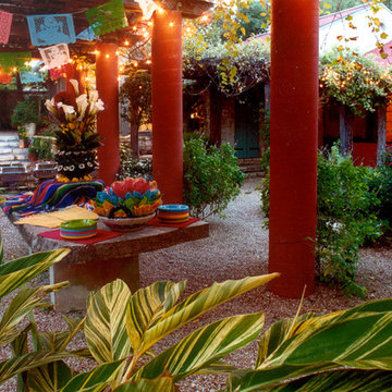
Inspired by the owners' travels in the Mediterranean region yet rooted firmly in Texas soil, this single family residence is designed to provide a secluded, comfortable environment for observing nature, relaxing, entertaining, living, and working. The oddly shaped site determined a house that is removed from the street, resulting in a long drive through a wooded area that leads to the gently sloping house site. The house is designed around a large, central public living area. The basic "H" shaped plan reaches out to define the entry court as well as the rear yard area. The building can only be seen in small vignettes as one moves around and through it, and is finally understood from inside the main room. The public space is central to the plan, where rooms overlay and flow through and into one another. Private rooms are tucked away in more remote parts of the site. The guest bedrooms are located at a slightly lower level, and a remote study, reached by a ship's ladder, overlooks the main living area and enjoys its own roof terrace. The central part of the house is designed as a solid, strong, "original" building to which other wings are added as if built over time. The client desired that the house appear to be of no discernible style or period, and seem older rather than newer.
Built By: Dalgleish Construction Co.
Photography By: Paul Bardagjy
 Creative Cabinets and Fine Finishes, LLC
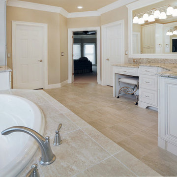
Brand new Antique white vanities with chocolate glaze are a perfect compliment to the Giallo Ornamental Premium granite countertops. And the amazing tile work on the floors, tub surround and shower pull all these elements together beautifully!
 Renovisions
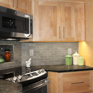
This kitchen had not been renovated since the salt box colonial house was built in the 1960’s. The new owner felt it was time for a complete refresh with some traditional details and adding in the owner’s contemporary tastes.
At initial observation, we determined the house had good bones; including high ceilings and abundant natural light from a double-hung window and three skylights overhead recently installed by our client. Mixing the homeowners desires required the skillful eyes of Cathy and Ed from Renovisions. The original kitchen had dark stained, worn cabinets, in-adequate lighting and a non-functional coat closet off the kitchen space. In order to achieve a true transitional look, Renovisions incorporated classic details with subtle, simple and cleaner line touches. For example, the backsplash mix of honed and polished 2” x 3” stone-look subway tile is outlined in brushed stainless steel strips creating an edgy feel, especially at the niche above the range. Removing the existing wall that shared the coat closet opened up the kitchen to allow adding an island for seating and entertaining guests.
We chose natural maple, shaker style flat panel cabinetry with longer stainless steel pulls instead of knobs, keeping in line with the clients desire for a sleeker design. This kitchen had to be gutted to accommodate the new layout featuring an island with pull-out trash and recycling and deeper drawers for utensils. Spatial constraints were top of mind and incorporating a convection microwave above the slide-in range made the most sense. Our client was thrilled with the ability to bake, broil and microwave from GE’s advantium oven – how convenient! A custom pull-out cabinet was built for his extensive array of spices and oils. The sink base cabinet provides plenty of area for the large rectangular stainless steel sink, single-lever multi-sprayer faucet and matching filtered water dispenser faucet. The natural, yet sleek green soapstone countertop with distinct white veining created a dynamic visual and principal focal point for the now open space.
While oak wood flooring existed in the entire first floor, as an added element of color and interest we installed multi-color slate-look porcelain tiles in the kitchen area. We also installed a fully programmable floor heating system for those chilly New England days. Overall, out client was thrilled with his Mission Transition.
 Klopf Architecture
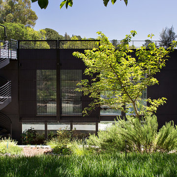
Sebastian and Tanja DiGrande's quest for natural light and open, modern design led them to Klopf Architecture in San Francisco. Working hand-in-hand with homeowner/designer Tanja DiGrande, Klopf collaborated on a modern addition to the rear of a traditional-style home. The idea was to depart from the original style completely to draw a distinction between the original house and any later additions, as well as observe a very minimal, clean, gallery-like modern style against which changing daylight, art, furniture, and of course the people provide the color and motion.
With its dark gray stuccoed walls, dark steel railing, and floor-to-ceiling windows, the exterior of the addition is at the same time an open, modern box as well as a receding volume that acts almost as a backdrop for the house, receding visually out of respect for the original home. From the interior, windows bring in nature and views from all around the lush property. They also allow views of the original house. Up on the roof deck the views magnify. The owners use a boom and crank to bring up food and drinks when entertaining!
Inside, the simple clean-lined spaces showcase the couple’s minimal, modern taste. The open bathroom epitomizes the clean, minimal style of the addition. On the exterior, steel elements bring a more industrial modern feeling to the addition from the rear.
Klopf Architecture Project Team: John Klopf, AIA, Geoff Campen, and Angela Todorova
Co-Designer: Tanja DiGrande
Contractor: Jose Ramirez & J-C General Contractors Inc.
Photography ©2015 Mariko Reed
Location: Orinda, CA
Year completed: 2014
 Ian Heath and Marilyn Ball Real Estate
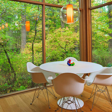
First Amongst Equals, Victoria BC
The boldly uplifting modernistic elegance of this stunningly designed and superbly constructed architectural masterpiece harmonizes serenely with its surroundings. Natural woodland textures create an exceptionally impressive organic setting. Inspired architect Franc D'Ambrosio incorporated classically dramatic mid-century design elements into a work of art for contemporary living. Quality constructed to unparalleled specifications, this award-winning home offers the much-coveted privacy of a peaceful retreat together with luxurious amenities and an outstanding architectural interpretation, only minutes from downtown Victoria. Significantly exceeds B.C building code, particular seismic integrity because of the steel frame.2015 VIBE top award
View 3D Tour and full details here: http://www.ianheath-marilynball.com/moreinfo_homes_new.php?property=361
Ian Heath and Marilyn Ball (250) 655-SOLD(7653)
 Black + Vernooy Architects
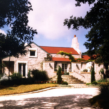
Inspired by the owners' travels in the Mediterranean region yet rooted firmly in Texas soil, this single family residence is designed to provide a secluded, comfortable environment for observing nature, relaxing, entertaining, living, and working. The oddly shaped site determined a house that is removed from the street, resulting in a long drive through a wooded area that leads to the gently sloping house site. The house is designed around a large, central public living area. The basic "H" shaped plan reaches out to define the entry court as well as the rear yard area. The building can only be seen in small vignettes as one moves around and through it, and is finally understood from inside the main room. The public space is central to the plan, where rooms overlay and flow through and into one another. Private rooms are tucked away in more remote parts of the site. The guest bedrooms are located at a slightly lower level, and a remote study, reached by a ship's ladder, overlooks the main living area and enjoys its own roof terrace. The central part of the house is designed as a solid, strong, "original" building to which other wings are added as if built over time. The client desired that the house appear to be of no discernible style or period, and seem older rather than newer.
Built By: Dalgleish Construction Co.
Photography By: Paul Bardagjy
86