
Search results for "Observing" in Home Design Ideas
 Arkin Tilt Architects
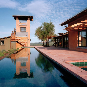
Across the pool terrace from the master wing sits a guest suite with a bedroom, bath, and sitting room. The sitting room sits in the base of the tower, with a study and viewing deck above.
Photography ©Edward Caldwell
 Klopf Architecture
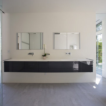
Sebastian and Tanja DiGrande's quest for natural light and open, modern design led them to Klopf Architecture in San Francisco. Working hand-in-hand with homeowner/designer Tanja DiGrande, Klopf collaborated on a modern addition to the rear of a traditional-style home. The idea was to depart from the original style completely to draw a distinction between the original house and any later additions, as well as observe a very minimal, clean, gallery-like modern style against which changing daylight, art, furniture, and of course the people provide the color and motion.
With its dark gray stuccoed walls, dark steel railing, and floor-to-ceiling windows, the exterior of the addition is at the same time an open, modern box as well as a receding volume that acts almost as a backdrop for the house, receding visually out of respect for the original home. From the interior, windows bring in nature and views from all around the lush property. They also allow views of the original house. Up on the roof deck the views magnify. The owners use a boom and crank to bring up food and drinks when entertaining!
Inside, the simple clean-lined spaces showcase the couple’s minimal, modern taste. The open bathroom epitomizes the clean, minimal style of the addition. On the exterior, steel elements bring a more industrial modern feeling to the addition from the rear.
Klopf Architecture Project Team: John Klopf, AIA, Geoff Campen, and Angela Todorova
Co-Designer: Tanja DiGrande
Contractor: Jose Ramirez & J-C General Contractors Inc.
Photography ©2015 Mariko Reed
Location: Orinda, CA
Year completed: 2014
 Keystone Custom Decks
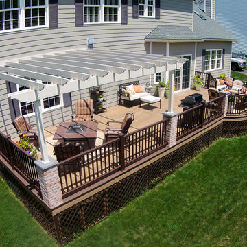
This Project was built using TimberTech Tigerwood and Mocha Decking with Kona Radiance Rail Express railing. This project feature a custom built pergola with brick columns. Also features is a custom radius bump out as well as a stamped concrete patio. This outdoor living space was finished in June of 2015.
Photography By: Keystone Custom Decks
Find the right local pro for your project
 NanaWall
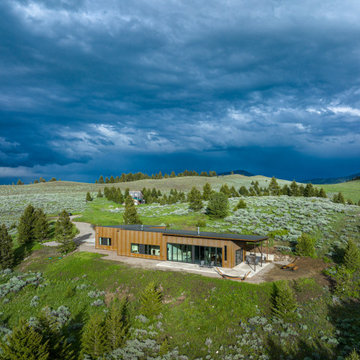
Drawn to the site’s serene location and the prospect of a quiet life after retirement, the homeowners purchased a parcel of land at the northern end of the Gallatin Range in Bozeman, Montana. After five years of engaging with the terrain and observing the local wildlife, they purchased the two adjacent parcels to preserve the optimal views of Paradise Valley and the Bridger Mountains. There, the homeowners envisioned a compact yet modern retreat with a fire-retardant building envelope and minimal disruption to the landscape and wildlife. Known for their sustainable architecture and environmentally conscious design, the homeowner entrusted Lori Ryker of studioryker and Riverbend Builders to bring his vision to life and construct a home with modern comforts and natural materials harmonizing with the land. “The owner was acutely in-tune with the landscape of the property, loving to watch wildlife, and interested in a house that sat down in the land instead of having a prominent profile in the landscape as so many “trophy” homes do,” shares Ryker.
The proximity to the forest and concern for fire led the home to be clad almost fully in steel with an apron of crushed rock on the ground surrounding the dwelling. Corten steel was selected for the building envelope for its low maintenance and ability to rust into a natural hue that blends with the surrounding landscape. Sustainability was a core principle throughout the design process. Inside, the home’s radiant-heated, polished concrete floors contribute to passive heating and cooling by absorbing heat during the day and releasing it at night. Folding glass walls enhance the home’s energy efficiency by allowing natural light and ventilation to flow freely through the interior spaces. For a cohesive appearance, all fenestration was specified in the color iron ore with triple glazing to ensure excellent thermal insulation, reducing energy consumption year-round.

 TN Nursery
Witch Hazel: A Shrub That Teaches Patience in the Garden
Witch hazel is a reminder that some of the most rewarding garden plants operate on a different timetable. Unlike shrubs that demand attention with bold flowers or fast growth, witch hazel reveals its value slowly and intentionally. Its most striking feature often appears when gardeners least expect it, with delicate, ribbon-like blooms emerging in late winter while much of the landscape still rests.
This timing alone sets witch hazel apart. Winter-blooming shrubs change the way gardeners experience their landscapes, encouraging observation during a season that is often overlooked. Planted near windows, paths, or entryways, witch hazel offers moments of surprise and quiet beauty when color is scarce. Its subtle fragrance and fine-textured flowers add depth without overwhelming the surrounding environment.
Beyond bloom, witch hazel contributes structure and balance to the garden year-round. Its branching form develops naturally into an open, graceful shape that rarely requires pruning. During the growing season, its foliage blends effortlessly with perennials, groundcovers, and woodland plants, creating cohesion rather than competition. In autumn, the leaves shift to soft golden tones, easing the transition into dormancy.
Witch hazel also supports a slower, more sustainable approach to gardening. Once established, it asks very little in return, adapting well to its surroundings and thriving without constant inputs. Its fallen leaves enrich the soil, reinforcing natural cycles that benefit neighboring plants.
In a garden culture often driven by instant results, witch hazel stands as a counterpoint. It rewards patience, invites reflection, and becomes more meaningful with time. For gardeners willing to embrace its rhythm, witch hazel offers not just seasonal interest, but a deeper connection to the quiet moments that make gardening truly fulfilling.
https://www.onlineplantnursery.com/products/witch-hazel
https://treenurseryco.com/witch-hazel-shrub
https://www.wholesalenurseryco.com/products/witch-hazel
https://www.tennesseewholesalenursery.com/products/witch-hazel
https://www.tnnursery.net/products/witch-hazel
 Metropolis Drafting and Construction Inc
An original 1930’s English Tudor with only 2 bedrooms and 1 bath spanning about 1730 sq.ft. was purchased by a family with 2 amazing young kids, we saw the potential of this property to become a wonderful nest for the family to grow.
The plan was to reach a 2550 sq. ft. home with 4 bedroom and 4 baths spanning over 2 stories.
With continuation of the exiting architectural style of the existing home.
A large 1000sq. ft. addition was constructed at the back portion of the house to include the expended master bedroom and a second-floor guest suite with a large observation balcony overlooking the mountains of Angeles Forest.
An L shape staircase leading to the upstairs creates a moment of modern art with an all white walls and ceilings of this vaulted space act as a picture frame for a tall window facing the northern mountains almost as a live landscape painting that changes throughout the different times of day.
Tall high sloped roof created an amazing, vaulted space in the guest suite with 4 uniquely designed windows extruding out with separate gable roof above.
The downstairs bedroom boasts 9’ ceilings, extremely tall windows to enjoy the greenery of the backyard, vertical wood paneling on the walls add a warmth that is not seen very often in today’s new build.
The master bathroom has a showcase 42sq. walk-in shower with its own private south facing window to illuminate the space with natural morning light. A larger format wood siding was using for the vanity backsplash wall and a private water closet for privacy.
In the interior reconfiguration and remodel portion of the project the area serving as a family room was transformed to an additional bedroom with a private bath, a laundry room and hallway.
The old bathroom was divided with a wall and a pocket door into a powder room the leads to a tub room.
The biggest change was the kitchen area, as befitting to the 1930’s the dining room, kitchen, utility room and laundry room were all compartmentalized and enclosed.
We eliminated all these partitions and walls to create a large open kitchen area that is completely open to the vaulted dining room. This way the natural light the washes the kitchen in the morning and the rays of sun that hit the dining room in the afternoon can be shared by the two areas.
The opening to the living room remained only at 8’ to keep a division of space.
 Cochrane Floors & More
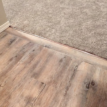
This renovation was completed with the primary goal of removed the carpet in the stairs which was not only difficult to clean but constantly looking worn in this very busy household. Ideally they wanted a durable, low maintenance flooring solution that still added character and coziness. The solution: Luxury vinyl planks! The unique and discreet metal nosings we used respect the clean lines and richness of this amazing plank in a non-commercial way. NOTE: While not all vinyl planks are created equal - the good ones are worth paying a little extra for!

 Renovisions
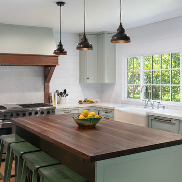
This kitchen had not been renovated since the salt box colonial house was built in the 1960’s. The new owner felt it was time for a complete refresh with some traditional details and adding in the owner’s contemporary tastes.
At initial observation, we determined the house had good bones; including high ceilings and abundant natural light from a double-hung window and three skylights overhead recently installed by our client. Mixing the homeowners desires required the skillful eyes of Cathy and Ed from Renovisions. The original kitchen had dark stained, worn cabinets, in-adequate lighting and a non-functional coat closet off the kitchen space. In order to achieve a true transitional look, Renovisions incorporated classic details with subtle, simple and cleaner line touches. For example, the backsplash mix of honed and polished 2” x 3” stone-look subway tile is outlined in brushed stainless steel strips creating an edgy feel, especially at the niche above the range. Removing the existing wall that shared the coat closet opened up the kitchen to allow adding an island for seating and entertaining guests.
We chose natural maple, shaker style flat panel cabinetry with longer stainless steel pulls instead of knobs, keeping in line with the clients desire for a sleeker design. This kitchen had to be gutted to accommodate the new layout featuring an island with pull-out trash and recycling and deeper drawers for utensils. Spatial constraints were top of mind and incorporating a convection microwave above the slide-in range made the most sense. Our client was thrilled with the ability to bake, broil and microwave from GE’s advantium oven – how convenient! A custom pull-out cabinet was built for his extensive array of spices and oils. The sink base cabinet provides plenty of area for the large rectangular stainless steel sink, single-lever multi-sprayer faucet and matching filtered water dispenser faucet. The natural, yet sleek green soapstone countertop with distinct white veining created a dynamic visual and principal focal point for the now open space.
While oak wood flooring existed in the entire first floor, as an added element of color and interest we installed multi-color slate-look porcelain tiles in the kitchen area. We also installed a fully programmable floor heating system for those chilly New England days. Overall, out client was thrilled with his Mission Transition.


 Cassoni Furniture & Accessories
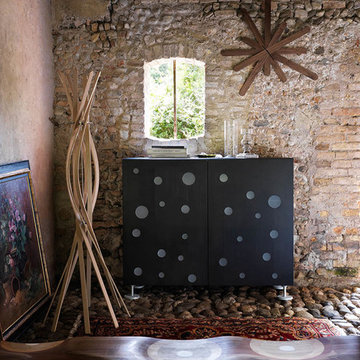
- POLKA DOTS CUPBOARD. In designing Polka Dots, Toyo Ito placed multiple methacrylate, circular inserts in apparent disarray on the doors, in stark contrast to the strict and minimalist structures of this piece of furniture. This graphic idea is reminiscent of Tokyo's Za-Koenji theatre, also designed by the great architect. The inserts represent, as the name itself indicates, a multitude of dots that seem to fly gently upwards and that, upon turning the interior lights on, create a magical play of lights and shadows.
75''5/8W x 19''1/4D x 41''3/4H.
http://bit.ly/2eT5pV2
- TWIST COAT STAND. The eight beech slats in its structure bend and twist as if they were dancing. Their elastic tension is essential to provide the hanger with excellent form and stability. Twist responds to a simple yet important observation: hangers usually vanish when you hang your coats or clothing. However, Twist does not disappear. Conversely, it is emphasized as only its central part is covered. Clothing can be hung on hooks stuck in the slats allowing the upper part of Twist, a beautiful wood flower, to emerge in all its elegance.
Ø23''5/8 x 65''3/4H.
http://bit.ly/2fyMRv0
- RIPPLES BENCH. Ripples, winner of the 2004 Compasso d'Oro, is made of a laminated composite of five different solid woods. Slide your hand along the surface to enjoy the seamless transitions between walnut, mahogany, cherry, oak, and ash. This enveloping seat, carved with mastery, is hand-finished to produce an elegant polychromatic effect arising from the ductility of the wood. A true icon of international design, Ripples is a bench suitable for home users, commercial environments, and public spaces.
78''3/4W x 19''5/8D x 15''3/4H.
http://bit.ly/2fNcqIZ
 Black + Vernooy Architects
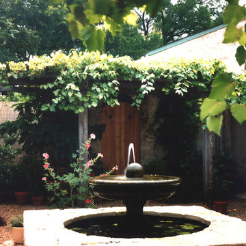
Inspired by the owners' travels in the Mediterranean region yet rooted firmly in Texas soil, this single family residence is designed to provide a secluded, comfortable environment for observing nature, relaxing, entertaining, living, and working. The oddly shaped site determined a house that is removed from the street, resulting in a long drive through a wooded area that leads to the gently sloping house site. The house is designed around a large, central public living area. The basic "H" shaped plan reaches out to define the entry court as well as the rear yard area. The building can only be seen in small vignettes as one moves around and through it, and is finally understood from inside the main room. The public space is central to the plan, where rooms overlay and flow through and into one another. Private rooms are tucked away in more remote parts of the site. The guest bedrooms are located at a slightly lower level, and a remote study, reached by a ship's ladder, overlooks the main living area and enjoys its own roof terrace. The central part of the house is designed as a solid, strong, "original" building to which other wings are added as if built over time. The client desired that the house appear to be of no discernible style or period, and seem older rather than newer.
Built By: Dalgleish Construction Co.
Photography By: Paul Bardagjy
 Emergent Form Architecture
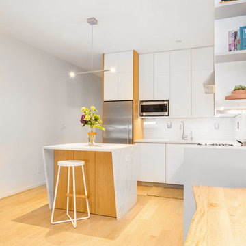
The functional island has a futuristic feel. The angular side panels minimize its footprint in the petite kitchen. The front panels open to reveal shallow glass shelving, and the fridge side houses long, deep drawers.
 Klopf Architecture
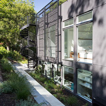
Sebastian and Tanja DiGrande's quest for natural light and open, modern design led them to Klopf Architecture in San Francisco. Working hand-in-hand with homeowner/designer Tanja DiGrande, Klopf collaborated on a modern addition to the rear of a traditional-style home. The idea was to depart from the original style completely to draw a distinction between the original house and any later additions, as well as observe a very minimal, clean, gallery-like modern style against which changing daylight, art, furniture, and of course the people provide the color and motion.
With its dark gray stuccoed walls, dark steel railing, and floor-to-ceiling windows, the exterior of the addition is at the same time an open, modern box as well as a receding volume that acts almost as a backdrop for the house, receding visually out of respect for the original home. From the interior, windows bring in nature and views from all around the lush property. They also allow views of the original house. Up on the roof deck the views magnify. The owners use a boom and crank to bring up food and drinks when entertaining!
Inside, the simple clean-lined spaces showcase the couple’s minimal, modern taste. The open bathroom epitomizes the clean, minimal style of the addition. On the exterior, steel elements bring a more industrial modern feeling to the addition from the rear.
Klopf Architecture Project Team: John Klopf, AIA, Geoff Campen, and Angela Todorova
Co-Designer: Tanja DiGrande
Contractor: Jose Ramirez & J-C General Contractors Inc.
Photography ©2015 Mariko Reed
Location: Orinda, CA
Year completed: 2014
 User
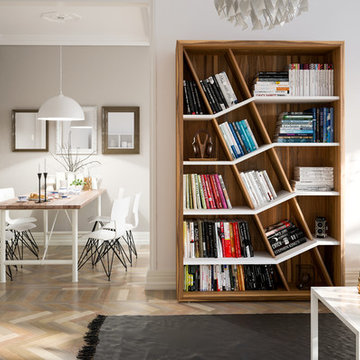
Userhe LoculaMENTUM bookcase was designed to meld traditional bookcase appearance with a modern interpretation and a twist. This twist allows for books or other collectible items to be artfully arranged, categorized, presented.
Diagonal compartments are the spine of the bookcase, so there is a progression of shapes: from the bottom to the top, creating an uplifting feel that has maximum storage capabilities. This is true to the Bauhaus principle, which denotes “form follows function”. In our bookcase design, warm traditional veneers paired with a modern finish and a versatile compartment proportioning make this piece of furniture one with the space.
Beveled edges, visible from every notion, add a distinctive unique touch to the bookcase. A design element that is consistently used in our projects, which translates into sleek streamlined furniture designs.
 Fortunata, Inc
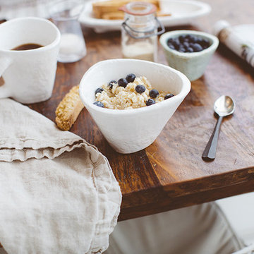
Casa Mia mug, cereal bowl and finger bowl.
Photo by Graham Yelton.
Minimalist home design photo in Birmingham
Minimalist home design photo in Birmingham
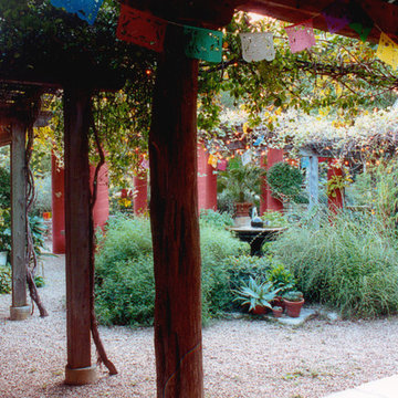 Black + Vernooy Architects
Inspired by the owners' travels in the Mediterranean region yet rooted firmly in Texas soil, this single family residence is designed to provide a secluded, comfortable environment for observing nature, relaxing, entertaining, living, and working. The oddly shaped site determined a house that is removed from the street, resulting in a long drive through a wooded area that leads to the gently sloping house site. The house is designed around a large, central public living area. The basic "H" shaped plan reaches out to define the entry court as well as the rear yard area. The building can only be seen in small vignettes as one moves around and through it, and is finally understood from inside the main room. The public space is central to the plan, where rooms overlay and flow through and into one another. Private rooms are tucked away in more remote parts of the site. The guest bedrooms are located at a slightly lower level, and a remote study, reached by a ship's ladder, overlooks the main living area and enjoys its own roof terrace. The central part of the house is designed as a solid, strong, "original" building to which other wings are added as if built over time. The client desired that the house appear to be of no discernible style or period, and seem older rather than newer.
Built By: Dalgleish Construction Co.
Photography By: Paul Bardagjy
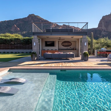
 Greey Pickett
This “Arizona Inspired” home draws on some of the couples’ favorite desert inspirations. The architecture honors the Wrightian design of The Arizona Biltmore, the courtyard raised planter beds feature labeled specimen cactus in the style of the Desert Botanical Gardens, and the expansive backyard offers a resort-style pool and cabana with plenty of entertainment space. Additional focal areas of landscape design include an outdoor living room in the front courtyard with custom steel fire trough, a shallow negative-edge fountain, and a rare “nurse tree” that was salvaged from a nearby site, sits in the corner of the courtyard – a unique conversation starter. The wash that runs on either side of the museum-glass hallway is filled with aloes, agaves and cactus. On the far end of the lot, a fire pit surrounded by desert planting offers stunning views both day and night of the Praying Monk rock formation on Camelback Mountain.
Project Details:
Landscape Architect: Greey|Pickett
Architect: Higgins Architects
Builder: GM Hunt Builders
Landscape Contractor: Benhart Landscaping
Interior Designer: Kitchell Brusnighan Interior Design
Photography: Ian Denker
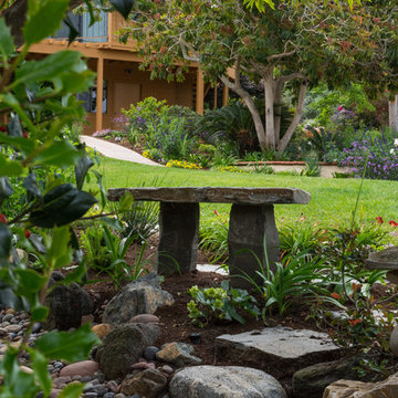
 Christiane Holmquist Landscape Design
With this client who has been passionate about plants all his life, there was naturally a close collaboration and a lot of input from him. Upon closer inspection you'd find some very exceptional plants that are sort of experimental but "all worth the try" in Gordon's eyes. And he is right! I relished the opportunity to use Star Magnolia stellata, Redbud Cercis 'Avondale' and 'Silver Cloud', Arabian Lilac 'Grand Duke of Tuscany', Royal Bromeliad Vriesea imperialis, also many unusual bulbs such as Scilla.
Besides structure providing shrubs and trees (Tecoma, existing Indian Hawthorne with beautiful structures, Sweet Pea Bush, Golden Breath of Heaven, Ilex, Ginkgo, Bronze Loquat etc.) you'll see here also my favorite perennials, succulents and grasses, all as low care and undemanding as well as low-water as possible, to keep the landscape colorful and interesting year round.
One of the highlights of this garden are the dry stream beds, bird bath and garden bench that we added. Built originally by himself and his wife, the dry stream beds were overgrown, mostly hidden by plant debris, or half rolling down hill. We had fun selecting a mixed collection of colorful and richly textured boulders of various sizes over, and with the input from 7 team members: Gordon, me, the contractor, the supervisor and three workers, we re-created the stream beds, making sure that anchor stones on the sides were well embedded in the slope, and that stone shelves and “top dressing” with smaller pebbles would add to the visual interest. Now these beds form very pleasing architectural features that look like they have always been there.
We were all surprised how quickly all plants adapted to the site and started growing and putting out bloom. Now the old birdbath, a traditional white thing with dove figurines resting on the scalloped bowl, looked out of place, and I suggested to replace it with a stone bowl. And that part of the garden just called for a bench under the Macademia nut tree, to observe the birds and contemplate the whole creation. Only stone would do, but not any stone! Gordon picked a Basalt boulder that was naturally bowl shaped. It’s so heavy that it took 8 men to heave it into place! The Basalt bench was not much lighter, and together they make a very inviting scene. This job should last for a while.
Photographed by Emma Almendarez at http://www.emmatheodoraphotography.com/
 Metropolis Drafting and Construction Inc
An original 1930’s English Tudor with only 2 bedrooms and 1 bath spanning about 1730 sq.ft. was purchased by a family with 2 amazing young kids, we saw the potential of this property to become a wonderful nest for the family to grow.
The plan was to reach a 2550 sq. ft. home with 4 bedroom and 4 baths spanning over 2 stories.
With continuation of the exiting architectural style of the existing home.
A large 1000sq. ft. addition was constructed at the back portion of the house to include the expended master bedroom and a second-floor guest suite with a large observation balcony overlooking the mountains of Angeles Forest.
An L shape staircase leading to the upstairs creates a moment of modern art with an all white walls and ceilings of this vaulted space act as a picture frame for a tall window facing the northern mountains almost as a live landscape painting that changes throughout the different times of day.
Tall high sloped roof created an amazing, vaulted space in the guest suite with 4 uniquely designed windows extruding out with separate gable roof above.
The downstairs bedroom boasts 9’ ceilings, extremely tall windows to enjoy the greenery of the backyard, vertical wood paneling on the walls add a warmth that is not seen very often in today’s new build.
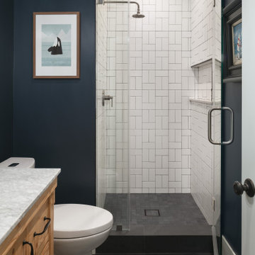
The master bathroom has a showcase 42sq. walk-in shower with its own private south facing window to illuminate the space with natural morning light. A larger format wood siding was using for the vanity backsplash wall and a private water closet for privacy.
In the interior reconfiguration and remodel portion of the project the area serving as a family room was transformed to an additional bedroom with a private bath, a laundry room and hallway.
The old bathroom was divided with a wall and a pocket door into a powder room the leads to a tub room.
The biggest change was the kitchen area, as befitting to the 1930’s the dining room, kitchen, utility room and laundry room were all compartmentalized and enclosed.
We eliminated all these partitions and walls to create a large open kitchen area that is completely open to the vaulted dining room. This way the natural light the washes the kitchen in the morning and the rays of sun that hit the dining room in the afternoon can be shared by the two areas.
The opening to the living room remained only at 8’ to keep a division of space.
 Black + Vernooy Architects
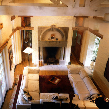
Inspired by the owners' travels in the Mediterranean region yet rooted firmly in Texas soil, this single family residence is designed to provide a secluded, comfortable environment for observing nature, relaxing, entertaining, living, and working. The oddly shaped site determined a house that is removed from the street, resulting in a long drive through a wooded area that leads to the gently sloping house site. The house is designed around a large, central public living area. The basic "H" shaped plan reaches out to define the entry court as well as the rear yard area. The building can only be seen in small vignettes as one moves around and through it, and is finally understood from inside the main room. The public space is central to the plan, where rooms overlay and flow through and into one another. Private rooms are tucked away in more remote parts of the site. The guest bedrooms are located at a slightly lower level, and a remote study, reached by a ship's ladder, overlooks the main living area and enjoys its own roof terrace. The central part of the house is designed as a solid, strong, "original" building to which other wings are added as if built over time. The client desired that the house appear to be of no discernible style or period, and seem older rather than newer.
Built By: Dalgleish Construction Co.
Photography By: Paul Bardagjy
85