
Search results for "Offer consists" in Home Design Ideas
 Drury Design
THE SETUP
Sam’s client had lived in her downtown townhome home for less than a year when she decided to remodel the spacious second level. This open area consisted of three sections: a TV and fireplace zone, a sparsely furnished dining area, and a dominant central kitchen. The kitchen featured a long back wall with three segmented sections and a massive island housing the cooktop. She found the kitchen’s functionality lacking and its presence overwhelming – it dominated the entire floor, regardless of where you stood.
Design objectives:
- Reconfigure key kitchen elements (sink, cooktop, oven) while minimizing the kitchen’s visual impact
- Optimize the kitchen’s back wall, eliminating existing dead space
- Create a purposeful, well-defined dining area
- Establish a distinct, comfortable living area
- Reuse existing appliances and flooring
- Maintain an overall modern design aesthetic
THE REMODEL
Design challenges to be solved:
- Redesign the island to reduce its overwhelming presence
- Create a comfortable, dedicated living room within the available space
- Establish a distinct, inviting dining area within spatial constraints
- Enhance kitchen functionality and style without dominating the entire floor
THE RENEWED SPACE
Design solutions:
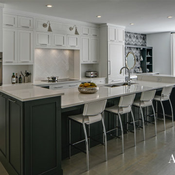
- Sam created raised end caps for the island. This separated the kitchen from adjacent living and dining areas while focusing the kitchen’s functionality. The new sink location offers ample workspace, allowing the cook to interact with guests seated at the island. The redesigned island also provides additional storage.
- For the living area, Sam opted for a functional-yet-minimalist approach. Large-format tile creates a natural stone look for the fireplace and TV wall. The recessed TV and extended fireplace shelf maintain a sleek profile. - Artistic wallpaper adds depth and texture, while the intentional lack of extensive shelving keeps the space open and distinct.
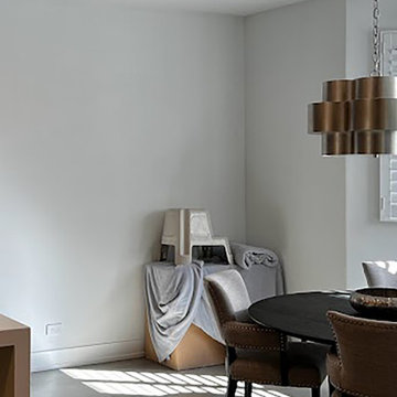
- Sam transformed the dining area’s blank wall into a feature, adding a unique dry bar with counter space, open shelves, cabinet storage and a beverage fridge. - - - Wallpaper behind and above the bar contributes to the area’s personality. A mirror adds depth while pendant lights add style and visual interest.
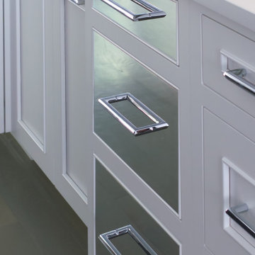
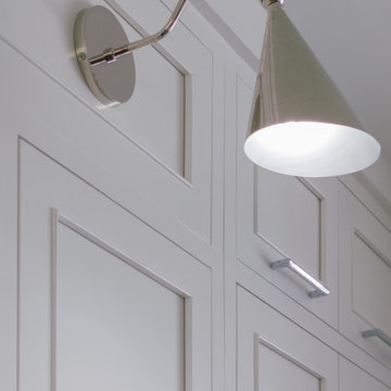
Relocating the cooktop to the back wall facilitates hidden ventilation, reducing visual clutter. Sam balanced transitional and modern elements for a contemporary yet comfortable feel. The digital control panel on the convection cooktop maintains a sleek look, while the wall oven is now at an easy-to-use height. ----- Mirrored base cabinet fronts and a paneled fridge prevent cabinetry monotony.
The redesign has delighted Sam’s client, achieving her main goal of creating a more inviting and visually appealing space. Each section now has its own visual personality and functionality while harmonizing within a monochromatic palette. The entire floor offers wow-factor pop upon first glance, with each area maintaining its distinct character while contributing to a cohesive, modern aesthetic.
 Drury Design
THE SETUP
Sam’s client had lived in her downtown townhome home for less than a year when she decided to remodel the spacious second level. This open area consisted of three sections: a TV and fireplace zone, a sparsely furnished dining area, and a dominant central kitchen. The kitchen featured a long back wall with three segmented sections and a massive island housing the cooktop. She found the kitchen’s functionality lacking and its presence overwhelming – it dominated the entire floor, regardless of where you stood.
Design objectives:
- Reconfigure key kitchen elements (sink, cooktop, oven) while minimizing the kitchen’s visual impact
- Optimize the kitchen’s back wall, eliminating existing dead space
- Create a purposeful, well-defined dining area
- Establish a distinct, comfortable living area
- Reuse existing appliances and flooring
- Maintain an overall modern design aesthetic
THE REMODEL
Design challenges to be solved:
- Redesign the island to reduce its overwhelming presence
- Create a comfortable, dedicated living room within the available space
- Establish a distinct, inviting dining area within spatial constraints
- Enhance kitchen functionality and style without dominating the entire floor
THE RENEWED SPACE
Design solutions:
- Sam created raised end caps for the island. This separated the kitchen from adjacent living and dining areas while focusing the kitchen’s functionality. The new sink location offers ample workspace, allowing the cook to interact with guests seated at the island. The redesigned island also provides additional storage.
- For the living area, Sam opted for a functional-yet-minimalist approach. Large-format tile creates a natural stone look for the fireplace and TV wall. The recessed TV and extended fireplace shelf maintain a sleek profile. - Artistic wallpaper adds depth and texture, while the intentional lack of extensive shelving keeps the space open and distinct.
- Sam transformed the dining area’s blank wall into a feature, adding a unique dry bar with counter space, open shelves, cabinet storage and a beverage fridge. - - - Wallpaper behind and above the bar contributes to the area’s personality. A mirror adds depth while pendant lights add style and visual interest.
Relocating the cooktop to the back wall facilitates hidden ventilation, reducing visual clutter. Sam balanced transitional and modern elements for a contemporary yet comfortable feel. The digital control panel on the convection cooktop maintains a sleek look, while the wall oven is now at an easy-to-use height. ----- Mirrored base cabinet fronts and a paneled fridge prevent cabinetry monotony.
The redesign has delighted Sam’s client, achieving her main goal of creating a more inviting and visually appealing space. Each section now has its own visual personality and functionality while harmonizing within a monochromatic palette. The entire floor offers wow-factor pop upon first glance, with each area maintaining its distinct character while contributing to a cohesive, modern aesthetic.
 Drury Design
THE SETUP
Sam’s client had lived in her downtown townhome home for less than a year when she decided to remodel the spacious second level. This open area consisted of three sections: a TV and fireplace zone, a sparsely furnished dining area, and a dominant central kitchen. The kitchen featured a long back wall with three segmented sections and a massive island housing the cooktop. She found the kitchen’s functionality lacking and its presence overwhelming – it dominated the entire floor, regardless of where you stood.
Design objectives:
- Reconfigure key kitchen elements (sink, cooktop, oven) while minimizing the kitchen’s visual impact
- Optimize the kitchen’s back wall, eliminating existing dead space
- Create a purposeful, well-defined dining area
- Establish a distinct, comfortable living area
- Reuse existing appliances and flooring
- Maintain an overall modern design aesthetic
THE REMODEL
Design challenges to be solved:
- Redesign the island to reduce its overwhelming presence
- Create a comfortable, dedicated living room within the available space
- Establish a distinct, inviting dining area within spatial constraints
- Enhance kitchen functionality and style without dominating the entire floor
THE RENEWED SPACE
Design solutions:
- Sam created raised end caps for the island. This separated the kitchen from adjacent living and dining areas while focusing the kitchen’s functionality. The new sink location offers ample workspace, allowing the cook to interact with guests seated at the island. The redesigned island also provides additional storage.
- For the living area, Sam opted for a functional-yet-minimalist approach. Large-format tile creates a natural stone look for the fireplace and TV wall. The recessed TV and extended fireplace shelf maintain a sleek profile. - Artistic wallpaper adds depth and texture, while the intentional lack of extensive shelving keeps the space open and distinct.
- Sam transformed the dining area’s blank wall into a feature, adding a unique dry bar with counter space, open shelves, cabinet storage and a beverage fridge. - - - Wallpaper behind and above the bar contributes to the area’s personality. A mirror adds depth while pendant lights add style and visual interest.
Relocating the cooktop to the back wall facilitates hidden ventilation, reducing visual clutter. Sam balanced transitional and modern elements for a contemporary yet comfortable feel. The digital control panel on the convection cooktop maintains a sleek look, while the wall oven is now at an easy-to-use height. ----- Mirrored base cabinet fronts and a paneled fridge prevent cabinetry monotony.
The redesign has delighted Sam’s client, achieving her main goal of creating a more inviting and visually appealing space. Each section now has its own visual personality and functionality while harmonizing within a monochromatic palette. The entire floor offers wow-factor pop upon first glance, with each area maintaining its distinct character while contributing to a cohesive, modern aesthetic.
Find the right local pro for your project
 Drury Design
THE SETUP
Sam’s client had lived in her downtown townhome home for less than a year when she decided to remodel the spacious second level. This open area consisted of three sections: a TV and fireplace zone, a sparsely furnished dining area, and a dominant central kitchen. The kitchen featured a long back wall with three segmented sections and a massive island housing the cooktop. She found the kitchen’s functionality lacking and its presence overwhelming – it dominated the entire floor, regardless of where you stood.
Design objectives:
- Reconfigure key kitchen elements (sink, cooktop, oven) while minimizing the kitchen’s visual impact
- Optimize the kitchen’s back wall, eliminating existing dead space
- Create a purposeful, well-defined dining area
- Establish a distinct, comfortable living area
- Reuse existing appliances and flooring
- Maintain an overall modern design aesthetic
THE REMODEL
Design challenges to be solved:
- Redesign the island to reduce its overwhelming presence
- Create a comfortable, dedicated living room within the available space
- Establish a distinct, inviting dining area within spatial constraints
- Enhance kitchen functionality and style without dominating the entire floor
THE RENEWED SPACE
Design solutions:
- Sam created raised end caps for the island. This separated the kitchen from adjacent living and dining areas while focusing the kitchen’s functionality. The new sink location offers ample workspace, allowing the cook to interact with guests seated at the island. The redesigned island also provides additional storage.
- For the living area, Sam opted for a functional-yet-minimalist approach. Large-format tile creates a natural stone look for the fireplace and TV wall. The recessed TV and extended fireplace shelf maintain a sleek profile. - Artistic wallpaper adds depth and texture, while the intentional lack of extensive shelving keeps the space open and distinct.
- Sam transformed the dining area’s blank wall into a feature, adding a unique dry bar with counter space, open shelves, cabinet storage and a beverage fridge. - - - Wallpaper behind and above the bar contributes to the area’s personality. A mirror adds depth while pendant lights add style and visual interest.
Relocating the cooktop to the back wall facilitates hidden ventilation, reducing visual clutter. Sam balanced transitional and modern elements for a contemporary yet comfortable feel. The digital control panel on the convection cooktop maintains a sleek look, while the wall oven is now at an easy-to-use height. ----- Mirrored base cabinet fronts and a paneled fridge prevent cabinetry monotony.
The redesign has delighted Sam’s client, achieving her main goal of creating a more inviting and visually appealing space. Each section now has its own visual personality and functionality while harmonizing within a monochromatic palette. The entire floor offers wow-factor pop upon first glance, with each area maintaining its distinct character while contributing to a cohesive, modern aesthetic.

 Standale Home Studio
This navy blue huge island is the hub of a very busy household. Beautiful contrast to the surrounding white cabinetry. Some of the front porch was taken to add storage, corner pantry and laundry behind the kitchen.
Beveled subway tile is ice white, Cambria quartz counter tops in Brittanica
 Fabco Sanctuary
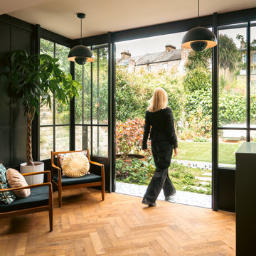
The architect and designer Guy Derwent was approached by his client with a clear and compelling brief: to completely transform a grand Victorian terrace house they were planning to renovate. The client envisioned something far beyond a standard renovation – this was to be a bold and dramatic reimagining of a family home that could grow with them over time.
With the property having remained largely untouched for more than fifty years, the architects saw an opportunity to unlock its potential and deliver a contemporary design that would contrast beautifully with its Victorian heritage.
The existing layout consisted of a series of small, disconnected rooms to the rear of the house. To respond to the client’s need for openness and flexibility, the architect proposed a radical restructuring of the ground floor:
The rear rooms were completely removed
Suspended timber floors were lowered by up to two metres to align with the garden
Two bold extensions were added
The first extension filled in the side return with a London stock brick facade and a glazed roof, while the second – a striking black steel and glass pavilion was glazed on three sides and placed along the garden elevation.
This new pavilion redefined the building’s relationship with the garden. Its steel-framed glazing created a seamless dialogue between interior and exterior, offering a sense of immersion in the surrounding landscape.
At the heart of the plan sits a dramatic, five-metre-tall dining space that acts as a transition from the original entrance hall into the new addition. A large, circular cast-glass window, framed in steel, provides a visual and spatial link between old and new, allowing light and movement to travel through the depth of the home.
Throughout the project, a series of black metal elements were introduced as sculptural interventions – each marking moments of transformation within the house. These included the bespoke steel framed circular window, a custom metal staircase, a cylindrical support column, and the striking steel and glass garden pavilion. Together, they formed a coherent architectural language that underscored the project’s bold intent.
Our steel windows and doors played a vital role in delivering the project’s vision. The architects chose steel for its refined sight lines and distinctive material character, which helped bridge the gap between the historical context of the building and the bold new additions.
The black steel frames provided a crisp contrast to the pale London stock brick and added definition to the glazed pavilion, reinforcing the sense of architectural precision. In particular, the fine steel profiles of the garden room allowed the extension to feel both lightweight and immersive, blurring the boundary between the house and its garden.
The architect drew inspiration from the Bauhaus Movement, particularly the work of Walter Gropius, whose approach to functional beauty and industrial materials informed the design of the garden pavilion.
Here, our glazing system was used not just for transparency, but as an expressive architectural element. The carefully proportioned panels help to conceal the roof thickness and reinforce the pavilion’s industrial yet abstract character – a deliberate nod to product design and modernist detailing.
Sustainability was an important factor in the selection of materials. Our steel systems, made from 99% recycled content and 100% recyclable, aligned with the project’s broader environmental goals.
The architects noted that this commitment to material longevity and circularity was central to their decision to use steel. The durability and recyclability of the windows and doors ensured the project met both aesthetic and ethical criteria.
This London terrace house now stands as a celebration of contrast – between heritage and innovation, solidity and transparency, tradition and transformation. Our steel windows and doors were not simply components; they were essential tools in crafting a home that is as bold and expressive as it is functional.
The result is a home designed for modern family life, where light, space, and materiality come together in perfect harmony.

 MIG Furniture Design, Inc.
Modern Italian Living Room Set 01 Palmira by LC Mobili. This super cool italian dining & living room furniture collection will turn your entire home into a beautiful and functionally organized place. Palmira line features very modern design with a bit contemporary flavor, making this furniture collection timeless. The Palmira Living Room Set 01 consists of Large TV Stand (W75.2") and Vitrine. Large tv stand features two doors, providing lots of internal hidden storage space for your DVDs, while its spacious open area gives enough space for your media electronic devices with remote-control. The open space is divided with a shelf. Vitrine is also great for living room, combining lots of hidden and and exposed storage opportunities and even featuring two drawers. However, except these pieces, the Palmira line offers: Sideboard, Highboard, Vitrine, TV Stand (two sizes), Dining Table (three sizes), Coffee Table and even Wall Unit Composition. Feel free adding extra unit, making this living room set even more functional!
MATERIAL/CONSTRUCTION:
E1-Class ecological panels, which are produced exclusively trough a wood recycling production process
Structure panels - 16mm (0.63") thick / Front doors - 22mm (0.87") thick
Soft-closing hardware
Unassembled, Ready-To-Assemble
The starting price is for the Palmira Living Room Set 01. (Includes: Large TV Stand and Vitrine).
Dimensions:
Small TV Stand: W55" x D20" x H17.7"
Large TV Stand: W75.2" x D20" x H17.7"
Vitrine: W48.5" x D20" x H67"
Highboard: W47" x D20" x H55"
Sideboard: W82.7" x D20" x H32.7"
Coffee Table: W34" x D34" x H15.8"
Dining Table: W65" x D34.6" x H30"
Dining Table: W74.5" x D34.6" x H30"
Extendable Dining Table: W55"-->86.5" x D34.6" x H30"
Wall Unit Composition: W110" x D17" x H81"
Sponsored
Columbus, OH
Free consultation for landscape design!

Peabody Landscape Group
Columbus' Reliable Landscape Design & Contracting

 Valentini Kids Furniture Brooklyn NY
Modern Bedroom Set Hudson by Up Huppe
Made in Canada
The Hudson Bedroom by Huppe is manufactured in specially selected white oak veneer as well as solid white oak representative of the latest trend. The Hudson bedroom collection is distinguished by its upholstered headboard mounted on a solid oak structure, providing it with a distinct character and allowing for the furniture placement in the center of a room. The bed legs are made of solid white oak, cut at different angles in a remarkable attention to detail. The bed is available with either a wooden slat platform or a wooden panel platform on which a mattress can be planted without a box spring. Optionally, the set also offers a dresser, chest and nightstands to provide the bedroom with an ergonomic system of storage. The backs of the upholstered headboard and night tables are completely finished, allowing for furniture placement in the center of a room. The drawer interiors are made of Russian birch treated and stained like the furniture and coated with a silky finish that protects the most delicate clothing. The drawers close softly and quietly thanks to hidden self-closing slow motion slides. Customers are ensured that this product, designed by Joel Dupras and manufactured in Canada by a passionate team, is unique, authentic and of top quality.
Features:
Designed by Joel Dupras
Structure consists of solid and veneered wood
Available in an aged, natural, gray, espresso, torrefied or smoked oak finish
Headboard is available upholstered in fabric, leatherette or leather
Matching nightstands, dressers, chests and mirrors are available
The drawers of the optional casegoods feature self-clothing slow motions slides
Bed only requires a mattress that sits on a wooden platform with slats or panels
The starting price is for the Hudson Queen size bed in a Torrefied Oak finish with the wooden slats platform and the headboard upholstered in a Chess #010 fabric.
Dimensions:
Queen Size Bed: W67.4" x D93.7" x H38.5"
King Size Bed: W85" x D93.7" x H38.5"
Night Stand (A-version): W20" x D19" x H18"
Night Stand (B-version): W26" x D19" x H18
Double Dresser: W62" x D19" x H30"
Triple Dresser: W78" x D19" x H32"
Guest Chest: W48" x D19" x H40"
Lingerie Chest: W26" x D19" x H56"
Horizontal Mirror: W47.3" x D1.3" x H22.3"
Floor Mirror: W24.3" x D1.3" x H76.3"
 Accent Window Fashions LLC
HUNTER DOUGLAS VIGNETTE®
The Modern Roman Shade
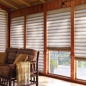
Vignette® Modern Roman Shades feature consistent folds and no exposed rear cords, keeping windows uncluttered. Choose from different fold styles and sizes, and a horizontal or vertical orientation.
Traditional™ Fold SOFT YET MODERN
A 4-inch contoured fold for that traditional, yet modern, look at the window.
Tailored™ Fold CRISP AND SOPHISTICATED
A 6-inch flat fold that is nicely pressed for a defined finish.
Architella® COOL IN THE SUMMER, WARM IN THE WINTER
Our most energy-efficient version of the classic Vignette design – these shades trap air, creating an extra layer of insulation to keep your home cooler in the summer and warmer in the winter.
Tiered™ STACKED SOFTNESS
This option allows shades to stack up, down or anywhere in between.
Traversed with Vertiglide™ FOR LARGE WINDOWS AND SLIDING DOORS
Vertiglide offers an exceptional solution for large expanses of windows and sliding glass doors.
REDUCE OUTSIDE NOISE
Improve your room’s acoustics while reducing the intensity of outside sound. It starts at the windows. Simple. The degree of sound control will depend on the fabric you choose, so if this is an important feature to you, be sure to discuss it with your sales expert.
UV Protection SUNSCREEN FOR YOUR VALUABLES
Protect your furniture, flooring and artwork from fading with at least 75% protection from harmful UV rays.
Top-Down/Bottom-Up PRIVACY WITH A VIEW
A more versatile approach to light control. Open from the top, from the bottom, or find somewhere in-between–for the perfect balance of privacy and light.
Platinum™ Technology CONTROL FROM YOUR PHONE OR TABLET
Controlling your window treatments with a mobile device means you can set your blinds to movie mode, work mode, or 8 a.m. mode with the touch of a button, without leaving your seat. It’s effortless, fun and smart—with perfectly smooth operation.
Accents by the Yard™ FABRICS FOR YOUR ROOM DECOR
Fabrics are available by the yard, so you can create decorative accents for any room with matching fabric.
Lifetime Guarantee FOR LIFE
Hunter Douglas products are designed and custom-assembled in the U.S. with the highest level of quality. But just in case, every window treatment from Hunter Douglas is covered by our lifetime limited guarantee. Read the Hunter Douglas Warranty to learn more.
Hunter Douglas Vignette® Tiered™ Modern Roman Shades with LiteRise®
Vignette®
Fabric/Material: Sahara
Color: Mirage
Operating Systems: LiteRise
Room: Living Room
Room Styles: Rustic
Available from Accent Window Fashions LLC
Hunter Douglas Showcase Priority Dealer
Hunter Douglas Certified Installer
Hunter Douglas Certified Professional Dealer
#Hunter_Douglas #Vignette #Tiered #Modern #Roman #Shades #LiteRise #Living_Room #Rustic #Window_Fashions #Window_Shadings #Window_Treatments #HunterDouglas #Accent_Window_Fashions
Copyright 2001-2014 Hunter Douglas, Inc. All rights reserved.

 Story Homes
This is the story about a kitchen that was showing it’s age with white countertops and dark oak cabinets on a dark oak floor. It all worked once, but now the kitchen felt dark, cramped and dysfunctional. The owners were looking for a total kitchen transformation.
After a disastrous beginning with a contractor taking their money and vanishing into thin air, the owners were left with a completely gutted kitchen that consisted of only the walls. They hired Rick Jacobson to rescue them and restart the project.
The new kitchen design began with the idea of using Cobalt Blue as a primary color. The blue seen on many glassware pieces is Cobalt Blue, and it was decided to use it in the tile for the kitchen, as well as the pendant lights. Another goal was to make the kitchen brighter with an easier traffic flow, as well as completely updated cabinetry. And there were traffic patterns to improve, a refrigerator to move, and exhaust vents to reroute.
Rick Jacobson listened to the owners and worked to create the kitchen that the owners imagined. He began by thinking through the traffic flow patterns. He noted that the doorway from the dining room needed to be widened. He added rounded doorway headers to match the home’s existing décor.
He carefully thought through where the kitchen island should be, including how opening the oven doors would be in relation to people sitting at the kitchen island at a family gathering. Kitchen cabinet touches include off edge flat panel doors, soft close wooden drawers, and a spice cabinet with two slide-out racks. The new longer center island features a drawer microwave that opens and closes automatically with the push of a button. The center island also features two recycling bins and seating for four. Rick even thought of adding decorative elements to the existing half wall to make it look in line with the kitchen island. The kitchen’s black granite countertops offer an unusually appealing view: There are lots of interesting reflections throughout the kitchen.
Another of Rick’s touches is that all of the lights, including recessed ceiling lights, three cobalt blue pendant lights and below cabinet lights are on dimmers which work to balance daytime and nighttime lighting.
The under mounted stainless steel single sink is complemented with a gooseneck faucet. The stainless steel gas range is thin enough to allow for a wide drawer below for utensils, and the stainless steel vent hood is vented through the ceiling to outdoors, allowing additional storage space in the top cabinets. Double ovens with white doors are the perfect match to the cabinets, with a location that makes baking and roasting easier with the two large vertical storage for baking sheets and supplies nearby.
The result: A functional, open, bright and Cobalt blue kitchen.

 InnovationLand
Among our Houston outdoor kitchens, this one is unique because of its concrete countertops, pergola with stucco wrapping and custom storage.
"It's not one of our biggest covered outdoor kitchens in Houston," says Outdoor Homescapes of Houston owner Wayne Franks. "But it's unique, and it looks really nice, too!"
The client, a young family, wanted an outdoor kitchen with a more minimalistic, modern look, explains Outdoor Homescapes senior designer Lisha Maxey.
"They're both doctors and very much attuned to detail," she says. "Their primary goal was to create a space where they could lounge while the children played as well as an area to entertain family and friends while cooking and dining outside."
Like a growing number of people wanting small outdoor kitchens in Houston, this client expressed interest in using concrete as a surface material: "The look is contemporary and is easily paired with any type of outdoor furniture," says Maxey, "from wicker to teak to iron."
Here's a closeup of the concrete countertops. You'll notice that they're glossy and smooth like glass, thanks to special sealers and a topcoat of UV-resistant resin that prevents the countertop from yellowing.
Since these particular clients lean toward the minimalistic side of contemporary design, she continues, "the standard granite countertop of many Houston outdoor kitchens would not work, since it typically has a lot of movement and can be busy."
Lisha sees the use of concrete as a growing outdoor design trend for Houston outdoor kitchens: "It's easy to maintain and again, leans towards a more modern look for outdoor."
All the furniture and lighting is from Restoration Hardware, says Lisha, who's offering $500 in free outdoor furniture consultation services as a special promotion. (Interested? Just contact us!)
The dining and lounge chairs are from the Antibes collection in cast aluminum with a bronze finish. The table is a Belgian Trestle made of weathered concrete and teak. Simple track lighting was used on the pergola in keeping with the minimalist look of the space.
The pergola is a treated pine, stained a Minwax Jacobean, which appears almost black. "This client chose a pergola over a roof extension off the house because they wanted it to still seem light and airy in their outdoor space for their young children," explains Lisha. "They wanted a certain degree of sun and shade protection, which a pergola does provide, but they wanted it to seem a bit like a park for the kids to play in."
"The seating/storage bin was not a part of the original design," says Lisha. "As the project progressed, the client expressed interest in some sort of chest for the new outdoor furniture cushions to be stored in."
The design for the storage bin was developed to accommodate this request: "It eventually evolved into a seating area as well. And to keep the look consistent with the new kitchen, it was agreed that the stone be carried through the design. The wood top was necessary so we could design a hinged access for storage."
 Nextoffice
Sharifi-ha House
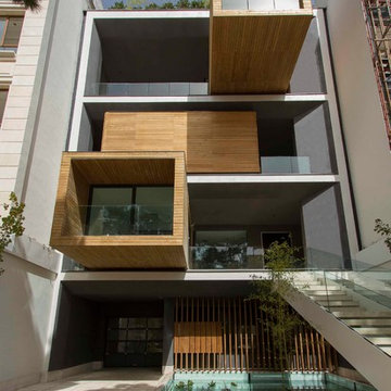
Uncertainty and flexibility lie at the heart of the design concept in Sharifi-ha House. The sensational, spatial qualities of the interiors, as well as the formal configuration of its exterior, directly respond to the displacement of turning boxes that lead the building volume to become open or closed, obtaining introverted or extroverted character. These changes may occur according to changing seasons or functional scenarios of floor plans.
Like many other urban plots, the land for this project had a noticeably narrow façade-width compared with its length. Consequently, our expertise in transforming a two-dimensional façade to a three-dimensional one became indispensable. Here, the openness /closure of the building volume is a reference to traditional Iranian houses, which would dynamically serve as seasonal modes of habitation by offering both a Zemestan-Neshin (winter living room) and Taabestan-Neshin (summer living room) to their residents. In summertime, Sharifi-ha House offers an open /transparent /perforated volume with wide, large terraces. In contrast, during Tehran’s cold, snowy winters the volume closes itself, offering minimal openings in total absence of those wide summer terraces. In this project, the challenges to the concepts of open/closed typology (introverted/extroverted character) led to an exciting spatial transformation of an ever-changing residential building.
The House is distributed over seven floors: the two basement floors are allocated to family conviviality, fitness facilities, and wellness areas, while the ground floor hosts parking and housekeeping rooms. Public activities all happen on the first and second floors, and the family’s private life takes place on the third and fourth floors.
The project consisted of four major parts; the fixed volume of the structure, the void, and the fixed volume and the mobile volume, respectively. When the turning boxes are closed, the building captures sunlight throughout the space of the central void, which also connects the two fixed volumes by suspended bridges.
The house adapts to the functional needs of its residents. For instance, depending on whether there is a guest or not, the guest room (located on the second floor) can be reconfigured for different purposes. Similarly, home office and breakfast room (turning rooms on the first and third floors) can change the formality of their appearance according to their residents’ desire. In other words, there is always the possibility of having different seasonal or lighting scenarios, some of which have been already considered in the BMS program of the project.
From the initial design steps, we noticed that three pine trees outside could be incorporated into the spaces of the interior. Now, in the open mode of the house, the trees are pleasantly captured by the window frames.
Stepping back for about three meters from the permitted construction boundary line allowed us to provide splendid daylight for the basement floors by inserting a glass fountain. The fitness and wellness areas are accommodated between this fountain and the basement pool where reflective installations reverberate the water’s radiance all over the space.
The applied manufacturing technique for the turning mechanism was in fact a simple one; the same method which is currently employed in turning theatrical scenes, turning the floor of car exhibitions, steel companies and the shipping industry in Iran. But as our client himself was into importing CNC and other similar industrial German machines, he preferred the structural system to be fabricated in Germany. In doing so, he could engage his employees in the manufacturing process and thus train them for future maintenance purposes.
Details of the handrails and air-penetration controlling methods were major issues considered in developing the design of the turning boxes. Designing foldable handrails and refining the edges of the boxes happened to be our feasible solutions.
Considering the specialties of this kind of architecture, the structural system was inevitably a customized one. After digitally modeling the structure, a series of SAP2000 analysis were undertaken to examine static/dynamic performance of the proposed system. Being partially moveable is the dominant feature of this structural assembly, which was contemplated throughout the fabrication process by the German manufacturer company. The main loads all rest on the beams of the living rooms.
Due to the various configurations the turning boxes may take, the loading calculation has been estimated based on the largest possible loading value applied to the system. Additionally, in order to prevent structural deformation controlling the probable vibrations in the turning boxes was taken into account during the design/calculations of the structure.
The house was titled Sharifi-ha House, in honor of traditional Iranian mansions.
 Orlando Magic Kingdom Rentals
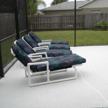
Many people visit Orlando to watch Disney world in its amazing grandeur however it is important to find vacation homes that will provide appropriate accommodation to them. Prior to the visit, one should log on to the website and book vacation homes online to get the best deals. Villa near the Crescent Lake is a prominent Orlando vacation rental home that would go a long way in providing best results to the users. It is situated two miles south of highway which consists of different restaurants and shops in the close vicinity.
Dwelling unit is equipped with all the modern amenities such as TV, internet, Hot tub and a warm pool where people can relax after a daylong sightseeing. Rooms, kitchens and the bathrooms are spacious so that people could relax without any hassles. Free parking is available along with the Dryer and the DVD players.
Another option is villa number 4 comprising of 2 master bedrooms and large 55 inch TV screen in the lounge. All the rooms are equipped with ceiling fans and air conditioners so that temperature could be regulated according to the requirements and the specifications of the visitors. For kids Nintendo and Play station could become a wonderful distraction after experiencing the ride in the amusement parks located in close vicinity.
A huge lounge and dining area offer amazing comfort to the visitors who can hog onto multiple cuisines as per their demands and preferences. Moreover large patio along with the full equipped modern kitchen will help prepare food of different varieties. Villa occupies a huge area that can accommodate about 16 families. Special facilities for kids like child crib, travel crib and crib bedding help the parents to relax when their children are playing ore sleeping.
In order to protect kids, Alarms are installed on all the doors leading to the swimming pool. Easy access is provided to the disabled people and telephone facilities allow people to make free local calls. Villa has an inbuilt laundry area that could be used to wash the clothes. Orlando is wonderful city with different sources of entertainment such as Disney world and innumerable clubs to enjoy the night life. Upon arrival to the tourist destination, you can rest in any of the vacation homes and proceed next day for sightseeing. For relaxation near the pool, cushion furniture are provided to the users apart from the Jacuzzi and spa facilities.


 John David Rulon
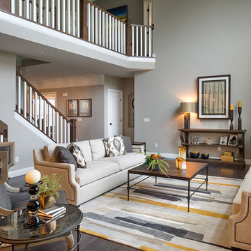
My client for this project was a builder/ developer. He had purchased a flat two acre parcel with vineyards that was within easy walking distance of downtown St. Helena. He planned to “build for sale” a three bedroom home with a separate one bedroom guest house, a pool and a pool house. He wanted a modern type farmhouse design that opened up to the site and to the views of the hills beyond and to keep as much of the vineyards as possible. The house was designed with a central Great Room consisting of a kitchen area, a dining area, and a living area all under one roof with a central linear cupola to bring natural light into the middle of the room. One approaches the entrance to the home through a small garden with water features on both sides of a path that leads to a covered entry porch and the front door. The entry hall runs the length of the Great Room and serves as both a link to the bedroom wings, the garage, the laundry room and a small study. The entry hall also serves as an art gallery for the future owner. An interstitial space between the entry hall and the Great Room contains a pantry, a wine room, an entry closet, an electrical room and a powder room. A large deep porch on the pool/garden side of the house extends most of the length of the Great Room with a small breakfast Room at one end that opens both to the kitchen and to this porch. The Great Room and porch open up to a swimming pool that is on on axis with the front door.
The main house has two wings. One wing contains the master bedroom suite with a walk in closet and a bathroom with soaking tub in a bay window and separate toilet room and shower. The other wing at the opposite end of the househas two children’s bedrooms each with their own bathroom a small play room serving both bedrooms. A rear hallway serves the children’s wing, a Laundry Room and a Study, the garage and a stair to an Au Pair unit above the garage.
A separate small one bedroom guest house has a small living room, a kitchen, a toilet room to serve the pool and a small covered porch. The bedroom is ensuite with a full bath. This guest house faces the side of the pool and serves to provide privacy and block views ofthe neighbors to the east. A Pool house at the far end of the pool on the main axis of the house has a covered sitting area with a pizza oven, a bar area and a small bathroom. Vineyards were saved on all sides of the house to help provide a private enclave within the vines.
The exterior of the house has simple gable roofs over the major rooms of the house with sloping ceilings and large wooden trusses in the Great Room and plaster sloping ceilings in the bedrooms. The exterior siding through out is painted board and batten siding similar to farmhouses of other older homes in the area.
Clyde Construction: General Contractor
Photographed by: Paul Rollins

 Michael Nash Design, Build & Homes
2010 NATIONAL NARI REGIONAL AWARD WINNER
Project Scope
The owners of this 7,000 square foot colonial in Oakton, Virginia, were seeking a multi-level Mediterranean-style indoor/outdoor living space off the back of their home. They turned to Michael Nash Design, Build & Homes for a design solution that would include a stone patio, a second-story deck, a screened-in porch and linking staircases.
While the structure was designed primarily for family dining and entertaining, it also had to accommodate periodic social gatherings of one hundred guests or more. To meet these needs, the project would include a fully-equipped outdoor kitchen, several serving counters with permanent refrigeration, and well-delineated socializing and dining zones.
The existing home’s setting offered several impressive assets the new outdoor living area was designed to exploit. The sprawling acreage features old stand trees, wooded paths and a private lake. Beautifully landscaped, it unfolds as an idyllic panorama that naturally draws people to the outdoors.
Challenges
Since the rear elevation was situated on a slope that drops away from the house, the Michael Nash team had to raise the grade two feet within in a 2,000 square foot area extending out from the back of the house. Infrastructure plans also called for a sophisticated drainage system that had to accommodate a whole series of water “runoff” considerations to be integrated into the decking itself. Excavation included constructing retaining walls to bolster the elevated grade—which also had to support a concrete slab, the primary foundation for the entire complex.
Solutions
The ground level decking consists of a 2,000 square foot flagstone patio level with the home’s lower level doors. There is a decorative water fountain mid-patio—an ornate collectible acquired in Florida. Food preparation is concentrated within a specially designed semi-circular wall that creates an “outdoor kitchen” equipped with a 60” Viking barbecue grill, a prep sink, a warming drawer, refrigerator and appropriate storage. There is a granite surfaced dining counter with seating for eight.
Wrought iron railing and approximately 20 decorative columns (some encasing steel vertical supports) are incorporated into the design scheme. Many of the columns house accent lights.
The top level—supported by horizontal steel beams– is a 2,500 square foot deck constructed entirely of Trex decking. The open air decking is, again, directly accessible from rooms on the second level of the house including the kitchen, sunroom and family room.
The platform’s most prominent feature is a U-shaped “kitchenette” with cedar shake shingle roofing. Like its counterpart one level below, the facility is equipped with grill, refrigerator and stainless steel cabinetry.
One portion of the deck has been allocated for a 16’ x 16’ octagonal screened-in porch crowned by a pair of 2’ x 4’ skylights. The porch can be accessed from the home’s conservatory via a set of French doors. With its mosaic tile flooring, stained cedar panel ceiling and honed granite counters, the interior is elegant and calming. Hand-painted stenciling and a wall-mounted water feature provide distinctive detailing.
Finally, the design introduced elements to highlight and reinforce an awareness of the lovely bucolic setting. Fountains and water features combined with textured surfaces and mosaic tiling and backsplashes to present a villa-like ambiance well-suited to the Virginia countryside.
 Nextoffice
Sharifi-ha House
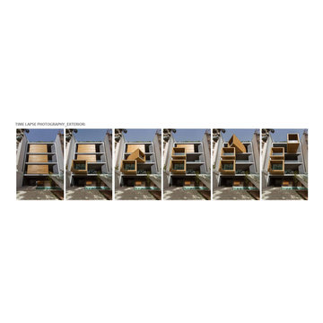
Uncertainty and flexibility lie at the heart of the design concept in Sharifi-ha House. The sensational, spatial qualities of the interiors, as well as the formal configuration of its exterior, directly respond to the displacement of turning boxes that lead the building volume to become open or closed, obtaining introverted or extroverted character. These changes may occur according to changing seasons or functional scenarios of floor plans.
Like many other urban plots, the land for this project had a noticeably narrow façade-width compared with its length. Consequently, our expertise in transforming a two-dimensional façade to a three-dimensional one became indispensable. Here, the openness /closure of the building volume is a reference to traditional Iranian houses, which would dynamically serve as seasonal modes of habitation by offering both a Zemestan-Neshin (winter living room) and Taabestan-Neshin (summer living room) to their residents. In summertime, Sharifi-ha House offers an open /transparent /perforated volume with wide, large terraces. In contrast, during Tehran’s cold, snowy winters the volume closes itself, offering minimal openings in total absence of those wide summer terraces. In this project, the challenges to the concepts of open/closed typology (introverted/extroverted character) led to an exciting spatial transformation of an ever-changing residential building.
The House is distributed over seven floors: the two basement floors are allocated to family conviviality, fitness facilities, and wellness areas, while the ground floor hosts parking and housekeeping rooms. Public activities all happen on the first and second floors, and the family’s private life takes place on the third and fourth floors.
The project consisted of four major parts; the fixed volume of the structure, the void, and the fixed volume and the mobile volume, respectively. When the turning boxes are closed, the building captures sunlight throughout the space of the central void, which also connects the two fixed volumes by suspended bridges.
The house adapts to the functional needs of its residents. For instance, depending on whether there is a guest or not, the guest room (located on the second floor) can be reconfigured for different purposes. Similarly, home office and breakfast room (turning rooms on the first and third floors) can change the formality of their appearance according to their residents’ desire. In other words, there is always the possibility of having different seasonal or lighting scenarios, some of which have been already considered in the BMS program of the project.
From the initial design steps, we noticed that three pine trees outside could be incorporated into the spaces of the interior. Now, in the open mode of the house, the trees are pleasantly captured by the window frames.
Stepping back for about three meters from the permitted construction boundary line allowed us to provide splendid daylight for the basement floors by inserting a glass fountain. The fitness and wellness areas are accommodated between this fountain and the basement pool where reflective installations reverberate the water’s radiance all over the space.
The applied manufacturing technique for the turning mechanism was in fact a simple one; the same method which is currently employed in turning theatrical scenes, turning the floor of car exhibitions, steel companies and the shipping industry in Iran. But as our client himself was into importing CNC and other similar industrial German machines, he preferred the structural system to be fabricated in Germany. In doing so, he could engage his employees in the manufacturing process and thus train them for future maintenance purposes.
Details of the handrails and air-penetration controlling methods were major issues considered in developing the design of the turning boxes. Designing foldable handrails and refining the edges of the boxes happened to be our feasible solutions.
Considering the specialties of this kind of architecture, the structural system was inevitably a customized one. After digitally modeling the structure, a series of SAP2000 analysis were undertaken to examine static/dynamic performance of the proposed system. Being partially moveable is the dominant feature of this structural assembly, which was contemplated throughout the fabrication process by the German manufacturer company. The main loads all rest on the beams of the living rooms.
Due to the various configurations the turning boxes may take, the loading calculation has been estimated based on the largest possible loading value applied to the system. Additionally, in order to prevent structural deformation controlling the probable vibrations in the turning boxes was taken into account during the design/calculations of the structure.
The house was titled Sharifi-ha House, in honor of traditional Iranian mansions.
 InnovationLand
Among our Houston outdoor kitchens, this one is unique because of its concrete countertops, pergola with stucco wrapping and custom storage.
"It's not one of our biggest covered outdoor kitchens in Houston," says Outdoor Homescapes of Houston owner Wayne Franks. "But it's unique, and it looks really nice, too!"
The client, a young family, wanted an outdoor kitchen with a more minimalistic, modern look, explains Outdoor Homescapes senior designer Lisha Maxey.
"They're both doctors and very much attuned to detail," she says. "Their primary goal was to create a space where they could lounge while the children played as well as an area to entertain family and friends while cooking and dining outside."
Like a growing number of people wanting small outdoor kitchens in Houston, this client expressed interest in using concrete as a surface material: "The look is contemporary and is easily paired with any type of outdoor furniture," says Maxey, "from wicker to teak to iron."
Here's a closeup of the concrete countertops. You'll notice that they're glossy and smooth like glass, thanks to special sealers and a topcoat of UV-resistant resin that prevents the countertop from yellowing.
Since these particular clients lean toward the minimalistic side of contemporary design, she continues, "the standard granite countertop of many Houston outdoor kitchens would not work, since it typically has a lot of movement and can be busy."
Lisha sees the use of concrete as a growing outdoor design trend for Houston outdoor kitchens: "It's easy to maintain and again, leans towards a more modern look for outdoor."
All the furniture and lighting is from Restoration Hardware, says Lisha, who's offering $500 in free outdoor furniture consultation services as a special promotion. (Interested? Just contact us!)
The dining and lounge chairs are from the Antibes collection in cast aluminum with a bronze finish. The table is a Belgian Trestle made of weathered concrete and teak. Simple track lighting was used on the pergola in keeping with the minimalist look of the space.
The pergola is a treated pine, stained a Minwax Jacobean, which appears almost black. "This client chose a pergola over a roof extension off the house because they wanted it to still seem light and airy in their outdoor space for their young children," explains Lisha. "They wanted a certain degree of sun and shade protection, which a pergola does provide, but they wanted it to seem a bit like a park for the kids to play in."
"The seating/storage bin was not a part of the original design," says Lisha. "As the project progressed, the client expressed interest in some sort of chest for the new outdoor furniture cushions to be stored in."
The design for the storage bin was developed to accommodate this request: "It eventually evolved into a seating area as well. And to keep the look consistent with the new kitchen, it was agreed that the stone be carried through the design. The wood top was necessary so we could design a hinged access for storage."
 Michael Nash Design, Build & Homes
2010 NATIONAL NARI REGIONAL AWARD WINNER
Project Scope
The owners of this 7,000 square foot colonial in Oakton, Virginia, were seeking a multi-level Mediterranean-style indoor/outdoor living space off the back of their home. They turned to Michael Nash Design, Build & Homes for a design solution that would include a stone patio, a second-story deck, a screened-in porch and linking staircases.
While the structure was designed primarily for family dining and entertaining, it also had to accommodate periodic social gatherings of one hundred guests or more. To meet these needs, the project would include a fully-equipped outdoor kitchen, several serving counters with permanent refrigeration, and well-delineated socializing and dining zones.
The existing home’s setting offered several impressive assets the new outdoor living area was designed to exploit. The sprawling acreage features old stand trees, wooded paths and a private lake. Beautifully landscaped, it unfolds as an idyllic panorama that naturally draws people to the outdoors.
Challenges
Since the rear elevation was situated on a slope that drops away from the house, the Michael Nash team had to raise the grade two feet within in a 2,000 square foot area extending out from the back of the house. Infrastructure plans also called for a sophisticated drainage system that had to accommodate a whole series of water “runoff” considerations to be integrated into the decking itself. Excavation included constructing retaining walls to bolster the elevated grade—which also had to support a concrete slab, the primary foundation for the entire complex.
Solutions
The ground level decking consists of a 2,000 square foot flagstone patio level with the home’s lower level doors. There is a decorative water fountain mid-patio—an ornate collectible acquired in Florida. Food preparation is concentrated within a specially designed semi-circular wall that creates an “outdoor kitchen” equipped with a 60” Viking barbecue grill, a prep sink, a warming drawer, refrigerator and appropriate storage. There is a granite surfaced dining counter with seating for eight.
Wrought iron railing and approximately 20 decorative columns (some encasing steel vertical supports) are incorporated into the design scheme. Many of the columns house accent lights.
The top level—supported by horizontal steel beams– is a 2,500 square foot deck constructed entirely of Trex decking. The open air decking is, again, directly accessible from rooms on the second level of the house including the kitchen, sunroom and family room.
The platform’s most prominent feature is a U-shaped “kitchenette” with cedar shake shingle roofing. Like its counterpart one level below, the facility is equipped with grill, refrigerator and stainless steel cabinetry.
One portion of the deck has been allocated for a 16’ x 16’ octagonal screened-in porch crowned by a pair of 2’ x 4’ skylights. The porch can be accessed from the home’s conservatory via a set of French doors. With its mosaic tile flooring, stained cedar panel ceiling and honed granite counters, the interior is elegant and calming. Hand-painted stenciling and a wall-mounted water feature provide distinctive detailing.
Finally, the design introduced elements to highlight and reinforce an awareness of the lovely bucolic setting. Fountains and water features combined with textured surfaces and mosaic tiling and backsplashes to present a villa-like ambiance well-suited to the Virginia countryside.

 TaylorPro Design and Remodeling, Inc.
"TaylorPro remodeled our kitchen, replacing cabinets, countertops and appliances. Keeping with the same footprint of our original kitchen and keeping our original travertine floors, Kerry Taylor helped us select a palette of rich, natural colors and materials--mocha-maple glazed cabinets, handsome granite and polished travertine backsplash tiles--to create a warm and beautiful new kitchen. He offered excellent design suggestions for placements of cabinetry and appliances. He recommended and implemented window trim enhancements as well as paint color and lighting design that brought the kitchen and attached family room together with a modern and very warm look. He created a rich, textured backsplash behind the stovetop that enhances the modern stainless steel vent hood. We couldn't be more pleased with the character and design of the kitchen and family room suite.
To begin with, Kerry gave us a detailed estimate covering the likely costs of labor, cabinetry, granite, tile backsplash, construction materials and appliances. His estimate for labor, granite and tile turned out to be ""spot-on"" accurate. Much to our surprise, for example, the granite slabs we selected from Daltile turned out to be exactly the price Kerry had estimated when evaluating the level of materials we would likely install in our kitchen. Kerry kept to his original labor costs, to the penny. Each week, he provided us with an invoice that showed, in percentages, exactly how much labor had been performed that week and how much remained to be done in future weeks. The amounts he charged each week for his labor were exact percentages of the amount of labor his crew had performed to that point. Though these invoices invited us to do a little math to confirm the accuracy of these percentages, Kerry's figures were consistently accurate.
The only categories in which Kerry's original estimate did not conform to the actual costs were in the areas of supplies from Home Depot (needed for the remodeling) and supplies from paint and hardware stores (needed for painting). These materials ended up costing somewhat more that Kerry had estimated. However, Kerry did provide us with receipts for all of these supplies.
Kerry's cabinet man, Jerry, made a very workable design using pre-fabricated cabinets; he then customized the sizes of at least half of these cabinets to conform to the requirements of the center island, cooktop and pantry spaces. We are very happy with the quality of the cabinets. We found the installation expertise of Jerry's installer, Gil, to be top-rate. His installation achieved a custom look and all the cupboards and drawers worked flawlessly.
Kerry's crew, Jake, Randall and Kevin, were great guys to have on site. They respected our property (and our dog) and possessed both skill and integrity. They arrived daily at the time they specified and worked tirelessly to achieve what they set out to do. We couldn't have been happier with their work. Kerry was on site frequently to supervise and coordinate their work and the work of subcontractors.
The project went quickly and efficiently, and the final result was outstanding. We recommend TaylorPro very highly."
~ Judy & Ron C, Clients
Photo By: Kerry W. Taylor
 Go Home Builders
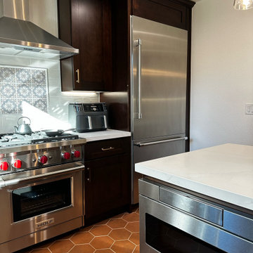
Step into this amazing, remodeled Spanish-style kitchen in Pasadena that captivates your attention with its striking style and design. Their earthy hues of deep oranges and rustic reds contribute to a vibrant yet soothing atmosphere, embodying the warmth of the Spanish sun.
The custom-made Espresso cabinets stand tall throughout the room and emanate a rich and deep tone. They exude an air of sophistication. In addition, the brass handles on these cabinets add a subtle touch of elegance, forming a beautiful contrast against the dark wood.
As your eyes wander, they are inevitably drawn to the exquisite white quartz countertops. The sleek and cool surfaces provide a perfect counterbalance to the warm and rustic elements present in the kitchen. This seamless blend of modern and traditional aesthetics is further enhanced by the spaciousness of the countertops They offer ample room for meal preparation. Additionally, their smooth finish ensures effortless cleaning, combining beauty with practicality.
Traditional to State-of-the-art
Against the backdrop of rich Espresso cabinets, a wavy subway tile backsplash is arranged in a traditional brick pattern. Its off-white hue, illuminated by LED recessed lighting, adds depth and interest to the kitchen.
The Spanish kitchen proudly showcases state-of-the-art stainless-steel appliances. With their modern and gleaming surfaces, as well as streamlined designs. Without a doubt, they blend well with the more traditional elements of the room. These appliances provide all the conveniences necessary for a contemporary lifestyle.
A custom aluminum window floods the room with natural light that is perfectly positioned above a farmhouse kitchen sink. Undoubtedly, this impressive feature is complemented by a brass faucet that continues over to the cabinet handles. Obviously, this helps to maintain consistency in the room’s design.
Charm in the details
Particularly above the kitchen island, pendant lights hang gracefully from the high ceiling. it should be noted, that they cast a gentle and welcoming glow over the area. Furthermore, the island itself has the same gleaming white quartz as the countertops providing additional prep space.
Clearly, to add a touch of authentic Spanish charm, the area over the range showcases stunning Spanish tiles. These tiles become a focal point in the kitchen. Even so, they serve both as a practical backsplash and a captivating piece of art that truly completes the aesthetic of the room.
In conclusion, this Spanish-style kitchen effortlessly combines tradition with contemporary elements, resulting in a space that is not only incredibly functional but also a true joy to spend time in. Clearly, the blend of rustic and modern, light and dark, creates an interesting collaboration that brings this kitchen to life. Finally, it captures the essence of Spanish style while adding a personalized touch that reflects the unique character of the homeowners.
84