
Search results for "Oftentimes" in Home Design Ideas
 Sixth Sense Studio
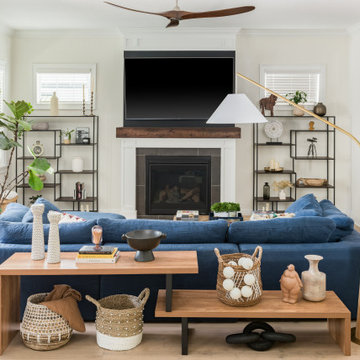
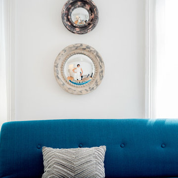
The living room exudes a sense of vibrant comfort. The spaciousness invites you to relax and spread out, while the large blue couch beckons you to sink in. A warm glow emanates from the space, thanks to the ample natural light. The eye-catching artwork adds a touch of playful energy with its mix of styles and colors.
There's a hint of sophistication in the artwork's bold design and pops of color, but the overall feeling is more welcoming and fun. It feels like a place where you can unwind and enjoy conversations with friends, or simply curl up with a good book on the inviting couch.
 Alexandra Crafton
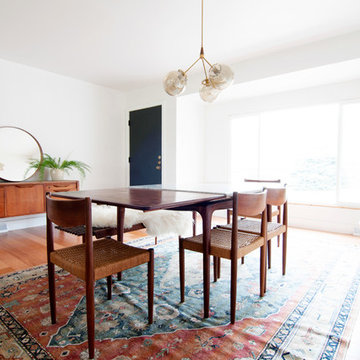
Wall paint: Simply White, Benjamin Moore; chandelier: Harlow Smoked, Triple Seven Home; table and bench: Craigslist; chairs: Homestead Seattle; rug: Sonoma Jewels Rug, Abacasa; wall art: The Island, Minted; mirror: Stockholm Mirror, Ikea; credenza: Craigslist; sheep’s skin throw: Black Sheep (White Light); hardwood floors: Southern Pecan Natural, Home Depot
Photo: Allie Crafton © 2016 Houzz
Design: Annabode + Co
 Howells Architecture + Design
Anna M Campbell
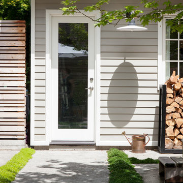
Inspiration for a small modern partial sun backyard concrete paver landscaping in Portland with a fire pit.
Inspiration for a small modern partial sun backyard concrete paver landscaping in Portland with a fire pit.
Find the right local pro for your project

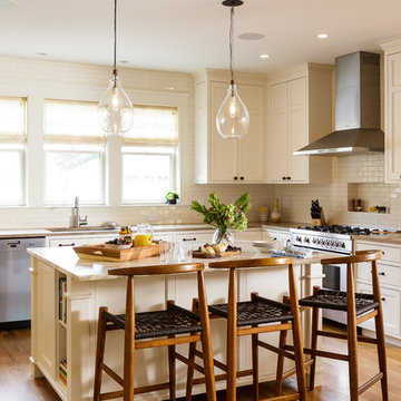
 Sophia Shibles Interiors (formerly SCS Design)
Chip Riegel
www.chipriegel.com
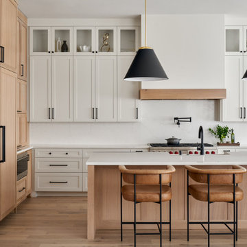
Open concept kitchen - large transitional l-shaped medium tone wood floor open concept kitchen idea in Providence with an undermount sink, recessed-panel cabinets, white cabinets, marble countertops, white backsplash, ceramic backsplash, stainless steel appliances and an island
Open concept kitchen - large transitional l-shaped medium tone wood floor open concept kitchen idea in Providence with an undermount sink, recessed-panel cabinets, white cabinets, marble countertops, white backsplash, ceramic backsplash, stainless steel appliances and an island

 Custom Glass Signs and Mirrors
All photos by Roderick Treece
Entryway - eclectic entryway idea in San Diego
Entryway - eclectic entryway idea in San Diego
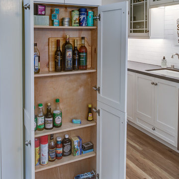

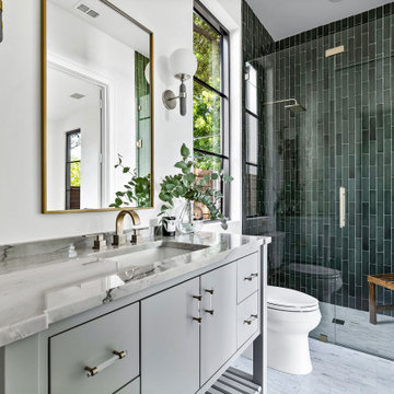

 Knocknock
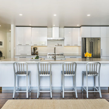
View of kitchen from living area. Photo by Olga Soboleva
Example of a mid-sized trendy galley medium tone wood floor eat-in kitchen design in San Francisco with an undermount sink, flat-panel cabinets, white cabinets, quartz countertops, white backsplash, ceramic backsplash, stainless steel appliances and an island
Example of a mid-sized trendy galley medium tone wood floor eat-in kitchen design in San Francisco with an undermount sink, flat-panel cabinets, white cabinets, quartz countertops, white backsplash, ceramic backsplash, stainless steel appliances and an island

 Hello Home
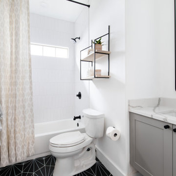
Mid-sized transitional kids' white tile and ceramic tile ceramic tile, black floor and single-sink bathroom photo in Austin with a floating vanity, shaker cabinets, gray cabinets, a two-piece toilet, white walls, an undermount sink, quartz countertops and white countertops


 Janiczek Homes
Angle Eye Photography
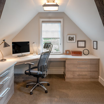
Inspiration for a rustic built-in desk carpeted study room remodel in Philadelphia with white walls
Inspiration for a rustic built-in desk carpeted study room remodel in Philadelphia with white walls
 Judith Balis Interiors
Allison Corona Photograpahy
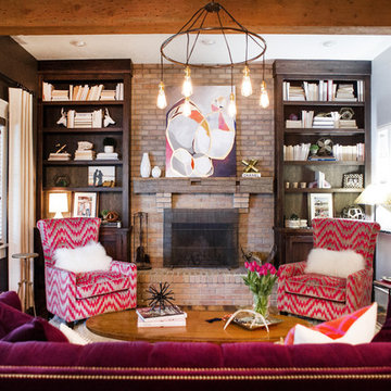
Small eclectic living room library photo in Boise with a standard fireplace, a brick fireplace and no tv
Small eclectic living room library photo in Boise with a standard fireplace, a brick fireplace and no tv
 Loom Decor
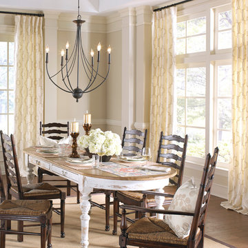
Add laidback modern elegance to a rustic farmhouse dining room with custom Euro pleated trellis embroidered curtain panels, gold scroll embroidered decorative throw pillows, a grey and persimmon orange stylized floral table runner, and brick red block printed placemats.
Shop and create your custom accents at loomdecor.com
 John Tarkany Associates, Inc.
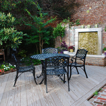
Charleston courtyards are a historic part of the city's hidden landscapes. Oftentimes seen through wrought iron gates, these courtyards have created an affinity for spaces built to host intimate gatherings, morning coffee, and respite after a long day.
 Vogue furniture
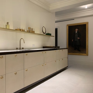
Oftentimes, New York apartment living demands that every inch of furniture is justified, but that doesn’t mean you have to sacrifice simplicity or compromise on the design aesthetic and character. Our team loves challenging traditional ideas of how a space should function. This elegant kitchen buffet features an integrated electric cook top, steam oven, dishwasher, refrigerator, freezer, and carefully calculated storage spaces hidden behind goat skin wrapped door fronts. What do you think?
 Dura Supreme Cabinetry
One important element with any design project is the development of a "design path" (or "color path"), that creates a coherent, well-planned look for the entire space. Oftentimes this is called a "color board" and all the swatches, finishes and fabrics are laid out together to see the entire room (or entire home) and how all the design elements coordinate and work together.
In kitchen design, this includes wall paint colors, cabinetry finish colors, flooring, countertops, and tile along with appliance, plumbing, and hardware finishes. For the interior design with a room or entire home, it includes furnishings and other surfaces as well. The idea is to create a cohesive look for the entire space.
To create a color path for your home or remodeling project, begin with your neutral colors and then select the other colors for your space. The colors you select may be based on your existing furnishings, a favorite piece of art, or simply colors that resonate to you. In order to create a visually appealing space, let this color page guide your color selections going forward.
Neutral colors (gray, beige, taupe or white) will usually be the background palette with 1-3 other dominant colors layered.
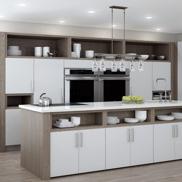
For contemporary or transitional designs, oftentimes a sleek, neutral palette is selected and it's important for all colors to be consistent with this palette. For this soft contemporary kitchen, a neutral palette of gray wood-tone (Weathered "A" finish on Oak) with white-gray paint, stainless and black appliances were selected and then carefully blended throughout the home for a clean, sleek appearance.
Once the "color path" was selected, the cabinetry was specified in the appropriate colors and all of the surfaces, soft goods, plateware, and accent pieces were selected to coordinate.
Featuring Dura Supreme's Bria Frameless Cabinetry shown with the Dura Supreme's Chroma door style. The Chrome door style is one of our many classic slab cabinet door styles. This design combines our Pearl light gray paint finish with our Weathered "A" finish on Red Oak for the accents and shelving.
Request a FREE Dura Supreme Brochure Packet:
http://www.durasupreme.com/request-brochure
Find a Dura Supreme Showroom near you today:
http://www.durasupreme.com/dealer-locator
 Almesedoors
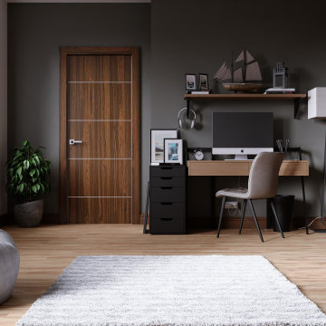
THE DOOR NAME ORIGIN - "ALLUMINIO ELIVIA VERTICAL WOOD GRAIN 4HS"
Of all the interior door models in the Elivia collection, this one is perhaps the most unapologetically elegant. Why? Hmm … That which is self-evident can be the most difficult to explain. Is it because it is built using the latest breakthroughs in interior door making technology? Look at the finish: the process of applying it utilizes something called “stretching” by professionals, which is to say that instead of simply slapping the finish on top of the interior door’s surface, our company fuses (for lack of a better word) the materials (on molecular level, no less), the result being that the finished product is more warp-resistant, scratch-resistant, and fade-proof than any interior door put together in the past. This is especially important in climates known for their high humidity levels. Yes, but this has more to do with engineering than aesthetics, right? Okay, so, is this interior door super-elegant because ... Show more!
FINISH: WALNUT
When it comes to interior door finishes, walnut may not be king per se, since “different folk have different views,” as the poet said, and it behooves a proper collection of finishes to be thoroughly democratic; but, but … you could view walnut as an important majority leader descended from royalty – like, say, Louis Napoleon back when he was still an elected official and not, as he eventually came to style himself, Napoleon III.
Strictly speaking, a walnut is the seed of a drupaceous nut, and not a true nut in the botanical sense. It is native to Persia (walnut oil is a staple in Iranian cuisine to this day) and North America, even though approximately one half of the world’s production today is done in China.
That said, one of its more historically curious uses would be the production of ink and dyes. Those are made, or used to be made, at least, from the husk surrounding the nut. The ink could be used to produce drawings – or darken paper to make it look older. It has (as it turned out by the by) excellent archival properties. It was used liberally by many capable and honest artists in the past.
A keen observer of the human condition, a Florentine named Leonardo da Vinci never left his house (which featured some pretty interesting interior doors, but that’s a story for another day) … never left it without a vial – and a sketch book.
As he took leisurely strolls around the streets and piazzas, he observed folks – socializing, arguing, fighting, striking bargains, and gossiping. Let us mention in passing – and this is merely an opinion, mind you – that his sketches seem to be a great deal livelier than his portraits, which for the most part adhere to the epoch’s somewhat mawkish standards and the algebraic, rather than harmonious, approach to depicting humans. The perpetual beguiling mystery of Mona Lisa’s smile is undoubtedly magnificent, but it is the Tuscan polymath’s quick yet amazingly insightful drawings that give us an idea – oftentimes a very comprehensive one – of what everyday life was truly like in Florence in the Sixteenth Century. An old man gloating at someone’s misfortune, two passionate merchants arguing over the price of some highly important delivery, a young woman lamenting the lack of decent men whom a reasonable person could view as husband material, and on and on – it’s all there in Leonardo’s sketches characterized by masterful lines and elegant shading despite the obvious – and necessary – impetuosity of each sketch. So precious and brilliant are those casual masterpieces that, had the scientifically inclined fellow eliminated the need for outdoor sketching by inventing photography, it would have been an historian’s immeasurable gain, certainly, but also an art lover’s great loss.
The idea behind our Walnut Finish is to invoke in the interior door owner a feeling of timeless historicity. Some things change, but others are forever. Stability is an important quality in an interior door, is it not?
Rembrandt van Rijn, who also used walnut ink extensively, was a studio artist, with only a few outdoor paintings in his legacy. Truth be told, he was a better draftsman than Leonardo, at least as far as technique goes (don’t let this get around). Well. He lived a century later and had the benefit of all the development art had undergone since the great Italian master. Just like these interior doors – your interior doors – are a huge improvement on anything that was available only twenty years ago, never mind a hundred years ago.
The “oscillation” of Rembrandt’s line, the delightful shift from the descriptive to the aesthetic stroke, makes his production in that category quite unique. Upon reaching artistic maturity, the stubborn Dutch master began to shun the unbroken contour line, which caused a lot of trouble for his drawings a century later, when dealers and collectors who wished to “update” his sketches to fit the current fashion had the audacity to “complete” Rembrandt’s pen-and-inks. Fortunately, some of the sketches escaped this sorry fate and have been preserved in their original glorious state to this day. Rembrandt’s mastery is yet another thing this interior door finish might remind you of each time you look at your doors.
2