
Search results for "Optimal angles" in Home Design Ideas
 Saikley Architects
The clients wanted to update their ranch house and make good use of their unusually large site next to downtown Mountain View. We sketched several options for design and scope of work to assess feasibility and value to the clients.
The chosen design retains an existing bedroom wing, while the layout of the living spaces is re-worked to an open plan flooded with light, with vaulted ceilings and strong indoor-outdoor connection to a yard optimized for outdoor living. Awkward angles and inefficient spaces of the former house have been replaced with a clear, simple floor plan designed for ease of everyday living.
One end of the site is used for a two-bedroom ADU (Accessory Dwelling Unit) with its own face to the street and its own back yard. Income from the ADU will go a long way toward financing the rebuild of the main house.
Photography: Kurt Manley
https://saikleyarchitects.com/portfolio/open-ranch-adu/
 Simply Home Decorating
This beautiful North Vancouver home belongs to a nature-loving and health-conscious couple, Emma and Vince (names changed), their two young children, and their dog, Jasper. When they contacted us about renovating and furnishing their kitchen and family room, we walked in and saw a world of potential waiting to be uncovered.
Before: Larkhall Crescent Home:
Like many original North Vancouver homes, the interior was definitely dated. We encountered late ‘80s finishes in powder pink and teal green, old carpet, and a kitchen that wasn’t maximized to suit this family’s modern-day lifestyle. However, the size of the rooms offered us a ton of space with which to get creative.
Knowing our clients’ love of cooking, need for work spaces (Emma and Vince both work remotely), and growing family, we developed a design concept that would increase usable space, optimize storage, and create intimacy in this large area. As for the style, we were inspired by their European roots, inventing a new and modern take on “Belgian Farmhouse” style. Now, the home is truly one-of-a-kind.
After: Warm & Cozy Family Room:
Fresh, bright, and comfortable, this living area has been transformed! We started with the fireplace as a focal point, selecting aged brick tiles for added texture and a crisp wood mantle. The taupe-coloured sectional infuses the room with visual warmth and serves the added purpose of separating the family room from the kitchen.
Emma and Vince were also keen on using non-toxic materials in their home, and we were happy to oblige. To meet their needs, we sourced natural wood elements and sought out Canadian-made products - that adhere to high health standards - whenever possible.
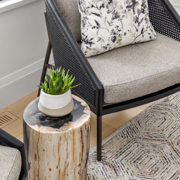
Look closer at the elements of this space, and you will find this stunning, honeycomb-patterned rug in earthy gold, beige, and charcoal tones. It’s plush to the touch and full of visual texture that brings this room’s colour palette together. We sourced these two-tone chairs with caning, petrified wood side table, black sconces, and botanical prints in greyscale from local artist, Heather Johnston.
We topped off the space with this dark wood and rattan console that offers storage facing the kitchen and presents an opportunity to display cherished items. The result is a cozy lounging space brimming with comfort and functionality. It’s perfect for enjoying quality family time, or Emma can simply slide the coffee table away to make room for her morning yoga practice.
Now, let’s turn around and give some attention to the kitchen. Do you remember what the original kitchen looked like? If not, scroll back up, because the transformation is shocking…
Moody & Welcoming Kitchen for Healthy Living:
This kitchen looks very different from how it started, right? Though we didn’t touch any walls, the kitchen has almost doubled in usable space! We created a long, extended island with storage, an outlet for small appliances, and seating for comfortable prep, after-school snacking, or mingling among friends.
On the other side of the island, the family has even more storage and an integrated dishwasher within easy reach of the sink, perfect for quick clean-up. From this angle, you can also see the expansive custom Shaker cabinetry in white and the integrated double ovens. These facilitate their cooking experience and gave us the opportunity to add an additional surprise…
A coffee garage station and more hidden storage! Keeping these items located along the perimeter allows them to be accessed by the family or their guests without someone getting under the cook’s feet. These are the little details that make everyday life easier and more enjoyable.
Moving deeper into the kitchen, the seamless induction cooktop topped with a freestanding concealed hood fan commands attention in a soft yet prominent way. The natural wood accent mirrors the fireplace mantle, and the choice of off-black wood-grain cabinets not only continues our black-and-white colour palette but adds a sense of depth and contrast. The corner sink is located to the right and perfectly positioned with a view of their thriving backyard.
To invite more of this family’s character into the space, we mixed metals for interest — matte black, dark pewter, and warm brass — and created open shelves in white oak for their plants and decor. You can also glimpse the tumbled edge of the backsplash tile, which echoes the rustic brick of the fireplace. It adds that farmhouse charm while still feeling timeless and sophisticated.
Last but not least, we designed this dining banquette in the bay window (with integrated bench storage, of course), where the family can share a meal together, the kids can do homework, or Emma and Vince can work and enjoy a change of scenery from their offices. Like the other spaces in the home, it was designed to be beautiful, multi-functional, and long-lasting.
Praise from Our Clients:
It is clear that we love this home, but what did our clients have to say?
“Lori is a visionary and masters execution to the finest detail all at the same time. When she first met us to know more about who we are and how we live, she could right away envision how we could use the space in our kitchen and living room…The results exceeded our expectations.
Lori and her team were also a delight to work with — coordination with all the trades, fast problem-solving, regular updates, professional and friendly attitude of her entire team — made it the dream team. Thank you SHD for making our space so beautiful!”
In turn, we are so grateful for this family’s trust, their open communication, and for being wonderful people with whom to work. (So, thank you!)
 ALVAREZ-DIAZ & VILLALON
Photography by Carlos Esteva.
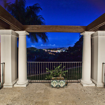
When this private client, a married couple, first approached Álvarez-Díaz & Villalón to build ‘the house of their dreams’ on the grounds of their sprawling family estate, the first challenge was to identify the exact location that would maximize the positive aspects of the topography while affording the most gracious views. Propped up on scaffolding, juggling digital cameras and folding ladders, the design team photographed the property from hundreds of angles before the ideal site was selected.
Once the site was selected, construction could begin.
The building’s foundation was raised slightly off the ground to disperse geothermal heat. In addition, the designers studied daily sunlight patterns and positioned the structure accordingly in order to warm the swimming pool during the cooler morning hours and illuminate the principal living quarters during the late afternoon. Finally, the main house was designed with functional balconies on all sides: each balcony meticulously planned ~ and precisely positioned ~ to
both optimize wind flow and frame the property’s most breath-taking views.
Stylistically, the goal was to create an authentic Spanish hacienda. Following Old World tradition, the house was anchored around a centralized interior patio
in the Moorish style: enclosed on three sides ~ yet
open on the fourth (similar to the Alcázar of Seville) ~ to reveal a reflecting pool ~ and mirror the water motif of the home’s magnificent marble fountain. A bell tower, horseshoe arches, a colonnaded,vineyard-style patio, and
ornamental Moorish mosaic tilework (“azulejos”) completed this picturesque portrait of a faraway fantasy world of castles, chivalry, and swordsplay, reminiscent of Medieval Spain.
Shortly after completion, this showcase home was showcased on the TVE Spanish television series Spaniards Around The World (Españoles Alrededor
Del Mundo) as a prime example of authentic Spanish architecture designed outside the peninsula. Not surprising. After all, the story of a fairy-tale retreat as
magical as this one deserves a happy ending.
 Haus Of Tre Li
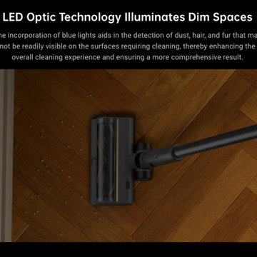
Powerful 190AW suction easily removes dirt and pet hair from floors and carpets. With a 90-minute runtime, you can tackle tough cleaning jobs effortlessly.
Enhanced LED dust detection illuminates hard-to-see areas, leaving no spot untouched.
Advanced dual brush head picks up dirt and debris from every angle, perfect for cleaning carpets and hardwood floors.
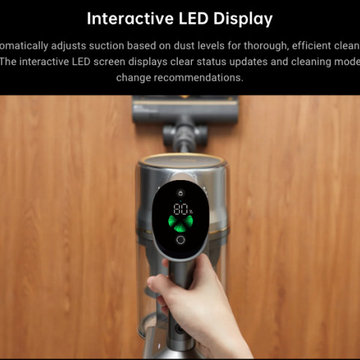
Intelligent dirt detection automatically adjusts suction power for optimal cleaning performance.
 Swatch Design Group
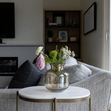
As a part of a larger transformation, the kitchen served as an anchor for rethinking how the home could feel and function. The goal was to create a space that felt truly integrated, flowed naturally within itself, and connected seamlessly to the outdoors. Storage was a top priority, with an emphasis on keeping countertops clean and the space feeling calm and open. Flow was equally important. What began as a layout optimized for entertaining evolved into a more intentional approach, where every sightline and transition was thoughtfully considered. The clients also needed the kitchen to work hard for their lifestyle, with a commercial-size refrigerator and freezer, generous prep space, and room to gather. The challenge was to bring purpose and polish to a space that didn’t quite feel like it belonged. The result is a kitchen that’s not only highly functional but finally feels like part of the home.
Project challenges:
- Maximizing storage was a primary challenge, especially with the inclusion of a commercial-sized fridge and freezer that occupied valuable cabinetry space.
- The need for clean, uninterrupted lines throughout the kitchen required thoughtful detailing, especially around cabinetry transitions and appliance integration.
- The oversized island design required two stone slabs and waterfall edges on both sides which posed both visual and logistical challenges.
- Incorporating electrical outlets into the island in a way that felt intentional and unobtrusive demanded creative problem-solving.
- The unique rooflines created strong visual angles that required a considered design approach to ensure the space felt cohesive rather than disjointed.
- Balancing symmetry and flow in a kitchen with structural constraints required precise layout planning to maintain a cohesive visual rhythm.
- Creating an intentional indoor/outdoor living flow, especially in the transitional space between the sliding doors to the backyard and the kitchen.
Project solutions:
- To balance the visual weight of the commercial-grade fridge and freezer, we flanked the range and hood with full-height pocket cabinetry, which created symmetry while reclaiming storage space. We also took a look into internal organization and carefully mapped out where every kitchen item would live. This allowed us to make informed decisions about drawer versus door configurations, and when to incorporate features like roll-out shelving to maximize accessibility and function.
- Linear light fixtures above the island were chosen for their low visual impact, allowing sightlines to remain clear and emphasizing the thoughtful spatial layout.
- The oversized island was carefully executed using two coordinated slabs, with a subtle brass inlay detail between them to turn a logistical challenge into a design feature.
- Pop-up electrical outlets were integrated into the island to keep surfaces clutter-free while maintaining easy access, which combined form and function seamlessly.
- With multiple focal points and a peaked vaulted ceiling, layout precision was key. The island, hood, and adjacent staircase were all perfectly centered on the vault, creating a sense of alignment across the open space.
- In the transitional area between kitchen and backyard, we added a wet bar that visually and functionally connects the indoor space with the outdoors. This addition provides extra storage and creates a dedicated entertainment spot for guests, enhancing the overall flow and usability of the home.
 B Street Design
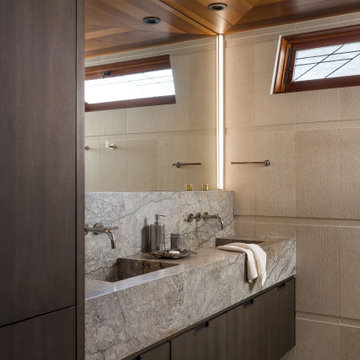
This home prized itself on unique architecture, with sharp angles and interesting geometric shapes incorporated throughout the design. We wanted to intermix this style in a softer fashion, while also maintaining functionality in the kitchen and bathrooms that were to be remodeled. The refreshed spaces now exude a highly contemporary allure, featuring integrated hardware, rich wood tones, and intriguing asymmetrical cabinetry, all anchored by a captivating silver roots marble.
In the bathrooms, integrated slab sinks took the spotlight, while the powder room countertop radiated a subtle glow. To address previous storage challenges, a full-height cabinet was introduced in the hall bath, optimizing space. Additional storage solutions were seamlessly integrated into the primary closet, adjacent to the primary bath. Despite the dark wood cabinetry, strategic lighting choices and lighter finishes were employed to enhance the perceived spaciousness of the rooms.
 Swatch Design Group
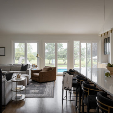
As a part of a larger transformation, the kitchen served as an anchor for rethinking how the home could feel and function. The goal was to create a space that felt truly integrated, flowed naturally within itself, and connected seamlessly to the outdoors. Storage was a top priority, with an emphasis on keeping countertops clean and the space feeling calm and open. Flow was equally important. What began as a layout optimized for entertaining evolved into a more intentional approach, where every sightline and transition was thoughtfully considered. The clients also needed the kitchen to work hard for their lifestyle, with a commercial-size refrigerator and freezer, generous prep space, and room to gather. The challenge was to bring purpose and polish to a space that didn’t quite feel like it belonged. The result is a kitchen that’s not only highly functional but finally feels like part of the home.
Project challenges:
- Maximizing storage was a primary challenge, especially with the inclusion of a commercial-sized fridge and freezer that occupied valuable cabinetry space.
- The need for clean, uninterrupted lines throughout the kitchen required thoughtful detailing, especially around cabinetry transitions and appliance integration.
- The oversized island design required two stone slabs and waterfall edges on both sides which posed both visual and logistical challenges.
- Incorporating electrical outlets into the island in a way that felt intentional and unobtrusive demanded creative problem-solving.
- The unique rooflines created strong visual angles that required a considered design approach to ensure the space felt cohesive rather than disjointed.
- Balancing symmetry and flow in a kitchen with structural constraints required precise layout planning to maintain a cohesive visual rhythm.
- Creating an intentional indoor/outdoor living flow, especially in the transitional space between the sliding doors to the backyard and the kitchen.
Project solutions:
- To balance the visual weight of the commercial-grade fridge and freezer, we flanked the range and hood with full-height pocket cabinetry, which created symmetry while reclaiming storage space. We also took a look into internal organization and carefully mapped out where every kitchen item would live. This allowed us to make informed decisions about drawer versus door configurations, and when to incorporate features like roll-out shelving to maximize accessibility and function.
- Linear light fixtures above the island were chosen for their low visual impact, allowing sightlines to remain clear and emphasizing the thoughtful spatial layout.
- The oversized island was carefully executed using two coordinated slabs, with a subtle brass inlay detail between them to turn a logistical challenge into a design feature.
- Pop-up electrical outlets were integrated into the island to keep surfaces clutter-free while maintaining easy access, which combined form and function seamlessly.
- With multiple focal points and a peaked vaulted ceiling, layout precision was key. The island, hood, and adjacent staircase were all perfectly centered on the vault, creating a sense of alignment across the open space.
- In the transitional area between kitchen and backyard, we added a wet bar that visually and functionally connects the indoor space with the outdoors. This addition provides extra storage and creates a dedicated entertainment spot for guests, enhancing the overall flow and usability of the home.
 High Country Fireplaces
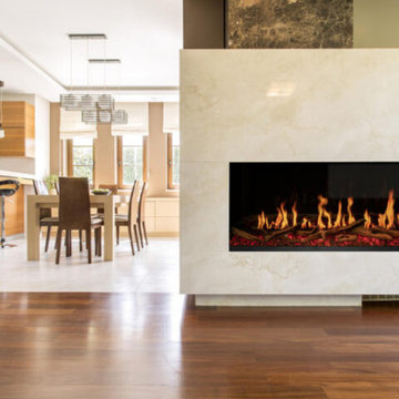
Experience the innovative Orion virtual fireplace that utilizes the most optimized technology, creating the most life-like fire in an electric fireplace.
• High Viewing Area - Enjoy a stunning visual experience with the Orion’s 15″ or 18″ high viewing angle.
• Custom Colors & Patterns - Personalize your fireplace with the Orion’s custom colors and patterns.
• Adjustable Flame Speed - Set the perfect mood with Orion’s adjustable flame speed.
• Ambient Crackling Sound - Immerse yourself in the cozy ambiance created by Orion’s ambient crackling sound.
• Multi-Color Ember Bed & Downlighting - Enhance your space with Orion’s vibrant multi-colored downlight.
 B Street Design
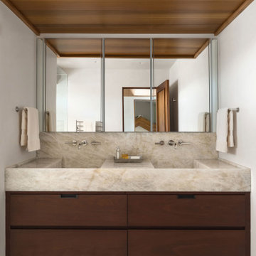
This home prized itself on unique architecture, with sharp angles and interesting geometric shapes incorporated throughout the design. We wanted to intermix this style in a softer fashion, while also maintaining functionality in the kitchen and bathrooms that were to be remodeled. The refreshed spaces now exude a highly contemporary allure, featuring integrated hardware, rich wood tones, and intriguing asymmetrical cabinetry, all anchored by a captivating silver roots marble.
In the bathrooms, integrated slab sinks took the spotlight, while the powder room countertop radiated a subtle glow. To address previous storage challenges, a full-height cabinet was introduced in the hall bath, optimizing space. Additional storage solutions were seamlessly integrated into the primary closet, adjacent to the primary bath. Despite the dark wood cabinetry, strategic lighting choices and lighter finishes were employed to enhance the perceived spaciousness of the rooms.
 Saikley Architects
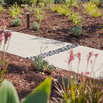
The clients wanted to update their ranch house and make good use of their unusually large site next to downtown Mountain View. We sketched several options for design and scope of work to assess feasibility and value to the clients.
The chosen design retains an existing bedroom wing, while the layout of the living spaces is re-worked to an open plan flooded with light, with vaulted ceilings and strong indoor-outdoor connection to a yard optimized for outdoor living. Awkward angles and inefficient spaces of the former house have been replaced with a clear, simple floor plan designed for ease of everyday living.
One end of the site is used for a two-bedroom ADU (Accessory Dwelling Unit) with its own face to the street and its own back yard. Income from the ADU will go a long way toward financing the rebuild of the main house.
Photography: Kurt Manley
https://saikleyarchitects.com/portfolio/open-ranch-adu/
 Sosna Inc
Our clients, a family of professionals with 2 young kids, approached us to renovate their early 2000’s Toronto home to make it better suit the needs of their family. Although they were happy with the Kitchen layout, they requested that we update the existing cabinetry, and add additional cabinetry for increased storage. In the Laundry Room, they needed a storage solution for cleaning materials, and an updated laundry sink. They wanted the Basement to be a comfortable family space to spend time together, and for the kids to have a space to play.
The Kitchen cabinets were dated and starting to fall apart, and the Master En-Suite was dated and awkwardly shaped, with a tight walk-in shower.
In the Basement, the HVAC bulkhead was awkward and unsightly, and the space was not ideal for the kids to play, due to outdated carpeting, and a lack of storage space for their toys.
We spent time getting to know our clients to design a space that optimized functionality and comfort for their family.
In the Kitchen, we kept the existing layout, but added a tall cabinet for pantry and broom storage. A new island was built with a space to accommodate a built-in microwave, to keep it from cluttering the countertop. The new white oak tall cabinets and island cabinets were complimented by light coloured marble-looking quartz countertops and the handmade subway tile backsplash for a fresh, updated look.
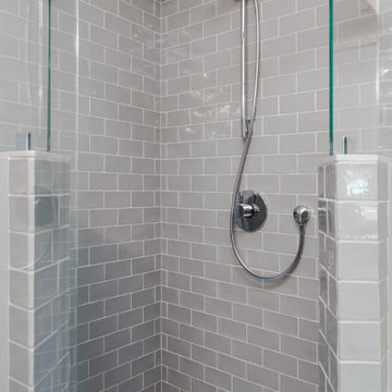
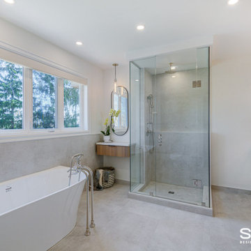
In the Master Ensuite, we replaced the large, dated deck-mounted tub with a semi-freestanding tub, tucked nicely into the corner. The extra space this created allowed us to add a walk-in shower without the awkward angle that had existed prior to the renovation. The new walk-in shower featured a ceiling mounted showerhead, and a useful ledge for toiletries. We even had enough space to add a bonus make-up table to match the new double vanity. Both were custom built to be floating for a modern look, and easier maintenance.
In the Laundry Room, we installed the washer and dryer side by side, instead of stacked. This allowed for a long working countertop and upper storage cabinets that were custom built. Additionally, a hanging rack installed above the sink is perfect for drying small items, and the adjustable shelves and dividers in the custom built cabinetry will provide plenty of convenient space to store cleaning materials.
In the Basement, we widened the bulkhead to allow us to center the wall-mounted TV, and added custom media cabinets with floating shelves to accommodate electronics.
The space was made more comfortable for the kids to play with new vinyl heated flooring, and tall cabinets with adjustable shelves, dividers, and deep drawers to keep all of their toys organized.
All of these updates provided our clients with a home that fits their family’s needs and lifestyle.
If your home isn’t functional for your family, contact us to learn more. We’re the Renovator You Can Count On!
 Maykke
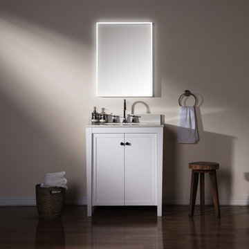
The Sophia Mirror combines a sleek, minimalist design with a functional LED shelf, bringing storage and lighting together into one convenient and ultra-modern mirror. Sharp angles and clean, frameless lines make the Sophia Mirror a truly versatile addition to your contemporary bathroom or home. The shelf's LED lights shine at a brilliant, pure white, providing optimal lighting for your daily morning prep it's especially ideal for cosmetics, skincare, and haircare routines, ensuring you'll always look your best before stepping out the door. As the shelf runs the entire perimeter of the mirror, the Sophia Mirror can be installed with portrait or landscape orientation depending on your home's needs. All necessary hardware for installation is included, making setup a breeze.
Features
- Minimalist contemporary design
- Wide frameless rectangular shape with perimeter shelf and border LED lighting at 6,000 color temperature
- Painted steel base, LED lighting with hardwire wall connection
- Overall Dimensions: 23-5/8" W x 3-15/16" D x 31-1/2" H
- Includes one mirror with shelf and all necessary mounting materials
- Vanity, sink, and all other pictured bathroom accessories are not included
Additional Information
- Weight: 28.66lbs
- Need Assembly: No
- Dimension: 23-5/8" W x 3-15/16" D x 31-1/2" H
- Feature: Frameless
- Design: Modern
- Material: LED
- Shape: Rectangle
- Orientation: Both
- Mounting Hardware: Yes
Our mirror LED lights are not intended to be the sole light source in a room, but are appropriate for ambient or accent lighting, or as a night light.
For more LED mirror options, please view our wide selection of mirrors in our catalog.
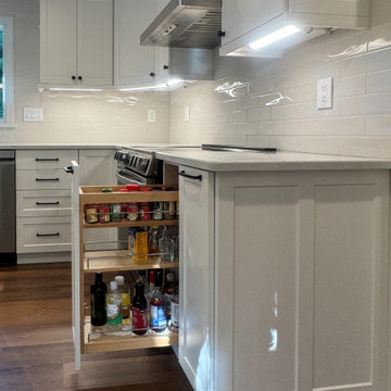
 Irene Designs
Home Remodeling Project Overview
This extensive home remodeling project transformed a dated and inefficient layout into a functional, open, and aesthetically cohesive living space. The original layout had several challenges:
• A kitchen with limited storage, no cabinets on the window side, a sink facing the wall, and a range crammed into the corner. The pantry closet was too deep and impractical.
• A living room that couldn’t accommodate furniture without interfering with traffic flow.
• A front foyer with wasted space.
• A claustrophobic hallway toilet room without a sink, located near the laundry room.
The Remodeling Concept
The scope of this project extended well beyond the kitchen. We proposed several layout options to address issues in all adjacent spaces, ultimately implementing a plan that:
• Removed two walls and moved doorways.
• Replaced the kitchen window.
• Converted the hallway toilet room into a storage space.
• Installed pocket doors to separate the laundry hallway from the living room.
Kitchen Transformation
• Open Concept: By removing the wall between the kitchen and dining room, the two spaces became a seamless open area.
• New Layout: Cabinets were relocated to the window side for more storage and natural light. A central island with storage and seating was added, and a coffee bar was installed in the dining room.
• Updated Pantry: The deep pantry closet was converted into a pullout pantry with a cabinet front for better accessibility.
• Design Details: Off-white kitchen cabinets pair beautifully with a light green island. Warm white quartz counters and an artisan tile backsplash complete the look.
Dining Room
• Expanded Space: Most of the wall separating the dining room and foyer was removed, creating a more spacious area while still accommodating all furniture thanks to careful measurements.
Living Room Improvements
• Optimized Layout: Moving doorways and installing pocket doors allowed for better furniture placement, including a sofa that doesn’t interfere with traffic flow.
• Fireplace Upgrade: The brick fireplace was updated with a three-dimensional staggered stone veneer in a color matching the kitchen cabinets, creating a cohesive look. A TV was installed above the fireplace at a comfortable viewing angle.
Additional Updates
• New Flooring: All remodeled rooms now feature updated flooring.
• Ceilings: Popcorn ceilings were replaced with smooth, flat finishes, complemented by recessed lighting.
• Walls: Fresh paint throughout the space, with an accent wall in the living room matching the light green of the kitchen island.
• Lighting: Stylish sconces were added for a touch of elegance.
The Result
The homeowners are thrilled with the transformation, marveling at how their once cramped and inefficient home now feels spacious, functional, and beautifully cohesive. They can’t believe their house could ever look like this!
 Swatch Design Group
As a part of a larger transformation, the kitchen served as an anchor for rethinking how the home could feel and function. The goal was to create a space that felt truly integrated, flowed naturally within itself, and connected seamlessly to the outdoors. Storage was a top priority, with an emphasis on keeping countertops clean and the space feeling calm and open. Flow was equally important. What began as a layout optimized for entertaining evolved into a more intentional approach, where every sightline and transition was thoughtfully considered. The clients also needed the kitchen to work hard for their lifestyle, with a commercial-size refrigerator and freezer, generous prep space, and room to gather. The challenge was to bring purpose and polish to a space that didn’t quite feel like it belonged. The result is a kitchen that’s not only highly functional but finally feels like part of the home.
Project challenges:
- Maximizing storage was a primary challenge, especially with the inclusion of a commercial-sized fridge and freezer that occupied valuable cabinetry space.
- The need for clean, uninterrupted lines throughout the kitchen required thoughtful detailing, especially around cabinetry transitions and appliance integration.
- The oversized island design required two stone slabs and waterfall edges on both sides which posed both visual and logistical challenges.
- Incorporating electrical outlets into the island in a way that felt intentional and unobtrusive demanded creative problem-solving.
- The unique rooflines created strong visual angles that required a considered design approach to ensure the space felt cohesive rather than disjointed.
- Balancing symmetry and flow in a kitchen with structural constraints required precise layout planning to maintain a cohesive visual rhythm.
- Creating an intentional indoor/outdoor living flow, especially in the transitional space between the sliding doors to the backyard and the kitchen.
Project solutions:
- To balance the visual weight of the commercial-grade fridge and freezer, we flanked the range and hood with full-height pocket cabinetry, which created symmetry while reclaiming storage space. We also took a look into internal organization and carefully mapped out where every kitchen item would live. This allowed us to make informed decisions about drawer versus door configurations, and when to incorporate features like roll-out shelving to maximize accessibility and function.
- Linear light fixtures above the island were chosen for their low visual impact, allowing sightlines to remain clear and emphasizing the thoughtful spatial layout.
- The oversized island was carefully executed using two coordinated slabs, with a subtle brass inlay detail between them to turn a logistical challenge into a design feature.
- Pop-up electrical outlets were integrated into the island to keep surfaces clutter-free while maintaining easy access, which combined form and function seamlessly.
- With multiple focal points and a peaked vaulted ceiling, layout precision was key. The island, hood, and adjacent staircase were all perfectly centered on the vault, creating a sense of alignment across the open space.
- In the transitional area between kitchen and backyard, we added a wet bar that visually and functionally connects the indoor space with the outdoors. This addition provides extra storage and creates a dedicated entertainment spot for guests, enhancing the overall flow and usability of the home.
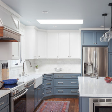 Saikley Architects
This house was a very small mid-century bungalow with previous additions that resulted in a large but chaotic layout. The owners wanted to convert the house to a super-efficient, and charming Craftsman-style, 6 bedroom home for their large family and work at home.
We achieved the space needs by moving a few walls for a more efficient, organized layout, setting up spaces for overlapping uses, and making a small upstairs addition. Every bit of square footage was optimized to meet the goals of the project without making the house huge or adding unnecessary cost.
Much thought was given to the entry sequence near the front door. A large flow-through mudroom with storage for each family member, and adjacent laundry, make it easy for children to be taught to keep their things organized and to contribute to household chores. A mail station and central home admin area at the mudroom help keep clutter down at other areas and minimize home management tasks. A garage door near the kitchen gives quick access to bulk items.
The existing house had too much view to the street from the living room through large corner windows, and too little entry transition, to the extent that the family did not feel comfortable using the living room much without shades drawn. We raised the window sills and brought the new windows in from the corner of the house, allowing plenty of light while protecting privacy and a sense of enclosure in the living room. We enlarged the front porch to create a more graceful transition from the public to private space. We located the front door so that the circulation from entry into the house would allow for furnishing the living room with a sitting circle that is not intruded upon by people walking through the room.
Sight lines through the living spaces were an important consideration in the design. The owners wanted discreet spaces for living room, kitchen, dining and family room, but also wanted the living spaces to feel connected and to be able to easily watch their children. Being able to see the children playing in the yard while getting things done inside the house was also important. While largely working with the existing structure, we opened walls and rearranged the use of spaces to make a series of connected living spaces with long views through them.
The character of the remodeled house is a contemporary Craftsman with classic materials and cool, consistent colors. A few arches echo through the house to frame spaces and soften the feeling of the rooms.
Photography: Kurt Manley
https://saikleyarchitects.com/portfolio/bungalow-expansion/
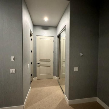
 Fresno Wallpaper Installer
Wallpaper Installation – Bedroom in Sanger
Create your dream retreat with expert bedroom wallpaper installation in Sanger. As your local wallpaper specialist, I transform master suites, guest rooms, and children's bedrooms into personalized sanctuaries with:
✔ Bedroom-Optimized Wallcoverings
Soothing textured wallpaper for relaxation
Bold accent wall murals for drama
Romantic floral prints or modern geometric designs
✔ Premium Installation Services
Precision pattern matching for seamless looks
Special techniques for vaulted ceilings or angled walls
Peel-and-stick wallpaper options for easy updates
✔ Complete Wall Solutions
Wallpaper repair for damaged or peeling sections
Professional wallpaper removal with wall protection
Surface preparation for perfect adhesion
Why Sanger Homeowners Trust Us:
✅ Sleep-Friendly Scheduling - Work around your routine
✅ Free Design Consultations - Bring your Pinterest ideas to life
✅ Central Valley-Approved Materials - Stands up to our climate
✅ 1-2 Day Room Transformations - Minimal disruption
Popular Sanger Bedroom Styles:
• Farmhouse Charm - Shiplap-look wallpapers
• Vineyard Elegance - Wine country themes
• Southwestern Warmth - Desert-inspired palettes
• Modern Romance - Metallic or velvet-textured papers
Serving All of Sanger - From historic downtown homes to new developments in the foothills.
pe
 ALVAREZ-DIAZ & VILLALON
Photography by Carlos Esteva.
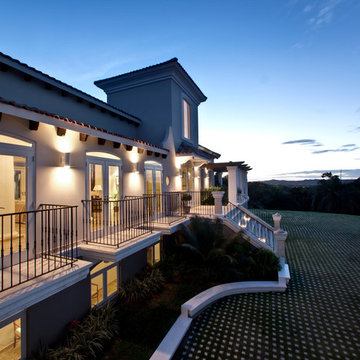
When this private client, a married couple, first approached Álvarez-Díaz & Villalón to build ‘the house of their dreams’ on the grounds of their sprawling family estate, the first challenge was to identify the exact location that would maximize the positive aspects of the topography while affording the most gracious views. Propped up on scaffolding, juggling digital cameras and folding ladders, the design team photographed the property from hundreds of angles before the ideal site was selected.
Once the site was selected, construction could begin.
The building’s foundation was raised slightly off the ground to disperse geothermal heat. In addition, the designers studied daily sunlight patterns and positioned the structure accordingly in order to warm the swimming pool during the cooler morning hours and illuminate the principal living quarters during the late afternoon. Finally, the main house was designed with functional balconies on all sides: each balcony meticulously planned ~ and precisely positioned ~ to
both optimize wind flow and frame the property’s most breath-taking views.
Stylistically, the goal was to create an authentic Spanish hacienda. Following Old World tradition, the house was anchored around a centralized interior patio
in the Moorish style: enclosed on three sides ~ yet
open on the fourth (similar to the Alcázar of Seville) ~ to reveal a reflecting pool ~ and mirror the water motif of the home’s magnificent marble fountain. A bell tower, horseshoe arches, a colonnaded,vineyard-style patio, and
ornamental Moorish mosaic tilework (“azulejos”) completed this picturesque portrait of a faraway fantasy world of castles, chivalry, and swordsplay, reminiscent of Medieval Spain.
Shortly after completion, this showcase home was showcased on the TVE Spanish television series Spaniards Around The World (Españoles Alrededor
Del Mundo) as a prime example of authentic Spanish architecture designed outside the peninsula. Not surprising. After all, the story of a fairy-tale retreat as
magical as this one deserves a happy ending.
 Haus Of Tre Li
Powerful 190AW suction easily removes dirt and pet hair from floors and carpets. With a 90-minute runtime, you can tackle tough cleaning jobs effortlessly.
Enhanced LED dust detection illuminates hard-to-see areas, leaving no spot untouched.
Advanced dual brush head picks up dirt and debris from every angle, perfect for cleaning carpets and hardwood floors.
Intelligent dirt detection automatically adjusts suction power for optimal cleaning performance.
24