
Search results for "Over all excellence" in Home Design Ideas
 TimeLine Renovations Inc.
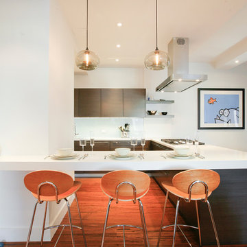
Going house hunting to find the dream home is difficult in every aspect, especially in NYC. The first apartment may have a feature that the other has but very rarely will one place have all. Most important is making sure the location and size works and everything else can be incorporated later. As the apartment our clients selected was "move in" condition its surely was not for what they work looking for in creating their dream home. We first started by creating a "wish list" of all of the essentials, which included; open kitchen, walk in closet, office space , larger master bathroom with stand up shower and soaking tub. With creating many different floor plan options, the only way we would achieve this was by sacrificing the 3rd bedroom. At this stage the 3rd bedroom was very easy for them to sacrifice as it gave them all of the wish list for now. In the future ,they could easily take the square footage from the new oversized living room and add that 3rd bedroom if it were necessary. Our first goal in the demolition stage was to remove all existing interior partition walls and start with a fresh new slate. By removing the existing kitchen walls the New Kitchen layout now combines it with the living room. The cabinetry is 2 tone color, flat slab doors for the modern look. State of the art appliances were installed; Integrated panels were installed on the fridge, wall oven, microwave, cook top. The sink is the ultimate chefs prep station sliding butcher block with bowls that slide over the sink. A garage cabinet was installed to conceal smaller appliances. The cantilever counter top adds the additional seating space for guests while keeping the bottom portion open for the view. The existing walk in closet was relocated to achieve the New Master Bathroom, Combining the spaces now gave us the option to add all the features. Floating vanity with double sinks, soaking tub, stand up shower. The glossy rectified tiles used are 12x36 and when installed make the grout line disappear and make it look like a solid wall. The chocolate floor tiles are randomly staggered then wrap up the tub platform and continue up one wall to create an accent. No tile edge was used but all tiles that meet on a 90 degree outside corner are mitered; tub platform, walls and shower niches. Heated floors were installed to keep the feet warm on the cold winter days. In the Master Bedroom we built a bed frame accent wall. Serves for multiple functions; eliminates night stands by using the niches for alarm clock / phone charger station, lights were added inside the niches for accent lights and raised wall paper was used to finish this beautiful feature. Each his and hers niche has an outlet, 4 way switch for the accent lights and 4 way switch for the recessed lights above when they are done reading in bed. Custom steps were built for easy up and down off the bed for the little puppies that could not possibly make the jump up. Other features throughout the apartment include; New bamboo floors throughout. Since the concrete ceiling slab cannot be chopped , soffits and drop ceilings were built throughout the apartment to accommodate recessed lights. Low voltage recessed lights were used with multiple zone dimmers for energy efficiency. Remote operated shades were installed The overall design was for the apartment was modern, simple lines and true elegance. The newly renovated apartment will be enjoyed by them, friends and family for many years to come...
edit
 Klopf Architecture
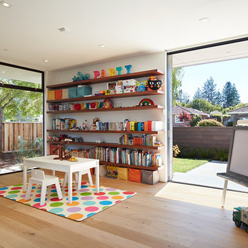
Klopf Architecture and Outer space Landscape Architects designed a new warm, modern, open, indoor-outdoor home in Los Altos, California. Inspired by mid-century modern homes but looking for something completely new and custom, the owners, a couple with two children, bought an older ranch style home with the intention of replacing it.
Created on a grid, the house is designed to be at rest with differentiated spaces for activities; living, playing, cooking, dining and a piano space. The low-sloping gable roof over the great room brings a grand feeling to the space. The clerestory windows at the high sloping roof make the grand space light and airy.
Upon entering the house, an open atrium entry in the middle of the house provides light and nature to the great room. The Heath tile wall at the back of the atrium blocks direct view of the rear yard from the entry door for privacy.
The bedrooms, bathrooms, play room and the sitting room are under flat wing-like roofs that balance on either side of the low sloping gable roof of the main space. Large sliding glass panels and pocketing glass doors foster openness to the front and back yards. In the front there is a fenced-in play space connected to the play room, creating an indoor-outdoor play space that could change in use over the years. The play room can also be closed off from the great room with a large pocketing door. In the rear, everything opens up to a deck overlooking a pool where the family can come together outdoors.
Wood siding travels from exterior to interior, accentuating the indoor-outdoor nature of the house. Where the exterior siding doesn’t come inside, a palette of white oak floors, white walls, walnut cabinetry, and dark window frames ties all the spaces together to create a uniform feeling and flow throughout the house. The custom cabinetry matches the minimal joinery of the rest of the house, a trim-less, minimal appearance. Wood siding was mitered in the corners, including where siding meets the interior drywall. Wall materials were held up off the floor with a minimal reveal. This tight detailing gives a sense of cleanliness to the house.
The garage door of the house is completely flush and of the same material as the garage wall, de-emphasizing the garage door and making the street presentation of the house kinder to the neighborhood.
The house is akin to a custom, modern-day Eichler home in many ways. Inspired by mid-century modern homes with today’s materials, approaches, standards, and technologies. The goals were to create an indoor-outdoor home that was energy-efficient, light and flexible for young children to grow. This 3,000 square foot, 3 bedroom, 2.5 bathroom new house is located in Los Altos in the heart of the Silicon Valley.
Klopf Architecture Project Team: John Klopf, AIA, and Chuang-Ming Liu
Landscape Architect: Outer space Landscape Architects
Structural Engineer: ZFA Structural Engineers
Staging: Da Lusso Design
Photography ©2018 Mariko Reed
Location: Los Altos, CA
Year completed: 2017
 Dimensions in Wood Inc
This client’s vision for their kitchen/hearth room remodel was to create a harmonious space for gathering and socializing with family and friends. Without the before and after photos, you would scarcely believe this was the same home.
This huge home renovation perfectly illustrates that Dimensions In Wood’s expert team can handle every aspect of your remodeling project. Plumbing, flooring, electrical wiring, custom cabinets, structural engineering, appliances, windows, interior and exterior doors, entertainment and more. Contact us today to discuss Translating Your Visions into Reality
The client was interested in new appliance technology, cabinetry to the ceiling, and an Island large enough to seat 3. They also wanted a built-in breakfast nook, improved pantry space, more functional storage on either side of their fireplace, and a built-in appearance for the TV above the mantel. The original built-in desk was not used, and they preferred for that space to serve as a small bar area with refrigeration and a place to store their printer. We designed several plans for the space before selecting the final layout.
The new design required the removal of the soffit over the old sink, as well as a small wall beside the old refrigerator. The wall beside the stairwell had to be shortened 13 inches and a new beam installed to carry the load of the home’s 2nd story to gain enough space for the large central island. The existing closet pantry walls were also reconfigured as per the new plan.
This serves as a great reminder that Dimensions In Wood is much more than just custom cabinets.
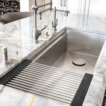
Central to the entire custom kitchen is an 8-foot Walnut island. The huge island, which comfortably seats three, is topped with Essenza Blue quartzite. The stone’s natural striations are beautiful. Quartzite is harder than granite, and less likely to stain than other stones because of its density. The couple had to look through multiple slabs to find a piece they LOVED. The island’s custom Walnut cabinetry, built to resemble a piece of custom furniture, was stained Bronzed Walnut by Sherwin Williams.
The 4-foot Galley Workstation in the island, handles all the kitchen’s prep, serving, and cleanup needs. The Galley’s culinary tools include an upper tier cutting board, upper tier drying rack, 2 lower tier platforms, 11″ colander with non-slip handles, and 11” mixing bowl with lid and non-slip bottom. Learn more about the amazing Galley Workstation here. A Waterstone gantry faucet in a pewter finish combines a pull-down sprayer for maximum mobility and a articulated swivel spout. A water tap with reverse osmosis filter provides the highest quality drinking water. To keep a clean and sleek counter we installed a raised air switch for the garbage disposal and integrated soap dispenser. The island also houses the Thermador Sapphire 7-Program Dishwasher with a hidden touch control panel and a custom Walnut wood front. The cabinetry under the Galley Workstation features a trash roll out, as well as storage for the culinary tools.
Shortening the stairwell wall, and reframing around the stairs, which included shortening the handrail, also made room for a bi-fold door walk-in pantry with extra roll out storage and space for a small microwave. Above the panty doors is a remote controlled, electric motor powered, lift up cabinet door which hides a flat screen TV, used while the family is cooking.
To the right of the walk-in pantry is cold food storage. The Thermador, 30-inch Freedom Collection refrigerator and 24-inch built-in freezer column with internal ice maker are covered with matching cabinetry fronts. An open display space was designed above the units, creating an aesthetically beautiful wall. To the right of the refrigerator & freezer columns is a tall cabinet designed for the built-in Thermador steam and convection oven. The convention steam oven is a relatively new technology for homes, but its versatility and food quality is amazing. To the right of this is a pull-out appliance pantry which provides easy access and storage for a stand mixer, blender, and any other appliance you do not want to clutter the counter.
The most visible wall of the kitchen features the 36-inch Thermador Professional Series Harmony Gas Range with Griddle. Between the range and custom designed wood hood, a framed mosaic tile accent in the backsplash, creates a focal point. To clear the air, the Professional Series Thermador 42-inch ventilation insert provides excellent exhaust capabilities, as well as providing multi-level, vivid LED lights for beautiful illumination.
The wall cabinetry symmetrically flanks the custom hood, utilizing deeper wall cabinetry on each end, allowing for storage of oversized dishware. The base cabinetry on this wall is made up of drawers, except for the corner, which is a Kesseböhmer LeMans II. This specially designed shelf system allows ease of access in underutilized blind corners. The dual action articulation system with soft close mechanism ensures a smooth open and close.
Rounding the corner to the outside wall, the base cabinetry was built to a narrower depth, providing additional space for the island, as well as easier access to the new larger pass-thru window which serves the screen porch. The client selected Black Vermont granite countertops with an ogee edge to contrast the Linen White painted cabinetry.
The door to the screen porch was replaced with a Marvin Exterior Door with a raised panel at the bottom of the 3⁄4 glass door.
Marvin Windows replaced the other windows in the space increasing the energy efficiency and value of the home. To establish the breakfast nook, a bench with drawers and an upholstered seat was built into the bay area of the room.
Custom bookshelves were built with open shelves, cabinet doors, and drawers on either side of the fireplace. A new stone hearth and fireplace surround were installed. Above the existing mantel we built a recessed space for the flat screen television hiding all wiring inside the walls for a completely clean look.
The space that was once a desk was transformed into a bar area. The glass shelves and glass cabinet front liquor cabinet stand out. But this bar area has hidden secrets. Tucked beneath the black granite is a Thermador under-counter double drawer refrigerator with matching wood front panels. They blend in perfectly with the cabinets. A wireless printer is easily accessed on a slide out drawer. Plus, what looks like merely wooden panels on the wall are concealing recessed storage for more bottles and glasses!
Overhead recessed lighting and speaker system provide illumination and entertainment through the entire space.
This luxury home had original, solid oak flooring through most of the first floor which the homeowner obviously wanted to keep but were in desperate need of repair and refinishing. Our master craftsmen wove in new wood flooring to match the old where needed, particularly where walls had been changed and where the floor was damaged. We sanded the floors, smoothing away years of wear and tear. The entire wood floor was then uniformly stained, making it impossible to differentiate where any repairs were made.
If this renovation has inspired you, then contact us today! There is no limit to our Dimensions.
Find the right local pro for your project
 Drewett Works
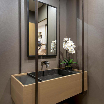
With adjacent neighbors within a fairly dense section of Paradise Valley, Arizona, C.P. Drewett sought to provide a tranquil retreat for a new-to-the-Valley surgeon and his family who were seeking the modernism they loved though had never lived in. With a goal of consuming all possible site lines and views while maintaining autonomy, a portion of the house — including the entry, office, and master bedroom wing — is subterranean. This subterranean nature of the home provides interior grandeur for guests but offers a welcoming and humble approach, fully satisfying the clients requests.
While the lot has an east-west orientation, the home was designed to capture mainly north and south light which is more desirable and soothing. The architecture’s interior loftiness is created with overlapping, undulating planes of plaster, glass, and steel. The woven nature of horizontal planes throughout the living spaces provides an uplifting sense, inviting a symphony of light to enter the space. The more voluminous public spaces are comprised of stone-clad massing elements which convert into a desert pavilion embracing the outdoor spaces. Every room opens to exterior spaces providing a dramatic embrace of home to natural environment.
Grand Award winner for Best Interior Design of a Custom Home
The material palette began with a rich, tonal, large-format Quartzite stone cladding. The stone’s tones gaveforth the rest of the material palette including a champagne-colored metal fascia, a tonal stucco system, and ceilings clad with hemlock, a tight-grained but softer wood that was tonally perfect with the rest of the materials. The interior case goods and wood-wrapped openings further contribute to the tonal harmony of architecture and materials.
Grand Award Winner for Best Indoor Outdoor Lifestyle for a Home This award-winning project was recognized at the 2020 Gold Nugget Awards with two Grand Awards, one for Best Indoor/Outdoor Lifestyle for a Home, and another for Best Interior Design of a One of a Kind or Custom Home.
At the 2020 Design Excellence Awards and Gala presented by ASID AZ North, Ownby Design received five awards for Tonal Harmony. The project was recognized for 1st place – Bathroom; 3rd place – Furniture; 1st place – Kitchen; 1st place – Outdoor Living; and 2nd place – Residence over 6,000 square ft. Congratulations to Claire Ownby, Kalysha Manzo, and the entire Ownby Design team.
Tonal Harmony was also featured on the cover of the July/August 2020 issue of Luxe Interiors + Design and received a 14-page editorial feature entitled “A Place in the Sun” within the magazine.
 Visbeen Architects
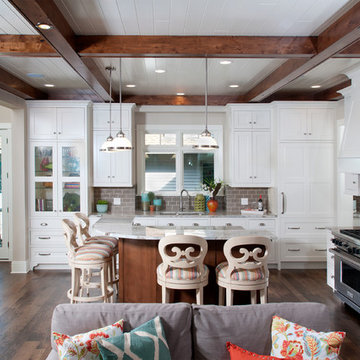
Forget just one room with a view—Lochley has almost an entire house dedicated to capturing nature’s best views and vistas. Make the most of a waterside or lakefront lot in this economical yet elegant floor plan, which was tailored to fit a narrow lot and has more than 1,600 square feet of main floor living space as well as almost as much on its upper and lower levels. A dovecote over the garage, multiple peaks and interesting roof lines greet guests at the street side, where a pergola over the front door provides a warm welcome and fitting intro to the interesting design. Other exterior features include trusses and transoms over multiple windows, siding, shutters and stone accents throughout the home’s three stories. The water side includes a lower-level walkout, a lower patio, an upper enclosed porch and walls of windows, all designed to take full advantage of the sun-filled site. The floor plan is all about relaxation – the kitchen includes an oversized island designed for gathering family and friends, a u-shaped butler’s pantry with a convenient second sink, while the nearby great room has built-ins and a central natural fireplace. Distinctive details include decorative wood beams in the living and kitchen areas, a dining area with sloped ceiling and decorative trusses and built-in window seat, and another window seat with built-in storage in the den, perfect for relaxing or using as a home office. A first-floor laundry and space for future elevator make it as convenient as attractive. Upstairs, an additional 1,200 square feet of living space include a master bedroom suite with a sloped 13-foot ceiling with decorative trusses and a corner natural fireplace, a master bath with two sinks and a large walk-in closet with built-in bench near the window. Also included is are two additional bedrooms and access to a third-floor loft, which could functions as a third bedroom if needed. Two more bedrooms with walk-in closets and a bath are found in the 1,300-square foot lower level, which also includes a secondary kitchen with bar, a fitness room overlooking the lake, a recreation/family room with built-in TV and a wine bar perfect for toasting the beautiful view beyond.
 Chi Renovation & Design
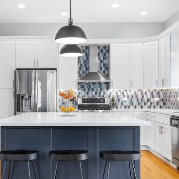
A few shades of grey, a splash of white, and a dark matte blue — this Chicago kitchen balances color beautifully. The hues are complemented with gorgeous modern decor like the statement mirror in the dining area, the pendant lamps over the island, and the intricate chandelier over the sleek metal and wood dining table.
Project designed by Skokie renovation firm, Chi Renovation & Design - general contractors, kitchen and bath remodelers, and design & build company. They serve the Chicago area and its surrounding suburbs, with an emphasis on the North Side and North Shore. You'll find their work from the Loop through Lincoln Park, Skokie, Evanston, Wilmette, and all the way up to Lake Forest.
For more about Chi Renovation & Design, click here: https://www.chirenovation.com/
To learn more about this project, click here:
https://www.chirenovation.com/portfolio/sleek-modern-chicago-kitchen/#kitchen-remodeling
 Forward Design Build Remodel
Goals
While their home provided them with enough square footage, the original layout caused for many rooms to be underutilized. The closed off kitchen and dining room were disconnected from the other common spaces of the home causing problems with circulation and limited sight-lines. A tucked-away powder room was also inaccessible from the entryway and main living spaces in the house.
Our Design Solution
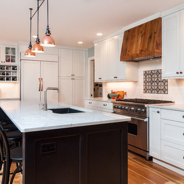
We sought out to improve the functionality of this home by opening up walls, relocating rooms, and connecting the entryway to the mudroom. By moving the kitchen into the formerly over-sized family room, it was able to really become the heart of the home with access from all of the other rooms in the house. Meanwhile, the adjacent family room was made into a cozy, comfortable space with updated fireplace and new cathedral style ceiling with skylights. The powder room was relocated to be off of the entry, making it more accessible for guests.
A transitional style with rustic accents was used throughout the remodel for a cohesive first floor design. White and black cabinets were complimented with brass hardware and custom wood features, including a hood top and accent wall over the fireplace. Between each room, walls were thickened and archway were put in place, providing the home with even more character.

Sponsored
Sunbury, OH

J.Holderby - Renovations
Franklin County's Leading General Contractors - 2X Best of Houzz!
 Abda Custom Window Fashions
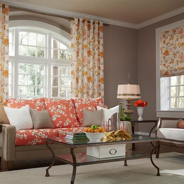
We Love this space because of the use of color! This picture is of a transitional living room. We love the gray-brownish walls with the pop of color throughout the room. Don't be afraid of adding the visual interest in the draperies and roman shades!
We also like layering the valances with the roman shades. This provides a gorgeous look while giving you privacy and sun protection.
**UPDATE** We also work with clients all over the country! Our virtual designers have experience as local and long distance design consultants. Our designers offer professional fabric and design recommendations, free estimates and have a great ability to communicate via email or phone to help conceptualize the project and see it through to the final stages. Fabric samples are mailed directly to you and we also provide easy installation guides.
We're very excited to announce that we were featured on HOUZZ! Click the link below to check out the article!
http://www.houzz.com/ideabooks/30722151/list/design-workshop-shutters-all-grown-up
Abda Window fashions of Indianapolis has custom curtains, drapes, valances, cornices, pillows and hardware in a variety of fabrics and finishes. Curtains and drapes are great alone or paired with a hard window treatment for the ultimate fashion statement. All of our curtains, drapes, valances, cornices and pillows are custom-made from our own workroom. We also make custom bedding and upholstery. We have a huge selection of fabrics that will match any style.
Our custom, affordable draperies, curtains and sheers are now available to anyone in the US. We make them in our own workroom and ship them anywhere in the US! Talk with our professional design specialists and let them help you transform your home! It’s simple and easy. This is a great solution for persons who live out of state or are too busy for a traditional home consultation. With our great reviews, solid company and company values- you know that you’re home is in great hands!
We also have ready-made curtains and bedding available too! And don’t forget our custom hardware! You can also check out our houzz.com store for great window fashion products, including our exclusive bendable rods!
To see our new line, contact Talitha at 317-273-8343 or email: talitha@abdawindowfashions.com or check out our houzz.com store!
For our local customers we offer, FREE In-home consultation or showroom appointment to meet your lifestyle and design needs. At Abda, we have the perfect blend of high-end and affordable solutions for every style and budget. Affordable doesn’t mean cheap! We pride ourselves on quality products with excellent service. We’re so confident of our products that we give our customers more than the manufacturers guarantee!
We give our customers an additional 2 year warranty on top of the manufacturers guarantee!
At Abda, you will find knowledgeable staff that will turn your visions into a reality. Stop in our showroom or schedule a Free In-home consultation today! We know you will be happy with the results but don’t take our word for it, check out what some of our customers say about us on Houzz and Angie’s List!
http://www.angieslist.com/companylist/us/in/indianapolis/abda-inc-custom-window-fashions-reviews-60394.htm?cid=ssabadge
Why Choose Us?
We have been in business since November 1998 and started in the window covering business by cleaning & repairing blinds. This gave us a unique perspective from most window covering dealers. We have always considered how well products hold up and which manufacturers stand behind their products the best. We let our clients know the benefits of more expensive products and give honest feedback. We take pride in showing alternative products to fit all budgets.
Our great testamonials on Angie’s List, Houzz.com and referrals have helped our company grow without the need for “conventional” advertising. Abda means ‘servant’. At Abda, we approach every customer with a servant’s attitude. This philosophy has helped our customers feel confident in their purchases and well-taken care of. Our number one focus is customer service and we believe in putting the customer’s needs first. We offer our clients an additional 2 year warranty on top of the manufacturer’s warranty and want each and every client to be completely happy with their purchase. We’ve been awarded the prestigious 2013 Angie’s List Super Service Award, an honor bestowed annually on approximately 5 percent of all the businesses rated on the nation’s leading provider of consumer reviews. We’ve grown over the years and have added more team members to our company and we’re very excited at the direction our company is going.
Check out our website for more information: www.abdawindowfashions.com
Below is a list of styles and types of curtains and draperies that we can help you with. No worries if you do not find what you’re looking for below! Since we have our own workroom, the sky is the limit. There’s no project too small or large! Our design specialists are great at helping you with window treatment ideas. Stop in our showroom or call today for a FREE in-home consultation. If you’re out of state, no problem! We’re now making our custom treatments and shipping them to you!
Call today (317-273-8343) for more information or email:
talitha@abdawindowfashions.com
Some of the styles and types:
Modern curtains & draperies,
Contemporary curtains & draperies,
Traditional curtains & draperies,
Transitional curtains & draperies,
Beach Style curtains & draperies,
Asian Style curtains & draperies,
Eclectic curtains & draperies,
Midcentury curtains & draperies,
Mediterranean curtains & draperies,
Farmhouse Style curtains & draperies
Kitchen curtains,
Living room curtains,
Dining room curtians,
Master Bedroom curtains,
Nursery curtains,
Children’s room curtains,
Guest bedroom curtains,
Areas that we serve for installation for curtains & draperies are listed below. (But we ship to anywhere in the US!) If you don’t see your city on the list, just give us a call and we will see what we can do.
Indianapolis curtains and draperies & surrounding areas,
Carmel curtains and draperies & surrounding areas,
Zionsville curtains and draperies & surrounding areas
Westfield curtains and draperies & surrounding areas,
Avon curtains and draperies & surrounding areas,
Greenwood curtains and draperies & surrounding areas,
 Corine Maggio Design
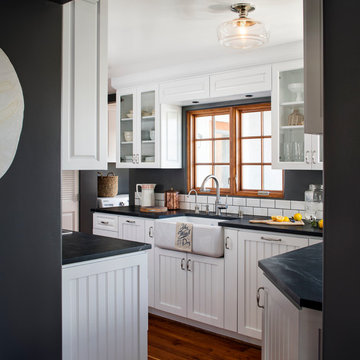
This adorable beach cottage is in the heart of the village of La Jolla in San Diego. The goals were to brighten up the space and be the perfect beach get-away for the client whose permanent residence is in Arizona. Some of the ways we achieved the goals was to place an extra high custom board and batten in the great room and by refinishing the kitchen cabinets (which were in excellent shape) white. We created interest through extreme proportions and contrast. Though there are a lot of white elements, they are all offset by a smaller portion of very dark elements. We also played with texture and pattern through wallpaper, natural reclaimed wood elements and rugs. This was all kept in balance by using a simplified color palate minimal layering.
I am so grateful for this client as they were extremely trusting and open to ideas. To see what the space looked like before the remodel you can go to the gallery page of the website www.cmnaturaldesigns.com
Photography by: Chipper Hatter
 FineLine Kitchens, Inc.
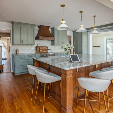
Hi everyone, I'm Sarah and Ogun we are here with fine line kitchens. So we are a couple working together. I do the interior design and remodeling of the space material selection meeting with the clients. And I handled operations outside, you know meaning all the construction work that is taking place the inside. The houses that we work in. I handle all the aspects of the construction, so today's project is very special. We're in Vienna and the client had a very big family. It's a family of seven that lives here. So we had a few aspects that we needed to keep in mind while designing this one. Having everybody be able to sit on the island. So we wanted plenty of seating all the way around. We didn't want anybody standing or anything like that. So what we did is we maximize the space. The center island is the biggest part of the kitchen. We use a natural stone to kind of give it a beautiful texture versus quartz. It's kind of standard white or kind of fabricated, so I wanted something very natural. We did this because I took my inspiration from the outside, so the inspiration if you look at the view right in front of me is there are so many greens there's a lot of brass accents and I wanted to bring this. Into this kitchen while designing it for my clients. She is very warm very. She wanted a very homey, comfy kind of look for the kitchen. So that's what we did today. As you can see, the cabinets are sage green, very light, so I still think it's a neutral, but it's a lighter color that again brings the outside in and we combine that with the oak right behind me so it's a slightly warm oak. It's not very dark. It's not very light. It's a medium brown and the same color went on the island. To kind of tie these two in and the backsplash, my favorite part is where you can see a little bit of design. It is, in my opinion still classic, but includes a pattern so the outside part is as we said in the beginning, is handled by my husband. I'd like him to speak a little bit about that. Thanks, Sarah, I want to talk to you guys a little bit about the construction part of this project. Originally this kitchen was located mostly in this area. They had their stove there sing. It was more of a peninsula layout in Sarah's and the customer vision they wanted. They wanted to get rid of the peninsula and they want to be able to have a huge island that can at least sit seven people because they're familiar with seven. So we wanted to make sure that we can achieve this design and bring it to life so that they can be happy with this layout. Some of the challenges we had, the house, the home being, you know, old home. There were a lot of you know the older electrical and plumbing that had to be replaced. We had to relocate the stove from here to this area. Over here we had put a nice foot fan that we had to relocate all the ductwork and the plumbing. Was being on the peninsula area. We had to relocate it to the center islands. So we achieved all this and kind of like bring it to bring in this kitchen up to date it looks beautiful. That's true, so yes, the old layout did not function for my clients because everything was kind of gathered on one side of the kitchen. So there was like a peninsula right there. So the end of this island kind of continued straight. And that was just the L shape. Kind of where everything was and there used to be another big table here, so they were using only kind of half of the space. So like I said at the beginning, our vision was to kind of feed everybody at the island, create some symmetry. 'cause I love that. So as you can see behind me, this is kind of the focal point symmetrical. Everything is kind of even we wanted to also panel the fridge here so it mimics the pantry and another size. So when you're looking at it, it is bringing again that symmetry back again. I hope you enjoyed this kitchen and this video and I'll see you soon. So how do you think this project turned out? It's nice. I like the color. I think it turned out nice. It's kind of like a little bit different color than what we always do. So I realize. Are you giving me a little bit of credit here that I did something different? Are you proud? I'm so proud of you. Other than that I like it. That they have kind of like a two sink. So if this was our kitchen, if we ever like you can have your own. I can have mine if we ever get into a fight then this can be like my own kitchen. Why are we gonna bring in a fight right now? So I'm cooking anyway. You're grilling most of the time, So what are you even talking about? My kitchen? That's my kitchen. You can just take the small sink. That's fine. It's always good to have your own space right there, so anyways. Thank you guys for watching. We hope to see you soon and if you have any questions please click the link below. It'll lead you to our website, house, YouTube and all of the social media is so nice to have you guys. We'll see you soon. Thanks bye bye-bye.
 Maraya Interior Design
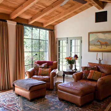
This old 1920's home is thought to be an original George Washington Smith home, has now been updated and extended by Architect Bob Easton of Santa Barbara.
Arched walls over stairs, plaster fireplaces, and very simple, comfortable design make for a very livable home for this family with multiple pets. Leather sofas for an easy feel, over antique hand knotted rugs and old world furniture show off this old Spanish home in the Ojai Valley. The Designers used periwinkle colored windows and doors to play off the black iron windows, and real Malibu tile with white marble tile surrounds around a blue granite kitchen island. The living room ceiling is completely original, and is the inspiration for the new exposed beam master suite ceilings. All the lighting is custom wrought iron fixtures, made especially for this home. A powder room features deep blue tiles and Malibu tile wainscot, the paintings are all of simple early California scenes which all make for an earthy, simple old time style, Project Location: Ojai, California. Project designed by Maraya Interior Design. From their beautiful resort town of Ojai, they serve clients in Montecito, Hope Ranch, Malibu, Westlake and Calabasas, across the tri-county areas of Santa Barbara, Ventura and Los Angeles, south to Hidden Hills- north through Solvang and more.
 Safferstone Interiors
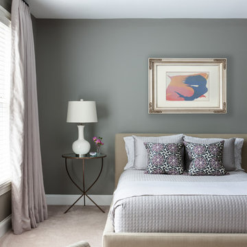
Dennis and Joe have a large, light-filled house. New construction meant lofted space and open floor plans with traditional styling. Running a busy dental practice by day and engaged in a rich social life by night, this couple needed a professional to take the lead on making their house a home.
That’s my cue!
They wanted to take risks, and stay away from “matchy-matchy”. We gussied up a plain ol’ TV room and gave it a healthy dose of luxury.
Our plan was initially inspired by an abstract painting hanging over their stone fireplace. We brought in their love of the outdoors to make things cozy and used family furniture whenever possible for nostalgia and comfort.
I took their love for one-of-a-kind objects and started making a design plan, aiming to solve their biggest frustration: the family room. They had a tortured relationship with a “forgotten family room,” a great space that was spacious and bright, but not at all cozy or joyful, and certainly not “them.”
I wanted to create a cozy space functional for everyday curling up with puppies and watching TV after dinner, yet chic enough for hosting the pre-dinner kitchen overflow and cocktails during parties.
I went looking for contrasting textures and materials. I wanted to balance patterns and scale, and use non-traditional colors as neutrals to create an overall sense of “BAM!”
Dennis and Joe loved the nod to the classics juxtaposed with new and different globally-inspired pieces. For this project our design aesthetic can be described as Middle Eastern/tribal meets mid-century modern. We played to their sensible side with proportion and balance, and stayed as far away from boring/bleh as we could.
You could say this room was pretty successful...It was featured in DC Modern Luxury. (#nobigdeal, right?)
From there we moved on to other spaces.. We added colorful pillows and sheer drapery to finish off their formal living room. We kept an inherited bedroom set from Dennis’ Mom and added color, draperies, and pillows to overhaul the guest bedroom.
Their project was not a rip-and-replace, we weren’t starting from scratch with a blank piece of paper.
Rather, our goal was to take what was already there and make it better, more like them. Using functionality first, we focused on giving the house a soothing, joyful aesthetic. We upped the chic factor by a gajillion and helped them find their ‘happy’ at home. See more Safferstone stuff at www.safferstone.com. Connect with us on Facebook, get inspired on Pinterest, and share modern musings on life & design on Instagram. Or, send us a love note at hello@safferstone.com.
Photo: Angie Seckinger
 TVL Creative Ltd.
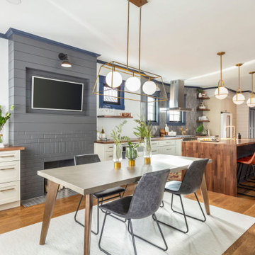
This 1910 West Highlands home was so compartmentalized that you couldn't help to notice you were constantly entering a new room every 8-10 feet. There was also a 500 SF addition put on the back of the home to accommodate a living room, 3/4 bath, laundry room and back foyer - 350 SF of that was for the living room. Needless to say, the house needed to be gutted and replanned.
Kitchen+Dining+Laundry-Like most of these early 1900's homes, the kitchen was not the heartbeat of the home like they are today. This kitchen was tucked away in the back and smaller than any other social rooms in the house. We knocked out the walls of the dining room to expand and created an open floor plan suitable for any type of gathering. As a nod to the history of the home, we used butcherblock for all the countertops and shelving which was accented by tones of brass, dusty blues and light-warm greys. This room had no storage before so creating ample storage and a variety of storage types was a critical ask for the client. One of my favorite details is the blue crown that draws from one end of the space to the other, accenting a ceiling that was otherwise forgotten.
Primary Bath-This did not exist prior to the remodel and the client wanted a more neutral space with strong visual details. We split the walls in half with a datum line that transitions from penny gap molding to the tile in the shower. To provide some more visual drama, we did a chevron tile arrangement on the floor, gridded the shower enclosure for some deep contrast an array of brass and quartz to elevate the finishes.
Powder Bath-This is always a fun place to let your vision get out of the box a bit. All the elements were familiar to the space but modernized and more playful. The floor has a wood look tile in a herringbone arrangement, a navy vanity, gold fixtures that are all servants to the star of the room - the blue and white deco wall tile behind the vanity.
Full Bath-This was a quirky little bathroom that you'd always keep the door closed when guests are over. Now we have brought the blue tones into the space and accented it with bronze fixtures and a playful southwestern floor tile.
Living Room & Office-This room was too big for its own good and now serves multiple purposes. We condensed the space to provide a living area for the whole family plus other guests and left enough room to explain the space with floor cushions. The office was a bonus to the project as it provided privacy to a room that otherwise had none before.

Sponsored
Columbus, OH

Hope Restoration & General Contracting
Columbus Design-Build, Kitchen & Bath Remodeling, Historic Renovations
 House of L
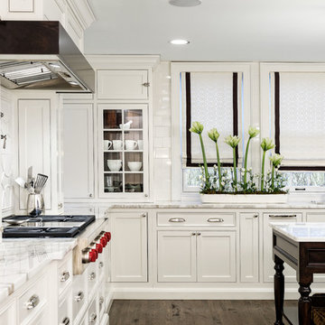
A 1927 colonial home in Shaker Heights, Ohio, received a breathtaking renovation that required extensive work, transforming it from a tucked away, utilitarian space, to an all-purpose gathering room, a role that most kitchens embrace in a home today. The scope of work changed over the course of the project, starting more minimalistically and then quickly becoming the main focus of the house's remodeling, resulting in a staircase being relocated and walls being torn down to create an inviting focal point to the home where family and friends could connect. The focus of the functionality was to allow for multiple prep areas with the inclusion of two islands and sinks, two eating areas (one for impromptu snacking and small meals of younger family members and friends on island no. two and a built-in bench seat for everyday meals in the immediate family). The kitchen was equipped with all Subzero and Wolf appliances, including a 48" range top with a 12" griddle, two double ovens, a 42" built-in side by side refrigerator and freezer, a microwave drawer on island no. one and a beverage center and icemaker in island no. two. The aesthetic feeling embraces the architectural feel of the home while adding a modern sensibility with the revamped layout and graphic elements that tie the color palette of whites, chocolate and charcoal. The cabinets were custom made and outfitted with beaded inset doors with a Shaker panel frame and finished in Benjamin Moore's OC-17 White Dove, a soft white that allowed for the kitchen to feel warm while still maintaining its brightness. Accents of walnut were added to create a sense of warmth, including a custom premium grade walnut countertop on island no. one from Brooks Custom and a TV cabinet with a doggie feeding station beneath. Bringing the cabinet line to the 8'6" ceiling height helps the room feel taller and bold light fixtures at the islands and eating area add detail to an otherwise simpler ceiling detail. The 1 1/4" countertops feature Calacatta Gold Marble with an ogee edge detail. Special touches on the interiors include secret storage panels, an appliance garage, breadbox, pull-out drawers behind the cabinet doors and all soft-close hinges and drawer glides. A kneading area was made as a part of island no. one for the homeowners' love of baking, complete with a stone top allowing for dough to stay cool. Baskets beneath store kitchen essentials that need air circulation. The room adjacent to the kitchen was converted to a hearth room (from a formal dining room) to extend the kitchen's living space and allow for a natural spillover for family and guests to spill into.
Jason Miller, Pixelate
 ODS Architecture
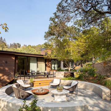
In a wooded area of Lafayette, a mid-century home was re-imagined for a graphic designer and kindergarten teacher couple and their three children. A major new design feature is a high ceiling great room that wraps from the front to the back yard, turning a corner at the kitchen and ending at the family room fireplace. This room was designed with a high flat roof to work in conjunction with existing roof forms to create a unified whole, and raise interior ceiling heights from eight to over ten feet. All new lighting and large floor to ceiling Fleetwood aluminum windows expand views of the trees beyond.
The existing home was enlarged by 700 square feet with a small exterior addition enlarging the kitchen over an existing deck, and a larger amount by excavating out crawlspace at the garage level to create a new home office with full bath, and separate laundry utility room. The remodeled residence became 3,847 square feet in total area including the garage.
Exterior curb appeal was improved with all new Fleetwood windows, stained wood siding and stucco. New steel railing and concrete steps lead up to the front entry. Front and rear yard new landscape design by Huettl Landscape Architecture dramatically alters the site. New planting was added at the front yard with landscape lighting and modern concrete pavers and the rear yard has multiple decks for family gatherings with the focal point a concrete conversation circle with central fire feature.
Everything revolves around the corner kitchen, large windows to the backyard, quartz countertops and cabinetry in painted and walnut finishes. The homeowners enjoyed the process of selecting Heath Tile for the kitchen backsplash and white oval tiles at the family room fireplace. Black brick tiles by Fireclay were used on the living room hearth. The kitchen flows into the family room all with views to the beautifully landscaped yards.
The primary suite has a built-in window seat with large windows overlooking the garden, walnut cabinetry in a skylit walk-in closet, and a large dramatic skylight bouncing light into the shower. The kid’s bath also has a skylight slot with light angling downward over double sinks. More colorful tile shows up in these spaces, as does a geometric patterned tile in the downstairs office bath shower.
The large yard is taken full advantage of with concrete paved walkways, stairs and firepit circle. New retaining walls in the rear yard helped to add more level usable outdoor space, with wood slats to visually blend them into the overall design.
The end result is a beautiful transformation of a mid-century home, that both captures the client’s personalities and elevates the house into the modern age.
 Amy Troute Inspired Interior Design
This designer’s ideal is homeowners with a clear vision, set priorities, and values that align seamlessly with ours. These clients, an accomplished artist and the owner of a generational hops growing farm, were collaborative and trusting from the start. They conscientiously selected a team of Architect (Green Hammer), General Contractor (Cellar Ridge) and ATIID for furnishings and finishing touches. Each firm was able to meticulously manage their leg of the project, while collaborating wholistically with each other and the homeowners.
The family farmhouse, lovingly named “Westwood,” was showing the wear one expects after serving a growing family for decades. The owner’s dream was to revive, open up, and breathe modern life into each space, while respecting the home’s heritage.
One of our first collaborations was the light fixture that would grace the main two-story entry hall. HiiH Lights in Astoria, Oregon, was commissioned to bring “the function of light, the craft of paper, and the art of sculpture” to the home. Visiting the maker’s space – a massive barn on his coastal property – was such an inspiring adventure! Original work by the resident artist sets an ethereal tone in the space, and an antique bench handsomely blends the old with the new.
A wall that divided the home’s living room and kitchen was removed, and the breezy and bright gathering room was born. Light walls, warm wood tones, cozy upholstery, clean lines and heritage elements create a welcoming atmosphere and invite lounging and conversation. The sun-drenched nook is the home’s main indoor dining area, with an extension table and sculpted chairs that are just right for family gatherings or morning rituals with the Sunday paper. The kitchen is a chef’s dream with every modern amenity, but its casual attitude is “let’s make a mess and eat!”
The owner’s artwork graces the mantel over the new fireplace that was carved from a tree felled on the property, illustrating the thoughtful consideration of each element. The muted wool area rugs in the entryways and great room are hard-wearing for farm life, and the furniture’s classic lines, bold contrasting colors, deep seating and soft textures encourage cozy conversations or large group gatherings.
The library is undoubtedly our favorite space in this home. Tucked in “speakeasy style” behind a hidden (wallpapered!) door in the moody wet bar, and drenched in deep green, the room offers a quiet retreat that hugs you in an embrace of books and family photos. The cozy settee nestled between the bookcases sits opposite a custom pair of modern cognac leather wing chairs. The area rug continues the storied look without the antique price tag with a piece from Loloi’s “Heritage Collection.”
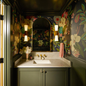
A little va-va-voom was requested for the powder bath and boy did we deliver! Custom wallpaper plays over original wainscotting and ceilings wrapped in more glorious green. The space evokes joy every time you open the door!
A primary suite that would “transport us to another world” and be “classic yet modern, peaceful, collected and uncluttered” was a tall order. Our new furniture layout takes full advantage of the view of wine country hills and the Willamette River, welcomes fireside lounging, and serves as a calm respite for the lovely owners.
Westwood Farmhouse truly was inspired by family, genuine love for home and graciousness for all who enter. Finishing the job was emotional for all involved because we were truly made to feel like part of the family.
Photography by George Barberis
 Melissa Hill Home Design
Hartley Hill Design
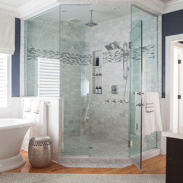
When our clients moved into their already built home they decided to live in it for a while before making any changes. Once they were settled they decided to hire us as their interior designers to renovate and redesign various spaces of their home. As they selected the spaces to be renovated they expressed a strong need for storage and customization. They allowed us to design every detail as well as oversee the entire construction process directing our team of skilled craftsmen. The home is a traditional home so it was important for us to retain some of the traditional elements while incorporating our clients style preferences.
Custom designed by Hartley and Hill Design.
All materials and furnishings in this space are available through Hartley and Hill Design. www.hartleyandhilldesign.com
888-639-0639
Neil Landino Photography

Sponsored
Sunbury, OH
J.Holderby - Renovations
Franklin County's Leading General Contractors - 2X Best of Houzz!
 Drewett Works
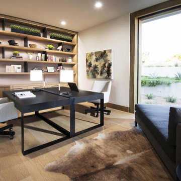
With adjacent neighbors within a fairly dense section of Paradise Valley, Arizona, C.P. Drewett sought to provide a tranquil retreat for a new-to-the-Valley surgeon and his family who were seeking the modernism they loved though had never lived in. With a goal of consuming all possible site lines and views while maintaining autonomy, a portion of the house — including the entry, office, and master bedroom wing — is subterranean. This subterranean nature of the home provides interior grandeur for guests but offers a welcoming and humble approach, fully satisfying the clients requests.
While the lot has an east-west orientation, the home was designed to capture mainly north and south light which is more desirable and soothing. The architecture’s interior loftiness is created with overlapping, undulating planes of plaster, glass, and steel. The woven nature of horizontal planes throughout the living spaces provides an uplifting sense, inviting a symphony of light to enter the space. The more voluminous public spaces are comprised of stone-clad massing elements which convert into a desert pavilion embracing the outdoor spaces. Every room opens to exterior spaces providing a dramatic embrace of home to natural environment.
Grand Award winner for Best Interior Design of a Custom Home
The material palette began with a rich, tonal, large-format Quartzite stone cladding. The stone’s tones gaveforth the rest of the material palette including a champagne-colored metal fascia, a tonal stucco system, and ceilings clad with hemlock, a tight-grained but softer wood that was tonally perfect with the rest of the materials. The interior case goods and wood-wrapped openings further contribute to the tonal harmony of architecture and materials.
Grand Award Winner for Best Indoor Outdoor Lifestyle for a Home This award-winning project was recognized at the 2020 Gold Nugget Awards with two Grand Awards, one for Best Indoor/Outdoor Lifestyle for a Home, and another for Best Interior Design of a One of a Kind or Custom Home.
At the 2020 Design Excellence Awards and Gala presented by ASID AZ North, Ownby Design received five awards for Tonal Harmony. The project was recognized for 1st place – Bathroom; 3rd place – Furniture; 1st place – Kitchen; 1st place – Outdoor Living; and 2nd place – Residence over 6,000 square ft. Congratulations to Claire Ownby, Kalysha Manzo, and the entire Ownby Design team.
Tonal Harmony was also featured on the cover of the July/August 2020 issue of Luxe Interiors + Design and received a 14-page editorial feature entitled “A Place in the Sun” within the magazine.
 Albert, Righter & Tittmann Architects, Inc.
Our client, with whom we had worked on a number of projects over the years, enlisted our help in transforming her family’s beloved but deteriorating rustic summer retreat, built by her grandparents in the mid-1920’s, into a house that would be livable year-‘round. It had served the family well but needed to be renewed for the decades to come without losing the flavor and patina they were attached to.
The house was designed by Ruth Adams, a rare female architect of the day, who also designed in a similar vein a nearby summer colony of Vassar faculty and alumnae.
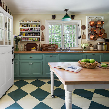
To make Treetop habitable throughout the year, the whole house had to be gutted and insulated. The raw homosote interior wall finishes were replaced with plaster, but all the wood trim was retained and reused, as were all old doors and hardware. The old single-glazed casement windows were restored, and removable storm panels fitted into the existing in-swinging screen frames. New windows were made to match the old ones where new windows were added. This approach was inherently sustainable, making the house energy-efficient while preserving most of the original fabric.
Changes to the original design were as seamless as possible, compatible with and enhancing the old character. Some plan modifications were made, and some windows moved around. The existing cave-like recessed entry porch was enclosed as a new book-lined entry hall and a new entry porch added, using posts made from an oak tree on the site.
The kitchen and bathrooms are entirely new but in the spirit of the place. All the bookshelves are new.
A thoroughly ramshackle garage couldn’t be saved, and we replaced it with a new one built in a compatible style, with a studio above for our client, who is a writer.
 Drewett Works
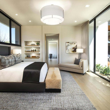
With adjacent neighbors within a fairly dense section of Paradise Valley, Arizona, C.P. Drewett sought to provide a tranquil retreat for a new-to-the-Valley surgeon and his family who were seeking the modernism they loved though had never lived in. With a goal of consuming all possible site lines and views while maintaining autonomy, a portion of the house — including the entry, office, and master bedroom wing — is subterranean. This subterranean nature of the home provides interior grandeur for guests but offers a welcoming and humble approach, fully satisfying the clients requests.
While the lot has an east-west orientation, the home was designed to capture mainly north and south light which is more desirable and soothing. The architecture’s interior loftiness is created with overlapping, undulating planes of plaster, glass, and steel. The woven nature of horizontal planes throughout the living spaces provides an uplifting sense, inviting a symphony of light to enter the space. The more voluminous public spaces are comprised of stone-clad massing elements which convert into a desert pavilion embracing the outdoor spaces. Every room opens to exterior spaces providing a dramatic embrace of home to natural environment.
Grand Award winner for Best Interior Design of a Custom Home
The material palette began with a rich, tonal, large-format Quartzite stone cladding. The stone’s tones gaveforth the rest of the material palette including a champagne-colored metal fascia, a tonal stucco system, and ceilings clad with hemlock, a tight-grained but softer wood that was tonally perfect with the rest of the materials. The interior case goods and wood-wrapped openings further contribute to the tonal harmony of architecture and materials.
Grand Award Winner for Best Indoor Outdoor Lifestyle for a Home This award-winning project was recognized at the 2020 Gold Nugget Awards with two Grand Awards, one for Best Indoor/Outdoor Lifestyle for a Home, and another for Best Interior Design of a One of a Kind or Custom Home.
At the 2020 Design Excellence Awards and Gala presented by ASID AZ North, Ownby Design received five awards for Tonal Harmony. The project was recognized for 1st place – Bathroom; 3rd place – Furniture; 1st place – Kitchen; 1st place – Outdoor Living; and 2nd place – Residence over 6,000 square ft. Congratulations to Claire Ownby, Kalysha Manzo, and the entire Ownby Design team.
Tonal Harmony was also featured on the cover of the July/August 2020 issue of Luxe Interiors + Design and received a 14-page editorial feature entitled “A Place in the Sun” within the magazine.
1