
Search results for "Overcome challenges" in Home Design Ideas

 Jamco Unlimited Inc
This was a simple bathroom remodel but with a slew of challenges to overcome. We were confined to a very small space however we needed to redesign this bathroom to fit the needs of a master bath setup. Adding the archway over the shower/tub and the custom shelving really gave some style to the room and added some much needed storage, we also tried our hardest to make the vanity a true centerpiece with the backsplash and all of the additions.

 Automation Design + Entertainment
Built within a divided basement area, a hallway ran through the center of the home theater. To overcome this challenge, custom, acoustic "barndoors" were designed that mimicked the room's panels, disguising the hallway.
 Jamco Unlimited Inc
This was a simple bathroom remodel but with a slew of challenges to overcome. We were confined to a very small space however we needed to redesign this bathroom to fit the needs of a master bath setup. Adding the archway over the shower/tub and the custom shelving really gave some style to the room and added some much needed storage, we also tried our hardest to make the vanity a true centerpiece with the backsplash and all of the additions.
Find the right local pro for your project

 Brooklyn SolarWorks
The Brooklyn Solar Canopy allows flat roof homeowners with highly obstructed roofs to proceed with solar installations by elevating modules above the roof surface. For NYC townhomes HVAC and AC units are typically solar project killers given the amount of scarce space they take up. The Brooklyn Solar Canopy overcomes this challenge by literally rising above it.
 Jamco Unlimited Inc
This was a simple bathroom remodel but with a slew of challenges to overcome. We were confined to a very small space however we needed to redesign this bathroom to fit the needs of a master bath setup. Adding the archway over the shower/tub and the custom shelving really gave some style to the room and added some much needed storage, we also tried our hardest to make the vanity a true centerpiece with the backsplash and all of the additions.

 Sandra Mijan, Dress Your Space
Climbing men from Global Views.
Please contact me if you would like to have them on your wall.
They remind of everyday triumphs and challenges life presents and the effort that it takes to overcome them.

 SKOLNICK Architecture & Design Partnership
Staircase
Photo by Peter Aaron
Inspiration for a mid-sized contemporary wooden l-shaped open staircase remodel in New York with beige walls
Inspiration for a mid-sized contemporary wooden l-shaped open staircase remodel in New York with beige walls


 Spaces Designed, Interior Design Studio, LLC
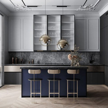
Modern, simple and with an element of pizzazz. That was the motto behind this Travis Country project. In this bathroom, our challenge was to extend the relatively small space while keeping the integrity of the existing floor tiles. Our expertise in color combinations and experience with patterns and textures helped us overcome the hurdle. The result was a clutter-free bathroom without being full-on minimalistic, and yet another happy customer.

 CG&S Design-Build
Design by Mark Lind
Project Management by Jon Strain
Photo by Patrick Wong
Integrating structural requirements and exacting finishes with the numerous unique architectural elements was a significant challenge overcome by careful planning and coordination. A high degree of detail went into planning for the rough-in stage to allow for lights in the new pair structural steel beam that separates the kitchen from the living room, for the dual custom concrete bars at the kitchen and dining areas, and for the structural supports of the awnings.

 Zieba Builders, Inc.
Our clients loved the location of their duplex home with its peak-a-boo ocean view, but their existing kitchen was not suited for their growing family. They wanted a kitchen with a coastal vibe, plenty of storage space, and an eat-in area.
We started by bringing the far wall into the kitchen space to accommodate a large panty and communication center for the family. Doing this allowed us to move the refrigerator out of the main traffic area and doubled the amount of storage space. Several new windows were added to bring in natural light. A half wall was moved to allow more countertop area and open up sight lines. The previously awkwardly shaped island was slimmed down to create better flow.
There were a few venting challenges to overcome; gas lines and plumbing had to be re-routed without disturbing the unit below. To open up sight lines, soffits were eliminated which allowed the extension of cabinets to the ceiling. To stay within the homeowner’s budget, we match existing scraped flooring by lacing in and repairing patches.
The old dining area was too small for table, so we designed and built a custom banquette to maximize the space and take advantage of the outdoor views. The overall space works for family meals as well as entertaining.
A light summer palette was used to reflect the shades of the sand, sea and sky. Even though the new kitchen is actually smaller than the original space, its now far more functional and open.
 Zieba Builders, Inc.
Our clients loved the location of their duplex home with its peak-a-boo ocean view, but their existing kitchen was not suited for their growing family. They wanted a kitchen with a coastal vibe, plenty of storage space, and an eat-in area.
We started by bringing the far wall into the kitchen space to accommodate a large panty and communication center for the family. Doing this allowed us to move the refrigerator out of the main traffic area and doubled the amount of storage space. Several new windows were added to bring in natural light. A half wall was moved to allow more countertop area and open up sight lines. The previously awkwardly shaped island was slimmed down to create better flow.
There were a few venting challenges to overcome; gas lines and plumbing had to be re-routed without disturbing the unit below. To open up sight lines, soffits were eliminated which allowed the extension of cabinets to the ceiling. To stay within the homeowner’s budget, we match existing scraped flooring by lacing in and repairing patches.
The old dining area was too small for table, so we designed and built a custom banquette to maximize the space and take advantage of the outdoor views. The overall space works for family meals as well as entertaining.
A light summer palette was used to reflect the shades of the sand, sea and sky. Even though the new kitchen is actually smaller than the original space, its now far more functional and open.

 DesignARC
The Tice Residences replace a run-down and aging duplex with two separate, modern, Santa Barbara homes. Although the unique creek-side site (which the client’s original home looked toward across a small ravine) proposed significant challenges, the clients were certain they wanted to live on the lush “Riviera” hillside.
The challenges presented were ultimately overcome through a thorough and careful study of site conditions. With an extremely efficient use of space and strategic placement of windows and decks, privacy is maintained while affording expansive views from each home to the creek, downtown Santa Barbara and Pacific Ocean beyond. Both homes appear to have far more openness than their compact lots afford.
The solution strikes a balance between enclosure and openness. Walls and landscape elements divide and protect two private domains, and are in turn, carefully penetrated to reveal views.
Both homes are variations on one consistent theme: elegant composition of contemporary, “warm” materials; strong roof planes punctuated by vertical masses; and floating decks. The project forms an intimate connection with its setting by using site-excavated stone, terracing landscape planters with native plantings, and utilizing the shade provided by its ancient Riviera Oak trees.
2012 AIA Santa Barbara Chapter Merit Award
Jim Bartsch Photography


 Spaces Designed, Interior Design Studio, LLC
Modern, simple and with an element of pizzazz. That was the motto behind this Travis Country project. In this bathroom, our challenge was to extend the relatively small space while keeping the integrity of the existing floor tiles. Our expertise in color combinations and experience with patterns and textures helped us overcome the hurdle. The result was a clutter-free bathroom without being full-on minimalistic, and yet another happy customer.
 Jamco Unlimited Inc
Our major challenge with this remodel was working with the space provided. Usually a U-shaped kitchen of this size can be comfortable and have no issues, but keeping the door on the edge of this kitchen really limited space and viability. Catering to all of the customers needs to make this kitchen useful and beautiful without impacting the walk way was a challenge we were happy to overcome.
 Zieba Builders, Inc.
Our clients loved the location of their duplex home with its peak-a-boo ocean view, but their existing kitchen was not suited for their growing family. They wanted a kitchen with a coastal vibe, plenty of storage space, and an eat-in area.
We started by bringing the far wall into the kitchen space to accommodate a large panty and communication center for the family. Doing this allowed us to move the refrigerator out of the main traffic area and doubled the amount of storage space. Several new windows were added to bring in natural light. A half wall was moved to allow more countertop area and open up sight lines. The previously awkwardly shaped island was slimmed down to create better flow.
There were a few venting challenges to overcome; gas lines and plumbing had to be re-routed without disturbing the unit below. To open up sight lines, soffits were eliminated which allowed the extension of cabinets to the ceiling. To stay within the homeowner’s budget, we match existing scraped flooring by lacing in and repairing patches.
The old dining area was too small for table, so we designed and built a custom banquette to maximize the space and take advantage of the outdoor views. The overall space works for family meals as well as entertaining.
A light summer palette was used to reflect the shades of the sand, sea and sky. Even though the new kitchen is actually smaller than the original space, its now far more functional and open.

 2 J's & Sons
This project went from bare ground to a lush green paradise. The slope of the yard presented some drainage challenges which were overcome with river rock. The homeowners love the river rock because it cuts down on mowing some of their fairly large yard.
Flag Stone was used for stepping stones to make walking over the river rock easier and much safer.

 Stone's Throw Builders
The juxtaposition of raw, weathered and finished woods with sleek whites, mixed metals and soft textured elements strike a fabulous balance between industrial, rustic and glamorous – exactly what the designers envisioned for this dream retreat. This unique home’s design combines recycled shipping containers with traditional stick-building methods and resulted in a luxury hybrid home, inside and out. The design team was particularly challenged with overcoming various preconceived notions about containers to truly create something new, luxurious and sustainable.

 Harris Household
The porch to our home feels like a cozy little nest. My husband and I have had many moments of drinking beer or wine here while dreaming up how we will fix something or overcome a challenge we ran into while restoring our home. The sculptural cacti in brass pots are complimentary in color to the house, and provide extra security near our window. The pressed stone concrete was original to the house and we love it!
Photo credit: San Antonio Board of Realtors/ Sunny Harris
 Ciarcelluti Mathers Architecture
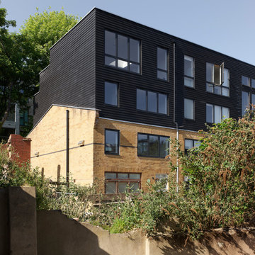
This unique project, in the heart of London Fields' creative sector, involved adjacent live-work units owned individually by a furniture maker and a group of video makers. Although experts in their respective fields, neither had experience with multi-unit development. The project presented several challenges and concerns from our clients, which we addressed with creative solutions, expertise, flexibility and collaboration.
The pair of property owners had become accidental developers by virtue of opportunity. We guided them through a complex process by helping them plan effectively, overcoming several obstacles, and ultimately leading them towards a successful outcome.
Our client's primary challenge was maximising the development potential. The two properties are part of a terrace of four. The other two owners had already added an extra storey. The new volume established a precedent for a volume the planners wanted to complete. Maximising the development potential would require carefully considering the limitations of the established volume to ensure a design that would captivate the target market of young and creative professionals.
To overcome these challenges, we took a comprehensive approach that integrated functional and aesthetic considerations. We first focused on reimagining the interior layout, utilising our expertise to optimise space and create a seamless flow within the units. This involved carefully addressing the planning limitations at the front, resulting in a stepped profile, which had initially posed limits to potential uses.
3