
Search results for "Overcome challenges" in Home Design Ideas

 Zelaya Properties LLC
We used: Custom cherry cabinetry in Arts & Crafts Shaker style by Kabinart in Boulder and Espresso stains. Liberty Hardware Venetian bronze 1-1/2" cabinet knobs. KitchenAid Architect II Series 22 CF counter-depth French door refrigerator. KitchenAid Architect Series II 27" convection single wall oven. KitchenAid 36" 6-burner dual fuel freestanding commercial-style range. KitchenAid Architect II Series 24" dishwasher. Sharp Insight Pro Series 24" built-in microwave drawer (Model #KB6524PS). Crystorama Solaris 12" wide pendant lights in English bronze. Granite countertops in Brown Fantasy. 3"x6" polished marble backsplash.
Paint colors:
Walls: Glidden Silver Cloud 30YY 63/024
Ceilings/Trims/Doors: Glidden Swan White GLC23
Robert B. Narod Photography

 Moderne Builders
Gorgeous master bath with dramatic retro "wave" tile. Peak Photography
Example of a 1950s bathroom design in Los Angeles
Example of a 1950s bathroom design in Los Angeles

 DC Clymens Construction
The project had some challenges to overcome. The space consisted of three small rooms and low ceilings. With the removal of the interior walls we were able to bring the light into the center of the space
Find the right local pro for your project

 Estes Builders
A quick glance at the new golf course home on Bainbridge Island reveals on-trend vertical siding and black window frames, a fresh, modern take on traditional farmhouse styling. But it’s the little details—and the challenges overcome—that truly set this home apart.
 Creative Cabinets and Fine Finishes, LLC
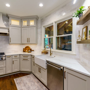
One of the main challenges was the presence of an angled wall along the perimeter, which complicated the process of enlarging the kitchen island without obstructing movement. To overcome this, we modified the cabinetry layout. By straightening the cabinet run so that it terminated directly into the angled wall, we optimized the flow and functionality of the space. This adjustment not only improved circulation but also presented a new design challenge: where to stop the backsplash.
 Estes Builders
A quick glance at the new golf course home on Bainbridge Island reveals on-trend vertical siding and black window frames, a fresh, modern take on traditional farmhouse styling. But it’s the little details—and the challenges overcome—that truly set this home apart.

 DesignARC
The Tice Residences replace a run-down and aging duplex with two separate, modern, Santa Barbara homes. Although the unique creek-side site (which the client’s original home looked toward across a small ravine) proposed significant challenges, the clients were certain they wanted to live on the lush “Riviera” hillside.
The challenges presented were ultimately overcome through a thorough and careful study of site conditions. With an extremely efficient use of space and strategic placement of windows and decks, privacy is maintained while affording expansive views from each home to the creek, downtown Santa Barbara and Pacific Ocean beyond. Both homes appear to have far more openness than their compact lots afford.
The solution strikes a balance between enclosure and openness. Walls and landscape elements divide and protect two private domains, and are in turn, carefully penetrated to reveal views.
Both homes are variations on one consistent theme: elegant composition of contemporary, “warm” materials; strong roof planes punctuated by vertical masses; and floating decks. The project forms an intimate connection with its setting by using site-excavated stone, terracing landscape planters with native plantings, and utilizing the shade provided by its ancient Riviera Oak trees.
2012 AIA Santa Barbara Chapter Merit Award
Jim Bartsch Photography


 Fredman Design Group
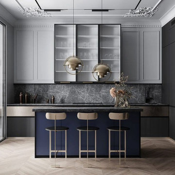
The juxtaposition of raw, weathered and finished woods with sleek whites, mixed metals and soft textured elements strike a fabulous balance between industrial, rustic and glamorous – exactly what the designers envisioned for this dream retreat. This unique home’s design combines recycled shipping containers with traditional stick-building methods and resulted in a luxury hybrid home, inside and out. The design team was particularly challenged with overcoming various preconceived notions about containers to truly create something new, luxurious and sustainable.
 DesignARC
The Tice Residences replace a run-down and aging duplex with two separate, modern, Santa Barbara homes. Although the unique creek-side site (which the client’s original home looked toward across a small ravine) proposed significant challenges, the clients were certain they wanted to live on the lush “Riviera” hillside.
The challenges presented were ultimately overcome through a thorough and careful study of site conditions. With an extremely efficient use of space and strategic placement of windows and decks, privacy is maintained while affording expansive views from each home to the creek, downtown Santa Barbara and Pacific Ocean beyond. Both homes appear to have far more openness than their compact lots afford.
The solution strikes a balance between enclosure and openness. Walls and landscape elements divide and protect two private domains, and are in turn, carefully penetrated to reveal views.
Both homes are variations on one consistent theme: elegant composition of contemporary, “warm” materials; strong roof planes punctuated by vertical masses; and floating decks. The project forms an intimate connection with its setting by using site-excavated stone, terracing landscape planters with native plantings, and utilizing the shade provided by its ancient Riviera Oak trees.
2012 AIA Santa Barbara Chapter Merit Award
Jim Bartsch Photography
 ONE ELEVEN
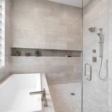
We developed a design that fully met the desires of a spacious, airy, light filled home incorporating Universal Design features that blend seamlessly adding beauty to the Minimalist Scandinavian concept.
 Fredman Design Group
The juxtaposition of raw, weathered and finished woods with sleek whites, mixed metals and soft textured elements strike a fabulous balance between industrial, rustic and glamorous – exactly what the designers envisioned for this dream retreat. This unique home’s design combines recycled shipping containers with traditional stick-building methods and resulted in a luxury hybrid home, inside and out. The design team was particularly challenged with overcoming various preconceived notions about containers to truly create something new, luxurious and sustainable.
 DesignARC
The Tice Residences replace a run-down and aging duplex with two separate, modern, Santa Barbara homes. Although the unique creek-side site (which the client’s original home looked toward across a small ravine) proposed significant challenges, the clients were certain they wanted to live on the lush “Riviera” hillside.
The challenges presented were ultimately overcome through a thorough and careful study of site conditions. With an extremely efficient use of space and strategic placement of windows and decks, privacy is maintained while affording expansive views from each home to the creek, downtown Santa Barbara and Pacific Ocean beyond. Both homes appear to have far more openness than their compact lots afford.
The solution strikes a balance between enclosure and openness. Walls and landscape elements divide and protect two private domains, and are in turn, carefully penetrated to reveal views.
Both homes are variations on one consistent theme: elegant composition of contemporary, “warm” materials; strong roof planes punctuated by vertical masses; and floating decks. The project forms an intimate connection with its setting by using site-excavated stone, terracing landscape planters with native plantings, and utilizing the shade provided by its ancient Riviera Oak trees.
2012 AIA Santa Barbara Chapter Merit Award
Jim Bartsch Photography

 One Week Bath, Inc.
Everyone asks us "How can I make my small bathroom look bigger?" It's a challenge a lot of homeowners face and want to overcome! So we have put together the best ways to make your bathroom go from tiny to big!
 One Week Bath, Inc.
Everyone asks us "How can I make my small bathroom look bigger?" It's a challenge a lot of homeowners face and want to overcome! So we have put together the best ways to make your bathroom go from tiny to big!

 Jamco Unlimited Inc
Our major challenge with this remodel was working with the space provided. Usually a U-shaped kitchen of this size can be comfortable and have no issues, but keeping the door on the edge of this kitchen really limited space and viability. Catering to all of the customers needs to make this kitchen useful and beautiful without impacting the walk way was a challenge we were happy to overcome.
 One Week Bath, Inc.
Everyone asks us "How can I make my small bathroom look bigger?" It's a challenge a lot of homeowners face and want to overcome! So we have put together the best ways to make your bathroom go from tiny to big!

 Adrienne DeRosa
Photo: Adrienne DeRosa © 2015 Houzz
It was of utmost importance to the homeowners to find a space that could highlight their extensive art collection. Representing an array of mediums, much of the collection is sourced from local galleries, such as Medelson Gallery, as well as Weisshouse. "I feel the artwork makes it a home," says Stacy. Here in the entry hall, Weiss thoughtfully placed large-scale works to bring intimacy into the grand space. "It adds a personal touch that you cannot achieve otherwise," she states.
While at times it can be a challenge to create balance in such an architectural environment, the homeowners have overcome this with their choice of furnishings. Unified through color and form, modern chairs punctuate the walkway. Their geometric designs give them an architectural quality that supports the environment without overwhelming it. With a mixture of new and vintage pieces, the look is effortless and chic.
Armchairs: Gerrit Rietveld for Cassina

 Way-Mar Inc.
As with most older homes, there were challenges to overcome for Paul and site foreman, Harold Lichty. The load bearing wall dividing the space was removed and replaced by a steel beam while the floor joists were sistered and leveled. A new custom staircase was built entirely on site to fit the narrow width and was extended to reach the lower elevation of the new floor. They were also able to gain some head clearance in the stairwell without affecting the existing upper level stairs.
photo: jeff brubacher

 REDinterior
On this remodel, my biggest challenge/goal was to ensure that the kitchen looked like one space. This was challenging because we expanded the kitchen into the dining space that had a 3' ceiling height difference and windows that we didn't want to cover. To overcome this hurdle, I designed a hanging soffit that was supported by oil rubbed bronze rods, which created a lighter look and allowed the light from the windows to be unobstructed.
 Jamco Unlimited Inc
This was a simple bathroom remodel but with a slew of challenges to overcome. We were confined to a very small space however we needed to redesign this bathroom to fit the needs of a master bath setup. Adding the archway over the shower/tub and the custom shelving really gave some style to the room and added some much needed storage, we also tried our hardest to make the vanity a true centerpiece with the backsplash and all of the additions.
2