
Search results for "Overwhelming task" in Home Design Ideas
 House of Meraki
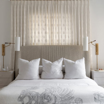
A white and neutral transitional bedroom design combines the timeless elegance of a neutral color palette with elements of both traditional and contemporary styles. The goal is to create a serene and soothing environment with a seamless blend of classic and modern elements. Soft white walls also help reflect natural light, making the room feel more spacious and airy.The bed is the focal point and features a simple yet elegant frame with clean lines and upholstered headboard in a light neutral velvet.The light-colored linen bedding is topped with an Hermes wool blanket, adding visual interest without overwhelming the space. The custom window treatments are kept light and airy to maximize natural light, with Hunter Douglas shades for privacy. The brass and stone chandelier by Kelly Wearstler for Visual Comfort and the pivoting sconces provide both task and mood lighting.
 Shuler Architecture
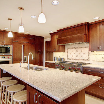
This classic 1970's rambler was purchased by our clients as their 'forever' retirement home and as a gathering place for their large, extended family. Situated on a large, verdant lot, the house was burdened with extremely dated finishes and poorly conceived spaces. These flaws were more than offset by the overwhelming advantages of a single level plan and spectacular sunset views. Weighing their options, our clients executed their purchase fully intending to hire us to immediately remodel this structure for them.
Our first task was to open up this plan and give the house a fresh, contemporary look that emphasizes views toward Lake Washington and the Olympic Mountains in the distance. Our initial response was to recreate our favorite Great Room plan. This started with the elimination of a large, masonry fireplace awkwardly located in the middle of the plan and to then tear out all the walls. We then flipped the Kitchen and Dining Room and inserted a walk-in pantry between the Garage and new Kitchen location.
While our clients' initial intention was to execute a simple Kitchen remodel, the project scope grew during the design phase. We convinced them that the original ill-conceived entry needed a make-over as well as both bathrooms on the main level. Now, instead of an entry sequence that looks like an afterthought, there is a formal court on axis with an entry art wall that arrests views before moving into the heart of the plan. The master suite was updated by sliding the wall between the bedroom and Great Room into the family area and then placing closets along this wall - in essence, using these closets as an acoustical buffer between the Master Suite and the Great Room. Moving these closets then freed up space for a 5-piece master bath, a more efficient hall bath and a stacking washer/dryer in a closet at the top of the stairs.
 Crystal Kitchen + Bath
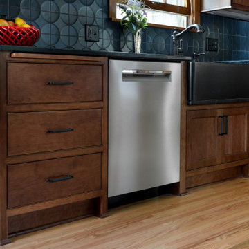
The goal for this 1939 Tudor-style story-and-a-half home was to create a kitchen that offered the conveniences, storage, and performance of a modern workspace while preserving the warmth, craftsmanship, and vintage charm that made the home special. The client, an avid home cook, wanted the room to feel as though it had always belonged to the house, with thoughtful upgrades that respected the original architecture rather than competing with it. Just as important, she needed a more efficient layout with enough storage for small appliances, so everyday cooking would no longer require carrying items up from the lower level.
Several existing conditions shaped the design approach. The kitchen retained original, amber-stained birch woodwork that the client wished to keep, and the compact footprint was interrupted by six doorways and two windows, none of which were to be moved, altered, or replaced. A previous flooring update had left the door casings undercut too short, creating visible gaps where the casing met the floor. The existing vintage 40-inch range also lacked proper ventilation, yet the client wished to accommodate a refrigerator, dishwasher, cooktop, double ovens, built-in microwave, and effective venting above the cooktop into the new kitchen layout.
To honor the original millwork, beaded inset-style cherry cabinetry was selected in a soft, hand-rubbed finish that will deepen over time and develop a natural patina. Charcoal-gray soapstone countertops complement the cabinetry while reinforcing the historic character of the home with an organic, timeworn texture. The former breakfast nook was transformed into a butler’s pantry, adding valuable base cabinet storage and expanded work surfaces for frequently used small appliances. Also in the butler’s pantry, a single upper cabinet was paired with open shelves to give an open, airy feeling while adding character and practical storage. A classic single-bowl apron-front workstation sink contributes both period-appropriate character and practical prep and cleanup function.
Because the home’s openings were such a defining feature, the design worked within the existing architecture instead of altering it. Custom plinth blocks were created for each doorway to extend the original casing gracefully down to the new natural red oak flooring, resolving the earlier construction issue while adding a detail that feels authentic to the age of the house. Despite the number of door and window openings, the new layout provides a significantly more functional, built-in kitchen with an improved work triangle for serious cooking.
Appliance placement was carefully planned to deliver the requested performance without overwhelming the small room. Three cooking functions (double ovens & microwave) were consolidated into one location with a GE Café double oven featuring Advantium Technology, while the client’s compact 31-inch refrigerator was reused to preserve space. A sleek 30-inch induction cooktop provides efficient cooking, and a Vent-A-Hood ARS ductless vent hood supplies needed ventilation without requiring a duct run to the exterior.
The finish palette balances richness, texture, and historical sensitivity. A deeply textured navy backsplash tile adds depth and dramatic shadow play against the soapstone, while wallpaper in the back entry echoes the tile’s geometric pattern to visually connect the adjoining spaces. Oil-rubbed bronze cabinet hardware and light fixtures enhance the warmth of the cherry cabinetry and complete the antique-inspired feel.
Lighting was layered to make the compact kitchen brighter, more useful, and more inviting. Vintage-style semi-flush ceiling fixtures establish the overall tone, while dimmable puck lights highlight select areas and undercabinet task lighting keeps work surfaces well illuminated.
The completed kitchen now feels both highly functional and deeply rooted in the home’s history. Rich cherry cabinetry, velvety soapstone, natural red oak flooring, navy tile, bronze accents, and carefully preserved birch trim work together to create a warm, cohesive space that celebrates timeless craftsmanship. By increasing storage, improving workflow, integrating modern appliances, and respecting the Tudor home’s original character, the design achieves the client’s vision: a kitchen that feels personal, practical, historically appropriate, and as though it has always been there.
Find the right local pro for your project
 House of Meraki
A white and neutral transitional bedroom design combines the timeless elegance of a neutral color palette with elements of both traditional and contemporary styles. The goal is to create a serene and soothing environment with a seamless blend of classic and modern elements. Soft white walls also help reflect natural light, making the room feel more spacious and airy.The bed is the focal point and features a simple yet elegant frame with clean lines and upholstered headboard in a light neutral velvet.The light-colored linen bedding is topped with an Hermes wool blanket, adding visual interest without overwhelming the space. The custom window treatments are kept light and airy to maximize natural light, with Hunter Douglas shades for privacy. The brass and stone chandelier by Kelly Wearstler for Visual Comfort and the pivoting sconces provide both task and mood lighting.
 User
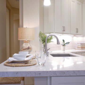
UserQuilt style random pattern backsplash accents the kitchen without overwhelming. Under cabinet lighting highlights coordinating backsplash tile and provides additional task lighting.
Photos by Mario Santana of Vision Aloft Productions
 Design Vision Studio
James Latta of Rancho Images -
MOVIE COLONY
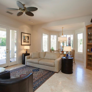
When we met these wonderful Palm Springs clients, they were overwhelmed with the task of downsizing their vast collection of fine art, antiques, and sculptures. The problem was it was an amazing collection so the task was not easy. What do we keep? What do we let go? Design Vision Studio to the rescue! We realized that to really showcase these beautiful pieces, we needed to pick and choose the right ones and ensure they were showcased properly.
Lighting was improved throughout the home. We installed and updated recessed lights and cabinet lighting. Outdated ceiling fans and chandeliers were replaced. The walls were painted with a warm, soft ivory color and the moldings, door and windows also were given a complimentary fresh coat of paint. The overall impact was a clean bright room.
We replaced the outdated oak front doors with modern glass doors. The fireplace received a facelift with new tile, a custom mantle and crushed glass to replace the old fake logs. Custom draperies frame the views. The dining room was brought to life with recycled magazine grass cloth wallpaper on the ceiling, new red leather upholstery on the chairs, and a custom red paint treatment on the new chandelier to tie it all together. (The chandelier was actually powder-coated at an auto paint shop!)
Once crammed with too much, too little and no style, the Asian Modern Bedroom Suite is now a DREAM COME TRUE. We even incorporated their much loved (yet horribly out-of-date) small sofa by recovering it with teal velvet to give it new life.
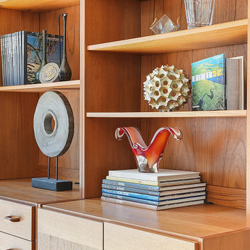
Underutilized hall coat closets were removed and transformed with custom cabinetry to create art niches. We also designed a custom built-in media cabinet with "breathing room" to display more of their treasures. The new furniture was intentionally selected with modern lines to give the rooms layers and texture.
When we suggested a crystal ship chandelier to our clients, they wanted US to walk the plank. Luckily, after months of consideration, the tides turned and they gained the confidence to follow our suggestion. Now their powder room is one of their favorite spaces in their home.
Our clients (and all of their friends) are amazed at the total transformation of this home and with how well it "fits" them. We love the results too. This home now tells a story through their beautiful life-long collections. The design may have a gallery look but the feeling is all comfort and style.
 Lori Delisle Interior Design & Decorating
My client's mother had a love for all things 60's, 70's & 80's. Her home was overflowing with original pieces in every corner, on every wall and in every nook and cranny. It was a crazy mish mosh of pieces and styles. When my clients decided to sell their parent's beloved home the task of making the craziness look welcoming seemed overwhelming but I knew that it was not only do-able but also had the potential to look absolutely amazing.
We did a massive, and when I say massive, I mean MASSIVE, decluttering including an estate sale, many donation runs and haulers. Then it was time to use the special pieces I had reserved, along with modern new ones, some repairs and fresh paint here and there to revive this special gem in Willow Glen, CA for a new home owner to love.
 Shuler Architecture
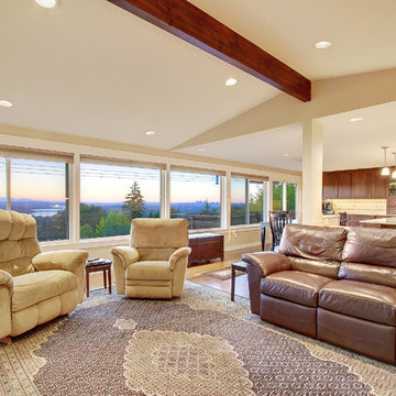
This classic 1970's rambler was purchased by our clients as their 'forever' retirement home and as a gathering place for their large, extended family. Situated on a large, verdant lot, the house was burdened with extremely dated finishes and poorly conceived spaces. These flaws were more than offset by the overwhelming advantages of a single level plan and spectacular sunset views. Weighing their options, our clients executed their purchase fully intending to hire us to immediately remodel this structure for them.
Our first task was to open up this plan and give the house a fresh, contemporary look that emphasizes views toward Lake Washington and the Olympic Mountains in the distance. Our initial response was to recreate our favorite Great Room plan. This started with the elimination of a large, masonry fireplace awkwardly located in the middle of the plan and to then tear out all the walls. We then flipped the Kitchen and Dining Room and inserted a walk-in pantry between the Garage and new Kitchen location.
While our clients' initial intention was to execute a simple Kitchen remodel, the project scope grew during the design phase. We convinced them that the original ill-conceived entry needed a make-over as well as both bathrooms on the main level. Now, instead of an entry sequence that looks like an afterthought, there is a formal court on axis with an entry art wall that arrests views before moving into the heart of the plan. The master suite was updated by sliding the wall between the bedroom and Great Room into the family area and then placing closets along this wall - in essence, using these closets as an acoustical buffer between the Master Suite and the Great Room. Moving these closets then freed up space for a 5-piece master bath, a more efficient hall bath and a stacking washer/dryer in a closet at the top of the stairs.
 lavish
This remarkable renovation reimagines an entire lower level into a multi-room retreat that reads less like a basement and more like a private members' club. Every inch was designed with intention — layering bold textures, curated art, and a confident mix of moody and luminous palettes to create a space that is simultaneously dramatic and deeply livable.
Main Living Area
The heart of this renovation is a sweeping living room where refined restraint meets expressive design. Walls are finished with architectural fluted millwork banding near the ceiling — a detail that adds rhythm and sophistication without overwhelming the space. Flanking panels of delicately patterned textured wallpaper frame a striking large-scale abstract canvas in black, white, and gold, which serves as both the focal point and the color story for the entire room. Paired frosted glass capsule sconces with warm brass fittings illuminate the artwork from either side, casting a soft, gallery-like glow.
The furniture selection is equally considered: a generous cream linen sofa anchors the primary seating area, complemented by a pair of sculptural dark leather swivel lounge chairs with a stone travertine pedestal side table nestled between them. A plush velvet ottoman, a brass arc floor lamp, and a soft gray area rug over wide-plank hardwood floors complete the composition with quiet luxury.
Bar & Entertainment Area
The bar is nothing short of a showpiece. Custom cabinetry in a sophisticated greige-gray, featuring a mix of flat-panel and reeded/fluted door fronts, is crowned with a jaw-dropping geometric faceted tile backsplash. The tile — a mosaic of black, white, and metallic stone set in a kaleidoscopic diamond pattern — catches the light and shifts dramatically depending on the angle. A pair of oversized brass dome pendant lights hang above a sleek island topped in richly veined dark marble, providing both task lighting and a glamorous focal point.
Open shelving built into the backsplash wall displays sculptural art objects — including a carved Buddha head and white abstract sculptures — reinforcing the home's gallery aesthetic. A brass spring-coil faucet, integrated beverage refrigerator, and patterned swirl-print ottomans tucked beneath the island make this bar equally functional and unforgettable.
Game Room
A complete tonal departure, the game room embraces deep, moody drama through floor-to-ceiling dark olive green walls and ceiling. A large-format sage green square tile accent wall grounds a wall-mounted flat screen TV, while a mahogany billiard table with slate blue felt takes center stage on a vintage-style area rug. A sculptural brass sputnik chandelier overhead adds a touch of glam that keeps the space from feeling too heavy. Floor-to-ceiling windows flood the room with natural light and offer serene woodland views — a beautiful contrast to the room's intentionally dark interior palette.
Sitting Room
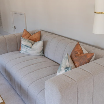
A quieter counterpart to the more dramatic spaces, the sitting room offers a warm, neutral sanctuary. A modern channel-tufted sofa in warm gray is dressed with rust terracotta and watercolor sage pillows. A sculptural tub chair in textured charcoal fabric, a pair of curved bronze ottomans with ribbed white upholstery, and a small dark marble side table complete a seating vignette that feels curated and calm.
Signature Art Installation
Perhaps the most conversation-starting element in the entire project is a bespoke wall sculpture: dozens of white ceramic pods with gold-leafed interiors, arranged in a sweeping, wave-like pattern across a stairwell or hallway wall. The installation bridges art and architecture, transforming a transitional space into a destination.
 Shuler Architecture
This classic 1970's rambler was purchased by our clients as their 'forever' retirement home and as a gathering place for their large, extended family. Situated on a large, verdant lot, the house was burdened with extremely dated finishes and poorly conceived spaces. These flaws were more than offset by the overwhelming advantages of a single level plan and spectacular sunset views. Weighing their options, our clients executed their purchase fully intending to hire us to immediately remodel this structure for them.
Our first task was to open up this plan and give the house a fresh, contemporary look that emphasizes views toward Lake Washington and the Olympic Mountains in the distance. Our initial response was to recreate our favorite Great Room plan. This started with the elimination of a large, masonry fireplace awkwardly located in the middle of the plan and to then tear out all the walls. We then flipped the Kitchen and Dining Room and inserted a walk-in pantry between the Garage and new Kitchen location.
While our clients' initial intention was to execute a simple Kitchen remodel, the project scope grew during the design phase. We convinced them that the original ill-conceived entry needed a make-over as well as both bathrooms on the main level. Now, instead of an entry sequence that looks like an afterthought, there is a formal court on axis with an entry art wall that arrests views before moving into the heart of the plan. The master suite was updated by sliding the wall between the bedroom and Great Room into the family area and then placing closets along this wall - in essence, using these closets as an acoustical buffer between the Master Suite and the Great Room. Moving these closets then freed up space for a 5-piece master bath, a more efficient hall bath and a stacking washer/dryer in a closet at the top of the stairs.
 JLC Designs
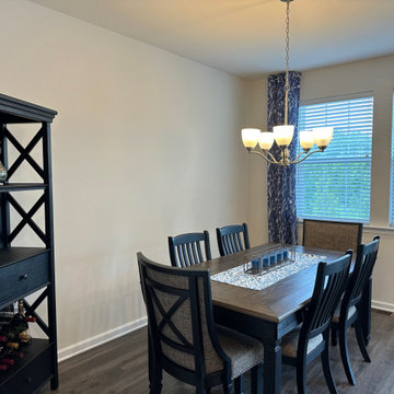
BEFORE: This new build was boring and left the homeowner uninspired. The task of choosing paint for every single room was overwhelming for her. We stepped in and made color selection, statement lighting, and a beautiful bold accent wall that she absolutely loves.
 Crystal Kitchen + Bath
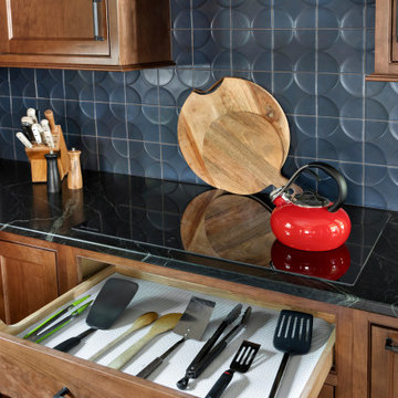
The goal for this 1939 Tudor-style story-and-a-half home was to create a kitchen that offered the conveniences, storage, and performance of a modern workspace while preserving the warmth, craftsmanship, and vintage charm that made the home special. The client, an avid home cook, wanted the room to feel as though it had always belonged to the house, with thoughtful upgrades that respected the original architecture rather than competing with it. Just as important, she needed a more efficient layout with enough storage for small appliances, so everyday cooking would no longer require carrying items up from the lower level.
Several existing conditions shaped the design approach. The kitchen retained original, amber-stained birch woodwork that the client wished to keep, and the compact footprint was interrupted by six doorways and two windows, none of which were to be moved, altered, or replaced. A previous flooring update had left the door casings undercut too short, creating visible gaps where the casing met the floor. The existing vintage 40-inch range also lacked proper ventilation, yet the client wished to accommodate a refrigerator, dishwasher, cooktop, double ovens, built-in microwave, and effective venting above the cooktop into the new kitchen layout.
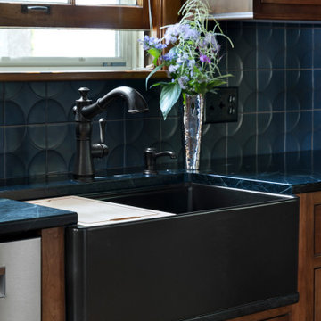
To honor the original millwork, beaded inset-style cherry cabinetry was selected in a soft, hand-rubbed finish that will deepen over time and develop a natural patina. Charcoal-gray soapstone countertops complement the cabinetry while reinforcing the historic character of the home with an organic, timeworn texture. The former breakfast nook was transformed into a butler’s pantry, adding valuable base cabinet storage and expanded work surfaces for frequently used small appliances. Also in the butler’s pantry, a single upper cabinet was paired with open shelves to give an open, airy feeling while adding character and practical storage. A classic single-bowl apron-front workstation sink contributes both period-appropriate character and practical prep and cleanup function.
Because the home’s openings were such a defining feature, the design worked within the existing architecture instead of altering it. Custom plinth blocks were created for each doorway to extend the original casing gracefully down to the new natural red oak flooring, resolving the earlier construction issue while adding a detail that feels authentic to the age of the house. Despite the number of door and window openings, the new layout provides a significantly more functional, built-in kitchen with an improved work triangle for serious cooking.
Appliance placement was carefully planned to deliver the requested performance without overwhelming the small room. Three cooking functions (double ovens & microwave) were consolidated into one location with a GE Café double oven featuring Advantium Technology, while the client’s compact 31-inch refrigerator was reused to preserve space. A sleek 30-inch induction cooktop provides efficient cooking, and a Vent-A-Hood ARS ductless vent hood supplies needed ventilation without requiring a duct run to the exterior.
The finish palette balances richness, texture, and historical sensitivity. A deeply textured navy backsplash tile adds depth and dramatic shadow play against the soapstone, while wallpaper in the back entry echoes the tile’s geometric pattern to visually connect the adjoining spaces. Oil-rubbed bronze cabinet hardware and light fixtures enhance the warmth of the cherry cabinetry and complete the antique-inspired feel.
Lighting was layered to make the compact kitchen brighter, more useful, and more inviting. Vintage-style semi-flush ceiling fixtures establish the overall tone, while dimmable puck lights highlight select areas and undercabinet task lighting keeps work surfaces well illuminated.
The completed kitchen now feels both highly functional and deeply rooted in the home’s history. Rich cherry cabinetry, velvety soapstone, natural red oak flooring, navy tile, bronze accents, and carefully preserved birch trim work together to create a warm, cohesive space that celebrates timeless craftsmanship. By increasing storage, improving workflow, integrating modern appliances, and respecting the Tudor home’s original character, the design achieves the client’s vision: a kitchen that feels personal, practical, historically appropriate, and as though it has always been there.
 Crystal Kitchen + Bath
The goal for this 1939 Tudor-style story-and-a-half home was to create a kitchen that offered the conveniences, storage, and performance of a modern workspace while preserving the warmth, craftsmanship, and vintage charm that made the home special. The client, an avid home cook, wanted the room to feel as though it had always belonged to the house, with thoughtful upgrades that respected the original architecture rather than competing with it. Just as important, she needed a more efficient layout with enough storage for small appliances, so everyday cooking would no longer require carrying items up from the lower level.
Several existing conditions shaped the design approach. The kitchen retained original, amber-stained birch woodwork that the client wished to keep, and the compact footprint was interrupted by six doorways and two windows, none of which were to be moved, altered, or replaced. A previous flooring update had left the door casings undercut too short, creating visible gaps where the casing met the floor. The existing vintage 40-inch range also lacked proper ventilation, yet the client wished to accommodate a refrigerator, dishwasher, cooktop, double ovens, built-in microwave, and effective venting above the cooktop into the new kitchen layout.
To honor the original millwork, beaded inset-style cherry cabinetry was selected in a soft, hand-rubbed finish that will deepen over time and develop a natural patina. Charcoal-gray soapstone countertops complement the cabinetry while reinforcing the historic character of the home with an organic, timeworn texture. The former breakfast nook was transformed into a butler’s pantry, adding valuable base cabinet storage and expanded work surfaces for frequently used small appliances. Also in the butler’s pantry, a single upper cabinet was paired with open shelves to give an open, airy feeling while adding character and practical storage. A classic single-bowl apron-front workstation sink contributes both period-appropriate character and practical prep and cleanup function.
Because the home’s openings were such a defining feature, the design worked within the existing architecture instead of altering it. Custom plinth blocks were created for each doorway to extend the original casing gracefully down to the new natural red oak flooring, resolving the earlier construction issue while adding a detail that feels authentic to the age of the house. Despite the number of door and window openings, the new layout provides a significantly more functional, built-in kitchen with an improved work triangle for serious cooking.
Appliance placement was carefully planned to deliver the requested performance without overwhelming the small room. Three cooking functions (double ovens & microwave) were consolidated into one location with a GE Café double oven featuring Advantium Technology, while the client’s compact 31-inch refrigerator was reused to preserve space. A sleek 30-inch induction cooktop provides efficient cooking, and a Vent-A-Hood ARS ductless vent hood supplies needed ventilation without requiring a duct run to the exterior.
The finish palette balances richness, texture, and historical sensitivity. A deeply textured navy backsplash tile adds depth and dramatic shadow play against the soapstone, while wallpaper in the back entry echoes the tile’s geometric pattern to visually connect the adjoining spaces. Oil-rubbed bronze cabinet hardware and light fixtures enhance the warmth of the cherry cabinetry and complete the antique-inspired feel.
Lighting was layered to make the compact kitchen brighter, more useful, and more inviting. Vintage-style semi-flush ceiling fixtures establish the overall tone, while dimmable puck lights highlight select areas and undercabinet task lighting keeps work surfaces well illuminated.
The completed kitchen now feels both highly functional and deeply rooted in the home’s history. Rich cherry cabinetry, velvety soapstone, natural red oak flooring, navy tile, bronze accents, and carefully preserved birch trim work together to create a warm, cohesive space that celebrates timeless craftsmanship. By increasing storage, improving workflow, integrating modern appliances, and respecting the Tudor home’s original character, the design achieves the client’s vision: a kitchen that feels personal, practical, historically appropriate, and as though it has always been there.
 Design Vision Studio
James Latta of Rancho Images -
MOVIE COLONY
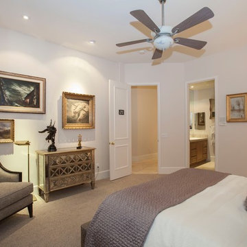
When we met these wonderful Palm Springs clients, they were overwhelmed with the task of downsizing their vast collection of fine art, antiques, and sculptures. The problem was it was an amazing collection so the task was not easy. What do we keep? What do we let go? Design Vision Studio to the rescue! We realized that to really showcase these beautiful pieces, we needed to pick and choose the right ones and ensure they were showcased properly.
Lighting was improved throughout the home. We installed and updated recessed lights and cabinet lighting. Outdated ceiling fans and chandeliers were replaced. The walls were painted with a warm, soft ivory color and the moldings, door and windows also were given a complimentary fresh coat of paint. The overall impact was a clean bright room.
We replaced the outdated oak front doors with modern glass doors. The fireplace received a facelift with new tile, a custom mantle and crushed glass to replace the old fake logs. Custom draperies frame the views. The dining room was brought to life with recycled magazine grass cloth wallpaper on the ceiling, new red leather upholstery on the chairs, and a custom red paint treatment on the new chandelier to tie it all together. (The chandelier was actually powder-coated at an auto paint shop!)
Once crammed with too much, too little and no style, the Asian Modern Bedroom Suite is now a DREAM COME TRUE. We even incorporated their much loved (yet horribly out-of-date) small sofa by recovering it with teal velvet to give it new life.
Underutilized hall coat closets were removed and transformed with custom cabinetry to create art niches. We also designed a custom built-in media cabinet with "breathing room" to display more of their treasures. The new furniture was intentionally selected with modern lines to give the rooms layers and texture.
When we suggested a crystal ship chandelier to our clients, they wanted US to walk the plank. Luckily, after months of consideration, the tides turned and they gained the confidence to follow our suggestion. Now their powder room is one of their favorite spaces in their home.
Our clients (and all of their friends) are amazed at the total transformation of this home and with how well it "fits" them. We love the results too. This home now tells a story through their beautiful life-long collections. The design may have a gallery look but the feeling is all comfort and style.
 Lori Delisle Interior Design & Decorating
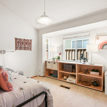
My client's mother had a love for all things 60's, 70's & 80's. Her home was overflowing with original pieces in every corner, on every wall and in every nook and cranny. It was a crazy mish mosh of pieces and styles. When my clients decided to sell their parent's beloved home the task of making the craziness look welcoming seemed overwhelming but I knew that it was not only do-able but also had the potential to look absolutely amazing.
We did a massive, and when I say massive, I mean MASSIVE, decluttering including an estate sale, many donation runs and haulers. Then it was time to use the special pieces I had reserved, along with modern new ones, some repairs and fresh paint here and there to revive this special gem in Willow Glen, CA for a new home owner to love.
 Meghan Carter Design Inc.
Leslie Goodwin Photography
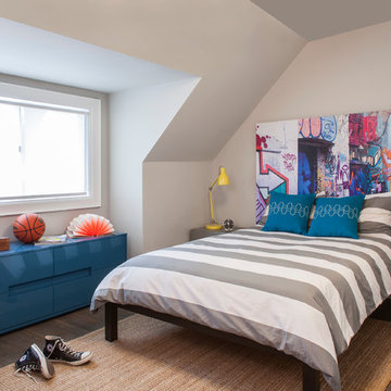
Example of a mid-sized eclectic medium tone wood floor and brown floor bedroom design in Toronto with gray walls and no fireplace
Example of a mid-sized eclectic medium tone wood floor and brown floor bedroom design in Toronto with gray walls and no fireplace
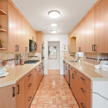 Lori Delisle Interior Design & Decorating
My client's mother had a love for all things 60's, 70's & 80's. Her home was overflowing with original pieces in every corner, on every wall and in every nook and cranny. It was a crazy mish mosh of pieces and styles. When my clients decided to sell their parent's beloved home the task of making the craziness look welcoming seemed overwhelming but I knew that it was not only do-able but also had the potential to look absolutely amazing.
We did a massive, and when I say massive, I mean MASSIVE, decluttering including an estate sale, many donation runs and haulers. Then it was time to use the special pieces I had reserved, along with modern new ones, some repairs and fresh paint here and there to revive this special gem in Willow Glen, CA for a new home owner to love.
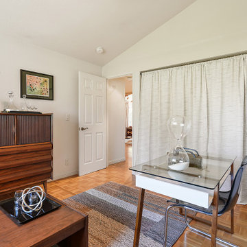 Lori Delisle Interior Design & Decorating
My client's mother had a love for all things 60's, 70's & 80's. Her home was overflowing with original pieces in every corner, on every wall and in every nook and cranny. It was a crazy mish mosh of pieces and styles. When my clients decided to sell their parent's beloved home the task of making the craziness look welcoming seemed overwhelming but I knew that it was not only do-able but also had the potential to look absolutely amazing.
We did a massive, and when I say massive, I mean MASSIVE, decluttering including an estate sale, many donation runs and haulers. Then it was time to use the special pieces I had reserved, along with modern new ones, some repairs and fresh paint here and there to revive this special gem in Willow Glen, CA for a new home owner to love.
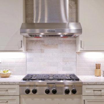 User
UserQuilt style random pattern backsplash accents the kitchen without overwhelming. Under cabinet lighting highlights coordinating backsplash tile and provides additional task lighting.
Photos by Mario Santana of Vision Aloft Productions
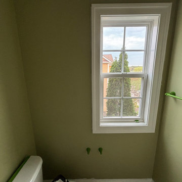
 ReNu Studios
This small powder room off the main hallway underwent a dramatic transformation, evolving from dated olive walls to a bright, airy space with a soft, sophisticated palette. The client wanted to take a hands-on approach to the project and tasked ReNu Studios with curating the materials, paint colors, and finishes.
We selected a soothing sky-blue wall color paired with a delicate floral wallpaper to add character without overwhelming the small footprint. Updated frosted glass light shades helped modernize the existing fixture without needing a full replacement.
By balancing fresh tones, simple updates, and thoughtful details, the result is a crisp, inviting bathroom that feels effortless and complete, proving that even small spaces (and DIY projects) deserve great design direction.
6