
Search results for "Parent desires" in Home Design Ideas
 ZeroEnergy Design
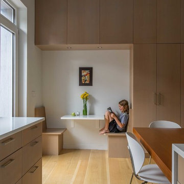
This renovated brick rowhome in Boston’s South End offers a modern aesthetic within a historic structure, creative use of space, exceptional thermal comfort, a reduced carbon footprint, and a passive stream of income.
DESIGN PRIORITIES. The goals for the project were clear - design the primary unit to accommodate the family’s modern lifestyle, rework the layout to create a desirable rental unit, improve thermal comfort and introduce a modern aesthetic. We designed the street-level entry as a shared entrance for both the primary and rental unit. The family uses it as their everyday entrance - we planned for bike storage and an open mudroom with bench and shoe storage to facilitate the change from shoes to slippers or bare feet as they enter their home. On the main level, we expanded the kitchen into the dining room to create an eat-in space with generous counter space and storage, as well as a comfortable connection to the living space. The second floor serves as master suite for the couple - a bedroom with a walk-in-closet and ensuite bathroom, and an adjacent study, with refinished original pumpkin pine floors. The upper floor, aside from a guest bedroom, is the child's domain with interconnected spaces for sleeping, work and play. In the play space, which can be separated from the work space with new translucent sliding doors, we incorporated recreational features inspired by adventurous and competitive television shows, at their son’s request.
MODERN MEETS TRADITIONAL. We left the historic front facade of the building largely unchanged - the security bars were removed from the windows and the single pane windows were replaced with higher performing historic replicas. We designed the interior and rear facade with a vision of warm modernism, weaving in the notable period features. Each element was either restored or reinterpreted to blend with the modern aesthetic. The detailed ceiling in the living space, for example, has a new matte monochromatic finish, and the wood stairs are covered in a dark grey floor paint, whereas the mahogany doors were simply refinished. New wide plank wood flooring with a neutral finish, floor-to-ceiling casework, and bold splashes of color in wall paint and tile, and oversized high-performance windows (on the rear facade) round out the modern aesthetic.
RENTAL INCOME. The existing rowhome was zoned for a 2-family dwelling but included an undesirable, single-floor studio apartment at the garden level with low ceiling heights and questionable emergency egress. In order to increase the quality and quantity of space in the rental unit, we reimagined it as a two-floor, 1 or 2 bedroom, 2 bathroom apartment with a modern aesthetic, increased ceiling height on the lowest level and provided an in-unit washer/dryer. The apartment was listed with Jackie O'Connor Real Estate and rented immediately, providing the owners with a source of passive income.
ENCLOSURE WITH BENEFITS. The homeowners sought a minimal carbon footprint, enabled by their urban location and lifestyle decisions, paired with the benefits of a high-performance home. The extent of the renovation allowed us to implement a deep energy retrofit (DER) to address air tightness, insulation, and high-performance windows. The historic front facade is insulated from the interior, while the rear facade is insulated on the exterior. Together with these building enclosure improvements, we designed an HVAC system comprised of continuous fresh air ventilation, and an efficient, all-electric heating and cooling system to decouple the house from natural gas. This strategy provides optimal thermal comfort and indoor air quality, improved acoustic isolation from street noise and neighbors, as well as a further reduced carbon footprint. We also took measures to prepare the roof for future solar panels, for when the South End neighborhood’s aging electrical infrastructure is upgraded to allow them.
URBAN LIVING. The desirable neighborhood location allows the both the homeowners and tenant to walk, bike, and use public transportation to access the city, while each charging their respective plug-in electric cars behind the building to travel greater distances.
OVERALL. The understated rowhouse is now ready for another century of urban living, offering the owners comfort and convenience as they live life as an expression of their values.
Photography: Eric Roth Photo
 Irons Brothers Construction Inc
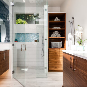
This stunning master bathroom started with a creative reconfiguration of space, but it’s the wall of shimmering blue dimensional tile that really makes this a “statement” bathroom.
The homeowners’, parents of two boys, wanted to add a master bedroom and bath onto the main floor of their classic mid-century home. Their objective was to be close to their kids’ rooms, but still have a quiet and private retreat.
To obtain space for the master suite, the construction was designed to add onto the rear of their home. This was done by expanding the interior footprint into their existing outside corner covered patio. To create a sizeable suite, we also utilized the current interior footprint of their existing laundry room, adjacent to the patio. The design also required rebuilding the exterior walls of the kitchen nook which was adjacent to the back porch. Our clients rounded out the updated rear home design by installing all new windows along the back wall of their living and dining rooms.
Once the structure was formed, our design team worked with the homeowners to fill in the space with luxurious elements to form their desired retreat with universal design in mind. The selections were intentional, mixing modern-day comfort and amenities with 1955 architecture.
The shower was planned to be accessible and easy to use at the couple ages in place. Features include a curb-less, walk-in shower with a wide shower door. We also installed two shower fixtures, a handheld unit and showerhead.
To brighten the room without sacrificing privacy, a clearstory window was installed high in the shower and the room is topped off with a skylight.
For ultimate comfort, heated floors were installed below the silvery gray wood-plank floor tiles which run throughout the entire room and into the shower! Additional features include custom cabinetry in rich walnut with horizontal grain and white quartz countertops. In the shower, oversized white subway tiles surround a mermaid-like soft-blue tile niche, and at the vanity the mirrors are surrounded by boomerang-shaped ultra-glossy marine blue tiles. These create a dramatic focal point. Serene and spectacular.

Find the right local pro for your project

 J.P. Hoffman Design Build
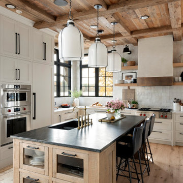
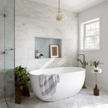
Located right off the Primary bedroom – this bathroom is located in the far corners of the house. It should be used as a retreat, to rejuvenate and recharge – exactly what our homeowners asked for. We came alongside our client – listening to the pain points and hearing the need and desire for a functional, calming retreat, a drastic change from the disjointed, previous space with exposed pipes from a previous renovation. We worked very closely through the design and materials selections phase, hand selecting the marble tile on the feature wall, sourcing luxe gold finishes and suggesting creative solutions (like the shower’s linear drain and the hidden niche on the inside of the shower’s knee wall). The Maax Tosca soaker tub is a main feature and our client's #1 request. Add the Toto Nexus bidet toilet and a custom double vanity with a countertop tower for added storage, this luxury retreat is a must for busy, working parents.
 Drewett Works
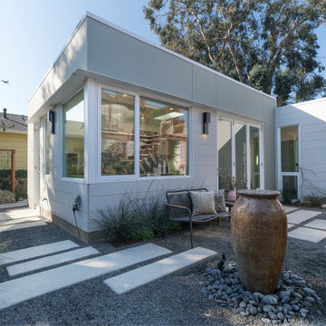
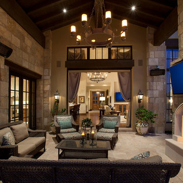
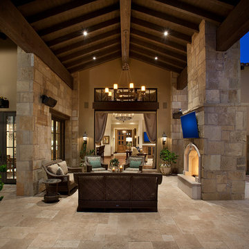
The genesis of design for this desert retreat was the informal dining area in which the clients, along with family and friends, would gather.
Located in north Scottsdale’s prestigious Silverleaf, this ranch hacienda offers 6,500 square feet of gracious hospitality for family and friends. Focused around the informal dining area, the home’s living spaces, both indoor and outdoor, offer warmth of materials and proximity for expansion of the casual dining space that the owners envisioned for hosting gatherings to include their two grown children, parents, and many friends.
The kitchen, adjacent to the informal dining, serves as the functioning heart of the home and is open to the great room, informal dining room, and office, and is mere steps away from the outdoor patio lounge and poolside guest casita. Additionally, the main house master suite enjoys spectacular vistas of the adjacent McDowell mountains and distant Phoenix city lights.
The clients, who desired ample guest quarters for their visiting adult children, decided on a detached guest casita featuring two bedroom suites, a living area, and a small kitchen. The guest casita’s spectacular bedroom mountain views are surpassed only by the living area views of distant mountains seen beyond the spectacular pool and outdoor living spaces.
Project Details | Desert Retreat, Silverleaf – Scottsdale, AZ
Architect: C.P. Drewett, AIA, NCARB; Drewett Works, Scottsdale, AZ
Builder: Sonora West Development, Scottsdale, AZ
Photographer: Dino Tonn
Featured in Phoenix Home and Garden, May 2015, “Sporting Style: Golf Enthusiast Christie Austin Earns Top Scores on the Home Front”
See more of this project here: http://drewettworks.com/desert-retreat-at-silverleaf/
 J.P. Hoffman Design Build
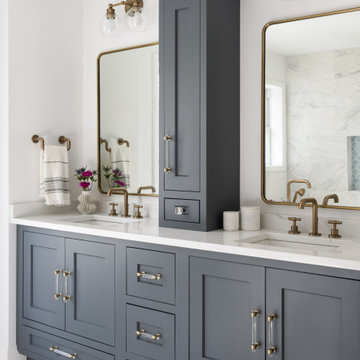
Located right off the Primary bedroom – this bathroom is located in the far corners of the house. It should be used as a retreat, to rejuvenate and recharge – exactly what our homeowners asked for. We came alongside our client – listening to the pain points and hearing the need and desire for a functional, calming retreat, a drastic change from the disjointed, previous space with exposed pipes from a previous renovation. We worked very closely through the design and materials selections phase, hand selecting the marble tile on the feature wall, sourcing luxe gold finishes and suggesting creative solutions (like the shower’s linear drain and the hidden niche on the inside of the shower’s knee wall). The Maax Tosca soaker tub is a main feature and our client's #1 request. Add the Toto Nexus bidet toilet and a custom double vanity with a countertop tower for added storage, this luxury retreat is a must for busy, working parents.
 Irons Brothers Construction Inc
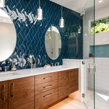
This stunning master bathroom started with a creative reconfiguration of space, but it’s the wall of shimmering blue dimensional tile that really makes this a “statement” bathroom.
The homeowners’, parents of two boys, wanted to add a master bedroom and bath onto the main floor of their classic mid-century home. Their objective was to be close to their kids’ rooms, but still have a quiet and private retreat.
To obtain space for the master suite, the construction was designed to add onto the rear of their home. This was done by expanding the interior footprint into their existing outside corner covered patio. To create a sizeable suite, we also utilized the current interior footprint of their existing laundry room, adjacent to the patio. The design also required rebuilding the exterior walls of the kitchen nook which was adjacent to the back porch. Our clients rounded out the updated rear home design by installing all new windows along the back wall of their living and dining rooms.
Once the structure was formed, our design team worked with the homeowners to fill in the space with luxurious elements to form their desired retreat with universal design in mind. The selections were intentional, mixing modern-day comfort and amenities with 1955 architecture.
The shower was planned to be accessible and easy to use at the couple ages in place. Features include a curb-less, walk-in shower with a wide shower door. We also installed two shower fixtures, a handheld unit and showerhead.
To brighten the room without sacrificing privacy, a clearstory window was installed high in the shower and the room is topped off with a skylight.
For ultimate comfort, heated floors were installed below the silvery gray wood-plank floor tiles which run throughout the entire room and into the shower! Additional features include custom cabinetry in rich walnut with horizontal grain and white quartz countertops. In the shower, oversized white subway tiles surround a mermaid-like soft-blue tile niche, and at the vanity the mirrors are surrounded by boomerang-shaped ultra-glossy marine blue tiles. These create a dramatic focal point. Serene and spectacular.
 Elizabeth Strianese Interiors LLC
Elizabeth Strianese Interiors and Meredith Heuer photography.
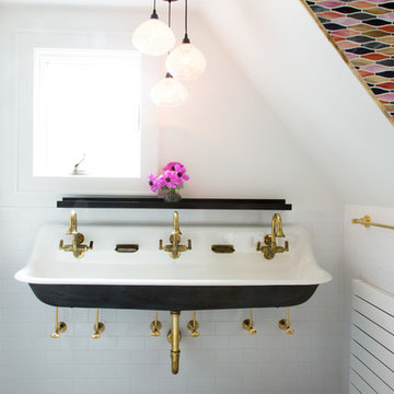
We opted for a classic inspired bathroom with literally "splashes" of fun for these little girls. The triple laundry sink serves the 3 children nicely with it's deep basin and built in soap holders. Simplicity was key when selecting a class marble hex floor tile and white subway tile for the bulk of the room - but then we had a little fun with the colorful glass mosaic tile in the tub niche. Handblown locally made light fixtures from Dan Spitzer over the sink keep my signature of "local and handmade" alive.
 Alair Homes Plano
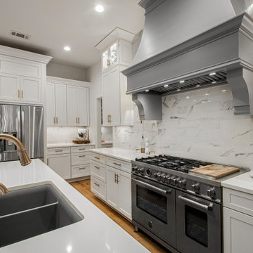
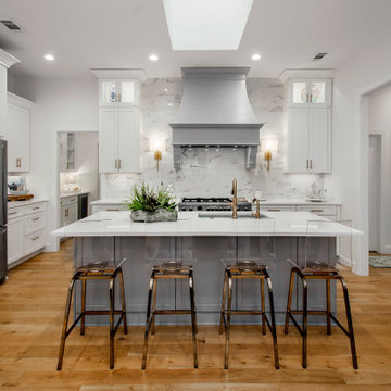
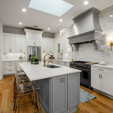
Our clients came to us wanting to maximize the space they had. They were not planning on moving anytime soon, as they loved their neighborhood. They wanted to renovate the front of their house, which included the front atrium, living room, kitchen, and powder bath. They hated their kitchen because it was completely closed off, had low ceilings, was dark and outdated, not to mention the floors were different in each of these rooms! The pantry was in the breakfast area and the kitchen table became a junk catcher, being the first thing you see when coming in from the garage/laundry room. In their living room, they wanted the spaces on either side of the fireplace to be symmetrical, whether that be bookshelves, a wet bar or closed off. Both parents are working professionals with no time and/or desire to design, create and figure this out on their own. They needed help figuring out how to reconfigure their current space in order to maximize what they already had, as they could not see an obvious solution. They could not envision how it would look so the fact that our designers were able to show them their new kitchen in 3D was pertinent.
We removed the pass-through windows that surrounded the atrium and front dining room, as well as the entire kitchen wall, completely opening up those two rooms. We removed a hall that used to lead between the kitchen and the living room since it was a complete waste of space! The ceilings were raised to 10’ in the kitchen and we were able to leave the skylight, letting in that natural light they wanted. We were able to give them a much larger pantry with tons of shelving and increase the size of their laundry room by utilizing the space of their old breakfast nook.
We relocated the door to the garage into their new elongated laundry room, built a wet bar across from their new larger pantry (with a pocket door) and the flow and functionality of these new spaces is just perfect! All new Waypoint cabinets were installed one two main kitchen surrounding walls painted Linen. Calacatta Bianco Polished Porcelain Tile 4x12 was used for the backsplash. A large eat-at island was installed, painted Stone, where the family can now gather for homework, meals, and mingling. The soft champagne bronze hardware and accent lighting really give this white and gray kitchen a soft classic look.
In the living room, we removed the built-in bookshelves to the left of the fireplace and closed off the wet-bar on the other side, giving them more space in their master suite. White Oak wood flooring, stained Putney, was installed throughout the entire new space, giving it the continuity they were looking for.
In the guest bathroom, Carrara white herringbone marble mosaic 12x12 tile was used on the shower floor and niche, while basic marble Bianco polished 12x24 porcelain tile was used on the walls. Luxart polished chrome traditional hardware gives this timeless bathroom the perfect shine.
Our clients are so happy with the new functionality and look of their space. It has definitely changed their lives in a way they could have never imagined!

 J.P. Hoffman Design Build
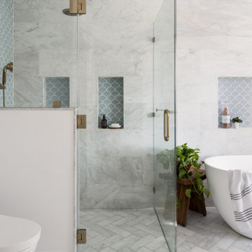
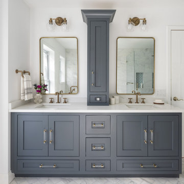
Located right off the Primary bedroom – this bathroom is located in the far corners of the house. It should be used as a retreat, to rejuvenate and recharge – exactly what our homeowners asked for. We came alongside our client – listening to the pain points and hearing the need and desire for a functional, calming retreat, a drastic change from the disjointed, previous space with exposed pipes from a previous renovation. We worked very closely through the design and materials selections phase, hand selecting the marble tile on the feature wall, sourcing luxe gold finishes and suggesting creative solutions (like the shower’s linear drain and the hidden niche on the inside of the shower’s knee wall). The Maax Tosca soaker tub is a main feature and our client's #1 request. Add the Toto Nexus bidet toilet and a custom double vanity with a countertop tower for added storage, this luxury retreat is a must for busy, working parents.
 J.P. Hoffman Design Build
Located right off the Primary bedroom – this bathroom is located in the far corners of the house. It should be used as a retreat, to rejuvenate and recharge – exactly what our homeowners asked for. We came alongside our client – listening to the pain points and hearing the need and desire for a functional, calming retreat, a drastic change from the disjointed, previous space with exposed pipes from a previous renovation. We worked very closely through the design and materials selections phase, hand selecting the marble tile on the feature wall, sourcing luxe gold finishes and suggesting creative solutions (like the shower’s linear drain and the hidden niche on the inside of the shower’s knee wall). The Maax Tosca soaker tub is a main feature and our client's #1 request. Add the Toto Nexus bidet toilet and a custom double vanity with a countertop tower for added storage, this luxury retreat is a must for busy, working parents.
 J Design Group - Interior Designers Miami - Modern
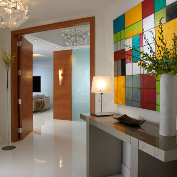
Ocean front, Luxury home in Miami Beach - Living Room.
Projects by J Design Group, Your friendly Interior designers firm in Miami, FL. at your service.
AVENTURA MAGAZINE selected our client’s luxury 5000 Sf ocean front apartment in Miami Beach, to publish it in their issue and they Said:
Story by Linda Marx, Photography by Daniel Newcomb
Light & Bright
New York snowbirds redesigned their Miami Beach apartment to take advantage of the tropical lifestyle.
New York snowbirds redesigned their Miami Beach apartment to take advantage of the tropical lifestyle.
WHEN INTERIOR DESIGNER JENNIFER CORREDOR was asked to recreate a four-bedroom, six-bath condominium at The Bath Club in Miami Beach, she seized the opportunity to open the rooms and better utilize the vast ocean views.
In five months last year, the designer transformed a dark and closed 5,000-square-foot unit located on a high floor into a series of sweeping waterfront spaces and updated the well located apartment into a light and airy retreat for a sports-loving family of five.
“They come down from New York every other weekend and wanted to make their waterfront home a series of grand open spaces,” says Jennifer Corrredor, of the J. Design Group in Miami, a firm specializing in modern and contemporary interiors. “Since many of the rooms face the ocean, it made sense to open and lighten up the home, taking advantage of the awesome views of the sea and the bay.”
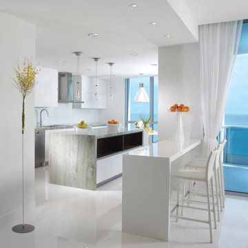
The designer used 40 x 40 all white tile throughout the apartment as a clean base. This way, her sophisticated use of color would stand out and bring the outdoors in.
The close-knit family members—two parents and three boys in college—like to do things together. But there were situations to overcome in the process of modernizing and opening the space. When Jennifer Corredor was briefed on their desires, nothing seemed too daunting. The confident designer was ready to delve in. For example, she fixed an area at the front door
that was curved. “The wood was concave so I straightened it out,” she explains of a request from the clients. “It was an obstacle that I overcame as part of what I do in a redesign. I don’t consider it a difficult challenge. Improving what I see is part of the process.”
She also tackled the kitchen with gusto by demolishing a wall. The kitchen had formerly been enclosed, which was a waste of space and poor use of available waterfront ambience. To create a grand space linking the kitchen to the living room and dining room area, something had to go. Once the wall was yesterday’s news, she relocated the refrigerator and freezer (two separate appliances) to the other side of the room. This change was a natural functionality in the new open space. “By tearing out the wall, the family has a better view of the kitchen from the living and dining rooms,” says Jennifer Corredor, who also made it easier to walk in and out of one area and into the other. “The views of the larger public space and the surrounding water are breathtaking.
Opening it up changed everything.”
They clients can now see the kitchen from the living and dining areas, and at the same time, dwell in an airy and open space instead of feeling stuck in a dark enclosed series of rooms. In fact, the high-top bar stools that Jennifer Corredor selected for the kitchen can be twirled around to use for watching TV in the living room.
In keeping with the theme of moving seamlessly from one room to the other, Corredor designed a subtle wall of glass in the living room along with lots of comfortable seating. This way, all family members feel at ease while relaxing, talking, or watching sporting events on the large flat screen television. “For this room, I wanted more open space, light and a supreme airy feeling,” she says. “With the glass design making a statement, it quickly became the star of the show.”…….
….. To add texture and depth, Jennifer Corredor custom created wood doors here, and in other areas of the home. They provide a nice contrast to the open Florida tropical feel. “I added character to the openness by using exotic cherry wood,” she says. “I repeated this throughout the home and it works well.”
Known for capturing the client’s vision while adding her own innovative twists, Jennifer Corredor lightened the family room, giving it a contemporary and modern edge with colorful art and matching throw pillows on the sofas. She added a large beige leather ottoman as the center coffee table in the room. This round piece was punctuated with a bold-toned flowering plant atop. It effortlessly matches the pillows and colors of the contemporary canvas.
Jennifer Corredor also gutted all of the bathrooms, resulting in a major redesign of the master. She jettisoned the whirlpool and created the dazzling illusion of a floating tub. From an area where there were two toilets, she eliminated one to make a grand rectangular shower, which became an overall showpiece. The master bath went from being just a functional water closet to a sophisticated spa-like space. “The client said I was ‘delicious’ after seeing the change,” laughed Jennifer Corredor, who emphasized that her clients love their part-time life in South Florida more each time they come down. Even when the husband has to work from their Miami Beach digs, he is surrounded by tropical beauty. For instance, there are times when the master bedroom must double as the husband’s home office.
The room had to be large enough to accommodate a working space for this purpose. So Jennifer Corredor placed an appropriate table near the window and across from the king-size bed. “No blocking of the amazing water view was necessary,” she says. “I kept an open space with a lot of white so It functions well and the work space fits right in.” She repeated the bold modern art in the room as well as in the guest bedroom, which also has a workspace for the sons when they are home from school and need to study.
The designer is still happy and glowing with the results of her toil in this apartment. She gets a “spiritual feeling” when she walks inside. “It is so peaceful and serene, with subtle hints of explosive statements,” she says. “The entire space is open, yet anchored by the warmth of the exotic woods.” The client wrote Jennifer Corredor a letter at the end of the project congratulating her on a
job well done. She revealed that owning a Miami Beach home was her husband’s dream 30 years ago. “Now we have a quality perfect yet practical home,” she wrote to the designer. “You solved the challenges, and the end
result far exceeds our expectations. We love it.”
Thanks for your interest in our Contemporary Interior Design projects and if you have any question please do not hesitate to ask us.
http://www.JDesignGroup.com
305.444.4611
Modern Interior designer Miami. Contemporary
Miami
Miami Interior Designers
Miami Interior Designer
Interior Designers Miami
Interior Designer Miami
Modern Interior Designers
Modern Interior Designer
Modern interior decorators
Modern interior decorator
Contemporary Interior Designers
Contemporary Interior Designer
Interior design decorators
Interior design decorator
Interior Decoration and Design
Black Interior Designers
Black Interior Designer
Interior designer
Interior designers
Interior design decorators
Interior design decorator
Home interior designers
Home interior designer
Interior design companies
Interior decorators
Interior decorator
Decorators
Decorator
Miami Decorators
Miami Decorator
Decorators Miami
Decorator Miami
Interior Design Firm
Interior Design Firms
Interior Designer Firm
Interior Designer Firms
Interior design
Interior designs
home decorators
Interior decorating Miami
Best Interior Designers.
225 Malaga Ave.
Coral Gable, FL 33134
http://www.JDesignGroup.com
305.444.4611
 Alair Homes Plano
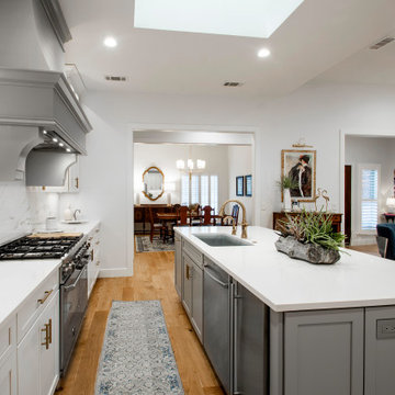
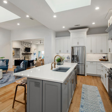
Our clients came to us wanting to maximize the space they had. They were not planning on moving anytime soon, as they loved their neighborhood. They wanted to renovate the front of their house, which included the front atrium, living room, kitchen, and powder bath. They hated their kitchen because it was completely closed off, had low ceilings, was dark and outdated, not to mention the floors were different in each of these rooms! The pantry was in the breakfast area and the kitchen table became a junk catcher, being the first thing you see when coming in from the garage/laundry room. In their living room, they wanted the spaces on either side of the fireplace to be symmetrical, whether that be bookshelves, a wet bar or closed off. Both parents are working professionals with no time and/or desire to design, create and figure this out on their own. They needed help figuring out how to reconfigure their current space in order to maximize what they already had, as they could not see an obvious solution. They could not envision how it would look so the fact that our designers were able to show them their new kitchen in 3D was pertinent.
We removed the pass-through windows that surrounded the atrium and front dining room, as well as the entire kitchen wall, completely opening up those two rooms. We removed a hall that used to lead between the kitchen and the living room since it was a complete waste of space! The ceilings were raised to 10’ in the kitchen and we were able to leave the skylight, letting in that natural light they wanted. We were able to give them a much larger pantry with tons of shelving and increase the size of their laundry room by utilizing the space of their old breakfast nook.
We relocated the door to the garage into their new elongated laundry room, built a wet bar across from their new larger pantry (with a pocket door) and the flow and functionality of these new spaces is just perfect! All new Waypoint cabinets were installed one two main kitchen surrounding walls painted Linen. Calacatta Bianco Polished Porcelain Tile 4x12 was used for the backsplash. A large eat-at island was installed, painted Stone, where the family can now gather for homework, meals, and mingling. The soft champagne bronze hardware and accent lighting really give this white and gray kitchen a soft classic look.
In the living room, we removed the built-in bookshelves to the left of the fireplace and closed off the wet-bar on the other side, giving them more space in their master suite. White Oak wood flooring, stained Putney, was installed throughout the entire new space, giving it the continuity they were looking for.
In the guest bathroom, Carrara white herringbone marble mosaic 12x12 tile was used on the shower floor and niche, while basic marble Bianco polished 12x24 porcelain tile was used on the walls. Luxart polished chrome traditional hardware gives this timeless bathroom the perfect shine.
Our clients are so happy with the new functionality and look of their space. It has definitely changed their lives in a way they could have never imagined!
 Alair Homes Plano
Our clients came to us wanting to maximize the space they had. They were not planning on moving anytime soon, as they loved their neighborhood. They wanted to renovate the front of their house, which included the front atrium, living room, kitchen, and powder bath. They hated their kitchen because it was completely closed off, had low ceilings, was dark and outdated, not to mention the floors were different in each of these rooms! The pantry was in the breakfast area and the kitchen table became a junk catcher, being the first thing you see when coming in from the garage/laundry room. In their living room, they wanted the spaces on either side of the fireplace to be symmetrical, whether that be bookshelves, a wet bar or closed off. Both parents are working professionals with no time and/or desire to design, create and figure this out on their own. They needed help figuring out how to reconfigure their current space in order to maximize what they already had, as they could not see an obvious solution. They could not envision how it would look so the fact that our designers were able to show them their new kitchen in 3D was pertinent.
We removed the pass-through windows that surrounded the atrium and front dining room, as well as the entire kitchen wall, completely opening up those two rooms. We removed a hall that used to lead between the kitchen and the living room since it was a complete waste of space! The ceilings were raised to 10’ in the kitchen and we were able to leave the skylight, letting in that natural light they wanted. We were able to give them a much larger pantry with tons of shelving and increase the size of their laundry room by utilizing the space of their old breakfast nook.
We relocated the door to the garage into their new elongated laundry room, built a wet bar across from their new larger pantry (with a pocket door) and the flow and functionality of these new spaces is just perfect! All new Waypoint cabinets were installed one two main kitchen surrounding walls painted Linen. Calacatta Bianco Polished Porcelain Tile 4x12 was used for the backsplash. A large eat-at island was installed, painted Stone, where the family can now gather for homework, meals, and mingling. The soft champagne bronze hardware and accent lighting really give this white and gray kitchen a soft classic look.
In the living room, we removed the built-in bookshelves to the left of the fireplace and closed off the wet-bar on the other side, giving them more space in their master suite. White Oak wood flooring, stained Putney, was installed throughout the entire new space, giving it the continuity they were looking for.
In the guest bathroom, Carrara white herringbone marble mosaic 12x12 tile was used on the shower floor and niche, while basic marble Bianco polished 12x24 porcelain tile was used on the walls. Luxart polished chrome traditional hardware gives this timeless bathroom the perfect shine.
Our clients are so happy with the new functionality and look of their space. It has definitely changed their lives in a way they could have never imagined!
 Alair Homes Plano
Our clients came to us wanting to maximize the space they had. They were not planning on moving anytime soon, as they loved their neighborhood. They wanted to renovate the front of their house, which included the front atrium, living room, kitchen, and powder bath. They hated their kitchen because it was completely closed off, had low ceilings, was dark and outdated, not to mention the floors were different in each of these rooms! The pantry was in the breakfast area and the kitchen table became a junk catcher, being the first thing you see when coming in from the garage/laundry room. In their living room, they wanted the spaces on either side of the fireplace to be symmetrical, whether that be bookshelves, a wet bar or closed off. Both parents are working professionals with no time and/or desire to design, create and figure this out on their own. They needed help figuring out how to reconfigure their current space in order to maximize what they already had, as they could not see an obvious solution. They could not envision how it would look so the fact that our designers were able to show them their new kitchen in 3D was pertinent.
We removed the pass-through windows that surrounded the atrium and front dining room, as well as the entire kitchen wall, completely opening up those two rooms. We removed a hall that used to lead between the kitchen and the living room since it was a complete waste of space! The ceilings were raised to 10’ in the kitchen and we were able to leave the skylight, letting in that natural light they wanted. We were able to give them a much larger pantry with tons of shelving and increase the size of their laundry room by utilizing the space of their old breakfast nook.
We relocated the door to the garage into their new elongated laundry room, built a wet bar across from their new larger pantry (with a pocket door) and the flow and functionality of these new spaces is just perfect! All new Waypoint cabinets were installed one two main kitchen surrounding walls painted Linen. Calacatta Bianco Polished Porcelain Tile 4x12 was used for the backsplash. A large eat-at island was installed, painted Stone, where the family can now gather for homework, meals, and mingling. The soft champagne bronze hardware and accent lighting really give this white and gray kitchen a soft classic look.
In the living room, we removed the built-in bookshelves to the left of the fireplace and closed off the wet-bar on the other side, giving them more space in their master suite. White Oak wood flooring, stained Putney, was installed throughout the entire new space, giving it the continuity they were looking for.
In the guest bathroom, Carrara white herringbone marble mosaic 12x12 tile was used on the shower floor and niche, while basic marble Bianco polished 12x24 porcelain tile was used on the walls. Luxart polished chrome traditional hardware gives this timeless bathroom the perfect shine.
Our clients are so happy with the new functionality and look of their space. It has definitely changed their lives in a way they could have never imagined!
 Alair Homes Plano
Our clients came to us wanting to maximize the space they had. They were not planning on moving anytime soon, as they loved their neighborhood. They wanted to renovate the front of their house, which included the front atrium, living room, kitchen, and powder bath. They hated their kitchen because it was completely closed off, had low ceilings, was dark and outdated, not to mention the floors were different in each of these rooms! The pantry was in the breakfast area and the kitchen table became a junk catcher, being the first thing you see when coming in from the garage/laundry room. In their living room, they wanted the spaces on either side of the fireplace to be symmetrical, whether that be bookshelves, a wet bar or closed off. Both parents are working professionals with no time and/or desire to design, create and figure this out on their own. They needed help figuring out how to reconfigure their current space in order to maximize what they already had, as they could not see an obvious solution. They could not envision how it would look so the fact that our designers were able to show them their new kitchen in 3D was pertinent.
We removed the pass-through windows that surrounded the atrium and front dining room, as well as the entire kitchen wall, completely opening up those two rooms. We removed a hall that used to lead between the kitchen and the living room since it was a complete waste of space! The ceilings were raised to 10’ in the kitchen and we were able to leave the skylight, letting in that natural light they wanted. We were able to give them a much larger pantry with tons of shelving and increase the size of their laundry room by utilizing the space of their old breakfast nook.
We relocated the door to the garage into their new elongated laundry room, built a wet bar across from their new larger pantry (with a pocket door) and the flow and functionality of these new spaces is just perfect! All new Waypoint cabinets were installed one two main kitchen surrounding walls painted Linen. Calacatta Bianco Polished Porcelain Tile 4x12 was used for the backsplash. A large eat-at island was installed, painted Stone, where the family can now gather for homework, meals, and mingling. The soft champagne bronze hardware and accent lighting really give this white and gray kitchen a soft classic look.
In the living room, we removed the built-in bookshelves to the left of the fireplace and closed off the wet-bar on the other side, giving them more space in their master suite. White Oak wood flooring, stained Putney, was installed throughout the entire new space, giving it the continuity they were looking for.
In the guest bathroom, Carrara white herringbone marble mosaic 12x12 tile was used on the shower floor and niche, while basic marble Bianco polished 12x24 porcelain tile was used on the walls. Luxart polished chrome traditional hardware gives this timeless bathroom the perfect shine.
Our clients are so happy with the new functionality and look of their space. It has definitely changed their lives in a way they could have never imagined!
 Drewett Works
The genesis of design for this desert retreat was the informal dining area in which the clients, along with family and friends, would gather.
Located in north Scottsdale’s prestigious Silverleaf, this ranch hacienda offers 6,500 square feet of gracious hospitality for family and friends. Focused around the informal dining area, the home’s living spaces, both indoor and outdoor, offer warmth of materials and proximity for expansion of the casual dining space that the owners envisioned for hosting gatherings to include their two grown children, parents, and many friends.
The kitchen, adjacent to the informal dining, serves as the functioning heart of the home and is open to the great room, informal dining room, and office, and is mere steps away from the outdoor patio lounge and poolside guest casita. Additionally, the main house master suite enjoys spectacular vistas of the adjacent McDowell mountains and distant Phoenix city lights.
The clients, who desired ample guest quarters for their visiting adult children, decided on a detached guest casita featuring two bedroom suites, a living area, and a small kitchen. The guest casita’s spectacular bedroom mountain views are surpassed only by the living area views of distant mountains seen beyond the spectacular pool and outdoor living spaces.
Project Details | Desert Retreat, Silverleaf – Scottsdale, AZ
Architect: C.P. Drewett, AIA, NCARB; Drewett Works, Scottsdale, AZ
Builder: Sonora West Development, Scottsdale, AZ
Photographer: Dino Tonn
Featured in Phoenix Home and Garden, May 2015, “Sporting Style: Golf Enthusiast Christie Austin Earns Top Scores on the Home Front”
See more of this project here: http://drewettworks.com/desert-retreat-at-silverleaf/
 J Design Group - Interior Designers Miami - Modern
AVENTURA MAGAZINE selected our client’s luxury 5000 Sf ocean front apartment in Miami Beach, to publish it in their issue and they Said:
Story by Linda Marx, Photography by Daniel Newcomb
Light & Bright
New York snowbirds redesigned their Miami Beach apartment to take advantage of the tropical lifestyle.
WHEN INTERIOR DESIGNER JENNIFER CORREDOR was asked to recreate a four-bedroom, six-bath condominium at The Bath Club in Miami Beach, she seized the opportunity to open the rooms and better utilize the vast ocean views.
In five months last year, the designer transformed a dark and closed 5,000-square-foot unit located on a high floor into a series of sweeping waterfront spaces and updated the well located apartment into a light and airy retreat for a sports-loving family of five.
“They come down from New York every other weekend and wanted to make their waterfront home a series of grand open spaces,” says Corrredor, of the J. Design Group in Coral Gables, a firm specializing in modern and contemporary interiors. “Since many of the rooms face the ocean, it made sense to open and lighten up the home, taking advantage of the awesome views of the sea and the bay.”
The designer used 40 x 40 all white tile throughout the apartment as a clean base. This way, her sophisticated use of color would stand out and bring the outdoors in.
The close-knit family members—two parents and three boys in college—like to do things together. But there were situations to overcome in the process of modernizing and opening the space. When Corredor was briefed on their desires, nothing seemed too daunting. The confident designer was ready to delve in. For example, she fixed an area at the front door
that was curved. “The wood was concave so I straightened it out,” she explains of a request from the clients. “It was an obstacle that I overcame as part of what I do in a redesign. I don’t consider it a difficult challenge. Improving what I see is part of the process.”
She also tackled the kitchen with gusto by demolishing a wall. The kitchen had formerly been enclosed, which was a waste of space and poor use of available waterfront ambience. To create a grand space linking the kitchen to the living room and dining room area, something had to go. Once the wall was yesterday’s news, she relocated the refrigerator and freezer (two separate appliances) to the other side of the room. This change was a natural functionality in the new open space. “By tearing out the wall, the family has a better view of the kitchen from the living and dining rooms,” says Corredor, who also made it easier to walk in and out of one area and into the other. “The views of the larger public space and the surrounding water are breathtaking.
Opening it up changed everything.”
They clients can now see the kitchen from the living and dining areas, and at the same time, dwell in an airy and open space instead of feeling stuck in a dark enclosed series of rooms. In fact, the high-top bar stools that Corredor selected for the kitchen can be twirled around to use for watching TV in the living room.
In keeping with the theme of moving seamlessly from one room to the other, Corredor designed a subtle wall of glass in the living room along with lots of comfortable seating. This way, all family members feel at ease while relaxing, talking, or watching sporting events on the large flat screen television. “For this room, I wanted more open space, light and a supreme airy feeling,” she says. “With the glass design making a statement, it quickly became the star of the show.”…….
….. To add texture and depth, Jennifer Corredor custom created wood doors here, and in other areas of the home. They provide a nice contrast to the open Florida tropical feel. “I added character to the openness by using exotic cherry wood,” she says. “I repeated this throughout the home and it works well.”
Known for capturing the client’s vision while adding her own innovative twists, Jennifer Corredor lightened the family room, giving it a contemporary and modern edge with colorful art and matching throw pillows on the sofas. She added a large beige leather ottoman as the center coffee table in the room. This round piece was punctuated with a bold-toned flowering plant atop. It effortlessly matches the pillows and colors of the contemporary canvas.
Miami,
Miami Interior Designers,
Miami Interior Designer,
Interior Designers Miami,
Interior Designer Miami,
Modern Interior Designers,
Modern Interior Designer,
Modern interior decorators,
Modern interior decorator,
Contemporary Interior Designers,
Contemporary Interior Designer,
Interior design decorators,
Interior design decorator,
Interior Decoration and Design,
Black Interior Designers,
Black Interior Designer,
Interior designer,
Interior designers,
Interior design decorators,
Interior design decorator,
Home interior designers,
Home interior designer,
Interior design companies,
Interior decorators,
Interior decorator,
Decorators,
Decorator,
Miami Decorators,
Miami Decorator,
Decorators Miami,
Decorator Miami,
Interior Design Firm,
Interior Design Firms,
Interior Designer Firm,
Interior Designer Firms,
Interior design,
Interior designs,
Home decorators,
Interior decorating Miami,
Best Interior Designers,
Interior design decorator,
Miami Beach
1