
Search results for "Patients" in Home Design Ideas
 Reico Kitchen & Bath
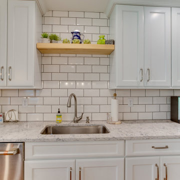
Designed by Katherine Dashiell of Reico Kitchen & Bath in Annapolis MD in collaboration with Lauer Construction, this transitional two-finish white and blue kitchen features Merillat Classic perimeter cabinets in the door style Ralston with Cotton finish complemented with Green Forest Park island cabinets in the Park Place door style with a Norfolk Blue finish.
The kitchen includes Silestone Pietra countertops on the perimeter with an Ash Butcher Block countertop for the island. The design also includes a Diamante Bevel 4x8 Gloss White tile backsplash.
“I love our new kitchen! Katherine and Angel we so patient with me throughout this process,” said the client.
Photos courtesy of BTW Images LLC.
 NZN Design
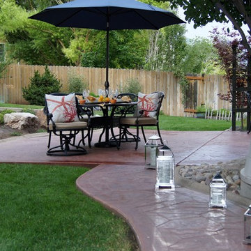
With so many inconveniences this stamped concrete was finished, my clients were very patient and then they loved the final product.
Example of a large transitional backyard stamped concrete patio design in Salt Lake City with a gazebo
Example of a large transitional backyard stamped concrete patio design in Salt Lake City with a gazebo
 Hammer & Hand
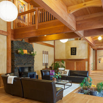
Designed by renowned architect and 'sacred geometer' David Yarbrough, this sacred space in Corbett, Oregon combines three functions under one roof: a Chinese medicine healing arts center, a community center, and a 1400 SF new home. An earth plaster, cedar chip, clay slip, natural wood slat wall system combines traditional construction techniques with energy efficiency to create a healthy environment for denizens, care providers, and patients.
Photography by Sally Painter.
Find the right local pro for your project

 Two Men And A Truck Santa Ana
From first contact, you will be taken care of by a knowlegable, patient and friendly Customer Service Representative who will provide you with the ins and outs of your move. Prepare your questions, we will have them all answered straight away!
 InnovationLand
Houston Interior Designer Lisha Maxey took this Museum District condo from the dated, mirrored walls of the 1980s to Mid Century Modern with a gallery look featuring the client's art collection.
"The place was covered with glued-down, floor-to-ceiling mirrors," says Lisha Maxey, senior designer for Homescapes of Houston and principal at LGH Design Services in Houston. "When we took them off the walls, the walls came apart. We ended up taking them down to the studs."
The makeover took six months to complete, primarily because of strict condo association rules that only gave the Houston interior designers very limited access to the elevator - through which all materials and team members had to go.
"Monday through Friday, we could only be noisy from 10 a.m. to 2 p.m., and if we had to do something extra loud, like sawing or drilling, we had to schedule it with the management and they had to communicate that to the condo owners. So it was just a lot of coordination. But a lot of Inner City Loopers live in these kinds of buildings, so we're used to handling that kind of thing."
The client, a child psychiatrist in her 60s, recently moved to Houston from northeast Texas to be with friends. After being widowed three years ago, she decided it was time to let go of the traditionally styled estate that wasn't really her style anyway. An avid diver who has traveled around the world to pursue her passion, she has amassed a large collection of art from her travels. Downsizing to 1,600 feet and wanting to go more contemporary, she wanted the display - and the look - more streamlined.
"She wanted clean lines and muted colors, with the main focus being her artwork," says Maxey. "So we made the space a palette for that."
Enter the white, gallery-grade paint she chose for the walls: "It's halfway between satin and flat," explains Maxey. "It's not glossy and it's not chalky - just very smooth and clean."
Adding to the gallery theme is the satin nickel track lighting with lamps aimed to highlight pieces of art. "This lighting has no wires," notes Maxey. "It's powered by a positive and negative conduit."
The new flooring throughout is a blended-grey porcelain tile that looks like wood planks. "It's gorgeous, natural-looking and combines all the beauty of wood with the durability of tile," says Maxey. "We used it throughout the condo to unify the space."
After Maxey started looking at the client's bright, vibrant, colorful artwork, she felt the palette couldn't stay as muted anymore. Hence the Mid Century Modern orange leather sofas from West Elm and bright green chairs from Joybird, plus the throw pillows in different textures, patterns and shades of gold, orange and green.
The concave lines of the Danish-inspired chairs, she notes, help them look beautiful from all the way around - a key to designing spaces for loft living.
"The table in the living room is very interesting," notes Maxey. "It was handmade for the client in 1974 and has a signature on it from the artist. She was adamant about including the piece, which has all these hand-painted black-and-white art tiles on the top. I took one look at it and said 'It's not really going to go.'"
However, after cutting 6 inches off the bottom and making it look a little distressed, the table ended up being the perfect complement to the sofas.
The dining room table - from Design Within Reach - is a solid piece of mahogany, the chair upholstery a mix of grey velvet and leather and the legs a shiny brass. "The side chairs are leather and the end ones are velvet," says Maxey. "It's a nice textural mix that lends depth and texture."
The galley kitchen, meanwhile, has been lightened and brightened, with white quartz countertops and backsplashes mimicking the look of Carrara marble, stainless steel appliances and a velvet green bench seat for a punch of color. The cabinets are painted a cool grey color called "Silverplate."
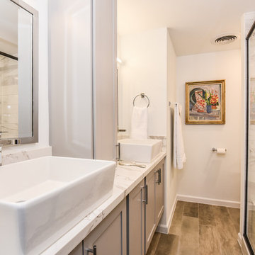
The two bathrooms have been updated with contemporary white vanities and vessel sinks and the master bath now features a walk-in shower tiled in Dolomite white marble (the floor is Bianco Carrara marble mosaic, done in a herringbone pattern.
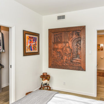
In the master bedroom, Homescapes of Houston knocked down a wall between two smaller closets with swing doors to make one large walk-in closet with pocket doors. The closet in the guest bedroom also came out 13 more inches.
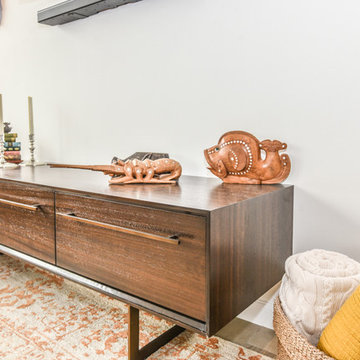
The client's artwork throughout personalizes the space and tells the story of a life. There's a huge bowl of shells from the client's diving adventures, framed art from her child psychiatry patients and a 16th century wood carving from a monastery that's been in her family forever.
"Her collection is quite impressive," says Maxey. "There's even a framed piece of autographed songs written by John Lennon." (You can see this black-framed piece of art on the wall in the photo above of two green chairs).
"We're extremely happy with how the project turned out, and so is the client," says Maxey. "No expense was spared for her. It was a labor of love and we were excited to do it."
 Srote & Co Architects | Planners | Interiors
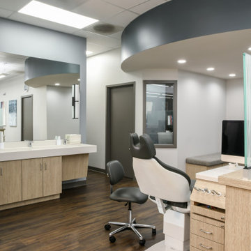
Our focus on this project was not only to provide a much needed update to the aesthetics, but also to nearly double the square footage. The goal was to better accommodate their growing practice by enlarging the waiting area, providing more private office space, adding another consultation room, and creating seating in the clinic itself.
With the new waiting area being nearly the size of the entire previous office, we were able to create features such as a laptop bar and an arcade.
The clinic updates focused on bringing in more natural and supplementary lighting to improve the functional task lighting, but to also cheer up a previously dreary space. By having the glass element on the partitions, we were able to increase patient privacy while also keeping things open and bright.
 McCabe By Design LLC
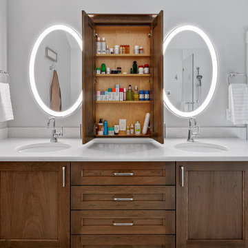
This bathroom was designed for two professionals who dedicate themselves to the health and wellness of others. The objective of the project was to be able to practice for themselves, what they preach to their patients.
The original 90” x 162” primary bathroom had so many pain points (would you to look at a toilet when taking a relaxing bath?), that it should have been an easy task to meet their needs and desires, but it was anything but due to structural issues with the home. Several design layouts were considered before it was concluded that the only approach to check the ‘needs’ boxes was to flip the primary fixtures in the room from one end of this long, narrow bathroom to the other and incorporating a wet room.
The needs list included a soaking tub, a spacious shower that accommodated dual showering on business workday morning, more counter space, a bidet toilet, more storage, better lighting, better heat and humidity control, a soothing color pallet and privacy from the neighbors.
An air jet soaking tub (motor concealed in the nearby vented base cabinet) under a new window with privacy glass on the bottom and a clear glass awning window on top checked two boxes. The center drain for the bathing features provides space for two people to shower simultaneously while highlighting the soothing color pallet from every view point in the room. The integrated bidet toilet is an affordable luxury that delivers health and wellness multiples times in a day. The expanded vanity optimized storage while providing more, clutter free countertop space. Utilizing a variety of lighting types, with dimmers, provides the right illumination for every bathroom activity. Lastly, the in-floor heat, toe-kick heater and relocated bathroom exhaust fan over the shower help maintain a consistently comfortable temperature and humidity level in this bathroom transformation.
 User
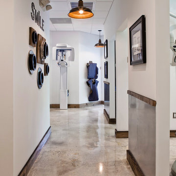
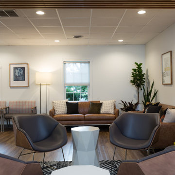
UserReclaimed wood and doors from the old Tampa Courthouse give dimension and a touch of whimsy to this South Tampa dentist office. We set up a drawing desk in the waiting area for children to make artwork while they wait to be seen. We also carried milky sealed concrete throughout the space for the feeling of relaxed sophistication. This is far from the cookie cutter office it started as and patients love it!
Photography: SpaceandLine.com
 Magazi Kitchens and Baths
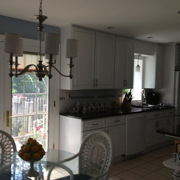
One of our latest kitchen remodels. Our client wanted a white kitchen with blue accents to blend in with her collection of Bavarian china accessories. The counter top we chose is Blue pearl granite with a white back splash that has various shades of blue stone accent. The soffit was removed to accommodate 42" tall wall cabinets.
She was very pleased with the finished product: "Mary, you are the most amazing talented lady who made all the difference in the planning and execution of my kitchen remodeling with all your wonderful expertise. You were so patient and anticipated every possible problem that I didn't. When I was concerned, you came out immediately and showed me how it would work beautifully. I can’t imagine redoing a kitchen with anybody else. Thank you for all your help, patience, great ideas and kindness. "
 InnovationLand
Houston Interior Designer Lisha Maxey took this Museum District condo from the dated, mirrored walls of the 1980s to Mid Century Modern with a gallery look featuring the client's art collection.
"The place was covered with glued-down, floor-to-ceiling mirrors," says Lisha Maxey, senior designer for Homescapes of Houston and principal at LGH Design Services in Houston. "When we took them off the walls, the walls came apart. We ended up taking them down to the studs."
The makeover took six months to complete, primarily because of strict condo association rules that only gave the Houston interior designers very limited access to the elevator - through which all materials and team members had to go.
"Monday through Friday, we could only be noisy from 10 a.m. to 2 p.m., and if we had to do something extra loud, like sawing or drilling, we had to schedule it with the management and they had to communicate that to the condo owners. So it was just a lot of coordination. But a lot of Inner City Loopers live in these kinds of buildings, so we're used to handling that kind of thing."
The client, a child psychiatrist in her 60s, recently moved to Houston from northeast Texas to be with friends. After being widowed three years ago, she decided it was time to let go of the traditionally styled estate that wasn't really her style anyway. An avid diver who has traveled around the world to pursue her passion, she has amassed a large collection of art from her travels. Downsizing to 1,600 feet and wanting to go more contemporary, she wanted the display - and the look - more streamlined.
"She wanted clean lines and muted colors, with the main focus being her artwork," says Maxey. "So we made the space a palette for that."
Enter the white, gallery-grade paint she chose for the walls: "It's halfway between satin and flat," explains Maxey. "It's not glossy and it's not chalky - just very smooth and clean."
Adding to the gallery theme is the satin nickel track lighting with lamps aimed to highlight pieces of art. "This lighting has no wires," notes Maxey. "It's powered by a positive and negative conduit."
The new flooring throughout is a blended-grey porcelain tile that looks like wood planks. "It's gorgeous, natural-looking and combines all the beauty of wood with the durability of tile," says Maxey. "We used it throughout the condo to unify the space."
After Maxey started looking at the client's bright, vibrant, colorful artwork, she felt the palette couldn't stay as muted anymore. Hence the Mid Century Modern orange leather sofas from West Elm and chartruese chairs from Joybird, plus the throw pillows in different textures, patterns and shades of gold, orange and green.
The concave lines of the Danish-inspired chairs, she notes, help them look beautiful from all the way around - a key to designing spaces for loft living.
"The table in the living room is very interesting," notes Maxey. "It was handmade for the client in 1974 and has a signature on it from the artist. She was adamant about including the piece, which has all these hand-painted black-and-white art tiles on the top. I took one look at it and said 'It's not really going to go.'"
However, after cutting 6 inches off the bottom and making it look a little distressed, the table ended up being the perfect complement to the sofas.
The dining room table - from Design Within Reach - is a solid piece of mahogany, the chair upholstery a mix of grey velvet and leather and the legs a shiny brass. "The side chairs are leather and the end ones are velvet," says Maxey. "It's a nice textural mix that lends depth and texture."
The galley kitchen, meanwhile, has been lightened and brightened, with white quartz countertops and backsplashes mimicking the look of Carrara marble, stainless steel appliances and a velvet green bench seat for a punch of color. The cabinets are painted a cool grey color called "Silverplate."
The two bathrooms have been updated with contemporary white vanities and vessel sinks and the master bath now features a walk-in shower tiled in Dolomite white marble (the floor is Bianco Carrara marble mosaic, done in a herringbone pattern.
In the master bedroom, Homescapes of Houston knocked down a wall between two smaller closets with swing doors to make one large walk-in closet with pocket doors. The closet in the guest bedroom also came out 13 more inches.
The client's artwork throughout personalizes the space and tells the story of a life. There's a huge bowl of shells from the client's diving adventures, framed art from her child psychiatry patients and a 16th century wood carving from a monastery that's been in her family forever.
"Her collection is quite impressive," says Maxey. "There's even a framed piece of autographed songs written by John Lennon." (You can see this black-framed piece of art on the wall in the photo above of two green chairs).
"We're extremely happy with how the project turned out, and so is the client," says Maxey. "No expense was spared for her. It was a labor of love and we were excited to do it."
 InnovationLand
Houston Interior Designer Lisha Maxey took this Museum District condo from the dated, mirrored walls of the 1980s to Mid Century Modern with a gallery look featuring the client’s art collection.
The place was covered with glued-down, floor-to-ceiling mirrors,” says Lisha Maxey, senior designer for Homescapes of Houston and principal at LGH Design Services in Houston. “When we took them off the walls, the walls came apart. We ended up taking them down to the studs."
The makeover took six months to complete, primarily because of strict condo association rules that only gave the Houston interior designers very limited access to the elevator – through which all materials and team members had to go.
“Monday through Friday, we could only be noisy from 10 a.m. to 2 p.m., and if we had to do something extra loud, like sawing or drilling, we had to schedule it with the management and they had to communicate that to the condo owners. So it was just a lot of coordination. But a lot of Inner City Loopers live in these kinds of buildings, so we’re used to handling that kind of thing.”
The client, a child psychiatrist in her 60s, recently moved to Houston from northeast Texas to be with friends. After being widowed three years ago, she decided it was time to let go of the traditionally styled estate that wasn’t really her style anyway. An avid diver who has traveled around the world to pursue her passion, she has amassed a large collection of art from her travels. Downsizing to 1,600 feet and wanting to go more contemporary, she wanted the display – and the look – more streamlined.
“She wanted clean lines and muted colors, with the main focus being her artwork,” says Maxey. “So we made the space a palette for that.”
Enter the white, gallery-grade paint she chose for the walls: “It’s halfway between satin and flat,” explains Maxey. “It’s not glossy and it’s not chalky – just very smooth and clean."
Adding to the gallery theme is the satin nickel track lighting with lamps aimed to highlight pieces of art. “This lighting has no wires,” notes Maxey. “It’s powered by a positive and negative conduit.”
The new flooring throughout is a blended-grey porcelain tile that looks like wood planks. “It’s gorgeous, natural-looking and combines all the beauty of wood with the durability of tile,” says Maxey. “We used it throughout the condo to unify the space.”
After Maxey started looking at the client’s bright, vibrant, colorful artwork, she felt the palette couldn’t stay as muted anymore. Hence the Mid Century Modern orange leather sofas from West Elm and bright green chairs from Joybird, plus the throw pillows in different textures, patterns and shades of gold, orange and green.
The concave lines of the Danish-inspired chairs, she notes, help them look beautiful from all the way around – a key to designing spaces for loft living.
“The table in the living room is very interesting,” notes Maxey. “It was handmade for the client in 1974 and has a signature on it from the artist. She was adamant about including the piece, which has all these hand-painted black-and-white art tiles on the top. I took one look at it and said ‘It’s not really going to go.’”
However, after cutting 6 inches off the bottom and making it look a little distressed, the table ended up being the perfect complement to the sofas.
The dining room table – from Design Within Reach – is a solid piece of mahogany, the chair upholstery a mix of grey velvet and leather and the legs a shiny brass. “The side chairs are leather and the end ones are velvet,” says Maxey. “It’s a nice textural mix that lends depth and texture.”The galley kitchen, meanwhile, has been lightened and brightened, with new, white contemporary cabinetry, quartz countertops mimicking the look of Carrara marble, stainless steel appliances and a velvet green bench seat for a punch of color.The two bathrooms have been updated with contemporary white vanities and vessel sinks and the master bath now features a walk-in shower tiled in Dolomite white marble (the floor is Bianco Carrara marble mosaic, done in a herringbone pattern).In the master bedroom, Homescapes of Houston knocked down a wall between two smaller closets with swing doors to make one large walk-in closet with pocket doors. The closet in the guest bedroom also came out 13 more inches.The client’s artwork throughout personalizes the space and tells the story of a life. There’s a huge bowl of shells from the client’s diving adventures, framed art from her child psychiatry patients and a 16th century wood carving from a monastery that’s been in her family forever.
“Her collection is quite impressive,” says Maxey. “There’s even a framed piece of autographed songs written by John Lennon.” (You can see this black-framed piece of art on the wall in the photo above of two green chairs).
“We’re extremely happy with how the project turned out, and so is the client,” says Maxey. “No expense was spared for her. It was a labor of love and we were excited to do it.”
 Brittanys Design
"Crisp Lodge on the River"
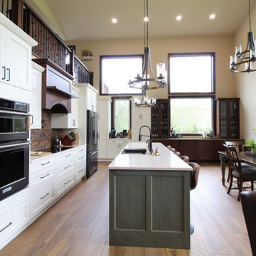
These clients were so patient as they had to move out for 6 months while we took over the renovation of the whole house! The biggest change and always the starting point of every project is the floorpan! The goal was to create a more functional kitchen, dining and living space to accommodate this growing family. The rosemary painted island really sets the tone for all the other cabinetry, flooring, countertops and the rustic rich backsplash along with the stacked slate fireplace tile.

 Bricks Incorporated
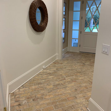
How amazing is this #reclaimed #brick used as #flooring?! These "Dark Pink" #Chicago common #bricks add warmth and #rustic, #oldworld charm to this #contemporary #residence in #Nashville's Hillwood neighborhood.
Homeowner Lee and his wife reviewed three different batches of #masonry before settling on the creamy pinks and beiges of this lot #salvaged from a #demolition site just down the road from our Kedzie yard. It's always fun to work with a #construction professionals on their own #homes — having seen and worked on hundreds of projects themselves, they're creative, patient, detail-oriented, and really appreciate unique and well-made materials!
Designer Emily Haraf of @eh_interiors came up with the #innovative choice of #floor #tile, which continues up and around the main #fireplace to accent the #hearth's #herringbone pattern of white fire brick. We also love the way she used pink cabinets and quirky #wallpaper to play off the colors of the #brick inside the #powderroom.
If you're based in #Tennesee, make sure to check out all the #smallbusinesses whose work on this project made our #commonbrick sparkle! #teamwork #shopsmall
@wr_newman
@kingdombuildersoftn
@eh_interiors



 Wise Medical Billing Company
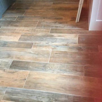
Allergy and immunology billing requires expertise to manage the complexities of coding, claim submissions, and compliance. Wise Medical Billing provides professional RCM services that address the unique needs of these specialties. By outsourcing your billing, you can reduce errors, improve cash flow, and avoid reimbursement delays. Our team ensures every detail is managed with precision, from accurate documentation to timely claim processing. We understand the challenges of allergy/immunology practices and offer customized solutions to support your growth. Let Wise Medical Billing handle the complexities while you focus on what matters most—patient care.
 HeartSing Home Decorating
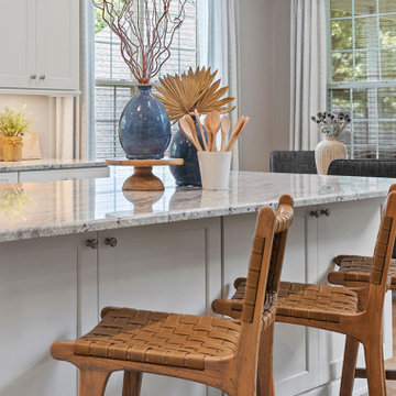
As this fun couple patiently waited through the pandemic for their newly renovated open-concept space, they dreamed of a contemporary look. We came on the scene after the last cabinet was put in place and our directive was to get all the traditional brown wood out. The large sectional was our first choice, followed by table selections that offered clean, modern lines in materials like concrete, raw wood, and resin. Dried florals in textured vases rounded out accessories, as did the bookcase styling with wood slice sculptures. Leather and light wood bar stools warm up the white kitchen, and a driftwood table paired with mod chairs creates a lovely place to dine. Custom draperies offer softness and echo the color scheme.
 Reico Kitchen & Bath
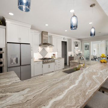
Linda Nielsen of Reico Kitchen and Bath in Millsboro, DE, partnered with Joyce G Designs to create a stunning classic-style kitchen. The design showcases Merillat Masterpiece cabinets.
The wall cabinets feature the Sawyer door style in a Moonshine finish, while the island and wet bar display a Translucent Monument Gray finish. Appliances, countertops, and tile were sourced separately.
Joyce, having worked with Linda on previous kitchen projects, was thrilled to collaborate on her own downsized kitchen. "We faced the challenge of working around support columns without disrupting the countertop and seating. Although bar-height islands are not currently trending, I still prefer the separation of the eating area. We achieved a functional work area that keeps the mess away and fits nicely between the columns."
"Linda suggested using Masterpiece cabinets. I love the finishes! The stepstool cabinet is my favorite, followed by the large spice cabinets. Seeing the showroom samples was helpful. Linda provided great suggestions and was patient with design changes. I am delighted with my kitchen and how it accommodates entertaining my big Italian family!"
According to Linda, the working relationship with Joyce is enjoyable, fostering a free exchange of ideas. "Her kitchen had to meet her needs and the architectural challenges. The mix of paint and specialty-stained cabinets is now the home's focal point."
Photos courtesy of Yeatman Photography.
 Reico Kitchen & Bath
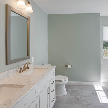
Designed by Dave Wilhide of Reico Kitchen & Bath in Woodbridge, VA in collaboration with Professional Home Improvements, this bathroom remodel features a transitional style inspired bathroom design. The bathroom cabinets are Merillat Classic in the Glenrock door style in a Cotton finish. The bathroom vanity top is a MSI Carrera Lumos quartz countertop. The bathroom also includes Meram Blanc Carrara tile for the shower floor, baseboard and tub wall tile; Seta shower wall tile; and Home Choice Ash floor tile.
“I am not one to like change. So when we decided to completely remodel our bathroom, it was a challenge,” said the client. “There are just so many options and it is easy to become overwhelmed. That is why we chose Reico to help. My designer, Dave, was extremely patient and helpful during the entire process. We love our new bathroom and we couldn’t be more pleased!”
Photos courtesy of BTW Images LLC.
37