
Search results for "People additionally" in Home Design Ideas
 STAK Architecture
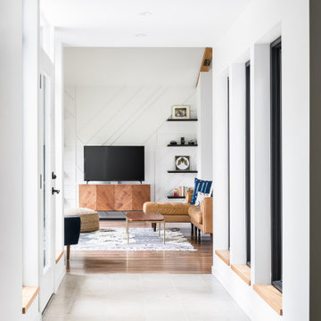
Nestled in a historic residential neighborhood this 1950s Baptist Church was outgrown by its congregation. The building was left unused for 12 years until it was adapted for reuse as a single family home. The home, for a young family of four, was designed with the healthy building principles in mind. The completed house is net zero ready, meaning that all of the systems necessary to convert this house to a net zero home are in place, all that is needed are solar panels. Though the original building was in very rough shape, the design team worked hard to retain as much of the original form as possible. The addition distinguishes itself from the original through materiality and structural articulation. The new form hovers on cantilevers, creating a light touch with the ground plane, in contrast to the heavy form of the original masonry structure. Even though the new building has a modern aesthetic it had to conform to some of the historic neighborhood ordinances of the city. The completed product is loved by the neighborhood, with many people taking their evening walks to pass by their new favorite house.
 We Build Green Inc.
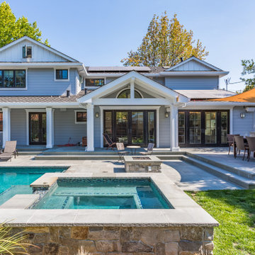
Almost any addition or change you make to a home will have an impact on its resale value, but that is not to say that any change will bring you the best return on investment. Proper planning and choosing the right renovations and upgrades will pay off the most. So, where should you start? For your convenience, we take care of all the aspects involved in increasing your property’s value.
Bathrooms and kitchens always bring a great return on investment, as it does not only increase value but also attracts more eyes to your property, even if you only choose to do some small improvements. Increasing interior spaces or making room additions are another great to achieve your reselling goals. For outdoor spaces, beautiful landscapes and living spaces where people can spend their days with friends and family are great selling points.

 Thomas J. Pearson, Inc.
This 24’ by 22’ addition opens up the kitchen space with an additional room which the kitchen connects to. The newly constructed space serves as a living room/sunroom.
To do this, we tore down the kitchen wall and built a temporary plywood wall to keep the space closed off from the new construction. The new structure was framed and the roof was shingled. To allow for the roof line, new window openings were built and new windows were purchased to meet current egress requirements. The double door that initially went to the exterior was transformed into an 8’ tall opening. The kitchen window at the sink was taken out and now has a wood jamb opening with a granite countertop for a bar where people can sit and watch the cooks at work.
Inside the addition we created some additional cabinet space for another serving area. The cabinetry was framed to fit a beverage cooler. The floor in the addition matches the existing hand scraped wood floor in the kitchen. One particular challenge we faced in the addition was ensuring that the floor elevation for the new addition lined perfectly so that it was seamless.
On the exterior we installed a new cultured ledge stone and a real limestone sill with actual rock face to provide a natural appearance. The stone steps on each of the entryways into the addition have a similar look. The radius steps contain the rock face feature as well. Large windows were installed which match the pitch of the existing roof. The siding on the new structure is sympathetic to the siding on the home. We also installed new state of the art skylights that shut themselves when it rains.
Find the right local pro for your project

 CITYDESKSTUDIO, Inc.
Believed to be the oldest building in Excelsior Minnesota, this humble brick structure has transformed, been moved, and housed countless people over its 162 years. Affectionately known as ‘The Beehive’, it was built in 1857 and began as the original Excelsior schoolhouse. It was moved to its’ current location in the 1880’s and became a 23-room dormitory for Northwestern Christian College, followed by a boarding house, and finally apartments (in addition to the rumors of more sordid activities in the early 20th century!).
After being in the same family for several decades, the owner wanted to transform the building one more time to make it her own home. Citydeskstudio worked closely with her and the Excelsior Historic Preservation Commission on the design. She now occupies the main floor, with additional units above and below for rental and for family.
The design celebrates the stout and blocky character of the building with a new modern expansion off the back. There, the building steps and expands outwards in glassy boxes of charred cedar. Inside, the original structure was repaired and uncovered where possible, and previous poorly done modifications were corrected. The center piece of this more open and light-filled home is a rich modern kitchen in walnut, travertine, and steel. The old character remains ever present and is essential to the spirit of The Beehive’s latest transformation.
This multigenerational home’s design honors the legacy of the property, marrying the original Excelsior schoolhouse with a beautiful, modern, contextually-sensitive remodel and addition.
Project Team:
Ben Awes, AIA, Principal-In-Charge
Chris Bach
Nate Dodge
 CITYDESKSTUDIO, Inc.
Believed to be the oldest building in Excelsior Minnesota, this humble brick structure has transformed, been moved, and housed countless people over its 162 years. Affectionately known as ‘The Beehive’, it was built in 1857 and began as the original Excelsior schoolhouse. It was moved to its’ current location in the 1880’s and became a 23-room dormitory for Northwestern Christian College, followed by a boarding house, and finally apartments (in addition to the rumors of more sordid activities in the early 20th century!).
After being in the same family for several decades, the owner wanted to transform the building one more time to make it her own home. Citydeskstudio worked closely with her and the Excelsior Historic Preservation Commission on the design. She now occupies the main floor, with additional units above and below for rental and for family.
The design celebrates the stout and blocky character of the building with a new modern expansion off the back. There, the building steps and expands outwards in glassy boxes of charred cedar. Inside, the original structure was repaired and uncovered where possible, and previous poorly done modifications were corrected. The center piece of this more open and light-filled home is a rich modern kitchen in walnut, travertine, and steel. The old character remains ever present and is essential to the spirit of The Beehive’s latest transformation.
This multigenerational home’s design honors the legacy of the property, marrying the original Excelsior schoolhouse with a beautiful, modern, contextually-sensitive remodel and addition.
Project Team:
Ben Awes, AIA, Principal-In-Charge
Chris Bach
Nate Dodge
 Metropolis Drafting and Construction Inc
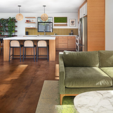
A Modern home that wished for more warmth...
An addition and reconstruction of approx. 750sq. area.
That included new kitchen, office, family room and back patio cover area.
The custom-made kitchen cabinets are semi-inset / semi-frameless combination.
The door style was custom build with a minor bevel at the edge of each door.
White oak was used for the frame, drawers and most of the cabinet doors with some doors paint white for accent effect.
The island "legs" or water fall sides if you wish and the hood enclosure are Tambour wood paneling.
These are 3/4" half round wood profile connected together for a continues pattern.
These Tambour panels, the wicker pendant lights and the green live walls inject a bit of an Asian fusion into the design mix.
The floors are polished concrete in a dark brown finish to inject additional warmth vs. the standard concrete gray most of us familiar with.
A huge 16' multi sliding door by La Cantina was installed, this door is aluminum clad (wood finish on the interior of the door).
 American Pool and Spa
The T40 Features:
1. SPACIOUS SHALLOW END BENCH SEAT
Want to take a break from the action and hang out with some friends? This seating area is properly sized to accommodate the whole family.
2. LARGE SHALLOW END FOR SOCIALIZING AND PLAY
The problem with most deep end pools is the tiny shallow end, which is where most people gather. The T40 shallow end is 30% larger than the industry standard deep end pool.
3. OPEN POOL INTERIOR
Want plenty of room to float and frolic? The rectangular design of the T40 provides ample room for all of your pool activities.
4. DEEP END SEATS / EXIT POINTS
When using deep end pools, people love to jump in, exit, and repeat. The deep end seats of the T40 provide a place to get in and out, as well as take a rest.
5. MASSIVE 8' 6" DEEP END
Looking for lots of water? The T40 is 6" deeper than most of the fiberglass deep end pools on the market.
6. AUTOMATIC COVER FRIENDLY
The rectangular design of the T40 allows cover tracks to be hidden beneath the pool coping, protecting them and keeping them out of sight.
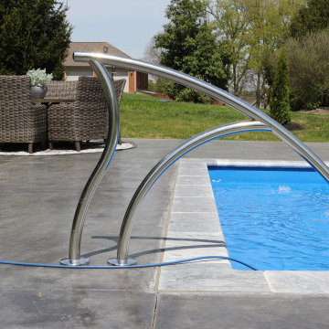
This customer has their Backyard Oasis furnished with both patio furniture, tables and loungers in addition to the shrubbery that ascetically hides the Equipment Pad.
Their Pool is trimmed with Marmiro Stone Travertine Coping.
It has a Slide, Basketball Hoop, Ledge Lounger Jets, and a Handicap Accessible entry point.
Sponsored
Columbus, OH

Hope Restoration & General Contracting
Columbus Design-Build, Kitchen & Bath Remodeling, Historic Renovations
 Thomas J. Pearson, Inc.
This 24’ by 22’ addition opens up the kitchen space with an additional room which the kitchen connects to. The newly constructed space serves as a living room/sunroom.
To do this, we tore down the kitchen wall and built a temporary plywood wall to keep the space closed off from the new construction. The new structure was framed and the roof was shingled. To allow for the roof line, new window openings were built and new windows were purchased to meet current egress requirements. The double door that initially went to the exterior was transformed into an 8’ tall opening. The kitchen window at the sink was taken out and now has a wood jamb opening with a granite countertop for a bar where people can sit and watch the cooks at work.
Inside the addition we created some additional cabinet space for another serving area. The cabinetry was framed to fit a beverage cooler. The floor in the addition matches the existing hand scraped wood floor in the kitchen. One particular challenge we faced in the addition was ensuring that the floor elevation for the new addition lined perfectly so that it was seamless.
On the exterior we installed a new cultured ledge stone and a real limestone sill with actual rock face to provide a natural appearance. The stone steps on each of the entryways into the addition have a similar look. The radius steps contain the rock face feature as well. Large windows were installed which match the pitch of the existing roof. The siding on the new structure is sympathetic to the siding on the home. We also installed new state of the art skylights that shut themselves when it rains.


 Mural Art - Wall Murals and Custom Paintings
Avengers Murals, hand painted throughout a kids bedroom by Tom Taylor of Mural Art LLC.
Superhero art has become very popular the last ten years and I've been asked to create superhero themed wall murals in rooms for kids and people of all ages. Whether it be Spiderman, Captain America, Batman or Avengers; the addition of large hand painted superheros will add amazing character to any room. I like to include shadowing with my characters to create a realistic 3D quality to the artwork and image. Superhero art is perfect for any game room, media room or your children's bedroom.
 CITYDESKSTUDIO, Inc.
Believed to be the oldest building in Excelsior Minnesota, this humble brick structure has transformed, been moved, and housed countless people over its 162 years. Affectionately known as ‘The Beehive’, it was built in 1857 and began as the original Excelsior schoolhouse. It was moved to its’ current location in the 1880’s and became a 23-room dormitory for Northwestern Christian College, followed by a boarding house, and finally apartments (in addition to the rumors of more sordid activities in the early 20th century!).
After being in the same family for several decades, the owner wanted to transform the building one more time to make it her own home. Citydeskstudio worked closely with her and the Excelsior Historic Preservation Commission on the design. She now occupies the main floor, with additional units above and below for rental and for family.
The design celebrates the stout and blocky character of the building with a new modern expansion off the back. There, the building steps and expands outwards in glassy boxes of charred cedar. Inside, the original structure was repaired and uncovered where possible, and previous poorly done modifications were corrected. The center piece of this more open and light-filled home is a rich modern kitchen in walnut, travertine, and steel. The old character remains ever present and is essential to the spirit of The Beehive’s latest transformation.
This multigenerational home’s design honors the legacy of the property, marrying the original Excelsior schoolhouse with a beautiful, modern, contextually-sensitive remodel and addition.
Project Team:
Ben Awes, AIA, Principal-In-Charge
Chris Bach
Nate Dodge
 Simply Home Decorating
This beautiful North Vancouver home belongs to a nature-loving and health-conscious couple, Emma and Vince (names changed), their two young children, and their dog, Jasper. When they contacted us about renovating and furnishing their kitchen and family room, we walked in and saw a world of potential waiting to be uncovered.
Before: Larkhall Crescent Home:
Like many original North Vancouver homes, the interior was definitely dated. We encountered late ‘80s finishes in powder pink and teal green, old carpet, and a kitchen that wasn’t maximized to suit this family’s modern-day lifestyle. However, the size of the rooms offered us a ton of space with which to get creative.
Knowing our clients’ love of cooking, need for work spaces (Emma and Vince both work remotely), and growing family, we developed a design concept that would increase usable space, optimize storage, and create intimacy in this large area. As for the style, we were inspired by their European roots, inventing a new and modern take on “Belgian Farmhouse” style. Now, the home is truly one-of-a-kind.
After: Warm & Cozy Family Room:
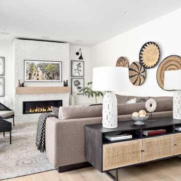
Fresh, bright, and comfortable, this living area has been transformed! We started with the fireplace as a focal point, selecting aged brick tiles for added texture and a crisp wood mantle. The taupe-coloured sectional infuses the room with visual warmth and serves the added purpose of separating the family room from the kitchen.
Emma and Vince were also keen on using non-toxic materials in their home, and we were happy to oblige. To meet their needs, we sourced natural wood elements and sought out Canadian-made products - that adhere to high health standards - whenever possible.
Look closer at the elements of this space, and you will find this stunning, honeycomb-patterned rug in earthy gold, beige, and charcoal tones. It’s plush to the touch and full of visual texture that brings this room’s colour palette together. We sourced these two-tone chairs with caning, petrified wood side table, black sconces, and botanical prints in greyscale from local artist, Heather Johnston.
We topped off the space with this dark wood and rattan console that offers storage facing the kitchen and presents an opportunity to display cherished items. The result is a cozy lounging space brimming with comfort and functionality. It’s perfect for enjoying quality family time, or Emma can simply slide the coffee table away to make room for her morning yoga practice.
Now, let’s turn around and give some attention to the kitchen. Do you remember what the original kitchen looked like? If not, scroll back up, because the transformation is shocking…
Moody & Welcoming Kitchen for Healthy Living:
This kitchen looks very different from how it started, right? Though we didn’t touch any walls, the kitchen has almost doubled in usable space! We created a long, extended island with storage, an outlet for small appliances, and seating for comfortable prep, after-school snacking, or mingling among friends.
On the other side of the island, the family has even more storage and an integrated dishwasher within easy reach of the sink, perfect for quick clean-up. From this angle, you can also see the expansive custom Shaker cabinetry in white and the integrated double ovens. These facilitate their cooking experience and gave us the opportunity to add an additional surprise…
A coffee garage station and more hidden storage! Keeping these items located along the perimeter allows them to be accessed by the family or their guests without someone getting under the cook’s feet. These are the little details that make everyday life easier and more enjoyable.
Moving deeper into the kitchen, the seamless induction cooktop topped with a freestanding concealed hood fan commands attention in a soft yet prominent way. The natural wood accent mirrors the fireplace mantle, and the choice of off-black wood-grain cabinets not only continues our black-and-white colour palette but adds a sense of depth and contrast. The corner sink is located to the right and perfectly positioned with a view of their thriving backyard.
To invite more of this family’s character into the space, we mixed metals for interest — matte black, dark pewter, and warm brass — and created open shelves in white oak for their plants and decor. You can also glimpse the tumbled edge of the backsplash tile, which echoes the rustic brick of the fireplace. It adds that farmhouse charm while still feeling timeless and sophisticated.
Last but not least, we designed this dining banquette in the bay window (with integrated bench storage, of course), where the family can share a meal together, the kids can do homework, or Emma and Vince can work and enjoy a change of scenery from their offices. Like the other spaces in the home, it was designed to be beautiful, multi-functional, and long-lasting.
Praise from Our Clients:
It is clear that we love this home, but what did our clients have to say?
“Lori is a visionary and masters execution to the finest detail all at the same time. When she first met us to know more about who we are and how we live, she could right away envision how we could use the space in our kitchen and living room…The results exceeded our expectations.
Lori and her team were also a delight to work with — coordination with all the trades, fast problem-solving, regular updates, professional and friendly attitude of her entire team — made it the dream team. Thank you SHD for making our space so beautiful!”
In turn, we are so grateful for this family’s trust, their open communication, and for being wonderful people with whom to work. (So, thank you!)
 Thomas J. Pearson, Inc.
This 24’ by 22’ addition opens up the kitchen space with an additional room which the kitchen connects to. The newly constructed space serves as a living room/sunroom.
To do this, we tore down the kitchen wall and built a temporary plywood wall to keep the space closed off from the new construction. The new structure was framed and the roof was shingled. To allow for the roof line, new window openings were built and new windows were purchased to meet current egress requirements. The double door that initially went to the exterior was transformed into an 8’ tall opening. The kitchen window at the sink was taken out and now has a wood jamb opening with a granite countertop for a bar where people can sit and watch the cooks at work.
Inside the addition we created some additional cabinet space for another serving area. The cabinetry was framed to fit a beverage cooler. The floor in the addition matches the existing hand scraped wood floor in the kitchen. One particular challenge we faced in the addition was ensuring that the floor elevation for the new addition lined perfectly so that it was seamless.
On the exterior we installed a new cultured ledge stone and a real limestone sill with actual rock face to provide a natural appearance. The stone steps on each of the entryways into the addition have a similar look. The radius steps contain the rock face feature as well. Large windows were installed which match the pitch of the existing roof. The siding on the new structure is sympathetic to the siding on the home. We also installed new state of the art skylights that shut themselves when it rains.
Sponsored
Columbus, OH
Hope Restoration & General Contracting
Columbus Design-Build, Kitchen & Bath Remodeling, Historic Renovations
 Thomas J. Pearson, Inc.
This 24’ by 22’ addition opens up the kitchen space with an additional room which the kitchen connects to. The newly constructed space serves as a living room/sunroom.
To do this, we tore down the kitchen wall and built a temporary plywood wall to keep the space closed off from the new construction. The new structure was framed and the roof was shingled. To allow for the roof line, new window openings were built and new windows were purchased to meet current egress requirements. The double door that initially went to the exterior was transformed into an 8’ tall opening. The kitchen window at the sink was taken out and now has a wood jamb opening with a granite countertop for a bar where people can sit and watch the cooks at work.
Inside the addition we created some additional cabinet space for another serving area. The cabinetry was framed to fit a beverage cooler. The floor in the addition matches the existing hand scraped wood floor in the kitchen. One particular challenge we faced in the addition was ensuring that the floor elevation for the new addition lined perfectly so that it was seamless.
On the exterior we installed a new cultured ledge stone and a real limestone sill with actual rock face to provide a natural appearance. The stone steps on each of the entryways into the addition have a similar look. The radius steps contain the rock face feature as well. Large windows were installed which match the pitch of the existing roof. The siding on the new structure is sympathetic to the siding on the home. We also installed new state of the art skylights that shut themselves when it rains.
 Thomas J. Pearson, Inc.
This 24’ by 22’ addition opens up the kitchen space with an additional room which the kitchen connects to. The newly constructed space serves as a living room/sunroom.
To do this, we tore down the kitchen wall and built a temporary plywood wall to keep the space closed off from the new construction. The new structure was framed and the roof was shingled. To allow for the roof line, new window openings were built and new windows were purchased to meet current egress requirements. The double door that initially went to the exterior was transformed into an 8’ tall opening. The kitchen window at the sink was taken out and now has a wood jamb opening with a granite countertop for a bar where people can sit and watch the cooks at work.
Inside the addition we created some additional cabinet space for another serving area. The cabinetry was framed to fit a beverage cooler. The floor in the addition matches the existing hand scraped wood floor in the kitchen. One particular challenge we faced in the addition was ensuring that the floor elevation for the new addition lined perfectly so that it was seamless.
On the exterior we installed a new cultured ledge stone and a real limestone sill with actual rock face to provide a natural appearance. The stone steps on each of the entryways into the addition have a similar look. The radius steps contain the rock face feature as well. Large windows were installed which match the pitch of the existing roof. The siding on the new structure is sympathetic to the siding on the home. We also installed new state of the art skylights that shut themselves when it rains.

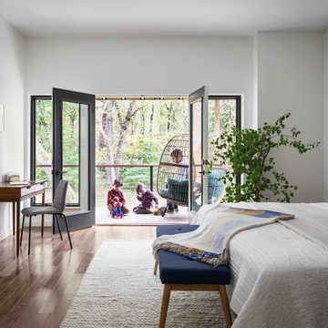 STAK Architecture
Nestled in a historic residential neighborhood this 1950s Baptist Church was outgrown by its congregation. The building was left unused for 12 years until it was adapted for reuse as a single family home. The home, for a young family of four, was designed with the healthy building principles in mind. The completed house is net zero ready, meaning that all of the systems necessary to convert this house to a net zero home are in place, all that is needed are solar panels. Though the original building was in very rough shape, the design team worked hard to retain as much of the original form as possible. The addition distinguishes itself from the original through materiality and structural articulation. The new form hovers on cantilevers, creating a light touch with the ground plane, in contrast to the heavy form of the original masonry structure. Even though the new building has a modern aesthetic it had to conform to some of the historic neighborhood ordinances of the city. The completed product is loved by the neighborhood, with many people taking their evening walks to pass by their new favorite house.
Sponsored
Columbus, OH
Hope Restoration & General Contracting
Columbus Design-Build, Kitchen & Bath Remodeling, Historic Renovations

 Saikley Architects
This beautiful 1881 Alameda Victorian cottage, wonderfully embodying the Transitional Gothic-Eastlake era, had most of its original features intact. Our clients, one of whom is a painter, wanted to preserve the beauty of the historic home while modernizing its flow and function.
From several small rooms, we created a bright, open artist’s studio. We dug out the basement for a large workshop, extending a new run of stair in keeping with the existing original staircase. While keeping the bones of the house intact, we combined small spaces into large rooms, closed off doorways that were in awkward places, removed unused chimneys, changed the circulation through the house for ease and good sightlines, and made new high doorways that work gracefully with the eleven foot high ceilings. We removed inconsistent picture railings to give wall space for the clients’ art collection and to enhance the height of the rooms. From a poorly laid out kitchen and adjunct utility rooms, we made a large kitchen and family room with nine-foot-high glass doors to a new large deck. A tall wood screen at one end of the deck, fire pit, and seating give the sense of an outdoor room, overlooking the owners’ intensively planted garden. A previous mismatched addition at the side of the house was removed and a cozy outdoor living space made where morning light is received. The original house was segmented into small spaces; the new open design lends itself to the clients’ lifestyle of entertaining groups of people, working from home, and enjoying indoor-outdoor living.
Photography by Kurt Manley.
https://saikleyarchitects.com/portfolio/artists-victorian/
 Metropolis Drafting and Construction Inc
Clean as clean can be. This super bright and white bathroom is a perfect design for whomever wants a easy on the eyes color scheme and a feeling of cleanliness.
The bathroom was constructed as an addition to the master bedroom. The vanity and the toilet are floating and mounted to the wall to give a light weight feeling and openness.
the huge double shower is perfect for two people to enjoy simultaneously and the curbless design (no step in) \ the open walk in area makes it easy and fun to use.
the floor tile are the contrasting touch and together with the peitra gray top of the shower benches give the color punch that a white bathroom needs.

 Cummings Architecture + Interiors
When Cummings Architects first met with the owners of this understated country farmhouse, the building’s layout and design was an incoherent jumble. The original bones of the building were almost unrecognizable. All of the original windows, doors, flooring, and trims – even the country kitchen – had been removed. Mathew and his team began a thorough design discovery process to find the design solution that would enable them to breathe life back into the old farmhouse in a way that acknowledged the building’s venerable history while also providing for a modern living by a growing family.
The redesign included the addition of a new eat-in kitchen, bedrooms, bathrooms, wrap around porch, and stone fireplaces. To begin the transforming restoration, the team designed a generous, twenty-four square foot kitchen addition with custom, farmers-style cabinetry and timber framing. The team walked the homeowners through each detail the cabinetry layout, materials, and finishes. Salvaged materials were used and authentic craftsmanship lent a sense of place and history to the fabric of the space.
The new master suite included a cathedral ceiling showcasing beautifully worn salvaged timbers. The team continued with the farm theme, using sliding barn doors to separate the custom-designed master bath and closet. The new second-floor hallway features a bold, red floor while new transoms in each bedroom let in plenty of light. A summer stair, detailed and crafted with authentic details, was added for additional access and charm.
Finally, a welcoming farmer’s porch wraps around the side entry, connecting to the rear yard via a gracefully engineered grade. This large outdoor space provides seating for large groups of people to visit and dine next to the beautiful outdoor landscape and the new exterior stone fireplace.
Though it had temporarily lost its identity, with the help of the team at Cummings Architects, this lovely farmhouse has regained not only its former charm but also a new life through beautifully integrated modern features designed for today’s family.
Photo by Eric Roth
72