
Search results for "Physically" in Home Design Ideas
 Flavin Architects
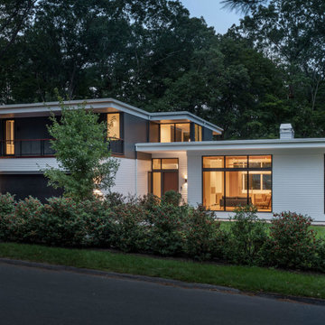
Our clients wanted to replace an existing suburban home with a modern house at the same Lexington address where they had lived for years. The structure the clients envisioned would complement their lives and integrate the interior of the home with the natural environment of their generous property. The sleek, angular home is still a respectful neighbor, especially in the evening, when warm light emanates from the expansive transparencies used to open the house to its surroundings. The home re-envisions the suburban neighborhood in which it stands, balancing relationship to the neighborhood with an updated aesthetic.
The floor plan is arranged in a “T” shape which includes a two-story wing consisting of individual studies and bedrooms and a single-story common area. The two-story section is arranged with great fluidity between interior and exterior spaces and features generous exterior balconies. A staircase beautifully encased in glass stands as the linchpin between the two areas. The spacious, single-story common area extends from the stairwell and includes a living room and kitchen. A recessed wooden ceiling defines the living room area within the open plan space.
Separating common from private spaces has served our clients well. As luck would have it, construction on the house was just finishing up as we entered the Covid lockdown of 2020. Since the studies in the two-story wing were physically and acoustically separate, zoom calls for work could carry on uninterrupted while life happened in the kitchen and living room spaces. The expansive panes of glass, outdoor balconies, and a broad deck along the living room provided our clients with a structured sense of continuity in their lives without compromising their commitment to aesthetically smart and beautiful design.

 VESTA
This highrise apartment had been designed and beautifully appointed back in the early 90’s but was desperate for an update. This Master Bath had an awkward angled shower with an enclosed toilet room that made it feel small and cramped.
By eliminating the toilet room and squaring off the shower for a larger footprint, we gained physical space. The sleek modern design was enhanced by using a single large format tile type throughout. The Duravit soaking tub has a “reading shelf” built into the side of the plinth facing the toilet - necessary, yet hidden. The tub was designed to be a feature as you walk into the room – allowing the homeowner to feature a favorite piece of art.

 Granit Architects + Interiors
We are delighted to have completed the radical transformation of a tired detached property in South Croydon.
When they appointed Granit, our clients were living in the property which had previously been divided into a number of flats.
The historic sub-division had resulted in an extremely poor use of space with redundant staircases, kitchens and bathrooms throughout.
Our clients sought to reconfigure the property back into a single dwelling for his growing family.
Our client had an eye for design and was keen to balance contemporary design whilst maintaining as much of the character of the original house.
Maximising natural light, space and establishing a visual and physical connection were also key drivers for the design. Owing to the size of the property, it became apparent that reconfiguration rather than extension provided the solution to meet the brief.
A metal clad ‘intervention’ was introduced to the rear facade. This created a strong horizontal element creating a visual balance with the vertical nature of the three storey gable.
The metal cladding specified echoed the colour of the red brick string courses tying old with new. Slender frame sliding doors provide access and views of the large garden.
The central circulation space was transformed by the introduction of a double height glazed slot wrapping up the rear facade and onto the roof. This allows daylight to permeate into the heart of the otherwise dark deep floor plan. The staircase was reconfigured into a series of landings looking down over the main void space below and out towards the tree canopies at the rear of the garden.
The introduction of double pocket doors throughout the ground floor creates a series of interconnected spaces and the whitewashed Larch flooring flows seamlessly from room to room. A bold palette of colours and materials lends character and texture throughout the property.
The end result is a spacious yet cosy environment for the family to inhabit for years to come.
Find the right local pro for your project

 BZ Architects
The previous layout of the main floor of this split level house separated each space from the other, resulting in a design which did not take advantage of either the existing space or potential views.
Our response was to modulate the degree of openness between the rooms and spaces using architectural elements. At the entry, an open, lattice-like divider replaces a full-height wall, physically and visually expanding the foyer. In the kitchen, strategically placed partial-height cabinets supplant full-height walls between the living room and kitchen and act as a visual barrier between the two, allowing the kitchen to become a destination rather than a corridor.
Removing the wall between the kitchen and dining room provides for better interaction between host and guest while a series of south-facing skylights over a new island help to blur the line between the interior and exterior.

 Studio41 Home Design Showroom
A NEW INTERPRETATION OF SENSUALITY IN THE BATHROOM. | LULU is part of a trend that goes far beyond the bathroom. Physical, sensual, soft. A world of visual seduction. A play on the easy-going French lifestyle: sensitivity, seduction, passion, love. Is it already the bathroom, or still the bedroom? The in-between place. Room for imagination. Everything seems playful, open, emotional. Design can be unapproachable – LULU is the opposite. With its sensual shapes, it represents enjoyment of life. At the same time, it is very soft and very linear, very slender and very alert. Its clear proportions, in conjunction with bold colors, develop a refreshing suspense – and prove that purism also works with color. Perhaps even a little bit better. | Available at www.shopstudio41.com
 Dylan Baliski
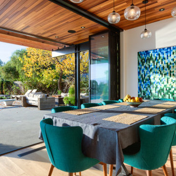
Residential architecture must always have a connection with its landscape: physically and visually.
The previous home, despite being located on a beautiful waterfront site, was derelict and not fit for purpose anymore. There was little connection to the water and beach, thus not taking advantage of its waterfront location. A true connection to the water was achieved through adaptable glazing covering the majority of the rear facade and a roof line that is set outwards. Furthermore, the protruding massing orients and aligns itself toward the waterfront, bringing the interior spaces and beach together. Despite the small plot, two accessory dwelling units were erected on the east end, providing additional affordable housing near the city centre.
Knowing the clients personally, I was fortunate enough to be trusted with leading the design of this project from its inception. 3D models and plans helped the clients and myself come to design decisions in the context of the site. My plans were signed off by a local drafting company with very minimal changes. The residence has won multiple awards including a first place in the “Residential Infill “ category from the Canadian Homebuilders Association.
 AIA Pittsburgh
INTERIOR ARCHITECTURE: Certificate of Merit
PROJECT: Altius
CLIENT: B DeFrancis
ARCHITECTURE FIRM: Bucco Architecture
ENGINEERS: Watson Engineers; Claitman Engineering Associates, Inc.
CONTRACTORS: RJS Construction
PHOTOGRAPHER: Walsh Photography
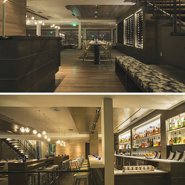
DESCRIPTION: Altius sits on the crest of Grandview Avenue and embraces its physical position to inspire the design, striving to create an ‘elevated’ experience. Spatially, that means creating a directional pull to the view with a series of elements: hostess station, open stair, communal tables, and bar are all positioned perpendicular to the windows to allow guests to move through the space with a continual connection to the expanse of windows.
JURY COMMENTS: This restaurant is really beautifully detailed with very rich materials. We especially appreciate that the detailing did not stop before it made it into the washrooms. The minimalist approach to these details adds a richness that will be appreciated more with each visit.

Sponsored
Sunbury, OH

J.Holderby - Renovations
Franklin County's Leading General Contractors - 2X Best of Houzz!
 Mike Farley Pool Designer, SWD, ASLA
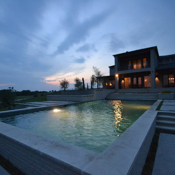
This contemporary design connects the house to the cabana office both physically and architecturally. Two sets of 12" stainless steal spill edges were used to be visible from both the office and the home. Colored and textured concrete blended with the Leuters limestone coping. Grass strips broke up the paving and blended the pools cape and landscape together which further enhances the linear concept. Photo and design by Mike Farley

 Wood Anchor
“A deep purple river joins two 14 ft live edge Winnipeg Elm slabs on this one of a kind table.
The angular design of the leg offers visual qualities much like a kite in the sky.
Shifting your perspective to the tables angles you really get a sense of visual and physical mass!
From its side profile you’ll see thin lines of angular connections.”
We were commissioned to build this one of a kind table for a customer residing in another province.
As with all of our custom pieces we worked closely with the customer (much through emails) understanding the emotion they wanted the table to invoke in their space.
Details:
14’ long x 5’ wide x 1.5” thick reclaimed Elm table with central live edge “river” coloured resin, squared outer edges, black powder coated steel leg (“w”leg design) with black powder coated steel table under structure.
First image credit: Customer supplied image.
2016 © Ray Chan Photo, All Rights Reserved
 Globe Electric
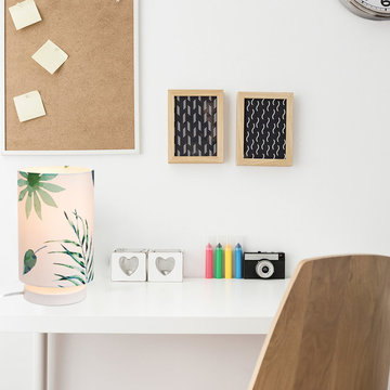
Inspired by Tapa cloth originating in the islands of the Pacific Ocean, the Lucy Table Lamp boasts a gorgeous folk art geometric motif. With a white base and black and white shade, you get a cheerful glow for your home or office. A 5-inch base lets you place this lamp anywhere you like without taking up too much physical space - though the light is especially visually appealing. While the design has a lot going on, it's actually very calming and a welcome addition to your ever-changing decor. Decorate with the Novogratz and Globe Electric - lighting made easy.
 Reader & Swartz Architects, P.C.
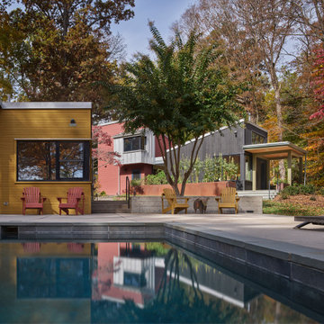
The goal of the project was to address the physical and perceptual challenges of aging in place while preserving and honoring the original design of the compound. The additions were designed to be compatible with the existing guest house, complement its small scale, and clearly read as new construction. The new volumes were purposely clad in contrasting materials, such as poplar bark shingles, thermally modified pine, stamped zinc-coated metal, and Shou Sugi Ban siding, to distinguish between the existing and the new, while still complementing the original materials palette. In consultation with arborists, the additions were designed to jog around and preserve the mature existing trees.
 Lamont Bros. Design & Construction
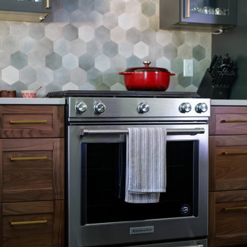
This Portland kitchen transformation focused on reimagining the flow and functionality of the space, while also refreshing its look and feel. The original layout featured a peninsula that created a visual and physical barrier between the cooking and dining areas—and the patio outside—limiting both movement and social interaction.
The homeowners goal was to remove this dividing element and replacing it with a thoughtfully designed custom island that serves as both a functional workspace and a natural gathering point. This strategic change opened up the entire space, creating a seamless flow while maintaining distinct zones for cooking and dining.
Because one of the homeowners is a talented woodworker, we were able to incorporate some really lovely, custom handmade elements throughout the kitchen and dining room.
The result is a kitchen that not only functions better but creates a more inviting environment for both everyday living and entertaining.
 Lamont Bros. Design & Construction
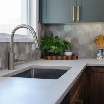
This Portland kitchen transformation focused on reimagining the flow and functionality of the space, while also refreshing its look and feel. The original layout featured a peninsula that created a visual and physical barrier between the cooking and dining areas—and the patio outside—limiting both movement and social interaction.
The homeowners goal was to remove this dividing element and replacing it with a thoughtfully designed custom island that serves as both a functional workspace and a natural gathering point. This strategic change opened up the entire space, creating a seamless flow while maintaining distinct zones for cooking and dining.
Because one of the homeowners is a talented woodworker, we were able to incorporate some really lovely, custom handmade elements throughout the kitchen and dining room.
The result is a kitchen that not only functions better but creates a more inviting environment for both everyday living and entertaining.
Sponsored
Sunbury, OH
J.Holderby - Renovations
Franklin County's Leading General Contractors - 2X Best of Houzz!
 Luxe pour Maison
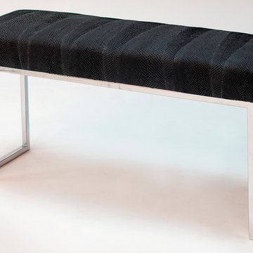
 Salmon Leather, is a new and exciting material! Our eco-friendly leather is made by repurposing a by-prodcut of the salmon industry; salmon skin, which is usually discarded. Salmon skin leather has some truly unique properties, not only aesthetically but physically as well.
It is a very strong & flexible material (more so than cow leather), and it has an amazing 3D texture, which has been compared to snake skin leather, except that salmon leather has a softer suede like feel to it.
At Luxe pour Maison, our mission is to practice and promote the use of sustainable innovation as a process for cultural, environmental and economic development. Sustainable design is our core competency and the common thread uniting every partner and activity we undertake.
We pride ourselves on following fair-trade principals, which create a synergy between local culture and industry; that respects local cultural values and stimulates ethical economic growth in the Chilean Patagonia, a pristine and untouched environment known for its unique beauty.

 RoomService 360
The design concept of Dylan Designer Leather Bed has been driven by extreme engineering, rigorous geometry and basic laws of physics. With extraordinary, innovative structure that gives the illusion of being suspended in air, Dylan Modern Leather Bed is an emblem of originality and a sign of exquisite taste. It is without a doubt by selecting Dylan Leather Platform Bed you are opting to express a distinctive character that echoes modern scale, silhouette and colors. Dylan Designer Platform Bed is made in Italy by Cattelan Italia and is designed by Andrea Lucatello.

 Lentz Kitchen & Bath
Although largely dictated by the husband's need for accessibility, the universal design of this kitchen is also extremely friendly for a person of smaller stature (his wife!)
The Crystal Keyline island, range-hood and accessible cooktop area are focal points, finished in Antique Ivory w/Brown Highlights, that contrast nicely with Crystal Keyline Toasted Rye w/Brown Highlights cabinetry. The Bayfield door style unifies the design.
An accessible prep area next to the right of the stove allows plenty of room for multiple cooks in the kitchen.
Typhoon Bordeaux granite countertops are layered in staggered heights for added visual interest.
The on-set of a neuromuscular disorder was the basis for this custom kitchen and required the complete customization of this space to the specific needs of the client, as well as to his wife who does most the cooking on a daily basis. The layout was designed for the couple to be able to work together in the kitchen, or independently.
The couple feels at home in this kitchen yet, it’s not obvious that someone with physical limitations utilizes this space.

 Shehan Luxury Pools
Often times some of the best features cannot be seen or captured on film. That is the case with this indoor water adventure. At Shehan Luxury Pools we know that some like to swim for exercise and others like to swim for pleasure - why not offer both? Hidden just to the right of the beach entry is a "Shehan" solution: A powerful commercial Swim-Jet. The purpose of the Swim-Jet is to provide a strong endless current of water. The result is an infinite swimming distance and duration in a location where space is limited. Problem solved!
Now for pleasure and fun. Hidden by design, this pool sports a fast-glide, contoured free-form speed slide. The more adventurous guests board the slide from a set of simulated rock stairs located to the left of the waterfall area. After climbing fourteen feet in elevation, riders will launch themselves down a tube of pure exhilaration. Seconds later, the swimmers are saturated with hundreds of gallons of water carrying them quickly back to the tropical lagoon where they first began; and then do it all over again. If your goals are physical fitness, aesthetics, or family pleasure, the professionals at Shehan Luxury Pools will exceed your expectation.
 Mike Farley Pool Designer, SWD, ASLA
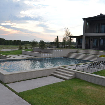
This is a view of the house with the street in the background that the wall with spill edges gives privacy from. This contemporary design connects the house to the cabana office both physically and architecturally. Two sets of 12" stainless steal spill edges were used to be visible from both the office and the home. Colored and textured concrete blended with the Leuters limestone coping. Grass strips broke up the paving and blended the pools cape and landscape together which further enhances the linear concept. Photo and design by Mike Farley
 Randy Thueme Design Inc. - Landscape Architecture
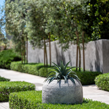
The expansive grounds surrounding this residence, designed anew in the 1990’s while the home was undergoing renovation and expansion, had since fallen into neglect. The new owners envisioned a landscape of tailored spaces accommodating adult recreation and children’s play, gatherings of family and parties with friends. A studio building on the site was also in need of repurposing. The young couple were visionary and believed the studio could house a swimming pool and spa, with potential use year-round. A series of design iterations resolved all the clients program including formal courtyards with strong axis, a lawn for play, a place for basketball, tailored evergreen plantings, fountains, a fireplace, an outdoor kitchen and subdued lighting. The studio building was transformed into a natatorium with expansive amounts of glass added to open physically to the courtyards and visually to foliage surrounding the building.
 PAUL CREMOUX studio
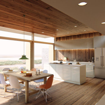
A visual artist and his fiancée’s house and studio were designed with various themes in mind, such as the physical context, client needs, security, and a limited budget.
Six options were analyzed during the schematic design stage to control the wind from the northeast, sunlight, light quality, cost, energy, and specific operating expenses. By using design performance tools and technologies such as Fluid Dynamics, Energy Consumption Analysis, Material Life Cycle Assessment, and Climate Analysis, sustainable strategies were identified. The building is self-sufficient and will provide the site with an aquifer recharge that does not currently exist.
The main masses are distributed around a courtyard, creating a moderately open construction towards the interior and closed to the outside. The courtyard contains a Huizache tree, surrounded by a water mirror that refreshes and forms a central part of the courtyard.
The house comprises three main volumes, each oriented at different angles to highlight different views for each area. The patio is the primary circulation stratagem, providing a refuge from the wind, a connection to the sky, and a night sky observatory. We aim to establish a deep relationship with the site by including the open space of the patio.
82