
Search results for "Physics" in Home Design Ideas
 Joy Street Design
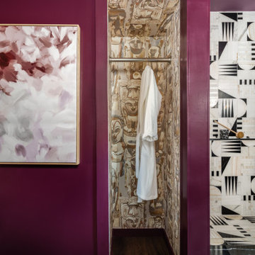
Our Oakland studio went ultra bold with the design of the guest suite at the Kips Bay Designer Showhouse. We chose the theme of a harmonious union of the physical and virtual universe through thoughtful, curated design. We used a dichromatic color theme in the bedroom to create a soothing sanctuary. Luxurious bedding, stylish fabrics, and soft velvet window treatments add a distinctive touch. In the bathroom, we added the classic black and white color theme with stylish tiles and attractive fixtures, creating a beautiful, bold contrast. The whole project emphasizes the past-meets-present-meets-future concept resulting in our most daring design yet!
---Designed by Oakland interior design studio Joy Street Design. Serving Alameda, Berkeley, Orinda, Walnut Creek, Piedmont, and San Francisco.
For more about Joy Street Design, click here:
https://www.joystreetdesign.com/
To learn more about this project, click here:
https://www.joystreetdesign.com/portfolio/kips-bay-showhouse-guest-suite
 M.O.Daby Design
Zen enSuite Bath + Steam Shower
Portland, OR
type: remodel
credits
design: Matthew O. Daby - m.o.daby design
interior design: Angela Mechaley - m.o.daby design
construction: Hayes Brothers Construction
photography: Kenton Waltz - KLIK Concepts
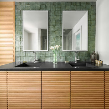
While the floorplan of their primary bath en-suite functioned well, the clients desired a private, spa-like retreat & finishes that better reflected their taste. Guided by existing Japanese & mid-century elements of their home, the materials and rhythm were chosen to contribute to a contemplative and relaxing environment.
One of the major upgrades was incorporating a steam shower to lend to their spa experience. Existing dark, drab cabinets that protruded into the room too deep, were replaced with a custom, white oak slatted vanity & matching linen cabinet. The lighter wood & the additional few inches gained in the walkway opened the space up visually & physically. The slatted rhythm provided visual interest through texture & depth. Custom concrete countertops with integrated, ramp sinks were selected for their wabi-sabi, textural quality & ability to have a single-material, seamless transition from countertop to sink basin with no presence of a traditional drain. The darker grey color was chosen to contrast with the cabinets but also to recede from the
darker patination of the backsplash tile & matched to the grout. A pop of color highlights the backsplash pulling green from the canopy of trees seen out the window. The tile offers subtle texture & pattern reminiscent of a raked, zen, sand garden (karesansui gardens). XL format tile in a warm, sandy tone with stone effect was selected for all floor & shower wall tiles, minimizing grout lines. A deeper, textured tile accents the back shower wall, highlighted with wall-wash recessed lighting.
 Studio BANAA
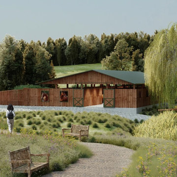
A nature-integrated wellness and retreat campus in Cotati designed to support the mental and physical recovery of first responders through healing landscapes and community-focused spaces.
Find the right local pro for your project
 aj Interiors
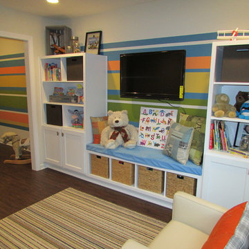
Samantha's House is a non-profit organization that redesigns homes to better suit the needs of children with physical limitations. The rooms are designed on a donation basis and extremely limited budget.
 Living By Laura
This kitchen remodel was interesting because the owners loved their previous kitchen but wanted to update well-worn laminate and vinyl surfaces.
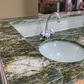
We installed "Whisper" Corian in the kitchen area. The surface is forgiving, doesn't break every glass that falls on it and hides seams. We spent the extra few dollars with the fabricator to set the pattern one-way across the kitchen instead of turning with the "run" of the countertops. You can't see they physical seams and you cannot see the pattern change at the seams.
Other items upgraded in the space were: The backsplash in a blue-gray porcelain with glass accent. The kitchen sink to an under-counter model. The dishwasher, cooktop and oven were upgraded, however black appliances topped stainless for this remodel.
Interesting fact: the glass in the proper cooking area is not the same color as the glass in back of the bar sink. They look the same, but the bar backsplash is more complimentary to its sink. The difference is undetectable looking across the kitchen.
The "office" area was updated to go underneath the countertop with a pull-out shelf. The shelf allows papers, and needed items to be stored below the counter surface.
This design is practical and casually elegant for the kitchen command center. The two peninsulas were done in "Cosmos" granite. By adding granite to the top-cap of the bar, these areas blend into the living area. The glass sink is new along with the glass tile but the Grohe faucet is a re-use from the original kitchen. They loved that faucet so why change something that you like that still works beautifully after nearly 25 years? The vinyl floor was upgraded to vinyl tile. This choice is softer and warm underfoot compared to other hard surfaces including porcelain tile.
 Kashmir Fine Arts & Crafts
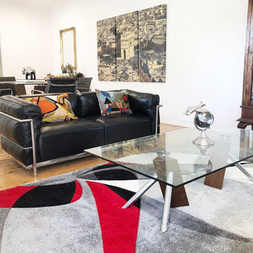
Kandinsky pillow cover – In the flow- Star fragments and enigmatic hieroglyphs artfully stitched in this decorative pillow cover in finest Kashmir wool chainstitch needlework. Various tones of light browns, complement earthier tones of coral terra cotta and other tones of ivory, to recreate a design based on the work of influential Russian artist, Wassily Kandinsky.The exciting pattern evokes the thought of a ladder to the stars, a comet’s tail, or a star map. This cover could grace the cabin of your boat or the chair in your solarium and yet be equally as comfortable in your den. Durable and easy to clean, this toss pillow will catch the eye of every passerby.
Composition: 70% Wool, 30% Cotton
Size: 13? x 21? (33cm x 53cm)
Pillow Insert not Included (Only Cover is on Sale)
Hand embroidered in Village Cottage Units
Backing: Canvas (See the Last Picture)
View additional pictures to see the intricate embroidery done in highly stylized beautiful patterns and superb craftsmanship unparalleled in the whole world.
A close-up view of this abstract pillow cover allows you to see the amazing chain-stitch embroidery work of master artisans who have practiced this art their entire lives.This abstract decorative pillow cover could grace the cabin of your boat or the chair in your solarium and yet be equally as comfortable in your den.
The eye-popping color and pattern of this modern throw pillow is just what the designer ordered to create a fiery focal point in your décor. Perfect wherever you need a splash of color, this art work pillow creation is as durable as it is beautiful. Easy to care for, this cushion cover could spark up an old throw pillow or grace a new pillow form.
Kandinsky conveyed profound spirituality and inner human emotion through a visual language of abstract forms and colors that transcended cultural and physical boundaries. He used interrelation between color and form to create an aesthetic experience that engaged the sight, sound, and emotions of the viewer.
Kandinsky viewed music as the most transcendent form of non-objective art – musicians could evoke images in listeners’ minds merely with sounds. He crafted spiritually rich paintings that alluded to sounds and emotions through sensations. Modern Artist Wassily Kandinsky used the form of concentric circles to portray the soul. Rendered here as chain stitch embroidery in wool, this cushion cover can create a new personality for any room in which you choose to use it.
 Kitchen & Bath Concepts
This home was built in the late 60’s to early 70’s in the classic “Brady Bunch” Ranch Style Genre.
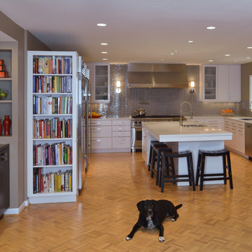
The new space was designed for a young active family, complete with big dog, that likes to entertain and finds themselves in the kitchen more than any other room in the house. “Mom” has a professional culinary background and has cooking events in her kitchen from time to time.
A prior remodel created an enclosed kitchen with angled walls protruding into the space. Our Design Objective was to open the space physically and visually in a clean contemporary style to create a more functional and inviting kitchen, Breakfast Area and drink bar that receives heavy daily use.
Walls were removed and reconfigured to create an open space. A professional style 60" dual-fuel range and stainless steel hood are the focal point of the kitchen along the back wall. To the left are a 36” all refrigerator and freezer separated by a pantry with chalk board that displays daily schedules or meals.
The drink bar sits across from the Breakfast area and features an under-counter beverage refrigerator, ice maker and under counter wine refrigerator.
Designed by Micqui McGowen, CMKBD, RID
 KSI Kitchen & Bath
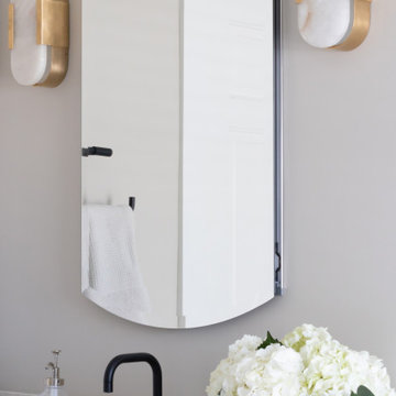
When culinary photographer, chef, and media personality Megan and her husband Mark came to us for his- and hers- bathroom remodels, We knew the collaboration would yield incredible results! They had exciting inspirations for their baths and were willing to explore some out-of-box design concepts that made the dual project especially enticing. In the hallway bath, they were hoping to make better use of adjacent space and enlarge the room to create a spa getaway for Megan. Meanwhile, their en suite master bath was outdated and seriously lacking in both style and storage for Mark's taste. They came prepared to our initial consultation with several inspiration photos to work off of for both space planning and material selections. Megan’s inspirations were light, airy, and leaned into some beautiful physical and visual textures. Mark’s inspirations were dark, moody, and included woodworking details and wainscoting reminiscent of a cigar lounge or country club.
 Field Architecture
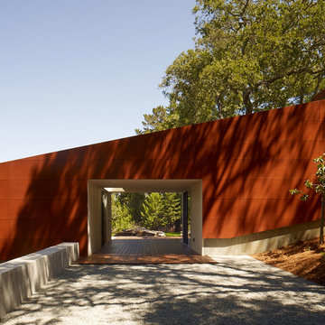
Situated in a pocket of classic Oak woodlands in Portola valley, the site of this home addition had partial views of the incredible landscape below, but lacked physical access to its full splendor. Analogous to a fallen log, the addition extends out from the original home to inhabit the slope, laying host to a new and unexpected habitable micro-environment. Gently cascading down the hillside, it echoes the natural slope of the site with a long, broad flowing stair lined with panoramic windows to capture views of the valley. As it terminates, a deck is laid forth and seemingly slips under the curtain wall beyond, spilling out onto a grassy play area and forming a seamless transition between indoor and outdoor living. Morning and evening light filtering through the trees create a dappled light that plays on the building and blends the house into the wooded hillside. Nature and nurture, soil and sun, is reinforced through all materials. The consistent color of the exterior panels forms a warm canvas for the light cast through the trees to create a brilliant exhibition of light and shadow that dances across the East and West façade as the sun moves throughout the day. The obscured forms of the surrounding trees dematerialize the house, which is consumed into the hillside. On the inside, faced with horizontally laid Eucalyptus, “cut-outs” in the cabinetry create small, warm apertures in the West façade where dramatic evening sun lights up the house and signals, “Its dinner time!”
 Arch-Interiors Design Group, Inc.
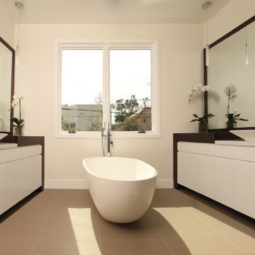
The tub was purposely placed perpendicular to the window which physically defined the two separate “areas”. The oval shape tub softens the space and is beautifully centered under the window.
 JOE GINSBERG DESIGN
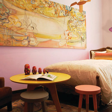
Urban Loft – One-of-a-Kind.
From our client to you, here's what we have created. A look so individual and one-of-a-kind, just as the family who lives there.
“Where to begin, what can I say..Joe is an artist, a craftsman, his imagination and his ability to make the physical, ethereal is his greatest gift. As our designer, Joe
has become a friend and we are graced with his magic every day. His work is so unique, we are always reminded of him in our home.
Joe created a home we could never have imagined, and yet it feels so much like home. Our home embraces us each time we walk in. The warmth of the walls reminiscent of Old Venice, the handmade resin doors that transport the light
throughout our loft apartment, the bookcase Joe created is so powerful and uplifting all at once, our massive bed that was built in pieces and put together in our room, our handmade rug is a silk wonderland, all of which Joe designed and fabricated for us.
Joe created a large painting for my daughter's room. The painting is childlike, wondrous and captivating all at once. My seven-year-old daughter swears that she painted it with Joe. When I shared this bit of comedy with Joe, he laughed
and then said in all earnest, 'of course she did, she was with me the whole time I painted it.'”
 Adaptiv DC
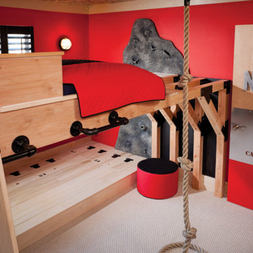
THEME The main theme for this room is an active, physical and personalized experience for a growing boy. This was achieved with the use of bold colors, creative inclusion of personal favorites and the use of industrial materials. FOCUS The main focus of the room is the 12 foot long x 4 foot high elevated bed. The bed is the focal point of the room and leaves ample space for activity within the room beneath. A secondary focus of the room is the desk, positioned in a private corner of the room outfitted with custom lighting and suspended desktop designed to support growing technical needs and school assignments. STORAGE A large floor armoire was built at the far die of the room between the bed and wall.. The armoire was built with 8 separate storage units that are approximately 12”x24” by 8” deep. These enclosed storage spaces are convenient for anything a growing boy may need to put away and convenient enough to make cleaning up easy for him. The floor is built to support the chair and desk built into the far corner of the room. GROWTH The room was designed for active ages 8 to 18. There are three ways to enter the bed, climb the knotted rope, custom rock wall, or pipe monkey bars up the wall and along the ceiling. The ladder was included only for parents. While these are the intended ways to enter the bed, they are also a convenient safety system to prevent younger siblings from getting into his private things. SAFETY This room was designed for an older child but safety is still a critical element and every detail in the room was reviewed for safety. The raised bed includes extra long and higher side boards ensuring that any rolling in bed is kept safe. The decking was sanded and edges cleaned to prevent any potential splintering. Power outlets are covered using exterior industrial outlets for the switches and plugs, which also looks really cool.
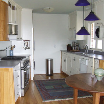
 Jaeger & Ernst Custom Cabinetmakers
Our country is filled with tiny kitchens. How do you expand these spaces effectively? Usually the tiny kitchen is found within a home with a small footprint, even so there are means to affect the space in a positive manner to increase the physical and perceptual aspects of the space. Good design and exceptional craftsmanship may conspire to present a beautiful kitchen environment: functional, durable, beautiful and interesting. Jaeger & Ernst cabinetmakers seek custom work: call 434-973-7018
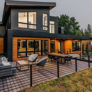
 Unfold Architecture
Nestled into a steep hill on an urban-sized lot, N44° 58' 34" is a creative response to a set of unique site conditions. The house is terraced up the hill, providing multiple connections to the large urban lot. This allows the main living spaces to wrap around the greenspace, providing numerous visual and physical relationships to the backyard. With a direct connection to the largest public park in Minneapolis, the backyard transforms seasonally to support the families active, outdoor lifestyle.
A grand, central staircase functions as a statement of modern design while windows simultaneously flood all three levels with light. The towering stair is framed by two distinct wings of the home, creating secluded, yet connected moments on each level.
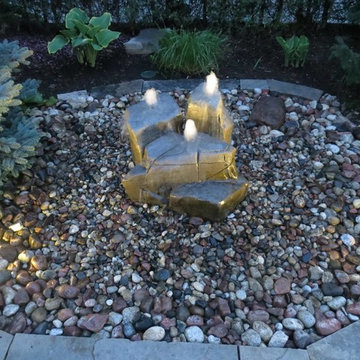
 Geert's Land & Waterscapes
Chickstone Boulders at dusk with 2 LED brass night lights of 3 Watts each on a photocell timer. Lights were installed inside a 8 inch sized custom core drilled granite rocks to camouflage and protect them from physical damage by the garden maintenance people.
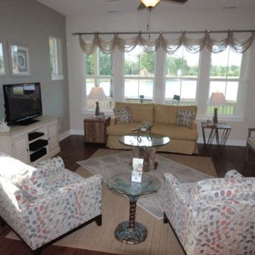
 Decor & More, LLC
Debbie Slovin
Local builder wanted a model home furnished. With furniture from Coastal Home the model was done in just two weeks working with furniture physically at the store. No time for special orders.
 IMAGIO Glass Design
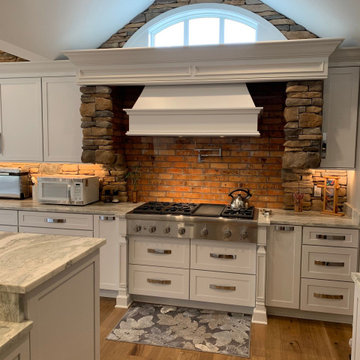
Today, not only for an exterior, brick is one of the trendiest interior design elements, especially for kitchens. Its incredibly durable structure makes the brick a perfect material for kitchens. IMAGIO too the beauty of brick and combined it with the strength of tempered glass creating this beautiful custom weathered brick solid glass backsplash for our customer. We were able to provide the look of bricks texture with a smooth surface! A solid glass backsplash is the logical choice, because after all, backsplashes can get messy, and the easier to clean the better. Need more reasons solid glass is the way to go for your backsplash?
1) IMAGIO glass is precision cut to fit your kitchen. With tile, corners and edges have dis proportioned pieces and careless cuts. Our glass is cut and fit to size leaving it seamless, clean and crisp.
2) Glass is a naturally antimicrobial surface, thus more sanitary than traditional tile or stone in a kitchen space.
3) IMAGIO glass is also very easy to clean requires no maintenance! To clean just use your favorite cleaning product with a soft cloth to wipe spatters away!
Glass is a non porous surface so it is impossible to stain.
4) IMAGIO glass is physically and thermally stronger than regular glass or tile. We use tough tempered glass, meaning it is more durable and can endure high heat.
5) Grout looks great but it requires cleaning and maintenance and that is why we say grout is OUT here at IMAGIO. We have created, with our ultra clear glass, a way to enjoy the looks of natural stone and tile seamlessly and without grout.
6) Healthy kitchen design with endless design possibilities.
Email info@imagioglass.com for a free estimate in 3 simple steps!
 Harald Koehn Construction
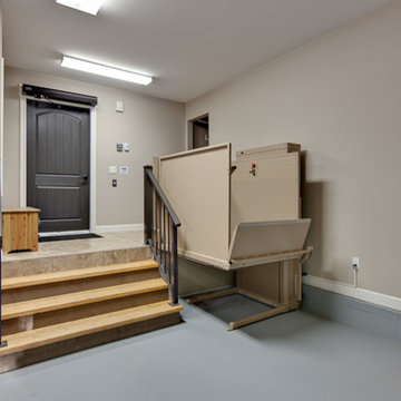
A custom lift in the garage providing easy access into the home in a wheelchair
Example of a transitional garage design in Vancouver
Example of a transitional garage design in Vancouver
 Fraley and Company
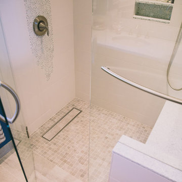
A universally designed curbless shower and built-in bench allows for grandma and all physical ability levels to safely use the shower. The white tile bounces light around the room and makes for a sparkling clean and bright showering experience.
Photography by: Schweitzer Creative

 3SI Design
Meet Don Fuego—a bold, luxurious, and unforgettable experience. ?
Bringing this vision to life was an incredible journey alongside talented vendors and artists. We began designing Don Fuego at the start of 2024, keeping four key elements at the forefront: Moody, Sophisticated, Bold, and Memorable.
Inspired by Día de los Muertos, this space pays homage to those who are no longer with us physically but remain with us spiritually. Every design choice reflects this essence—deep, rich textures, dramatic lighting, and custom elements that make Don Fuego a true work of art.
One of the focal points is the custom-designed checkout counter, featuring a striking porcelain slab that embodies everything Don Fuego stands for: fire, intensity, and individuality. The moment we saw it, we knew it was destined for this space.
Design is all about the details, and Don Fuego is no exception. From late-night idea exchanges to meticulous material selections, every element was chosen with intention. We introduced texture through limewash, mimicking the organic feel of a grave, and Roman clay, sculpted into arches reminiscent of traditional Mexican architecture.
Lighting is the jewelry of a space, and in Don Fuego, it sets the mood. We layered task, decorative, ambient, and accent lighting to create an immersive atmosphere. One of our favorite details? A light fixture inspired by the cascarón, a cracked egg symbolizing good luck and prosperity in Mexican culture. The moment we discovered it, we knew it belonged here—to bring blessings to our clients and everyone who steps inside this curated experience.
Don Fuego isn’t just a space—it’s a feeling, a story, a tribute. ✨
70