
Search results for "Piece problem" in Home Design Ideas

 Bearded Builders
The home owner's considered all of their options when deciding to transform this space.
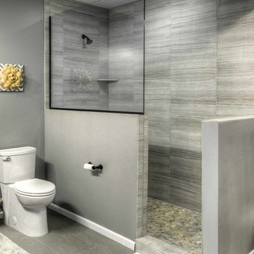
Mid-sized trendy 3/4 gray tile and porcelain tile porcelain tile and gray floor bathroom photo in Omaha with shaker cabinets, dark wood cabinets, a one-piece toilet, gray walls, an undermount sink and quartzite countertops
Mid-sized trendy 3/4 gray tile and porcelain tile porcelain tile and gray floor bathroom photo in Omaha with shaker cabinets, dark wood cabinets, a one-piece toilet, gray walls, an undermount sink and quartzite countertops
 Kohler
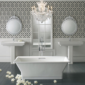
Elegant take on a modern bathroom featuring Kohler Purist faucets with Reve sinks and bath tub.
Large elegant master white tile and wood-look tile dark wood floor freestanding bathtub photo in Milwaukee with a pedestal sink and black walls
Large elegant master white tile and wood-look tile dark wood floor freestanding bathtub photo in Milwaukee with a pedestal sink and black walls
Find the right local pro for your project

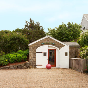
 Nantucket Architecture Group Ltd.
conversion of garage to gym,
Jeff Allen Photography
Inspiration for a timeless detached studio / workshop shed remodel in Boston
Inspiration for a timeless detached studio / workshop shed remodel in Boston
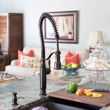
 Twelve Stones Designs, LLC
The owners of this kitchen had spent the money to upgrade the finishes in their kitchen upon building the home 12 years ago, but after living in the space for several years they realized how nonfunctional the layout really was. The (then) two preschool aged children had grown into busy, hungry teenagers with many friends who also liked to hang out at the house. So the family needed a more functional kitchen with better traffic flow, space for daily activities revolving around the kitchen at different times of day, and a kitchen that could accommodate cooking for and serving large groups. Furthermore, the dark, traditional finishes no longer reflected the homeowners’ style. They requested a brighter, more relaxed, coastal style that reflected their love of the seaside cities they like to visit.
Originally, the kitchen was U-shaped with a narrow island in the middle. The island created narrow aisles that bottle-necked at the dishwasher, refrigerator, and cooktop areas. There was a pass-through from the foyer into the kitchen, but the owners never liked that the pass-through was also located so close to the powder room. The awkward proximity was unappealing and made guests feel uncomfortable.
The kitchen’s storage was made up of lots of narrow cabinets, apothecary drawers, clipped corner units, and very few drawers. It lacked useful storage for the larger items the family used on a daily basis. And the kitchen’s only pantry was small closet that had only builder-grade, narrow shelving with no illumination to be able to see the contents inside.
Overall, the kitchen’s lighting plan was poorly executed. Only six recessed cans illuminated the entire kitchen and nook areas. The under cabinet lighting was not evenly distributed either. In fact, the builder had mis-placed the under cabinet lighting around the decorative pilasters which made for choppy, dark cubbies. Further, the builder didn’t include any lighting over the sink or the bar area, which meant whoever was doing the dishes was always in their own shadow. That, coupled with the steep overhang of the game room above made the bar area feel like a dim, cavernous space that wasn’t inviting or task oriented. The kitchen looked out into the main living space, but the raised bar and a narrow wall (which held the only large cabinet in the kitchen) created more of a barrier than a relationship to the living room or breakfast nook. In fact, one couldn’t even see the breakfast nook from the cooktop or sink areas due to its orientation. The raised bar top was too narrow to comfortably sit to either dine at or chat from due to the lack of knee space. The the homeowners confided that the kitchen felt more like a dark, dirty prison than place where the family, or their guests, wanted to gather and commune.
The clients' needs and desires were:
➢ to create a kitchen that would be a space the family loved to be in; to relate to the adjacent spaces all around, and to have better flow for entertaining large groups
➢ to remove the walls between the breakfast nook and living area and to be able to utilize the natural light from the windows in both those areas
➢ to incorporate a functional chopping block for prepping fresh food for home cooked meals, an island with a large sink and drain board, 2 pull out trash cans, and seating for at least the 2 teens to eat or do homework
➢ to design a kitchen and breakfast nook with an airy, coastal, relaxed vibe that blended with the rest of the house's coastal theme
➢ to integrate a layered lighting plan which would include ample general illumination, specific task lighting, decorative lighting, and lots of illuminated storage
➢ to design a kitchen with not only more storage for all the husband’s kitchen gadgets and collection of oils and spices, but smart storage, including a coffee/breakfast bar and a place to store and conceal the toaster oven and microwave
➢ to find a way to utilize the large open space between the kitchen, pantry area, and breakfast nook
Twelve Stones Designs achieved the owner's goals by:
➢ removing the walls between the kitchen and living room to allow the natural light to filter in from the adjacent rooms and to create a connection between the kitchen, nook, and living spaces for a sense of unity and communion
➢ removing the existing pantry and designing 3 large pantry style cabinets with LED tape lights and rollout drawers to house lots of kitchen appliances, gadgets, and tons of groceries. We also took the cabinets all the way up to the 9’ ceiling for additional storage for seasonal items and bulk storage.
➢ designing 2 islands - 1 with a gorgeous black walnut chopping block that houses a drawer for chopping and carving knives and a custom double pull out trash unit for point of use utilization - and 1 that houses the dishwasher, a large Blanco Gourmet sink with integrated drain board, woven baskets for fresh root vegetables and kitchen towels, plenty of drawer storage for kitchen items, and bar seating for up to 4 diners.
➢ closing off the space between the kitchen and the powder room to create a beautiful new private alcove for the powder room as well as adding some decorative storage. This also gave us space to include more tall storage near the new range for precision placement of the husband’s extensive oil and spice collection as well as a location for a combo-steam oven the wife wanted for baking and cooking healthy meals.
The project is enhanced functionally by:
➢ incorporated USB and standard receptacles for the kids’ laptops and phone charging in the large island
➢ designing the small island to include additional open shelving for items used on a daily basis such as a variety of bowls, plates, and colanders. This set up also works well for the husband who prefers to “plate” his dinners in restaurant-style fashion before presenting them to the table.
➢ the integration of specific storage units, such as double stacked cutlery drawers, a custom spice pull-out, a Kuerig coffee and tea pod drawer, and custom double stacked utensil drawers
➢ moving the refrigerator to the old oven location - this eliminated the bottle neck as well as created a better relationship to the eating table. It also utilizes the floor space between the pantry, nook, and kitchen
➢ creating a banquet style breakfast nook - this banquette seating not only doubles the amount of seating for large gatherings but it better utilizes the odd space between the kitchen and the previous nook area. It also helps to create a distinct pathway from the mudroom room through the pantry area, kitchen, nook, and living room.
➢ the coffee/breakfast bar area which includes the perfect location for the concealed microwave and toaster oven, convenient storage for the coffee pods and tea accoutrements. Roll-out drawers below also house the smoothie maker, hot water kettle, and a plethora of smoothie-making ingredients such as protein powders, smoothie additives, etc. Furthermore, the drawers below the Keurig house measuring utensil, cutlery, baking supplies and tupperware storage.
➢ incorporating lots of wide drawers and pullouts to accommodate large cookware.
➢ utilizing as much vertical space as possible by building storage to the ceiling which accommodates the family’s abundant amount of serving platters, baking sheets, bakeware, casserole dishes, and additional cutting boards.
The project is enhanced aesthetically by:
➢ new 5-piece Versailles pattern porcelain tile that now seamlessly joins the entire down stairs area together creating a bright, cohesiveness feeling instead of choppy separated spaces - it also adds a coastal feeling
➢ designing a cabinet to conceal the microwave and toaster oven
➢ the coastal influenced light fixtures over the nook table and island
➢ the sandy colors of the Langdon Cambria countertops. The swirling pattern and sparkling quartz pieces remind the homeowner of black-and-tan sandy beaches
➢ the striped banquet seating whose creamy white background and blue-green stripes were the inspiration for the cabinet and wall colors.
➢ All the interior doors were painted black to coordinate with the blacks and grays in the backsplash tile and countertop. This also adds a hint of tailored formality to an otherwise casual space.
➢ the use of WAC's Oculux small aperture LED units for the overhead lighting complimented with Diode LED strips for task lighting under the cabinets and inside the pantry and glass wall cabinets. All of the lighting applications are on separate dimmer switches.
Innovative uses of materials or construction methods by Realty Restoration LLC:
➢ Each 1-1/2” x 3” block of reclaimed end-grain black walnut that makes up the center island chopping block was hand milled and built in the shop. It was designed to look substantial and proportional to the surrounding elements, executed by creating the 4 inch tall top with a solid wood chamfered edge band.
➢ The metal doors on either side of the vent hood were also custom designed for this project and built in the Realty Restoration LLC shop. They are made 1x2, 11-gauge mild steel with ribbed glass. Weighing 60 lbs a piece, heavy duty cabinet hinges were added to support the weight of the door and keep them from sagging.
➢ Under-cabinet receptacles were added along the range wall in order to have a clean, uninterrupted backsplash.
Design obstacles to overcome:
➢ Because we were removing the demising walls between the kitchen and living room, we had to find a way to plumb and vent the new island. We did this by tunneling through the slab (the slab had post tension cables which prevented us from just trenching) to run a new wet vent through a nearby structural wall. We pulled the existing hot and cold lines between upper floor joists and ran them down the structural wall as well and up through a conduit in the tunnel.
➢ Since we were converting from wall overs to a gas range it allowed us to utilize the 220 feed for the wall ovens to provide a new sub panel for all the new kitchen circuits
➢ Due to framing deficiencies inherited from the original build there was a 1-1/2” differential in the floor-to-ceiling height over a 20 foot span; by utilizing the process of cutting and furring coupled with the crown moulding details on the cabinet elevations we were able to mask the problem and provide seamless transitions between the cabinet components.
Evidence of superior craftsmanship:
➢ uniquely designed, one-of-a-kind metal “X” end panels on the large island. The end panels were custom made in the Realty Restoration LLC shop and fitted to the exact dimensions of the island. The welding seams are completely indistinguishable - the posts look like they are cut from a single sheet of metal
➢ square metal posts on the small island were also custom made and designed to compliment and carry through the metal element s throughout the kitchen
➢ the beautiful, oversized end panels on the pantry cabinets which give the breakfast nook a tailored look
➢ integrating a large format 5 piece Versailles tile pattern to seamlessly flow from the existing spaces into the new kitchen space
➢ By constructing a custom cabinet that jogged around a corner we could not remodel (housing the entry way coat closet) we were able to camouflage the adjacent wall offset within the upper and lower cabinets. By designing around the existing jog in the structural walls we accomplished a few things: we were able to find the space to house, and hide, the microwave and toaster oven yet still have a clean cohesive appearance from the kitchen side. Additionally, the owners were able to keep their much needed coat closet and we didn’t have to increase the budget with unnecessary structural work.
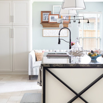 Twelve Stones Designs, LLC
The owners of this kitchen had spent the money to upgrade the finishes in their kitchen upon building the home 12 years ago, but after living in the space for several years they realized how nonfunctional the layout really was. The (then) two preschool aged children had grown into busy, hungry teenagers with many friends who also liked to hang out at the house. So the family needed a more functional kitchen with better traffic flow, space for daily activities revolving around the kitchen at different times of day, and a kitchen that could accommodate cooking for and serving large groups. Furthermore, the dark, traditional finishes no longer reflected the homeowners’ style. They requested a brighter, more relaxed, coastal style that reflected their love of the seaside cities they like to visit.
Originally, the kitchen was U-shaped with a narrow island in the middle. The island created narrow aisles that bottle-necked at the dishwasher, refrigerator, and cooktop areas. There was a pass-through from the foyer into the kitchen, but the owners never liked that the pass-through was also located so close to the powder room. The awkward proximity was unappealing and made guests feel uncomfortable.
The kitchen’s storage was made up of lots of narrow cabinets, apothecary drawers, clipped corner units, and very few drawers. It lacked useful storage for the larger items the family used on a daily basis. And the kitchen’s only pantry was small closet that had only builder-grade, narrow shelving with no illumination to be able to see the contents inside.
Overall, the kitchen’s lighting plan was poorly executed. Only six recessed cans illuminated the entire kitchen and nook areas. The under cabinet lighting was not evenly distributed either. In fact, the builder had mis-placed the under cabinet lighting around the decorative pilasters which made for choppy, dark cubbies. Further, the builder didn’t include any lighting over the sink or the bar area, which meant whoever was doing the dishes was always in their own shadow. That, coupled with the steep overhang of the game room above made the bar area feel like a dim, cavernous space that wasn’t inviting or task oriented. The kitchen looked out into the main living space, but the raised bar and a narrow wall (which held the only large cabinet in the kitchen) created more of a barrier than a relationship to the living room or breakfast nook. In fact, one couldn’t even see the breakfast nook from the cooktop or sink areas due to its orientation. The raised bar top was too narrow to comfortably sit to either dine at or chat from due to the lack of knee space. The the homeowners confided that the kitchen felt more like a dark, dirty prison than place where the family, or their guests, wanted to gather and commune.
The clients' needs and desires were:
➢ to create a kitchen that would be a space the family loved to be in; to relate to the adjacent spaces all around, and to have better flow for entertaining large groups
➢ to remove the walls between the breakfast nook and living area and to be able to utilize the natural light from the windows in both those areas
➢ to incorporate a functional chopping block for prepping fresh food for home cooked meals, an island with a large sink and drain board, 2 pull out trash cans, and seating for at least the 2 teens to eat or do homework
➢ to design a kitchen and breakfast nook with an airy, coastal, relaxed vibe that blended with the rest of the house's coastal theme
➢ to integrate a layered lighting plan which would include ample general illumination, specific task lighting, decorative lighting, and lots of illuminated storage
➢ to design a kitchen with not only more storage for all the husband’s kitchen gadgets and collection of oils and spices, but smart storage, including a coffee/breakfast bar and a place to store and conceal the toaster oven and microwave
➢ to find a way to utilize the large open space between the kitchen, pantry area, and breakfast nook
Twelve Stones Designs achieved the owner's goals by:
➢ removing the walls between the kitchen and living room to allow the natural light to filter in from the adjacent rooms and to create a connection between the kitchen, nook, and living spaces for a sense of unity and communion
➢ removing the existing pantry and designing 3 large pantry style cabinets with LED tape lights and rollout drawers to house lots of kitchen appliances, gadgets, and tons of groceries. We also took the cabinets all the way up to the 9’ ceiling for additional storage for seasonal items and bulk storage.
➢ designing 2 islands - 1 with a gorgeous black walnut chopping block that houses a drawer for chopping and carving knives and a custom double pull out trash unit for point of use utilization - and 1 that houses the dishwasher, a large Blanco Gourmet sink with integrated drain board, woven baskets for fresh root vegetables and kitchen towels, plenty of drawer storage for kitchen items, and bar seating for up to 4 diners.
➢ closing off the space between the kitchen and the powder room to create a beautiful new private alcove for the powder room as well as adding some decorative storage. This also gave us space to include more tall storage near the new range for precision placement of the husband’s extensive oil and spice collection as well as a location for a combo-steam oven the wife wanted for baking and cooking healthy meals.
The project is enhanced functionally by:
➢ incorporated USB and standard receptacles for the kids’ laptops and phone charging in the large island
➢ designing the small island to include additional open shelving for items used on a daily basis such as a variety of bowls, plates, and colanders. This set up also works well for the husband who prefers to “plate” his dinners in restaurant-style fashion before presenting them to the table.
➢ the integration of specific storage units, such as double stacked cutlery drawers, a custom spice pull-out, a Kuerig coffee and tea pod drawer, and custom double stacked utensil drawers
➢ moving the refrigerator to the old oven location - this eliminated the bottle neck as well as created a better relationship to the eating table. It also utilizes the floor space between the pantry, nook, and kitchen
➢ creating a banquet style breakfast nook - this banquette seating not only doubles the amount of seating for large gatherings but it better utilizes the odd space between the kitchen and the previous nook area. It also helps to create a distinct pathway from the mudroom room through the pantry area, kitchen, nook, and living room.
➢ the coffee/breakfast bar area which includes the perfect location for the concealed microwave and toaster oven, convenient storage for the coffee pods and tea accoutrements. Roll-out drawers below also house the smoothie maker, hot water kettle, and a plethora of smoothie-making ingredients such as protein powders, smoothie additives, etc. Furthermore, the drawers below the Keurig house measuring utensil, cutlery, baking supplies and tupperware storage.
➢ incorporating lots of wide drawers and pullouts to accommodate large cookware.
➢ utilizing as much vertical space as possible by building storage to the ceiling which accommodates the family’s abundant amount of serving platters, baking sheets, bakeware, casserole dishes, and additional cutting boards.
The project is enhanced aesthetically by:
➢ new 5-piece Versailles pattern porcelain tile that now seamlessly joins the entire down stairs area together creating a bright, cohesiveness feeling instead of choppy separated spaces - it also adds a coastal feeling
➢ designing a cabinet to conceal the microwave and toaster oven
➢ the coastal influenced light fixtures over the nook table and island
➢ the sandy colors of the Langdon Cambria countertops. The swirling pattern and sparkling quartz pieces remind the homeowner of black-and-tan sandy beaches
➢ the striped banquet seating whose creamy white background and blue-green stripes were the inspiration for the cabinet and wall colors.
➢ All the interior doors were painted black to coordinate with the blacks and grays in the backsplash tile and countertop. This also adds a hint of tailored formality to an otherwise casual space.
➢ the use of WAC's Oculux small aperture LED units for the overhead lighting complimented with Diode LED strips for task lighting under the cabinets and inside the pantry and glass wall cabinets. All of the lighting applications are on separate dimmer switches.
Innovative uses of materials or construction methods by Realty Restoration LLC:
➢ Each 1-1/2” x 3” block of reclaimed end-grain black walnut that makes up the center island chopping block was hand milled and built in the shop. It was designed to look substantial and proportional to the surrounding elements, executed by creating the 4 inch tall top with a solid wood chamfered edge band.
➢ The metal doors on either side of the vent hood were also custom designed for this project and built in the Realty Restoration LLC shop. They are made 1x2, 11-gauge mild steel with ribbed glass. Weighing 60 lbs a piece, heavy duty cabinet hinges were added to support the weight of the door and keep them from sagging.
➢ Under-cabinet receptacles were added along the range wall in order to have a clean, uninterrupted backsplash.
Design obstacles to overcome:
➢ Because we were removing the demising walls between the kitchen and living room, we had to find a way to plumb and vent the new island. We did this by tunneling through the slab (the slab had post tension cables which prevented us from just trenching) to run a new wet vent through a nearby structural wall. We pulled the existing hot and cold lines between upper floor joists and ran them down the structural wall as well and up through a conduit in the tunnel.
➢ Since we were converting from wall overs to a gas range it allowed us to utilize the 220 feed for the wall ovens to provide a new sub panel for all the new kitchen circuits
➢ Due to framing deficiencies inherited from the original build there was a 1-1/2” differential in the floor-to-ceiling height over a 20 foot span; by utilizing the process of cutting and furring coupled with the crown moulding details on the cabinet elevations we were able to mask the problem and provide seamless transitions between the cabinet components.
Evidence of superior craftsmanship:
➢ uniquely designed, one-of-a-kind metal “X” end panels on the large island. The end panels were custom made in the Realty Restoration LLC shop and fitted to the exact dimensions of the island. The welding seams are completely indistinguishable - the posts look like they are cut from a single sheet of metal
➢ square metal posts on the small island were also custom made and designed to compliment and carry through the metal element s throughout the kitchen
➢ the beautiful, oversized end panels on the pantry cabinets which give the breakfast nook a tailored look
➢ integrating a large format 5 piece Versailles tile pattern to seamlessly flow from the existing spaces into the new kitchen space
➢ By constructing a custom cabinet that jogged around a corner we could not remodel (housing the entry way coat closet) we were able to camouflage the adjacent wall offset within the upper and lower cabinets. By designing around the existing jog in the structural walls we accomplished a few things: we were able to find the space to house, and hide, the microwave and toaster oven yet still have a clean cohesive appearance from the kitchen side. Additionally, the owners were able to keep their much needed coat closet and we didn’t have to increase the budget with unnecessary structural work.
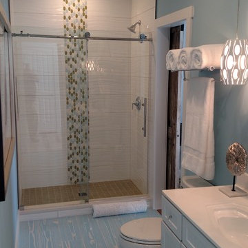

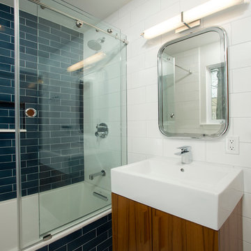
 Four Brothers Design + Build
Inspiration for a mid-sized eclectic kids' blue tile and ceramic tile mosaic tile floor bathroom remodel in DC Metro with flat-panel cabinets, medium tone wood cabinets, a one-piece toilet, white walls and a vessel sink
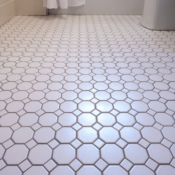
 Kathleen Jennison
An Arts & Crafts Bungalow is one of my favorite styles of homes. We have quite a few of them in our Stockton Mid-Town area. And when C&L called us to help them remodel their 1923 American Bungalow, I was beyond thrilled.
As per usual, when we get a new inquiry, we quickly Google the project location while we are talking to you on the phone. My excitement escalated when I saw the Google Earth Image of the sweet Sage Green bungalow in Mid-Town Stockton. "Yes, we would be interested in working with you," I said trying to keep my cool.
But what made it even better was meeting C&L and touring their home, because they are the nicest young couple, eager to make their home period perfect. Unfortunately, it had been slightly molested by some bad house-flippers, and we needed to bring the bathroom back to it "roots."
We knew we had to banish the hideous brown tile and cheap vanity quickly. But C&L complained about the condensation problems and the constant fight with mold. This immediately told me that improper remodeling had occurred and we needed to remedy that right away.
The Before: Frustrations with a Botched Remodel
The bathroom needed to be brought back to period appropriate design with all the functionality of a modern bathroom. We thought of things like marble countertop, white mosaic floor tiles, white subway tile, board and batten molding, and of course a fabulous wallpaper.
This small (and only) bathroom on a tight budget required a little bit of design sleuthing to figure out how we could get the proper look and feel. Our goal was to determine where to splurge and where to economize and how to complete the remodel as quickly as possible because C&L would have to move out while construction was going on.
The Process: Hard Work to Remedy Design and Function
During our initial design study, (which included 2 hours in the owners’ home), we noticed framed images of William Morris Arts and Crafts textile patterns and knew this would be our design inspiration. We presented C&L with three options and they quickly selected the Pimpernel Design Concept.
We had originally selected the Black and Olive colors with a black vanity, mirror, and black and white floor tile. C&L liked it but weren’t quite sure about the black, We went back to the drawing board and decided the William & Co Pimpernel Wallpaper in Bayleaf and Manilla color with a softer gray painted vanity and mirror and white floor tile was more to their liking.
After the Design Concept was approved, we went to work securing the building permit, procuring all the elements, and scheduling our trusted tradesmen to perform the work.
We did uncover some shoddy work by the flippers such as live electrical wires hidden behind the wall, plumbing venting cut-off and buried in the walls (hence the constant dampness), the tub barely balancing on two fence boards across the floor joist, and no insulation on the exterior wall.
All of the previous blunders were fixed and the bathroom put back to its previous glory. We could feel the house thanking us for making it pretty again.
The After Reveal: Cohesive Design Decisions
We selected a simple white subway tile for the tub/shower. This is always classic and in keeping with the style of the house.
We selected a pre-fab vanity and mirror, but they look rich with the quartz countertop. There is much more storage in this small vanity than you would think.
The Transformation: A Period Perfect Refresh
We began the remodel just as the pandemic reared and stay-in-place orders went into effect. As C&L were already moved out and living with relatives, we got the go-ahead from city officials to get the work done (after all, how can you shelter in place without a bathroom?).
All our tradesmen were scheduled to work so that only one crew was on the job site at a time. We stayed on the original schedule with only a one week delay.
The end result is the sweetest little bathroom I've ever seen (and I can't wait to start work on C&L's kitchen next).
Thank you for joining me in this project transformation. I hope this inspired you to think about being creative with your design projects, determining what works best in keeping with the architecture of your space, and carefully assessing how you can have the best life in your home.
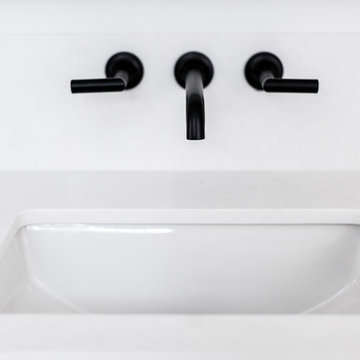
 Jula Cole Design
Full gut renovation on a master bathroom.
Custom vanity, shiplap, floating slab shower bench with waterfall edge
Double shower - mid-sized country master white tile and terra-cotta tile travertine floor and beige floor double shower idea in San Diego with shaker cabinets, medium tone wood cabinets, a two-piece toilet, white walls, an undermount sink, quartz countertops and a hinged shower door
Double shower - mid-sized country master white tile and terra-cotta tile travertine floor and beige floor double shower idea in San Diego with shaker cabinets, medium tone wood cabinets, a two-piece toilet, white walls, an undermount sink, quartz countertops and a hinged shower door
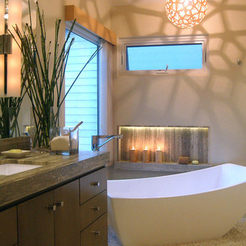
 Dunlevie Interiors
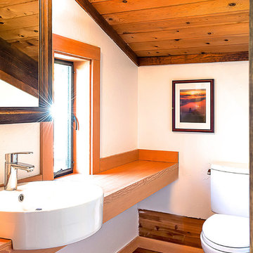
Adding raised, awning-style windows solved the ventilation and neighbor privacy problem. The linen vertical shades provide plenty of golf course privacy options.
 David Moulton AIA
In the upstairs half-bath, a new Douglas-Fir countertop is topped by a Scarabeo Geo vessel sink with a Grohe faucet.
searanchimages.com
Example of a small mountain style 3/4 medium tone wood floor bathroom design in San Francisco with a vessel sink, wood countertops, a one-piece toilet and white walls
Example of a small mountain style 3/4 medium tone wood floor bathroom design in San Francisco with a vessel sink, wood countertops, a one-piece toilet and white walls
 Henry Kate Design Co.
Photo: Ashley K.
Shower Door: Shower Doors of Houston
Fixtures: Grohe and American Standard
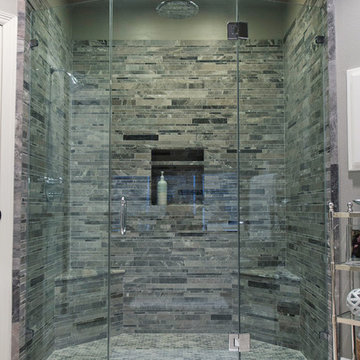
Transitional gray tile and ceramic tile bathroom photo in Houston with an undermount sink, furniture-like cabinets, black cabinets, marble countertops and a one-piece toilet
Transitional gray tile and ceramic tile bathroom photo in Houston with an undermount sink, furniture-like cabinets, black cabinets, marble countertops and a one-piece toilet

Sponsored
Fredericksburg, OH

High Point Cabinets
Columbus' Experienced Custom Cabinet Builder | 4x Best of Houzz Winner
 Fredrick Dawson Design Consulting
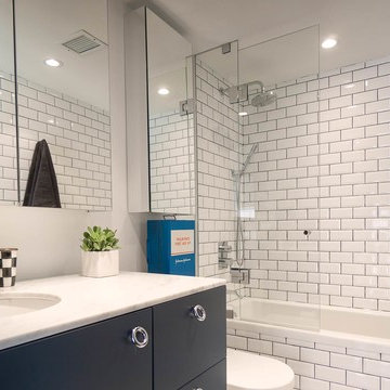
Small eclectic master white tile and subway tile mosaic tile floor bathroom photo in Toronto with flat-panel cabinets, blue cabinets, a two-piece toilet, white walls, an undermount sink and marble countertops
 BJOID Inc.
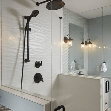
This client wanted a relaxing bathroom that brought the ocean to Waterloo, Ontario. The wavy tile in the shower, and the glass teardrop accents in the niche and behind both his & her vanities showcase the movement and sheen of the water, and the soft blue and grey colour scheme allow a warm and cozy, yet fresh feeling overall. The hexagon marble tile on the shower floor was copied behind the soaker tub to define the space, and the furniture style cabinets from Casey’s Creative Kitchens offer an authentic classic look. The oil-rubbed finishes were carried throughout for consistency, and add a true luxury to the bathroom. The client mentioned, ‘…this is an amazing shower’ – the fixtures from Delta offer flexibility and customization. Fantasy Brown granite was used, and inhibites the movement of a stream, bringing together the browns, creams, whites blues and greens. The tile floor has a sandy texture and colour, and gives the feeling of being at the beach. With the sea-inspired colour scheme, and numerous textures and patterns, this bathroom is the perfect oasis from the everyday.
 Coats Homes
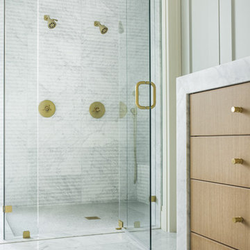
Large trendy master multicolored tile and stone tile marble floor bathroom photo in Dallas with flat-panel cabinets, dark wood cabinets, a two-piece toilet, multicolored walls, an undermount sink and marble countertops
 Brandon Oriental Rugs
Sunday, September 14, 2014
Is Your Interior Design Depressing You?
By Joseph Pubillones
(DailyHerald.com http://www.dailyherald.com/article/20140913/entlife/140919600)
From time to time, someone will corner me and confess to me that they are depressed; they whisper that they believe their decorating is making them sick. They tell me that their interiors are not to their liking because of choices made by their spouse, their designer, or because of their own misguided attempts at decorating.
Is it possible for their environment to make them feel sick? Yes (as I think about it), it is possible for design to alter moods.
In the mid-1950s, Norbett Mintz, a researcher at Brandeis University, and his mentor, the renowned psychologist Abraham Maslow, decided to conduct research about the effects of "beauty" on behavior. Mintz had already conducted experiments about the effects of color on human behavior and concluded that color selection has a palpable effect on personal behavior.
A room's design can have an impact on your mood. Mismatched colors or an
overstuffed room can affect your ability to relax and feel comfortable.
In their experiment about beauty, they designed three rooms. The first was "the ugly room", replete with clashing colors and patterns, disorganization and too much furniture for the size of the space. The second was "the average room", arranged with a monochromatic scheme, basic furniture pieces and subtly colored nondescript art. The third was "the beautiful room", decorated with quality case-goods, and fashionable fabrics and colors. Overwhelmingly, the test group rejected "the ugly room". "The average room" and "the beautiful room" were tied as the preferred room. When asked to describe the rooms, the test group was best able to describe "the beautiful room".
As a designer, this is not news to me. There are rooms, especially those that I like, that I can describe with remarkable detail. Although our notion of what is beautiful varies from person to person, it can be said that beautiful design is more memorable. We can deduce that each person prefers the beautiful.
From the time we are born, there are foods that are preferred -- some love sweets; others prefer more savory flavors. Over time, our taste buds evolve, and what was once a favorite food can become insipid or nauseating. The same is true for interior design. Over time, everyone develops preferences about what makes us feel comfortable and at home.
When I hear that someone's home is depressing, I am concerned. I suggest immediate action to change what is most bothersome. If it is wall color: a painting party is overdue. If it is furniture: I ask them to consider new upholstery; a new furniture arrangement; or substituting new pieces for those that offend. And for those too timid or dismayed to tackle their problems head-on and alone, I suggest hiring a professional interior designer.
( Joseph Pubillones is the owner of Joseph Pubillones Interiors, an award-winning interior design firm based in Palm Beach, Fla. © 2014 Creators.com)
[Comment by Brandon Oriental Rugs: Good quality is evident in the words we use when we appreciate its presence: beauty, harmony, integrity, excellence. These are appealing impressions it makes upon our minds and spirits. It can't be faked. Attempts to put a stamp of "quality" -- as in "good quality" -- upon things which possess or convey "bad quality" doesn't fool anyone who appreciates quality and the benefits it inherently brings.]
Related articles
Is your interior design depressing you?
Why Our Brains Love Colorful Interiors
A Little Spent on a Well Chosen Oriental Rug Can Save You a Lot on the Remaining Furnishings for Your Home
How Can Interior Design Inspire Fashion Design? | L' Essenziale Home Designs
Interior Design Pet Peeves
Hand-Knotted Oriental Rugs Are Best Friends With Leather Furniture And Arts & Crafts (especially Stickley (tm)) Furnishings of Every Kind
Homeowners Select Persian Kashan Rug from Bucks County Oriental Rug Store Brandon Oriental Rugs (www.BrandonRugs.com) for Family Room of Their Upper Montgomery County Farmhouse
There Is Nothing New Under The Sun - Opposites Attract - The Truth Does Not Change - Quality IS Forever Manifesting Itself - REAL Is Now
ShareThisFacebookTweetLinkedInPinterestEmail
Posted by brandon rugs at 6:06 PM No comments: Links to this post
Email This
BlogThis!
Share to Twitter
Share to Facebook
Share to Pinterest
Labels: Brandon, Brandonrugs.com, Bucks County oriental rugs, colorful rugs, designing for mood, environment, interior design, personal expression, rug store Bucks County, rugs and design
Saturday, September 13, 2014
Bucks County Rug Store Helps Bethlehem, PA Homeowners Select Rugs to Complete Newly Furnished Living Room and Dining Room
Our customers purchased new living room and dining room furniture from Hendrixson's Fine Furnishings in Shimersville, PA.
With most of both rooms finished, they asked Brandon Oriental Rugs to help them find two fine quality oriental rugs that would coordinate with each other, and serve as the last puzzle pieces to complete their decorating.
Both rugs are finely detailed, hand-knotted, antique reproduction Persian Tabriz design oriental rugs made in India. The living room rug has a golden-maize color background with an antique gold border that subtly complements the fabrics and floor color in the room. The small scale motifs add color and interest while not defeating the supporting role the rug plays in the room to the customer's collection of fine original artworks.
The dining room rug is an unusual "Hasht-guli" design with berry-red background and golden-maize border that complements the living room rug, the rich mahogany wood-tones of the dining room suite, and the fabrics used in the custom window treatments designed and installed by Hendrixson's.
The wonderful result wrought by our customers expressing their good taste in an unswerving commitment to quality is proof that a modestly sized home can look and feel as elegant and luxurious as any palace.
Related articles
Lehigh Valley: Bucks County Oriental Rug Store, Brandon Oriental Rugs - www.BrandonRugs.com - Finds and Delivers Rugs for Lehigh Valley Home in Bethlehem, PA
New Homeowners in Doylestown, PA (Bucks County) Find Handmade Oriental Rug That Complements Everything in the Entry Hall to Their Home with Help from Brandon Oriental Rugs (www.BrandonRugs.com)
Brandon Oriental Rugs in Bucks County, PA helps Lehigh Valley Homeowner ( Bethlehem, PA ) Find a Fine Quality Oriental Rug to Complete Family Room
Aesthetic pieces
RUG SALE REALITY -- What Kind of Rug Sale Are You Looking For: "Biggest Discount" or "Best Quality at the Best Price"? Bucks County Oriental Rug Store - Brandon Oriental Rugs (BrandonRugs.com) - Helps You Understand the Difference
Brandon Oriental Rugs Helps Newtown, PA Homeowner Prepare for Holiday Entertaining with new Hand-knotted Oriental Rugs for the Living Room and Dining Room
Is That Really an Antique Rug? Antique Rugs Might Not Always Be As Old As You Think.
ShareThisFacebookTweetLinkedInPinterestEmail
Posted by brandon rugs at 2:47 PM No comments: Links to this post
Email This
BlogThis!
Share to Twitter
Share to Facebook
Share to Pinterest
Labels: Bethlehem, Brandon, choosing an area rug, Doylestown, interior design, Lehigh Valley home furnishings, oriental rugs bucks county
Tuesday, September 9, 2014
Oriental Rugs: What More Can You Say?
(BrandonRugs.com) Sometimes when there's a lot to be said, saying it quietly commands more attention.
You almost want to invite the oriental rugs to speak up, but they are always content playing a supporting role.
Related articles
New Homeowners in Doylestown, PA (Bucks County) Find Handmade Oriental Rug That Complements Everything in the Entry Hall to Their Home with Help from Brandon Oriental Rugs (www.BrandonRugs.com)
Bucks County Rug Store and Rug Search Service (Brandon Oriental Rugs - www.BrandonRugs.com) Helps Upper Bucks County Homeowner to Select Living Room Rugs for Old Farmhouse Renovation
A Little Spent on a Well Chosen Oriental Rug Can Save You a Lot on the Remaining Furnishings for Your Home
5 Things That Take a Room from Good to Great
RUG SALE REALITY -- What Kind of Rug Sale Are You Looking For: "Biggest Discount" or "Best Quality at the Best Price"? Bucks County Oriental Rug Store - Brandon Oriental Rugs (BrandonRugs.com) - Helps You Understand the Difference
Rug Shopping in Princeton - Hopewell - Skillman New Jersey Region Made Easier with Help From Bucks County Oriental Rug Store Brandon Oriental Rugs - www.BrandonRugs.com - as Proven by Customer's Experience
Video: All About Persian Rugs from Their Source ( with commentary from Bucks County Oriental Rug Store Brandon Oriental Rugs - www.BrandonRugs.com )
Advice For Maintaining Oriental Rugs
ShareThisFacebookTweetLinkedInPinterestEmail
Posted by brandon rugs at 4:07 PM No comments: Links to this post
Email This
BlogThis!
Share to Twitter
Share to Facebook
Share to Pinterest
Labels: Brandon, Bucks County oriental rugs, choose an oriental rug, Doylestown, Huntingdon Valley, layered rugs, New Hope, Newtown, oriental rug store Bucks County, Pinterest, rug sale, rug size, rugs and decor
Rug Placement Helps Determine Room Function and Where Rooms Begin and End
(BrandonRugs.com) If feel that your decorating is neither here nor there; the appropriate use of handmade oriental rugs will definitely help you to figure out where here is.
http://www.pinterest.com/pin/133348838942090547/
Related articles
New Homeowners in Doylestown, PA (Bucks County) Find Handmade Oriental Rug That Complements Everything in the Entry Hall to Their Home with Help from Brandon Oriental Rugs (www.BrandonRugs.com)
Bucks County Rug Store and Rug Search Service (Brandon Oriental Rugs - www.BrandonRugs.com) Helps Upper Bucks County Homeowner to Select Living Room Rugs for Old Farmhouse Renovation
Homeowners Select Persian Kashan Rug from Bucks County Oriental Rug Store Brandon Oriental Rugs (www.BrandonRugs.com) for Family Room of Their Upper Montgomery County Farmhouse
Oriental Rugs and Rugged Individualism: The World at Your Feet Is An Expression of You
Rug Shopping in Princeton - Hopewell - Skillman New Jersey Region Made Easier with Help From Bucks County Oriental Rug Store Brandon Oriental Rugs - www.BrandonRugs.com - as Proven by Customer's Experience
One-of-a-Kind Oriental Rugs Are Something Special for Those Blazing a Trail of Exquisite Taste That Can Be Admired But Not Duplicated
ShareThisFacebookTweetLinkedInPinterestEmail
Posted by brandon rugs at 3:22 PM No comments: Links to this post
Email This
BlogThis!
Share to Twitter
Share to Facebook
Share to Pinterest
Labels: Brandon, Bucks County oriental rugs, choose an oriental rug, Doylestown, Huntingdon Valley, layered rugs, New Hope, Newtown, oriental rug store Bucks County, Pinterest, rug sale, rug size, rugs and decor
Saturday, September 6, 2014
Why You Should Hire a Professional Interior Designer
by Cindy Beyer — August 27, 2014 at 1:00 pm
( http://www.restonnow.com/2014/08/27/why-you-should-hire-a-professional-interior-designer)
The interior of your home says a lot about you. Your home is your castle. Many of my clients have said they couldn’t imagine the results after their project was completed. They say it was the WOW factor. I say, that is why you hired a professional designer.
There are many situations that warrant the hiring a professional interior designer. This includes something as simple as choosing paint and window covering to full scale renovation work such as a new kitchen, bath or lower level. In addition to achieving that WOW factor, a professional interior designer will save their clients’ money in many ways, most importantly the avoidance of costly mistakes.
Not only will a professional designer understand the context of the project, they will have access to many resources and their trained eye can make a world of difference in the final result. And those final results also will improve the value of your home.
Professional interior designers are able to work closely with architects and contractors and are comfortable with drawing floor plans, as well as understanding the implications of how interiors will be used as it relates to structural and available floor space.
Beyond floor plans, program management, installation and understanding how structural design will be used in a practical setting, a professional interior designer will also be knowledgeable in color and fabric design, space planning, window coverings, furniture design, architecture and much more. So when you see the initials ASID and NCIDQ next to an interior designer’s name, know they have been through significant amount of formal certification.
When hiring a professional interior designer, it is important to have an understanding of the scope of the work to be done. Before my initial meeting with a new client, I ask them to spend some time making a list of their needs as well as any pictures they saved of items or rooms they like. Upon our first meeting, I take photos and measurements. Together,we then develop a detailed itemized list covering all areas of concern. The next step is to draw up and present a floor plan. Depending on the type of project this could include floor plans and furniture placement as well as construction and lighting if needed.
Once the plan is approved appropriate furnishings and finishes are selected. This can be fun - and exhausting as well. I often present my clients with many samples from which to choose. After the furniture choices, I develop a comprehensive budget itemizing all purchases.
I also may call on several of the contractors I work with such as electricians, plumbers, cabinet wholesalers and cabinet makers, painters, as well as drapery workrooms and installers. It has taken many years to compile trusted associates, which is an important part of being a good designer.
Lead times for good furniture and furnishings can take from 6-12 weeks depending on availability. This extra time gives sufficient time to finish the required preparatory work, and allows clients time to dispose of old furniture.
Related articles
Interior Design Pet Peeves
A Little Spent on a Well Chosen Oriental Rug Can Save You a Lot on the Remaining Furnishings for Your Home
Analysis of Initial Reaction to the New Furniture Exhibition 1901 - an 'exceedingly vulgar show' - (Curated by The Victoria and Albert Museum) with Lessons for Today (extending to the use of handmade area rugs) Regarding Evolution of Tastes and Styles
Hand-Knotted Oriental Rugs Are Best Friends With Leather Furniture And Arts & Crafts (especially Stickley (tm)) Furnishings of Every Kind
How Can Interior Design Inspire Fashion Design? | L' Essenziale Home Designs
Brandon Oriental Rugs Helps Homeowner in Doylestown, PA (Bucks County) Find Rug to Complete Newly Furnished Study
Fine Quality Area Rugs - Naturally Including Oriental Rugs - Are A Step In the Right Direction As Designers and Homeowners Plan Improvements: What's Under Foot for 2014? | ASID Icon
Bucks County Interior Designer Able to Find Oriental Rug for Her Project Through Brandon Oriental Rugs (www.BrandonRugs.com)
ShareThisFacebookTweetLinkedInPinterestEmail
Posted by brandon rugs at 11:28 PM No comments: Links to this post
Email This
BlogThis!
Share to Twitter
Share to Facebook
Share to Pinterest
Labels: Brandon, Bucks County oriental rugs, floorplan, home fashion, interior design, lifestyle, oriental rugs, rug store Bucks County
Thursday, September 4, 2014
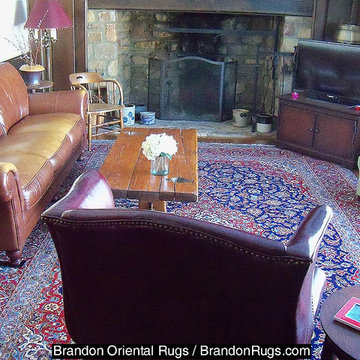
Homeowners Select Persian Kashan Rug from Bucks County Oriental Rug Store Brandon Oriental Rugs (www.BrandonRugs.com) for Family Room of Their Upper Montgomery County Farmhouse - See more at: http://brandonrugs.blogspot.com/#sthash.QMFruxxC.dpuf (Pamela Ward/ Brandon Oriental Rugs)

 Kathleen Jennison
An Arts & Crafts Bungalow is one of my favorite styles of homes. We have quite a few of them in our Stockton Mid-Town area. And when C&L called us to help them remodel their 1923 American Bungalow, I was beyond thrilled.
As per usual, when we get a new inquiry, we quickly Google the project location while we are talking to you on the phone. My excitement escalated when I saw the Google Earth Image of the sweet Sage Green bungalow in Mid-Town Stockton. "Yes, we would be interested in working with you," I said trying to keep my cool.
But what made it even better was meeting C&L and touring their home, because they are the nicest young couple, eager to make their home period perfect. Unfortunately, it had been slightly molested by some bad house-flippers, and we needed to bring the bathroom back to it "roots."
We knew we had to banish the hideous brown tile and cheap vanity quickly. But C&L complained about the condensation problems and the constant fight with mold. This immediately told me that improper remodeling had occurred and we needed to remedy that right away.
The Before: Frustrations with a Botched Remodel
The bathroom needed to be brought back to period appropriate design with all the functionality of a modern bathroom. We thought of things like marble countertop, white mosaic floor tiles, white subway tile, board and batten molding, and of course a fabulous wallpaper.
This small (and only) bathroom on a tight budget required a little bit of design sleuthing to figure out how we could get the proper look and feel. Our goal was to determine where to splurge and where to economize and how to complete the remodel as quickly as possible because C&L would have to move out while construction was going on.
The Process: Hard Work to Remedy Design and Function
During our initial design study, (which included 2 hours in the owners’ home), we noticed framed images of William Morris Arts and Crafts textile patterns and knew this would be our design inspiration. We presented C&L with three options and they quickly selected the Pimpernel Design Concept.
We had originally selected the Black and Olive colors with a black vanity, mirror, and black and white floor tile. C&L liked it but weren’t quite sure about the black, We went back to the drawing board and decided the William & Co Pimpernel Wallpaper in Bayleaf and Manilla color with a softer gray painted vanity and mirror and white floor tile was more to their liking.
After the Design Concept was approved, we went to work securing the building permit, procuring all the elements, and scheduling our trusted tradesmen to perform the work.
We did uncover some shoddy work by the flippers such as live electrical wires hidden behind the wall, plumbing venting cut-off and buried in the walls (hence the constant dampness), the tub barely balancing on two fence boards across the floor joist, and no insulation on the exterior wall.
All of the previous blunders were fixed and the bathroom put back to its previous glory. We could feel the house thanking us for making it pretty again.
The After Reveal: Cohesive Design Decisions
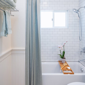
We selected a simple white subway tile for the tub/shower. This is always classic and in keeping with the style of the house.
We selected a pre-fab vanity and mirror, but they look rich with the quartz countertop. There is much more storage in this small vanity than you would think.
The Transformation: A Period Perfect Refresh
We began the remodel just as the pandemic reared and stay-in-place orders went into effect. As C&L were already moved out and living with relatives, we got the go-ahead from city officials to get the work done (after all, how can you shelter in place without a bathroom?).
All our tradesmen were scheduled to work so that only one crew was on the job site at a time. We stayed on the original schedule with only a one week delay.
The end result is the sweetest little bathroom I've ever seen (and I can't wait to start work on C&L's kitchen next).
Thank you for joining me in this project transformation. I hope this inspired you to think about being creative with your design projects, determining what works best in keeping with the architecture of your space, and carefully assessing how you can have the best life in your home.
 Phoenix Home Remodeling
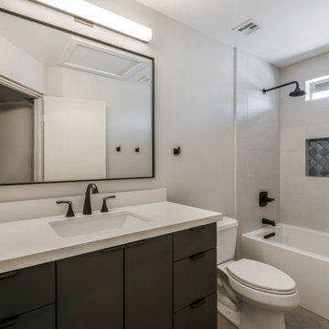
Lisa & Juan guest bathroom struggled to meet the needs of their children, guest, and became a problem with its age. The dated fixtures and the lack of space for organization was a big problem for them.
They hired us for a solution to improve and help to make the space more functional. First, we literally went to the drawing board to design a custom vanity that will help in the storage area.
The vanity is dark grey with a white quartz countertop. A rectangular undermount sink were installed. All plumbing fixtures are from Delta Faucet and in Matte Black.
New lighting and mirrors were also installed to modernize the room and support the overall design style.
After that shifted our focus to the tub and shower. They wanted a clean, contemporary, and functional space that was low maintenance but stylish.
A new Kohler tub was installed. This tub is wider and taller for a better bathing experience. We installed a new floor as well which contrast nicely with the tub. The floor tile is called Unica Stone from Arizona Tile.
The Shower walls are called Cemento Rasato Bianco from Arizona Tile. The niche tile is a large format tile called Box Silver. This tile is 18X35 and is installed as one piece in the niche which eliminates any grout in the niche back wall.
 GRAYSON DE VERE
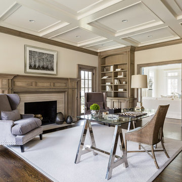
Study room - mid-sized coastal freestanding desk dark wood floor and brown floor study room idea in Miami with beige walls, a standard fireplace and a stone fireplace
19