
Search results for "Placing bigger" in Home Design Ideas
 12/12 Architects & Planners
This 6,000sf luxurious custom new construction 5-bedroom, 4-bath home combines elements of open-concept design with traditional, formal spaces, as well. Tall windows, large openings to the back yard, and clear views from room to room are abundant throughout. The 2-story entry boasts a gently curving stair, and a full view through openings to the glass-clad family room. The back stair is continuous from the basement to the finished 3rd floor / attic recreation room.
The interior is finished with the finest materials and detailing, with crown molding, coffered, tray and barrel vault ceilings, chair rail, arched openings, rounded corners, built-in niches and coves, wide halls, and 12' first floor ceilings with 10' second floor ceilings.
It sits at the end of a cul-de-sac in a wooded neighborhood, surrounded by old growth trees. The homeowners, who hail from Texas, believe that bigger is better, and this house was built to match their dreams. The brick - with stone and cast concrete accent elements - runs the full 3-stories of the home, on all sides. A paver driveway and covered patio are included, along with paver retaining wall carved into the hill, creating a secluded back yard play space for their young children.
Project photography by Kmieick Imagery.
 Sarah Feucht Gartendesign
Pool
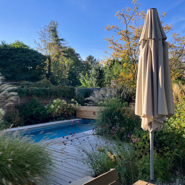
Inspiration for a mid-sized contemporary backyard rectangular lap pool remodel in Berlin
Inspiration for a mid-sized contemporary backyard rectangular lap pool remodel in Berlin

Find the right local pro for your project
 Coleen Norris
Jessie Preza
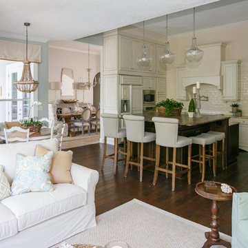
Mid-sized beach style open concept dark wood floor and brown floor living room photo in Jacksonville with blue walls, a standard fireplace, a stone fireplace and a wall-mounted tv
Mid-sized beach style open concept dark wood floor and brown floor living room photo in Jacksonville with blue walls, a standard fireplace, a stone fireplace and a wall-mounted tv

 Landis Architects | Builders
Greg Hadley Photography
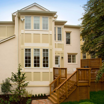
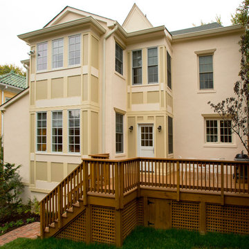
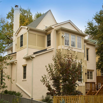
The existing house is large and we knew the renovation would make it bigger, so we stepped back the rear structure to lessen the impact of the addition. The “bay” bump out adds interest to the addition and has a hip roof. We added a new wood deck to the rear of the house. The original home is stucco, which has a heavy look. We did match the stucco and used it on the addition, but to lighten the feel and add interest, we used fiber cement HardiePanel and trimmed it with a composite product call Tru Exterior. The differing shades of paint on the HardiePanel and the trim add depth to the exterior. We re-used several of the home’s Pella windows in the addition.


 Landis Architects | Builders
Greg Hadley Photography
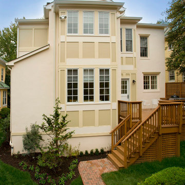
The existing house is large and we knew the renovation would make it bigger, so we stepped back the rear structure to lessen the impact of the addition. The “bay” bump out adds interest to the addition and has a hip roof. We added a new wood deck to the rear of the house. The original home is stucco, which has a heavy look. We did match the stucco and used it on the addition, but to lighten the feel and add interest, we used fiber cement HardiePanel and trimmed it with a composite product call Tru Exterior. The differing shades of paint on the HardiePanel and the trim add depth to the exterior. We re-used several of the home’s Pella windows in the addition.
 Landis Architects | Builders
Greg Hadley Photography
The existing house is large and we knew the renovation would make it bigger, so we stepped back the rear structure to lessen the impact of the addition. The “bay” bump out adds interest to the addition and has a hip roof. We added a new wood deck to the rear of the house. The original home is stucco, which has a heavy look. We did match the stucco and used it on the addition, but to lighten the feel and add interest, we used fiber cement HardiePanel and trimmed it with a composite product call Tru Exterior. The differing shades of paint on the HardiePanel and the trim add depth to the exterior. We re-used several of the home’s Pella windows in the addition.
 Landis Architects | Builders
Greg Hadley Photography
The existing house is large and we knew the renovation would make it bigger, so we stepped back the rear structure to lessen the impact of the addition. The “bay” bump out adds interest to the addition and has a hip roof. We added a new wood deck to the rear of the house. The original home is stucco, which has a heavy look. We did match the stucco and used it on the addition, but to lighten the feel and add interest, we used fiber cement HardiePanel and trimmed it with a composite product call Tru Exterior. The differing shades of paint on the HardiePanel and the trim add depth to the exterior. We re-used several of the home’s Pella windows in the addition.
 Kenmore Homes
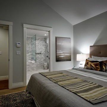
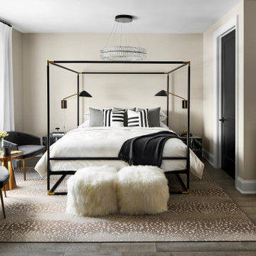
This Master Bedroom with Diamond Cut Clear Crystals Chandelier over a King size Canopy bed has plenty of room! Lounge chair area and ample floor space in this 9' high ceiling room makes it feel even bigger. The hardwood flooring is softened up with a large area rug.
 Everything Home
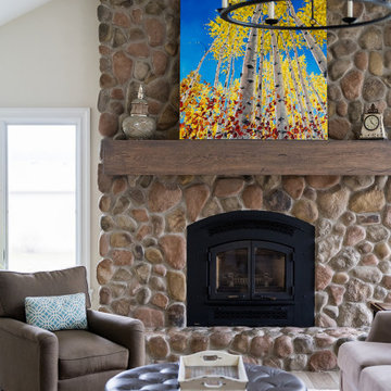
The utility room was in between the LR and the kitchen, so we moved it in order to connect the two spaces. We put the utility room where the laundry room used to be and created a new laundry room off a new hallway that leads to the master bedroom. The space for this was created by borrowing space from the XL dining area. We carved out space for the formal living room to accommodate a larger kitchen. The rest of the space became modest-sized offices with French doors to allow light from the house's front into the kitchen. The living room now transitioned into the kitchen with a new bar and sitting area.
We also transformed the full bath and hallway, which became a half-bath and mudroom for this single couple. The master bathroom was redesigned to receive a private toilet room and tiled shower. The stairs were reoriented to highlight an open railing and small foyer with a pretty armchair. The client’s existing stylish furnishings were incorporated into the colorful, bold design. Each space had personality and unique charm. The aqua kitchen’s focal point is the Kohler cast-iron vintage-inspired sink. The enlarged windows in the living room and sink allow the homeowners to enjoy the natural surroundings.
Builder Partner – Parsetich Custom Homes
Photographer - Sarah Shields
---
Project completed by Wendy Langston's Everything Home interior design firm, which serves Carmel, Zionsville, Fishers, Westfield, Noblesville, and Indianapolis.
For more about Everything Home, click here: https://everythinghomedesigns.com/
To learn more about this project, click here:
https://everythinghomedesigns.com/portfolio/this-is-my-happy-place/


Sponsored
Columbus, OH

Hope Restoration & General Contracting
Columbus Design-Build, Kitchen & Bath Remodeling, Historic Renovations

 Alair Homes Plano
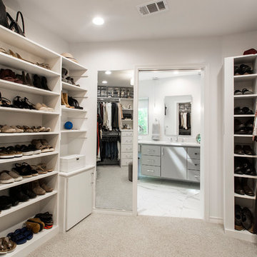
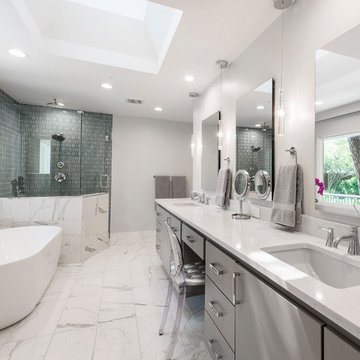
This home had a previous master bathroom remodel and addition with poor layout. Our homeowners wanted a whole new suite that was functional and beautiful. They wanted the new bathroom to feel bigger with more functional space. Their current bathroom was choppy with too many walls. The lack of storage in the bathroom and the closet was a problem and they hated the cabinets. They have a really nice large back yard and the views from the bathroom should take advantage of that.
We decided to move the main part of the bathroom to the rear of the bathroom that has the best view and combine the closets into one closet, which required moving all of the plumbing, as well as the entrance to the new bathroom. Where the old toilet, tub and shower were is now the new extra-large closet. We had to frame in the walls where the glass blocks were once behind the tub and the old doors that once went to the shower and water closet. We installed a new soft close pocket doors going into the water closet and the new closet. A new window was added behind the tub taking advantage of the beautiful backyard. In the partial frameless shower we installed a fogless mirror, shower niches and a large built in bench. . An articulating wall mount TV was placed outside of the closet, to be viewed from anywhere in the bathroom.
The homeowners chose some great floating vanity cabinets to give their new bathroom a more modern feel that went along great with the large porcelain tile flooring. A decorative tumbled marble mosaic tile was chosen for the shower walls, which really makes it a wow factor! New recessed can lights were added to brighten up the room, as well as four new pendants hanging on either side of the three mirrors placed above the seated make-up area and sinks.
Design/Remodel by Hatfield Builders & Remodelers | Photography by Versatile Imaging
 Advance Design Studio, Ltd.
Our clients in Tower Lakes, IL, needed more storage and functionality from their kitchen. They were primarily focused on finding the right combination of cabinets, shelves, and drawers that fit all their cookware, flatware, and appliances. They wanted a brighter, bigger space with a natural cooking flow and plenty of storage. Soffits and crown molding needed to be removed to make the kitchen feel larger. Redesign elements included: relocating the fridge, adding a baking station and coffee bar, and placing the microwave in the kitchen island.
Advance Design Studio’s Claudia Pop offered functional, creative, and unique solutions to the homeowners’ problems. Our clients wanted a unique kitchen that was not completely white, a balance of design and function. Claudia offered functional, creative, and unique solutions to Chad and Karen’s kitchen design challenges. The first thing to go was soffits. Today, most kitchens can benefit from the added height and space; removing soffits is nearly always step one. Steely gray-blue was the color of choice for a freshly unique look bringing a sophisticated-looking space to wrap around the fresh new kitchen. Cherry cabinetry in a true brown stain compliments the stormy accents with sharp contrasting white Cambria quartz top balancing out the space with a dramatic flair.
“We wanted something unique and special in this space, something none of the neighbors would have,” said Claudia.
The dramatic veined Cambria countertops continue upward into a backsplash behind three complimentary open shelves. These countertops provide visual texture and movement in the kitchen. The kitchen includes two larder cabinets for both the coffee bar and baking station. The kitchen is now functional and unique in design.
“When we design a new kitchen space, as designers, we are always looking for ways to balance interesting design elements with practical functionality,” Claudia said. “This kitchen’s new design is not only way more functional but is stunning in a way a piece of art can catch one’s attention.”
Decorative mullions with mirrored inserts sit atop dual sentinel pantries flanking the new refrigerator, while a 48″ dual fuel Wolf range replaced the island cooktop and double oven. The new microwave is cleverly hidden within the island, eliminating the cluttered counter and attention-grabbing wall of stainless steel from the previous space.
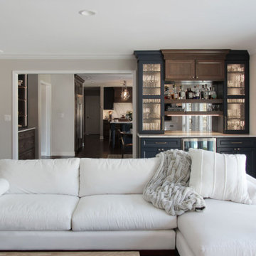
The family room was completely renovated, including a beautifully functional entertainment bar with the same combination of woods and stone as the kitchen and coffee bar. Mesh inserts instead of plain glass add visual texture while revealing pristine glassware. Handcrafted built-ins surround the fireplace.
The beautiful and efficient design created by designer Claudia transitioned directly to the installation team seamlessly, much like the basement project experience Chad and Karen enjoyed previously.
“We definitely will and have recommended Advance Design Studio to friends who are looking to embark on a project small or large,” Karen said.
“Everything that was designed and built exactly how we envisioned it, and we are really enjoying it to its full potential,” Karen said.
Our award-winning design team would love to create a beautiful, functional, and spacious place for you and your family. With our “Common Sense Remodeling” approach, the process of renovating your home has never been easier. Contact us today at 847-665-1711 or schedule an appointment.
 Alair Homes Plano
This home had a previous master bathroom remodel and addition with poor layout. Our homeowners wanted a whole new suite that was functional and beautiful. They wanted the new bathroom to feel bigger with more functional space. Their current bathroom was choppy with too many walls. The lack of storage in the bathroom and the closet was a problem and they hated the cabinets. They have a really nice large back yard and the views from the bathroom should take advantage of that.
We decided to move the main part of the bathroom to the rear of the bathroom that has the best view and combine the closets into one closet, which required moving all of the plumbing, as well as the entrance to the new bathroom. Where the old toilet, tub and shower were is now the new extra-large closet. We had to frame in the walls where the glass blocks were once behind the tub and the old doors that once went to the shower and water closet. We installed a new soft close pocket doors going into the water closet and the new closet. A new window was added behind the tub taking advantage of the beautiful backyard. In the partial frameless shower we installed a fogless mirror, shower niches and a large built in bench. . An articulating wall mount TV was placed outside of the closet, to be viewed from anywhere in the bathroom.
The homeowners chose some great floating vanity cabinets to give their new bathroom a more modern feel that went along great with the large porcelain tile flooring. A decorative tumbled marble mosaic tile was chosen for the shower walls, which really makes it a wow factor! New recessed can lights were added to brighten up the room, as well as four new pendants hanging on either side of the three mirrors placed above the seated make-up area and sinks.
Design/Remodel by Hatfield Builders & Remodelers | Photography by Versatile Imaging

Sponsored
Columbus, OH

Structural Remodeling
Franklin County's Heavy Timber Specialists | Best of Houzz 2020!
 Klopf Architecture
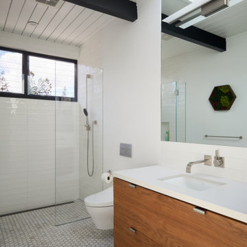
Located in Palo Alto's flood zone, this Eichler home underwent a phased renovation thoughtfully redesigned to accommodate a growing family of five, with an emphasis on school proximity and nearby grandparents. The bedroom wing was completely reconfigured, including a new front addition as a guest suite for grandparents, expanding the house to five bedrooms and three baths. Taller 9-foot ceilings were introduced in some areas, enhancing the overall openness—a lofty goal for an Eichler.
The tranquil courtyard, a favorite spot for the family, was redesigned to allow parents to watch the kids while cooking. The backyard became a relaxing lounging area connected to the living room. Once dark living spaces were modernized by removing a low-hanging beam in the kitchen, adding skylights for natural light, and eliminating the fireplace to create a more functional entertainment space. Finally, new landscaping reflecting the client's heritage and some of the home's architectural elements, creates a harmonious indoor-outdoor flow.
Klopf Architecture Project Team: John Klopf, AIA and Angela Alexander
Interior Architecture: Klopf Architecture
Bathroom Materials and Light Fixture Selection: Lucile Glessner
Landscape Architect: Thuilot and Associates
Photography: ©2024 Mariko Reed
Year Completed: 2024
Location: Palo Alto, CA
 Steveworks LLC
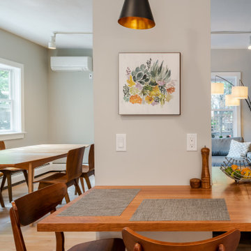
We opened up the wall on both sides of the chimney (which could not be removed) to improve flow and make the space feel bigger
Breakfast nook - contemporary light wood floor breakfast nook idea in Boston with gray walls
Breakfast nook - contemporary light wood floor breakfast nook idea in Boston with gray walls
 Godwin Residential Construction
© Wing Wong
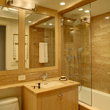
The goal for this pied-a-terre was to keep an open and light ambiance, reminiscent of a being on a ship. To create better eye line views of the East River, new tilt and turn windows were installed. Custom mill work and radiator enclosures were created for this repeat client. Also, the kitchen was opened to the living room.
19