
Search results for "Platform's user friendly" in Home Design Ideas
 User
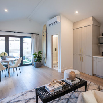
All Weather teamed up with the Property Brothers and Darren Criss on this week’s episode of HGTV’s hit series Celebrity IOU. In the Darren Criss Makes Over his Managers Garage episode. the 34-year old actor, singer and songwriter trades in his guitar for a sledgehammer to help transform his decade-long best friend and manager Ricky’s old, detached garage into a beautiful, dedicated home office space with a spa like bathroom, kitchenette and living area.
Darren wanted to express his heartfelt gratitude and thank Ricky, who he credits with helping to launch his career, for his years of support. “Ricky is easily one of the best things that has ever happened to me in my entire life,” added the Emmy and Golden Globe winning multi talented star. “He has invested so much of himself into making my dreams come true. This is a small token of all my appreciation for everything he’s done.”
In addition to the turning the garage into a much needed five star home office/flex space that can also be utilized as an in law suite, the Property Brothers give Ricky’s lackluster backyard a major upgrade including an outdoor kitchen and hot tub. All Weather’s Series 7000 Swing Door opens into the new spacious outdoor kitchen and dining space. All Weather Series 5000 casement windows allow natural light to brighten the renovated home office/in law suite. And to maximize space, All Weather Series 9100 Bifold Doors connect to the outdoor lounging area and hot tub tp create indoor/outdoor living. Check out the project photos from this epic transformation.
As an added bonus, Darren Criss can turn anything into a musical moment. From harmonizing with the Property Brothers to bursting into song while helping host Jonathan Scott select design options for this epic transformation. Darren ends the episode by singing Celebrity IOU’s first ever theme song and jamming with his newest band that include Drew Scott on guitar, Jonathan Scott on cymbals and Ricky on drums.
Now in its second season, Celebrity IOU gives celebrities a chance to show their deepest gratitude for someone who helped shape their life or career by giving their living space a complete redesign, courtesy of the Drew and Jonathan Scott.

 Hansgrohe USA
Miracle of convenience with handspray for price-conscious cooking fans
Cooks like using the best ingredients. Hansgrohe believes: then start with your faucet. Our Focus range has brains, beauty and functional solutions for every kitchen environment. Convenient: We offer basic Focus versions with a high spout and long handle, and also a reasonably priced sink unit faucet with dual-jet handspray.
What makes Focus the ideal choice in the kitchen?
+ Intelligent functions and high-quality design at an attractive price. The Focus, Focus E and Focus S ranges combine aesthetics and practical details.
+ Focus sink unit faucets offer a wide range of combination options and blend in perfectly in modern kitchens with straight, clear lines.
+ Chrome or stainless steel. Depending on the color of the oven, fridge, extractor hood or handles in your kitchen, you simply select the matching surface finish.
+ In this range, you can find models with high swivel spouts, which can be swiveled by up to 360°.
+ Whether pull-out or handspray with two jet types, the faucet extensions bring water to where it is needed.
+ The ergonomic handle and variable handle positioning make Focus especially user friendly. Simply let your plumber know whether you want the right-handed or left-handed version installed.

 Earthscape - Landscape Design & Build
The goal of this project was to transform the existing decrepit landscape into a newly modern space with the purpose of entertaining family and friends. The clients also wanted a hint of ‘steam-punk’ incorporated into the overall theme.
To achieve the wants and needs of the client a new composite deck was installed with an angular form to maximize space on an already tight backyard with large setbacks. A swim spa was built into the deck and a secret hatch door was installed for any future maintenance. Large angled steps lead you from the deck down to the new random flagstone patio.
A large custom pavilion was installed over the patio to shelter users from the elements. Oversized rough Douglas Fir posts and beams were used along with some black powder coated steel bars to achieve the steam punk theme. Extensive engineering was involved to achieve the cantilevered look and reduce the need for an outside post. Tongue and groove cedar planks make up the ceiling of the structure along with LED pot lights. 3 pieces of sandblasted Eramosa stone acts as a bar area for users in the newly installed hot tub. Lastly a frosted glass privacy screen with LED colour changing lights separates the sitting area under the pavilion and the barbecue area of the deck.
Some existing plants and shrubs were salvaged during construction and were reused in the new low maintenance-planting plan. A new section of fence closes off the backyard for the homeowner’s dogs and a new gate was created with the use of steel bars to mirror the pavilion.
Find the right local pro for your project

 Canterbury Design Kitchen Interiors
Beaux arts architecture of Blairsden was inspiration for kitchen. Homeowner wanted clean airy look while repurposing cold commercial cooking space to an aesthetically pleasing functional kitchen for family and friends or for a catering staff during larger gatherings.
Aside from the hand made LaCornue range, no appliances were to be be in the kitchen so as not to interfere with the aesthetic. Instead, the appliances were moved to an adjacent space and celebrated as their own aesthetic with complimentary stainless steel cabinetry and tiled walls.
The color pallet of the kitchen was intentionally subtle with tones of beige white and grey. Light was reintroduced into the space by rebuilding the east and north windows.
Traffic pattern was improved by moving range from south wall to north wall. Custom stainless structural window, with stainless steel screen and natural brass harlequin grill encapsulated in insulated frosted glass, was engineered to support hood and creates a stunning backdrop for the already gorgeous range.
All hardware in kitchen is unlacquered natural brass intentionally selected so as to develop its own patina as it oxides over time to give a true historic quality.
Other interesting point about kitchen:
All cabinetry doors 5/4"
All cabinetry interiors natural walnut
All cabinetry interiors on sensors and light up with LED lights that are routed into frames of cabinetry
Magnetic cutlery dividers in drawers enable user to reposition easily
Venician plaster walls
Lava stone countertops on perimeter
Marble countertop island
2 level cutting boards and strainers in sink by galley workstation
 Earthscape - Landscape Design & Build
The goal of this project was to transform the existing decrepit landscape into a newly modern space with the purpose of entertaining family and friends. The clients also wanted a hint of ‘steam-punk’ incorporated into the overall theme.
To achieve the wants and needs of the client a new composite deck was installed with an angular form to maximize space on an already tight backyard with large setbacks. A swim spa was built into the deck and a secret hatch door was installed for any future maintenance. Large angled steps lead you from the deck down to the new random flagstone patio.
A large custom pavilion was installed over the patio to shelter users from the elements. Oversized rough Douglas Fir posts and beams were used along with some black powder coated steel bars to achieve the steam punk theme. Extensive engineering was involved to achieve the cantilevered look and reduce the need for an outside post. Tongue and groove cedar planks make up the ceiling of the structure along with LED pot lights. 3 pieces of sandblasted Eramosa stone acts as a bar area for users in the newly installed hot tub. Lastly a frosted glass privacy screen with LED colour changing lights separates the sitting area under the pavilion and the barbecue area of the deck.
Some existing plants and shrubs were salvaged during construction and were reused in the new low maintenance-planting plan. A new section of fence closes off the backyard for the homeowner’s dogs and a new gate was created with the use of steel bars to mirror the pavilion.
 User
A masterpiece of light and design, this gorgeous Beverly Hills contemporary is filled with incredible moments, offering the perfect balance of intimate corners and open spaces.
A large driveway with space for ten cars is complete with a contemporary fountain wall that beckons guests inside. An amazing pivot door opens to an airy foyer and light-filled corridor with sliding walls of glass and high ceilings enhancing the space and scale of every room. An elegant study features a tranquil outdoor garden and faces an open living area with fireplace. A formal dining room spills into the incredible gourmet Italian kitchen with butler’s pantry—complete with Miele appliances, eat-in island and Carrara marble countertops—and an additional open living area is roomy and bright. Two well-appointed powder rooms on either end of the main floor offer luxury and convenience.
Surrounded by large windows and skylights, the stairway to the second floor overlooks incredible views of the home and its natural surroundings. A gallery space awaits an owner’s art collection at the top of the landing and an elevator, accessible from every floor in the home, opens just outside the master suite. Three en-suite guest rooms are spacious and bright, all featuring walk-in closets, gorgeous bathrooms and balconies that open to exquisite canyon views. A striking master suite features a sitting area, fireplace, stunning walk-in closet with cedar wood shelving, and marble bathroom with stand-alone tub. A spacious balcony extends the entire length of the room and floor-to-ceiling windows create a feeling of openness and connection to nature.
A large grassy area accessible from the second level is ideal for relaxing and entertaining with family and friends, and features a fire pit with ample lounge seating and tall hedges for privacy and seclusion. Downstairs, an infinity pool with deck and canyon views feels like a natural extension of the home, seamlessly integrated with the indoor living areas through sliding pocket doors.
Amenities and features including a glassed-in wine room and tasting area, additional en-suite bedroom ideal for staff quarters, designer fixtures and appliances and ample parking complete this superb hillside retreat.
 Hansgrohe USA
Miracle of convenience with handspray for price-conscious cooking fans
Cooks like using the best ingredients. Hansgrohe believes: then start with your faucet. Our Focus range has brains, beauty and functional solutions for every kitchen environment. Convenient: We offer basic Focus versions with a high spout and long handle, and also a reasonably priced sink unit faucet with dual-jet handspray.
What makes Focus the ideal choice in the kitchen?
+ Intelligent functions and high-quality design at an attractive price. The Focus, Focus E and Focus S ranges combine aesthetics and practical details.
+ Focus sink unit faucets offer a wide range of combination options and blend in perfectly in modern kitchens with straight, clear lines.
+ Chrome or stainless steel. Depending on the color of the oven, fridge, extractor hood or handles in your kitchen, you simply select the matching surface finish.
+ In this range, you can find models with high swivel spouts, which can be swiveled by up to 360°.
+ Whether pull-out or handspray with two jet types, the faucet extensions bring water to where it is needed.
+ The ergonomic handle and variable handle positioning make Focus especially user friendly. Simply let your plumber know whether you want the right-handed or left-handed version installed.
 Kitchen, Bath & Home - Texas
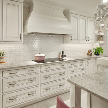
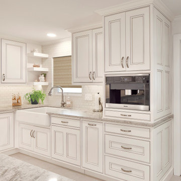
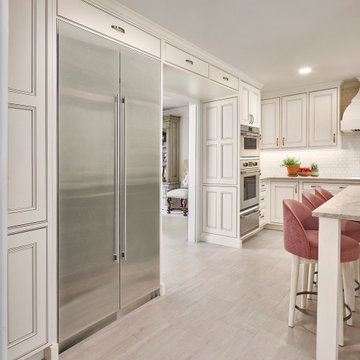
Once upon a time, there was a “Country” house that dreamed of one day being a ”Town” house with all the luxuries and delights of city life. Set on 52 acres and built in the 1970s, the kitchen was dark, dated and divided. You might describe the original space as “practical” where everything functioned properly but had no eye appeal. No glamour. Cue the designer, who took the inspiration the client had of the French countryside, and added cabinet details, mosaic tiles, chandeliers, top-of-the-line appliances, and a pop of pink to bring the vision to life.
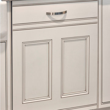
• The recessed cabinets doors and drawer faces, stain and detailed workmanship set tone and elegance for the room overall.
• Everywhere you look you’ll find storage, storage and more storage, including a set of cabinets stretching across the top of the entry into the dining room, Lemans in each corner cabinet, and pull-out can storage.
• The built-in coffee bar includes a pull-out tray to set your mug on while mixing your morning brew.
• The custom dishwasher panel was made to match the cabinet doors perfectly.
• Lighter colors were chosen to brighten the space and wider entry spaces bring in more natural light from other rooms.
• Appliances were moved to make the space more user-friendly.
Now the client enjoys the simple life in the country with its peace and security as well as the luxuries and dainties of the city all in one place – their home. The End.

 Daniel Scerri Periti
We were approached with a request to design the furnishings for an existing ‘finished’ apartment. The intention was to move in relatively fast, and the property already had an existing marble floor, kitchen and bathrooms which had to be kept. The property also boasted a fantastic 270 degree view, seen from most of the apartment. The clients had a very important role in the completion of the project. They were very involved during the design process and through various decoration choices. The final design was kept as a rigid guideline when faced with picking out all the different elements.
Once clear of all previous furniture, the space felt cold and bare; so we immediately felt the need for warmth, and raw, natural elements and textures to complement the cold marble floor while visually tying in the design of the whole apartment together.
Since the existing kitchen had a touch of dark walnut stain, we felt this material was one we should add to the palette of materials to contest the stark materials. A raw cement finish was another material we felt would add an interesting contrast and could be used in a variety of ways, from cabinets to walls and ceilings, to tie up the design of various areas of the apartment.
To warm up the living/dining area, keeping the existing marble floor but visually creating zones within the large living/dining area without hindering the flow, a dark timber custom-made soffit, continuous with a floor-to-ceiling drinks cabinet zones the dining area, giving it a degree of much-needed warmth.
The various windows with a stupendous 270 degree view needed to be visually tied together. This was done by introducing a continuous sheer [drape] which also doubled up as a sound-absorbing material along 2 of the 4 walls of the space.
A very large sofa was required to fill up the space correctly, also required for the size of the young family.
Services were integrated within the units and soffits, while a customized design in the corner between the kitchen and the living room took into consideration the viewpoints from the main areas to create a pantry without hindering the flow or views. A strategically placed floor-to-ceiling mirror doubles up the space and extends the view to the inner parts of the apartment.
The daughter’s bedroom was a small challenge in itself, and a fun task, where we wanted to achieve the perception of a cozy niche with its own enclosed reading nook [for reading fairy tales], behind see-through curtains and a custom-ordered wall print sporting the girl’s favorite colors.
The sons’ bedroom had double the requirements in terms of space needed: more wardrobe, more homework desk space, a tv/play station area… “We combined a raised platform area between the boys’ beds to become an area with cushions where the kids can lay down and play, and face a hidden screen behind the homework desk’s sliding back panel for their play station”. The color of the homework desk was chosen in relation to the boys’ ages. A more masculine material palette was chosen for this room, in contrast to the light pastel palette of the girl’s bedroom. Again, this colour can easily be changed over time for a more mature look.
PROJECT DATA:
St. Paul’s Bay, Malta
DESIGN TEAM:
Perit Rebecca Zammit, Perit Daniel Scerri, Elyse Tonna
OTHER CREDITS:
Photography: Tonio Lombardi
Styling : TKS
 Daniel Scerri Periti
We were approached with a request to design the furnishings for an existing ‘finished’ apartment. The intention was to move in relatively fast, and the property already had an existing marble floor, kitchen and bathrooms which had to be kept. The property also boasted a fantastic 270 degree view, seen from most of the apartment. The clients had a very important role in the completion of the project. They were very involved during the design process and through various decoration choices. The final design was kept as a rigid guideline when faced with picking out all the different elements.
Once clear of all previous furniture, the space felt cold and bare; so we immediately felt the need for warmth, and raw, natural elements and textures to complement the cold marble floor while visually tying in the design of the whole apartment together.
Since the existing kitchen had a touch of dark walnut stain, we felt this material was one we should add to the palette of materials to contest the stark materials. A raw cement finish was another material we felt would add an interesting contrast and could be used in a variety of ways, from cabinets to walls and ceilings, to tie up the design of various areas of the apartment.
To warm up the living/dining area, keeping the existing marble floor but visually creating zones within the large living/dining area without hindering the flow, a dark timber custom-made soffit, continuous with a floor-to-ceiling drinks cabinet zones the dining area, giving it a degree of much-needed warmth.
The various windows with a stupendous 270 degree view needed to be visually tied together. This was done by introducing a continuous sheer [drape] which also doubled up as a sound-absorbing material along 2 of the 4 walls of the space.
A very large sofa was required to fill up the space correctly, also required for the size of the young family.
Services were integrated within the units and soffits, while a customized design in the corner between the kitchen and the living room took into consideration the viewpoints from the main areas to create a pantry without hindering the flow or views. A strategically placed floor-to-ceiling mirror doubles up the space and extends the view to the inner parts of the apartment.
The daughter’s bedroom was a small challenge in itself, and a fun task, where we wanted to achieve the perception of a cozy niche with its own enclosed reading nook [for reading fairy tales], behind see-through curtains and a custom-ordered wall print sporting the girl’s favorite colors.
The sons’ bedroom had double the requirements in terms of space needed: more wardrobe, more homework desk space, a tv/play station area… “We combined a raised platform area between the boys’ beds to become an area with cushions where the kids can lay down and play, and face a hidden screen behind the homework desk’s sliding back panel for their play station”. The color of the homework desk was chosen in relation to the boys’ ages. A more masculine material palette was chosen for this room, in contrast to the light pastel palette of the girl’s bedroom. Again, this colour can easily be changed over time for a more mature look.
PROJECT DATA:
St. Paul’s Bay, Malta
DESIGN TEAM:
Perit Rebecca Zammit, Perit Daniel Scerri, Elyse Tonna
OTHER CREDITS:
Photography: Tonio Lombardi
Styling : TKS
 Kitchen, Bath & Home - Texas
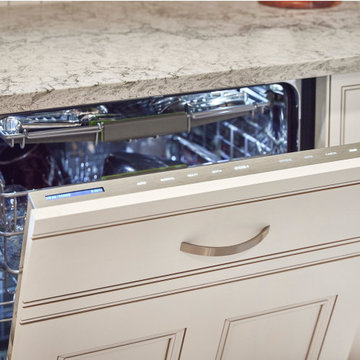
Once upon a time, there was a “Country” house that dreamed of one day being a ”Town” house with all the luxuries and delights of city life. Set on 52 acres and built in the 1970s, the kitchen was dark, dated and divided. You might describe the original space as “practical” where everything functioned properly but had no eye appeal. No glamour. Cue the designer, who took the inspiration the client had of the French countryside, and added cabinet details, mosaic tiles, chandeliers, top-of-the-line appliances, and a pop of pink to bring the vision to life.
• The recessed cabinets doors and drawer faces, stain and detailed workmanship set tone and elegance for the room overall.
• Everywhere you look you’ll find storage, storage and more storage, including a set of cabinets stretching across the top of the entry into the dining room, Lemans in each corner cabinet, and pull-out can storage.
• The built-in coffee bar includes a pull-out tray to set your mug on while mixing your morning brew.
• The custom dishwasher panel was made to match the cabinet doors perfectly.
• Lighter colors were chosen to brighten the space and wider entry spaces bring in more natural light from other rooms.
• Appliances were moved to make the space more user-friendly.
Now the client enjoys the simple life in the country with its peace and security as well as the luxuries and dainties of the city all in one place – their home. The End.
 Kitchen, Bath & Home - Texas
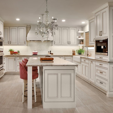
Once upon a time, there was a “Country” house that dreamed of one day being a ”Town” house with all the luxuries and delights of city life. Set on 52 acres and built in the 1970s, the kitchen was dark, dated and divided. You might describe the original space as “practical” where everything functioned properly but had no eye appeal. No glamour. Cue the designer, who took the inspiration the client had of the French countryside, and added cabinet details, mosaic tiles, chandeliers, top-of-the-line appliances, and a pop of pink to bring the vision to life.
• The recessed cabinets doors and drawer faces, stain and detailed workmanship set tone and elegance for the room overall.
• Everywhere you look you’ll find storage, storage and more storage, including a set of cabinets stretching across the top of the entry into the dining room, Lemans in each corner cabinet, and pull-out can storage.
• The built-in coffee bar includes a pull-out tray to set your mug on while mixing your morning brew.
• The custom dishwasher panel was made to match the cabinet doors perfectly.
• Lighter colors were chosen to brighten the space and wider entry spaces bring in more natural light from other rooms.
• Appliances were moved to make the space more user-friendly.
Now the client enjoys the simple life in the country with its peace and security as well as the luxuries and dainties of the city all in one place – their home. The End.
 Kitchen, Bath & Home - Texas
Once upon a time, there was a “Country” house that dreamed of one day being a ”Town” house with all the luxuries and delights of city life. Set on 52 acres and built in the 1970s, the kitchen was dark, dated and divided. You might describe the original space as “practical” where everything functioned properly but had no eye appeal. No glamour. Cue the designer, who took the inspiration the client had of the French countryside, and added cabinet details, mosaic tiles, chandeliers, top-of-the-line appliances, and a pop of pink to bring the vision to life.
• The recessed cabinets doors and drawer faces, stain and detailed workmanship set tone and elegance for the room overall.
• Everywhere you look you’ll find storage, storage and more storage, including a set of cabinets stretching across the top of the entry into the dining room, Lemans in each corner cabinet, and pull-out can storage.
• The built-in coffee bar includes a pull-out tray to set your mug on while mixing your morning brew.
• The custom dishwasher panel was made to match the cabinet doors perfectly.
• Lighter colors were chosen to brighten the space and wider entry spaces bring in more natural light from other rooms.
• Appliances were moved to make the space more user-friendly.
Now the client enjoys the simple life in the country with its peace and security as well as the luxuries and dainties of the city all in one place – their home. The End.
 Kitchen, Bath & Home - Texas
Once upon a time, there was a “Country” house that dreamed of one day being a ”Town” house with all the luxuries and delights of city life. Set on 52 acres and built in the 1970s, the kitchen was dark, dated and divided. You might describe the original space as “practical” where everything functioned properly but had no eye appeal. No glamour. Cue the designer, who took the inspiration the client had of the French countryside, and added cabinet details, mosaic tiles, chandeliers, top-of-the-line appliances, and a pop of pink to bring the vision to life.
• The recessed cabinets doors and drawer faces, stain and detailed workmanship set tone and elegance for the room overall.
• Everywhere you look you’ll find storage, storage and more storage, including a set of cabinets stretching across the top of the entry into the dining room, Lemans in each corner cabinet, and pull-out can storage.
• The built-in coffee bar includes a pull-out tray to set your mug on while mixing your morning brew.
• The custom dishwasher panel was made to match the cabinet doors perfectly.
• Lighter colors were chosen to brighten the space and wider entry spaces bring in more natural light from other rooms.
• Appliances were moved to make the space more user-friendly.
Now the client enjoys the simple life in the country with its peace and security as well as the luxuries and dainties of the city all in one place – their home. The End.
 Kitchen, Bath & Home - Texas
Once upon a time, there was a “Country” house that dreamed of one day being a ”Town” house with all the luxuries and delights of city life. Set on 52 acres and built in the 1970s, the kitchen was dark, dated and divided. You might describe the original space as “practical” where everything functioned properly but had no eye appeal. No glamour. Cue the designer, who took the inspiration the client had of the French countryside, and added cabinet details, mosaic tiles, chandeliers, top-of-the-line appliances, and a pop of pink to bring the vision to life.
• The recessed cabinets doors and drawer faces, stain and detailed workmanship set tone and elegance for the room overall.
• Everywhere you look you’ll find storage, storage and more storage, including a set of cabinets stretching across the top of the entry into the dining room, Lemans in each corner cabinet, and pull-out can storage.
• The built-in coffee bar includes a pull-out tray to set your mug on while mixing your morning brew.
• The custom dishwasher panel was made to match the cabinet doors perfectly.
• Lighter colors were chosen to brighten the space and wider entry spaces bring in more natural light from other rooms.
• Appliances were moved to make the space more user-friendly.
Now the client enjoys the simple life in the country with its peace and security as well as the luxuries and dainties of the city all in one place – their home. The End.
 Daniel Scerri Periti
We were approached with a request to design the furnishings for an existing ‘finished’ apartment. The intention was to move in relatively fast, and the property already had an existing marble floor, kitchen and bathrooms which had to be kept. The property also boasted a fantastic 270 degree view, seen from most of the apartment. The clients had a very important role in the completion of the project. They were very involved during the design process and through various decoration choices. The final design was kept as a rigid guideline when faced with picking out all the different elements.
Once clear of all previous furniture, the space felt cold and bare; so we immediately felt the need for warmth, and raw, natural elements and textures to complement the cold marble floor while visually tying in the design of the whole apartment together.
Since the existing kitchen had a touch of dark walnut stain, we felt this material was one we should add to the palette of materials to contest the stark materials. A raw cement finish was another material we felt would add an interesting contrast and could be used in a variety of ways, from cabinets to walls and ceilings, to tie up the design of various areas of the apartment.
To warm up the living/dining area, keeping the existing marble floor but visually creating zones within the large living/dining area without hindering the flow, a dark timber custom-made soffit, continuous with a floor-to-ceiling drinks cabinet zones the dining area, giving it a degree of much-needed warmth.
The various windows with a stupendous 270 degree view needed to be visually tied together. This was done by introducing a continuous sheer [drape] which also doubled up as a sound-absorbing material along 2 of the 4 walls of the space.
A very large sofa was required to fill up the space correctly, also required for the size of the young family.
Services were integrated within the units and soffits, while a customized design in the corner between the kitchen and the living room took into consideration the viewpoints from the main areas to create a pantry without hindering the flow or views. A strategically placed floor-to-ceiling mirror doubles up the space and extends the view to the inner parts of the apartment.
The daughter’s bedroom was a small challenge in itself, and a fun task, where we wanted to achieve the perception of a cozy niche with its own enclosed reading nook [for reading fairy tales], behind see-through curtains and a custom-ordered wall print sporting the girl’s favorite colors.
The sons’ bedroom had double the requirements in terms of space needed: more wardrobe, more homework desk space, a tv/play station area… “We combined a raised platform area between the boys’ beds to become an area with cushions where the kids can lay down and play, and face a hidden screen behind the homework desk’s sliding back panel for their play station”. The color of the homework desk was chosen in relation to the boys’ ages. A more masculine material palette was chosen for this room, in contrast to the light pastel palette of the girl’s bedroom. Again, this colour can easily be changed over time for a more mature look.
PROJECT DATA:
St. Paul’s Bay, Malta
DESIGN TEAM:
Perit Rebecca Zammit, Perit Daniel Scerri, Elyse Tonna
OTHER CREDITS:
Photography: Tonio Lombardi
Styling : TKS
 User
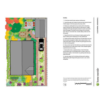
“I have a big ask,” wrote this Berkeley, California, homeowner, explaining that she wanted a yard where her young children could spend as much time outdoors as possible, but she also envisioned a garden that would feel like an extension of the small bungalow-style house, which offered little space for entertaining and hanging out. She wanted to keep the front yard open to the street and inviting, while also creating a bit of privacy for a dining area in the front window that felt too exposed. With lots of DIY experience and skills, this family was ready to roll up their sleeves and install a new landscape, but they knew that before they started, they needed some expert design help. An online search brought them to Home Outside.
The Home Outside designer studied their goals and preferences and created a landscape design in which the front yard is partially screened by a flower garden and a fence that swoops upward to form an arbor over the front walkway. The existing wooden deck is extended to accommodate dining, while a pea-stone terrace with firepit forms an outdoor living room, with space for the potted plants the owner loves. A lattice-topped fence creates privacy and offers a vertical surface for lush vines to grab onto—a great trick for a small property. A corner of the yard is dedicated to children’s play, with a round lawn, play structure, and secret hiding places under the shrubbery. Finally, we recommended that they turn their driveway into a sustainable “garden” by laying pervious concrete planks for the tire tracks, with low groundcover plants along the center strip and repurposed brick (already on site) to walk upon.
The homeowner wrote to Home Outside to say, “We love how it is turning out, and several of our friends have commented that it is like stepping into a yard out of Sunset magazine. The design investment and the hard work have been one of the most transformative and positive projects we have taken on.”
 Earthscape - Landscape Design & Build
The goal of this project was to transform the existing decrepit landscape into a newly modern space with the purpose of entertaining family and friends. The clients also wanted a hint of ‘steam-punk’ incorporated into the overall theme.
To achieve the wants and needs of the client a new composite deck was installed with an angular form to maximize space on an already tight backyard with large setbacks. A swim spa was built into the deck and a secret hatch door was installed for any future maintenance. Large angled steps lead you from the deck down to the new random flagstone patio.
A large custom pavilion was installed over the patio to shelter users from the elements. Oversized rough Douglas Fir posts and beams were used along with some black powder coated steel bars to achieve the steam punk theme. Extensive engineering was involved to achieve the cantilevered look and reduce the need for an outside post. Tongue and groove cedar planks make up the ceiling of the structure along with LED pot lights. 3 pieces of sandblasted Eramosa stone acts as a bar area for users in the newly installed hot tub. Lastly a frosted glass privacy screen with LED colour changing lights separates the sitting area under the pavilion and the barbecue area of the deck.
Some existing plants and shrubs were salvaged during construction and were reused in the new low maintenance-planting plan. A new section of fence closes off the backyard for the homeowner’s dogs and a new gate was created with the use of steel bars to mirror the pavilion.

 Zola European Windows
McKeesport Downtown Housing, formerly a YMCA, is an 84-unit SRO for people at risk of homelessness. The old brick and terracotta building was important historically for McKeesport. The decision to design the project to Passive House criteria actually went a long way to making the pro-forma work. This project was the first large scale retrofit to be designed to meet Passive House Standards in the US. Another major concern of the project team was to maintain the historic charm of the building.
Space was at a premium and a reorganization of space allowed for making larger resident rooms. Through a community process with various stakeholders, amenities were identified and added to the project, including a community room, a bike storage area, exterior smoking balconies, single-user rest rooms, a bed bug room for non-toxic treatment of bed bugs, and communal kitchens to provide healthy options for food. The renovation includes new additional lighting, air-conditioning, make-up air and ventilation systems, an elevator, and cooking facilities. A cold-weather shelter, 60-day emergency housing, bridge housing, and section 8 apartment rentals make up the housing programs within the shelter. Thoughtful Balance designed the interiors, and selected the furniture for durability and resistance to bed bugs.
The project team worked closely with Zola Windows to specify a unique uPVC window that not only offers passive house performance levels at an affordable cost, but also harmonizes with the building’s historic aesthetic. Zola’s American Heritage SDH (simulated double hung) from the popular, budget-friendly Thermo uPVC line was specified for the project. The windows implemented in this project feature a lower tilt & turn window and a fixed upper for maximum airtightness and thermal performance. The implementation of these windows helped the project team achieve a very significant energy consumption reduction of at least 75%.
Photographer: Alexander Denmarsh

 Yard Maven
Photo: Christopher Lee Foto
Design ideas for a drought-tolerant backyard landscaping in Los Angeles.
Design ideas for a drought-tolerant backyard landscaping in Los Angeles.
48