
Search results for "Platform's user friendly" in Home Design Ideas

 Daniel Scerri Periti
We were approached with a request to design the furnishings for an existing ‘finished’ apartment. The intention was to move in relatively fast, and the property already had an existing marble floor, kitchen and bathrooms which had to be kept. The property also boasted a fantastic 270 degree view, seen from most of the apartment. The clients had a very important role in the completion of the project. They were very involved during the design process and through various decoration choices. The final design was kept as a rigid guideline when faced with picking out all the different elements.
Once clear of all previous furniture, the space felt cold and bare; so we immediately felt the need for warmth, and raw, natural elements and textures to complement the cold marble floor while visually tying in the design of the whole apartment together.
Since the existing kitchen had a touch of dark walnut stain, we felt this material was one we should add to the palette of materials to contest the stark materials. A raw cement finish was another material we felt would add an interesting contrast and could be used in a variety of ways, from cabinets to walls and ceilings, to tie up the design of various areas of the apartment.
To warm up the living/dining area, keeping the existing marble floor but visually creating zones within the large living/dining area without hindering the flow, a dark timber custom-made soffit, continuous with a floor-to-ceiling drinks cabinet zones the dining area, giving it a degree of much-needed warmth.
The various windows with a stupendous 270 degree view needed to be visually tied together. This was done by introducing a continuous sheer [drape] which also doubled up as a sound-absorbing material along 2 of the 4 walls of the space.
A very large sofa was required to fill up the space correctly, also required for the size of the young family.
Services were integrated within the units and soffits, while a customized design in the corner between the kitchen and the living room took into consideration the viewpoints from the main areas to create a pantry without hindering the flow or views. A strategically placed floor-to-ceiling mirror doubles up the space and extends the view to the inner parts of the apartment.
The daughter’s bedroom was a small challenge in itself, and a fun task, where we wanted to achieve the perception of a cozy niche with its own enclosed reading nook [for reading fairy tales], behind see-through curtains and a custom-ordered wall print sporting the girl’s favorite colors.
The sons’ bedroom had double the requirements in terms of space needed: more wardrobe, more homework desk space, a tv/play station area… “We combined a raised platform area between the boys’ beds to become an area with cushions where the kids can lay down and play, and face a hidden screen behind the homework desk’s sliding back panel for their play station”. The color of the homework desk was chosen in relation to the boys’ ages. A more masculine material palette was chosen for this room, in contrast to the light pastel palette of the girl’s bedroom. Again, this colour can easily be changed over time for a more mature look.
PROJECT DATA:
St. Paul’s Bay, Malta
DESIGN TEAM:
Perit Rebecca Zammit, Perit Daniel Scerri, Elyse Tonna
OTHER CREDITS:
Photography: Tonio Lombardi
Styling : TKS
 Daniel Scerri Periti
We were approached with a request to design the furnishings for an existing ‘finished’ apartment. The intention was to move in relatively fast, and the property already had an existing marble floor, kitchen and bathrooms which had to be kept. The property also boasted a fantastic 270 degree view, seen from most of the apartment. The clients had a very important role in the completion of the project. They were very involved during the design process and through various decoration choices. The final design was kept as a rigid guideline when faced with picking out all the different elements.
Once clear of all previous furniture, the space felt cold and bare; so we immediately felt the need for warmth, and raw, natural elements and textures to complement the cold marble floor while visually tying in the design of the whole apartment together.
Since the existing kitchen had a touch of dark walnut stain, we felt this material was one we should add to the palette of materials to contest the stark materials. A raw cement finish was another material we felt would add an interesting contrast and could be used in a variety of ways, from cabinets to walls and ceilings, to tie up the design of various areas of the apartment.
To warm up the living/dining area, keeping the existing marble floor but visually creating zones within the large living/dining area without hindering the flow, a dark timber custom-made soffit, continuous with a floor-to-ceiling drinks cabinet zones the dining area, giving it a degree of much-needed warmth.
The various windows with a stupendous 270 degree view needed to be visually tied together. This was done by introducing a continuous sheer [drape] which also doubled up as a sound-absorbing material along 2 of the 4 walls of the space.
A very large sofa was required to fill up the space correctly, also required for the size of the young family.
Services were integrated within the units and soffits, while a customized design in the corner between the kitchen and the living room took into consideration the viewpoints from the main areas to create a pantry without hindering the flow or views. A strategically placed floor-to-ceiling mirror doubles up the space and extends the view to the inner parts of the apartment.
The daughter’s bedroom was a small challenge in itself, and a fun task, where we wanted to achieve the perception of a cozy niche with its own enclosed reading nook [for reading fairy tales], behind see-through curtains and a custom-ordered wall print sporting the girl’s favorite colors.
The sons’ bedroom had double the requirements in terms of space needed: more wardrobe, more homework desk space, a tv/play station area… “We combined a raised platform area between the boys’ beds to become an area with cushions where the kids can lay down and play, and face a hidden screen behind the homework desk’s sliding back panel for their play station”. The color of the homework desk was chosen in relation to the boys’ ages. A more masculine material palette was chosen for this room, in contrast to the light pastel palette of the girl’s bedroom. Again, this colour can easily be changed over time for a more mature look.
PROJECT DATA:
St. Paul’s Bay, Malta
DESIGN TEAM:
Perit Rebecca Zammit, Perit Daniel Scerri, Elyse Tonna
OTHER CREDITS:
Photography: Tonio Lombardi
Styling : TKS

 User
A masterpiece of light and design, this gorgeous Beverly Hills contemporary is filled with incredible moments, offering the perfect balance of intimate corners and open spaces.
A large driveway with space for ten cars is complete with a contemporary fountain wall that beckons guests inside. An amazing pivot door opens to an airy foyer and light-filled corridor with sliding walls of glass and high ceilings enhancing the space and scale of every room. An elegant study features a tranquil outdoor garden and faces an open living area with fireplace. A formal dining room spills into the incredible gourmet Italian kitchen with butler’s pantry—complete with Miele appliances, eat-in island and Carrara marble countertops—and an additional open living area is roomy and bright. Two well-appointed powder rooms on either end of the main floor offer luxury and convenience.
Surrounded by large windows and skylights, the stairway to the second floor overlooks incredible views of the home and its natural surroundings. A gallery space awaits an owner’s art collection at the top of the landing and an elevator, accessible from every floor in the home, opens just outside the master suite. Three en-suite guest rooms are spacious and bright, all featuring walk-in closets, gorgeous bathrooms and balconies that open to exquisite canyon views. A striking master suite features a sitting area, fireplace, stunning walk-in closet with cedar wood shelving, and marble bathroom with stand-alone tub. A spacious balcony extends the entire length of the room and floor-to-ceiling windows create a feeling of openness and connection to nature.
A large grassy area accessible from the second level is ideal for relaxing and entertaining with family and friends, and features a fire pit with ample lounge seating and tall hedges for privacy and seclusion. Downstairs, an infinity pool with deck and canyon views feels like a natural extension of the home, seamlessly integrated with the indoor living areas through sliding pocket doors.
Amenities and features including a glassed-in wine room and tasting area, additional en-suite bedroom ideal for staff quarters, designer fixtures and appliances and ample parking complete this superb hillside retreat.
Find the right local pro for your project
 Windy City Painters
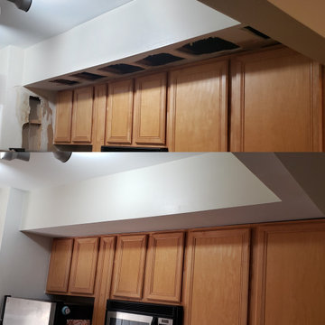
 response to water damage in a kitchen:
Assessment and Inspection:
Windy City Painters initiates the process by conducting a thorough assessment of the water damage in the kitchen. This involves inspecting the soffit above the kitchen cabinets and the side wall to identify the areas that require repair. The severity of the damage is carefully evaluated to determine the scope of the restoration.
Insulation Replacement:
In cases where water has damaged insulation, Windy City Painters removes and replaces the affected insulation to ensure proper restoration of the affected areas. This step is crucial for preventing future issues related to moisture and maintaining the integrity of the space.
Drywall Replacement:
Damaged drywall is carefully removed and replaced during the repair process. This includes removing sections of drywall that have been compromised by water, ensuring that the new drywall seamlessly integrates with the existing structure.
Sealing Water Spots with Oil-Based Primer:
To prevent any potential water stains from bleeding through the new paint, Windy City Painters applies an oil-based primer to seal water spots. This step not only ensures a smooth and uniform finish but also provides additional protection against future water damage.
Cleaning and Restoration:
After completing the repair work, Chicago painter takes the extra step of cleaning the entire area to ensure a neat and polished final result. This includes removing any debris or dust generated during the repair process, leaving the kitchen in a clean and presentable condition.
Efficient Completion by Skilled Painter:
Windy City Painters prides itself on efficiency, and the entire drywall repair job is completed within one day by a skilled painter. This quick turnaround minimizes disruptions to the homeowner's routine and allows for a prompt return to normalcy.
Scheduling and Estimates:
Customers looking to schedule an appointment or obtain an online estimate can easily do so by visiting the official website at www.windypainters.com. The user-friendly platform facilitates convenient scheduling and access to estimates.
Customer Assurance and Reviews:
Windy City Painters emphasizes customer satisfaction and provides the highest quality service. Potential customers are encouraged to check the company's 5-star reviews on Yelp ( https://www.yelp.com/biz/windy-city-painters-chicago-2) and Google, offering a glimpse into the positive experiences of previous clients.
Windy City Painters offers a comprehensive and efficient drywall repair service, addressing water damage in kitchens with expertise, professionalism, and a commitment to customer satisfaction.
 Daniel Scerri Periti
We were approached with a request to design the furnishings for an existing ‘finished’ apartment. The intention was to move in relatively fast, and the property already had an existing marble floor, kitchen and bathrooms which had to be kept. The property also boasted a fantastic 270 degree view, seen from most of the apartment. The clients had a very important role in the completion of the project. They were very involved during the design process and through various decoration choices. The final design was kept as a rigid guideline when faced with picking out all the different elements.
Once clear of all previous furniture, the space felt cold and bare; so we immediately felt the need for warmth, and raw, natural elements and textures to complement the cold marble floor while visually tying in the design of the whole apartment together.
Since the existing kitchen had a touch of dark walnut stain, we felt this material was one we should add to the palette of materials to contest the stark materials. A raw cement finish was another material we felt would add an interesting contrast and could be used in a variety of ways, from cabinets to walls and ceilings, to tie up the design of various areas of the apartment.
To warm up the living/dining area, keeping the existing marble floor but visually creating zones within the large living/dining area without hindering the flow, a dark timber custom-made soffit, continuous with a floor-to-ceiling drinks cabinet zones the dining area, giving it a degree of much-needed warmth.
The various windows with a stupendous 270 degree view needed to be visually tied together. This was done by introducing a continuous sheer [drape] which also doubled up as a sound-absorbing material along 2 of the 4 walls of the space.
A very large sofa was required to fill up the space correctly, also required for the size of the young family.
Services were integrated within the units and soffits, while a customized design in the corner between the kitchen and the living room took into consideration the viewpoints from the main areas to create a pantry without hindering the flow or views. A strategically placed floor-to-ceiling mirror doubles up the space and extends the view to the inner parts of the apartment.
The daughter’s bedroom was a small challenge in itself, and a fun task, where we wanted to achieve the perception of a cozy niche with its own enclosed reading nook [for reading fairy tales], behind see-through curtains and a custom-ordered wall print sporting the girl’s favorite colors.
The sons’ bedroom had double the requirements in terms of space needed: more wardrobe, more homework desk space, a tv/play station area… “We combined a raised platform area between the boys’ beds to become an area with cushions where the kids can lay down and play, and face a hidden screen behind the homework desk’s sliding back panel for their play station”. The color of the homework desk was chosen in relation to the boys’ ages. A more masculine material palette was chosen for this room, in contrast to the light pastel palette of the girl’s bedroom. Again, this colour can easily be changed over time for a more mature look.
PROJECT DATA:
St. Paul’s Bay, Malta
DESIGN TEAM:
Perit Rebecca Zammit, Perit Daniel Scerri, Elyse Tonna
OTHER CREDITS:
Photography: Tonio Lombardi
Styling : TKS

 Cantoni Irvine
Brad Haines knows a thing or two about building things. The intensely creative and innovative founder of Oklahoma City-based Haines Capital is the driving force behind numerous successful companies including Bank 7 (NASDAQ BSVN), which proudly reported record year-end earnings since going public in September of last year. He has beautifully built, renovated, and personally thumb printed all of his commercial spaces and residences. “Our theory is to keep things sophisticated but comfortable,” Brad says.
That’s the exact approach he took in his personal haven in Nichols Hills, Oklahoma. Painstakingly renovated over the span of two years by Candeleria Foster Design-Build of Oklahoma City, his home boasts museum-white, authentic Venetian plaster walls and ceilings; charcoal tiled flooring; imported marble in the master bath; and a pretty kitchen you’ll want to emulate.
Reminiscent of an edgy luxury hotel, it is a vibe conjured by Cantoni designer Nicole George. “The new remodel plan was all about opening up the space and layering monochromatic color with lots of texture,” says Nicole, who collaborated with Brad on two previous projects. “The color palette is minimal, with charcoal, bone, amber, stone, linen and leather.”
“Sophisticated“Sophisticated“Sophisticated“Sophisticated“Sophisticated
Nicole helped oversee space planning and selection of interior finishes, lighting, furnishings and fine art for the entire 7,000-square-foot home. It is now decked top-to-bottom in pieces sourced from Cantoni, beginning with the custom-ordered console at entry and a pair of Glacier Suspension fixtures over the stairwell. “Every angle in the house is the result of a critical thought process,” Nicole says. “We wanted to make sure each room would be purposeful.”
To that end, “we reintroduced the ‘parlor,’ and also redefined the formal dining area as a bar and drink lounge with enough space for 10 guests to comfortably dine,” Nicole says. Brad’s parlor holds the Swing sectional customized in a silky, soft-hand charcoal leather crafted by prominent Italian leather furnishings company Gamma. Nicole paired it with the Kate swivel chair customized in a light grey leather, the sleek DK writing desk, and the Black & More bar cabinet by Malerba. “Nicole has a special design talent and adapts quickly to what we expect and like,” Brad says.
To create the restaurant-worthy dining space, Nicole brought in a black-satin glass and marble-topped dining table and mohair-velvet chairs, all by Italian maker Gallotti & Radice. Guests can take a post-dinner respite on the adjoining room’s Aston sectional by Gamma.
In the formal living room, Nicole paired Cantoni’s Fashion Affair club chairs with the Black & More cocktail table, and sofas sourced from Désirée, an Italian furniture upholstery company that creates cutting-edge yet comfortable pieces. The color-coordinating kitchen and breakfast area, meanwhile, hold a set of Guapa counter stools in ash grey leather, and the Ray dining table with light-grey leather Cattelan Italia chairs. The expansive loggia also is ideal for entertaining and lounging with the Versa grand sectional, the Ido cocktail table in grey aged walnut and Dolly chairs customized in black nubuck leather. Nicole made most of the design decisions, but, “she took my suggestions seriously and then put me in my place,” Brad says.
She had the master bedroom’s Marlon bed by Gamma customized in a remarkably soft black leather with a matching stitch and paired it with onyx gloss Black & More nightstands. “The furnishings absolutely complement the style,” Brad says. “They are high-quality and have a modern flair, but at the end of the day, are still comfortable and user-friendly.”
The end result is a home Brad not only enjoys, but one that Nicole also finds exceptional. “I honestly love every part of this house,” Nicole says. “Working with Brad is always an adventure but a privilege that I take very seriously, from the beginning of the design process to installation.”

 The Kingston Group - Remodeling Specialists
Inspiration for a small timeless 3/4 white tile and subway tile ceramic tile doorless shower remodel in Nashville with a wall-mount sink, open cabinets, a two-piece toilet and green walls

 Lentz Kitchen & Bath
The Crystal Keyline island, range-hood and accessible cooktop area are focal points, finished in Antique Ivory w/Brown Highlights, that contrast nicely with Crystal Keyline Toasted Rye w/Brown Highlights cabinetry. The Bayfield door style unifies the design.
Typhoon Bordeaux granite countertops are layered in staggered heights for added visual interest.
The on-set of a neuromuscular disorder was the basis for this custom kitchen and required the complete customization of this space to the specific needs of the client, as well as to his wife who does most the cooking on a daily basis. The layout was designed for the couple to be able to work together in the kitchen, or independently.
An accessible prep area next to the stove allows plenty of room for multiple cooks in the kitchen. Note the placement of the microwave is not only ideal for wheelchair accessibility, but eliminates potentially dangerous overhead lifting of hot or heavy containers.
Although largely dictated by the husband's need for accessibility, the universal design of this kitchen is also extremely friendly for a person of smaller stature (his wife!)
The couple feels at home in this kitchen yet, it’s not obvious that someone with physical limitations utilizes this space.
 Daniel Scerri Periti
We were approached with a request to design the furnishings for an existing ‘finished’ apartment. The intention was to move in relatively fast, and the property already had an existing marble floor, kitchen and bathrooms which had to be kept. The property also boasted a fantastic 270 degree view, seen from most of the apartment. The clients had a very important role in the completion of the project. They were very involved during the design process and through various decoration choices. The final design was kept as a rigid guideline when faced with picking out all the different elements.
Once clear of all previous furniture, the space felt cold and bare; so we immediately felt the need for warmth, and raw, natural elements and textures to complement the cold marble floor while visually tying in the design of the whole apartment together.
Since the existing kitchen had a touch of dark walnut stain, we felt this material was one we should add to the palette of materials to contest the stark materials. A raw cement finish was another material we felt would add an interesting contrast and could be used in a variety of ways, from cabinets to walls and ceilings, to tie up the design of various areas of the apartment.
To warm up the living/dining area, keeping the existing marble floor but visually creating zones within the large living/dining area without hindering the flow, a dark timber custom-made soffit, continuous with a floor-to-ceiling drinks cabinet zones the dining area, giving it a degree of much-needed warmth.
The various windows with a stupendous 270 degree view needed to be visually tied together. This was done by introducing a continuous sheer [drape] which also doubled up as a sound-absorbing material along 2 of the 4 walls of the space.
A very large sofa was required to fill up the space correctly, also required for the size of the young family.
Services were integrated within the units and soffits, while a customized design in the corner between the kitchen and the living room took into consideration the viewpoints from the main areas to create a pantry without hindering the flow or views. A strategically placed floor-to-ceiling mirror doubles up the space and extends the view to the inner parts of the apartment.
The daughter’s bedroom was a small challenge in itself, and a fun task, where we wanted to achieve the perception of a cozy niche with its own enclosed reading nook [for reading fairy tales], behind see-through curtains and a custom-ordered wall print sporting the girl’s favorite colors.
The sons’ bedroom had double the requirements in terms of space needed: more wardrobe, more homework desk space, a tv/play station area… “We combined a raised platform area between the boys’ beds to become an area with cushions where the kids can lay down and play, and face a hidden screen behind the homework desk’s sliding back panel for their play station”. The color of the homework desk was chosen in relation to the boys’ ages. A more masculine material palette was chosen for this room, in contrast to the light pastel palette of the girl’s bedroom. Again, this colour can easily be changed over time for a more mature look.
PROJECT DATA:
St. Paul’s Bay, Malta
DESIGN TEAM:
Perit Rebecca Zammit, Perit Daniel Scerri, Elyse Tonna
OTHER CREDITS:
Photography: Tonio Lombardi
Styling : TKS
 User
A masterpiece of light and design, this gorgeous Beverly Hills contemporary is filled with incredible moments, offering the perfect balance of intimate corners and open spaces.
A large driveway with space for ten cars is complete with a contemporary fountain wall that beckons guests inside. An amazing pivot door opens to an airy foyer and light-filled corridor with sliding walls of glass and high ceilings enhancing the space and scale of every room. An elegant study features a tranquil outdoor garden and faces an open living area with fireplace. A formal dining room spills into the incredible gourmet Italian kitchen with butler’s pantry—complete with Miele appliances, eat-in island and Carrara marble countertops—and an additional open living area is roomy and bright. Two well-appointed powder rooms on either end of the main floor offer luxury and convenience.
Surrounded by large windows and skylights, the stairway to the second floor overlooks incredible views of the home and its natural surroundings. A gallery space awaits an owner’s art collection at the top of the landing and an elevator, accessible from every floor in the home, opens just outside the master suite. Three en-suite guest rooms are spacious and bright, all featuring walk-in closets, gorgeous bathrooms and balconies that open to exquisite canyon views. A striking master suite features a sitting area, fireplace, stunning walk-in closet with cedar wood shelving, and marble bathroom with stand-alone tub. A spacious balcony extends the entire length of the room and floor-to-ceiling windows create a feeling of openness and connection to nature.
A large grassy area accessible from the second level is ideal for relaxing and entertaining with family and friends, and features a fire pit with ample lounge seating and tall hedges for privacy and seclusion. Downstairs, an infinity pool with deck and canyon views feels like a natural extension of the home, seamlessly integrated with the indoor living areas through sliding pocket doors.
Amenities and features including a glassed-in wine room and tasting area, additional en-suite bedroom ideal for staff quarters, designer fixtures and appliances and ample parking complete this superb hillside retreat.
 Daniel Scerri Periti
We were approached with a request to design the furnishings for an existing ‘finished’ apartment. The intention was to move in relatively fast, and the property already had an existing marble floor, kitchen and bathrooms which had to be kept. The property also boasted a fantastic 270 degree view, seen from most of the apartment. The clients had a very important role in the completion of the project. They were very involved during the design process and through various decoration choices. The final design was kept as a rigid guideline when faced with picking out all the different elements.
Once clear of all previous furniture, the space felt cold and bare; so we immediately felt the need for warmth, and raw, natural elements and textures to complement the cold marble floor while visually tying in the design of the whole apartment together.
Since the existing kitchen had a touch of dark walnut stain, we felt this material was one we should add to the palette of materials to contest the stark materials. A raw cement finish was another material we felt would add an interesting contrast and could be used in a variety of ways, from cabinets to walls and ceilings, to tie up the design of various areas of the apartment.
To warm up the living/dining area, keeping the existing marble floor but visually creating zones within the large living/dining area without hindering the flow, a dark timber custom-made soffit, continuous with a floor-to-ceiling drinks cabinet zones the dining area, giving it a degree of much-needed warmth.
The various windows with a stupendous 270 degree view needed to be visually tied together. This was done by introducing a continuous sheer [drape] which also doubled up as a sound-absorbing material along 2 of the 4 walls of the space.
A very large sofa was required to fill up the space correctly, also required for the size of the young family.
Services were integrated within the units and soffits, while a customized design in the corner between the kitchen and the living room took into consideration the viewpoints from the main areas to create a pantry without hindering the flow or views. A strategically placed floor-to-ceiling mirror doubles up the space and extends the view to the inner parts of the apartment.
The daughter’s bedroom was a small challenge in itself, and a fun task, where we wanted to achieve the perception of a cozy niche with its own enclosed reading nook [for reading fairy tales], behind see-through curtains and a custom-ordered wall print sporting the girl’s favorite colors.
The sons’ bedroom had double the requirements in terms of space needed: more wardrobe, more homework desk space, a tv/play station area… “We combined a raised platform area between the boys’ beds to become an area with cushions where the kids can lay down and play, and face a hidden screen behind the homework desk’s sliding back panel for their play station”. The color of the homework desk was chosen in relation to the boys’ ages. A more masculine material palette was chosen for this room, in contrast to the light pastel palette of the girl’s bedroom. Again, this colour can easily be changed over time for a more mature look.
PROJECT DATA:
St. Paul’s Bay, Malta
DESIGN TEAM:
Perit Rebecca Zammit, Perit Daniel Scerri, Elyse Tonna
OTHER CREDITS:
Photography: Tonio Lombardi
Styling : TKS
 Dimensions in Wood Inc
This client’s vision for their kitchen/hearth room remodel was to create a harmonious space for gathering and socializing with family and friends. Without the before and after photos, you would scarcely believe this was the same home.
This huge home renovation perfectly illustrates that Dimensions In Wood’s expert team can handle every aspect of your remodeling project. Plumbing, flooring, electrical wiring, custom cabinets, structural engineering, appliances, windows, interior and exterior doors, entertainment and more. Contact us today to discuss Translating Your Visions into Reality
The client was interested in new appliance technology, cabinetry to the ceiling, and an Island large enough to seat 3. They also wanted a built-in breakfast nook, improved pantry space, more functional storage on either side of their fireplace, and a built-in appearance for the TV above the mantel. The original built-in desk was not used, and they preferred for that space to serve as a small bar area with refrigeration and a place to store their printer. We designed several plans for the space before selecting the final layout.
The new design required the removal of the soffit over the old sink, as well as a small wall beside the old refrigerator. The wall beside the stairwell had to be shortened 13 inches and a new beam installed to carry the load of the home’s 2nd story to gain enough space for the large central island. The existing closet pantry walls were also reconfigured as per the new plan.
This serves as a great reminder that Dimensions In Wood is much more than just custom cabinets.
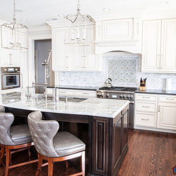
Central to the entire custom kitchen is an 8-foot Walnut island. The huge island, which comfortably seats three, is topped with Essenza Blue quartzite. The stone’s natural striations are beautiful. Quartzite is harder than granite, and less likely to stain than other stones because of its density. The couple had to look through multiple slabs to find a piece they LOVED. The island’s custom Walnut cabinetry, built to resemble a piece of custom furniture, was stained Bronzed Walnut by Sherwin Williams.
The 4-foot Galley Workstation in the island, handles all the kitchen’s prep, serving, and cleanup needs. The Galley’s culinary tools include an upper tier cutting board, upper tier drying rack, 2 lower tier platforms, 11″ colander with non-slip handles, and 11” mixing bowl with lid and non-slip bottom. Learn more about the amazing Galley Workstation here. A Waterstone gantry faucet in a pewter finish combines a pull-down sprayer for maximum mobility and a articulated swivel spout. A water tap with reverse osmosis filter provides the highest quality drinking water. To keep a clean and sleek counter we installed a raised air switch for the garbage disposal and integrated soap dispenser. The island also houses the Thermador Sapphire 7-Program Dishwasher with a hidden touch control panel and a custom Walnut wood front. The cabinetry under the Galley Workstation features a trash roll out, as well as storage for the culinary tools.
Shortening the stairwell wall, and reframing around the stairs, which included shortening the handrail, also made room for a bi-fold door walk-in pantry with extra roll out storage and space for a small microwave. Above the panty doors is a remote controlled, electric motor powered, lift up cabinet door which hides a flat screen TV, used while the family is cooking.
To the right of the walk-in pantry is cold food storage. The Thermador, 30-inch Freedom Collection refrigerator and 24-inch built-in freezer column with internal ice maker are covered with matching cabinetry fronts. An open display space was designed above the units, creating an aesthetically beautiful wall. To the right of the refrigerator & freezer columns is a tall cabinet designed for the built-in Thermador steam and convection oven. The convention steam oven is a relatively new technology for homes, but its versatility and food quality is amazing. To the right of this is a pull-out appliance pantry which provides easy access and storage for a stand mixer, blender, and any other appliance you do not want to clutter the counter.
The most visible wall of the kitchen features the 36-inch Thermador Professional Series Harmony Gas Range with Griddle. Between the range and custom designed wood hood, a framed mosaic tile accent in the backsplash, creates a focal point. To clear the air, the Professional Series Thermador 42-inch ventilation insert provides excellent exhaust capabilities, as well as providing multi-level, vivid LED lights for beautiful illumination.
The wall cabinetry symmetrically flanks the custom hood, utilizing deeper wall cabinetry on each end, allowing for storage of oversized dishware. The base cabinetry on this wall is made up of drawers, except for the corner, which is a Kesseböhmer LeMans II. This specially designed shelf system allows ease of access in underutilized blind corners. The dual action articulation system with soft close mechanism ensures a smooth open and close.
Rounding the corner to the outside wall, the base cabinetry was built to a narrower depth, providing additional space for the island, as well as easier access to the new larger pass-thru window which serves the screen porch. The client selected Black Vermont granite countertops with an ogee edge to contrast the Linen White painted cabinetry.
The door to the screen porch was replaced with a Marvin Exterior Door with a raised panel at the bottom of the 3⁄4 glass door.
Marvin Windows replaced the other windows in the space increasing the energy efficiency and value of the home. To establish the breakfast nook, a bench with drawers and an upholstered seat was built into the bay area of the room.
Custom bookshelves were built with open shelves, cabinet doors, and drawers on either side of the fireplace. A new stone hearth and fireplace surround were installed. Above the existing mantel we built a recessed space for the flat screen television hiding all wiring inside the walls for a completely clean look.
The space that was once a desk was transformed into a bar area. The glass shelves and glass cabinet front liquor cabinet stand out. But this bar area has hidden secrets. Tucked beneath the black granite is a Thermador under-counter double drawer refrigerator with matching wood front panels. They blend in perfectly with the cabinets. A wireless printer is easily accessed on a slide out drawer. Plus, what looks like merely wooden panels on the wall are concealing recessed storage for more bottles and glasses!
Overhead recessed lighting and speaker system provide illumination and entertainment through the entire space.
This luxury home had original, solid oak flooring through most of the first floor which the homeowner obviously wanted to keep but were in desperate need of repair and refinishing. Our master craftsmen wove in new wood flooring to match the old where needed, particularly where walls had been changed and where the floor was damaged. We sanded the floors, smoothing away years of wear and tear. The entire wood floor was then uniformly stained, making it impossible to differentiate where any repairs were made.
If this renovation has inspired you, then contact us today! There is no limit to our Dimensions.
 User
The living room furniture wasn’t doing our clients any favours. The comfort they once sought in the room had turned to lethargy, and they wanted to liven things up. (When the sag in your sofa turns you into a human burrito, it’s time to let go.) Before we brought in the new, however, we wanted to focus on functionality. How was the space going to be used? Our clients love to host casual get togethers with family and friends, and they love a family movie night, so we knew ample seating was a must-have.
We also wanted to make the living room feel as big as it actually is. Something to note: Let your furniture breathe! Allow for plenty of clearance between your furniture; don’t fill up your space with furniture just because the space allows for it. We got rid of the bookshelf and console table behind the sofa, which opened up the space for entertaining or for movie nights. Our clients now have room for a Christmas tree in the corner! Now the space is modern, purposeful, and oh so cozy! We stopped at nothing to make this living room feel as inviting as possible. The detailed tile in the fireplace, the textures in the accessories and pillows, and the various wood tones all work together to create comfort and style. And please don’t worry about mixing wood tones. When done with the right balance, the different shades will add warmth and depth to any space.
Ottomans are the perfect way to maximize seating and comfort. They can be used for extra seating or pulled over to a sofa to rest the legs for maximum lounging. Now that there’s plenty of clearance between the cocktail table and sofas, our clients have the space to move these versatile pieces around.
Thank you for visiting! We’re always honoured to share our transformed and updated homes! We hope you love this cozy living room as much as our clients do. If you have any questions about this project, feel free to ask us in the Comments below!
 Inhabit | Space
Whon Photography
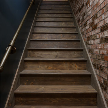
Large urban underground carpeted staircase photo in Indianapolis with gray walls and no fireplace
Large urban underground carpeted staircase photo in Indianapolis with gray walls and no fireplace
 TRA studio Architecture PLLC
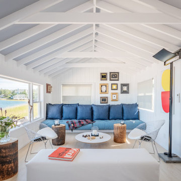
This Atlantic holiday cottage is located in the unique landscape of the creek at Towd Point, in Southampton, one of only 28 Federal Ecological Preserves in the US. Caterina and Bob, a design couple who owns the architecture firm TRA studio in the city, chose the property because of their historic ties to the area and the extraordinary setting and its precise location within it: it is the only house whose site is at the bend of the Towd Point peninsula, right where the views of the protected creek are at the widest and where a little beach naturally occurred.
Although the views are open and vast, the property is minimal, way too small to even consider a small pool or spa: the pristine creek is the house water feature, the recreation expansion of the diminutive back yard. We often joke that at TRA we can make small spaces feel big, which is, exactly what we did.
As often happened with TRA’s renovation projects, as well as with the most recent art pieces by Robert Traboscia, one of the Studio’s founders, the house is an “object trouve’’, originally a modest fishing outpost, that went through many alterations, to finally find a refreshed life as a modern cottage for a New York family. A vintage busted kayak, repurposed as a planter, completes the process.
The cottage is actually a collection of objects: the original Bayman’s cottage now houses two bedrooms, the adjoining deck soon afterwards was enclosed to make space for the kitchen/dining volume and a newer living room addition was later built to complete the compound.’
The compactness of the volumes contributes to the environmental quality of the house, whose
simple natural materials have been carefully restored and insulated, while the simplicity of the volumes, which has been respectfully retained, talks about a nostalgia for the past Long Island seaside retreats. The single level recognizable gabled roof silhouette sits comfortably on the private beach, the greyed cedar deck acting as a platform to connect with the landscape.
The informal weathered materials and the reductive color palette weave effortlessly from the exterior to the interior, creating a serene environment, echoing the coastal landscape, which emphasizes the line where the water meets the sky, the natural beach, tall breezy grasses and the multitude of happy birds who call the creek home.
The restoration process started with the modest goal of cleaning up the walls and replace the worn uneven floor, it soon turned into a forensic research for the original elements, uncovering the historic foam-green siding gabled façade that is now the backdrop of the dining pavilion. The renovation respected the history of the place: everything changed and everything stayed the same.
In an area known for vast, affluent, estates, the house is often the place where friends and family gather: the size of the house, the largeness of the creek, the wild life coexisting in harmony with the visitors, the availability of a swim in the bay or kayak adventure, are all interesting and inviting. We often observed that people do not want to leave our interiors, we love the little house because is a place that you never need to leave, this is definitely a house where there is always something to do. In the Hamptons, the question is often “what you are looking at”, usually the pool or landscaped nature, here it is easy to respond: our private beach and protected nature.
The landscaping simply aims at enhancing the existing: three sculptural and weathered trees were given new life, the natural arch of the Creek, further outlined by the bulkhead, is amplified and repeated, similarly to rock stratifications, to connect to the house and define the different modes of the landscape: native grasses, private beach, gravel lawn, fence and finally Towd Point Road. Towd Point Little Beach is a habitat meant to be shared with birds and animals.

 J Design Group - Interior Designers Miami - Modern
A TOUCHDOWN BY DESIGN
Interior design by Jennifer Corredor, J Design Group, Coral Gables, Florida
Text by Christine Davis
Photography by Daniel Newcomb, Palm Beach Gardens, FL
What did Detroit Lions linebacker, Stephen Tulloch, do when he needed a decorator for his new Miami 10,000-square-foot home? He tackled the situation by hiring interior designer Jennifer Corredor. Never defensive, he let her have run of the field. “He’d say, ‘Jen, do your thing,’” she says. And she did it well.
The first order of the day was to get a lay of the land and a feel for what he wanted. For his primary residence, Tulloch chose a home in Pinecrest, Florida. — a great family neighborhood known for its schools and ample lot sizes. “His lot is huge,” Corredor says. “He could practice his game there if he wanted.”
A laidback feeling permeates the suburban village, where mostly Mediterranean homes intermix with a few modern styles. With views toward the pool and a landscaped yard, Tulloch’s 10,000-square-foot home touches on both, a Mediterranean exterior with chic contemporary interiors.
Step inside, where high ceilings and a sculptural stairway with oak treads and linear spindles immediately capture the eye. “Knowing he was more inclined toward an uncluttered look, and taking into consideration his age and lifestyle, I naturally took the path of choosing more modern furnishings,” the designer says.
In the dining room, Tulloch specifically asked for a round table and Corredor found “Xilos Simplice” by Maxalto, a table that seats six to eight and has a Lazy Susan.
And just past the stairway, two armless chairs from Calligaris and a semi-round sofa shape the living room. In keeping with Tulloch’s desire for a simple no-fuss lifestyle, leather is often used for upholstery. “He preferred wipe-able areas,” she says. “Nearly everything in the living room is clad in leather.”
An architecturally striking, oak-coffered ceiling warms the family room, while Saturnia marble flooring grounds the space in cool comfort. “Since it’s just off the kitchen, this relaxed space provides the perfect place for family and friends to congregate — somewhere to hang out,” Corredor says. The deep-seated sofa wrapped in tan leather and Minotti armchairs in white join a pair of linen-clad ottomans for ample seating.
With eight bedrooms in the home, there was “plenty of space to repurpose,” Corredor says. “Five are used for sleeping quarters, but the others have been converted into a billiard room, a home office and the memorabilia room.” On the first floor, the billiard room is set for fun and entertainment with doors that open to the pool area.
The memorabilia room presented quite a challenge. Undaunted, Corredor delved into a seemingly never-ending collection of mementos to create a tribute to Tulloch’s career. “His team colors are blue and white, so we used those colors in this space,” she says.
In a nod to Tulloch’s career on and off the field, his home office displays awards, recognition plaques and photos from his foundation. A Copenhagen desk, Herman Miller chair and leather-topped credenza further an aura of masculinity.
All about relaxation, the master bedroom would not be complete without its own sitting area for viewing sports updates or late-night movies. Here, lounge chairs recline to create the perfect spot for Tulloch to put his feet up and watch TV. “He wanted it to be really comfortable,” Corredor says
A total redo was required in the master bath, where the now 12-foot-long shower is a far cry from those in a locker room. “This bath is more like a launching pad to get you going in the morning,” Corredor says.
“All in all, it’s a fun, warm and beautiful environment,” the designer says. “I wanted to create something unique, that would make my client proud and happy.” In Tulloch’s world, that’s a touchdown.
Your friendly Interior design firm in Miami at your service.
Contemporary - Modern Interior designs.
Top Interior Design Firm in Miami – Coral Gables.
Office,
Offices,
Kitchen,
Kitchens,
Bedroom,
Bedrooms,
Bed,
Queen bed,
King Bed,
Single bed,
House Interior Designer,
House Interior Designers,
Home Interior Designer,
Home Interior Designers,
Residential Interior Designer,
Residential Interior Designers,
Modern Interior Designers,
Miami Beach Designers,
Best Miami Interior Designers,
Miami Beach Interiors,
Luxurious Design in Miami,
Top designers,
Deco Miami,
Luxury interiors,
Miami modern,
Interior Designer Miami,
Contemporary Interior Designers,
Coco Plum Interior Designers,
Miami Interior Designer,
Sunny Isles Interior Designers,
Pinecrest Interior Designers,
Interior Designers Miami,
J Design Group interiors,
South Florida designers,
Best Miami Designers,
Miami interiors,
Miami décor,
Miami Beach Luxury Interiors,
Miami Interior Design,
Miami Interior Design Firms,
Beach front,
Top Interior Designers,
top décor,
Top Miami Decorators,
Miami luxury condos,
Top Miami Interior Decorators,
Top Miami Interior Designers,
Modern Designers in Miami,
modern interiors,
Modern,
Pent house design,
white interiors,
Miami, South Miami, Miami Beach, South Beach, Williams Island, Sunny Isles, Surfside, Fisher Island, Aventura, Brickell, Brickell Key, Key Biscayne, Coral Gables, CocoPlum, Coconut Grove, Pinecrest, Miami Design District, Golden Beach, Downtown Miami, Miami Interior Designers, Miami Interior Designer, Interior Designers Miami, Modern Interior Designers, Modern Interior Designer, Modern interior decorators, Contemporary Interior Designers, Interior decorators, Interior decorator, Interior designer, Interior designers, Luxury, modern, best, unique, real estate, decor
J Design Group – Miami Interior Design Firm – Modern – Contemporary
Contact us: (305) 444-4611
http://www.JDesignGroup.com
 Cantoni Irvine
Brad Haines knows a thing or two about building things. The intensely creative and innovative founder of Oklahoma City-based Haines Capital is the driving force behind numerous successful companies including Bank 7 (NASDAQ BSVN), which proudly reported record year-end earnings since going public in September of last year. He has beautifully built, renovated, and personally thumb printed all of his commercial spaces and residences. “Our theory is to keep things sophisticated but comfortable,” Brad says.
That’s the exact approach he took in his personal haven in Nichols Hills, Oklahoma. Painstakingly renovated over the span of two years by Candeleria Foster Design-Build of Oklahoma City, his home boasts museum-white, authentic Venetian plaster walls and ceilings; charcoal tiled flooring; imported marble in the master bath; and a pretty kitchen you’ll want to emulate.
Reminiscent of an edgy luxury hotel, it is a vibe conjured by Cantoni designer Nicole George. “The new remodel plan was all about opening up the space and layering monochromatic color with lots of texture,” says Nicole, who collaborated with Brad on two previous projects. “The color palette is minimal, with charcoal, bone, amber, stone, linen and leather.”
“Sophisticated“Sophisticated“Sophisticated“Sophisticated“Sophisticated
Nicole helped oversee space planning and selection of interior finishes, lighting, furnishings and fine art for the entire 7,000-square-foot home. It is now decked top-to-bottom in pieces sourced from Cantoni, beginning with the custom-ordered console at entry and a pair of Glacier Suspension fixtures over the stairwell. “Every angle in the house is the result of a critical thought process,” Nicole says. “We wanted to make sure each room would be purposeful.”
To that end, “we reintroduced the ‘parlor,’ and also redefined the formal dining area as a bar and drink lounge with enough space for 10 guests to comfortably dine,” Nicole says. Brad’s parlor holds the Swing sectional customized in a silky, soft-hand charcoal leather crafted by prominent Italian leather furnishings company Gamma. Nicole paired it with the Kate swivel chair customized in a light grey leather, the sleek DK writing desk, and the Black & More bar cabinet by Malerba. “Nicole has a special design talent and adapts quickly to what we expect and like,” Brad says.
To create the restaurant-worthy dining space, Nicole brought in a black-satin glass and marble-topped dining table and mohair-velvet chairs, all by Italian maker Gallotti & Radice. Guests can take a post-dinner respite on the adjoining room’s Aston sectional by Gamma.
In the formal living room, Nicole paired Cantoni’s Fashion Affair club chairs with the Black & More cocktail table, and sofas sourced from Désirée, an Italian furniture upholstery company that creates cutting-edge yet comfortable pieces. The color-coordinating kitchen and breakfast area, meanwhile, hold a set of Guapa counter stools in ash grey leather, and the Ray dining table with light-grey leather Cattelan Italia chairs. The expansive loggia also is ideal for entertaining and lounging with the Versa grand sectional, the Ido cocktail table in grey aged walnut and Dolly chairs customized in black nubuck leather. Nicole made most of the design decisions, but, “she took my suggestions seriously and then put me in my place,” Brad says.
She had the master bedroom’s Marlon bed by Gamma customized in a remarkably soft black leather with a matching stitch and paired it with onyx gloss Black & More nightstands. “The furnishings absolutely complement the style,” Brad says. “They are high-quality and have a modern flair, but at the end of the day, are still comfortable and user-friendly.”
The end result is a home Brad not only enjoys, but one that Nicole also finds exceptional. “I honestly love every part of this house,” Nicole says. “Working with Brad is always an adventure but a privilege that I take very seriously, from the beginning of the design process to installation.”

 StoneUnlimited Kitchen and Bath Remodeling
When deciding to either keep a tub and shower or take out the tub and expand the shower in the master bathroom is solely dependent on a homeowner's preference. Although having a tub in the master bathroom is still a desired feature for home buyer's, especially for those who have or are excepting children, there's no definitive proof that having a tub is going to guarantee a higher rate of return on the investment.
This chic and modern shower is easily accessible. The expanded room provides the ability to move around freely without constraint and makes showering more welcoming and relaxing. This shower is a great addition and can be highly beneficial in the future to any individuals who are elderly, wheelchair bound or have mobility impairments. Fixtures and furnishings such as the grab bar, a bench and hand shower also makes the shower more user friendly.
The decision to take out the tub and make the shower larger has visually transformed this master bathroom and created a spacious feel. The shower is a wonderful upgrade and has added value and style to our client's beautiful home.
Check out the before and after photographs as well as the video!
Here are some of the materials that were used for this transformation:
12x24 Porcelain Lara Dark Grey
6" Shower band of Keystone Interlocking Mosaic Tile
Delta fixtures throughout
Ranier Quartz vanity countertops
 Turner Home Remodeling
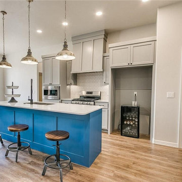
As general contractors in San Jose, whether it’s a “Galley-Style” or an “Island Kitchen”, it must be spacious enough to accommodate all the appliances. Home remodeling & general contractors in San Jose like Turner Home Remodeling specializes in custom kitchen remodel in San Jose that help a cooking space become more functional, efficient, user-friendly and bigger in size.
Kitchen Remodelers in San Jose CA, by General Contractors in San Jose CA - https://www.turnerhomeremodeling.com/
ZIP Code 95002, ZIP Code 95101, ZIP Code 95103, ZIP Code 95106, ZIP Code 95108, ZIP Code 95109 ,ZIP Code 95110, ZIP Code 95111, ZIP Code 95112, ZIP Code 95113, ZIP Code 95115, ZIP Code 95116, ZIP Code 95117, ZIP Code 95118, ZIP Code 95119, ZIP Code 95120, ZIP Code 95121, ZIP Code 95122, ZIP Code 95123, ZIP Code 95124, ZIP Code 95125, ZIP Code 95126, ZIP Code 95127 ,ZIP Code 95128, ZIP Code 95129, ZIP Code 95130, ZIP Code 95131, ZIP Code 95132, ZIP Code 95133
 Reico Kitchen & Bath
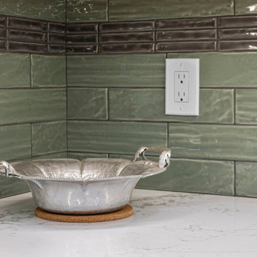
Kathy Moore from Reico Kitchen & Bath in King of Prussia, PA, worked with Belfry Construction to design a transitional kitchen featuring Merillat Autograph cabinets. The perimeter cabinets are in the Bayard door style with a Warm White finish, while the island has an Evergreen finish, paired with Q4076 Verde Peake countertops.
The remodel also includes Daltile 3x12 Aloe Rectangle and 1x6 Drift Straight Joint backsplash tiles, along with Frigidaire appliances.
The client said, “We love the extra counter space, storage, and modern look. Kathy was key to the project’s success because she considered every detail in the design. Her top suggestion was the utensil storage cabinet. Our favorite feature is the drawer microwave, which makes the area more user-friendly. We also moved the basement door to the dining room to add a corner cabinet and create a larger work area.”
Kathy shared, “The kitchen needed more storage and better functionality. The biggest challenge was designing within the existing space since it was original and the clients had specific tastes. Moving the door allowed for more cabinets. I enjoyed working with the clients to pick all the options. The communication was excellent — they were excited, and we worked well as a team.”
Photos courtesy of Dan Williams Photography.
50