
Search results for "Platforms continually" in Home Design Ideas
 Daniel Scerri Periti
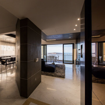
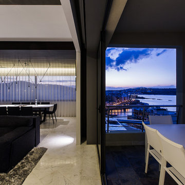
We were approached with a request to design the furnishings for an existing ‘finished’ apartment. The intention was to move in relatively fast, and the property already had an existing marble floor, kitchen and bathrooms which had to be kept. The property also boasted a fantastic 270 degree view, seen from most of the apartment. The clients had a very important role in the completion of the project. They were very involved during the design process and through various decoration choices. The final design was kept as a rigid guideline when faced with picking out all the different elements.
Once clear of all previous furniture, the space felt cold and bare; so we immediately felt the need for warmth, and raw, natural elements and textures to complement the cold marble floor while visually tying in the design of the whole apartment together.
Since the existing kitchen had a touch of dark walnut stain, we felt this material was one we should add to the palette of materials to contest the stark materials. A raw cement finish was another material we felt would add an interesting contrast and could be used in a variety of ways, from cabinets to walls and ceilings, to tie up the design of various areas of the apartment.
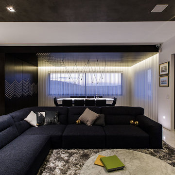
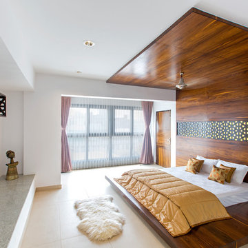
To warm up the living/dining area, keeping the existing marble floor but visually creating zones within the large living/dining area without hindering the flow, a dark timber custom-made soffit, continuous with a floor-to-ceiling drinks cabinet zones the dining area, giving it a degree of much-needed warmth.
The various windows with a stupendous 270 degree view needed to be visually tied together. This was done by introducing a continuous sheer [drape] which also doubled up as a sound-absorbing material along 2 of the 4 walls of the space.
A very large sofa was required to fill up the space correctly, also required for the size of the young family.
Services were integrated within the units and soffits, while a customized design in the corner between the kitchen and the living room took into consideration the viewpoints from the main areas to create a pantry without hindering the flow or views. A strategically placed floor-to-ceiling mirror doubles up the space and extends the view to the inner parts of the apartment.
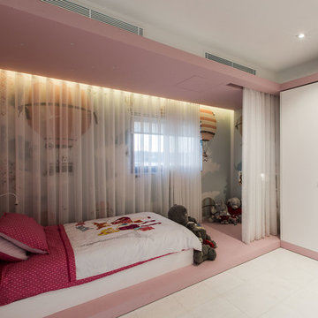
The daughter’s bedroom was a small challenge in itself, and a fun task, where we wanted to achieve the perception of a cozy niche with its own enclosed reading nook [for reading fairy tales], behind see-through curtains and a custom-ordered wall print sporting the girl’s favorite colors.
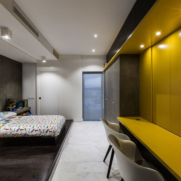
The sons’ bedroom had double the requirements in terms of space needed: more wardrobe, more homework desk space, a tv/play station area… “We combined a raised platform area between the boys’ beds to become an area with cushions where the kids can lay down and play, and face a hidden screen behind the homework desk’s sliding back panel for their play station”. The color of the homework desk was chosen in relation to the boys’ ages. A more masculine material palette was chosen for this room, in contrast to the light pastel palette of the girl’s bedroom. Again, this colour can easily be changed over time for a more mature look.
PROJECT DATA:
St. Paul’s Bay, Malta
DESIGN TEAM:
Perit Rebecca Zammit, Perit Daniel Scerri, Elyse Tonna
OTHER CREDITS:
Photography: Tonio Lombardi
Styling : TKS
 Daniel Scerri Periti
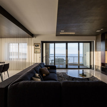
We were approached with a request to design the furnishings for an existing ‘finished’ apartment. The intention was to move in relatively fast, and the property already had an existing marble floor, kitchen and bathrooms which had to be kept. The property also boasted a fantastic 270 degree view, seen from most of the apartment. The clients had a very important role in the completion of the project. They were very involved during the design process and through various decoration choices. The final design was kept as a rigid guideline when faced with picking out all the different elements.
Once clear of all previous furniture, the space felt cold and bare; so we immediately felt the need for warmth, and raw, natural elements and textures to complement the cold marble floor while visually tying in the design of the whole apartment together.
Since the existing kitchen had a touch of dark walnut stain, we felt this material was one we should add to the palette of materials to contest the stark materials. A raw cement finish was another material we felt would add an interesting contrast and could be used in a variety of ways, from cabinets to walls and ceilings, to tie up the design of various areas of the apartment.
To warm up the living/dining area, keeping the existing marble floor but visually creating zones within the large living/dining area without hindering the flow, a dark timber custom-made soffit, continuous with a floor-to-ceiling drinks cabinet zones the dining area, giving it a degree of much-needed warmth.
The various windows with a stupendous 270 degree view needed to be visually tied together. This was done by introducing a continuous sheer [drape] which also doubled up as a sound-absorbing material along 2 of the 4 walls of the space.
A very large sofa was required to fill up the space correctly, also required for the size of the young family.
Services were integrated within the units and soffits, while a customized design in the corner between the kitchen and the living room took into consideration the viewpoints from the main areas to create a pantry without hindering the flow or views. A strategically placed floor-to-ceiling mirror doubles up the space and extends the view to the inner parts of the apartment.
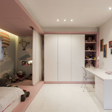
The daughter’s bedroom was a small challenge in itself, and a fun task, where we wanted to achieve the perception of a cozy niche with its own enclosed reading nook [for reading fairy tales], behind see-through curtains and a custom-ordered wall print sporting the girl’s favorite colors.
The sons’ bedroom had double the requirements in terms of space needed: more wardrobe, more homework desk space, a tv/play station area… “We combined a raised platform area between the boys’ beds to become an area with cushions where the kids can lay down and play, and face a hidden screen behind the homework desk’s sliding back panel for their play station”. The color of the homework desk was chosen in relation to the boys’ ages. A more masculine material palette was chosen for this room, in contrast to the light pastel palette of the girl’s bedroom. Again, this colour can easily be changed over time for a more mature look.
PROJECT DATA:
St. Paul’s Bay, Malta
DESIGN TEAM:
Perit Rebecca Zammit, Perit Daniel Scerri, Elyse Tonna
OTHER CREDITS:
Photography: Tonio Lombardi
Styling : TKS
 Daniel Scerri Periti
We were approached with a request to design the furnishings for an existing ‘finished’ apartment. The intention was to move in relatively fast, and the property already had an existing marble floor, kitchen and bathrooms which had to be kept. The property also boasted a fantastic 270 degree view, seen from most of the apartment. The clients had a very important role in the completion of the project. They were very involved during the design process and through various decoration choices. The final design was kept as a rigid guideline when faced with picking out all the different elements.
Once clear of all previous furniture, the space felt cold and bare; so we immediately felt the need for warmth, and raw, natural elements and textures to complement the cold marble floor while visually tying in the design of the whole apartment together.
Since the existing kitchen had a touch of dark walnut stain, we felt this material was one we should add to the palette of materials to contest the stark materials. A raw cement finish was another material we felt would add an interesting contrast and could be used in a variety of ways, from cabinets to walls and ceilings, to tie up the design of various areas of the apartment.
To warm up the living/dining area, keeping the existing marble floor but visually creating zones within the large living/dining area without hindering the flow, a dark timber custom-made soffit, continuous with a floor-to-ceiling drinks cabinet zones the dining area, giving it a degree of much-needed warmth.
The various windows with a stupendous 270 degree view needed to be visually tied together. This was done by introducing a continuous sheer [drape] which also doubled up as a sound-absorbing material along 2 of the 4 walls of the space.
A very large sofa was required to fill up the space correctly, also required for the size of the young family.
Services were integrated within the units and soffits, while a customized design in the corner between the kitchen and the living room took into consideration the viewpoints from the main areas to create a pantry without hindering the flow or views. A strategically placed floor-to-ceiling mirror doubles up the space and extends the view to the inner parts of the apartment.
The daughter’s bedroom was a small challenge in itself, and a fun task, where we wanted to achieve the perception of a cozy niche with its own enclosed reading nook [for reading fairy tales], behind see-through curtains and a custom-ordered wall print sporting the girl’s favorite colors.
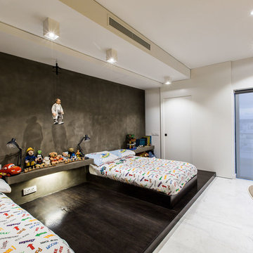
The sons’ bedroom had double the requirements in terms of space needed: more wardrobe, more homework desk space, a tv/play station area… “We combined a raised platform area between the boys’ beds to become an area with cushions where the kids can lay down and play, and face a hidden screen behind the homework desk’s sliding back panel for their play station”. The color of the homework desk was chosen in relation to the boys’ ages. A more masculine material palette was chosen for this room, in contrast to the light pastel palette of the girl’s bedroom. Again, this colour can easily be changed over time for a more mature look.
PROJECT DATA:
St. Paul’s Bay, Malta
DESIGN TEAM:
Perit Rebecca Zammit, Perit Daniel Scerri, Elyse Tonna
OTHER CREDITS:
Photography: Tonio Lombardi
Styling : TKS
Find the right local pro for your project
 Daniel Scerri Periti
We were approached with a request to design the furnishings for an existing ‘finished’ apartment. The intention was to move in relatively fast, and the property already had an existing marble floor, kitchen and bathrooms which had to be kept. The property also boasted a fantastic 270 degree view, seen from most of the apartment. The clients had a very important role in the completion of the project. They were very involved during the design process and through various decoration choices. The final design was kept as a rigid guideline when faced with picking out all the different elements.
Once clear of all previous furniture, the space felt cold and bare; so we immediately felt the need for warmth, and raw, natural elements and textures to complement the cold marble floor while visually tying in the design of the whole apartment together.
Since the existing kitchen had a touch of dark walnut stain, we felt this material was one we should add to the palette of materials to contest the stark materials. A raw cement finish was another material we felt would add an interesting contrast and could be used in a variety of ways, from cabinets to walls and ceilings, to tie up the design of various areas of the apartment.
To warm up the living/dining area, keeping the existing marble floor but visually creating zones within the large living/dining area without hindering the flow, a dark timber custom-made soffit, continuous with a floor-to-ceiling drinks cabinet zones the dining area, giving it a degree of much-needed warmth.
The various windows with a stupendous 270 degree view needed to be visually tied together. This was done by introducing a continuous sheer [drape] which also doubled up as a sound-absorbing material along 2 of the 4 walls of the space.
A very large sofa was required to fill up the space correctly, also required for the size of the young family.
Services were integrated within the units and soffits, while a customized design in the corner between the kitchen and the living room took into consideration the viewpoints from the main areas to create a pantry without hindering the flow or views. A strategically placed floor-to-ceiling mirror doubles up the space and extends the view to the inner parts of the apartment.
The daughter’s bedroom was a small challenge in itself, and a fun task, where we wanted to achieve the perception of a cozy niche with its own enclosed reading nook [for reading fairy tales], behind see-through curtains and a custom-ordered wall print sporting the girl’s favorite colors.
The sons’ bedroom had double the requirements in terms of space needed: more wardrobe, more homework desk space, a tv/play station area… “We combined a raised platform area between the boys’ beds to become an area with cushions where the kids can lay down and play, and face a hidden screen behind the homework desk’s sliding back panel for their play station”. The color of the homework desk was chosen in relation to the boys’ ages. A more masculine material palette was chosen for this room, in contrast to the light pastel palette of the girl’s bedroom. Again, this colour can easily be changed over time for a more mature look.
PROJECT DATA:
St. Paul’s Bay, Malta
DESIGN TEAM:
Perit Rebecca Zammit, Perit Daniel Scerri, Elyse Tonna
OTHER CREDITS:
Photography: Tonio Lombardi
Styling : TKS
 Daniel Scerri Periti
We were approached with a request to design the furnishings for an existing ‘finished’ apartment. The intention was to move in relatively fast, and the property already had an existing marble floor, kitchen and bathrooms which had to be kept. The property also boasted a fantastic 270 degree view, seen from most of the apartment. The clients had a very important role in the completion of the project. They were very involved during the design process and through various decoration choices. The final design was kept as a rigid guideline when faced with picking out all the different elements.
Once clear of all previous furniture, the space felt cold and bare; so we immediately felt the need for warmth, and raw, natural elements and textures to complement the cold marble floor while visually tying in the design of the whole apartment together.
Since the existing kitchen had a touch of dark walnut stain, we felt this material was one we should add to the palette of materials to contest the stark materials. A raw cement finish was another material we felt would add an interesting contrast and could be used in a variety of ways, from cabinets to walls and ceilings, to tie up the design of various areas of the apartment.
To warm up the living/dining area, keeping the existing marble floor but visually creating zones within the large living/dining area without hindering the flow, a dark timber custom-made soffit, continuous with a floor-to-ceiling drinks cabinet zones the dining area, giving it a degree of much-needed warmth.
The various windows with a stupendous 270 degree view needed to be visually tied together. This was done by introducing a continuous sheer [drape] which also doubled up as a sound-absorbing material along 2 of the 4 walls of the space.
A very large sofa was required to fill up the space correctly, also required for the size of the young family.
Services were integrated within the units and soffits, while a customized design in the corner between the kitchen and the living room took into consideration the viewpoints from the main areas to create a pantry without hindering the flow or views. A strategically placed floor-to-ceiling mirror doubles up the space and extends the view to the inner parts of the apartment.
The daughter’s bedroom was a small challenge in itself, and a fun task, where we wanted to achieve the perception of a cozy niche with its own enclosed reading nook [for reading fairy tales], behind see-through curtains and a custom-ordered wall print sporting the girl’s favorite colors.
The sons’ bedroom had double the requirements in terms of space needed: more wardrobe, more homework desk space, a tv/play station area… “We combined a raised platform area between the boys’ beds to become an area with cushions where the kids can lay down and play, and face a hidden screen behind the homework desk’s sliding back panel for their play station”. The color of the homework desk was chosen in relation to the boys’ ages. A more masculine material palette was chosen for this room, in contrast to the light pastel palette of the girl’s bedroom. Again, this colour can easily be changed over time for a more mature look.
PROJECT DATA:
St. Paul’s Bay, Malta
DESIGN TEAM:
Perit Rebecca Zammit, Perit Daniel Scerri, Elyse Tonna
OTHER CREDITS:
Photography: Tonio Lombardi
Styling : TKS
 Daniel Scerri Periti
We were approached with a request to design the furnishings for an existing ‘finished’ apartment. The intention was to move in relatively fast, and the property already had an existing marble floor, kitchen and bathrooms which had to be kept. The property also boasted a fantastic 270 degree view, seen from most of the apartment. The clients had a very important role in the completion of the project. They were very involved during the design process and through various decoration choices. The final design was kept as a rigid guideline when faced with picking out all the different elements.
Once clear of all previous furniture, the space felt cold and bare; so we immediately felt the need for warmth, and raw, natural elements and textures to complement the cold marble floor while visually tying in the design of the whole apartment together.
Since the existing kitchen had a touch of dark walnut stain, we felt this material was one we should add to the palette of materials to contest the stark materials. A raw cement finish was another material we felt would add an interesting contrast and could be used in a variety of ways, from cabinets to walls and ceilings, to tie up the design of various areas of the apartment.
To warm up the living/dining area, keeping the existing marble floor but visually creating zones within the large living/dining area without hindering the flow, a dark timber custom-made soffit, continuous with a floor-to-ceiling drinks cabinet zones the dining area, giving it a degree of much-needed warmth.
The various windows with a stupendous 270 degree view needed to be visually tied together. This was done by introducing a continuous sheer [drape] which also doubled up as a sound-absorbing material along 2 of the 4 walls of the space.
A very large sofa was required to fill up the space correctly, also required for the size of the young family.
Services were integrated within the units and soffits, while a customized design in the corner between the kitchen and the living room took into consideration the viewpoints from the main areas to create a pantry without hindering the flow or views. A strategically placed floor-to-ceiling mirror doubles up the space and extends the view to the inner parts of the apartment.
The daughter’s bedroom was a small challenge in itself, and a fun task, where we wanted to achieve the perception of a cozy niche with its own enclosed reading nook [for reading fairy tales], behind see-through curtains and a custom-ordered wall print sporting the girl’s favorite colors.
The sons’ bedroom had double the requirements in terms of space needed: more wardrobe, more homework desk space, a tv/play station area… “We combined a raised platform area between the boys’ beds to become an area with cushions where the kids can lay down and play, and face a hidden screen behind the homework desk’s sliding back panel for their play station”. The color of the homework desk was chosen in relation to the boys’ ages. A more masculine material palette was chosen for this room, in contrast to the light pastel palette of the girl’s bedroom. Again, this colour can easily be changed over time for a more mature look.
PROJECT DATA:
St. Paul’s Bay, Malta
DESIGN TEAM:
Perit Rebecca Zammit, Perit Daniel Scerri, Elyse Tonna
OTHER CREDITS:
Photography: Tonio Lombardi
Styling : TKS
 Daniel Scerri Periti
We were approached with a request to design the furnishings for an existing ‘finished’ apartment. The intention was to move in relatively fast, and the property already had an existing marble floor, kitchen and bathrooms which had to be kept. The property also boasted a fantastic 270 degree view, seen from most of the apartment. The clients had a very important role in the completion of the project. They were very involved during the design process and through various decoration choices. The final design was kept as a rigid guideline when faced with picking out all the different elements.
Once clear of all previous furniture, the space felt cold and bare; so we immediately felt the need for warmth, and raw, natural elements and textures to complement the cold marble floor while visually tying in the design of the whole apartment together.
Since the existing kitchen had a touch of dark walnut stain, we felt this material was one we should add to the palette of materials to contest the stark materials. A raw cement finish was another material we felt would add an interesting contrast and could be used in a variety of ways, from cabinets to walls and ceilings, to tie up the design of various areas of the apartment.
To warm up the living/dining area, keeping the existing marble floor but visually creating zones within the large living/dining area without hindering the flow, a dark timber custom-made soffit, continuous with a floor-to-ceiling drinks cabinet zones the dining area, giving it a degree of much-needed warmth.
The various windows with a stupendous 270 degree view needed to be visually tied together. This was done by introducing a continuous sheer [drape] which also doubled up as a sound-absorbing material along 2 of the 4 walls of the space.
A very large sofa was required to fill up the space correctly, also required for the size of the young family.
Services were integrated within the units and soffits, while a customized design in the corner between the kitchen and the living room took into consideration the viewpoints from the main areas to create a pantry without hindering the flow or views. A strategically placed floor-to-ceiling mirror doubles up the space and extends the view to the inner parts of the apartment.
The daughter’s bedroom was a small challenge in itself, and a fun task, where we wanted to achieve the perception of a cozy niche with its own enclosed reading nook [for reading fairy tales], behind see-through curtains and a custom-ordered wall print sporting the girl’s favorite colors.
The sons’ bedroom had double the requirements in terms of space needed: more wardrobe, more homework desk space, a tv/play station area… “We combined a raised platform area between the boys’ beds to become an area with cushions where the kids can lay down and play, and face a hidden screen behind the homework desk’s sliding back panel for their play station”. The color of the homework desk was chosen in relation to the boys’ ages. A more masculine material palette was chosen for this room, in contrast to the light pastel palette of the girl’s bedroom. Again, this colour can easily be changed over time for a more mature look.
PROJECT DATA:
St. Paul’s Bay, Malta
DESIGN TEAM:
Perit Rebecca Zammit, Perit Daniel Scerri, Elyse Tonna
OTHER CREDITS:
Photography: Tonio Lombardi
Styling : TKS
 Daniel Scerri Periti
We were approached with a request to design the furnishings for an existing ‘finished’ apartment. The intention was to move in relatively fast, and the property already had an existing marble floor, kitchen and bathrooms which had to be kept. The property also boasted a fantastic 270 degree view, seen from most of the apartment. The clients had a very important role in the completion of the project. They were very involved during the design process and through various decoration choices. The final design was kept as a rigid guideline when faced with picking out all the different elements.
Once clear of all previous furniture, the space felt cold and bare; so we immediately felt the need for warmth, and raw, natural elements and textures to complement the cold marble floor while visually tying in the design of the whole apartment together.
Since the existing kitchen had a touch of dark walnut stain, we felt this material was one we should add to the palette of materials to contest the stark materials. A raw cement finish was another material we felt would add an interesting contrast and could be used in a variety of ways, from cabinets to walls and ceilings, to tie up the design of various areas of the apartment.
To warm up the living/dining area, keeping the existing marble floor but visually creating zones within the large living/dining area without hindering the flow, a dark timber custom-made soffit, continuous with a floor-to-ceiling drinks cabinet zones the dining area, giving it a degree of much-needed warmth.
The various windows with a stupendous 270 degree view needed to be visually tied together. This was done by introducing a continuous sheer [drape] which also doubled up as a sound-absorbing material along 2 of the 4 walls of the space.
A very large sofa was required to fill up the space correctly, also required for the size of the young family.
Services were integrated within the units and soffits, while a customized design in the corner between the kitchen and the living room took into consideration the viewpoints from the main areas to create a pantry without hindering the flow or views. A strategically placed floor-to-ceiling mirror doubles up the space and extends the view to the inner parts of the apartment.
The daughter’s bedroom was a small challenge in itself, and a fun task, where we wanted to achieve the perception of a cozy niche with its own enclosed reading nook [for reading fairy tales], behind see-through curtains and a custom-ordered wall print sporting the girl’s favorite colors.
The sons’ bedroom had double the requirements in terms of space needed: more wardrobe, more homework desk space, a tv/play station area… “We combined a raised platform area between the boys’ beds to become an area with cushions where the kids can lay down and play, and face a hidden screen behind the homework desk’s sliding back panel for their play station”. The color of the homework desk was chosen in relation to the boys’ ages. A more masculine material palette was chosen for this room, in contrast to the light pastel palette of the girl’s bedroom. Again, this colour can easily be changed over time for a more mature look.
PROJECT DATA:
St. Paul’s Bay, Malta
DESIGN TEAM:
Perit Rebecca Zammit, Perit Daniel Scerri, Elyse Tonna
OTHER CREDITS:
Photography: Tonio Lombardi
Styling : TKS

 pipexai
Pipex.ai is an example of an efficient sourcing option through a reliable B2B platform, where buyers can search for relevant components of intricate piping systems. The bleed ring flange can be used between two flanges to provide a safe way to measure the pressure, sample the fluid, and vent the pipeline without breaking the pipeline. This element is also extensively used in oil and gas, refineries, petrochemical plants, and power plants, where the aspects of operational safety and control are paramount. A buyer can also compare specifications, compliance information, and order certified bleed ring flanges that would fit in the high-pressure, high-temperature environment and ensure the system reliability, maintenance control, and continuous industrial processes.
In case of critical pipeline installations, the Bleed Ring Flanges Manufacturers prepare components that are built to fit between normal flanges without pressure reduction. The bleed ring flange will enable the controlled monitoring and isolation, which will reduce downtime even when inspection or sampling is in progress. A B2B Portal assists buyers in accessing qualified suppliers that will supply the products and materials that have been machined correctly, and a reliable supply. Adequate selection of the Bleed Ring Flange of the system would enhance safety precautions, system diagnostics, and add to the future efficacy of the systems, hence a required change in the case of industries operating with pressurized and hazardous media.
 Swatch Design Group
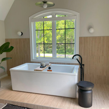
This bathroom is a serene, modern retreat that blends clean architectural lines with warm, organic textures. The freestanding white soaking tub becomes the focal point, set on an elevated platform wrapped in narrow, linear tile that continues halfway up the wall. The ribbed detailing of the tile creates subtle movement, complementing the soft beige tones while adding a sense of texture and depth. A matte black floor-mounted tub filler and a sculptural black side stool provide bold contrast, grounding the space with a contemporary edge. A leafy potted plant adds a natural, refreshing touch beside the tub, softening the overall look.
Natural light floods the room through a large arched window framed in crisp white trim, offering views of lush greenery outside and reinforcing the connection between indoors and outdoors. Above, a minimalist flush-mount light and matching wall sconces continue the clean, understated design language, allowing the architectural elements to shine.
The vanity features warm, natural wood cabinetry paired with a pale stone countertop, striking a perfect balance between modern and timeless. A large rectangular mirror framed in matte black is flanked by vertical black sconces with globe bulbs, creating symmetry and rhythm while tying in the darker accents throughout the room.
On the opposite side, a dramatic arched cabinet in a rich black finish introduces a sculptural element, while the adjacent shower makes a statement with earthy stone tiles accented by a decorative banding detail. The shower entry is framed with white marble veining, which elegantly transitions from the neutral gray floor tile into the rich tones of the shower interior.
Every detail of this bathroom has been considered to achieve a refined yet welcoming atmosphere. The palette of warm woods, creamy neutrals, and bold black accents creates a space that feels elevated yet effortless—modern but inviting. This is not just a bathroom, but a carefully crafted sanctuary designed for relaxation, function, and timeless style.
 Maison Areeba
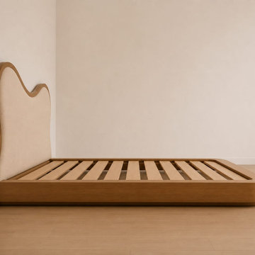
This platform bed features graceful continuous curve of the upholstered headboard and the clean, low-profile wooden platform. The flowing silhouette gives the bed a sculptural presence while maintaining a minimalist aesthetic. Designed for contemporary, Scandinavian, Japandi and organic-modern bedrooms, this handcrafted bed can be customized to suit individual requirements.
 Swatch Design Group
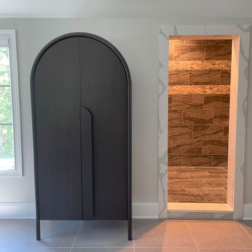
This bathroom is a serene, modern retreat that blends clean architectural lines with warm, organic textures. The freestanding white soaking tub becomes the focal point, set on an elevated platform wrapped in narrow, linear tile that continues halfway up the wall. The ribbed detailing of the tile creates subtle movement, complementing the soft beige tones while adding a sense of texture and depth. A matte black floor-mounted tub filler and a sculptural black side stool provide bold contrast, grounding the space with a contemporary edge. A leafy potted plant adds a natural, refreshing touch beside the tub, softening the overall look.
Natural light floods the room through a large arched window framed in crisp white trim, offering views of lush greenery outside and reinforcing the connection between indoors and outdoors. Above, a minimalist flush-mount light and matching wall sconces continue the clean, understated design language, allowing the architectural elements to shine.
The vanity features warm, natural wood cabinetry paired with a pale stone countertop, striking a perfect balance between modern and timeless. A large rectangular mirror framed in matte black is flanked by vertical black sconces with globe bulbs, creating symmetry and rhythm while tying in the darker accents throughout the room.
On the opposite side, a dramatic arched cabinet in a rich black finish introduces a sculptural element, while the adjacent shower makes a statement with earthy stone tiles accented by a decorative banding detail. The shower entry is framed with white marble veining, which elegantly transitions from the neutral gray floor tile into the rich tones of the shower interior.
Every detail of this bathroom has been considered to achieve a refined yet welcoming atmosphere. The palette of warm woods, creamy neutrals, and bold black accents creates a space that feels elevated yet effortless—modern but inviting. This is not just a bathroom, but a carefully crafted sanctuary designed for relaxation, function, and timeless style.
 Swatch Design Group
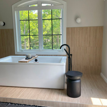
This bathroom is a serene, modern retreat that blends clean architectural lines with warm, organic textures. The freestanding white soaking tub becomes the focal point, set on an elevated platform wrapped in narrow, linear tile that continues halfway up the wall. The ribbed detailing of the tile creates subtle movement, complementing the soft beige tones while adding a sense of texture and depth. A matte black floor-mounted tub filler and a sculptural black side stool provide bold contrast, grounding the space with a contemporary edge. A leafy potted plant adds a natural, refreshing touch beside the tub, softening the overall look.
Natural light floods the room through a large arched window framed in crisp white trim, offering views of lush greenery outside and reinforcing the connection between indoors and outdoors. Above, a minimalist flush-mount light and matching wall sconces continue the clean, understated design language, allowing the architectural elements to shine.
The vanity features warm, natural wood cabinetry paired with a pale stone countertop, striking a perfect balance between modern and timeless. A large rectangular mirror framed in matte black is flanked by vertical black sconces with globe bulbs, creating symmetry and rhythm while tying in the darker accents throughout the room.
On the opposite side, a dramatic arched cabinet in a rich black finish introduces a sculptural element, while the adjacent shower makes a statement with earthy stone tiles accented by a decorative banding detail. The shower entry is framed with white marble veining, which elegantly transitions from the neutral gray floor tile into the rich tones of the shower interior.
Every detail of this bathroom has been considered to achieve a refined yet welcoming atmosphere. The palette of warm woods, creamy neutrals, and bold black accents creates a space that feels elevated yet effortless—modern but inviting. This is not just a bathroom, but a carefully crafted sanctuary designed for relaxation, function, and timeless style.
 Taragano Design and Build
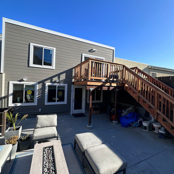
Taragano Design & Build completed this two story rear addition in
San Francisco, California.
On a narrow urban lot there is no direction to build but up and
back, and the constraint that governs everything is the rear yard
setback. The addition was held to the line, which fixed the
footprint before any interior planning began. Every square foot
inside came from stacking rather than spreading.
That created the real problem, which is access. Adding upstairs
living space on a lot this size means the upper floor has no way
out to the yard, and in a city where outdoor space is scarce, an
upper floor that cannot reach the ground wastes the yard it sits
above. The exterior stair answers that. It runs down the property
line where it takes nothing from the usable patio, and it gives the
upper floor its own direct route out.
The deck was kept deliberately small. A larger platform would have
shaded the patio below and turned the ground level into a covered
service area rather than a place anyone would sit. Holding it to a
landing keeps daylight on the concrete for most of the day, which
is what makes the lower level the primary outdoor room.
The two levels then read as one exterior. Continuous siding and
matching trim across old and new means the addition does not
announce itself as an addition, which on a rear elevation this
visible from neighboring properties matters more than it would on a
detached lot.
Licensed general contractor, CSLB #1143420. Diamond Certified.
 Windows of Montclair, Inc.
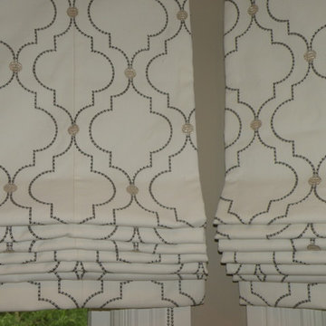
Children's play room: Interesting embroidered weave from Kravet.
Working roman shades on windows.
In progress: comfy cushion seating and wall attached back rests on floor platform. To be continued!
 Izen Architecture Inc.
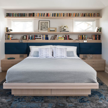
Inspiration for a contemporary light wood floor bedroom remodel in Toronto with white walls
 DNB Renovations
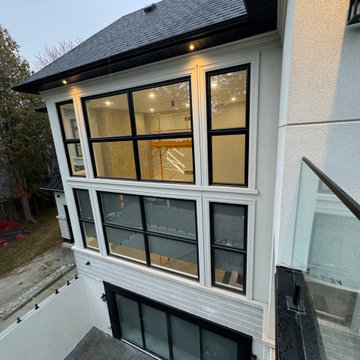
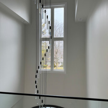
This full-scale gut renovation reimagined the entire home with a balance of luxury and practicality. We installed new black-framed windows throughout, integrated advanced blind and security systems, and incorporated custom glasswork to enhance light and visual continuity. Comprehensive electrical upgrades supported a layered lighting plan — from statement chandeliers to recessed and task lighting — while thoughtful paint finishes and detailed millwork tied the home together with a cohesive, high-end feel. The kitchen was fully remodeled around the family’s needs, and the bathrooms were completely redesigned, including plumbing modifications to accommodate both showers and freestanding tub options. Custom stone slabs were used throughout for a modern, luxurious aesthetic, and we added purpose-built spaces like a fully designed pantry and bespoke cabinetry to ensure every area performs as beautifully as it looks. While the clients were away during construction, we maintained full transparency through regular schedule and photo updates via our project management platforms.
 DNB Renovations
This full-scale gut renovation reimagined the entire home with a balance of luxury and practicality. We installed new black-framed windows throughout, integrated advanced blind and security systems, and incorporated custom glasswork to enhance light and visual continuity. Comprehensive electrical upgrades supported a layered lighting plan — from statement chandeliers to recessed and task lighting — while thoughtful paint finishes and detailed millwork tied the home together with a cohesive, high-end feel. The kitchen was fully remodeled around the family’s needs, and the bathrooms were completely redesigned, including plumbing modifications to accommodate both showers and freestanding tub options. Custom stone slabs were used throughout for a modern, luxurious aesthetic, and we added purpose-built spaces like a fully designed pantry and bespoke cabinetry to ensure every area performs as beautifully as it looks. While the clients were away during construction, we maintained full transparency through regular schedule and photo updates via our project management platforms.
 safe ZOnea
In 2026, DIY home design and renovation will become easier than ever. Free mobile apps like Houzz, Homestyler, and Planner 5D will put professional tools in everyone’s pocket, letting users visualize layouts, test colors, and estimate costs before buying materials. Experts predict that over 50% of homeowners will use apps to plan upgrades. It will save money and reduce costly mistakes. Even now, about 54% prefer mobile tools.
Why Mobile Apps are Changing Home Renovation
DIY renovation has changed a lot in recent years. Homeowners don’t have to rely on sketches or guesswork anymore. Thanks to AR, AI, and 3D renderings, apps can show exactly how furniture and cabinets will fit. By 2026, many of these tools will be free - and packed with features that rival expensive software. With just a smartphone, anyone can try out layouts, test colors, and even create detailed floor plans.
The Tech Behind Modern Design Apps
Most renovation apps now leverage AI to generate design suggestions. They are based on your space and preferences. Upload a photo of your room. The algorithms will check the sizes, lighting, and features. Then, they’ll suggest furniture layouts or color schemes. Some apps use your phone’s camera and sensor. They make accurate measurements, so you won’t need tape measures or notepads.
Top Free Apps Transforming DIY Projects
Houzz continues to lead the pack with its massive photo library and ability to connect users with local contractors. The platform now gives AI design suggestions. It looks at your style preferences across millions of professional spaces.
For anyone serious about planning their next project, exploring comprehensive resources helps narrow down what works. It’s just like in iGaming, where review platforms like Slotzilla help gamblers to find casinos with user-friendly tools, bonus rounds, and progressive jackpots that will work for them.
Planner 5D shines with realistic 3D renderings and a huge furniture catalog, letting you switch between 2D plans and 3D walkthroughs - even in VR. Room Planner helps you design practical layouts. You can easily arrange furniture and check dimensions. It offers real-time 3D views and features items from real brands.
Apps for Specific Renovation Tasks
Not every project needs full 3D renderings - sometimes you just want to try paint colors or test tile patterns. ColorSnap by Sherwin-Williams uses AR to show colors on your actual walls and even matches shades from photos. Magicplan makes creating floor plans easy by measuring rooms with your phone as you walk around. Both apps help plan renovations and communicate ideas without the guesswork.
Budget Tracking and Project Management
Renovation apps do more than make spaces look good - managing budgets and timelines is just as important. HomeZada even uses AI to predict your budget and track material prices, so DIYers don’t get hit with surprise costs. Trello is a lifesaver - set deadlines, track progress, and share updates with anyone helping on the project.
How Apps Reflect 2026 Design Trends
This year’s popular apps reflect the largest home design trends. Colorful rooms are on the rise. Zillow shows a 149% increase in listings. Plus, apps like Houzz let users test bold shades before making a choice. Cozy reading nooks are also on the rise, showing up in nearly half of listings. Renovation apps now provide templates. They include tips for shelves and lighting. This helps create cozy, thoughtful spaces.
Here’s a quick comparison of what different free apps offer:
App name
Best feature
Learning curve
Platform
Houzz
25M+ inspiration photos
Easy
iOS, Android
Planner 5D
Photorealistic 3D renders
Moderate
iOS, Android, Web
Room Planner
Accurate measurements
Easy
iOS, Android
Magicplan
Auto floor plan creation
Easy
iOS, Android
Natural materials and earthy tones will lead design trends in 2026. Warm neutrals will take over from the grey-and-white minimalism of the last ten years.
The AI Revolution in Home Design
AI is no longer just a gimmick in renovation apps. Chat features can suggest furniture layouts, color palettes, and materials for your budget. It’s like having a designer on call. Renovate AI turns photos of your room into multiple style ideas in seconds, from mid-century to rustic farmhouse. It’s great for brainstorming and getting past the “I don’t know what I want” stage.
Practical Tips for Using Renovation Apps
Getting the most from design apps requires a strategic approach. Here are essential steps every DIYer should follow:
Start by gathering inspiration. Look through photo libraries on Houzz or Pinterest. Then, dive into detailed planning.
Don’t rely solely on screen colors; get actual paint chips and fabric swatches.
Save multiple design versions. Create variations of your plan to compare options side-by-side.
This workflow helps you avoid common mistakes. It leads to better design choices before you buy anything.
When Apps Aren’t Enough
Digital tools can’t do everything. Big structural changes, electrical work, or plumbing always need a pro. Apps are great for planning and talking with contractors, but they can’t replace expertise. And always check textures in real life - that sofa might look perfect on screen, but feel different.
The Future of DIY Renovation
In 2026, renovation apps will become smarter. They’ll have voice control and better AR. Improved AI will make DIY design feel more like professional services. Creating beautiful, functional spaces is easier than ever. For homeowners, it’s important to use apps that match local materials and building codes. The biggest benefit is confidence - seeing your design in 3D makes projects far less intimidating.

9