
Search results for "Play money" in Home Design Ideas

 Annette Jaffe Interiors
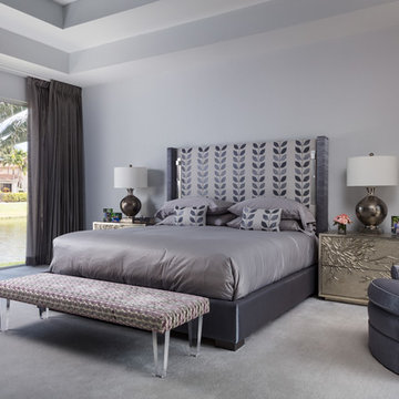
Snowbirds create a nest in Boca Raton. Stylish, modern vibe with many "magnets" to attract family and friends to visit, stay and play.
Bedroom - mid-sized modern master carpeted and gray floor bedroom idea in New York with gray walls and no fireplace
Bedroom - mid-sized modern master carpeted and gray floor bedroom idea in New York with gray walls and no fireplace
 Tiffany Brooks, HGTV Host & Interior Designer
Inquire About Our Design Services
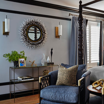
When we first started talking in the spring of 2015, I was impressed. She was witty, realistic, and understood that as much as she loves my shows on HGTV, design does not does not happen in 43 minutes! She told me about her space, and how she felt that her bedroom seemed “blah” to her. She had no retreat. Molly desperately longed for a place that she could spend time in, read in, play in and above all, relax in.
What we did:
Many people are terrified of hiring a designer. Rightfully so, they are investing a pretty penny in their homes. They want to make sure that everything, down to the last floral arrangement, is to their liking, because they will have to live it (and pay for it). Unfortunately, a client can unintentionally stifle a designer’s creativity through micro-management. This can produce lackluster results and ultimately cause more time (and money) to be spent on a project than is really necessary.
With Molly, that was never an issue. Before she even showed me the room in question, she said that I could have full creative license to do what I needed to do to her bedroom. SAY WHAAH!?
With Molly giving me complete creative freedom, I planned everything out and got down to business. The result: Bite-your-bottom-lip sexy. I don’t get jealous of too many of my clients’ spaces, but this one still takes my breath away every time I look at the pics!
The craziest part was that by adding more furniture, it actually made the space feel larger.
Molly and her husband Patrick loved the finished space, and promised me I will be back to finish the rest of the house!
Here’s the highlights of the rest of the project:
I came up with a space plan with three options.
Next, we reviewed mood boards and fabric schemes that would work for both Molly and her hubby Patrick.
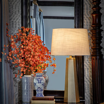
We started with the bed. My goal was to add edge to its otherwise traditional style.
We decided to spice things up by painting the trim work in the room black.
We built in layers of lighting with dimmers. In a bedroom everything should be on dimmers, right? Right.
We designed and customized bedding, chairs and window treatments.
Together with Molly, we selected the most perfect wallpaper. This geometric “grasscloth” adds so much depth and dimension that was just missing before.
What I love:
That light fixture. I mean it is really, really amazing in person.
The porcupine mirror. This thing came packaged like it was the hope diamond, and everyone was terrified to handle it. But it really became a highlight of the room.
Find the right local pro for your project

 Tiffany Brooks, HGTV Host & Interior Designer
Inquire About Our Design Services
When we first started talking in the spring of 2015, I was impressed. She was witty, realistic, and understood that as much as she loves my shows on HGTV, design does not does not happen in 43 minutes! She told me about her space, and how she felt that her bedroom seemed “blah” to her. She had no retreat. Molly desperately longed for a place that she could spend time in, read in, play in and above all, relax in.
What we did:
Many people are terrified of hiring a designer. Rightfully so, they are investing a pretty penny in their homes. They want to make sure that everything, down to the last floral arrangement, is to their liking, because they will have to live it (and pay for it). Unfortunately, a client can unintentionally stifle a designer’s creativity through micro-management. This can produce lackluster results and ultimately cause more time (and money) to be spent on a project than is really necessary.
With Molly, that was never an issue. Before she even showed me the room in question, she said that I could have full creative license to do what I needed to do to her bedroom. SAY WHAAH!?
With Molly giving me complete creative freedom, I planned everything out and got down to business. The result: Bite-your-bottom-lip sexy. I don’t get jealous of too many of my clients’ spaces, but this one still takes my breath away every time I look at the pics!
The craziest part was that by adding more furniture, it actually made the space feel larger.
Molly and her husband Patrick loved the finished space, and promised me I will be back to finish the rest of the house!
Here’s the highlights of the rest of the project:
I came up with a space plan with three options.
Next, we reviewed mood boards and fabric schemes that would work for both Molly and her hubby Patrick.
We started with the bed. My goal was to add edge to its otherwise traditional style.
We decided to spice things up by painting the trim work in the room black.
We built in layers of lighting with dimmers. In a bedroom everything should be on dimmers, right? Right.
We designed and customized bedding, chairs and window treatments.
Together with Molly, we selected the most perfect wallpaper. This geometric “grasscloth” adds so much depth and dimension that was just missing before.
What I love:
That light fixture. I mean it is really, really amazing in person.
The porcupine mirror. This thing came packaged like it was the hope diamond, and everyone was terrified to handle it. But it really became a highlight of the room.



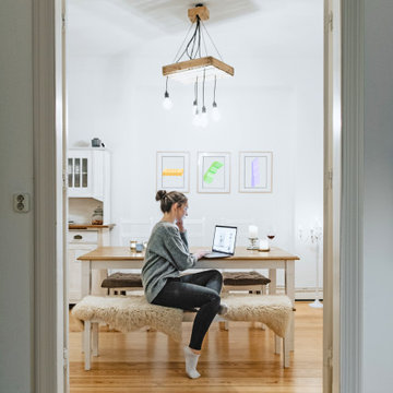
 EL & EL Wood Products Corp.
Scandinavian design is an off-shoot of the mid-century modern movement. It plays with organic, simple, contemporary, and functional materials. Also, it's a clean, versatile aesthetic for your home. Normally you will have white or gray tones as the foundation colors. Create a great entryway like this one with 145MUL and 162MUL. Don't be afraid to mix mouldings!
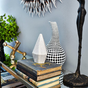 Tiffany Brooks, HGTV Host & Interior Designer
Inquire About Our Design Services
When we first started talking in the spring of 2015, I was impressed. She was witty, realistic, and understood that as much as she loves my shows on HGTV, design does not does not happen in 43 minutes! She told me about her space, and how she felt that her bedroom seemed “blah” to her. She had no retreat. Molly desperately longed for a place that she could spend time in, read in, play in and above all, relax in.
What we did:
Many people are terrified of hiring a designer. Rightfully so, they are investing a pretty penny in their homes. They want to make sure that everything, down to the last floral arrangement, is to their liking, because they will have to live it (and pay for it). Unfortunately, a client can unintentionally stifle a designer’s creativity through micro-management. This can produce lackluster results and ultimately cause more time (and money) to be spent on a project than is really necessary.
With Molly, that was never an issue. Before she even showed me the room in question, she said that I could have full creative license to do what I needed to do to her bedroom. SAY WHAAH!?
With Molly giving me complete creative freedom, I planned everything out and got down to business. The result: Bite-your-bottom-lip sexy. I don’t get jealous of too many of my clients’ spaces, but this one still takes my breath away every time I look at the pics!
The craziest part was that by adding more furniture, it actually made the space feel larger.
Molly and her husband Patrick loved the finished space, and promised me I will be back to finish the rest of the house!
Here’s the highlights of the rest of the project:
I came up with a space plan with three options.
Next, we reviewed mood boards and fabric schemes that would work for both Molly and her hubby Patrick.
We started with the bed. My goal was to add edge to its otherwise traditional style.
We decided to spice things up by painting the trim work in the room black.
We built in layers of lighting with dimmers. In a bedroom everything should be on dimmers, right? Right.
We designed and customized bedding, chairs and window treatments.
Together with Molly, we selected the most perfect wallpaper. This geometric “grasscloth” adds so much depth and dimension that was just missing before.
What I love:
That light fixture. I mean it is really, really amazing in person.
The porcupine mirror. This thing came packaged like it was the hope diamond, and everyone was terrified to handle it. But it really became a highlight of the room.
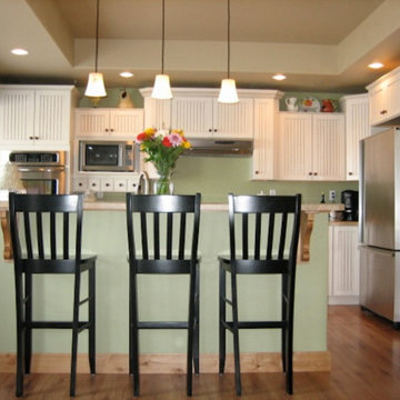
 Prairie Builders
Inspiration for a mid-sized craftsman single-wall light wood floor eat-in kitchen remodel with an undermount sink, recessed-panel cabinets, white cabinets, stainless steel appliances, an island, granite countertops, beige backsplash and stone slab backsplash
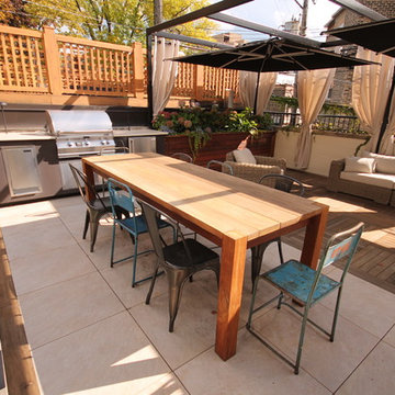
 Chicago Green Design Inc.
 This small but quaint Chicago rooftop allows the family to enjoy the outdoors in the city. With ample shade, a dinning area, play area for the kids, a kitchen and a small garden to grow some veggies/herbs in. This view shows you the open concept. Photos by: Don Maldonado

 Mint Design Studio
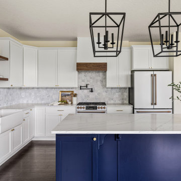
The existing home was a builder grade residence with a strong need for renovation in order to create the custom-home feel the client aspired to achieve. To save money, we kept existing plumbing locations and reused existing cabinets. We gave them a fresh look with a new coat of paint and new countertops. Walking through the home, you experience pops of color, playful shapes, and new complexions. The remodel touched every square inch of the home and included adding a bathroom to the lower level.

 Joy Street Design
Shared office space and playroom renovation we completed for our client and their kid! A perfect space for mom and dad to read or work that also can also be used by their child to play.
Designed by Joy Street Design serving Oakland, Berkeley, San Francisco, and the whole of the East Bay.
For more about Joy Street Design, click here: https://www.joystreetdesign.com/
 The Table Server
No more crying over spilled milk, hot coffee, or your favorite cocktail. The Table Server’s line of tables’ - high quality, stylish hardwood end tables and side tables in various finishes and sizes - with cup holders, can help you save time and money by preventing spills. The cup holders on all our tables are built-in into the tabletop and can hold everything from wine bottles to wine glasses to pint glasses to plastic red cups.
The Home Décor Tables - with four cup holders in the table top - are a space maker, spill preventer, end table, side table, tray server, bar table, conversation piece, and an elegant piece of accent furniture all-in-one. A lower serving tray provides additional storage and the bottom flat tray can sit where the table top is, giving you more options than any other table. Available in deep mahogany finish or with hand painted floral accents in a distressed finish. Add a touch of class to any room in your home.
The ChairSide is the essential media room table. With two cup holders to prevent spills, The ChairSide fits comfortably alongside your favorite chair or couch and will help you enjoy an Oscar winning movie or follow your favorite team as they play a big game. Your snacks are always secure from sliding off the table top with a gallery trimmed lip along the edge. Available in deep mahogany finish with an oval leg base and a vibrant oak or rich mahogany finish with a turned leg base. The height on the Turned Leg ChairSides are adjustable giving you even more flexability around your home.
 RW Hardware
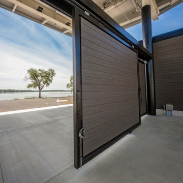
A successful concert is all about dynamics: both in music, and the orchestration behind the scenes. Musicians and crew have to play in perfect sync. From load-in to load-out, everything needs to move smoothly and efficiently.
That’s just the problem that the Devon Lakeshore Amphitheater was facing: with acts booked every weekend of the summer, it had become an inefficient use of time, money and effort to load them all in and out of the venue without an optimal access point to the stage. The team was looking for a way to have a directly accessible loading dock, so that trucks could pull up and load in from behind the stage, but still have the view closed off from audiences with a partition in front. Adding to their challenge was that the doors this would require weighed 2,000 lbs each. That’s where RW came in strong.
 M-Squared Contracting Inc.
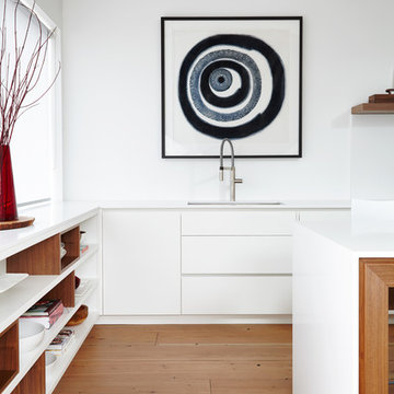
Example of a large minimalist single-wall light wood floor open concept kitchen design in Toronto with an undermount sink, flat-panel cabinets, white cabinets, quartz countertops, white backsplash, stone slab backsplash, paneled appliances and an island
 The Conscious Builder Inc.
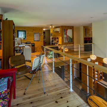
For this project, the goals were straight forward - a low energy, low maintenance home that would allow the "60 something couple” time and money to enjoy all their interests. Accessibility was also important since this is likely their last home. In the end the style is minimalist, but the raw, natural materials add texture that give the home a warm, inviting feeling.
The home has R-67.5 walls, R-90 in the attic, is extremely air tight (0.4 ACH) and is oriented to work with the sun throughout the year. As a result, operating costs of the home are minimal. The HVAC systems were chosen to work efficiently, but not to be complicated. They were designed to perform to the highest standards, but be simple enough for the owners to understand and manage.
The owners spend a lot of time camping and traveling and wanted the home to capture the same feeling of freedom that the outdoors offers. The spaces are practical, easy to keep clean and designed to create a free flowing space that opens up to nature beyond the large triple glazed Passive House windows. Built-in cubbies and shelving help keep everything organized and there is no wasted space in the house - Enough space for yoga, visiting family, relaxing, sculling boats and two home offices.
The most frequent comment of visitors is how relaxed they feel. This is a result of the unique connection to nature, the abundance of natural materials, great air quality, and the play of light throughout the house.
The exterior of the house is simple, but a striking reflection of the local farming environment. The materials are low maintenance, as is the landscaping. The siting of the home combined with the natural landscaping gives privacy and encourages the residents to feel close to local flora and fauna.
Photo Credit: Leon T. Switzer/Front Page Media Group
 The Conscious Builder Inc.
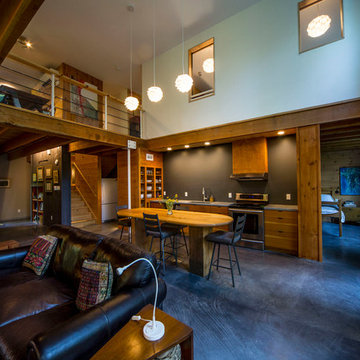
For this project, the goals were straight forward - a low energy, low maintenance home that would allow the "60 something couple” time and money to enjoy all their interests. Accessibility was also important since this is likely their last home. In the end the style is minimalist, but the raw, natural materials add texture that give the home a warm, inviting feeling.
The home has R-67.5 walls, R-90 in the attic, is extremely air tight (0.4 ACH) and is oriented to work with the sun throughout the year. As a result, operating costs of the home are minimal. The HVAC systems were chosen to work efficiently, but not to be complicated. They were designed to perform to the highest standards, but be simple enough for the owners to understand and manage.
The owners spend a lot of time camping and traveling and wanted the home to capture the same feeling of freedom that the outdoors offers. The spaces are practical, easy to keep clean and designed to create a free flowing space that opens up to nature beyond the large triple glazed Passive House windows. Built-in cubbies and shelving help keep everything organized and there is no wasted space in the house - Enough space for yoga, visiting family, relaxing, sculling boats and two home offices.
The most frequent comment of visitors is how relaxed they feel. This is a result of the unique connection to nature, the abundance of natural materials, great air quality, and the play of light throughout the house.
The exterior of the house is simple, but a striking reflection of the local farming environment. The materials are low maintenance, as is the landscaping. The siting of the home combined with the natural landscaping gives privacy and encourages the residents to feel close to local flora and fauna.
Photo Credit: Leon T. Switzer/Front Page Media Group
 The Conscious Builder Inc.
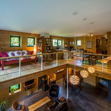
For this project, the goals were straight forward - a low energy, low maintenance home that would allow the "60 something couple” time and money to enjoy all their interests. Accessibility was also important since this is likely their last home. In the end the style is minimalist, but the raw, natural materials add texture that give the home a warm, inviting feeling.
The home has R-67.5 walls, R-90 in the attic, is extremely air tight (0.4 ACH) and is oriented to work with the sun throughout the year. As a result, operating costs of the home are minimal. The HVAC systems were chosen to work efficiently, but not to be complicated. They were designed to perform to the highest standards, but be simple enough for the owners to understand and manage.
The owners spend a lot of time camping and traveling and wanted the home to capture the same feeling of freedom that the outdoors offers. The spaces are practical, easy to keep clean and designed to create a free flowing space that opens up to nature beyond the large triple glazed Passive House windows. Built-in cubbies and shelving help keep everything organized and there is no wasted space in the house - Enough space for yoga, visiting family, relaxing, sculling boats and two home offices.
The most frequent comment of visitors is how relaxed they feel. This is a result of the unique connection to nature, the abundance of natural materials, great air quality, and the play of light throughout the house.
The exterior of the house is simple, but a striking reflection of the local farming environment. The materials are low maintenance, as is the landscaping. The siting of the home combined with the natural landscaping gives privacy and encourages the residents to feel close to local flora and fauna.
Photo Credit: Leon T. Switzer/Front Page Media Group
9