
Search results for "Poor black" in Home Design Ideas
 Honeycomb Design + Build, LLC
Jessica Delaney Photography
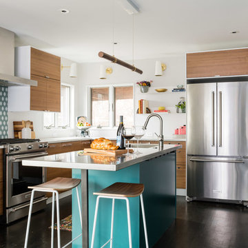
Example of a trendy kitchen design in Boston
Example of a trendy kitchen design in Boston

 The Custom Shower Company
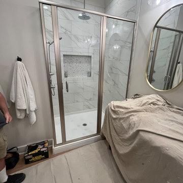
"Do It Right or Do It Twice: A Luxury Rebuild Done the Right Way
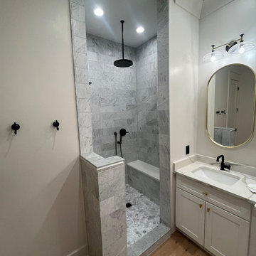
Two years ago, this client invested in what they hoped would be a dream bathroom. But what they got was a disaster in disguise — poor workmanship, structural shortcuts, and a layout that never lived up to the space’s potential. Disappointed but determined, they called us in with one goal: make it right. Not just aesthetically, but fundamentally.
We began by stripping the room back to its bones — removing the poorly installed shower, repairing water-damaged trim, and rebuilding everything with precision and care. The new layout centers around a striking walk-in shower, crafted with full-height marble tile and grounded by a custom pony wall that adds both visual structure and everyday functionality — no need for glass, no clutter, just clean, timeless lines.
To unify the space, we built a new wall next to the vanity, rerouted electrical, and installed a tailored filler strip for a seamless, furniture-like fit. Fresh drywall, expertly painted walls, and flawless trim work brought cohesion and polish to the room. Every detail — from the matte black fixtures to the soft oak flooring — was selected to reflect the homeowners’ taste and trust in long-lasting quality.
The result isn’t just a bathroom; it’s a statement. One that says: luxury is not just how something looks — it’s how well it’s built to last."
Find the right local pro for your project
 Scenic Interiors, LLC
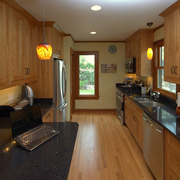
We completely remodeled an outdated, poorly designed kitchen that was separated from the rest of the house by a narrow doorway. We opened the wall to the dining room and framed it with an oak archway. We transformed the space with an open, timeless design that incorporates a counter-height eating and work area, cherry inset door shaker-style cabinets, increased counter work area made from Cambria quartz tops, and solid oak moldings that echo the style of the 1920's bungalow. Some of the original wood moldings were re-used to case the new energy efficient window.
 The Custom Shower Company
"Do It Right or Do It Twice: A Luxury Rebuild Done the Right Way
Two years ago, this client invested in what they hoped would be a dream bathroom. But what they got was a disaster in disguise — poor workmanship, structural shortcuts, and a layout that never lived up to the space’s potential. Disappointed but determined, they called us in with one goal: make it right. Not just aesthetically, but fundamentally.
We began by stripping the room back to its bones — removing the poorly installed shower, repairing water-damaged trim, and rebuilding everything with precision and care. The new layout centers around a striking walk-in shower, crafted with full-height marble tile and grounded by a custom pony wall that adds both visual structure and everyday functionality — no need for glass, no clutter, just clean, timeless lines.
To unify the space, we built a new wall next to the vanity, rerouted electrical, and installed a tailored filler strip for a seamless, furniture-like fit. Fresh drywall, expertly painted walls, and flawless trim work brought cohesion and polish to the room. Every detail — from the matte black fixtures to the soft oak flooring — was selected to reflect the homeowners’ taste and trust in long-lasting quality.
The result isn’t just a bathroom; it’s a statement. One that says: luxury is not just how something looks — it’s how well it’s built to last."
 Michael Nash Design, Build & Homes
This growing family of six was struggling with a dysfunctional kitchen design. The center island had been installed at an odd angle that limited accessibility and traffic flow. Additionally, storage space was limited by poor cabinet design. Finally, doorways in and out of the kitchen were narrow and poorly located, especially for children dashing in and out.
Other design challenges included how to better use a 10’ x 12’ room for children’s jackets and toys and how to add a professional-quality gas range in a neighborhood were natural gas wasn’t available. The new design would address all of these issues.
DESIGN SOLUTIONS
The new kitchen design revolves around a more proportional island. Carefully placed in the center of the new space with seating for four, it includes a prep sink, a second dishwasher and a beverage center.
The distressed ebony-stained island and hutch provides a brilliant contrast between the white color cabinetry. White Carrera marble countertops and backsplash top both island and perimeter cabinets.
Tall, double stacked cabinetry lines two walls to maximize storage space. Across the room there was an unused wall that now contains a 36” tower fridge and freezer, both covered with matching panels, and a tall cabinet that contains a microwave, steam unit and warming drawer.
A propane tank was buried in the back yard to provide gas to a new 60” professional range and cooktop. A custom-made wood mantel hood blends perfectly with the cabinet style.
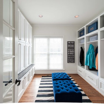
The old laundry room was reconfigured to have lots of locker space for all kids and added cabinetry for storage. A double entry door separated the new mudroom from the rest of the back hall. In the back hall the back windows were replaced with a set of French door and added decking to create a direct access to deck and backyard.
The end result is an open floor plan, high-end appliances, great traffic flow and pleasing colors. The homeowner calls it the “kitchen of her dreams.”
 Milwaukee/NARI Home Improvement Council, Inc.
Jim Wirtz’s Woodworks
Milwaukee, WI
Kitchen $40,000-$80,000
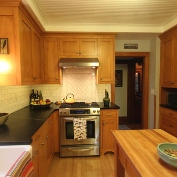
An outdated and poorly designed kitchen was adjacent to an unheated and seldom used enclosed porch. Walls were removed to combine the spaces and the porch area was rebuilt to become part of the kitchen.
Custom cabinetry was stained to match existing woodwork. Transom windows and architectural features helped convert the porch into a dinette. The new kitchen is well lit with LED under-counter lighting, hood lighting, vintage scones, and ceiling lights.

Sponsored
Sunbury, OH

J.Holderby - Renovations
Franklin County's Leading General Contractors - 2X Best of Houzz!
 New England Design & Construction
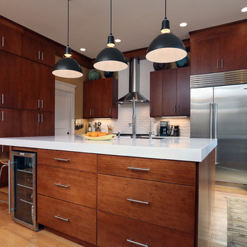
In this major kitchen remodel, we switched the locations of a half bath and a kitchen pantry, and gave an outdated and poorly laid out kitchen a total upgrade, including creating a better work triangle for people who actually cook in their kitchens. A spare, modern aesthetic was used with warm wood tones to offset the white counters.
Photos by Jay Groccia at OnSite Studios
 Milgard Windows & Doors
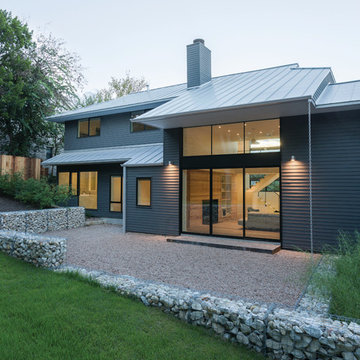
The Kiguchi family moved into their Austin, Texas home in 1994. Built in the 1980’s as part of a neighborhood development, they happily raised their family here but longed for something more contemporary. Once they became empty nesters, they decided it was time for a major remodel. After spending many years visiting Austin AIA Home Tours that highlight contemporary residential architecture, they had a lot of ideas and in 2013 were ready to interview architects and get their renovation underway.
The project turned into a major remodel due to an unstable foundation. Architects Ben Arbib and Ed Hughey, of Arbib Hughey Design were hired to solve the structural issue and look for inspiration in the bones of the house, which sat on top of a hillside and was surrounded by great views.
Unfortunately, with the old floor plan, the beautiful views were hidden by small windows that were poorly placed. In order to bring more natural light into the house the window sizes and configurations had to be addressed, all while keeping in mind the homeowners desire for a modern look and feel.
To achieve a more contemporary and sophisticated front of house, a new entry was designed that included removing a two-story bay window and porch. The entrance of the home also became more integrated with the landscape creating a template for new foliage to be planted. Older exterior materials were updated to incorporate a more muted palette of colors with a metal roof, dark grey siding in the back and white stucco in the front. Deep eaves were added over many of the new large windows for clean lines and sun protection.
“Inside it was about opening up the floor plan, expanding the views throughout the house, and updating the material palette to get a modern look that was also warm and inviting,” said Ben from Arbib Hughey Design. “Prior to the remodel, the house had the typical separation of rooms. We removed the walls between them and changed all of the windows to Milgard Thermally Improved Aluminum to connect the inside with the outside. No matter where you are you get nice views and natural light.”
The architects wanted to create some drama, which they accomplished with the window placement and opening up the interior floor plan to an open concept approach. Cabinetry was used to help delineate intimate spaces. To add warmth to an all-white living room, white-washed oak wood floors were installed and pine planks were used around the fireplace. The large windows served as artwork bringing the color of nature into the space.
An octagon shaped, elevated dining room, (named “the turret”), had a big impact on the design of the house. They architects rounded the corners and added larger window openings overlooking a new sunken garden. The great room was also softened by rounding out the corners and that circular theme continued throughout the house, being picked up in skylight wells and kitchen cabinetry. A staircase leading to a catwalk was added and the result was a two-story window wall that flooded the home with natural light.
When asked why Milgard® Thermally Improved Aluminum windows were selected, the architectural team listed many reasons:
1) Aesthetics: “We liked the slim profiles and narrow sightlines. The window frames never get in the way of the view and that was important to us. They also have a very contemporary look that went well with our design.”
2) Options: “We liked that we could get large sliding doors that matched the windows, giving us a very cohesive look and feel throughout the project.”
3) Cost Effective: “Milgard windows are affordable. You get a good product at a good price.”
4) Custom Sizes: “Milgard windows are customizable, which allowed us to get the right window for each location.”
Ready to take on your own traditional to modern home remodeling project? Arbib Hughey Design advises, “Work with a good architect. That means picking a team that is creative, communicative, listens well and is responsive. We think it’s important for an architect to listen to their clients and give them something they want, not something the architect thinks they should have. At the same time you want an architect who is willing and able to think outside the box and offer up design options that you may not have considered. Design is about a lot of back and forth, trying out ideas, getting feedback and trying again.”
The home was completely transformed into a unique, contemporary house perfectly integrated with its site. Internally the home has a natural flow for the occupants and externally it is integrated with the surroundings taking advantage of great natural light. As a side note, it was highly praised as part of the Austin AIA homes tour.
 Robin's Nest Interiors
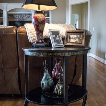
These long time clients have a beautiful home and property, but wanted to make their Living Room more functional for their large extended family. When they originally moved into their home, they furnished the space with lovely things from their previous home, but rarely used it. They recently decided to purchase a reclining sectional and add a television. We helped them finish off the space with accent tables, artwork and window treatments.
This oversized club chair helps balance the sectional. The wood tray helps make the fun tufted ottoman more functional
We added petite faux roman shades to the doors that lead out to the patio. We did not want to block the view of the pool and beyond!
The sectional had a curved corner so we added this gorgeous black table with greek key motif to cover a poorly placed floor outlet and add additional lighting. This Living Room is now lovely and functional! Enjoy!
 Robin's Nest Interiors
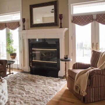
These long time clients have a beautiful home and property, but wanted to make their Living Room more functional for their large extended family. When they originally moved into their home, they furnished the space with lovely things from their previous home, but rarely used it. They recently decided to purchase a reclining sectional and add a television. We helped them finish off the space with accent tables, artwork and window treatments.
This oversized club chair helps balance the sectional. The wood tray helps make the fun tufted ottoman more functional
We added petite faux roman shades to the doors that lead out to the patio. We did not want to block the view of the pool and beyond!
The sectional had a curved corner so we added this gorgeous black table with greek key motif to cover a poorly placed floor outlet and add additional lighting. This Living Room is now lovely and functional! Enjoy!
 Robin's Nest Interiors
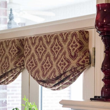
These long time clients have a beautiful home and property, but wanted to make their Living Room more functional for their large extended family. When they originally moved into their home, they furnished the space with lovely things from their previous home, but rarely used it. They recently decided to purchase a reclining sectional and add a television. We helped them finish off the space with accent tables, artwork and window treatments.
This oversized club chair helps balance the sectional. The wood tray helps make the fun tufted ottoman more functional
We added petite faux roman shades to the doors that lead out to the patio. We did not want to block the view of the pool and beyond!
The sectional had a curved corner so we added this gorgeous black table with greek key motif to cover a poorly placed floor outlet and add additional lighting. This Living Room is now lovely and functional! Enjoy!


 MRF Construction, Inc.
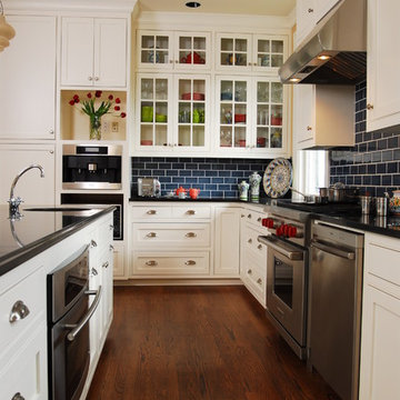
This stately lumber baron home, built in 1890, was updated to match the historic nature of the home and to create a kitchen the homeowners could entertain in more easily. The kitchen’s previous update was in 1960, and the space was cut up leaving it feeling disjointed and small. Almost half the space in the kitchen was used as a large butler’s pantry, and was further confined by a poor layout. By removing the wall separating the pantry, we were able to make a much larger, more comfortable space.
The kitchen is outfitted with custom cabinets in a traditional inset shaker style door to fit the age of the home. Honed black granite countertops and handmade blue subway tile complete the period look. The kitchen has all of the modern conveniences, with high end appliances, including a built-in Miele coffee-maker in the area where the pantry once resided. Along the same wall, there is a desk with compartments for mail, bills and homework, which is a must for this busy family!
 kimberly peck architect
photos by Pedro Marti
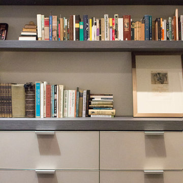
The main goal of this renovation was to improve the overall flow of this one bedroom. The existing layout consisted of too much unusable circulation space and poorly laid out storage located at the entry of the apartment. The existing kitchen was an antiquated, small enclosed space. The main design solution was to remove the long entry hall by opening the kitchen to create one large open space that interacted with the main living room. A new focal point was created in the space by adding a long linear element of floating shelves with a workspace below opposite the kitchen running from the entry to the living space. Visually the apartment is tied together by using the same material for various elements throughout. Grey oak is used for the custom kitchen cabinetry, the floating shelves and desk, and to clad the entry walls. Custom light grey acid etched glass is used for the upper kitchen cabinets, the drawer fronts below the desk, and the tall closet doors at the entry. In the kitchen black granite countertops wrap around terminating with a raised dining surface open to the living room. The black counters are mirrored with a soft black acid etched backsplash that helps the kitchen feel larger as they create the illusion of receding. The existing floors of the apartment were stained a dark ebony and complimented by the new dark metallic porcelain tiled kitchen floor. In the bathroom the tub was replaced with an open shower. Brown limestone floors flow straight from the bathroom into the shower with out a curb, European style. The walls are tiled with a large format light blue glass.
 Robin's Nest Interiors
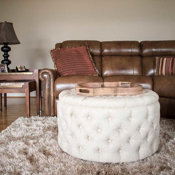
These long time clients have a beautiful home and property, but wanted to make their Living Room more functional for their large extended family. When they originally moved into their home, they furnished the space with lovely things from their previous home, but rarely used it. They recently decided to purchase a reclining sectional and add a television. We helped them finish off the space with accent tables, artwork and window treatments.
This oversized club chair helps balance the sectional. The wood tray helps make the fun tufted ottoman more functional
We added petite faux roman shades to the doors that lead out to the patio. We did not want to block the view of the pool and beyond!
The sectional had a curved corner so we added this gorgeous black table with greek key motif to cover a poorly placed floor outlet and add additional lighting. This Living Room is now lovely and functional! Enjoy!
 New England Design & Construction
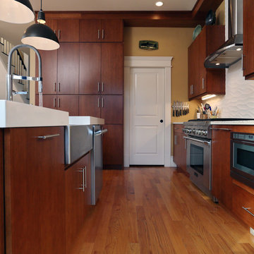
In this major kitchen remodel, we switched the locations of a half bath and a kitchen pantry, and gave an outdated and poorly laid out kitchen a total upgrade, including creating a better work triangle for people who actually cook in their kitchens. A spare, modern aesthetic was used with warm wood tones to offset the white counters.
Photos by Jay Groccia at OnSite Studios

 New England Design & Construction
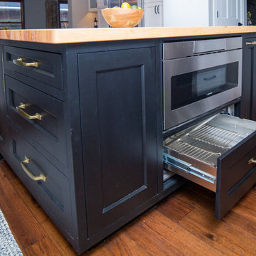
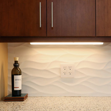
In this major kitchen remodel, we switched the locations of a half bath and a kitchen pantry, and gave an outdated and poorly laid out kitchen a total upgrade, including creating a better work triangle for people who actually cook in their kitchens. A spare, modern aesthetic was used with warm wood tones to offset the white counters.
Photos by Jay Groccia at OnSite Studios
 MRF Construction, Inc.
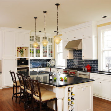
This stately lumber baron home, built in 1890, was updated to match the historic nature of the home and to create a kitchen the homeowners could entertain in more easily. The kitchen’s previous update was in 1960, and the space was cut up leaving it feeling disjointed and small. Almost half the space in the kitchen was used as a large butler’s pantry, and was further confined by a poor layout. By removing the wall separating the pantry, we were able to make a much larger, more comfortable space.
The kitchen is outfitted with custom cabinets in a traditional inset shaker style door to fit the age of the home. Honed black granite countertops and handmade blue subway tile complete the period look. The kitchen has all of the modern conveniences, with high end appliances, including a built-in Miele coffee-maker in the area where the pantry once resided. Along the same wall, there is a desk with compartments for mail, bills and homework, which is a must for this busy family!
 Truss and Texture, LLC
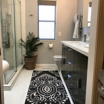
This is a budget conscious remodel of an original bathroom that was really sad and tired. A large garden tub that was never used and a poorly constructed one piece leaky shower along with a vanity that was 6 inches under normal height. We completely gutted the bathroom and transformed the cabinetry outside of the bathroom into a convenient ironing area with pullout laundry bins to make for more room in the walk-in closet. We used reclaimed wood to enhance the existing new closet doors and for smarter storage and display of the client's treasures.
17