
Search results for "Poor black" in Home Design Ideas
 Designs by KS
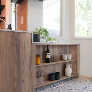
When our clients came to us with their renovation project asking for a pink kitchen, we were thrilled at the opportunity to create a unique, bright and colourful kitchen. It’s not something you see everyday, and we live for it! Being that they are a young family, who loves to cook but felt secluded and overwhelmed when in this space, we knew that this was going to be an epic transformation, not just aesthetically but also for their day-to-day life.
This renovation transformed a closed off, cramped, and poorly laid-out kitchen into a colourful, bright, open, and inviting space that combines functionality with vibrant colours and character. The redesign focused on maximizing storage, improving layout efficiency, and infusing the space with unique design elements that make it both practical and fun.
 MRF Construction, Inc.
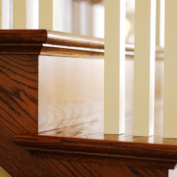
This stately lumber baron home, built in 1890, was updated to match the historic nature of the home and to create a kitchen the homeowners could entertain in more easily. The kitchen’s previous update was in 1960, and the space was cut up leaving it feeling disjointed and small. Almost half the space in the kitchen was used as a large butler’s pantry, and was further confined by a poor layout. By removing the wall separating the pantry, we were able to make a much larger, more comfortable space.
The kitchen is outfitted with custom cabinets in a traditional inset shaker style door to fit the age of the home. Honed black granite countertops and handmade blue subway tile complete the period look. The kitchen has all of the modern conveniences, with high end appliances, including a built-in Miele coffee-maker in the area where the pantry once resided. Along the same wall, there is a desk with compartments for mail, bills and homework, which is a must for this busy family!
 Designs by KS
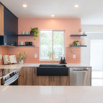
When our clients came to us with their renovation project asking for a pink kitchen, we were thrilled at the opportunity to create a unique, bright and colourful kitchen. It’s not something you see everyday, and we live for it! Being that they are a young family, who loves to cook but felt secluded and overwhelmed when in this space, we knew that this was going to be an epic transformation, not just aesthetically but also for their day-to-day life.
This renovation transformed a closed off, cramped, and poorly laid-out kitchen into a colourful, bright, open, and inviting space that combines functionality with vibrant colours and character. The redesign focused on maximizing storage, improving layout efficiency, and infusing the space with unique design elements that make it both practical and fun.
Find the right local pro for your project
 The Design House
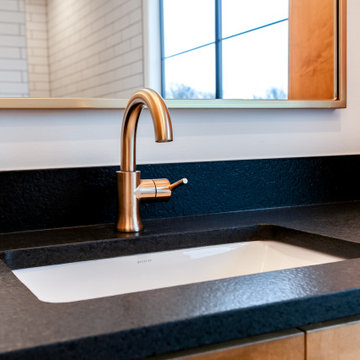
his Flower Mound bathroom remodel is a masterclass in texture and contrast. We moved away from standard polished surfaces to create a vanity that feels as good as it looks. The star is the Leathered Absolute Black Granite. This "leathering" process creates a matte, textured finish that is incredibly tactile and, unlike polished black stone, hides fingerprints and water spots perfectly.
The "Operator" Execution:
The Texture: Most fabricators struggle with leathered finishes because they can't hide poor cuts with polish. Because we own Stonemeyer Granite, we precision-cut this slab to ensure the textured edge profile was consistent and smooth to the touch.
The "Mixed Metals": We paired the matte black stone with a stunning Brushed Gold Single-Hole Faucet. The contrast between the rugged stone and the refined metal creates a "Modern Industrial" look that is timeless, not trendy.
The Splash: We installed a matching 4-Inch Granite Backsplash to keep the look cohesive and protect the drywall. Notice how the texture runs continuously from the deck up the splash—a detail only a custom shop gets right.
The Reflection: In the mirror, you can see the White Subway Tile on the opposite wall, keeping the room bright despite the dark vanity top.
Materials Used:
Countertop: Absolute Black Granite (Leathered Finish)
Faucet: Brushed Gold / Champagne Bronze [Modern Cylinder Style]
Sink: Rectangular White Undermount
Mirror: Gold Metal Frame
If you want a modern bathroom renovation in Flower Mound that features custom textured stone and designer finishes, contact The Design House today.
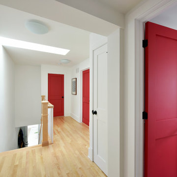
 Amsted Design-Build
Previously renovated with a two-story addition in the 80’s, the home’s square footage had been increased, but the current homeowners struggled to integrate the old with the new.
An oversized fireplace and awkward jogged walls added to the challenges on the main floor, along with dated finishes. While on the second floor, a poorly configured layout was not functional for this expanding family.
From the front entrance, we can see the fireplace was removed between the living room and dining rooms, creating greater sight lines and allowing for more traditional archways between rooms.
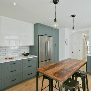
At the back of the home, we created a new mudroom area, and updated the kitchen with custom two-tone millwork, countertops and finishes. These main floor changes work together to create a home more reflective of the homeowners’ tastes.
On the second floor, the master suite was relocated and now features a beautiful custom ensuite, walk-in closet and convenient adjacency to the new laundry room.
Gordon King Photography
 Designs by KS
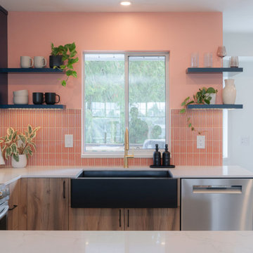
When our clients came to us with their renovation project asking for a pink kitchen, we were thrilled at the opportunity to create a unique, bright and colourful kitchen. It’s not something you see everyday, and we live for it! Being that they are a young family, who loves to cook but felt secluded and overwhelmed when in this space, we knew that this was going to be an epic transformation, not just aesthetically but also for their day-to-day life.
This renovation transformed a closed off, cramped, and poorly laid-out kitchen into a colourful, bright, open, and inviting space that combines functionality with vibrant colours and character. The redesign focused on maximizing storage, improving layout efficiency, and infusing the space with unique design elements that make it both practical and fun.
 Living with Lolo
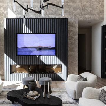
Living Room in Desert Escape |
Room Type:
Full Home Remodel + Furnishing (4 Bedroom, 5 Bath, 3,627 sq ft residence).
Project Name:
Desert Escape Design.
Key Feature:
A complete home refurnishing and remodel including the master bathroom, powder room, and fireplace, designed to deliver striking wow factor while maintaining the warmth of a serene desert retreat.
Challenge:
The previous designer’s work was poor quality, and remodeling only the primary suite would have created a noticeable disconnect with the rest of the home.
Solution:
The clients chose to fully refurnish the entire home and remodel the master bathroom, powder room, and fireplace to create a cohesive, elevated design throughout.
Materials:
Lighting: Visual Comfort, Circa Lighting, Hammerton Studio.
Rugs: Jaipur.
Art: Leftbank.
Mirrors: Four Hands.
Wallpaper: Arte, Elitis.
Furniture: Four Hands, Moss Studio, Dovetail, Bernhardt, Noir, Arteriors, CFC.
Budget:
$100K-$250K |
Timeline:
Completed August 202
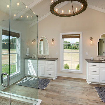

 Amsted Design-Build
Previously renovated with a two-story addition in the 80’s, the home’s square footage had been increased, but the current homeowners struggled to integrate the old with the new.
An oversized fireplace and awkward jogged walls added to the challenges on the main floor, along with dated finishes. While on the second floor, a poorly configured layout was not functional for this expanding family.
From the front entrance, we can see the fireplace was removed between the living room and dining rooms, creating greater sight lines and allowing for more traditional archways between rooms.
At the back of the home, we created a new mudroom area, and updated the kitchen with custom two-tone millwork, countertops and finishes. These main floor changes work together to create a home more reflective of the homeowners’ tastes.
On the second floor, the master suite was relocated and now features a beautiful custom ensuite, walk-in closet and convenient adjacency to the new laundry room.
Gordon King Photography
 Gale Rew Construction, Inc.
Becky Pospical
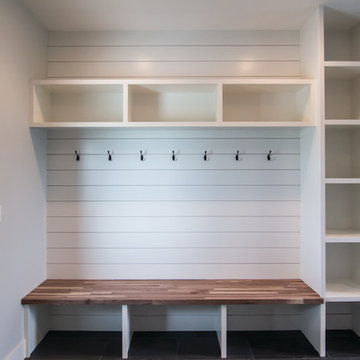
Large arts and crafts slate floor and beige floor mudroom photo with blue walls
Large arts and crafts slate floor and beige floor mudroom photo with blue walls
 HouseHome
Built in 1896, the original site of the Baldwin Piano warehouse was transformed into several turn-of-the-century residential spaces in the heart of Downtown Denver. The building is the last remaining structure in Downtown Denver with a cast-iron facade. HouseHome was invited to take on a poorly designed loft and transform it into a luxury Airbnb rental. Since this building has such a dense history, it was our mission to bring the focus back onto the unique features, such as the original brick, large windows, and unique architecture.
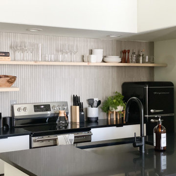
Our client wanted the space to be transformed into a luxury, unique Airbnb for world travelers and tourists hoping to experience the history and art of the Denver scene. We went with a modern, clean-lined design with warm brick, moody black tones, and pops of green and white, all tied together with metal accents. The high-contrast black ceiling is the wow factor in this design, pushing the envelope to create a completely unique space. Other added elements in this loft are the modern, high-gloss kitchen cabinetry, the concrete tile backsplash, and the unique multi-use space in the Living Room. Truly a dream rental that perfectly encapsulates the trendy, historical personality of the Denver area.

 Twelve Stones Designs, LLC
The owners of this kitchen had spent the money to upgrade the finishes in their kitchen upon building the home 12 years ago, but after living in the space for several years they realized how nonfunctional the layout really was. The (then) two preschool aged children had grown into busy, hungry teenagers with many friends who also liked to hang out at the house. So the family needed a more functional kitchen with better traffic flow, space for daily activities revolving around the kitchen at different times of day, and a kitchen that could accommodate cooking for and serving large groups. Furthermore, the dark, traditional finishes no longer reflected the homeowners’ style. They requested a brighter, more relaxed, coastal style that reflected their love of the seaside cities they like to visit.
Originally, the kitchen was U-shaped with a narrow island in the middle. The island created narrow aisles that bottle-necked at the dishwasher, refrigerator, and cooktop areas. There was a pass-through from the foyer into the kitchen, but the owners never liked that the pass-through was also located so close to the powder room. The awkward proximity was unappealing and made guests feel uncomfortable.
The kitchen’s storage was made up of lots of narrow cabinets, apothecary drawers, clipped corner units, and very few drawers. It lacked useful storage for the larger items the family used on a daily basis. And the kitchen’s only pantry was small closet that had only builder-grade, narrow shelving with no illumination to be able to see the contents inside.
Overall, the kitchen’s lighting plan was poorly executed. Only six recessed cans illuminated the entire kitchen and nook areas. The under cabinet lighting was not evenly distributed either. In fact, the builder had mis-placed the under cabinet lighting around the decorative pilasters which made for choppy, dark cubbies. Further, the builder didn’t include any lighting over the sink or the bar area, which meant whoever was doing the dishes was always in their own shadow. That, coupled with the steep overhang of the game room above made the bar area feel like a dim, cavernous space that wasn’t inviting or task oriented. The kitchen looked out into the main living space, but the raised bar and a narrow wall (which held the only large cabinet in the kitchen) created more of a barrier than a relationship to the living room or breakfast nook. In fact, one couldn’t even see the breakfast nook from the cooktop or sink areas due to its orientation. The raised bar top was too narrow to comfortably sit to either dine at or chat from due to the lack of knee space. The the homeowners confided that the kitchen felt more like a dark, dirty prison than place where the family, or their guests, wanted to gather and commune.
The clients' needs and desires were:
➢ to create a kitchen that would be a space the family loved to be in; to relate to the adjacent spaces all around, and to have better flow for entertaining large groups
➢ to remove the walls between the breakfast nook and living area and to be able to utilize the natural light from the windows in both those areas
➢ to incorporate a functional chopping block for prepping fresh food for home cooked meals, an island with a large sink and drain board, 2 pull out trash cans, and seating for at least the 2 teens to eat or do homework
➢ to design a kitchen and breakfast nook with an airy, coastal, relaxed vibe that blended with the rest of the house's coastal theme
➢ to integrate a layered lighting plan which would include ample general illumination, specific task lighting, decorative lighting, and lots of illuminated storage
➢ to design a kitchen with not only more storage for all the husband’s kitchen gadgets and collection of oils and spices, but smart storage, including a coffee/breakfast bar and a place to store and conceal the toaster oven and microwave
➢ to find a way to utilize the large open space between the kitchen, pantry area, and breakfast nook
Twelve Stones Designs achieved the owner's goals by:
➢ removing the walls between the kitchen and living room to allow the natural light to filter in from the adjacent rooms and to create a connection between the kitchen, nook, and living spaces for a sense of unity and communion
➢ removing the existing pantry and designing 3 large pantry style cabinets with LED tape lights and rollout drawers to house lots of kitchen appliances, gadgets, and tons of groceries. We also took the cabinets all the way up to the 9’ ceiling for additional storage for seasonal items and bulk storage.
➢ designing 2 islands - 1 with a gorgeous black walnut chopping block that houses a drawer for chopping and carving knives and a custom double pull out trash unit for point of use utilization - and 1 that houses the dishwasher, a large Blanco Gourmet sink with integrated drain board, woven baskets for fresh root vegetables and kitchen towels, plenty of drawer storage for kitchen items, and bar seating for up to 4 diners.
➢ closing off the space between the kitchen and the powder room to create a beautiful new private alcove for the powder room as well as adding some decorative storage. This also gave us space to include more tall storage near the new range for precision placement of the husband’s extensive oil and spice collection as well as a location for a combo-steam oven the wife wanted for baking and cooking healthy meals.
The project is enhanced functionally by:
➢ incorporated USB and standard receptacles for the kids’ laptops and phone charging in the large island
➢ designing the small island to include additional open shelving for items used on a daily basis such as a variety of bowls, plates, and colanders. This set up also works well for the husband who prefers to “plate” his dinners in restaurant-style fashion before presenting them to the table.
➢ the integration of specific storage units, such as double stacked cutlery drawers, a custom spice pull-out, a Kuerig coffee and tea pod drawer, and custom double stacked utensil drawers
➢ moving the refrigerator to the old oven location - this eliminated the bottle neck as well as created a better relationship to the eating table. It also utilizes the floor space between the pantry, nook, and kitchen
➢ creating a banquet style breakfast nook - this banquette seating not only doubles the amount of seating for large gatherings but it better utilizes the odd space between the kitchen and the previous nook area. It also helps to create a distinct pathway from the mudroom room through the pantry area, kitchen, nook, and living room.
➢ the coffee/breakfast bar area which includes the perfect location for the concealed microwave and toaster oven, convenient storage for the coffee pods and tea accoutrements. Roll-out drawers below also house the smoothie maker, hot water kettle, and a plethora of smoothie-making ingredients such as protein powders, smoothie additives, etc. Furthermore, the drawers below the Keurig house measuring utensil, cutlery, baking supplies and tupperware storage.
➢ incorporating lots of wide drawers and pullouts to accommodate large cookware.
➢ utilizing as much vertical space as possible by building storage to the ceiling which accommodates the family’s abundant amount of serving platters, baking sheets, bakeware, casserole dishes, and additional cutting boards.
The project is enhanced aesthetically by:
➢ new 5-piece Versailles pattern porcelain tile that now seamlessly joins the entire down stairs area together creating a bright, cohesiveness feeling instead of choppy separated spaces - it also adds a coastal feeling
➢ designing a cabinet to conceal the microwave and toaster oven
➢ the coastal influenced light fixtures over the nook table and island
➢ the sandy colors of the Langdon Cambria countertops. The swirling pattern and sparkling quartz pieces remind the homeowner of black-and-tan sandy beaches
➢ the striped banquet seating whose creamy white background and blue-green stripes were the inspiration for the cabinet and wall colors.
➢ All the interior doors were painted black to coordinate with the blacks and grays in the backsplash tile and countertop. This also adds a hint of tailored formality to an otherwise casual space.
➢ the use of WAC's Oculux small aperture LED units for the overhead lighting complimented with Diode LED strips for task lighting under the cabinets and inside the pantry and glass wall cabinets. All of the lighting applications are on separate dimmer switches.
Innovative uses of materials or construction methods by Realty Restoration LLC:
➢ Each 1-1/2” x 3” block of reclaimed end-grain black walnut that makes up the center island chopping block was hand milled and built in the shop. It was designed to look substantial and proportional to the surrounding elements, executed by creating the 4 inch tall top with a solid wood chamfered edge band.
➢ The metal doors on either side of the vent hood were also custom designed for this project and built in the Realty Restoration LLC shop. They are made 1x2, 11-gauge mild steel with ribbed glass. Weighing 60 lbs a piece, heavy duty cabinet hinges were added to support the weight of the door and keep them from sagging.
➢ Under-cabinet receptacles were added along the range wall in order to have a clean, uninterrupted backsplash.
Design obstacles to overcome:
➢ Because we were removing the demising walls between the kitchen and living room, we had to find a way to plumb and vent the new island. We did this by tunneling through the slab (the slab had post tension cables which prevented us from just trenching) to run a new wet vent through a nearby structural wall. We pulled the existing hot and cold lines between upper floor joists and ran them down the structural wall as well and up through a conduit in the tunnel.
➢ Since we were converting from wall overs to a gas range it allowed us to utilize the 220 feed for the wall ovens to provide a new sub panel for all the new kitchen circuits
➢ Due to framing deficiencies inherited from the original build there was a 1-1/2” differential in the floor-to-ceiling height over a 20 foot span; by utilizing the process of cutting and furring coupled with the crown moulding details on the cabinet elevations we were able to mask the problem and provide seamless transitions between the cabinet components.
Evidence of superior craftsmanship:
➢ uniquely designed, one-of-a-kind metal “X” end panels on the large island. The end panels were custom made in the Realty Restoration LLC shop and fitted to the exact dimensions of the island. The welding seams are completely indistinguishable - the posts look like they are cut from a single sheet of metal
➢ square metal posts on the small island were also custom made and designed to compliment and carry through the metal element s throughout the kitchen
➢ the beautiful, oversized end panels on the pantry cabinets which give the breakfast nook a tailored look
➢ integrating a large format 5 piece Versailles tile pattern to seamlessly flow from the existing spaces into the new kitchen space
➢ By constructing a custom cabinet that jogged around a corner we could not remodel (housing the entry way coat closet) we were able to camouflage the adjacent wall offset within the upper and lower cabinets. By designing around the existing jog in the structural walls we accomplished a few things: we were able to find the space to house, and hide, the microwave and toaster oven yet still have a clean cohesive appearance from the kitchen side. Additionally, the owners were able to keep their much needed coat closet and we didn’t have to increase the budget with unnecessary structural work.
 JMA (Jim Murphy and Associates)
Adrian Gregorutti
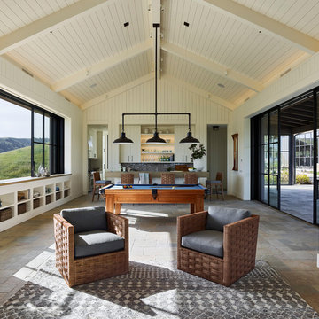
Inspiration for a huge cottage open concept slate floor and multicolored floor game room remodel in San Francisco with white walls, a standard fireplace, a concrete fireplace and a concealed tv
Inspiration for a huge cottage open concept slate floor and multicolored floor game room remodel in San Francisco with white walls, a standard fireplace, a concrete fireplace and a concealed tv
 AK Complete Home Renovations
ational Association of the Remodeling Industry Contractor of the Year (CoTY) Award Winning Design
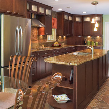
The new Marietta kitchen you see below is a far cry from the old, outdated and poorly designed kitchen that AK first saw. The homeowners complained that, among other issues, you could not open the oven and the refrigerator at the same time! The new kitchen boasts an incredible amount of customized storage, rich textures, colors a professional design plan that suited their unique lifestyle and acclaimed tile design.

 Max Hugo Interior Design
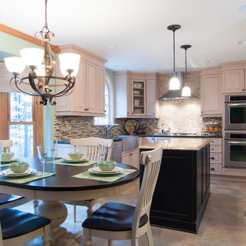
An outdated and poorly laid out kitchen was gutted and fitted with cabinetry in a new configuration in this Kitchen remodel Dark cabinets were replaced with light colored glazed and speckled cabinets with a unique crown molding. The kitchen island provides more work space, storage, and holds a drawer microwave. The stainless steel apron front sink compliments the new appliances in this kitchen. Old vinyl flooring was removed and replaced with Adura squares. These have the look of tile without the "hardness" of a tile floor for the cook that spends a good deal of time standing in the kitchen. Two tile selections were used on the backsplash areas. Under the counters, glass and stone pencil tile was applied to the walls. Behind the gas cooktop, marble tile in a basketweave patten spanned the wall from the granite countertop to the ceiling.
 Living with Lolo
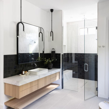
Bathroom in Desert Escape |
Room Type:
Full Home Remodel + Furnishing (4 Bedroom, 5 Bath, 3,627 sq ft residence).
Project Name:
Desert Escape Design.
Key Feature:
A complete home refurnishing and remodel including the master bathroom, powder room, and fireplace, designed to deliver striking wow factor while maintaining the warmth of a serene desert retreat.
Challenge:
The previous designer’s work was poor quality, and remodeling only the primary suite would have created a noticeable disconnect with the rest of the home.
Solution:
The clients chose to fully refurnish the entire home and remodel the master bathroom, powder room, and fireplace to create a cohesive, elevated design throughout.
Materials:
Lighting: Visual Comfort, Circa Lighting, Hammerton Studio.
Rugs: Jaipur.
Art: Leftbank.
Mirrors: Four Hands.
Wallpaper: Arte, Elitis.
Furniture: Four Hands, Moss Studio, Dovetail, Bernhardt, Noir, Arteriors, CFC.
Budget:
$100K-$250K |
Timeline:
Completed August 202
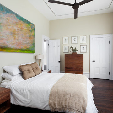
 Saikley Architects
This beautiful 1881 Alameda Victorian cottage, wonderfully embodying the Transitional Gothic-Eastlake era, had most of its original features intact. Our clients, one of whom is a painter, wanted to preserve the beauty of the historic home while modernizing its flow and function.
From several small rooms, we created a bright, open artist’s studio. We dug out the basement for a large workshop, extending a new run of stair in keeping with the existing original staircase. While keeping the bones of the house intact, we combined small spaces into large rooms, closed off doorways that were in awkward places, removed unused chimneys, changed the circulation through the house for ease and good sightlines, and made new high doorways that work gracefully with the eleven foot high ceilings. We removed inconsistent picture railings to give wall space for the clients’ art collection and to enhance the height of the rooms. From a poorly laid out kitchen and adjunct utility rooms, we made a large kitchen and family room with nine-foot-high glass doors to a new large deck. A tall wood screen at one end of the deck, fire pit, and seating give the sense of an outdoor room, overlooking the owners’ intensively planted garden. A previous mismatched addition at the side of the house was removed and a cozy outdoor living space made where morning light is received. The original house was segmented into small spaces; the new open design lends itself to the clients’ lifestyle of entertaining groups of people, working from home, and enjoying indoor-outdoor living.
Photography by Kurt Manley.
https://saikleyarchitects.com/portfolio/artists-victorian/
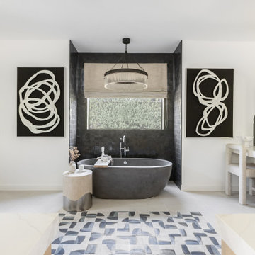 Living with Lolo
Bathroom in Desert Escape |
Room Type:
Full Home Remodel + Furnishing (4 Bedroom, 5 Bath, 3,627 sq ft residence).
Project Name:
Desert Escape Design.
Key Feature:
A complete home refurnishing and remodel including the master bathroom, powder room, and fireplace, designed to deliver striking wow factor while maintaining the warmth of a serene desert retreat.
Challenge:
The previous designer’s work was poor quality, and remodeling only the primary suite would have created a noticeable disconnect with the rest of the home.
Solution:
The clients chose to fully refurnish the entire home and remodel the master bathroom, powder room, and fireplace to create a cohesive, elevated design throughout.
Materials:
Lighting: Visual Comfort, Circa Lighting, Hammerton Studio.
Rugs: Jaipur.
Art: Leftbank.
Mirrors: Four Hands.
Wallpaper: Arte, Elitis.
Furniture: Four Hands, Moss Studio, Dovetail, Bernhardt, Noir, Arteriors, CFC.
Budget:
$100K-$250K |
Timeline:
Completed August 202


 Kathy Tracey Design LLC
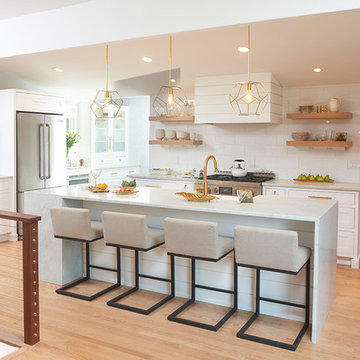
Example of a mid-sized transitional l-shaped medium tone wood floor kitchen design in New York with a farmhouse sink, shaker cabinets, white cabinets, marble countertops, white backsplash, subway tile backsplash, stainless steel appliances and an island
 User
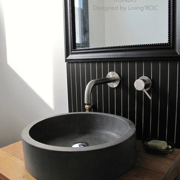
UserReference: BB507-US
Model: RONDO
Color: Concrete gray
Shape: round
Finish: honed inside and outside
US Dimensions: 16 x 4-1/3"
US Drain size: standard hole size (1.5")
Material- Basalt-Andesite
RONDO is a 15-3/4" x 4-1/3" round Concrete gray Andesite (basalt) vessel sink, genuine stone made for bathroom decoration. Our products cannot be compared to poor quality plastic, often overpriced vessel sinks. RONDO pure and sleek lines will give a cool and chic look to your bathroom with its gray tones reminder of the concrete color fashionable for the bathroom decor.
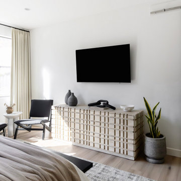 Living with Lolo
Bedroom in Desert Escape |
Room Type:
Full Home Remodel + Furnishing (4 Bedroom, 5 Bath, 3,627 sq ft residence).
Project Name:
Desert Escape Design.
Key Feature:
A complete home refurnishing and remodel including the master bathroom, powder room, and fireplace, designed to deliver striking wow factor while maintaining the warmth of a serene desert retreat.
Challenge:
The previous designer’s work was poor quality, and remodeling only the primary suite would have created a noticeable disconnect with the rest of the home.
Solution:
The clients chose to fully refurnish the entire home and remodel the master bathroom, powder room, and fireplace to create a cohesive, elevated design throughout.
Materials:
Lighting: Visual Comfort, Circa Lighting, Hammerton Studio.
Rugs: Jaipur.
Art: Leftbank.
Mirrors: Four Hands.
Wallpaper: Arte, Elitis.
Furniture: Four Hands, Moss Studio, Dovetail, Bernhardt, Noir, Arteriors, CFC.
Budget:
$100K-$250K |
Timeline:
Completed August 202
22