
Search results for "Poor black" in Home Design Ideas
 Henry Poor Lumber
Dave Mason-ISPhotographic
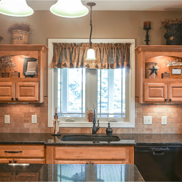
Large elegant u-shaped medium tone wood floor and brown floor open concept kitchen photo with an undermount sink, raised-panel cabinets, medium tone wood cabinets, granite countertops, beige backsplash, travertine backsplash, black appliances and an island
Large elegant u-shaped medium tone wood floor and brown floor open concept kitchen photo with an undermount sink, raised-panel cabinets, medium tone wood cabinets, granite countertops, beige backsplash, travertine backsplash, black appliances and an island
 Andrea Brodfuehrer
Todd Vorenkamp; trvphoto.com
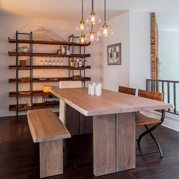
Dining room - mid-sized rustic dark wood floor dining room idea in New York with gray walls
Dining room - mid-sized rustic dark wood floor dining room idea in New York with gray walls
 Twelve Stones Designs, LLC
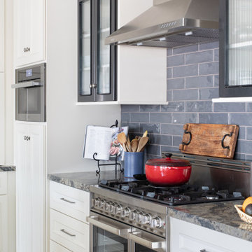
The owners of this kitchen had spent the money to upgrade the finishes in their kitchen upon building the home 12 years ago, but after living in the space for several years they realized how nonfunctional the layout really was. The (then) two preschool aged children had grown into busy, hungry teenagers with many friends who also liked to hang out at the house. So the family needed a more functional kitchen with better traffic flow, space for daily activities revolving around the kitchen at different times of day, and a kitchen that could accommodate cooking for and serving large groups. Furthermore, the dark, traditional finishes no longer reflected the homeowners’ style. They requested a brighter, more relaxed, coastal style that reflected their love of the seaside cities they like to visit.
Originally, the kitchen was U-shaped with a narrow island in the middle. The island created narrow aisles that bottle-necked at the dishwasher, refrigerator, and cooktop areas. There was a pass-through from the foyer into the kitchen, but the owners never liked that the pass-through was also located so close to the powder room. The awkward proximity was unappealing and made guests feel uncomfortable.
The kitchen’s storage was made up of lots of narrow cabinets, apothecary drawers, clipped corner units, and very few drawers. It lacked useful storage for the larger items the family used on a daily basis. And the kitchen’s only pantry was small closet that had only builder-grade, narrow shelving with no illumination to be able to see the contents inside.
Overall, the kitchen’s lighting plan was poorly executed. Only six recessed cans illuminated the entire kitchen and nook areas. The under cabinet lighting was not evenly distributed either. In fact, the builder had mis-placed the under cabinet lighting around the decorative pilasters which made for choppy, dark cubbies. Further, the builder didn’t include any lighting over the sink or the bar area, which meant whoever was doing the dishes was always in their own shadow. That, coupled with the steep overhang of the game room above made the bar area feel like a dim, cavernous space that wasn’t inviting or task oriented. The kitchen looked out into the main living space, but the raised bar and a narrow wall (which held the only large cabinet in the kitchen) created more of a barrier than a relationship to the living room or breakfast nook. In fact, one couldn’t even see the breakfast nook from the cooktop or sink areas due to its orientation. The raised bar top was too narrow to comfortably sit to either dine at or chat from due to the lack of knee space. The the homeowners confided that the kitchen felt more like a dark, dirty prison than place where the family, or their guests, wanted to gather and commune.
The clients' needs and desires were:
➢ to create a kitchen that would be a space the family loved to be in; to relate to the adjacent spaces all around, and to have better flow for entertaining large groups
➢ to remove the walls between the breakfast nook and living area and to be able to utilize the natural light from the windows in both those areas
➢ to incorporate a functional chopping block for prepping fresh food for home cooked meals, an island with a large sink and drain board, 2 pull out trash cans, and seating for at least the 2 teens to eat or do homework
➢ to design a kitchen and breakfast nook with an airy, coastal, relaxed vibe that blended with the rest of the house's coastal theme
➢ to integrate a layered lighting plan which would include ample general illumination, specific task lighting, decorative lighting, and lots of illuminated storage
➢ to design a kitchen with not only more storage for all the husband’s kitchen gadgets and collection of oils and spices, but smart storage, including a coffee/breakfast bar and a place to store and conceal the toaster oven and microwave
➢ to find a way to utilize the large open space between the kitchen, pantry area, and breakfast nook
Twelve Stones Designs achieved the owner's goals by:
➢ removing the walls between the kitchen and living room to allow the natural light to filter in from the adjacent rooms and to create a connection between the kitchen, nook, and living spaces for a sense of unity and communion
➢ removing the existing pantry and designing 3 large pantry style cabinets with LED tape lights and rollout drawers to house lots of kitchen appliances, gadgets, and tons of groceries. We also took the cabinets all the way up to the 9’ ceiling for additional storage for seasonal items and bulk storage.
➢ designing 2 islands - 1 with a gorgeous black walnut chopping block that houses a drawer for chopping and carving knives and a custom double pull out trash unit for point of use utilization - and 1 that houses the dishwasher, a large Blanco Gourmet sink with integrated drain board, woven baskets for fresh root vegetables and kitchen towels, plenty of drawer storage for kitchen items, and bar seating for up to 4 diners.
➢ closing off the space between the kitchen and the powder room to create a beautiful new private alcove for the powder room as well as adding some decorative storage. This also gave us space to include more tall storage near the new range for precision placement of the husband’s extensive oil and spice collection as well as a location for a combo-steam oven the wife wanted for baking and cooking healthy meals.
The project is enhanced functionally by:
➢ incorporated USB and standard receptacles for the kids’ laptops and phone charging in the large island
➢ designing the small island to include additional open shelving for items used on a daily basis such as a variety of bowls, plates, and colanders. This set up also works well for the husband who prefers to “plate” his dinners in restaurant-style fashion before presenting them to the table.
➢ the integration of specific storage units, such as double stacked cutlery drawers, a custom spice pull-out, a Kuerig coffee and tea pod drawer, and custom double stacked utensil drawers
➢ moving the refrigerator to the old oven location - this eliminated the bottle neck as well as created a better relationship to the eating table. It also utilizes the floor space between the pantry, nook, and kitchen
➢ creating a banquet style breakfast nook - this banquette seating not only doubles the amount of seating for large gatherings but it better utilizes the odd space between the kitchen and the previous nook area. It also helps to create a distinct pathway from the mudroom room through the pantry area, kitchen, nook, and living room.
➢ the coffee/breakfast bar area which includes the perfect location for the concealed microwave and toaster oven, convenient storage for the coffee pods and tea accoutrements. Roll-out drawers below also house the smoothie maker, hot water kettle, and a plethora of smoothie-making ingredients such as protein powders, smoothie additives, etc. Furthermore, the drawers below the Keurig house measuring utensil, cutlery, baking supplies and tupperware storage.
➢ incorporating lots of wide drawers and pullouts to accommodate large cookware.
➢ utilizing as much vertical space as possible by building storage to the ceiling which accommodates the family’s abundant amount of serving platters, baking sheets, bakeware, casserole dishes, and additional cutting boards.
The project is enhanced aesthetically by:
➢ new 5-piece Versailles pattern porcelain tile that now seamlessly joins the entire down stairs area together creating a bright, cohesiveness feeling instead of choppy separated spaces - it also adds a coastal feeling
➢ designing a cabinet to conceal the microwave and toaster oven
➢ the coastal influenced light fixtures over the nook table and island
➢ the sandy colors of the Langdon Cambria countertops. The swirling pattern and sparkling quartz pieces remind the homeowner of black-and-tan sandy beaches
➢ the striped banquet seating whose creamy white background and blue-green stripes were the inspiration for the cabinet and wall colors.
➢ All the interior doors were painted black to coordinate with the blacks and grays in the backsplash tile and countertop. This also adds a hint of tailored formality to an otherwise casual space.
➢ the use of WAC's Oculux small aperture LED units for the overhead lighting complimented with Diode LED strips for task lighting under the cabinets and inside the pantry and glass wall cabinets. All of the lighting applications are on separate dimmer switches.
Innovative uses of materials or construction methods by Realty Restoration LLC:
➢ Each 1-1/2” x 3” block of reclaimed end-grain black walnut that makes up the center island chopping block was hand milled and built in the shop. It was designed to look substantial and proportional to the surrounding elements, executed by creating the 4 inch tall top with a solid wood chamfered edge band.
➢ The metal doors on either side of the vent hood were also custom designed for this project and built in the Realty Restoration LLC shop. They are made 1x2, 11-gauge mild steel with ribbed glass. Weighing 60 lbs a piece, heavy duty cabinet hinges were added to support the weight of the door and keep them from sagging.
➢ Under-cabinet receptacles were added along the range wall in order to have a clean, uninterrupted backsplash.
Design obstacles to overcome:
➢ Because we were removing the demising walls between the kitchen and living room, we had to find a way to plumb and vent the new island. We did this by tunneling through the slab (the slab had post tension cables which prevented us from just trenching) to run a new wet vent through a nearby structural wall. We pulled the existing hot and cold lines between upper floor joists and ran them down the structural wall as well and up through a conduit in the tunnel.
➢ Since we were converting from wall overs to a gas range it allowed us to utilize the 220 feed for the wall ovens to provide a new sub panel for all the new kitchen circuits
➢ Due to framing deficiencies inherited from the original build there was a 1-1/2” differential in the floor-to-ceiling height over a 20 foot span; by utilizing the process of cutting and furring coupled with the crown moulding details on the cabinet elevations we were able to mask the problem and provide seamless transitions between the cabinet components.
Evidence of superior craftsmanship:
➢ uniquely designed, one-of-a-kind metal “X” end panels on the large island. The end panels were custom made in the Realty Restoration LLC shop and fitted to the exact dimensions of the island. The welding seams are completely indistinguishable - the posts look like they are cut from a single sheet of metal
➢ square metal posts on the small island were also custom made and designed to compliment and carry through the metal element s throughout the kitchen
➢ the beautiful, oversized end panels on the pantry cabinets which give the breakfast nook a tailored look
➢ integrating a large format 5 piece Versailles tile pattern to seamlessly flow from the existing spaces into the new kitchen space
➢ By constructing a custom cabinet that jogged around a corner we could not remodel (housing the entry way coat closet) we were able to camouflage the adjacent wall offset within the upper and lower cabinets. By designing around the existing jog in the structural walls we accomplished a few things: we were able to find the space to house, and hide, the microwave and toaster oven yet still have a clean cohesive appearance from the kitchen side. Additionally, the owners were able to keep their much needed coat closet and we didn’t have to increase the budget with unnecessary structural work.
Find the right local pro for your project
 Tile Doctor Ltd
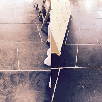
I was recently asked to this property in Wimbledon in to see if there was anything we could do to resolve the problem with a recently laid Black Limestone tiled floor. The builders that had laid the Limestone did not cover or clean the tiles prior to sealing with an impregnating seal thereby trapping in all the dirt from the building works. They then grouted the tiles but didn’t clean the grout off the surface before putting on another two coats of sealer all of which resulted in a very poor finish.
Naturally the customer was not happy so called them back to rectify the problem and so they came back and tried to strip the sealer off with cloths and a chemical stripper. Then without rinsing the stone to remove the chemicals they added another two coats of sealer; in desperation the lady gave up with them and called me in.
To resolve I tried all the sealant strippers available to me but couldn’t budge the mess effectively. The only other option available was to diamond grind the surface so I discussed this with the customer and she agreed to this and left me to carry on.
Initially I started with a coarse 400 grit diamond pad but even that wasn’t having much effect so in the end I had to cut back the surface using a 100 grit pad moving up to 200 grit, then 400 before finally stopping at 800. To lubricate the process you need to use a little water and then rinse away the resultant soil after each pad. If this was a polished stone surface I would have continued with finer and finer grits to restore the surface polish however these tiles were rough limestone and I needed to leave it as near to how it should be.
Once all the Limestone had been stripped back the stone turned an uninviting grey colour, so to bring it back to black I applied two coats of Tile Doctor Stone Oil which enhanced the colour.
I left the floor overnight to allow the Stone Oil to dry out and then returned to seal the Limestone using two coats of Tile Doctor Colour Grow which is an impregnating sealer that enhances the colour in the stone and will protect it from staining going forward.
When the customer saw the final result she was overwhelmed and said she felt like crying with relief, because the floor now looked how she had imagined it to be. It was a great feeling for me to know that I had solved the problems for her.
 Nautilus Architects
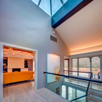
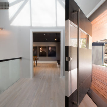
Located on a marsh in the upper reaches of the Lieutenant River in Old Lyme, the existing house was well-sited and well-built, but the design failed to exploit the views and more importantly was a confused combination of contemporary and traditional elements. The new homeowners, a successful businesswoman and an accomplished artist and photographer, were interested in creating a fully-contemporary environment to open up space, connect indoors with outdoors, display artwork and showcase the husband’s distinctive photographs.
One glaring deficiency was the curb appeal and approach sequence: the grade sloped down and the path to the house followed, but this led to an uncomfortable dip and abrupt rise to the front door. By creating a virtual “moat,” occupied by a grid of raised-bed grasses contained in aluminum-clad boxes, and spanning the moat with an ipe bridge, the approach becomes level and engaging. The façade of the existing house was blank and bland, and with no cover. Adding a deep overhang with a wide porch creates a welcoming, covered condition, accentuated by a 6’ wide pivoting front door that feels more like a moving piece of wall.
Another deficiency was the connection to the outdoors. By adding glass to the front and back of the house, and removing interior walls selectively, the house takes on a diaphanous quality that allows one to see through to the marsh beyond, even when in the driveway. The raised-bed grasses act as abstract, geometric versions of the marsh beyond. A large, pyramidal skylight establishes a spatial hierarchy around which the rooms revolve.
The house featured several tray-ceilinged spaces – living room, kitchen, and master bedroom – that were poorly-proportioned and with panels at the top that resembled inset flat panel doors. The solution was to use a different strategy for each: the bedroom turns the ceiling into an eggshell through the use of a creative trim detail; the living room has an oversized sculptural, backlit lighting element; and the kitchen has a collage of painted rectangular forms that support or include lighting pieces.
A palette of concrete, blackened steel, stainless steel and colors carefully chosen by homeowner and architect create an interior and exterior environment punctuated by moments that are as artistic as the featured works in the black-ceilinged gallery.
 Saikley Architects
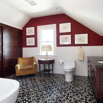
This beautiful 1881 Alameda Victorian cottage, wonderfully embodying the Transitional Gothic-Eastlake era, had most of its original features intact. Our clients, one of whom is a painter, wanted to preserve the beauty of the historic home while modernizing its flow and function.
From several small rooms, we created a bright, open artist’s studio. We dug out the basement for a large workshop, extending a new run of stair in keeping with the existing original staircase. While keeping the bones of the house intact, we combined small spaces into large rooms, closed off doorways that were in awkward places, removed unused chimneys, changed the circulation through the house for ease and good sightlines, and made new high doorways that work gracefully with the eleven foot high ceilings. We removed inconsistent picture railings to give wall space for the clients’ art collection and to enhance the height of the rooms. From a poorly laid out kitchen and adjunct utility rooms, we made a large kitchen and family room with nine-foot-high glass doors to a new large deck. A tall wood screen at one end of the deck, fire pit, and seating give the sense of an outdoor room, overlooking the owners’ intensively planted garden. A previous mismatched addition at the side of the house was removed and a cozy outdoor living space made where morning light is received. The original house was segmented into small spaces; the new open design lends itself to the clients’ lifestyle of entertaining groups of people, working from home, and enjoying indoor-outdoor living.
Photography by Kurt Manley.
https://saikleyarchitects.com/portfolio/artists-victorian/
 Nautilus Architects
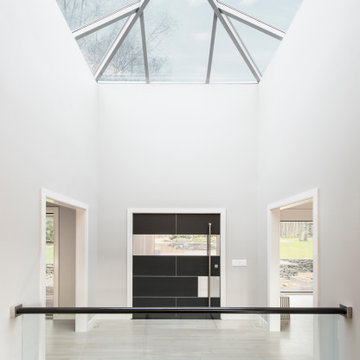
Located on a marsh in the upper reaches of the Lieutenant River in Old Lyme, the existing house was well-sited and well-built, but the design failed to exploit the views and more importantly was a confused combination of contemporary and traditional elements. The new homeowners, a successful businesswoman and an accomplished artist and photographer, were interested in creating a fully-contemporary environment to open up space, connect indoors with outdoors, display artwork and showcase the husband’s distinctive photographs.
One glaring deficiency was the curb appeal and approach sequence: the grade sloped down and the path to the house followed, but this led to an uncomfortable dip and abrupt rise to the front door. By creating a virtual “moat,” occupied by a grid of raised-bed grasses contained in aluminum-clad boxes, and spanning the moat with an ipe bridge, the approach becomes level and engaging. The façade of the existing house was blank and bland, and with no cover. Adding a deep overhang with a wide porch creates a welcoming, covered condition, accentuated by a 6’ wide pivoting front door that feels more like a moving piece of wall.
Another deficiency was the connection to the outdoors. By adding glass to the front and back of the house, and removing interior walls selectively, the house takes on a diaphanous quality that allows one to see through to the marsh beyond, even when in the driveway. The raised-bed grasses act as abstract, geometric versions of the marsh beyond. A large, pyramidal skylight establishes a spatial hierarchy around which the rooms revolve.
The house featured several tray-ceilinged spaces – living room, kitchen, and master bedroom – that were poorly-proportioned and with panels at the top that resembled inset flat panel doors. The solution was to use a different strategy for each: the bedroom turns the ceiling into an eggshell through the use of a creative trim detail; the living room has an oversized sculptural, backlit lighting element; and the kitchen has a collage of painted rectangular forms that support or include lighting pieces.
A palette of concrete, blackened steel, stainless steel and colors carefully chosen by homeowner and architect create an interior and exterior environment punctuated by moments that are as artistic as the featured works in the black-ceilinged gallery.

Sponsored
Sunbury, OH

J.Holderby - Renovations
Franklin County's Leading General Contractors - 2X Best of Houzz!
 Nautilus Architects
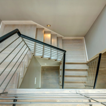
Located on a marsh in the upper reaches of the Lieutenant River in Old Lyme, the existing house was well-sited and well-built, but the design failed to exploit the views and more importantly was a confused combination of contemporary and traditional elements. The new homeowners, a successful businesswoman and an accomplished artist and photographer, were interested in creating a fully-contemporary environment to open up space, connect indoors with outdoors, display artwork and showcase the husband’s distinctive photographs.
One glaring deficiency was the curb appeal and approach sequence: the grade sloped down and the path to the house followed, but this led to an uncomfortable dip and abrupt rise to the front door. By creating a virtual “moat,” occupied by a grid of raised-bed grasses contained in aluminum-clad boxes, and spanning the moat with an ipe bridge, the approach becomes level and engaging. The façade of the existing house was blank and bland, and with no cover. Adding a deep overhang with a wide porch creates a welcoming, covered condition, accentuated by a 6’ wide pivoting front door that feels more like a moving piece of wall.
Another deficiency was the connection to the outdoors. By adding glass to the front and back of the house, and removing interior walls selectively, the house takes on a diaphanous quality that allows one to see through to the marsh beyond, even when in the driveway. The raised-bed grasses act as abstract, geometric versions of the marsh beyond. A large, pyramidal skylight establishes a spatial hierarchy around which the rooms revolve.
The house featured several tray-ceilinged spaces – living room, kitchen, and master bedroom – that were poorly-proportioned and with panels at the top that resembled inset flat panel doors. The solution was to use a different strategy for each: the bedroom turns the ceiling into an eggshell through the use of a creative trim detail; the living room has an oversized sculptural, backlit lighting element; and the kitchen has a collage of painted rectangular forms that support or include lighting pieces.
A palette of concrete, blackened steel, stainless steel and colors carefully chosen by homeowner and architect create an interior and exterior environment punctuated by moments that are as artistic as the featured works in the black-ceilinged gallery.
 Nautilus Architects
Located on a marsh in the upper reaches of the Lieutenant River in Old Lyme, the existing house was well-sited and well-built, but the design failed to exploit the views and more importantly was a confused combination of contemporary and traditional elements. The new homeowners, a successful businesswoman and an accomplished artist and photographer, were interested in creating a fully-contemporary environment to open up space, connect indoors with outdoors, display artwork and showcase the husband’s distinctive photographs.
One glaring deficiency was the curb appeal and approach sequence: the grade sloped down and the path to the house followed, but this led to an uncomfortable dip and abrupt rise to the front door. By creating a virtual “moat,” occupied by a grid of raised-bed grasses contained in aluminum-clad boxes, and spanning the moat with an ipe bridge, the approach becomes level and engaging. The façade of the existing house was blank and bland, and with no cover. Adding a deep overhang with a wide porch creates a welcoming, covered condition, accentuated by a 6’ wide pivoting front door that feels more like a moving piece of wall.
Another deficiency was the connection to the outdoors. By adding glass to the front and back of the house, and removing interior walls selectively, the house takes on a diaphanous quality that allows one to see through to the marsh beyond, even when in the driveway. The raised-bed grasses act as abstract, geometric versions of the marsh beyond. A large, pyramidal skylight establishes a spatial hierarchy around which the rooms revolve.
The house featured several tray-ceilinged spaces – living room, kitchen, and master bedroom – that were poorly-proportioned and with panels at the top that resembled inset flat panel doors. The solution was to use a different strategy for each: the bedroom turns the ceiling into an eggshell through the use of a creative trim detail; the living room has an oversized sculptural, backlit lighting element; and the kitchen has a collage of painted rectangular forms that support or include lighting pieces.
A palette of concrete, blackened steel, stainless steel and colors carefully chosen by homeowner and architect create an interior and exterior environment punctuated by moments that are as artistic as the featured works in the black-ceilinged gallery.
 Mihaly Slocombe
Brunswick Parlour transforms a Victorian cottage into a hard-working, personalised home for a family of four.
Our clients loved the character of their Brunswick terrace home, but not its inefficient floor plan and poor year-round thermal control. They didn't need more space, they just needed their space to work harder.
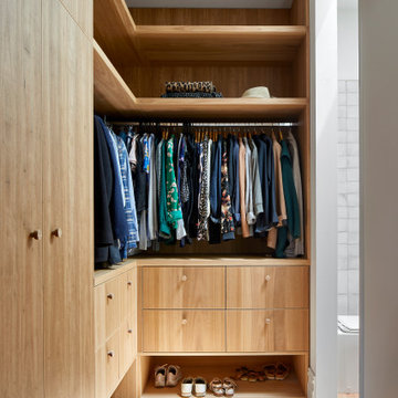
The front bedrooms remain largely untouched, retaining their Victorian features and only introducing new cabinetry. Meanwhile, the main bedroom’s previously pokey en suite and wardrobe have been expanded, adorned with custom cabinetry and illuminated via a generous skylight.
At the rear of the house, we reimagined the floor plan to establish shared spaces suited to the family’s lifestyle. Flanked by the dining and living rooms, the kitchen has been reoriented into a more efficient layout and features custom cabinetry that uses every available inch. In the dining room, the Swiss Army Knife of utility cabinets unfolds to reveal a laundry, more custom cabinetry, and a craft station with a retractable desk. Beautiful materiality throughout infuses the home with warmth and personality, featuring Blackbutt timber flooring and cabinetry, and selective pops of green and pink tones.
The house now works hard in a thermal sense too. Insulation and glazing were updated to best practice standard, and we’ve introduced several temperature control tools. Hydronic heating installed throughout the house is complemented by an evaporative cooling system and operable skylight.
The result is a lush, tactile home that increases the effectiveness of every existing inch to enhance daily life for our clients, proving that good design doesn’t need to add space to add value.
 Saikley Architects
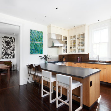
This beautiful 1881 Alameda Victorian cottage, wonderfully embodying the Transitional Gothic-Eastlake era, had most of its original features intact. Our clients, one of whom is a painter, wanted to preserve the beauty of the historic home while modernizing its flow and function.
From several small rooms, we created a bright, open artist’s studio. We dug out the basement for a large workshop, extending a new run of stair in keeping with the existing original staircase. While keeping the bones of the house intact, we combined small spaces into large rooms, closed off doorways that were in awkward places, removed unused chimneys, changed the circulation through the house for ease and good sightlines, and made new high doorways that work gracefully with the eleven foot high ceilings. We removed inconsistent picture railings to give wall space for the clients’ art collection and to enhance the height of the rooms. From a poorly laid out kitchen and adjunct utility rooms, we made a large kitchen and family room with nine-foot-high glass doors to a new large deck. A tall wood screen at one end of the deck, fire pit, and seating give the sense of an outdoor room, overlooking the owners’ intensively planted garden. A previous mismatched addition at the side of the house was removed and a cozy outdoor living space made where morning light is received. The original house was segmented into small spaces; the new open design lends itself to the clients’ lifestyle of entertaining groups of people, working from home, and enjoying indoor-outdoor living.
Photography by Kurt Manley.
https://saikleyarchitects.com/portfolio/artists-victorian/
 Saikley Architects
This beautiful 1881 Alameda Victorian cottage, wonderfully embodying the Transitional Gothic-Eastlake era, had most of its original features intact. Our clients, one of whom is a painter, wanted to preserve the beauty of the historic home while modernizing its flow and function.
From several small rooms, we created a bright, open artist’s studio. We dug out the basement for a large workshop, extending a new run of stair in keeping with the existing original staircase. While keeping the bones of the house intact, we combined small spaces into large rooms, closed off doorways that were in awkward places, removed unused chimneys, changed the circulation through the house for ease and good sightlines, and made new high doorways that work gracefully with the eleven foot high ceilings. We removed inconsistent picture railings to give wall space for the clients’ art collection and to enhance the height of the rooms. From a poorly laid out kitchen and adjunct utility rooms, we made a large kitchen and family room with nine-foot-high glass doors to a new large deck. A tall wood screen at one end of the deck, fire pit, and seating give the sense of an outdoor room, overlooking the owners’ intensively planted garden. A previous mismatched addition at the side of the house was removed and a cozy outdoor living space made where morning light is received. The original house was segmented into small spaces; the new open design lends itself to the clients’ lifestyle of entertaining groups of people, working from home, and enjoying indoor-outdoor living.
Photography by Kurt Manley.
https://saikleyarchitects.com/portfolio/artists-victorian/
 The Design House
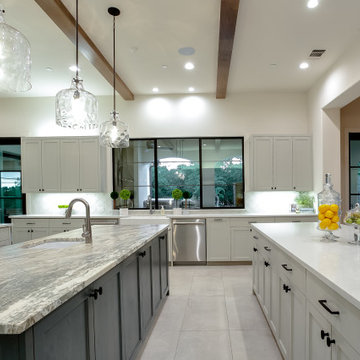
In this expansive Argyle estate kitchen remodel, one island simply wasn't enough. We designed and built a stunning Double Island configuration to separate the "work zone" from the "entertainment zone." This project showcases the full power of The Design House's vertical integration—coordinating complex stone fabrication, custom cabinetry, and structural beam installation under one single contract.
The "One-Stop" Execution:
The Showpiece Island: The primary island features a massive slab of Fantasy Brown Stone with dramatic movement. Because we own Stonemeyer Granite, we handled the delicate vein-matching and fabrication in-house, ensuring the natural flow of the stone wasn't interrupted by poor seams.
The Prep Island: To balance the drama, the secondary island features a clean, durable Pure White Quartz, providing a bulletproof surface for food prep and serving.
Architectural Details: We installed exposed cedar beams to draw the eye upward to the vaulted ceilings, adding warmth to the modern black-and-white palette.
Flooring: Large-format porcelain tile in a soft gray connects the open-concept space, installed by our expert tile setters to ensure perfectly level grout lines across the massive span.
Materials Used:
Islands: Fantasy Brown (Main), Pure White Quartz (Secondary)
Cabinetry: Custom Shaker in "Sherwin Williams Snowbound" (Perimeter) and "Iron Ore" (Main Island)
Flooring: 24x48 Matte Porcelain Tile
If you need a luxury kitchen contractor in Argyle who can handle structural changes and complex stone work without the wait, contact The Design House today.

 Nip Tuck Remodeling
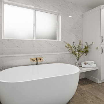
This home had dated and falling apart finishes, an insignificant fireplace in a giant living room, and a poor layout in the family room. Not to mention the primary bath covered in bamboo wallpaper.
The clients wanted a functional, updated and good-looking kitchen, a more adult family room, an updated serene primary bath. The remaining baths to be updated and modern. And, to make it feel like a holistic update, they wanted a welcoming staircase/entry.
As with most clients, stretching their dollar as far as possible was important. They didn't want to enlarge any footprint or move walls - we had to stay within existing bounds. With a whole home remodel costs can add up quickly depending on where we start & stop. For this family it made sense to do all the work at once to avoid repeat remodels. It was either buy new and still have to customize, or remodel to their exact needs and wants. The remodel was more affordable and made just for them.
Many finishes are clean, simple, and modern. A window was removed! in the family room to allow for a symmetrical entertainment center. A dramatic floor to ceiling fireplace surround was created in the Living room. The staircase was totally redone in both shape and style! The primary bath was reworked to get a two-person shower, and soaking tub. Serene /quiet finishes in the primary helped achieve a mellow /calming atmosphere. All new doors and trim throughout.
 Nip Tuck Remodeling
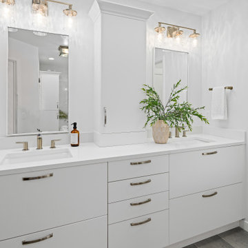
This home had dated and falling apart finishes, an insignificant fireplace in a giant living room, and a poor layout in the family room. Not to mention the primary bath covered in bamboo wallpaper.
The clients wanted a functional, updated and good-looking kitchen, a more adult family room, an updated serene primary bath. The remaining baths to be updated and modern. And, to make it feel like a holistic update, they wanted a welcoming staircase/entry.
As with most clients, stretching their dollar as far as possible was important. They didn't want to enlarge any footprint or move walls - we had to stay within existing bounds. With a whole home remodel costs can add up quickly depending on where we start & stop. For this family it made sense to do all the work at once to avoid repeat remodels. It was either buy new and still have to customize, or remodel to their exact needs and wants. The remodel was more affordable and made just for them.
Many finishes are clean, simple, and modern. A window was removed! in the family room to allow for a symmetrical entertainment center. A dramatic floor to ceiling fireplace surround was created in the Living room. The staircase was totally redone in both shape and style! The primary bath was reworked to get a two-person shower, and soaking tub. Serene /quiet finishes in the primary helped achieve a mellow /calming atmosphere. All new doors and trim throughout.
 Nip Tuck Remodeling
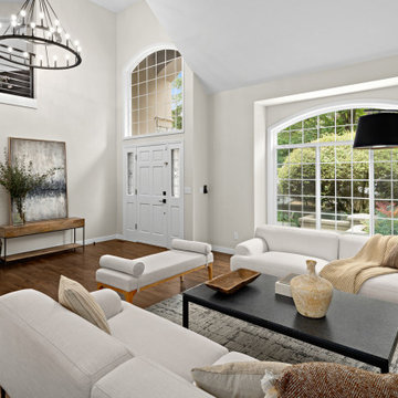
This home had dated and falling apart finishes, an insignificant fireplace in a giant living room, and a poor layout in the family room. Not to mention the primary bath covered in bamboo wallpaper.
The clients wanted a functional, updated and good-looking kitchen, a more adult family room, an updated serene primary bath. The remaining baths to be updated and modern. And, to make it feel like a holistic update, they wanted a welcoming staircase/entry.
As with most clients, stretching their dollar as far as possible was important. They didn't want to enlarge any footprint or move walls - we had to stay within existing bounds. With a whole home remodel costs can add up quickly depending on where we start & stop. For this family it made sense to do all the work at once to avoid repeat remodels. It was either buy new and still have to customize, or remodel to their exact needs and wants. The remodel was more affordable and made just for them.
Many finishes are clean, simple, and modern. A window was removed! in the family room to allow for a symmetrical entertainment center. A dramatic floor to ceiling fireplace surround was created in the Living room. The staircase was totally redone in both shape and style! The primary bath was reworked to get a two-person shower, and soaking tub. Serene /quiet finishes in the primary helped achieve a mellow /calming atmosphere. All new doors and trim throughout.
 Murphy Bros. Design | Build | Remodel
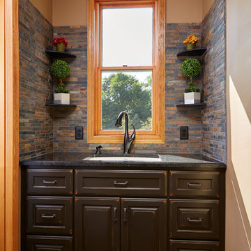
Butler's pantry sink and storage carries over same sophisticated Cambria surfaces from kitchen and rub-off finishes. Pocket door allows for maximum light and easy access.

Sponsored
Columbus, OH

Hope Restoration & General Contracting
Columbus Design-Build, Kitchen & Bath Remodeling, Historic Renovations
 Nip Tuck Remodeling
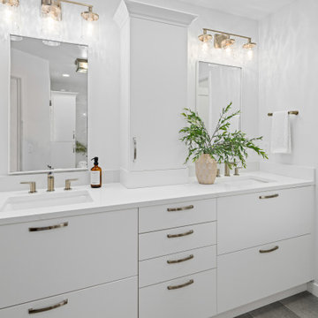
This home had dated and falling apart finishes, an insignificant fireplace in a giant living room, and a poor layout in the family room. Not to mention the primary bath covered in bamboo wallpaper.
The clients wanted a functional, updated and good-looking kitchen, a more adult family room, an updated serene primary bath. The remaining baths to be updated and modern. And, to make it feel like a holistic update, they wanted a welcoming staircase/entry.
As with most clients, stretching their dollar as far as possible was important. They didn't want to enlarge any footprint or move walls - we had to stay within existing bounds. With a whole home remodel costs can add up quickly depending on where we start & stop. For this family it made sense to do all the work at once to avoid repeat remodels. It was either buy new and still have to customize, or remodel to their exact needs and wants. The remodel was more affordable and made just for them.
Many finishes are clean, simple, and modern. A window was removed! in the family room to allow for a symmetrical entertainment center. A dramatic floor to ceiling fireplace surround was created in the Living room. The staircase was totally redone in both shape and style! The primary bath was reworked to get a two-person shower, and soaking tub. Serene /quiet finishes in the primary helped achieve a mellow /calming atmosphere. All new doors and trim throughout.
 Nip Tuck Remodeling
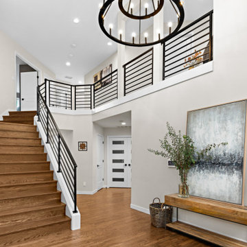
This home had dated and falling apart finishes, an insignificant fireplace in a giant living room, and a poor layout in the family room. Not to mention the primary bath covered in bamboo wallpaper.
The clients wanted a functional, updated and good-looking kitchen, a more adult family room, an updated serene primary bath. The remaining baths to be updated and modern. And, to make it feel like a holistic update, they wanted a welcoming staircase/entry.
As with most clients, stretching their dollar as far as possible was important. They didn't want to enlarge any footprint or move walls - we had to stay within existing bounds. With a whole home remodel costs can add up quickly depending on where we start & stop. For this family it made sense to do all the work at once to avoid repeat remodels. It was either buy new and still have to customize, or remodel to their exact needs and wants. The remodel was more affordable and made just for them.
Many finishes are clean, simple, and modern. A window was removed! in the family room to allow for a symmetrical entertainment center. A dramatic floor to ceiling fireplace surround was created in the Living room. The staircase was totally redone in both shape and style! The primary bath was reworked to get a two-person shower, and soaking tub. Serene /quiet finishes in the primary helped achieve a mellow /calming atmosphere. All new doors and trim throughout.
 Nip Tuck Remodeling
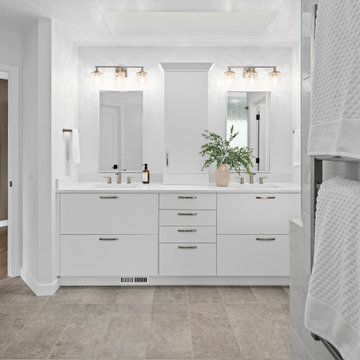
This home had dated and falling apart finishes, an insignificant fireplace in a giant living room, and a poor layout in the family room. Not to mention the primary bath covered in bamboo wallpaper.
The clients wanted a functional, updated and good-looking kitchen, a more adult family room, an updated serene primary bath. The remaining baths to be updated and modern. And, to make it feel like a holistic update, they wanted a welcoming staircase/entry.
As with most clients, stretching their dollar as far as possible was important. They didn't want to enlarge any footprint or move walls - we had to stay within existing bounds. With a whole home remodel costs can add up quickly depending on where we start & stop. For this family it made sense to do all the work at once to avoid repeat remodels. It was either buy new and still have to customize, or remodel to their exact needs and wants. The remodel was more affordable and made just for them.
Many finishes are clean, simple, and modern. A window was removed! in the family room to allow for a symmetrical entertainment center. A dramatic floor to ceiling fireplace surround was created in the Living room. The staircase was totally redone in both shape and style! The primary bath was reworked to get a two-person shower, and soaking tub. Serene /quiet finishes in the primary helped achieve a mellow /calming atmosphere. All new doors and trim throughout.
28