
Search results for "Poor black" in Home Design Ideas


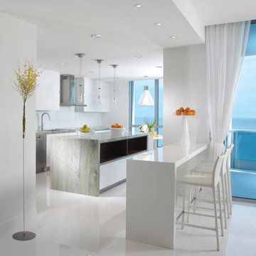
 J Design Group - Interior Designers Miami - Modern
AVENTURA MAGAZINE selected our client’s luxury 5000 Sf ocean front apartment in Miami Beach, to publish it in their issue and they Said:
Story by Linda Marx, Photography by Daniel Newcomb
Light & Bright
New York snowbirds redesigned their Miami Beach apartment to take advantage of the tropical lifestyle.
WHEN INTERIOR DESIGNER JENNIFER CORREDOR was asked to recreate a four-bedroom, six-bath condominium at The Bath Club in Miami Beach, she seized the opportunity to open the rooms and better utilize the vast ocean views.
In five months last year, the designer transformed a dark and closed 5,000-square-foot unit located on a high floor into a series of sweeping waterfront spaces and updated the well located apartment into a light and airy retreat for a sports-loving family of five.
“They come down from New York every other weekend and wanted to make their waterfront home a series of grand open spaces,” says Corrredor, of the J. Design Group in Coral Gables, a firm specializing in modern and contemporary interiors. “Since many of the rooms face the ocean, it made sense to open and lighten up the home, taking advantage of the awesome views of the sea and the bay.”
The designer used 40 x 40 all white tile throughout the apartment as a clean base. This way, her sophisticated use of color would stand out and bring the outdoors in.
The close-knit family members—two parents and three boys in college—like to do things together. But there were situations to overcome in the process of modernizing and opening the space. When Corredor was briefed on their desires, nothing seemed too daunting. The confident designer was ready to delve in. For example, she fixed an area at the front door
that was curved. “The wood was concave so I straightened it out,” she explains of a request from the clients. “It was an obstacle that I overcame as part of what I do in a redesign. I don’t consider it a difficult challenge. Improving what I see is part of the process.”
She also tackled the kitchen with gusto by demolishing a wall. The kitchen had formerly been enclosed, which was a waste of space and poor use of available waterfront ambience. To create a grand space linking the kitchen to the living room and dining room area, something had to go. Once the wall was yesterday’s news, she relocated the refrigerator and freezer (two separate appliances) to the other side of the room. This change was a natural functionality in the new open space. “By tearing out the wall, the family has a better view of the kitchen from the living and dining rooms,” says Corredor, who also made it easier to walk in and out of one area and into the other. “The views of the larger public space and the surrounding water are breathtaking.
Opening it up changed everything.”
They clients can now see the kitchen from the living and dining areas, and at the same time, dwell in an airy and open space instead of feeling stuck in a dark enclosed series of rooms. In fact, the high-top bar stools that Corredor selected for the kitchen can be twirled around to use for watching TV in the living room.
In keeping with the theme of moving seamlessly from one room to the other, Corredor designed a subtle wall of glass in the living room along with lots of comfortable seating. This way, all family members feel at ease while relaxing, talking, or watching sporting events on the large flat screen television. “For this room, I wanted more open space, light and a supreme airy feeling,” she says. “With the glass design making a statement, it quickly became the star of the show.”…….
….. To add texture and depth, Jennifer Corredor custom created wood doors here, and in other areas of the home. They provide a nice contrast to the open Florida tropical feel. “I added character to the openness by using exotic cherry wood,” she says. “I repeated this throughout the home and it works well.”
Known for capturing the client’s vision while adding her own innovative twists, Jennifer Corredor lightened the family room, giving it a contemporary and modern edge with colorful art and matching throw pillows on the sofas. She added a large beige leather ottoman as the center coffee table in the room. This round piece was punctuated with a bold-toned flowering plant atop. It effortlessly matches the pillows and colors of the contemporary canvas.
Miami,
Miami Interior Designers,
Miami Interior Designer,
Interior Designers Miami,
Interior Designer Miami,
Modern Interior Designers,
Modern Interior Designer,
Modern interior decorators,
Modern interior decorator,
Contemporary Interior Designers,
Contemporary Interior Designer,
Interior design decorators,
Interior design decorator,
Interior Decoration and Design,
Black Interior Designers,
Black Interior Designer,
Interior designer,
Interior designers,
Interior design decorators,
Interior design decorator,
Home interior designers,
Home interior designer,
Interior design companies,
Interior decorators,
Interior decorator,
Decorators,
Decorator,
Miami Decorators,
Miami Decorator,
Decorators Miami,
Decorator Miami,
Interior Design Firm,
Interior Design Firms,
Interior Designer Firm,
Interior Designer Firms,
Interior design,
Interior designs,
Home decorators,
Interior decorating Miami,
Best Interior Designers,
Interior design decorator,
Miami Beach
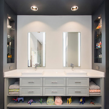
 Alair Homes Plano
The master bathroom remodel was a must! The homeowners hated the existing tile and workmanship. The old bathroom had small split vanities, poor lighting and not enough space. We removed the unused bathtub to free up space for their fun eclectic painted furniture. We installed a frameless shower and added a teak folding shower seat. The new shaker cabinets were painted in Stamped Concrete (SW7655), contrasting with the Web Gray walls. Modela Integrated light custom vanity mirrors were hung above each sink, helped to brighten this master bath in addition to the added recessed lighting. The original built in shelves were redesigned with glass shelves to open them up but keep the added need for storage and to showcase the homeowners travel keepsakes. A heated towel rack was hung on the wall for an additional cozy element. The bathroom is now 100% usable space and the clients love the look! Design by Hatfield Builders & Remodelers | Photography by Versatile Imaging
Find the right local pro for your project
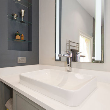 Alair Homes Plano
The master bathroom remodel was a must! The homeowners hated the existing tile and workmanship. The old bathroom had small split vanities, poor lighting and not enough space. We removed the unused bathtub to free up space for their fun eclectic painted furniture. We installed a frameless shower and added a teak folding shower seat. The new shaker cabinets were painted in Stamped Concrete (SW7655), contrasting with the Web Gray walls. Modela Integrated light custom vanity mirrors were hung above each sink, helped to brighten this master bath in addition to the added recessed lighting. The original built in shelves were redesigned with glass shelves to open them up but keep the added need for storage and to showcase the homeowners travel keepsakes. A heated towel rack was hung on the wall for an additional cozy element. The bathroom is now 100% usable space and the clients love the look! Design by Hatfield Builders & Remodelers | Photography by Versatile Imaging
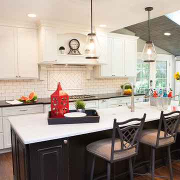
 Advance Design Studio, Ltd.
The major kitchen renovation of this old country farmhouse was a task of love, one that had been planned for many years by these Barrington seasoned homeowners. After interviewing no less than five companies, the homeowners chose the design team at Advance Design Studio to make the transformation they had long planned for.
“They had an understanding of the right design for the space almost from the instant they walked in the room”, says Sharon Scott of the design team of Nicole Ryan at Todd Jurs at Advance Design Studio. “They were the only designers who laid out ideas in the first meeting at the house that we really loved”, she says. “It was obvious that they understood the house, and understood us - and from then on the decision to hire them literally made itself”.
The original kitchen had a dividing “wall” of cabinetry…that made the rather large space seem very small, and cut off the kitchen from the eating area that has a beautiful garden view completely hidden from the main kitchen. Circulation was poor, leaving family members on top of one another when entertaining family and friends.
The new kitchen design nearly doubles the kitchen size within the original space; opening it up completely and enjoying an expansive island containing a new Kohler Whitehaven Smart Divide farm sink, a dishwasher, and pull out double trash receptacle. The great new gathering space accommodates four pull out stools beckoning grandchildren and friends alike. Removing the range from the island and relocating it to create a dramatic “feature” wall, completely out of the way of guests; it is now crowned with a beautiful completely customized wood hood designed to ventilate much more efficiently than the original island range containing a limited downdraft system.
The much more efficient use of the space after removing a pantry closet made way for a fully functional “tall wall” housing a double oven and refrigerator, out of the way of guests. Removing the restrictive cabinetry wall now allowed for an expansive floor to ceiling pantry cabinet with full extension pull out shelving, and an elegant display area complete with a beautiful furniture detailed buffet.
Fitting perfectly into the farmhouse charm of the old estate, Medallion Silver Lancaster cabinetry was chosen in a soft white Maple Divinity paint finish lining the perimeter. The stunning island hints to this old home’s past with Medallion Gold’s Maple Devonshire style graced with a Carriage Black Heirloom painted finish. The rubbed off black paint finish reveals the soft wood tones beneath, mimicking furniture you’d see in your grandmother’s home that has lovingly been polished for years to reveal a soft, subtly rubbed-off sheen.
Counter tops reverse contrast with perimeter tops of black “Raven” granite possessing a subtle honed finish, and a shift to Quartz Difinity Viareggio - resembling white Carrera marble on the island. A simple herringbone detail completes the decorative range wall, and subtle porcelain subway tiles grace the backsplash throughout.
The design is finished off with crisp Thermador and Bosch stainless steel appliances, and bright brushed cup pull and handle combination hardware. A pull down Kohler Bellaria faucet makes cleanup a breeze, and soft under-cabinet LED lighting throughout makes every work surface shine softly, and highlights the cabinetry display area with grace.
One special detail was created to make the dramatic ceiling transition to a vaulted area above the breakfast nook extra special. A tongue and groove solid wood ceiling was hung above, and a subtle greenish-grey distressed paint finish was hand developed on site by the talented crew, complementing the new kitchen with a completely unique surface that appears as if it’s been there for many, many years. It’s just one standout feature in the amazing new space that is sure to be in every conversation as newcomers enjoy the newest best hangout in this old home renewed!
After 30 years of renovating homes, this now content homeowner sips a cup of tea enjoying her new garden view, and reminisces projects of past – and lastly reports their experience with Advance Design Studio culminating with their amazing new kitchen to be the most enjoyable and satisfying home experience yet.
Designer: Nicole Ryan
Photographer: Joe Nowak
 Twelve Stones Designs, LLC
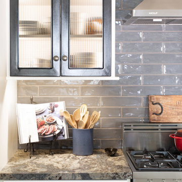
The owners of this kitchen had spent the money to upgrade the finishes in their kitchen upon building the home 12 years ago, but after living in the space for several years they realized how nonfunctional the layout really was. The (then) two preschool aged children had grown into busy, hungry teenagers with many friends who also liked to hang out at the house. So the family needed a more functional kitchen with better traffic flow, space for daily activities revolving around the kitchen at different times of day, and a kitchen that could accommodate cooking for and serving large groups. Furthermore, the dark, traditional finishes no longer reflected the homeowners’ style. They requested a brighter, more relaxed, coastal style that reflected their love of the seaside cities they like to visit.
Originally, the kitchen was U-shaped with a narrow island in the middle. The island created narrow aisles that bottle-necked at the dishwasher, refrigerator, and cooktop areas. There was a pass-through from the foyer into the kitchen, but the owners never liked that the pass-through was also located so close to the powder room. The awkward proximity was unappealing and made guests feel uncomfortable.
The kitchen’s storage was made up of lots of narrow cabinets, apothecary drawers, clipped corner units, and very few drawers. It lacked useful storage for the larger items the family used on a daily basis. And the kitchen’s only pantry was small closet that had only builder-grade, narrow shelving with no illumination to be able to see the contents inside.
Overall, the kitchen’s lighting plan was poorly executed. Only six recessed cans illuminated the entire kitchen and nook areas. The under cabinet lighting was not evenly distributed either. In fact, the builder had mis-placed the under cabinet lighting around the decorative pilasters which made for choppy, dark cubbies. Further, the builder didn’t include any lighting over the sink or the bar area, which meant whoever was doing the dishes was always in their own shadow. That, coupled with the steep overhang of the game room above made the bar area feel like a dim, cavernous space that wasn’t inviting or task oriented. The kitchen looked out into the main living space, but the raised bar and a narrow wall (which held the only large cabinet in the kitchen) created more of a barrier than a relationship to the living room or breakfast nook. In fact, one couldn’t even see the breakfast nook from the cooktop or sink areas due to its orientation. The raised bar top was too narrow to comfortably sit to either dine at or chat from due to the lack of knee space. The the homeowners confided that the kitchen felt more like a dark, dirty prison than place where the family, or their guests, wanted to gather and commune.
The clients' needs and desires were:
➢ to create a kitchen that would be a space the family loved to be in; to relate to the adjacent spaces all around, and to have better flow for entertaining large groups
➢ to remove the walls between the breakfast nook and living area and to be able to utilize the natural light from the windows in both those areas
➢ to incorporate a functional chopping block for prepping fresh food for home cooked meals, an island with a large sink and drain board, 2 pull out trash cans, and seating for at least the 2 teens to eat or do homework
➢ to design a kitchen and breakfast nook with an airy, coastal, relaxed vibe that blended with the rest of the house's coastal theme
➢ to integrate a layered lighting plan which would include ample general illumination, specific task lighting, decorative lighting, and lots of illuminated storage
➢ to design a kitchen with not only more storage for all the husband’s kitchen gadgets and collection of oils and spices, but smart storage, including a coffee/breakfast bar and a place to store and conceal the toaster oven and microwave
➢ to find a way to utilize the large open space between the kitchen, pantry area, and breakfast nook
Twelve Stones Designs achieved the owner's goals by:
➢ removing the walls between the kitchen and living room to allow the natural light to filter in from the adjacent rooms and to create a connection between the kitchen, nook, and living spaces for a sense of unity and communion
➢ removing the existing pantry and designing 3 large pantry style cabinets with LED tape lights and rollout drawers to house lots of kitchen appliances, gadgets, and tons of groceries. We also took the cabinets all the way up to the 9’ ceiling for additional storage for seasonal items and bulk storage.
➢ designing 2 islands - 1 with a gorgeous black walnut chopping block that houses a drawer for chopping and carving knives and a custom double pull out trash unit for point of use utilization - and 1 that houses the dishwasher, a large Blanco Gourmet sink with integrated drain board, woven baskets for fresh root vegetables and kitchen towels, plenty of drawer storage for kitchen items, and bar seating for up to 4 diners.
➢ closing off the space between the kitchen and the powder room to create a beautiful new private alcove for the powder room as well as adding some decorative storage. This also gave us space to include more tall storage near the new range for precision placement of the husband’s extensive oil and spice collection as well as a location for a combo-steam oven the wife wanted for baking and cooking healthy meals.
The project is enhanced functionally by:
➢ incorporated USB and standard receptacles for the kids’ laptops and phone charging in the large island
➢ designing the small island to include additional open shelving for items used on a daily basis such as a variety of bowls, plates, and colanders. This set up also works well for the husband who prefers to “plate” his dinners in restaurant-style fashion before presenting them to the table.
➢ the integration of specific storage units, such as double stacked cutlery drawers, a custom spice pull-out, a Kuerig coffee and tea pod drawer, and custom double stacked utensil drawers
➢ moving the refrigerator to the old oven location - this eliminated the bottle neck as well as created a better relationship to the eating table. It also utilizes the floor space between the pantry, nook, and kitchen
➢ creating a banquet style breakfast nook - this banquette seating not only doubles the amount of seating for large gatherings but it better utilizes the odd space between the kitchen and the previous nook area. It also helps to create a distinct pathway from the mudroom room through the pantry area, kitchen, nook, and living room.
➢ the coffee/breakfast bar area which includes the perfect location for the concealed microwave and toaster oven, convenient storage for the coffee pods and tea accoutrements. Roll-out drawers below also house the smoothie maker, hot water kettle, and a plethora of smoothie-making ingredients such as protein powders, smoothie additives, etc. Furthermore, the drawers below the Keurig house measuring utensil, cutlery, baking supplies and tupperware storage.
➢ incorporating lots of wide drawers and pullouts to accommodate large cookware.
➢ utilizing as much vertical space as possible by building storage to the ceiling which accommodates the family’s abundant amount of serving platters, baking sheets, bakeware, casserole dishes, and additional cutting boards.
The project is enhanced aesthetically by:
➢ new 5-piece Versailles pattern porcelain tile that now seamlessly joins the entire down stairs area together creating a bright, cohesiveness feeling instead of choppy separated spaces - it also adds a coastal feeling
➢ designing a cabinet to conceal the microwave and toaster oven
➢ the coastal influenced light fixtures over the nook table and island
➢ the sandy colors of the Langdon Cambria countertops. The swirling pattern and sparkling quartz pieces remind the homeowner of black-and-tan sandy beaches
➢ the striped banquet seating whose creamy white background and blue-green stripes were the inspiration for the cabinet and wall colors.
➢ All the interior doors were painted black to coordinate with the blacks and grays in the backsplash tile and countertop. This also adds a hint of tailored formality to an otherwise casual space.
➢ the use of WAC's Oculux small aperture LED units for the overhead lighting complimented with Diode LED strips for task lighting under the cabinets and inside the pantry and glass wall cabinets. All of the lighting applications are on separate dimmer switches.
Innovative uses of materials or construction methods by Realty Restoration LLC:
➢ Each 1-1/2” x 3” block of reclaimed end-grain black walnut that makes up the center island chopping block was hand milled and built in the shop. It was designed to look substantial and proportional to the surrounding elements, executed by creating the 4 inch tall top with a solid wood chamfered edge band.
➢ The metal doors on either side of the vent hood were also custom designed for this project and built in the Realty Restoration LLC shop. They are made 1x2, 11-gauge mild steel with ribbed glass. Weighing 60 lbs a piece, heavy duty cabinet hinges were added to support the weight of the door and keep them from sagging.
➢ Under-cabinet receptacles were added along the range wall in order to have a clean, uninterrupted backsplash.
Design obstacles to overcome:
➢ Because we were removing the demising walls between the kitchen and living room, we had to find a way to plumb and vent the new island. We did this by tunneling through the slab (the slab had post tension cables which prevented us from just trenching) to run a new wet vent through a nearby structural wall. We pulled the existing hot and cold lines between upper floor joists and ran them down the structural wall as well and up through a conduit in the tunnel.
➢ Since we were converting from wall overs to a gas range it allowed us to utilize the 220 feed for the wall ovens to provide a new sub panel for all the new kitchen circuits
➢ Due to framing deficiencies inherited from the original build there was a 1-1/2” differential in the floor-to-ceiling height over a 20 foot span; by utilizing the process of cutting and furring coupled with the crown moulding details on the cabinet elevations we were able to mask the problem and provide seamless transitions between the cabinet components.
Evidence of superior craftsmanship:
➢ uniquely designed, one-of-a-kind metal “X” end panels on the large island. The end panels were custom made in the Realty Restoration LLC shop and fitted to the exact dimensions of the island. The welding seams are completely indistinguishable - the posts look like they are cut from a single sheet of metal
➢ square metal posts on the small island were also custom made and designed to compliment and carry through the metal element s throughout the kitchen
➢ the beautiful, oversized end panels on the pantry cabinets which give the breakfast nook a tailored look
➢ integrating a large format 5 piece Versailles tile pattern to seamlessly flow from the existing spaces into the new kitchen space
➢ By constructing a custom cabinet that jogged around a corner we could not remodel (housing the entry way coat closet) we were able to camouflage the adjacent wall offset within the upper and lower cabinets. By designing around the existing jog in the structural walls we accomplished a few things: we were able to find the space to house, and hide, the microwave and toaster oven yet still have a clean cohesive appearance from the kitchen side. Additionally, the owners were able to keep their much needed coat closet and we didn’t have to increase the budget with unnecessary structural work.
 Alair Homes Plano
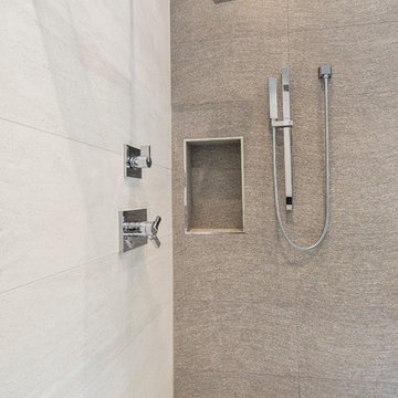
The master bathroom remodel was a must! The homeowners hated the existing tile and workmanship. The old bathroom had small split vanities, poor lighting and not enough space. We removed the unused bathtub to free up space for their fun eclectic painted furniture. We installed a frameless shower and added a teak folding shower seat. The new shaker cabinets were painted in Stamped Concrete (SW7655), contrasting with the Web Gray walls. Modela Integrated light custom vanity mirrors were hung above each sink, helped to brighten this master bath in addition to the added recessed lighting. The original built in shelves were redesigned with glass shelves to open them up but keep the added need for storage and to showcase the homeowners travel keepsakes. A heated towel rack was hung on the wall for an additional cozy element. The bathroom is now 100% usable space and the clients love the look! Design by Hatfield Builders & Remodelers | Photography by Versatile Imaging

Sponsored
Sunbury, OH

J.Holderby - Renovations
Franklin County's Leading General Contractors - 2X Best of Houzz!
 Kathy Tufts Beyond Design, Inc.
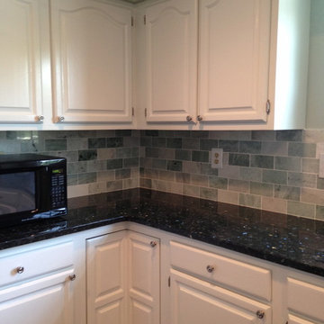
Kitchen update in Ashburn, VA. Cabinets - Sherwin Williams "Spare White", wall color in Sherwin Williams "Sea Salt", Subway tile backsplash - Amalfi Green Marble, granite countertops - Emerald Pearl
 Chester County Kitchen & Bath
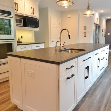
Big changes at this Wayne Pa kitchen remodel. This homes original kitchen was tight and poorly designed for the space. We removed a wall between the kitchen and an adjoining sitting room as well as a ton of inefficient framed pantries and closets to open up the space. We installed a new 7 ½’ window overlooking the backyard patio and pool as well as bringing great natural light into the space. With a family of 5 this customer needed lots of storage and fridge space. We designed the new kitchen with this in mind. The Fabuwood cabinetry in the Galaxy Frost door style gives this kitchen a clean bright feel and all the pantries and 2 fridges give the customer all the storage they could dream of. The flooring was replaced throughout the first floor and kitchen with kid and lifestyle friendly Coretec waterproof luxury vinyl which will hold up to plenty of wet feet from the backyard pool. The steel grey granite with a leathered finish has a smooth textured feel and coordinates well with the flooring and other finishes. The tile backsplash was installed in a herring bone pattern adds to this awesome new look. Everything was expertly installed by lead carpenters Steve McHenry and Rick Morro. What a great project with happy homeowners.
 Creative Design Landscapes
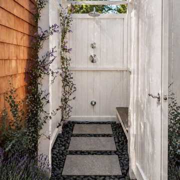
This project involved the removal of an aging wood shower enclosure and surrounding fencing, which had begun to deteriorate and contribute to poor drainage conditions. The existing area retained moisture, creating a muddy, unstable surface that impacted both usability and long-term durability.
The redesigned space introduces a fully upgraded outdoor shower system positioned discreetly behind a new white privacy enclosure. The structure was selected for its clean architectural lines, low-maintenance material, and ability to brighten and modernize the space while maintaining privacy.
A primary focus of the project was drainage correction. The ground plane was regraded and rebuilt using a permeable system consisting of oversized stone slabs set within polished black river rock. This layout allows water to move efficiently through the surface while maintaining a stable, clean, and visually refined finish. The contrast between the large-format slabs and the dark stone creates a structured, intentional foundation that elevates the overall design.
Planting was incorporated with both aesthetic and functional intent. Lavender was installed and trained along the enclosure to soften the structure and introduce seasonal fragrance. In addition to its visual contribution, it serves as a natural pest deterrent, helping to reduce mosquito activity and improve comfort within the space. Supporting plant material was kept minimal and scaled appropriately to maintain a clean, uncluttered environment.
The result is a fully integrated outdoor feature that transforms a previously underperforming area into a functional, durable, and visually cohesive extension of the home. The space now supports consistent use while delivering a refined, spa-like experience aligned with the surrounding landscape.
 Alair Homes Plano
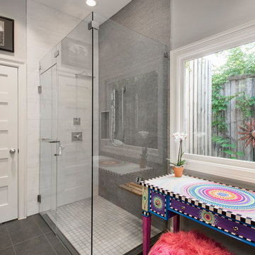
The master bathroom remodel was a must! The homeowners hated the existing tile and workmanship. The old bathroom had small split vanities, poor lighting and not enough space. We removed the unused bathtub to free up space for their fun eclectic painted furniture. We installed a frameless shower and added a teak folding shower seat. The new shaker cabinets were painted in Stamped Concrete (SW7655), contrasting with the Web Gray walls. Modela Integrated light custom vanity mirrors were hung above each sink, helped to brighten this master bath in addition to the added recessed lighting. The original built in shelves were redesigned with glass shelves to open them up but keep the added need for storage and to showcase the homeowners travel keepsakes. A heated towel rack was hung on the wall for an additional cozy element. The bathroom is now 100% usable space and the clients love the look! Design by Hatfield Builders & Remodelers | Photography by Versatile Imaging
 Nip Tuck Remodeling
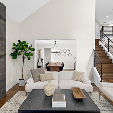
This home had dated and falling apart finishes, an insignificant fireplace in a giant living room, and a poor layout in the family room. Not to mention the primary bath covered in bamboo wallpaper.
The clients wanted a functional, updated and good looking kitchen, a more adult family room, an updated serene primary bath. The remaining baths to be updated and modern. And, to make it feel like a holistic update, they wanted a welcoming staircase/entry.
As with most clients, stretching their dollar as far as possible was important. They didn't want to enlarge any footprint or move walls - we had to stay within existing bounds. With a whole home remodel costs can add-up quickly depending on where we start & stop. For this family it made sense to do all the work at once to avoid repeat remodels. It was either buy new and still have to customize, or remodel to their exact needs and wants. The remodel was more affordable and made just for them.
Many finishes are clean, simple and modern. A window was removed! in the family room to allow for a symmetrical entertainment center. A dramatic floor to ceiling fireplace surround was created in the Living room. The staircase was totally redone in both shape and style! The primary bath was reworked to get a two-person shower, and soaking tub. Serene /quiet finishes in the primary helped achieve a mellow /calming atmosphere. All new doors and trim throughout.
 Jakob Morse Flooring Installation
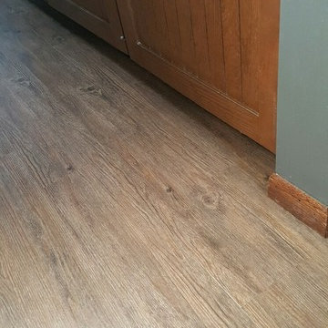
The color of the floor has a great blend between the richness of the brown and the coolness of the gray. The tile is next!
Example of a small country kids' yellow tile and ceramic tile vinyl floor drop-in bathtub design with recessed-panel cabinets, brown cabinets, a two-piece toilet, gray walls, a drop-in sink and laminate countertops
Example of a small country kids' yellow tile and ceramic tile vinyl floor drop-in bathtub design with recessed-panel cabinets, brown cabinets, a two-piece toilet, gray walls, a drop-in sink and laminate countertops

 HUNTER DOUGLAS-LNG BLINDS
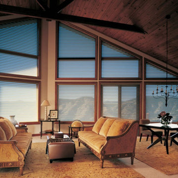
4 Benefits of Using Window Treatments
1. Privacy
Keep your private matters private with window treatments. Window treatments are available in several designs that vary the level of privacy given. Many people have become accustomed to purchasing window treatments at a department store where they’re surrounded by poor quality products and little selection. Moreover, they settle for curtains that are highly opaque and sacrifice their natural light for privacy. This is not the only solution. We offer many options that will let you have control of privacy and lighting.
2. Light Control
The material of your window treatments and their structure plays a huge role in how much light can enter a room. We carry all types of treatments from light filtering sheer drapes to black out shades. For maximum control consider horizontal or vertical blinds. These blinds make it easy to redirect light. However, if you’d like to maintain a view, bottom up/top down options might be the way to go.
3. Protection
UV rays can damage your floors, ruin artwork, and cause fading to furniture. Shades, blinds, and shutters can all keep your furnishings in pristine condition by blocking harmful UV light.
4. Energy Efficiency
Window treatments are good insulators. During the summer months closed blinds can keep heat from entering, and during the winter they can keep warmth contained. For maximum energy efficiency, consider cellular shades, dual shades, roman shades, shutters, or draperies.
LNG Blinds
19 Addison Pl
Valley Stream, NY 11580
Call Us (516) 593-0044
#homesweethome #homedecor #lovemyhome #barenecessities #windows #instastyle #instadesign #interiordesign#blinds #privacy #embellishment #instahomes #propertyowner #renovation #customblindsbydesign #showcase #displays #windowtreatments #windowcoverings #shades #shutters #drapery #interiors #decor
 Nip Tuck Remodeling
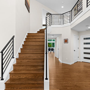
This home had dated and falling apart finishes, an insignificant fireplace in a giant living room, and a poor layout in the family room. Not to mention the primary bath covered in bamboo wallpaper.
The clients wanted a functional, updated and good-looking kitchen, a more adult family room, an updated serene primary bath. The remaining baths to be updated and modern. And, to make it feel like a holistic update, they wanted a welcoming staircase/entry.
As with most clients, stretching their dollar as far as possible was important. They didn't want to enlarge any footprint or move walls - we had to stay within existing bounds. With a whole home remodel costs can add up quickly depending on where we start & stop. For this family it made sense to do all the work at once to avoid repeat remodels. It was either buy new and still have to customize, or remodel to their exact needs and wants. The remodel was more affordable and made just for them.
Many finishes are clean, simple, and modern. A window was removed! in the family room to allow for a symmetrical entertainment center. A dramatic floor to ceiling fireplace surround was created in the Living room. The staircase was totally redone in both shape and style! The primary bath was reworked to get a two-person shower, and soaking tub. Serene /quiet finishes in the primary helped achieve a mellow /calming atmosphere. All new doors and trim throughout.
 Chester County Kitchen & Bath
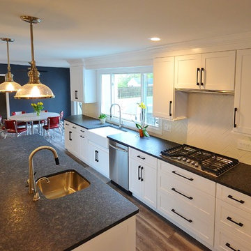
Big changes at this Wayne Pa kitchen remodel. This homes original kitchen was tight and poorly designed for the space. We removed a wall between the kitchen and an adjoining sitting room as well as a ton of inefficient framed pantries and closets to open up the space. We installed a new 7 ½’ window overlooking the backyard patio and pool as well as bringing great natural light into the space. With a family of 5 this customer needed lots of storage and fridge space. We designed the new kitchen with this in mind. The Fabuwood cabinetry in the Galaxy Frost door style gives this kitchen a clean bright feel and all the pantries and 2 fridges give the customer all the storage they could dream of. The flooring was replaced throughout the first floor and kitchen with kid and lifestyle friendly Coretec waterproof luxury vinyl which will hold up to plenty of wet feet from the backyard pool. The steel grey granite with a leathered finish has a smooth textured feel and coordinates well with the flooring and other finishes. The tile backsplash was installed in a herring bone pattern adds to this awesome new look. Everything was expertly installed by lead carpenters Steve McHenry and Rick Morro. What a great project with happy homeowners.
 Advance Design Studio, Ltd.
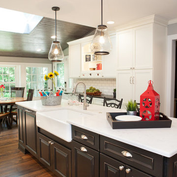
The major kitchen renovation of this old country farmhouse was a task of love, one that had been planned for many years by these Barrington seasoned homeowners. After interviewing no less than five companies, the homeowners chose the design team at Advance Design Studio to make the transformation they had long planned for.
“They had an understanding of the right design for the space almost from the instant they walked in the room”, says Sharon Scott of the design team of Nicole Ryan at Todd Jurs at Advance Design Studio. “They were the only designers who laid out ideas in the first meeting at the house that we really loved”, she says. “It was obvious that they understood the house, and understood us - and from then on the decision to hire them literally made itself”.
The original kitchen had a dividing “wall” of cabinetry…that made the rather large space seem very small, and cut off the kitchen from the eating area that has a beautiful garden view completely hidden from the main kitchen. Circulation was poor, leaving family members on top of one another when entertaining family and friends.
The new kitchen design nearly doubles the kitchen size within the original space; opening it up completely and enjoying an expansive island containing a new Kohler Whitehaven Smart Divide farm sink, a dishwasher, and pull out double trash receptacle. The great new gathering space accommodates four pull out stools beckoning grandchildren and friends alike. Removing the range from the island and relocating it to create a dramatic “feature” wall, completely out of the way of guests; it is now crowned with a beautiful completely customized wood hood designed to ventilate much more efficiently than the original island range containing a limited downdraft system.
The much more efficient use of the space after removing a pantry closet made way for a fully functional “tall wall” housing a double oven and refrigerator, out of the way of guests. Removing the restrictive cabinetry wall now allowed for an expansive floor to ceiling pantry cabinet with full extension pull out shelving, and an elegant display area complete with a beautiful furniture detailed buffet.
Fitting perfectly into the farmhouse charm of the old estate, Medallion Silver Lancaster cabinetry was chosen in a soft white Maple Divinity paint finish lining the perimeter. The stunning island hints to this old home’s past with Medallion Gold’s Maple Devonshire style graced with a Carriage Black Heirloom painted finish. The rubbed off black paint finish reveals the soft wood tones beneath, mimicking furniture you’d see in your grandmother’s home that has lovingly been polished for years to reveal a soft, subtly rubbed-off sheen.
Counter tops reverse contrast with perimeter tops of black “Raven” granite possessing a subtle honed finish, and a shift to Quartz Difinity Viareggio - resembling white Carrera marble on the island. A simple herringbone detail completes the decorative range wall, and subtle porcelain subway tiles grace the backsplash throughout.
The design is finished off with crisp Thermador and Bosch stainless steel appliances, and bright brushed cup pull and handle combination hardware. A pull down Kohler Bellaria faucet makes cleanup a breeze, and soft under-cabinet LED lighting throughout makes every work surface shine softly, and highlights the cabinetry display area with grace.
One special detail was created to make the dramatic ceiling transition to a vaulted area above the breakfast nook extra special. A tongue and groove solid wood ceiling was hung above, and a subtle greenish-grey distressed paint finish was hand developed on site by the talented crew, complementing the new kitchen with a completely unique surface that appears as if it’s been there for many, many years. It’s just one standout feature in the amazing new space that is sure to be in every conversation as newcomers enjoy the newest best hangout in this old home renewed!
After 30 years of renovating homes, this now content homeowner sips a cup of tea enjoying her new garden view, and reminisces projects of past – and lastly reports their experience with Advance Design Studio culminating with their amazing new kitchen to be the most enjoyable and satisfying home experience yet.
Designer: Nicole Ryan
Photographer: Joe Nowak




 Henry Poor Lumber
Dave Mason-ISPhotographic
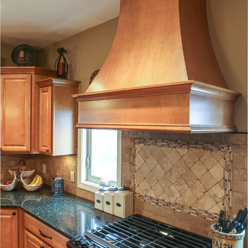
Open concept kitchen - large traditional u-shaped medium tone wood floor and brown floor open concept kitchen idea with an undermount sink, raised-panel cabinets, medium tone wood cabinets, granite countertops, beige backsplash, travertine backsplash, black appliances and an island
Open concept kitchen - large traditional u-shaped medium tone wood floor and brown floor open concept kitchen idea with an undermount sink, raised-panel cabinets, medium tone wood cabinets, granite countertops, beige backsplash, travertine backsplash, black appliances and an island
 Mihaly Slocombe
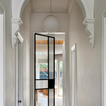
Brunswick Parlour transforms a Victorian cottage into a hard-working, personalised home for a family of four.
Our clients loved the character of their Brunswick terrace home, but not its inefficient floor plan and poor year-round thermal control. They didn't need more space, they just needed their space to work harder.
The front bedrooms remain largely untouched, retaining their Victorian features and only introducing new cabinetry. Meanwhile, the main bedroom’s previously pokey en suite and wardrobe have been expanded, adorned with custom cabinetry and illuminated via a generous skylight.
At the rear of the house, we reimagined the floor plan to establish shared spaces suited to the family’s lifestyle. Flanked by the dining and living rooms, the kitchen has been reoriented into a more efficient layout and features custom cabinetry that uses every available inch. In the dining room, the Swiss Army Knife of utility cabinets unfolds to reveal a laundry, more custom cabinetry, and a craft station with a retractable desk. Beautiful materiality throughout infuses the home with warmth and personality, featuring Blackbutt timber flooring and cabinetry, and selective pops of green and pink tones.
The house now works hard in a thermal sense too. Insulation and glazing were updated to best practice standard, and we’ve introduced several temperature control tools. Hydronic heating installed throughout the house is complemented by an evaporative cooling system and operable skylight.
The result is a lush, tactile home that increases the effectiveness of every existing inch to enhance daily life for our clients, proving that good design doesn’t need to add space to add value.
27