
Search results for "Poor colors" in Home Design Ideas
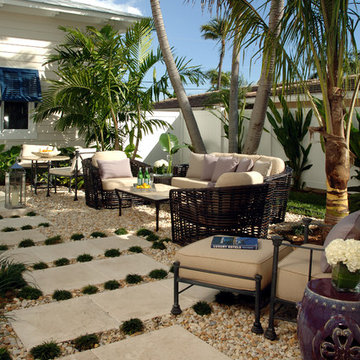
 Frances Herrera Interior Design
This guest house and courtyard was part of the 2014 Designer Show House in Lighthouse Point, Florida benefitting Food for the Poor.
My vision was a space that allowed guests to be transported, which is why I selected the guesthouse and courtyard. With careful attention to every detail, I created a modern sanctuary filled with exquisite, unique pieces that revive the spirit and inspire curiosity. It's a space where guests will feel transported with exotic elegance and leave invigorated.
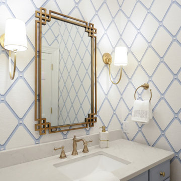
 Corinthian Fine Homes
Our busy young homeowners were looking to move back to Indianapolis and considered building new, but they fell in love with the great bones of this Coppergate home. The home reflected different times and different lifestyles and had become poorly suited to contemporary living. We worked with Stacy Thompson of Compass Design for the design and finishing touches on this renovation. The makeover included improving the awkwardness of the front entrance into the dining room, lightening up the staircase with new spindles, treads and a brighter color scheme in the hall. New carpet and hardwoods throughout brought an enhanced consistency through the first floor. We were able to take two separate rooms and create one large sunroom with walls of windows and beautiful natural light to abound, with a custom designed fireplace. The downstairs powder received a much-needed makeover incorporating elegant transitional plumbing and lighting fixtures. In addition, we did a complete top-to-bottom makeover of the kitchen, including custom cabinetry, new appliances and plumbing and lighting fixtures. Soft gray tile and modern quartz countertops bring a clean, bright space for this family to enjoy. This delightful home, with its clean spaces and durable surfaces is a textbook example of how to take a solid but dull abode and turn it into a dream home for a young family.
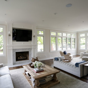 Corinthian Fine Homes
Our busy young homeowners were looking to move back to Indianapolis and considered building new, but they fell in love with the great bones of this Coppergate home. The home reflected different times and different lifestyles and had become poorly suited to contemporary living. We worked with Stacy Thompson of Compass Design for the design and finishing touches on this renovation. The makeover included improving the awkwardness of the front entrance into the dining room, lightening up the staircase with new spindles, treads and a brighter color scheme in the hall. New carpet and hardwoods throughout brought an enhanced consistency through the first floor. We were able to take two separate rooms and create one large sunroom with walls of windows and beautiful natural light to abound, with a custom designed fireplace. The downstairs powder received a much-needed makeover incorporating elegant transitional plumbing and lighting fixtures. In addition, we did a complete top-to-bottom makeover of the kitchen, including custom cabinetry, new appliances and plumbing and lighting fixtures. Soft gray tile and modern quartz countertops bring a clean, bright space for this family to enjoy. This delightful home, with its clean spaces and durable surfaces is a textbook example of how to take a solid but dull abode and turn it into a dream home for a young family.
Find the right local pro for your project
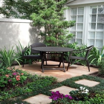
 ZODEGA | TIS
This is a very small space that measures approximately 20x14 feet and gets very little sunlight. The client is from New Orleans where they still maintain a house and wanted something that would remind them of home so we went with a contemporary take on the New Orleans-style courtyard. This space was unused and the landscape died as a result of poor soil conditions, poor drainage and heavy shade long before we took on the project. Our mission was to 1) Invite the homeowner into a space they were familiar and comfortable with, and 2) Involve all of their senses (aesthetics for the eyes, water fountain for the ears, fragrant flowers and herbs for the nose). This picture is the right side of this outdoor living space which features an area that allows the homeowner to read, one of their favorite activities, in a cozy and private environment. We used multiple flowers and colors, along with a variety of ground cover.
 Michael Nash Design, Build & Homes
2011 NARI CAPITAL COTY FINALIST AWARD WINNER
Project Scope--
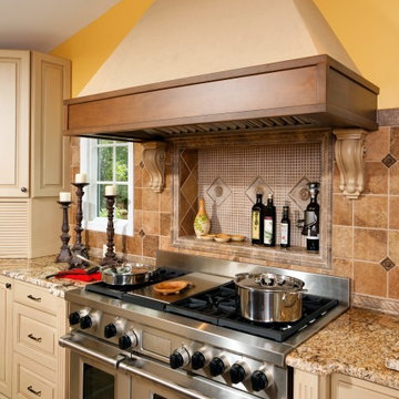
The owners of this 1990’s colonial home were seeking to convert the existing space-constricted builder-grade kitchen into a generously-apportioned Tuscan-style country kitchen with lots of natural light, high-end appointments and a warmly textured interior design concept. Among other features they sought a mid-room island that would house critical appliances, complete the work triangle and provide dining counter space for three. They also wanted to include a professional-grade gas range.
Challenges--
Situated between dining room and family room, the existing kitchen was small and poorly planned. The sink faced a blank wall and the appliances were inadequate for the owner’s gourmet cooking ambitions.
To create the desired footprint, the contractor, Michael Nash Design, Build & Homes, created a plan that called for consolidating square footage in several rooms adjacent to the kitchen. This entailed removing two load bearing walls– one between the kitchen and dining room, a second separating the kitchen and family room– and shifting loads to newly installed structural supports carefully concealed within the resultant “open” floor plan.
To accommodate new appliances (and work efficiencies) called for by this radically altered space plan, the design located the new professional gas range and other key features in the footprint formerly occupied by the breakfast room, a change that takes advantage of opportunities for a higher cathedral ceiling, better natural lighting and greater space.
Solutions--
With this space plan resolved, the design team could now eliminate a picture window on the west elevation, designing a new elevation to accommodate a stucco cooktop flanked by a pair of custom Palladium windows. A side elevation slider was replaced with a French door.
Infrastructure considerations included introducing gas lines needed for the 48” Viking cooktop range and re-routing plumbing. The 5’ x 9’ granite-surfaced custom designed island includes the primary kitchen sink, a dishwasher, microwave and dining overhang that provided seating for up to four.
On another wall, the design called for installing ceiling flush “beaded” display pantries with open bookcases, and routed-in plumbing for a water fountain, a faucet and an ice-making machine.
Glazed maple and cherry cabinetry increased available storage by over 50%. A recessed space was also created for a built-in vertical wine rack. Style-appropriate terra cotta tiling with mosaic bordering detailing extends into the home’s foyer. Other finishing work elements include crown molding with rounded turn posts and corbels.
 Corinthian Fine Homes
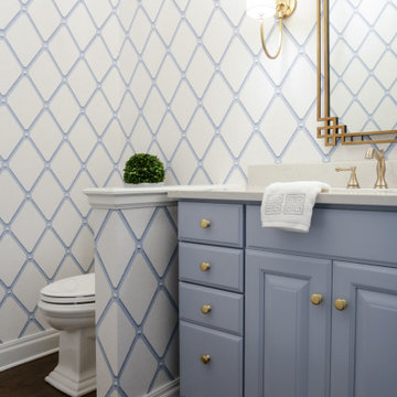
Our busy young homeowners were looking to move back to Indianapolis and considered building new, but they fell in love with the great bones of this Coppergate home. The home reflected different times and different lifestyles and had become poorly suited to contemporary living. We worked with Stacy Thompson of Compass Design for the design and finishing touches on this renovation. The makeover included improving the awkwardness of the front entrance into the dining room, lightening up the staircase with new spindles, treads and a brighter color scheme in the hall. New carpet and hardwoods throughout brought an enhanced consistency through the first floor. We were able to take two separate rooms and create one large sunroom with walls of windows and beautiful natural light to abound, with a custom designed fireplace. The downstairs powder received a much-needed makeover incorporating elegant transitional plumbing and lighting fixtures. In addition, we did a complete top-to-bottom makeover of the kitchen, including custom cabinetry, new appliances and plumbing and lighting fixtures. Soft gray tile and modern quartz countertops bring a clean, bright space for this family to enjoy. This delightful home, with its clean spaces and durable surfaces is a textbook example of how to take a solid but dull abode and turn it into a dream home for a young family.
 Corinthian Fine Homes
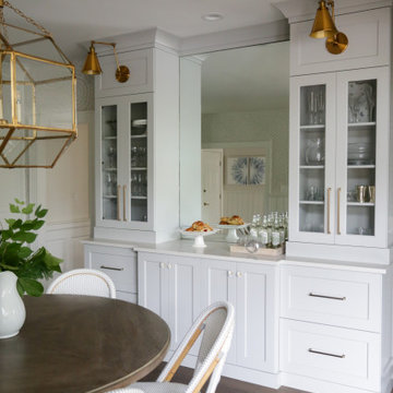
Our busy young homeowners were looking to move back to Indianapolis and considered building new, but they fell in love with the great bones of this Coppergate home. The home reflected different times and different lifestyles and had become poorly suited to contemporary living. We worked with Stacy Thompson of Compass Design for the design and finishing touches on this renovation. The makeover included improving the awkwardness of the front entrance into the dining room, lightening up the staircase with new spindles, treads and a brighter color scheme in the hall. New carpet and hardwoods throughout brought an enhanced consistency through the first floor. We were able to take two separate rooms and create one large sunroom with walls of windows and beautiful natural light to abound, with a custom designed fireplace. The downstairs powder received a much-needed makeover incorporating elegant transitional plumbing and lighting fixtures. In addition, we did a complete top-to-bottom makeover of the kitchen, including custom cabinetry, new appliances and plumbing and lighting fixtures. Soft gray tile and modern quartz countertops bring a clean, bright space for this family to enjoy. This delightful home, with its clean spaces and durable surfaces is a textbook example of how to take a solid but dull abode and turn it into a dream home for a young family.
Sponsored
Columbus, OH

Hope Restoration & General Contracting
Columbus Design-Build, Kitchen & Bath Remodeling, Historic Renovations
 Corinthian Fine Homes
Our busy young homeowners were looking to move back to Indianapolis and considered building new, but they fell in love with the great bones of this Coppergate home. The home reflected different times and different lifestyles and had become poorly suited to contemporary living. We worked with Stacy Thompson of Compass Design for the design and finishing touches on this renovation. The makeover included improving the awkwardness of the front entrance into the dining room, lightening up the staircase with new spindles, treads and a brighter color scheme in the hall. New carpet and hardwoods throughout brought an enhanced consistency through the first floor. We were able to take two separate rooms and create one large sunroom with walls of windows and beautiful natural light to abound, with a custom designed fireplace. The downstairs powder received a much-needed makeover incorporating elegant transitional plumbing and lighting fixtures. In addition, we did a complete top-to-bottom makeover of the kitchen, including custom cabinetry, new appliances and plumbing and lighting fixtures. Soft gray tile and modern quartz countertops bring a clean, bright space for this family to enjoy. This delightful home, with its clean spaces and durable surfaces is a textbook example of how to take a solid but dull abode and turn it into a dream home for a young family.

 Castle Building & Remodeling
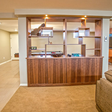
Built in 1951, this sprawling ranch style home has plenty of room for a large family, but the basement was vintage 50’s, with dark wood paneling and poor lighting. One redeeming feature was a curved bar, with multi-colored glass block lighting in the foot rest, wood paneling surround, and a red-orange laminate top. If one thing was to be saved, this was it.
Castle designed an open family, media & game room with a dining area near the vintage bar and an additional bedroom. Mid-century modern cabinetry was custom made to provide an open partition between the family and game rooms, as well as needed storage and display for family photos and mementos.
The enclosed, dark stairwell was opened to the new family space and a custom steel & cable railing system was installed. Lots of new lighting brings a bright, welcoming feel to the space. Now, the entire family can share and enjoy a part of the house that was previously uninviting and underused.
Come see this remodel during the 2018 Castle Home Tour, September 29-30, 2018!
 Chi Renovation & Design
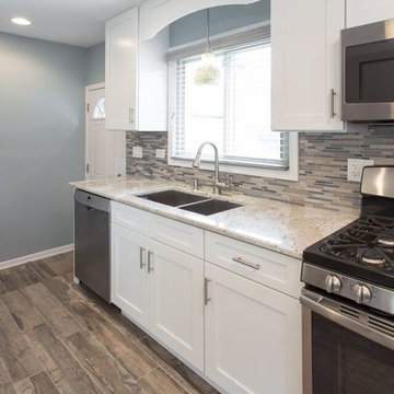
A complete gut rehab was needed to create this modern kitchen. With features such as a rustic hardwood floor, light-colored cabinets and walls, dark wooden peninsula with custom granite countertops, white wooden bar stools, can lights, subway tile backsplash, ceiling fan, and silver appliances, this space will suit this family’s needs and lifestyle for years to come.
Project designed by Skokie renovation firm, Chi Renovation & Design. They serve the Chicagoland area, and it's surrounding suburbs, with an emphasis on the North Side and North Shore. You'll find their work from the Loop through Lincoln Park, Skokie, Evanston, Wilmette, and all of the way up to Lake Forest.
For more about Chi Renovation & Design, click here: https://www.chirenovation.com/
To learn more about this project, click here: https://www.chirenovation.com/galleries/kitchen-dining/
 Voar Construction
Before the Remodel – Master Bathroom
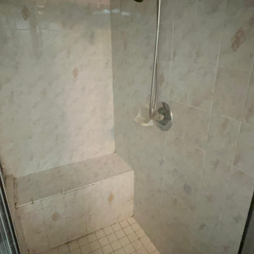
The master bathroom felt outdated and poorly designed. Despite its generous size, the space was not used efficiently: a massive, old masonry bathtub dominated the room, while the shower was uncomfortably small and unpractical. The dark tile and color choices made the entire space feel heavy and closed-in, taking away any sense of comfort or luxury. Overall, it was an old-fashioned, poorly planned bathroom in need of a complete reimagining.
 Susan Mackenzie Interiors
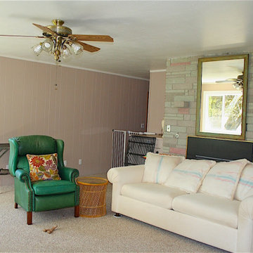
The living room was neither comfortable nor attractive with worn carpet, mismatched sofa and arm chair, and dark beige walls. The fireplace insert was not accessible. Furnishings were neither adequate nor arranged for socializing. The mirror was placed to cover some vents in the brickwork but was too too tall for the space when placed vertically. Since no one had ever figure out who much furniture to include nor how to placed it, the ceiling fan was poorly placed.

 User
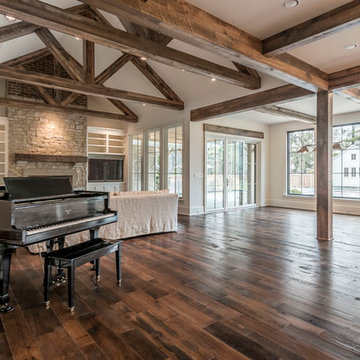
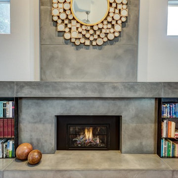
UserContemporary Napa interior with a nod to Danish Modern. Worked closely with clients to carefully choose colors, finishes, furnishings, and design details. Custom fireplace designed by Poor House's Melissa Schmitt and fabricated by SC Fabrication. Photos by Bryan Gray.
 Tile Doctor Ltd
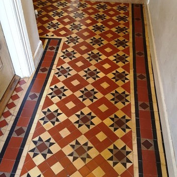
Pontcanna is a popular residential area in the western district of Cardiff, in South East Wales. Known for its rather large houses and spectacular foliage, interestingly enough roughly a quarter of the population are English folk.
I was called down to a property in the area to take a look at a Victorian tiled floor which was in quite poor condition. Along with the typical amount of dirt and muck seen on poorly maintained tiles, there were a number of missing tiles and a fair bit of cement caked on the surface of the floor.
It would require a robust clean, fresh seal, and several repairs to get this floor back into optimum condition.
To begin, I checked for excess moisture problems using a damp meter in various places of the hallway floor and, thankfully, it was showing dry results. Any dampness could have potentially caused problems later on in the restoration process, so it was s good idea to run tests before starting.
Next, I manually scraped as much of the dry paint and cement off the tiles as possible, with no lubrication necessary. I then proceeded to clean the floor with a solution I mixed early, consisting of equal parts Tile Doctor NanoTech HBU and Tile Doctor Pro Clean, rinsing as I went. Both products are designed to tackle heavy soil build-up, with the former uniquely using nano-sized particles (as the product name suggests) to penetrate deep into difficult to reach areas in the tiles in order to lift out ingrained muck.
Following the initial clean, I removed all of the loose tiles and those heavily affected by cement, before retiling as necessary with fresh Victorian tiles, and grouting the whole floor. Of course, these replacement tiles were carefully sourced to ensure consistency, as far as possible, with the original pattern of the floor.
The next day, I went over the whole floor with an application of the acid-based Tile Doctor Grout Clean Up, diluted with a little alkaline Pro Clean to form a cleaning solution. I then used a black pad to scrub the cleaner into the tiles, similarly to the previous day’s cleaning. This was followed by a through rinse with water to neutralise the floor.
It was at this point that I noticed some stubborn cement stains remained so I set about breaking them down using a 60 grade hand held diamond polishing block, and this technique proved successful.
After completing the clean, I left the floor to dry out for roughly 24 hours. Upon my return to the property to seal the tiles, I tested again for moisture. It is recommended to run damp tests before sealing, as excess moisture can cloud the sealer, affecting its performance in the long run.
Fortunately, no dampness was detected and I was proceeded to seal the floor with seven coats of Tile Doctor Seal & Go, which enhances the natural colours in the stone and provides a nice satin gloss appearance, as requested by the customer.
I was extremely pleased with the results of this restoration, as was the customer. The extent of the soil build up and damage was such before the restoration that, after completion, the floor looked like it had been newly laid!
Julian Iancono
South East Wales Tile Doctor
 Basile Landscaping & Lawn Care
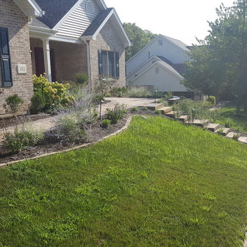
This is the view of the front landscaping from the driveway. Their poor lawn had to be ripped up due to a water main replacement and the utility company ruined it with poor seed and un-clean straw. The customer is now taking part of our lawn renovation service to clear the weeds out and grow greener grass.
 Voar Construction
Before the Remodel – Master Bathroom
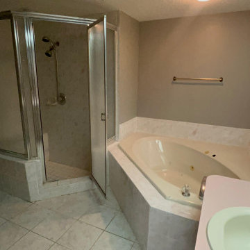
The master bathroom felt outdated and poorly designed. Despite its generous size, the space was not used efficiently: a massive, old masonry bathtub dominated the room, while the shower was uncomfortably small and unpractical. The dark tile and color choices made the entire space feel heavy and closed-in, taking away any sense of comfort or luxury. Overall, it was an old-fashioned, poorly planned bathroom in need of a complete reimagining.
Sponsored
Columbus, OH
Hope Restoration & General Contracting
Columbus Design-Build, Kitchen & Bath Remodeling, Historic Renovations
 San Luis Kitchen Co.
Surrounded by vineyards, horse ranches, and open land, the home is in a great location that is reasonably close to town while retaining a secluded air.
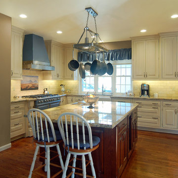
Our homeowners have enjoyed their country retreat for many years. They are blessed with a large extended family and love to host gatherings and entertain weekend guests. The only drawback to their gracious home was the drab and malfunctioning kitchen. First off, the cabinets were an out-dated whitewashed oak. Uggh! High ceilings were a plus feature that was negated by bizarrely stacked wall cabinets – making you think that maybe the original “designer” forgot about the 9 foot ceiling height. More likely, the original cabinets were stock items that didn’t come in the right size for the house. You can also see the lovely fluorescent light box tacked to the middle of the ceiling over the island. Why? Was there no thought to the style shown in the rest of the house?
Secondly, the homeowners were fighting with a poor kitchen layout. The large built-in refrigerator and separate freezer were placed right in the main traffic flow from the hall, there was not enough counter space to the right of the sink, the dishwasher was crammed right next to the fridge, and a broom closet took up prime real estate next to the cook-top. Now, remember, guests are frequent in this home and often several people were trying to use the kitchen at one time. Cross traffic and outright pile-ups were inevitable as some folks gathered veggies from the fridge to sauté at the cook-top while others were rinsing used dishes for the dishwasher and still others were taking frozen items to the prep sink and then the microwave. Don’t get me started about the trash and recycling receptacles – complete inconvenience to all!
So, our homeowners – the poor, benighted souls – were desperate for a remodel when they found San Luis Kitchen. On their first visit to our showroom, the couple fell in love with our French Country display. The display features soft white cabinets in a distressed cottage finish with a contrasting dark island and armoire; our homeowners were smitten. We knew everyone was up to the challenge and so we got right down to work.
We visited their home and measured their kitchen. While we were there, we took stock of the house’s overall style and the homeowner’s décor. We asked what they liked best about their home, what worked well and what didn’t. We found that they loved their arched passageways, the trim details on their mantle and the soft curves of the posts at their stair rail. They also showed us many photos of kitchens that they liked – both from magazines and on-line. Using this information, we went back to the office and pulled together a design.
We suggested swinging the refrigerator and freezer 90 degrees and setting them in place of the existing oven and hutch area. This brings them out of the traffic flow and into a comfortable relationship to the island counter. The fridge and freezer the homeowners chose were mismatched in width – we disguised the difference using custom detailing on the decorative panels. Deep storage cabinets above fill out the space.
Moving the fridge/freezer gained lots of luxurious counter space to the right of the new farmhouse sink. We placed the broom closet near the hall and tucked the microwave behind closed cabinet doors (which tuck away when open) to the left of it. The beautiful existing wood floor insisted that the island remain in the same location, however we replaced it with luscious cherry cabinets in an antique burnished finish. The island retained its prep sink and gained a wine refrigerator and both a trash compactor and double bin recycling cabinet. A decorative pot rack now hangs in place of the ugly old fluorescent lights.
The highlight of the new kitchen is the La Cornue range in a bright and bold blue! The homeowners traveled to a Bay area appliance showroom to see the ranges in person before purchasing to make sure that the ovens were of suitable size and that blue was truly the right color. The range was perfect, so it was purchased. The matching blue hood was created on site using a standard stainless hood as the base and painting a tapered drywall cover. To either side of the range we placed pullout base cabinets for oils and spices and such, each fronted with a turned post chosen to echo their stairway balusters. We also chose cabinet trim (crown, light rail and toe base) to harmonize with the homes existing details.
We knew for sure that the completed kitchen was a success when the happy homeowners reported to us that over Thanksgiving they had five cooks working in the space with no conflict whatsoever. That’s a true complement to our design – Thank You!
 User
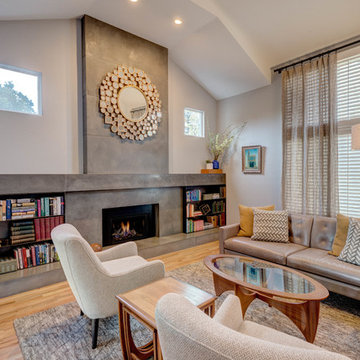
UserContemporary Napa interior with a nod to Danish Modern. Worked closely with clients to carefully choose colors, finishes, furnishings, and design details. Custom fireplace designed by Poor House's Melissa Schmitt and fabricated by SC Fabrication. Photos by Bryan Gray.
 Voar Construction
Before the Remodel – Master Bathroom
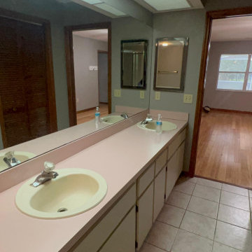
The master bathroom felt outdated and poorly designed. Despite its generous size, the space was not used efficiently: a massive, old masonry bathtub dominated the room, while the shower was uncomfortably small and unpractical. The dark tile and color choices made the entire space feel heavy and closed-in, taking away any sense of comfort or luxury. Overall, it was an old-fashioned, poorly planned bathroom in need of a complete reimagining.
28