
Search results for "Poor condition" in Home Design Ideas
 Nautilus Architects
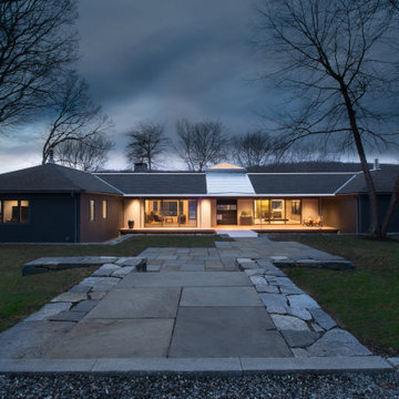
Located on a marsh in the upper reaches of the Lieutenant River in Old Lyme, the existing house was well-sited and well-built, but the design failed to exploit the views and more importantly was a confused combination of contemporary and traditional elements. The new homeowners, a successful businesswoman and an accomplished artist and photographer, were interested in creating a fully-contemporary environment to open up space, connect indoors with outdoors, display artwork and showcase the husband’s distinctive photographs.
One glaring deficiency was the curb appeal and approach sequence: the grade sloped down and the path to the house followed, but this led to an uncomfortable dip and abrupt rise to the front door. By creating a virtual “moat,” occupied by a grid of raised-bed grasses contained in aluminum-clad boxes, and spanning the moat with an ipe bridge, the approach becomes level and engaging. The façade of the existing house was blank and bland, and with no cover. Adding a deep overhang with a wide porch creates a welcoming, covered condition, accentuated by a 6’ wide pivoting front door that feels more like a moving piece of wall.
Another deficiency was the connection to the outdoors. By adding glass to the front and back of the house, and removing interior walls selectively, the house takes on a diaphanous quality that allows one to see through to the marsh beyond, even when in the driveway. The raised-bed grasses act as abstract, geometric versions of the marsh beyond. A large, pyramidal skylight establishes a spatial hierarchy around which the rooms revolve.
The house featured several tray-ceilinged spaces – living room, kitchen, and master bedroom – that were poorly-proportioned and with panels at the top that resembled inset flat panel doors. The solution was to use a different strategy for each: the bedroom turns the ceiling into an eggshell through the use of a creative trim detail; the living room has an oversized sculptural, backlit lighting element; and the kitchen has a collage of painted rectangular forms that support or include lighting pieces.
A palette of concrete, blackened steel, stainless steel and colors carefully chosen by homeowner and architect create an interior and exterior environment punctuated by moments that are as artistic as the featured works in the black-ceilinged gallery.
 ideabox LLC
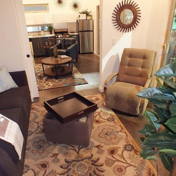
A modern "euro" kitchen offers full cooking in a tidy space. The mini house is conditioned via LG ductless heat pump. Spaces can be utilized as needed. Rooms open outside with sliding glass doors.
photo by ideabox LLC
 HUNTER DOUGLAS-LNG BLINDS
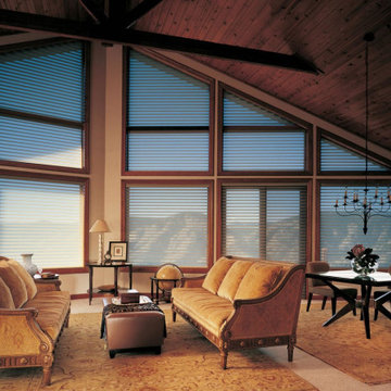
4 Benefits of Using Window Treatments
1. Privacy
Keep your private matters private with window treatments. Window treatments are available in several designs that vary the level of privacy given. Many people have become accustomed to purchasing window treatments at a department store where they’re surrounded by poor quality products and little selection. Moreover, they settle for curtains that are highly opaque and sacrifice their natural light for privacy. This is not the only solution. We offer many options that will let you have control of privacy and lighting.
2. Light Control
The material of your window treatments and their structure plays a huge role in how much light can enter a room. We carry all types of treatments from light filtering sheer drapes to black out shades. For maximum control consider horizontal or vertical blinds. These blinds make it easy to redirect light. However, if you’d like to maintain a view, bottom up/top down options might be the way to go.
3. Protection
UV rays can damage your floors, ruin artwork, and cause fading to furniture. Shades, blinds, and shutters can all keep your furnishings in pristine condition by blocking harmful UV light.
4. Energy Efficiency
Window treatments are good insulators. During the summer months closed blinds can keep heat from entering, and during the winter they can keep warmth contained. For maximum energy efficiency, consider cellular shades, dual shades, roman shades, shutters, or draperies.
LNG Blinds
19 Addison Pl
Valley Stream, NY 11580
Call Us (516) 593-0044
#homesweethome #homedecor #lovemyhome #barenecessities #windows #instastyle #instadesign #interiordesign#blinds #privacy #embellishment #instahomes #propertyowner #renovation #customblindsbydesign #showcase #displays #windowtreatments #windowcoverings #shades #shutters #drapery #interiors #decor
Find the right local pro for your project

 Borealis Landscape & Design DBA Skipley Farm
Huckleberry. This is our native-the Evergreen Huckleberry. Easy in any growing condition except wet/poorly drained soils
Country home design photo in Seattle
Country home design photo in Seattle
 Tile Doctor Ltd
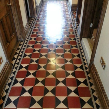
Recently I was contacted by a man in the town of Bedford who was worried that he had damaged his Victorian tiled hallway as a result of dragging a piano across the floor. I went round to the property to get a better look at the problem and, on closer inspection, realised that the tiles were actually fine; however, the piano had torn through the old surface seal.
The 150-year old tiles, dating back – as the name suggests – to the reign of Queen Victoria, had been poorly sealed and additionally had not been maintained correctly with the appropriate cleaning products. I was commissioned to remove the old sealer, clean and re-seal in order to restore this fantastic floor to its former glory.
My first task was to mix a solution of Tile Doctor Pro-Clean and water, which was then spread across the floor. Pro-Clean is a high alkaline cleaner which also contains stripping properties and this helped to break down the old, damaged sealer. The solution was left to dwell for approximately 20 minutes, giving it time to seep into the stone to get underneath, and lift out, any ingrained dirt. Pro-Clean was worked into the tiles using a heavy low speed rotary machine fitted with a black pad.
Once cleaned and stripped, we rinsed the floor using plain, clean water to neutralise the high alkaline Pro-Clean and the removed the resulting slurry using a wet-vac machine.
At this point I noticed that the white/magnolia tiles were particularly well worn and still very dirty and in need of further cleaning. Around this time Tile Doctor had also been discussing the successful use of Burnishing Pads (normally used on polished stone) on Victorian Tiles so I hand burnished the most stained tiles with a small 6 inch diamond encrusted burnishing pad with a little water to help lubricate the process. Following this, I rinsed the entire floor once again.
After leaving the floor to dry for four days, I returned to the house to seal the tiles opting to apply a single coat of Tile Doctor Colour Grow impregnating sealer first followed up with four coats of Tile Doctor Seal & Go. This combination of sealers provides a durable internal and surface stain protection whilst lifting the colours and adding a nice subtle sheen finish.
Once dried and cured, the floor was buffed using micro-fibre clothes to further enhance the appearance of the tiles further. My client was very pleased with the results, and couldn’t believe it was possible to get a floor that was so old appear brand new! The floor will dull with wear so I advised my client on the benefits of a regular maintenance plan going forward to ensure this great flooring feature remains in top condition.
Andrew Evans
Bedfordshire Tile Doctor
 Lincoln Lighthill Architect
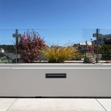
What does a roof deck look like when every part of the roof, even areas deemed uninhabitable and structurally weak, is utilized and optimized?
This large midcentury home on the edge of Presidio National Park in San Francisco had an incredible location and views. But the original roof deck suffered from poor design detailing that had rendered it a leaking, deteriorating mess. Even worse, the previous owner had covered three roof areas surrounding the deck with river stones, structurally overloading the building and endangering its occupants.
We removed the river stones and everything else down to the framing. An expertly detailed drainage and waterproofing system underlies everything above. The deck and access stairs are surfaced with durable and refined porcelain pavers. The guardrail is made from custom stainless steel supports with clear, low-iron, laminated glass spanning between for an unobstructed view. Heated seats make watching the chilly fog roll in through the gate comfy.
Planting and greenery surround the deck. The type varies depending on structural conditions- a deep planter sits on top of a structural wall, sedums in shallow soil occupy the strong edges of the surrounding rooftops, and faux grass turf fills out the middle in areas that can’t support the weight of wet soil.
 Penny Lawns
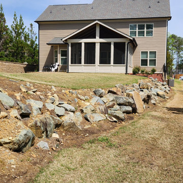
Before view of side yard - The terrain in Kennesaw, GA is notoriously difficult for landscaping due to dense red clay and deeply embedded granite. These rocky conditions often require heavy machinery, like jackhammers or rock saws, to break through large stones just beneath the surface. What looks like a manageable yard can quickly reveal solid rock layers that slow down grading and increase labor. The clay and rock also create poor drainage, leading to water pooling that must be addressed with solutions like dry creek beds or advanced regrading. Despite the challenge, with the right tools and planning, even the toughest Kennesaw yards can be transformed into functional, beautiful spaces.
 Tailored Closet and Premier Garage of Central NJ
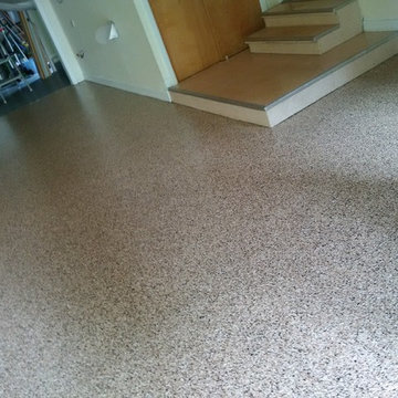
Picture of a garage floor that was in good condition but cosmetically very poor. 2 days later, It is a totally different space.
Example of a large classic attached two-car garage design in New York
Example of a large classic attached two-car garage design in New York
 SUPERIOR CHIMNEY SERVICES CORPORATION
Out of sight, out of mind. That’s what happens with the poor chimney. It stands up there, straight and tall, each day taking a beating from the sun, wind, rain, snow and freeze/thaw cycles of winter. Yet, we rely on the chimney each day to take away the smoke and gasses from the fireplace, furnace and water heater appliances.
What can we do as homeowners to ensure it continues to do its job without fail?
Sweep & Check the Chimney and Fireplace
A Certified Technician performs sweep and/or inspection of nearly/over a thousand chimneys annually. You may be familiar with the 14-point certified chimney inspection accompanied by photo documentation - I’ve shown you this graphic before, but it sure is a good one. It gives you the “what and where” of the overall condition of your chimney(s). If you have any questions, you can point to the picture and the certified technician can elaborate on the relative chimney inspection-point results.
Exterior Chimney
Part of the inspection, as you will see in the picture, is to inspect the exterior of the chimney. The Certified Chimney Technician will inspect the full chimney including the chimney flashing, bricks and mortar joints, chimney crown and cap. Let’s take a look at each one.
Chimney Flashing
Chimney flashing plays a vital role to the protection of your home. It’s the piece of material that protects where chimney protrude out of the roof. To prevent water leaks and damage, the technician will inspect for any loose, missing, cracked or damaged flashing.
Brick & Mortar Joints
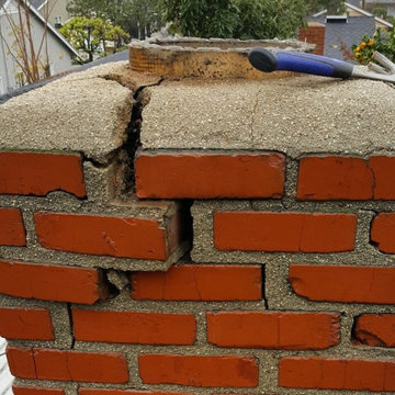
This is key. To prevent any type of major repairs, take care of minor repairs now. The technician will check for loose, cracked or spalling (chipped) bricks. If there are loose bricks and numerous cracks and chips, we’ll inspect further for any type of water leaks or water damage problems.
Chimney Crown
The concrete slab on top of the chimney is the chimney crown. It serves a very important purpose. The concrete slab acts like your chimney’s own personal roof. The technician will check if there are cracks, loose or missing pieces from the crown.
Chimney Cap
Chimney caps are also a critical component of the chimney - Every chimney needs a chimney cap for the same reasons every home needs a roof! It covers the opening of the flue. It prevents animals, debris and water from entering the chimney. The material of a chimney cap is usually made of stainless steel, as it will not rust.
Overall
If you’ve put-off getting the chimney inspected for some time, it’s best to get it checked. We’ve had some challenging weather this summer, and winter is not too far off. Take the time to give us a call and we’ll come out to give you a complete 14-point inspection with supporting photo documentation. If you don’t have a problem, fantastic, you’re ready for winter! If not, get the repairs done now so you don’t experience further damage to the interior or exterior of your home during the high-use months of winter.
Give us a call today at 877-CHIM-FIX (877-244-6349)
 Nautilus Architects
Located on a marsh in the upper reaches of the Lieutenant River in Old Lyme, the existing house was well-sited and well-built, but the design failed to exploit the views and more importantly was a confused combination of contemporary and traditional elements. The new homeowners, a successful businesswoman and an accomplished artist and photographer, were interested in creating a fully-contemporary environment to open up space, connect indoors with outdoors, display artwork and showcase the husband’s distinctive photographs.
One glaring deficiency was the curb appeal and approach sequence: the grade sloped down and the path to the house followed, but this led to an uncomfortable dip and abrupt rise to the front door. By creating a virtual “moat,” occupied by a grid of raised-bed grasses contained in aluminum-clad boxes, and spanning the moat with an ipe bridge, the approach becomes level and engaging. The façade of the existing house was blank and bland, and with no cover. Adding a deep overhang with a wide porch creates a welcoming, covered condition, accentuated by a 6’ wide pivoting front door that feels more like a moving piece of wall.
Another deficiency was the connection to the outdoors. By adding glass to the front and back of the house, and removing interior walls selectively, the house takes on a diaphanous quality that allows one to see through to the marsh beyond, even when in the driveway. The raised-bed grasses act as abstract, geometric versions of the marsh beyond. A large, pyramidal skylight establishes a spatial hierarchy around which the rooms revolve.
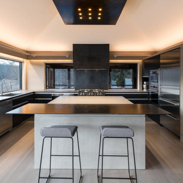
The house featured several tray-ceilinged spaces – living room, kitchen, and master bedroom – that were poorly-proportioned and with panels at the top that resembled inset flat panel doors. The solution was to use a different strategy for each: the bedroom turns the ceiling into an eggshell through the use of a creative trim detail; the living room has an oversized sculptural, backlit lighting element; and the kitchen has a collage of painted rectangular forms that support or include lighting pieces.
A palette of concrete, blackened steel, stainless steel and colors carefully chosen by homeowner and architect create an interior and exterior environment punctuated by moments that are as artistic as the featured works in the black-ceilinged gallery.
 Lincoln Lighthill Architect
What does a roof deck look like when every part of the roof, even areas deemed uninhabitable and structurally weak, is utilized and optimized?
This large midcentury home on the edge of Presidio National Park in San Francisco had an incredible location and views. But the original roof deck suffered from poor design detailing that had rendered it a leaking, deteriorating mess. Even worse, the previous owner had covered three roof areas surrounding the deck with river stones, structurally overloading the building and endangering its occupants.
We removed the river stones and everything else down to the framing. An expertly detailed drainage and waterproofing system underlies everything above. The deck and access stairs are surfaced with durable and refined porcelain pavers. The guardrail is made from custom stainless steel supports with clear, low-iron, laminated glass spanning between for an unobstructed view. Heated seats make watching the chilly fog roll in through the gate comfy.
Planting and greenery surround the deck. The type varies depending on structural conditions- a deep planter sits on top of a structural wall, sedums in shallow soil occupy the strong edges of the surrounding rooftops, and faux grass turf fills out the middle in areas that can’t support the weight of wet soil.

 Nautilus Architects
Located on a marsh in the upper reaches of the Lieutenant River in Old Lyme, the existing house was well-sited and well-built, but the design failed to exploit the views and more importantly was a confused combination of contemporary and traditional elements. The new homeowners, a successful businesswoman and an accomplished artist and photographer, were interested in creating a fully-contemporary environment to open up space, connect indoors with outdoors, display artwork and showcase the husband’s distinctive photographs.
One glaring deficiency was the curb appeal and approach sequence: the grade sloped down and the path to the house followed, but this led to an uncomfortable dip and abrupt rise to the front door. By creating a virtual “moat,” occupied by a grid of raised-bed grasses contained in aluminum-clad boxes, and spanning the moat with an ipe bridge, the approach becomes level and engaging. The façade of the existing house was blank and bland, and with no cover. Adding a deep overhang with a wide porch creates a welcoming, covered condition, accentuated by a 6’ wide pivoting front door that feels more like a moving piece of wall.
Another deficiency was the connection to the outdoors. By adding glass to the front and back of the house, and removing interior walls selectively, the house takes on a diaphanous quality that allows one to see through to the marsh beyond, even when in the driveway. The raised-bed grasses act as abstract, geometric versions of the marsh beyond. A large, pyramidal skylight establishes a spatial hierarchy around which the rooms revolve.
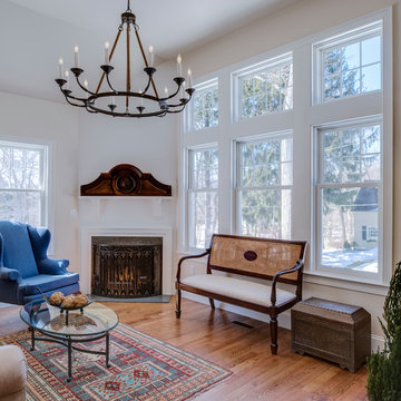
The house featured several tray-ceilinged spaces – living room, kitchen, and master bedroom – that were poorly-proportioned and with panels at the top that resembled inset flat panel doors. The solution was to use a different strategy for each: the bedroom turns the ceiling into an eggshell through the use of a creative trim detail; the living room has an oversized sculptural, backlit lighting element; and the kitchen has a collage of painted rectangular forms that support or include lighting pieces.
A palette of concrete, blackened steel, stainless steel and colors carefully chosen by homeowner and architect create an interior and exterior environment punctuated by moments that are as artistic as the featured works in the black-ceilinged gallery.
 San Luis Kitchen Co.
When the homeowners decided to move from San Francisco to the Central Coast, they were looking for a more relaxed lifestyle, a unique place to call their own, and an environment conducive to raising their young children. They found it all in San Luis Obispo. They had owned a house here in SLO for several years that they had used as a rental. As the homeowners own and run a contracting business and relocation was not impossible, they decided to move their business and make this SLO rental into their dream home.
As a rental, the house was in a bare-bones condition. The kitchen had old white cabinets, boring white tile counters, and a horrendous vinyl tile floor. Not only was the kitchen out-of-date and old-fashioned, it was also pretty worn out. The tiles were cracking and the grout was stained, the cabinet doors were sagging, and the appliances were conflicting (ie: you could not open the stove and dishwasher at the same time).
To top it all off, the kitchen was just too small for the custom home the homeowners wanted to create.
Thus enters San Luis Kitchen. At the beginning of their quest to remodel, the homeowners visited San Luis Kitchen’s showroom and fell in love with our Tuscan Grotto display. They sat down with our designers and together we worked out the scope of the project, the budget for cabinetry and how that fit into their overall budget, and then we worked on the new design for the home starting with the kitchen.
As the homeowners felt the kitchen was cramped, it was decided to expand by moving the window wall out onto the existing porch. Besides the extra space gained, moving the wall brought the kitchen window out from under the porch roof – increasing the natural light available in the space. (It really helps when the homeowner both understands building and can do his own contracting and construction.) A new arched window and stone clad wall now highlights the end of the kitchen. As we gained wall space, we were able to move the range and add a plaster hood, creating a focal nice focal point for the kitchen.
The other long wall now houses a Sub-Zero refrigerator and lots of counter workspace. Then we completed the kitchen by adding a wrap-around wet bar extending into the old dining space. We included a pull-out pantry unit with open shelves above it, wine cubbies, a cabinet for glassware recessed into the wall, under-counter refrigerator drawers, sink base and trash cabinet, along with a decorative bookcase cabinet and bar seating. Lots of function in this corner of the kitchen; a bar for entertaining and a snack station for the kids.
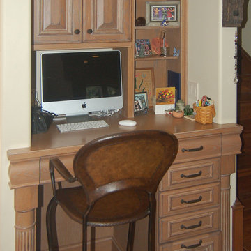
After the kitchen design was finalized and ordered, the homeowners turned their attention to the rest of the house. They asked San Luis Kitchen to help with their master suite, a guest bath, their home control center (essentially a deck tucked under the main staircase) and finally their laundry room. Here are the photos:
I wish I could show you the rest of the house. The homeowners took a poor rental house and turned it into a showpiece! They added custom concrete floors, unique fiber optic lighting, large picture windows, and much more. There is now an outdoor kitchen complete with pizza oven, an outdoor shower and exquisite garden. They added a dedicated dog run to the side yard for their pooches and a rooftop deck at the very peak. Such a fun house.
Wood-Mode Fine Custom Cabinetry, Barcelona
 Benjamin Vogt / Monarch Gardens
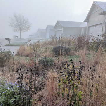
1,000' front lawn converted to meadow beds in suburban development.
This is an example of a drought-tolerant and full sun front yard landscaping in Other for winter.
This is an example of a drought-tolerant and full sun front yard landscaping in Other for winter.
 Nautilus Architects
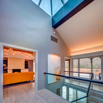
Located on a marsh in the upper reaches of the Lieutenant River in Old Lyme, the existing house was well-sited and well-built, but the design failed to exploit the views and more importantly was a confused combination of contemporary and traditional elements. The new homeowners, a successful businesswoman and an accomplished artist and photographer, were interested in creating a fully-contemporary environment to open up space, connect indoors with outdoors, display artwork and showcase the husband’s distinctive photographs.
One glaring deficiency was the curb appeal and approach sequence: the grade sloped down and the path to the house followed, but this led to an uncomfortable dip and abrupt rise to the front door. By creating a virtual “moat,” occupied by a grid of raised-bed grasses contained in aluminum-clad boxes, and spanning the moat with an ipe bridge, the approach becomes level and engaging. The façade of the existing house was blank and bland, and with no cover. Adding a deep overhang with a wide porch creates a welcoming, covered condition, accentuated by a 6’ wide pivoting front door that feels more like a moving piece of wall.
Another deficiency was the connection to the outdoors. By adding glass to the front and back of the house, and removing interior walls selectively, the house takes on a diaphanous quality that allows one to see through to the marsh beyond, even when in the driveway. The raised-bed grasses act as abstract, geometric versions of the marsh beyond. A large, pyramidal skylight establishes a spatial hierarchy around which the rooms revolve.
The house featured several tray-ceilinged spaces – living room, kitchen, and master bedroom – that were poorly-proportioned and with panels at the top that resembled inset flat panel doors. The solution was to use a different strategy for each: the bedroom turns the ceiling into an eggshell through the use of a creative trim detail; the living room has an oversized sculptural, backlit lighting element; and the kitchen has a collage of painted rectangular forms that support or include lighting pieces.
A palette of concrete, blackened steel, stainless steel and colors carefully chosen by homeowner and architect create an interior and exterior environment punctuated by moments that are as artistic as the featured works in the black-ceilinged gallery.
 San Luis Kitchen Co.
When the homeowners decided to move from San Francisco to the Central Coast, they were looking for a more relaxed lifestyle, a unique place to call their own, and an environment conducive to raising their young children. They found it all in San Luis Obispo. They had owned a house here in SLO for several years that they had used as a rental. As the homeowners own and run a contracting business and relocation was not impossible, they decided to move their business and make this SLO rental into their dream home.
As a rental, the house was in a bare-bones condition. The kitchen had old white cabinets, boring white tile counters, and a horrendous vinyl tile floor. Not only was the kitchen out-of-date and old-fashioned, it was also pretty worn out. The tiles were cracking and the grout was stained, the cabinet doors were sagging, and the appliances were conflicting (ie: you could not open the stove and dishwasher at the same time).
To top it all off, the kitchen was just too small for the custom home the homeowners wanted to create.
Thus enters San Luis Kitchen. At the beginning of their quest to remodel, the homeowners visited San Luis Kitchen’s showroom and fell in love with our Tuscan Grotto display. They sat down with our designers and together we worked out the scope of the project, the budget for cabinetry and how that fit into their overall budget, and then we worked on the new design for the home starting with the kitchen.
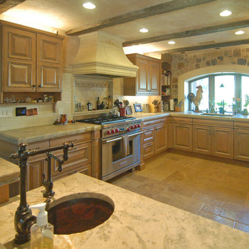
As the homeowners felt the kitchen was cramped, it was decided to expand by moving the window wall out onto the existing porch. Besides the extra space gained, moving the wall brought the kitchen window out from under the porch roof – increasing the natural light available in the space. (It really helps when the homeowner both understands building and can do his own contracting and construction.) A new arched window and stone clad wall now highlights the end of the kitchen. As we gained wall space, we were able to move the range and add a plaster hood, creating a focal nice focal point for the kitchen.
The other long wall now houses a Sub-Zero refrigerator and lots of counter workspace. Then we completed the kitchen by adding a wrap-around wet bar extending into the old dining space. We included a pull-out pantry unit with open shelves above it, wine cubbies, a cabinet for glassware recessed into the wall, under-counter refrigerator drawers, sink base and trash cabinet, along with a decorative bookcase cabinet and bar seating. Lots of function in this corner of the kitchen; a bar for entertaining and a snack station for the kids.
After the kitchen design was finalized and ordered, the homeowners turned their attention to the rest of the house. They asked San Luis Kitchen to help with their master suite, a guest bath, their home control center (essentially a deck tucked under the main staircase) and finally their laundry room. Here are the photos:
I wish I could show you the rest of the house. The homeowners took a poor rental house and turned it into a showpiece! They added custom concrete floors, unique fiber optic lighting, large picture windows, and much more. There is now an outdoor kitchen complete with pizza oven, an outdoor shower and exquisite garden. They added a dedicated dog run to the side yard for their pooches and a rooftop deck at the very peak. Such a fun house.
Wood-Mode Fine Custom Cabinetry, Barcelona
 Caley Carpentry, LLC
M. Caley
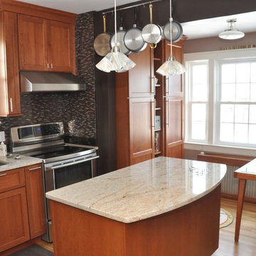
Inspiration for a small timeless l-shaped light wood floor and beige floor eat-in kitchen remodel in Providence with raised-panel cabinets, medium tone wood cabinets, black appliances, an island and an undermount sink
Inspiration for a small timeless l-shaped light wood floor and beige floor eat-in kitchen remodel in Providence with raised-panel cabinets, medium tone wood cabinets, black appliances, an island and an undermount sink
 San Luis Kitchen Co.
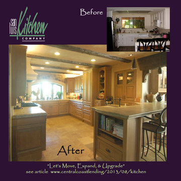
Tuscan design using a burnished & glazed finish on oak cabinets by Wood-Mode. The columns either side of the range pull out with spice and bottle storage behind. The curved profile of the top drawer-heads extends around the kitchen.
When the homeowners decided to move from San Francisco to the Central Coast, they were looking for a more relaxed lifestyle, a unique place to call their own, and an environment conducive to raising their young children. They found it all in San Luis Obispo. They had owned a house here in SLO for several years that they had used as a rental. As the homeowners own and run a contracting business and relocation was not impossible, they decided to move their business and make this SLO rental into their dream home.
As a rental, the house was in a bare-bones condition. The kitchen had old white cabinets, boring white tile counters, and a horrendous vinyl tile floor. Not only was the kitchen out-of-date and old-fashioned, it was also pretty worn out. The tiles were cracking and the grout was stained, the cabinet doors were sagging, and the appliances were conflicting (ie: you could not open the stove and dishwasher at the same time).
To top it all off, the kitchen was just too small for the custom home the homeowners wanted to create.
Thus enters San Luis Kitchen. At the beginning of their quest to remodel, the homeowners visited San Luis Kitchen’s showroom and fell in love with our Tuscan Grotto display. They sat down with our designers and together we worked out the scope of the project, the budget for cabinetry and how that fit into their overall budget, and then we worked on the new design for the home starting with the kitchen.
As the homeowners felt the kitchen was cramped, it was decided to expand by moving the window wall out onto the existing porch. Besides the extra space gained, moving the wall brought the kitchen window out from under the porch roof – increasing the natural light available in the space. (It really helps when the homeowner both understands building and can do his own contracting and construction.) A new arched window and stone clad wall now highlights the end of the kitchen. As we gained wall space, we were able to move the range and add a plaster hood, creating a focal nice focal point for the kitchen.
The other long wall now houses a Sub-Zero refrigerator and lots of counter workspace. Then we completed the kitchen by adding a wrap-around wet bar extending into the old dining space. We included a pull-out pantry unit with open shelves above it, wine cubbies, a cabinet for glassware recessed into the wall, under-counter refrigerator drawers, sink base and trash cabinet, along with a decorative bookcase cabinet and bar seating. Lots of function in this corner of the kitchen; a bar for entertaining and a snack station for the kids.
After the kitchen design was finalized and ordered, the homeowners turned their attention to the rest of the house. They asked San Luis Kitchen to help with their master suite, a guest bath, their home control center (essentially a deck tucked under the main staircase) and finally their laundry room. Here are the photos:
I wish I could show you the rest of the house. The homeowners took a poor rental house and turned it into a showpiece! They added custom concrete floors, unique fiber optic lighting, large picture windows, and much more. There is now an outdoor kitchen complete with pizza oven, an outdoor shower and exquisite garden. They added a dedicated dog run to the side yard for their pooches and a rooftop deck at the very peak. Such a fun house.
 Nautilus Architects
Located on a marsh in the upper reaches of the Lieutenant River in Old Lyme, the existing house was well-sited and well-built, but the design failed to exploit the views and more importantly was a confused combination of contemporary and traditional elements. The new homeowners, a successful businesswoman and an accomplished artist and photographer, were interested in creating a fully-contemporary environment to open up space, connect indoors with outdoors, display artwork and showcase the husband’s distinctive photographs.
One glaring deficiency was the curb appeal and approach sequence: the grade sloped down and the path to the house followed, but this led to an uncomfortable dip and abrupt rise to the front door. By creating a virtual “moat,” occupied by a grid of raised-bed grasses contained in aluminum-clad boxes, and spanning the moat with an ipe bridge, the approach becomes level and engaging. The façade of the existing house was blank and bland, and with no cover. Adding a deep overhang with a wide porch creates a welcoming, covered condition, accentuated by a 6’ wide pivoting front door that feels more like a moving piece of wall.
Another deficiency was the connection to the outdoors. By adding glass to the front and back of the house, and removing interior walls selectively, the house takes on a diaphanous quality that allows one to see through to the marsh beyond, even when in the driveway. The raised-bed grasses act as abstract, geometric versions of the marsh beyond. A large, pyramidal skylight establishes a spatial hierarchy around which the rooms revolve.
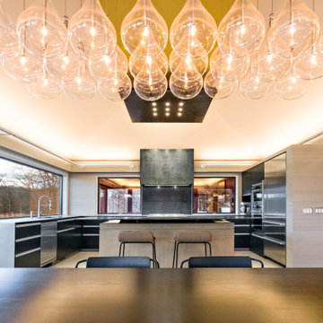
The house featured several tray-ceilinged spaces – living room, kitchen, and master bedroom – that were poorly-proportioned and with panels at the top that resembled inset flat panel doors. The solution was to use a different strategy for each: the bedroom turns the ceiling into an eggshell through the use of a creative trim detail; the living room has an oversized sculptural, backlit lighting element; and the kitchen has a collage of painted rectangular forms that support or include lighting pieces.
A palette of concrete, blackened steel, stainless steel and colors carefully chosen by homeowner and architect create an interior and exterior environment punctuated by moments that are as artistic as the featured works in the black-ceilinged gallery.
14