
Search results for "Poor condition" in Home Design Ideas
 Lincoln Lighthill Architect
What does a roof deck look like when every part of the roof, even areas deemed uninhabitable and structurally weak, is utilized and optimized?
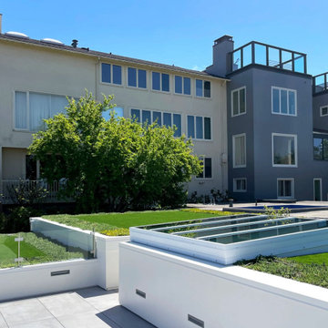
This large midcentury home on the edge of Presidio National Park in San Francisco had an incredible location and views. But the original roof deck suffered from poor design detailing that had rendered it a leaking, deteriorating mess. Even worse, the previous owner had covered three roof areas surrounding the deck with river stones, structurally overloading the building and endangering its occupants.
We removed the river stones and everything else down to the framing. An expertly detailed drainage and waterproofing system underlies everything above. The deck and access stairs are surfaced with durable and refined porcelain pavers. The guardrail is made from custom stainless steel supports with clear, low-iron, laminated glass spanning between for an unobstructed view. Heated seats make watching the chilly fog roll in through the gate comfy.
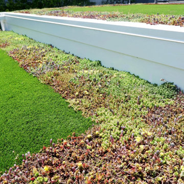
Planting and greenery surround the deck. The type varies depending on structural conditions- a deep planter sits on top of a structural wall, sedums in shallow soil occupy the strong edges of the surrounding rooftops, and faux grass turf fills out the middle in areas that can’t support the weight of wet soil.
 Nautilus Architects
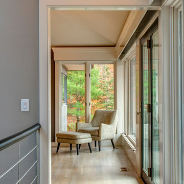
Located on a marsh in the upper reaches of the Lieutenant River in Old Lyme, the existing house was well-sited and well-built, but the design failed to exploit the views and more importantly was a confused combination of contemporary and traditional elements. The new homeowners, a successful businesswoman and an accomplished artist and photographer, were interested in creating a fully-contemporary environment to open up space, connect indoors with outdoors, display artwork and showcase the husband’s distinctive photographs.
One glaring deficiency was the curb appeal and approach sequence: the grade sloped down and the path to the house followed, but this led to an uncomfortable dip and abrupt rise to the front door. By creating a virtual “moat,” occupied by a grid of raised-bed grasses contained in aluminum-clad boxes, and spanning the moat with an ipe bridge, the approach becomes level and engaging. The façade of the existing house was blank and bland, and with no cover. Adding a deep overhang with a wide porch creates a welcoming, covered condition, accentuated by a 6’ wide pivoting front door that feels more like a moving piece of wall.
Another deficiency was the connection to the outdoors. By adding glass to the front and back of the house, and removing interior walls selectively, the house takes on a diaphanous quality that allows one to see through to the marsh beyond, even when in the driveway. The raised-bed grasses act as abstract, geometric versions of the marsh beyond. A large, pyramidal skylight establishes a spatial hierarchy around which the rooms revolve.
The house featured several tray-ceilinged spaces – living room, kitchen, and master bedroom – that were poorly-proportioned and with panels at the top that resembled inset flat panel doors. The solution was to use a different strategy for each: the bedroom turns the ceiling into an eggshell through the use of a creative trim detail; the living room has an oversized sculptural, backlit lighting element; and the kitchen has a collage of painted rectangular forms that support or include lighting pieces.
A palette of concrete, blackened steel, stainless steel and colors carefully chosen by homeowner and architect create an interior and exterior environment punctuated by moments that are as artistic as the featured works in the black-ceilinged gallery.
 Lincoln Lighthill Architect
What does a roof deck look like when every part of the roof, even areas deemed uninhabitable and structurally weak, is utilized and optimized?
This large midcentury home on the edge of Presidio National Park in San Francisco had an incredible location and views. But the original roof deck suffered from poor design detailing that had rendered it a leaking, deteriorating mess. Even worse, the previous owner had covered three roof areas surrounding the deck with river stones, structurally overloading the building and endangering its occupants.
We removed the river stones and everything else down to the framing. An expertly detailed drainage and waterproofing system underlies everything above. The deck and access stairs are surfaced with durable and refined porcelain pavers. The guardrail is made from custom stainless steel supports with clear, low-iron, laminated glass spanning between for an unobstructed view. Heated seats make watching the chilly fog roll in through the gate comfy.
Planting and greenery surround the deck. The type varies depending on structural conditions- a deep planter sits on top of a structural wall, sedums in shallow soil occupy the strong edges of the surrounding rooftops, and faux grass turf fills out the middle in areas that can’t support the weight of wet soil.
Find the right local pro for your project
 Green Gorge Construction
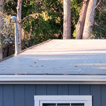
Due to its deteriorating condition, the asphalt roll roofing on this ADU required replacement before the Fall rains. Asphalt roll roofing generally lasts only 5-10 years, leading to ongoing maintenance challenges. The original 1×10 sheathing showed significant sagging in several spots, resulting in standing water not suitable for asphalt. Additionally, there was a complete absence of ventilation after improper installation of R-21 fiberglass insulation, leaving no air gap between the sheathing and insulation. A noticeable hump along the center of the roof indicated that the load-bearing wall had been supporting that section since construction, contributing to light sagging between the walls.
The old roof was completely removed down to the joists, revealing a solid base for the new installation. The central hump was eliminated by shaving the high point along that line. 2×6 beams were ripped in half then nailed on top of the existing joists, creating a 1.5″ gap for insulation and providing strong attachment points for the OSB sheathing, which was secured with screws to prevent any potential issues with nail heads popping through over the roof’s expected lifespan of over 50 years. The EPDM membrane was then adhered using glue and contact cement along the edges of each sheet, with the ends folded over the roof edges and secured with termination bars. Drip edge flashing was added and taped to ensure a water-tight seal, and EPDM-safe caulking was applied over the seams for additional protection. Finally, all exposed wood was primed and painted.
The new roof features a 60mil commercial-grade EPDM rubber membrane, offering a lifespan exceeding 50 years, in stark contrast to the 5-10 year lifespan of asphalt roll roofing.
Using two sheets of EPDM for installation streamlined the process, resulting in one single seam across the entire roof, compared to the asphalt roll’s dimensions of 3 feet wide by 33 feet long, which created 8 vertical seams and 9 horizontal seams—significantly increasing the risk of leakage and failure. Wrapping the rubber over the edge of the roof effectively addressed concerns about water infiltration at the edges, an issue prevalent with the asphalt and drip edge interface.
Another benefit to removing the splitting 1×10 decking and replacing it with OSB sheathing is the increase in structural integrity, moisture resistance, longevity and consistency.
The project successfully transformed the ADU’s roof from a maintenance-prone asphalt roll system to a highly durable 60mil EPDM rubber membrane. By addressing critical structural issues, including sagging sheathing and inadequate ventilation, the team ensured that the new roof not only offers superior water resistance and longevity but also meets higher performance standards for insulation and durability. The replacement process eliminated common weak points, such as numerous seams and poor edge sealing, which were vulnerabilities in the old roofing system. The result is a streamlined, secure installation that provides peace of mind and long-term value, with a lifespan extending well beyond the original roof.
 Nautilus Architects
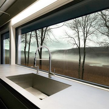
Located on a marsh in the upper reaches of the Lieutenant River in Old Lyme, the existing house was well-sited and well-built, but the design failed to exploit the views and more importantly was a confused combination of contemporary and traditional elements. The new homeowners, a successful businesswoman and an accomplished artist and photographer, were interested in creating a fully-contemporary environment to open up space, connect indoors with outdoors, display artwork and showcase the husband’s distinctive photographs.
One glaring deficiency was the curb appeal and approach sequence: the grade sloped down and the path to the house followed, but this led to an uncomfortable dip and abrupt rise to the front door. By creating a virtual “moat,” occupied by a grid of raised-bed grasses contained in aluminum-clad boxes, and spanning the moat with an ipe bridge, the approach becomes level and engaging. The façade of the existing house was blank and bland, and with no cover. Adding a deep overhang with a wide porch creates a welcoming, covered condition, accentuated by a 6’ wide pivoting front door that feels more like a moving piece of wall.
Another deficiency was the connection to the outdoors. By adding glass to the front and back of the house, and removing interior walls selectively, the house takes on a diaphanous quality that allows one to see through to the marsh beyond, even when in the driveway. The raised-bed grasses act as abstract, geometric versions of the marsh beyond. A large, pyramidal skylight establishes a spatial hierarchy around which the rooms revolve.
The house featured several tray-ceilinged spaces – living room, kitchen, and master bedroom – that were poorly-proportioned and with panels at the top that resembled inset flat panel doors. The solution was to use a different strategy for each: the bedroom turns the ceiling into an eggshell through the use of a creative trim detail; the living room has an oversized sculptural, backlit lighting element; and the kitchen has a collage of painted rectangular forms that support or include lighting pieces.
A palette of concrete, blackened steel, stainless steel and colors carefully chosen by homeowner and architect create an interior and exterior environment punctuated by moments that are as artistic as the featured works in the black-ceilinged gallery.
 Nautilus Architects
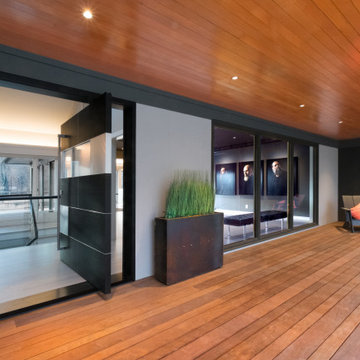
Located on a marsh in the upper reaches of the Lieutenant River in Old Lyme, the existing house was well-sited and well-built, but the design failed to exploit the views and more importantly was a confused combination of contemporary and traditional elements. The new homeowners, a successful businesswoman and an accomplished artist and photographer, were interested in creating a fully-contemporary environment to open up space, connect indoors with outdoors, display artwork and showcase the husband’s distinctive photographs.
One glaring deficiency was the curb appeal and approach sequence: the grade sloped down and the path to the house followed, but this led to an uncomfortable dip and abrupt rise to the front door. By creating a virtual “moat,” occupied by a grid of raised-bed grasses contained in aluminum-clad boxes, and spanning the moat with an ipe bridge, the approach becomes level and engaging. The façade of the existing house was blank and bland, and with no cover. Adding a deep overhang with a wide porch creates a welcoming, covered condition, accentuated by a 6’ wide pivoting front door that feels more like a moving piece of wall.
Another deficiency was the connection to the outdoors. By adding glass to the front and back of the house, and removing interior walls selectively, the house takes on a diaphanous quality that allows one to see through to the marsh beyond, even when in the driveway. The raised-bed grasses act as abstract, geometric versions of the marsh beyond. A large, pyramidal skylight establishes a spatial hierarchy around which the rooms revolve.
The house featured several tray-ceilinged spaces – living room, kitchen, and master bedroom – that were poorly-proportioned and with panels at the top that resembled inset flat panel doors. The solution was to use a different strategy for each: the bedroom turns the ceiling into an eggshell through the use of a creative trim detail; the living room has an oversized sculptural, backlit lighting element; and the kitchen has a collage of painted rectangular forms that support or include lighting pieces.
A palette of concrete, blackened steel, stainless steel and colors carefully chosen by homeowner and architect create an interior and exterior environment punctuated by moments that are as artistic as the featured works in the black-ceilinged gallery.
 Nautilus Architects
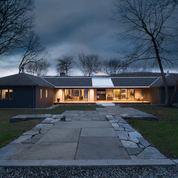
Located on a marsh in the upper reaches of the Lieutenant River in Old Lyme, the existing house was well-sited and well-built, but the design failed to exploit the views and more importantly was a confused combination of contemporary and traditional elements. The new homeowners, a successful businesswoman and an accomplished artist and photographer, were interested in creating a fully-contemporary environment to open up space, connect indoors with outdoors, display artwork and showcase the husband’s distinctive photographs.
One glaring deficiency was the curb appeal and approach sequence: the grade sloped down and the path to the house followed, but this led to an uncomfortable dip and abrupt rise to the front door. By creating a virtual “moat,” occupied by a grid of raised-bed grasses contained in aluminum-clad boxes, and spanning the moat with an ipe bridge, the approach becomes level and engaging. The façade of the existing house was blank and bland, and with no cover. Adding a deep overhang with a wide porch creates a welcoming, covered condition, accentuated by a 6’ wide pivoting front door that feels more like a moving piece of wall.
Another deficiency was the connection to the outdoors. By adding glass to the front and back of the house, and removing interior walls selectively, the house takes on a diaphanous quality that allows one to see through to the marsh beyond, even when in the driveway. The raised-bed grasses act as abstract, geometric versions of the marsh beyond. A large, pyramidal skylight establishes a spatial hierarchy around which the rooms revolve.
The house featured several tray-ceilinged spaces – living room, kitchen, and master bedroom – that were poorly-proportioned and with panels at the top that resembled inset flat panel doors. The solution was to use a different strategy for each: the bedroom turns the ceiling into an eggshell through the use of a creative trim detail; the living room has an oversized sculptural, backlit lighting element; and the kitchen has a collage of painted rectangular forms that support or include lighting pieces.
A palette of concrete, blackened steel, stainless steel and colors carefully chosen by homeowner and architect create an interior and exterior environment punctuated by moments that are as artistic as the featured works in the black-ceilinged gallery.
 Lemon Remodeling & Services
Planning a Modern Kitchen Remodel
Every successful kitchen remodeling project begins with careful planning. Before construction starts, it is important to evaluate the existing layout, cabinet storage, lighting conditions, appliance placement, and how the kitchen connects to surrounding living spaces.
For this project, the primary design goals included:
Creating a brighter open concept kitchen
Improving functionality and circulation
Increasing pantry and cabinet storage
Maximizing natural light with skylight integration
Creating a clean and timeless design aesthetic
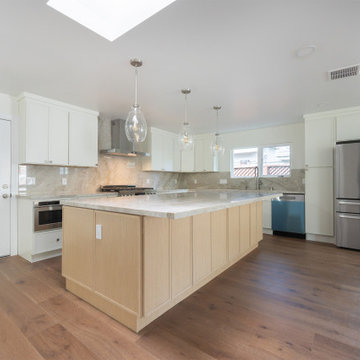
The final layout centered around a large kitchen island that functions as both a workspace and gathering area. Open concept kitchens remain highly desirable because they improve communication between living areas while helping the home feel larger and more connected.
Importance of Natural Light
Natural lighting plays a major role in modern kitchen remodeling. In this renovation, the skylight significantly improved brightness throughout the space and helped create a softer, more inviting atmosphere during the day.
Combined with recessed lighting and pendant fixtures above the island, the layered lighting design provides both functional task lighting and balanced ambient illumination.
Construction and Material Selection
Kitchen remodeling projects require coordination between multiple construction trades including demolition, framing, electrical, plumbing, drywall, flooring, cabinetry, countertops, and finish carpentry.
Bi-Color Kitchen Remodel Design
One of the standout features of this project is the bi-color kitchen remodel design. The warm natural wood island creates contrast against the surrounding white cabinetry while maintaining a clean and balanced appearance.
This approach helps:
Add visual depth to the kitchen
Create separation between functional zones
Prevent the space from feeling overly monochromatic
Introduce warmth into modern kitchen designs
The oversized island also provides additional storage, countertop workspace, and seating opportunities for everyday use and entertaining.
Countertops, Cabinetry, and Finishes
The kitchen includes:
Quartz countertops with waterfall-style edges
Custom shaker-style cabinetry
Stainless steel appliances
Modern pendant lighting
Wide plank engineered hardwood flooring
Full-height backsplash surfaces
The neutral color palette was selected to create a timeless appearance while allowing flexibility for future décor and furniture changes.
Pantry Kitchen Renovation
Storage planning is one of the most important aspects of kitchen remodeling. The pantry kitchen renovation focused on improving organization and accessibility while maximizing usable storage space.
Modern pantry systems help homeowners:
Reduce countertop clutter
Improve kitchen organization
Store small appliances more efficiently
Increase long-term functionality
Thoughtful storage design can significantly improve the daily usability of a kitchen without increasing square footage.
Real Estate Value and Long-Term Benefits
Kitchen remodeling remains one of the highest-value residential renovation projects in the Bay Area real estate market. A professionally designed open concept kitchen can improve buyer perception, increase property appeal, and modernize outdated layouts.
Features such as large islands, skylights, pantry storage, and bi-color cabinetry continue to remain highly desirable among homeowners and future buyers alike.
Common Kitchen Remodeling Mistakes
Some common mistakes homeowners should avoid include:
Insufficient lighting design
Poor circulation planning
Limited storage solutions
Choosing low-durability materials
Overcrowded layouts
Inadequate electrical preparation
Working with experienced remodeling professionals can help avoid costly design and construction issues later in the process.
Common Questions
How long does a kitchen remodel usually take?
Most kitchen remodeling projects take approximately 6–12 weeks depending on the project scope, inspections, material lead times, and structural modifications.
Do kitchen remodels require permits?
Permits are often required when plumbing, electrical, structural, or layout changes are involved. Requirements vary depending on the city and scope of work.
What is a bi-color kitchen remodel?
A bi-color kitchen remodel uses two cabinet finishes or tones to create visual contrast and a more customized design appearance.
Does an open concept kitchen increase home value?
Open concept kitchens are highly desirable because they improve functionality, natural lighting, and overall flow throughout the home.
Conclusion
A well-planned kitchen remodeling project combines thoughtful design, quality craftsmanship, and durable materials to create a space that is both functional and visually appealing. Features such as skylight integration, open concept layouts, pantry kitchen renovations, and bi-color cabinetry continue to remain popular among Bay Area homeowners seeking timeless and practical kitchen designs.
Careful planning, professional coordination, and attention to detail are essential for creating a kitchen that performs well aesthetically and functionally for many years.
------->
If you’re planning a kitchen remodeling project, consulting with an experienced contractor can help simplify the design and construction process while avoiding costly mistakes.
Book a consultation:
calendly.com/lemonremodeling
 Nautilus Architects
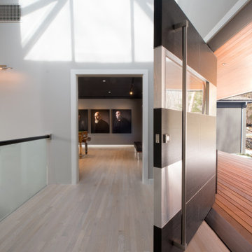
Located on a marsh in the upper reaches of the Lieutenant River in Old Lyme, the existing house was well-sited and well-built, but the design failed to exploit the views and more importantly was a confused combination of contemporary and traditional elements. The new homeowners, a successful businesswoman and an accomplished artist and photographer, were interested in creating a fully-contemporary environment to open up space, connect indoors with outdoors, display artwork and showcase the husband’s distinctive photographs.
One glaring deficiency was the curb appeal and approach sequence: the grade sloped down and the path to the house followed, but this led to an uncomfortable dip and abrupt rise to the front door. By creating a virtual “moat,” occupied by a grid of raised-bed grasses contained in aluminum-clad boxes, and spanning the moat with an ipe bridge, the approach becomes level and engaging. The façade of the existing house was blank and bland, and with no cover. Adding a deep overhang with a wide porch creates a welcoming, covered condition, accentuated by a 6’ wide pivoting front door that feels more like a moving piece of wall.
Another deficiency was the connection to the outdoors. By adding glass to the front and back of the house, and removing interior walls selectively, the house takes on a diaphanous quality that allows one to see through to the marsh beyond, even when in the driveway. The raised-bed grasses act as abstract, geometric versions of the marsh beyond. A large, pyramidal skylight establishes a spatial hierarchy around which the rooms revolve.
The house featured several tray-ceilinged spaces – living room, kitchen, and master bedroom – that were poorly-proportioned and with panels at the top that resembled inset flat panel doors. The solution was to use a different strategy for each: the bedroom turns the ceiling into an eggshell through the use of a creative trim detail; the living room has an oversized sculptural, backlit lighting element; and the kitchen has a collage of painted rectangular forms that support or include lighting pieces.
A palette of concrete, blackened steel, stainless steel and colors carefully chosen by homeowner and architect create an interior and exterior environment punctuated by moments that are as artistic as the featured works in the black-ceilinged gallery.
 Budget Blinds of Richmond Hill
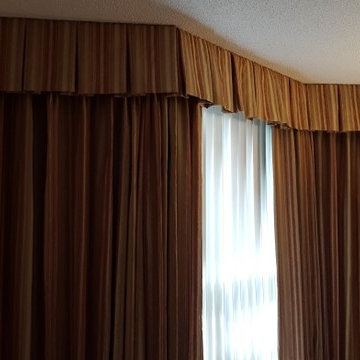
View of guest bedroom in Thornhill condo with the drapery slightly open. The existing vertical blinds, even in the closed position, are doing a poor job of blocking the light. The drapery, which includes a blackout liner, not only effectively blocks out the light, but also adds insulation which is sure to lower heating expenses in the winter and air conditioning costs in the summer.
 Longjin Craft
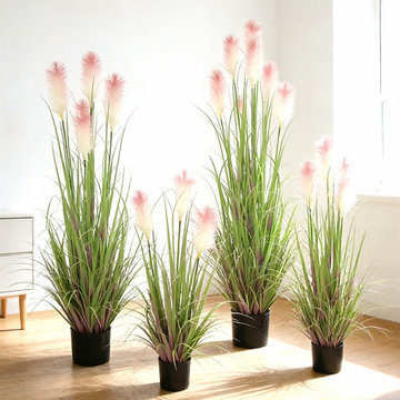
Bringing Nature Indoors Potted grasses are an excellent way to infuse a touch of nature into your home decor. Unlike live plants, artificial potted grass requires minimal maintenance while still providing vibrant greenery. They can easily enhance any room, turning a bare corner into a lively focal point. With designs like artificial pampas grass, brands such as Longjin Craft offer a range of options that mimic the ethereal beauty of natural flora. These faux plants not only look stunning but also stand the test of time, ensuring your home remains beautiful without the hassle of regular care. Versatile Home Decor Options One of the most appealing aspects of indoor artificial potted grasses is their versatility. Whether you’re aiming for a modern aesthetic or a more rustic vibe, there’s a fake potted grass option suitable for every taste. Tall grasses can add height to your decor, while shorter versions fit perfectly on shelves or tabletops. The aesthetic possibilities are endless; you can mix different types of artificial grasses for a more textured look. This creative freedom allows you to personalize your decor in a way that might be harder to achieve with live plants, which often come with their own growth limitations. Ideal for Any Environment Artificial potted grass is perfect for various settings, from homes to offices. In workspaces, they can provide an element of tranquility amidst busy schedules. Moreover, they are an excellent choice for individuals who may have allergies or pets that could interact poorly with natural plants. Longjin Craft’s artificial varieties are designed to withstand various indoor conditions and maintain their allure without fading over time. This makes them an ideal choice for those seeking stylish yet practical decor solutions. Whether you’re hosting a gathering or enjoying a quiet evening at home, these faux plants charm any space effortlessly. This article is sourced from Longjin Craft Artificial Potted Grass (longjincraft.com).
 Lincoln Lighthill Architect
What does a roof deck look like when every part of the roof, even areas deemed uninhabitable and structurally weak, is utilized and optimized?
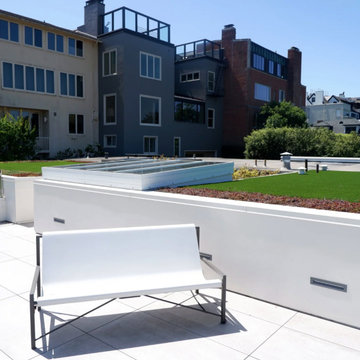
This large midcentury home on the edge of Presidio National Park in San Francisco had an incredible location and views. But the original roof deck suffered from poor design detailing that had rendered it a leaking, deteriorating mess. Even worse, the previous owner had covered three roof areas surrounding the deck with river stones, structurally overloading the building and endangering its occupants.
We removed the river stones and everything else down to the framing. An expertly detailed drainage and waterproofing system underlies everything above. The deck and access stairs are surfaced with durable and refined porcelain pavers. The guardrail is made from custom stainless steel supports with clear, low-iron, laminated glass spanning between for an unobstructed view. Heated seats make watching the chilly fog roll in through the gate comfy.
Planting and greenery surround the deck. The type varies depending on structural conditions- a deep planter sits on top of a structural wall, sedums in shallow soil occupy the strong edges of the surrounding rooftops, and faux grass turf fills out the middle in areas that can’t support the weight of wet soil.
 San Luis Kitchen Co.
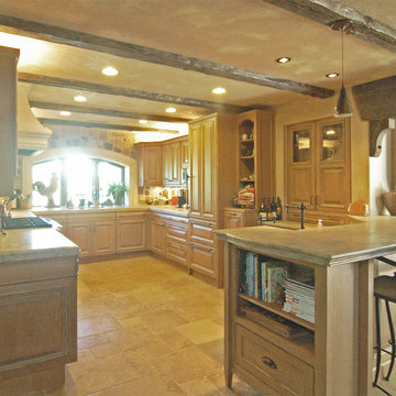
When the homeowners decided to move from San Francisco to the Central Coast, they were looking for a more relaxed lifestyle, a unique place to call their own, and an environment conducive to raising their young children. They found it all in San Luis Obispo. They had owned a house here in SLO for several years that they had used as a rental. As the homeowners own and run a contracting business and relocation was not impossible, they decided to move their business and make this SLO rental into their dream home.
As a rental, the house was in a bare-bones condition. The kitchen had old white cabinets, boring white tile counters, and a horrendous vinyl tile floor. Not only was the kitchen out-of-date and old-fashioned, it was also pretty worn out. The tiles were cracking and the grout was stained, the cabinet doors were sagging, and the appliances were conflicting (ie: you could not open the stove and dishwasher at the same time).
To top it all off, the kitchen was just too small for the custom home the homeowners wanted to create.
Thus enters San Luis Kitchen. At the beginning of their quest to remodel, the homeowners visited San Luis Kitchen’s showroom and fell in love with our Tuscan Grotto display. They sat down with our designers and together we worked out the scope of the project, the budget for cabinetry and how that fit into their overall budget, and then we worked on the new design for the home starting with the kitchen.
As the homeowners felt the kitchen was cramped, it was decided to expand by moving the window wall out onto the existing porch. Besides the extra space gained, moving the wall brought the kitchen window out from under the porch roof – increasing the natural light available in the space. (It really helps when the homeowner both understands building and can do his own contracting and construction.) A new arched window and stone clad wall now highlights the end of the kitchen. As we gained wall space, we were able to move the range and add a plaster hood, creating a focal nice focal point for the kitchen.
The other long wall now houses a Sub-Zero refrigerator and lots of counter workspace. Then we completed the kitchen by adding a wrap-around wet bar extending into the old dining space. We included a pull-out pantry unit with open shelves above it, wine cubbies, a cabinet for glassware recessed into the wall, under-counter refrigerator drawers, sink base and trash cabinet, along with a decorative bookcase cabinet and bar seating. Lots of function in this corner of the kitchen; a bar for entertaining and a snack station for the kids.
After the kitchen design was finalized and ordered, the homeowners turned their attention to the rest of the house. They asked San Luis Kitchen to help with their master suite, a guest bath, their home control center (essentially a deck tucked under the main staircase) and finally their laundry room. Here are the photos:
I wish I could show you the rest of the house. The homeowners took a poor rental house and turned it into a showpiece! They added custom concrete floors, unique fiber optic lighting, large picture windows, and much more. There is now an outdoor kitchen complete with pizza oven, an outdoor shower and exquisite garden. They added a dedicated dog run to the side yard for their pooches and a rooftop deck at the very peak. Such a fun house.
Wood-Mode Fine Custom Cabinetry, Barcelona
 Nautilus Architects
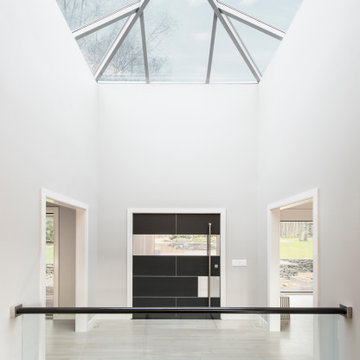
Located on a marsh in the upper reaches of the Lieutenant River in Old Lyme, the existing house was well-sited and well-built, but the design failed to exploit the views and more importantly was a confused combination of contemporary and traditional elements. The new homeowners, a successful businesswoman and an accomplished artist and photographer, were interested in creating a fully-contemporary environment to open up space, connect indoors with outdoors, display artwork and showcase the husband’s distinctive photographs.
One glaring deficiency was the curb appeal and approach sequence: the grade sloped down and the path to the house followed, but this led to an uncomfortable dip and abrupt rise to the front door. By creating a virtual “moat,” occupied by a grid of raised-bed grasses contained in aluminum-clad boxes, and spanning the moat with an ipe bridge, the approach becomes level and engaging. The façade of the existing house was blank and bland, and with no cover. Adding a deep overhang with a wide porch creates a welcoming, covered condition, accentuated by a 6’ wide pivoting front door that feels more like a moving piece of wall.
Another deficiency was the connection to the outdoors. By adding glass to the front and back of the house, and removing interior walls selectively, the house takes on a diaphanous quality that allows one to see through to the marsh beyond, even when in the driveway. The raised-bed grasses act as abstract, geometric versions of the marsh beyond. A large, pyramidal skylight establishes a spatial hierarchy around which the rooms revolve.
The house featured several tray-ceilinged spaces – living room, kitchen, and master bedroom – that were poorly-proportioned and with panels at the top that resembled inset flat panel doors. The solution was to use a different strategy for each: the bedroom turns the ceiling into an eggshell through the use of a creative trim detail; the living room has an oversized sculptural, backlit lighting element; and the kitchen has a collage of painted rectangular forms that support or include lighting pieces.
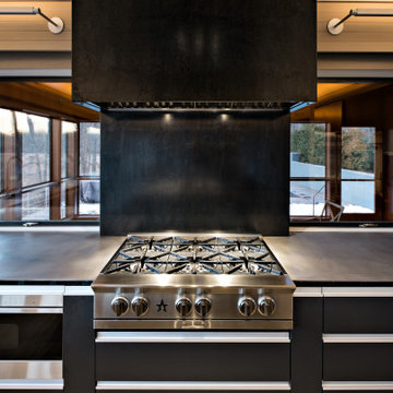
A palette of concrete, blackened steel, stainless steel and colors carefully chosen by homeowner and architect create an interior and exterior environment punctuated by moments that are as artistic as the featured works in the black-ceilinged gallery.

 Nautilus Architects
Located on a marsh in the upper reaches of the Lieutenant River in Old Lyme, the existing house was well-sited and well-built, but the design failed to exploit the views and more importantly was a confused combination of contemporary and traditional elements. The new homeowners, a successful businesswoman and an accomplished artist and photographer, were interested in creating a fully-contemporary environment to open up space, connect indoors with outdoors, display artwork and showcase the husband’s distinctive photographs.
One glaring deficiency was the curb appeal and approach sequence: the grade sloped down and the path to the house followed, but this led to an uncomfortable dip and abrupt rise to the front door. By creating a virtual “moat,” occupied by a grid of raised-bed grasses contained in aluminum-clad boxes, and spanning the moat with an ipe bridge, the approach becomes level and engaging. The façade of the existing house was blank and bland, and with no cover. Adding a deep overhang with a wide porch creates a welcoming, covered condition, accentuated by a 6’ wide pivoting front door that feels more like a moving piece of wall.
Another deficiency was the connection to the outdoors. By adding glass to the front and back of the house, and removing interior walls selectively, the house takes on a diaphanous quality that allows one to see through to the marsh beyond, even when in the driveway. The raised-bed grasses act as abstract, geometric versions of the marsh beyond. A large, pyramidal skylight establishes a spatial hierarchy around which the rooms revolve.
The house featured several tray-ceilinged spaces – living room, kitchen, and master bedroom – that were poorly-proportioned and with panels at the top that resembled inset flat panel doors. The solution was to use a different strategy for each: the bedroom turns the ceiling into an eggshell through the use of a creative trim detail; the living room has an oversized sculptural, backlit lighting element; and the kitchen has a collage of painted rectangular forms that support or include lighting pieces.
A palette of concrete, blackened steel, stainless steel and colors carefully chosen by homeowner and architect create an interior and exterior environment punctuated by moments that are as artistic as the featured works in the black-ceilinged gallery.
 Nautilus Architects
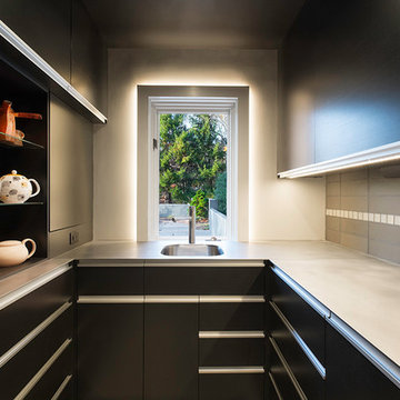
Located on a marsh in the upper reaches of the Lieutenant River in Old Lyme, the existing house was well-sited and well-built, but the design failed to exploit the views and more importantly was a confused combination of contemporary and traditional elements. The new homeowners, a successful businesswoman and an accomplished artist and photographer, were interested in creating a fully-contemporary environment to open up space, connect indoors with outdoors, display artwork and showcase the husband’s distinctive photographs.
One glaring deficiency was the curb appeal and approach sequence: the grade sloped down and the path to the house followed, but this led to an uncomfortable dip and abrupt rise to the front door. By creating a virtual “moat,” occupied by a grid of raised-bed grasses contained in aluminum-clad boxes, and spanning the moat with an ipe bridge, the approach becomes level and engaging. The façade of the existing house was blank and bland, and with no cover. Adding a deep overhang with a wide porch creates a welcoming, covered condition, accentuated by a 6’ wide pivoting front door that feels more like a moving piece of wall.
Another deficiency was the connection to the outdoors. By adding glass to the front and back of the house, and removing interior walls selectively, the house takes on a diaphanous quality that allows one to see through to the marsh beyond, even when in the driveway. The raised-bed grasses act as abstract, geometric versions of the marsh beyond. A large, pyramidal skylight establishes a spatial hierarchy around which the rooms revolve.
The house featured several tray-ceilinged spaces – living room, kitchen, and master bedroom – that were poorly-proportioned and with panels at the top that resembled inset flat panel doors. The solution was to use a different strategy for each: the bedroom turns the ceiling into an eggshell through the use of a creative trim detail; the living room has an oversized sculptural, backlit lighting element; and the kitchen has a collage of painted rectangular forms that support or include lighting pieces.
A palette of concrete, blackened steel, stainless steel and colors carefully chosen by homeowner and architect create an interior and exterior environment punctuated by moments that are as artistic as the featured works in the black-ceilinged gallery.
 KD Project Design, LLC
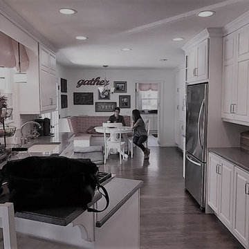
The original layout, though in good condition, was a poorly laid out wide galley style, with large wasted circulation space. Access to the rear patio was limited and not centrally located to the adjacent family room.
 Tile Doctor Ltd
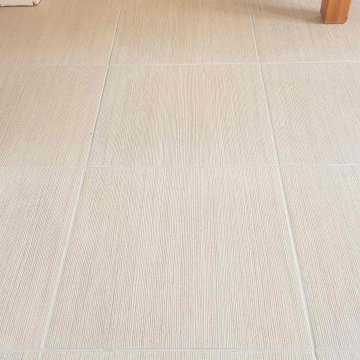
Recently it seems I am getting called out to an increasing number of new builds to sort out patchy grout issues. The reason why there have been so many issues arising is a bit of a mystery, but I put it down to a combination of things like poor quality grout, rushed installations, wet subfloors and the use of different batches.
This recently built house in the village of Darton is a great example and in this case, I suspect two different batches of the same grout had been applied. Darton by the way is a small village in the Borough of Barnsley.
Invariably these problems are picked up by the new owner on their snagging list, with the tiler long gone and the builder keen to get their final payment it is always a tricky situation to resolve. I find the best solution is to apply a Tile Doctor Grout Colourant, it’s a much quicker process than removing the old grout and replacing with new. Most new homeowners would not appreciate us ripping up their brand-new rooms and generating lots of dust in the process! Also, by using the Tile Doctor Grout Colourant it adds a barrier of the grout preventing dirt from discolouring it further down the line.
Even though the house was brand new, the Porcelain Tiled floor was not looking great. The client was happy for me to go ahead and would take up the bill with the housebuilder. I first pre-treated it with Tile Doctors Grout Colourant Pre-Treatment. This removes any contamination from the grout which might affect the adhesion of the colourant and being an acid, it also etches the surface of the grout to ensure a superior bond with the colourant.
The client chose our Light Grey colour which is one of 10 colours we offer. Once the pre-treatment had been applied, scrubbed, rinsed, and vacuumed away the floor was left to dry. Once dry we started applying the colourant, this is done with a small brush (a toothbrush is ideal) carefully scrubbing colourant into each grout joint and wiping off any excess that gets on the tiles before it is able to dry.
Once complete the newly coloured grout lines totally transformed the floor and because the grout colorant is epoxy based the grout lines will stay stain free and never get dirty.
The porcelain tiles were factory sealed so there is no need to apply a seal to the floor.
I recommended the use of Tile Doctor Neutral Tile Cleaner to keep the floor in the best condition. It is pH neutral so is far less harsh on the surface than the everyday household cleaners available. It has a minty fragrance and is mild enough to use daily. They were very happy that the floor now looked as it should have from the start and was the finishing touch to their beautiful new home.
Matthew Lovett
South Yorkshire Tile Doctor
 Prep & Paint
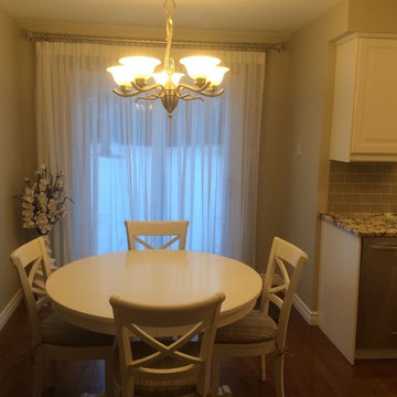
Many years of poorly applied paint and dated decor rendered this otherwise lovely home in need of a pre-move in update by the new owners.
All walls mechanically sanded, patched and refined to a nearly new like condition. Quality paints applied in the current and complimentary colours add to the fresh, crisp appeal.
Prep & Paint Toronto/GTA – Responsive, reliable. High quality residential painter.
13