
Search results for "Poor decision making" in Home Design Ideas
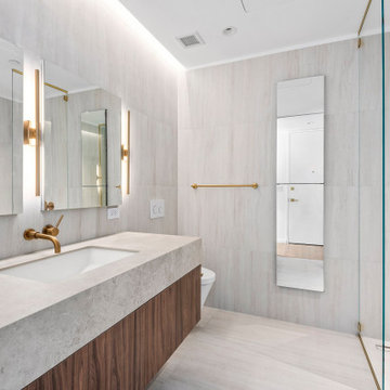
 KURV Architecture DPC (Alex Hughes Architects)
Located in the heart of Manhattan’s Lower East Side, the building was erected on a shallow commercial lot between two 120 year old masonry buildings and a new residential rental building. 330 Grand Street is a mix of 725 SF 1BRs and 1050 SF 2BR apartments. It also contains a 1100 SF two story duplex as well as private and public rooftop space, large private balconies for most units and two large private terraces for the ground floor units.
330 Grand Street was originally designed and approved at the NYC DOB as a prefabricated modular building. During the pandemic, as shipping costs skyrocketed putting the project at risk, we suggested redesigning the building as a reinforced cast-in-place concrete structure. Concrete was readily available and prices had not been affected by the demand increase that many other materials suffered in the pandemic. We took this opportunity to raise floor to ceiling heights, enlarge high performance windows and redistribute the buildings MEPFS and Structural Systems to create very open floor plans.
The challenge was to create a luxurious sensorial living experience with very limited means. In a city with very high construction costs, low cost residential buildings in the area are usually devoid of good quality, design and character. Our approach was to aim high for the end user, prioritizing natural light, open space with long visual perspectives, high ceilings and as always, rejecting the use of predefined building templates.
Our biggest challenge was to ensure that the small spaces feel as clean cut, large and bright as possible. Several unique design decisions were made to ensure low cost and high quality;
Floor plans were laid out so that spaces were wide open and free of clutter from mechanical or structural interruptions. Therefore all infrastructure was placed in lateral demising walls, which in turn act as the unit’s storage and kitchen. The apartments feel wide open, are super quiet and have more storage space than any other comparable apartment in the city.
To solve the problem of the site’s shallow commercial lot which is typically prone to dark interior spaces we focused our attention on the building’s envelope. Instead of the usual small punched window openings, oversized high performance windows were designed to ensure that light penetrated as far as possible into the units. In the smaller 1BR units, the full 50’ depth of the lot is perceived by partitioning spaces with sliding pocket doors that can be retracted to allow deep visual perspectives, making the sight lines in the space feel longer, larger, more ample than normal. In addition to the full height glazing, each unit above the 2nd floor receives a 7 foot covered balcony, adding 120 to 240 sf to each apartment, something unusual in New York City buildings. The space is large enough for a full size dining table, when the weather permits being outside.
We also worked hard to ensure modularity. For example, all kitchen units are all identical throughout the building. The idea of modularity and the economy of the repetitive unit is exercised to the maximum through the building.
Hardware, appliances, flooring, wall coverings and material finishes are all carefully selected to feel bespoke, high quality and unique.
It was important to KURV that the result of this work manifest into something that would deeply connect with the end user and sustain relationships with the consumers of this space.
All images by KURV Architecture ©
 Susan Yeley Homes
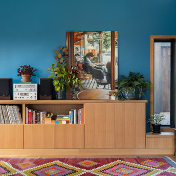
We approached this new build as a seamless, full-service collaboration between architecture and interiors. Every decision—structural, spatial, and aesthetic—was shaped with intention, not to mention collaboration, since our contractor was also our client. Our contractor said, “make the rooflines simple and direct the water away.” His wife said, “I like color.” Check, and check. The bold exterior lines of the home both contrast with and recede into the woods around it, and the interiors are layered with cheerful hues, custom details, and playful patterns. Each room carries its own moment of cheer, while the overall palette ties together into a cohesive, uplifting whole, not unlike its namesake rainbow.
 Susan Yeley Homes
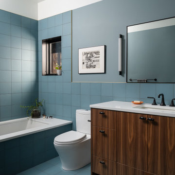
We approached this new build as a seamless, full-service collaboration between architecture and interiors. Every decision—structural, spatial, and aesthetic—was shaped with intention, not to mention collaboration, since our contractor was also our client. Our contractor said, “make the rooflines simple and direct the water away.” His wife said, “I like color.” Check, and check. The bold exterior lines of the home both contrast with and recede into the woods around it, and the interiors are layered with cheerful hues, custom details, and playful patterns. Each room carries its own moment of cheer, while the overall palette ties together into a cohesive, uplifting whole, not unlike its namesake rainbow.
Find the right local pro for your project
 Cantoni Irvine
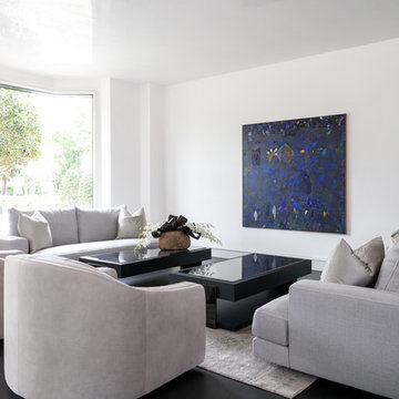
Brad Haines knows a thing or two about building things. The intensely creative and innovative founder of Oklahoma City-based Haines Capital is the driving force behind numerous successful companies including Bank 7 (NASDAQ BSVN), which proudly reported record year-end earnings since going public in September of last year. He has beautifully built, renovated, and personally thumb printed all of his commercial spaces and residences. “Our theory is to keep things sophisticated but comfortable,” Brad says.
That’s the exact approach he took in his personal haven in Nichols Hills, Oklahoma. Painstakingly renovated over the span of two years by Candeleria Foster Design-Build of Oklahoma City, his home boasts museum-white, authentic Venetian plaster walls and ceilings; charcoal tiled flooring; imported marble in the master bath; and a pretty kitchen you’ll want to emulate.
Reminiscent of an edgy luxury hotel, it is a vibe conjured by Cantoni designer Nicole George. “The new remodel plan was all about opening up the space and layering monochromatic color with lots of texture,” says Nicole, who collaborated with Brad on two previous projects. “The color palette is minimal, with charcoal, bone, amber, stone, linen and leather.”
“Sophisticated“Sophisticated“Sophisticated“Sophisticated“Sophisticated
Nicole helped oversee space planning and selection of interior finishes, lighting, furnishings and fine art for the entire 7,000-square-foot home. It is now decked top-to-bottom in pieces sourced from Cantoni, beginning with the custom-ordered console at entry and a pair of Glacier Suspension fixtures over the stairwell. “Every angle in the house is the result of a critical thought process,” Nicole says. “We wanted to make sure each room would be purposeful.”
To that end, “we reintroduced the ‘parlor,’ and also redefined the formal dining area as a bar and drink lounge with enough space for 10 guests to comfortably dine,” Nicole says. Brad’s parlor holds the Swing sectional customized in a silky, soft-hand charcoal leather crafted by prominent Italian leather furnishings company Gamma. Nicole paired it with the Kate swivel chair customized in a light grey leather, the sleek DK writing desk, and the Black & More bar cabinet by Malerba. “Nicole has a special design talent and adapts quickly to what we expect and like,” Brad says.
To create the restaurant-worthy dining space, Nicole brought in a black-satin glass and marble-topped dining table and mohair-velvet chairs, all by Italian maker Gallotti & Radice. Guests can take a post-dinner respite on the adjoining room’s Aston sectional by Gamma.
In the formal living room, Nicole paired Cantoni’s Fashion Affair club chairs with the Black & More cocktail table, and sofas sourced from Désirée, an Italian furniture upholstery company that creates cutting-edge yet comfortable pieces. The color-coordinating kitchen and breakfast area, meanwhile, hold a set of Guapa counter stools in ash grey leather, and the Ray dining table with light-grey leather Cattelan Italia chairs. The expansive loggia also is ideal for entertaining and lounging with the Versa grand sectional, the Ido cocktail table in grey aged walnut and Dolly chairs customized in black nubuck leather. Nicole made most of the design decisions, but, “she took my suggestions seriously and then put me in my place,” Brad says.
She had the master bedroom’s Marlon bed by Gamma customized in a remarkably soft black leather with a matching stitch and paired it with onyx gloss Black & More nightstands. “The furnishings absolutely complement the style,” Brad says. “They are high-quality and have a modern flair, but at the end of the day, are still comfortable and user-friendly.”
The end result is a home Brad not only enjoys, but one that Nicole also finds exceptional. “I honestly love every part of this house,” Nicole says. “Working with Brad is always an adventure but a privilege that I take very seriously, from the beginning of the design process to installation.”
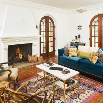
 DK Studio
This Oak Vista home was built in the early part of the 20th Century. We were brought in to make some drastic changes. This property had been used for many years as an office space, so it was full of fluorescent lighting, inexpensive cabinetry, and poorly-executed space planning.
We took down a wall between the existing kitchen and another unused room to create a much more useful and beautiful kitchen with all new cabinets and finishes.
In the upstairs master bathroom, we reconfigured the master bathroom and added a large shower.
In the upstairs hall, which connected to one of the bedrooms, we added a secondary bathroom with a shower featuring period-appropriate scalloped tile.
We selected vintage lighting and, when possible, we reused some of the original fixtures that luckily had been stored previously in the basement for years.
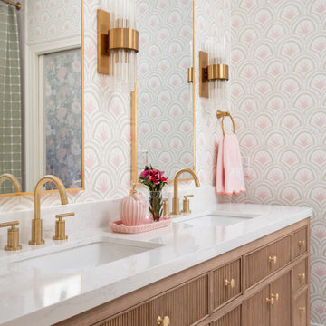
 lavish
These two adjoining girls' rooms — a show-stopping nursery and a dreamy toddler bedroom — are among the most enchanting children's spaces imaginable. Each room has its own distinct personality while sharing a thread of botanical wonder, soft femininity, and elevated design that refuses to talk down to its young inhabitants. These are spaces designed not just for children, but with genuine artistry — rooms that will inspire wonder for years to come.
The Nursery
Step into this nursery and feel immediately transported into a secret garden at dusk. The design decision that sets the entire room apart is breathtakingly bold: a large-scale dark floral wallpaper — blooming with oversized peonies, roses, and wildflowers in dusty pink, peach, sage, and cream against a deep slate blue ground — wraps every wall from chair rail to ceiling, creating an immersive, almost painterly environment that feels simultaneously dramatic and deeply soft.
The ceiling is painted a warm, powdery pink that picks up the blush tones within the wallpaper perfectly — a "fifth wall" design moment that makes the room feel like a complete, considered installation rather than a decorated room. The transition from wallpapered walls to pink ceiling at the crown molding line is seamless and intentional, wrapping the baby in a floral garden overhead and all around.
Anchoring the room with genuine design authority is a spectacular gold and crystal chandelier — its circular brass frame hung with vertical crystal rods that catch and scatter light like a garden in rain — elevating the nursery from charming to genuinely luxurious. Beneath it, a natural oak arched spindle crib sits against the wallpapered feature wall, its warm honey wood grain providing organic contrast to the moody floral backdrop. Pink velvet pillows and a soft crib mobile of plush clouds and moons complete the crib vignette with gentle whimsy.
A boucle glider chair and matching stacked ottoman in cream provide the nursing corner, paired with a small brass side table for midnight essentials. A soft blush pink area rug anchors the seating area and echoes the ceiling color. Linen drapery panels in soft ivory frame the windows without competing with the wallpaper, their pinch-pleat heading adding a refined tailoring detail.
The Toddler Bedroom
The connecting bedroom takes the botanical theme in a softer, sunnier direction — all blush pink walls (matching ceiling and walls in the same warm rose tone for a cocooning effect), botanical print drapery in cream with red and green wildflowers, and brass curtain hardware that ties to the nursery's gold palette. A gold spindle crib — the metallic version of the nursery's wooden one — grounds the room with warmth, while a sage green upholstered glider provides a reading corner. A white dresser with brass hardware doubles as a changing table, topped with art prints and a Matisse-inspired framed poster in a gold frame that adds a touch of grown-up gallery sensibility.
Floating acrylic shelves hold a curated collection of board books at child-height — a detail that communicates that this room was designed for a child who will love and use it, not just admire it. A whimsical wicker llama toy basket, an indoor olive tree, and a fluffy white boucle child's armchair complete a room that balances magic with livability.
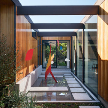
 Klopf Architecture
Malibu Glass Box House by Klopf Architecture
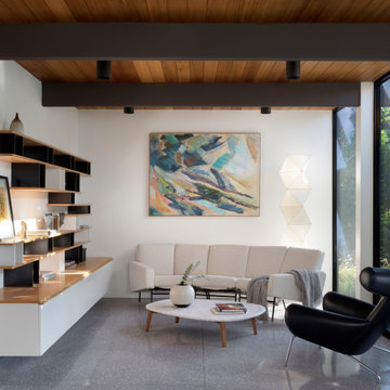
Following the devastating Woolsey Fire of 2018, the site in Malibu offered a unique opportunity to rebuild not just a home, but a new architectural composition that highlighted the property’s potential while navigating strict fire-rebuild codes in the area. Designed by Klopf Architecture, this project embraced a set of limitations and translated them into an architectural asset.
The city’s fire-rebuild process required the new structure to remain close to the original footprint, size and bulk, a constraint that ultimately clarified the architectural direction. Perched near the front of a long, narrow lot, the new home frames and overlooks a private, park-like rear expanse, an uncommon luxury especially in this part of Malibu .
Without a fixed program, the design process allowed for a different kind of creative focus allowing Klopf Architecture the opportunity to explore how a modernist home could best respond to this site. The team approached the project not with a list of requirements, but with a question: How might a modernist live here? What spatial qualities would inspire calm, connection, and a sense of wonder in this setting? The process became less about problem-solving and more about architectural storytelling—letting the site, the light, and the principles of modern design guide the form and flow of the home.
The response emerged in the form of a glass-box pavilion, an open, Mid-Century Modern inspired living, dining, and kitchen space that floats at the edge of the property’s natural descent. Connected to the more enclosed, private areas of the home by a glass-walled hallway, the living pavilion becomes a distinct centerpiece of the design. It opens on all four sides to the landscape with decks and patios on the flanks, an internal garden and water feature to the north, and a dramatic unguarded view of the expansive backyard and ocean horizon to the south.
Because of the mandated footprint, careful planning was required to ensure every space could still engage with light, landscape, or both. Strategic voids in the form of atriums and courtyards allow daylight to filter deep into the home’s core, while offering moments of surprise and retreat. These design gestures allow natural light to filter deep into the interior, creating a sense of brightness and openness throughout the day. At the same time, they expand the perceptual boundaries between inside and out, making the home feel more expansive while anchoring its connection to the surrounding landscape.
The siting of the house is what gives it its unique character. Rather than receding into the backyard like the neighboring homes, the house holds a slight prominence. From the central living pavilion, stepping down into the landscape feels more like entering a secluded park where a separate existing accessory structure, trail, and recreational areas await. The home’s modest street presence gives way to this unfolding drama of space, view, and nature.
Fire-resilient materials and assemblies are integrated seamlessly throughout including triple-pane glazing, under-slab and roof insulation, and locally sourced fire-rated cladding ensure the house not only meets Calfornia’s rigorous wildland-urban interface (WUI) standards, but feels effortlessly aligned with them. While technical decisions like fire-hardening and mechanical systems presented some construction challenges, particularly around the cantilevered glass box, the team found a functional compromise that preserved the integrity of the design.
Inside, a restrained palette and exposed post and beam design celebrate the ethos of mid-century modernism. A central circulation spine extends from the entry to the rear glass wall, offering a continuous visual link from street to ocean. Spaces such as the library and office, though more intimate in scale, are never cut off from nature as each opens to its own unique courtyard or garden view.
Though born out of a strict regulatory framework and developed without a specific client, the rebuild design unfolded with remarkable clarity. Grounded in site logic, refined by limitations and an emphasis on timeless spatial relationships – light, proportion, and a strong connection to nature, the resulting design feels both effortless and uplifting. The home lives lightly on the land, opens generously to its surroundings, and strikes a careful balance between privacy, openness, and calm. For Klopf Architecture, it stands as a compelling case study in how site, code, and circumstantial constraints can inspire enduring, modernist architecture. With years of experience reimagining mid-century modern design for how people live today, the firm took the project’s limitations as an opportunity. The result is a home shaped by open, flowing spaces, strong indoor-outdoor connections, and a calm, clear sense of structure. It’s a good reminder that even with strict constraints, there’s still room for architecture to breathe—and for modernism to keep moving forward.
Klopf Architecture project team: Geoff Campen, John Klopf, AIA, and Sherry Tan
Structural Engineer: ZFA
Contractor: Maison D’Artiste
Photography: ©2025 Mariko Reed
Year Completed: 2023
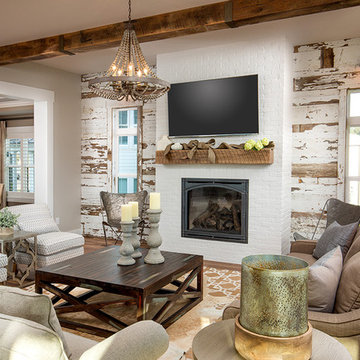

 Klopf Architecture
Malibu Glass Box House by Klopf Architecture
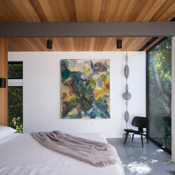
Following the devastating Woolsey Fire of 2018, the site in Malibu offered a unique opportunity to rebuild not just a home, but a new architectural composition that highlighted the property’s potential while navigating strict fire-rebuild codes in the area. Designed by Klopf Architecture, this project embraced a set of limitations and translated them into an architectural asset.
The city’s fire-rebuild process required the new structure to remain close to the original footprint, size and bulk, a constraint that ultimately clarified the architectural direction. Perched near the front of a long, narrow lot, the new home frames and overlooks a private, park-like rear expanse, an uncommon luxury especially in this part of Malibu .
Without a fixed program, the design process allowed for a different kind of creative focus allowing Klopf Architecture the opportunity to explore how a modernist home could best respond to this site. The team approached the project not with a list of requirements, but with a question: How might a modernist live here? What spatial qualities would inspire calm, connection, and a sense of wonder in this setting? The process became less about problem-solving and more about architectural storytelling—letting the site, the light, and the principles of modern design guide the form and flow of the home.
The response emerged in the form of a glass-box pavilion, an open, Mid-Century Modern inspired living, dining, and kitchen space that floats at the edge of the property’s natural descent. Connected to the more enclosed, private areas of the home by a glass-walled hallway, the living pavilion becomes a distinct centerpiece of the design. It opens on all four sides to the landscape with decks and patios on the flanks, an internal garden and water feature to the north, and a dramatic unguarded view of the expansive backyard and ocean horizon to the south.
Because of the mandated footprint, careful planning was required to ensure every space could still engage with light, landscape, or both. Strategic voids in the form of atriums and courtyards allow daylight to filter deep into the home’s core, while offering moments of surprise and retreat. These design gestures allow natural light to filter deep into the interior, creating a sense of brightness and openness throughout the day. At the same time, they expand the perceptual boundaries between inside and out, making the home feel more expansive while anchoring its connection to the surrounding landscape.
The siting of the house is what gives it its unique character. Rather than receding into the backyard like the neighboring homes, the house holds a slight prominence. From the central living pavilion, stepping down into the landscape feels more like entering a secluded park where a separate existing accessory structure, trail, and recreational areas await. The home’s modest street presence gives way to this unfolding drama of space, view, and nature.
Fire-resilient materials and assemblies are integrated seamlessly throughout including triple-pane glazing, under-slab and roof insulation, and locally sourced fire-rated cladding ensure the house not only meets Calfornia’s rigorous wildland-urban interface (WUI) standards, but feels effortlessly aligned with them. While technical decisions like fire-hardening and mechanical systems presented some construction challenges, particularly around the cantilevered glass box, the team found a functional compromise that preserved the integrity of the design.
Inside, a restrained palette and exposed post and beam design celebrate the ethos of mid-century modernism. A central circulation spine extends from the entry to the rear glass wall, offering a continuous visual link from street to ocean. Spaces such as the library and office, though more intimate in scale, are never cut off from nature as each opens to its own unique courtyard or garden view.
Though born out of a strict regulatory framework and developed without a specific client, the rebuild design unfolded with remarkable clarity. Grounded in site logic, refined by limitations and an emphasis on timeless spatial relationships – light, proportion, and a strong connection to nature, the resulting design feels both effortless and uplifting. The home lives lightly on the land, opens generously to its surroundings, and strikes a careful balance between privacy, openness, and calm. For Klopf Architecture, it stands as a compelling case study in how site, code, and circumstantial constraints can inspire enduring, modernist architecture. With years of experience reimagining mid-century modern design for how people live today, the firm took the project’s limitations as an opportunity. The result is a home shaped by open, flowing spaces, strong indoor-outdoor connections, and a calm, clear sense of structure. It’s a good reminder that even with strict constraints, there’s still room for architecture to breathe—and for modernism to keep moving forward.
Klopf Architecture project team: Geoff Campen, John Klopf, AIA, and Sherry Tan
Structural Engineer: ZFA
Contractor: Maison D’Artiste
Photography: ©2025 Mariko Reed
Year Completed: 2023
 Klopf Architecture
Malibu Glass Box House by Klopf Architecture
Following the devastating Woolsey Fire of 2018, the site in Malibu offered a unique opportunity to rebuild not just a home, but a new architectural composition that highlighted the property’s potential while navigating strict fire-rebuild codes in the area. Designed by Klopf Architecture, this project embraced a set of limitations and translated them into an architectural asset.
The city’s fire-rebuild process required the new structure to remain close to the original footprint, size and bulk, a constraint that ultimately clarified the architectural direction. Perched near the front of a long, narrow lot, the new home frames and overlooks a private, park-like rear expanse, an uncommon luxury especially in this part of Malibu .
Without a fixed program, the design process allowed for a different kind of creative focus allowing Klopf Architecture the opportunity to explore how a modernist home could best respond to this site. The team approached the project not with a list of requirements, but with a question: How might a modernist live here? What spatial qualities would inspire calm, connection, and a sense of wonder in this setting? The process became less about problem-solving and more about architectural storytelling—letting the site, the light, and the principles of modern design guide the form and flow of the home.
The response emerged in the form of a glass-box pavilion, an open, Mid-Century Modern inspired living, dining, and kitchen space that floats at the edge of the property’s natural descent. Connected to the more enclosed, private areas of the home by a glass-walled hallway, the living pavilion becomes a distinct centerpiece of the design. It opens on all four sides to the landscape with decks and patios on the flanks, an internal garden and water feature to the north, and a dramatic unguarded view of the expansive backyard and ocean horizon to the south.
Because of the mandated footprint, careful planning was required to ensure every space could still engage with light, landscape, or both. Strategic voids in the form of atriums and courtyards allow daylight to filter deep into the home’s core, while offering moments of surprise and retreat. These design gestures allow natural light to filter deep into the interior, creating a sense of brightness and openness throughout the day. At the same time, they expand the perceptual boundaries between inside and out, making the home feel more expansive while anchoring its connection to the surrounding landscape.
The siting of the house is what gives it its unique character. Rather than receding into the backyard like the neighboring homes, the house holds a slight prominence. From the central living pavilion, stepping down into the landscape feels more like entering a secluded park where a separate existing accessory structure, trail, and recreational areas await. The home’s modest street presence gives way to this unfolding drama of space, view, and nature.
Fire-resilient materials and assemblies are integrated seamlessly throughout including triple-pane glazing, under-slab and roof insulation, and locally sourced fire-rated cladding ensure the house not only meets Calfornia’s rigorous wildland-urban interface (WUI) standards, but feels effortlessly aligned with them. While technical decisions like fire-hardening and mechanical systems presented some construction challenges, particularly around the cantilevered glass box, the team found a functional compromise that preserved the integrity of the design.
Inside, a restrained palette and exposed post and beam design celebrate the ethos of mid-century modernism. A central circulation spine extends from the entry to the rear glass wall, offering a continuous visual link from street to ocean. Spaces such as the library and office, though more intimate in scale, are never cut off from nature as each opens to its own unique courtyard or garden view.
Though born out of a strict regulatory framework and developed without a specific client, the rebuild design unfolded with remarkable clarity. Grounded in site logic, refined by limitations and an emphasis on timeless spatial relationships – light, proportion, and a strong connection to nature, the resulting design feels both effortless and uplifting. The home lives lightly on the land, opens generously to its surroundings, and strikes a careful balance between privacy, openness, and calm. For Klopf Architecture, it stands as a compelling case study in how site, code, and circumstantial constraints can inspire enduring, modernist architecture. With years of experience reimagining mid-century modern design for how people live today, the firm took the project’s limitations as an opportunity. The result is a home shaped by open, flowing spaces, strong indoor-outdoor connections, and a calm, clear sense of structure. It’s a good reminder that even with strict constraints, there’s still room for architecture to breathe—and for modernism to keep moving forward.
Klopf Architecture project team: Geoff Campen, John Klopf, AIA, and Sherry Tan
Structural Engineer: ZFA
Contractor: Maison D’Artiste
Photography: ©2025 Mariko Reed
Year Completed: 2023
 Living with Lolo
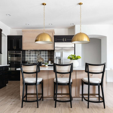
Kitchen in Ironwood Drive | Warm Modern Home in Scottsdale, AZ |
Room Type: Whole Home Remodel and Furnishings |
Project Name: Ironwood Drive Residence |
Key Feature: A Tuscan home transformed into a warm modern interior through a full remodel and furnishings, highlighted by a custom hand-painted terracotta tile backsplash, custom cabinetry, and a new fireplace clad in basalt black stone that anchors the living space with drama and elegance.
Challenge: Tuscan homes in Scottsdale are everywhere, and the design language that defined them, heavy wood, ornate details, dark iron, and rustic stone, does not transition gracefully on its own. The goal was to shed that Old World weight and move the home into something warmer and more current without losing the character that makes a remodeled home feel intentional rather than generic.
Solution: Living with Lolo led the full remodel and furnishings as a single integrated project, which meant every decision from the custom cabinetry to the final throw pillow was made in service of the same design vision. The hand-painted terracotta tile backsplash brought artisan character into the kitchen in a way that felt fresh rather than Tuscan, and the basalt black stone fireplace gave the living space a bold focal point that reads as distinctly modern. Because Lauren holds both an interior design credential and an active Arizona ROC general contractor license, the construction and design were managed under one roof with no gap between the two.
Materials: Custom hand-painted terracotta tile backsplash, custom cabinetry, basalt black stone fireplace, curated warm modern furnishings and textiles sourced through Living with Lolo's trade relationships.
Budget: $250,000 to $550,000 |
Timeline: Approximately 5 to 9 months from design through completion.
 Susan Yeley Homes
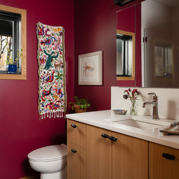
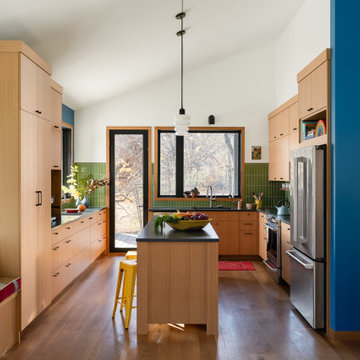
We approached this new build as a seamless, full-service collaboration between architecture and interiors. Every decision—structural, spatial, and aesthetic—was shaped with intention, not to mention collaboration, since our contractor was also our client. Our contractor said, “make the rooflines simple and direct the water away.” His wife said, “I like color.” Check, and check. The bold exterior lines of the home both contrast with and recede into the woods around it, and the interiors are layered with cheerful hues, custom details, and playful patterns. Each room carries its own moment of cheer, while the overall palette ties together into a cohesive, uplifting whole, not unlike its namesake rainbow.
 Susan Yeley Homes
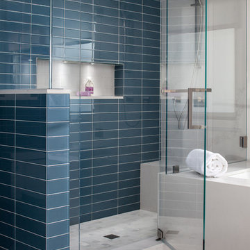
We approached this new build as a seamless, full-service collaboration between architecture and interiors. Every decision—structural, spatial, and aesthetic—was shaped with intention, not to mention collaboration, since our contractor was also our client. Our contractor said, “make the rooflines simple and direct the water away.” His wife said, “I like color.” Check, and check. The bold exterior lines of the home both contrast with and recede into the woods around it, and the interiors are layered with cheerful hues, custom details, and playful patterns. Each room carries its own moment of cheer, while the overall palette ties together into a cohesive, uplifting whole, not unlike its namesake rainbow.
 TBS Construction Inc.
Bathroom is a place where you start and end your day. So how could it be anything short of perfection?! We took this inspiration and transformed one Stanford home’s master bathroom from outdated to sleek and elegant place. Designed according to its function bathroom is also well suited to homeowner’s style preferences. It was a great pleasure working on this project! Owners were highly involved in decision making process and their taste in design turned out to be exquisite!
High end custom materials from leading names:
Caesarstone US, Crystal Cabinet Works Inc., Da Vinci Marble Inc, AKDO, California Faucets, Isenberg Water Experience
Designed and built by TBS Construction Inc
Interior Designers: Krishna Shah & Michelle Talley
Project Manager: Doug Mszanowski
Thanks to Agnieszka Jakubowicz Photography for these gorgeous photos!
Sponsored
Sunbury, OH

J.Holderby - Renovations
Franklin County's Leading General Contractors - 2X Best of Houzz!
 Melissa Sakell, CKBD
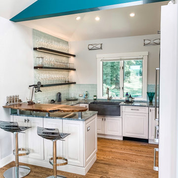
This project was an especially fun one for me and was the first of many with these amazing clients. The original space did not make sense with the homes style and definitely not with the homeowners personalities. So the goal was to brighten it up, make it into an entertaining kitchen as the main kitchen is in another of the house and make it feel like it was always supposed to be there. The space was slightly expanded giving a little more working space and allowing some room for the gorgeous Walnut bar top by Grothouse Lumber, which if you look closely resembles a shark,t he homeowner is an avid diver so this was fate. We continued with water tones in the wavy glass subway tile backsplash and fusion granite countertops, kept the custom WoodMode cabinet white with a slight distressing for some character and grounded the space a little with some darker elements found in the floating shelving and slate farmhouse sink. We also remodeled a pantry in the same style cabinetry and created a whole different feel by switching up the backsplash to a deeper blue. Being just off the main kitchen and close to outdoor entertaining it also needed to be functional and beautiful, wine storage and an ice maker were added to make entertaining a dream. Along with tons of storage to keep everything in its place. The before and afters are amazing and the new spaces fit perfectly within the home and with the homeowners.
 M.J. Whelan Construction
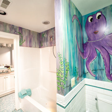
This Rainbow Fish Mural runs throughout all three rooms of this Jack & Jill bath. Built-in pullout stools that look like drawers make using the sink easy for little kids. Round penny floor tile with metallic silver grout, wave light fixtures & watery glass wall tile finish off the theme & make this bath so much fun for 3 lucky kids! Hall Of Portraits
 O’Hara Interiors
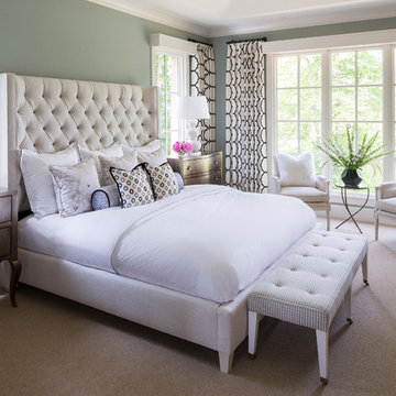
Martha O'Hara Interiors, Interior Design & Photo Styling | Kyle Hunt & Partners, Builder | Troy Thies, Photography
Please Note: All “related,” “similar,” and “sponsored” products tagged or listed by Houzz are not actual products pictured. They have not been approved by Martha O’Hara Interiors nor any of the professionals credited. For information about our work, please contact design@oharainteriors.com.
 Denise Quade Design
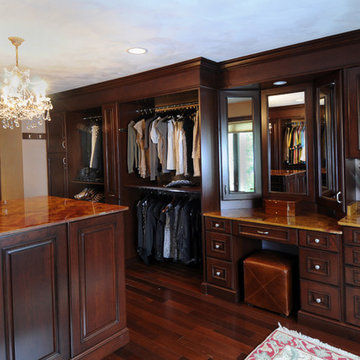
A make up vanity with a tri-view mirror with storage behind the mirror was built in next to a coffee bar into this master bathroom. Five piece drawer fronts make all the cabinets feel more furniture like and more formal. Onyx countertops were used on all the spaces.

Sponsored
Sunbury, OH
J.Holderby - Renovations
Franklin County's Leading General Contractors - 2X Best of Houzz!
 Interiors by Popov
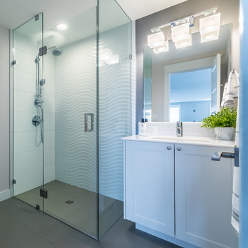
Our clients owned a secondary home in Bellevue and decided to do a major renovation as the family wanted to make this their main residence. A decision was made to add 3 bedrooms and an expanded large kitchen to the property. The homeowners were in love with whites and grays, and their idea was to create a soft modern look with transitional elements.
We designed the kitchen layout to capitalize on the view and to meet all of the homeowners requirements. Large open plan kitchen lets in plenty of natural light and lots of space for their 3 boys to run around. We redesigned all the bathrooms, helped the clients with selection of all the finishes, materials, and fixtures for their new home.
 DEANE Inc | Distinctive Design & Cabinetry
Located in the highly sought-after Allwood neighborhood of Darien, this spec house is the fourth collaboration with a client who first began with a renovation of her own home. While architecturally it is a traditional home from the exterior, the interiors are more transitional in style. In order to compete in the speculative market, our client’s directive was clear – ‘differentiation the kitchen design from every other spec house’. So we incorporated painted cabinetry but highlighted with rift-cut white oak base cabinets. This contrast between these finishes influenced our decision to select a subtle white quartzite countertop to deliberately highlight the striking porcelain backsplash.
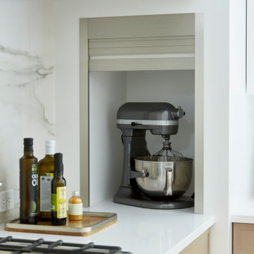
The steel and glass partition frames the space – drawing the eye to the focal point of the kitchen, the custom stainless steel hood. Gold hardware adds a pop of flair to the space and warms the room. Walnut drawer inserts, stainless steel appliance garage, pull out trash drawers with compost bins and a stylish desk make this the Gold Standard of spec houses.
 Jarrett Design
This bathroom needed help as it was tired, dated and cramped! The vanity area was open to the master bedroom and sandwiched between a closet and existing bathroom wall. Behind the bathroom wall, was a second sink, a small walk-in shower and the commode. A poorly placed linen closet ate into the area and there was a soffit over the shower adding to the cramped feeling. The ceiling was cluttered with old-school heating lamps, flush-mount fixtures and ventilation grills. The “movie star” lighting meant to add some glamour only made the bathroom feel dated and sad. Our clients wanted to bring this bathroom to life.
We built a wall and added a door between the bedroom and bathroom to ensure more privacy and define the space. In addition, we removed the wall separating the actual bathroom and vanity area to make the master bathroom larger. The linen closet was also taken out so the shower could be expanded significantly. Our homeowner had recently suffered a knee injury so they were looking for future solutions that would work for them as they continued to age. We made the shower large enough to include a bench and installed a handheld sprayer located near the seat. Shower walls were reinforced so that when the day came that a grab bar was needed, they would be ready.
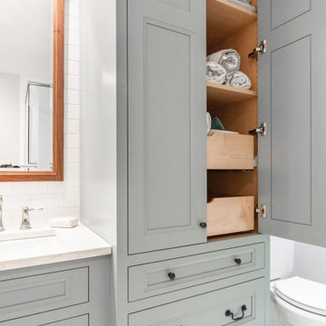
We added a tall cabinet that featured two, deep rollouts and interior shelving to keep linens and bathroom supplies organized. Beneath the sinks, we included rollout drawers so items would not get lost in those dark areas under the plumbing. Everything that had been cluttering the ceiling was removed including the shower soffit and heat lamp. With those gone, we added evenly-spaced, recessed ceiling lights to help brighten the space making it safer and more practical.
We chose a custom blue-green paint for the cabinets which was understated enough to provide a sense of serenity while still offering a splash of color to help liven up the room. Walnut-framed mirrors added a touch of warmth and the patterned floor tile made the whole room fun! An old bathroom came alive!
26