
Search results for "Potential challenges" in Home Design Ideas
 SGDI - Sarah Gallop Design Inc.
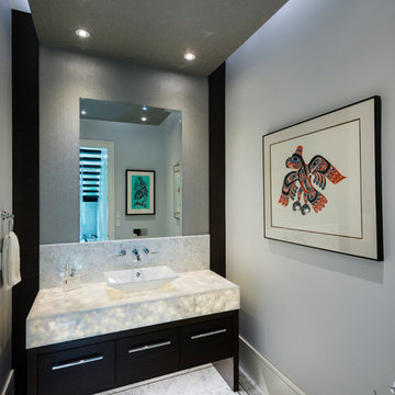
The objective was to create a warm neutral space to later customize to a specific colour palate/preference of the end user for this new construction home being built to sell. A high-end contemporary feel was requested to attract buyers in the area. An impressive kitchen that exuded high class and made an impact on guests as they entered the home, without being overbearing. The space offers an appealing open floorplan conducive to entertaining with indoor-outdoor flow.
Due to the spec nature of this house, the home had to remain appealing to the builder, while keeping a broad audience of potential buyers in mind. The challenge lay in creating a unique look, with visually interesting materials and finishes, while not being so unique that potential owners couldn’t envision making it their own. The focus on key elements elevates the look, while other features blend and offer support to these striking components. As the home was built for sale, profitability was important; materials were sourced at best value, while retaining high-end appeal. Adaptations to the home’s original design plan improve flow and usability within the kitchen-greatroom. The client desired a rich dark finish. The chosen colours tie the kitchen to the rest of the home (creating unity as combination, colours and materials, is repeated throughout).
Photos- Paul Grdina
 Ciarcelluti Mathers Architecture
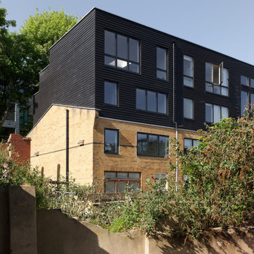
This unique project, in the heart of London Fields' creative sector, involved adjacent live-work units owned individually by a furniture maker and a group of video makers. Although experts in their respective fields, neither had experience with multi-unit development. The project presented several challenges and concerns from our clients, which we addressed with creative solutions, expertise, flexibility and collaboration.
The pair of property owners had become accidental developers by virtue of opportunity. We guided them through a complex process by helping them plan effectively, overcoming several obstacles, and ultimately leading them towards a successful outcome.
Our client's primary challenge was maximising the development potential. The two properties are part of a terrace of four. The other two owners had already added an extra storey. The new volume established a precedent for a volume the planners wanted to complete. Maximising the development potential would require carefully considering the limitations of the established volume to ensure a design that would captivate the target market of young and creative professionals.
To overcome these challenges, we took a comprehensive approach that integrated functional and aesthetic considerations. We first focused on reimagining the interior layout, utilising our expertise to optimise space and create a seamless flow within the units. This involved carefully addressing the planning limitations at the front, resulting in a stepped profile, which had initially posed limits to potential uses.
 Drury Design
The Setup
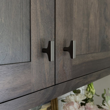
The homeowners of this Barrington Hills residence approached Drury Design with a clear vision: transform their existing kitchen into a space that would better serve their active family of four. With two young children who are homeschooled and love to bake with their mom, plus two dogs, this kitchen needed to function as the true heart of the home.
The existing kitchen was functional but didn’t maximize the potential of the beautiful natural light and scenic views available through the floor-to-ceiling windows. The space was locked between the dining room and family room, which limited structural modifications, but the homeowners wanted to create a more family-friendly environment that would complement the warm walnut built-ins and furnishings in the adjacent dining room while staying true to the home’s overall aesthetic.
Design Objectives:
Create a highly functional workspace that accommodates multiple family members cooking and gathering simultaneously
Maximize the connection to the beautiful outdoor scenery and natural light through thoughtful design choices
Establish a cohesive color palette that complements the existing walnut elements in the adjacent dining room without becoming too tone-on-tone (aka “matchy matchy”)
Improve the seating arrangement to take advantage of the stunning views (rather than facing away from the windows)
Work within the existing architectural constraints, including a curved soffit that could not be removed
Increase storage capacity while maintaining clean, uncluttered sightlines throughout the space
Design Challenges:
The curved soffit presented a design dilemma of whether to echo the curve throughout the kitchen or work with it in a more subtle way
The relatively low ceiling height required careful consideration to avoid making the space feel cramped or cave-like
The existing hardwood floor could not be refinished, which meant the new kitchen footprint had to match or exceed the original layout exactly
Finding the right balance of warm and neutral tones to complement both the existing walnut elements nearby and the natural outdoor views proved challenging
The refrigerator placement was constrained by door swing requirements, which affected the entire layout and prevented centering the sink on the back wall
Rethinking the original seating, which faced inward toward the kitchen (turning backs to the beautiful windows and outdoor views)
Pendant lighting from the previous kitchen obstructed views to the outdoors despite the abundant natural light available
The Renewed Space
Design Solutions:
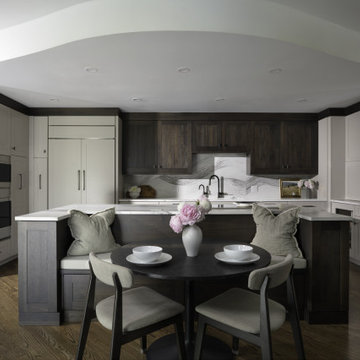
The curved soffit was embraced subtly through the full slab backsplash, which echoes the curve without requiring curved cabinetry or architectural elements that might feel forced
Low ceiling challenges were addressed by using lighter painted cabinets for some tall elements, including the double oven, pantries, and refrigerator area, creating an airy feel while reserving the darker stained walnut for the center section and island
The floor constraint was managed by designing the new layout to cover all previously unfinished areas while maintaining the exact footprint, with only minor touch-ups needed in a few areas
The color palette balances warm walnut stain (harmonizing with the dining room built-ins) with soft, neutral painted cabinets – avoiding stark white that wouldn’t complement the home’s warm aesthetic
Refrigerator placement was optimized with a slim pullout pantry to the left, allowing proper door clearance while maintaining the desired layout flow and enabling the main pantry to be positioned adjacently
The seating was completely reimagined with a built-in banquette facing the windows, allowing diners to enjoy the outdoor views while providing flexible seating for two to four people
Decorative pendant lighting was eliminated in favor of recessed can lights, preserving the unobstructed views to the beautiful outdoor scenery
This kitchen transformation demonstrates how thoughtful design can dramatically improve functionality for a busy family while honoring existing architectural elements. The children immediately began cooking and baking with their mother in the new space, and the window-facing banquette has become a favorite gathering spot where the family can enjoy both meals and the beautiful outdoor views.
Find the right local pro for your project
 Drury Design
THE SETUP
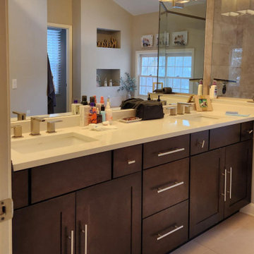
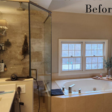
While the existing layout wasn’t inherently flawed, this primary bathroom felt outdated and lacked the desired aesthetic appeal for our client. The goal was to revitalize the space, catering to her refined taste while ensuring a bright, inviting ambiance. The client wanted a comfortable and classy gender-neutral design that would retain its updated look and have broad appeal for eventual resale.
Design Objectives:
Create a spacious, luxurious shower enclosure
Incorporate ample storage for towels, linens and an extensive hair care collection
Embrace a transitional design style that blends contemporary and classic elements
Establish a harmonious color palette that complements the home’s new black window frames
Ensure a future-proof design to maximize resale potential
Design Challenges:
Integrating a spacious shower within the existing layout
Ensuring accessible towel and robe storage near the shower and tub areas
Providing ample lighting and mirror space without cluttering the vanity area
Finding dedicated storage for hair care essentials and accessories
Maximizing linen storage while minimizing clutter
Decluttering the tub niche area
Tall angled ceiling almost too dramatic
THE RENEWED SPACE
Design Solutions:
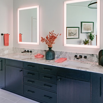
Frameless glass shower enclosure with a recessed niche (in the half wall) for body care products
Strategically placed robe/towel hooks on shower glass facing shower and tub
Illuminated, oversized mirrors with integrated lighting
Multiple large pull-out drawers with electrical outlets in the vanity
Dedicated base cabinet with countertop for towel/linen storage and decor
Single, spacious tub niche for products and decorative accents
Subtle horizontal trim lines at standard ceiling height to visually ground the space
This primary bathroom remodel seamlessly blends style and functionality, catering to the client’s discerning taste while ensuring adaptability for future needs. The harmonious fusion of contemporary and classic design elements, coupled with innovative storage solutions and thoughtful lighting choices, creates a timeless sanctuary that exudes elegance and comfort.
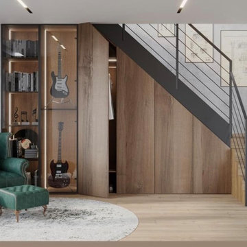
 komandor
Under Stairs Storage & Display Cabinet by Komandor. Under stairs storage can sometimes look awkward and out of place. This cabinet looks like it belongs with wood panelled doors that just blend into the stairs and a stylish display cabinet with lighting & modern mat black framed glass doors. Using design to its utmost potential to enhance this space!
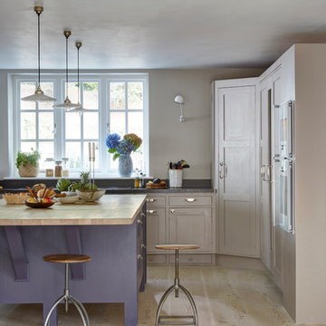

 Drury Design
The Setup
The homeowners of this Barrington Hills residence approached Drury Design with a clear vision: transform their existing kitchen into a space that would better serve their active family of four. With two young children who are homeschooled and love to bake with their mom, plus two dogs, this kitchen needed to function as the true heart of the home.
The existing kitchen was functional but didn’t maximize the potential of the beautiful natural light and scenic views available through the floor-to-ceiling windows. The space was locked between the dining room and family room, which limited structural modifications, but the homeowners wanted to create a more family-friendly environment that would complement the warm walnut built-ins and furnishings in the adjacent dining room while staying true to the home’s overall aesthetic.
Design Objectives:
Create a highly functional workspace that accommodates multiple family members cooking and gathering simultaneously
Maximize the connection to the beautiful outdoor scenery and natural light through thoughtful design choices
Establish a cohesive color palette that complements the existing walnut elements in the adjacent dining room without becoming too tone-on-tone (aka “matchy matchy”)
Improve the seating arrangement to take advantage of the stunning views (rather than facing away from the windows)
Work within the existing architectural constraints, including a curved soffit that could not be removed
Increase storage capacity while maintaining clean, uncluttered sightlines throughout the space
Design Challenges:
The curved soffit presented a design dilemma of whether to echo the curve throughout the kitchen or work with it in a more subtle way
The relatively low ceiling height required careful consideration to avoid making the space feel cramped or cave-like
The existing hardwood floor could not be refinished, which meant the new kitchen footprint had to match or exceed the original layout exactly
Finding the right balance of warm and neutral tones to complement both the existing walnut elements nearby and the natural outdoor views proved challenging
The refrigerator placement was constrained by door swing requirements, which affected the entire layout and prevented centering the sink on the back wall
Rethinking the original seating, which faced inward toward the kitchen (turning backs to the beautiful windows and outdoor views)
Pendant lighting from the previous kitchen obstructed views to the outdoors despite the abundant natural light available
The Renewed Space
Design Solutions:
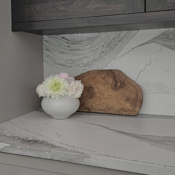
The curved soffit was embraced subtly through the full slab backsplash, which echoes the curve without requiring curved cabinetry or architectural elements that might feel forced
Low ceiling challenges were addressed by using lighter painted cabinets for some tall elements, including the double oven, pantries, and refrigerator area, creating an airy feel while reserving the darker stained walnut for the center section and island
The floor constraint was managed by designing the new layout to cover all previously unfinished areas while maintaining the exact footprint, with only minor touch-ups needed in a few areas
The color palette balances warm walnut stain (harmonizing with the dining room built-ins) with soft, neutral painted cabinets – avoiding stark white that wouldn’t complement the home’s warm aesthetic
Refrigerator placement was optimized with a slim pullout pantry to the left, allowing proper door clearance while maintaining the desired layout flow and enabling the main pantry to be positioned adjacently
The seating was completely reimagined with a built-in banquette facing the windows, allowing diners to enjoy the outdoor views while providing flexible seating for two to four people
Decorative pendant lighting was eliminated in favor of recessed can lights, preserving the unobstructed views to the beautiful outdoor scenery
This kitchen transformation demonstrates how thoughtful design can dramatically improve functionality for a busy family while honoring existing architectural elements. The children immediately began cooking and baking with their mother in the new space, and the window-facing banquette has become a favorite gathering spot where the family can enjoy both meals and the beautiful outdoor views.


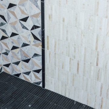 Drury Design
THE SETUP
While the existing layout wasn’t inherently flawed, this primary bathroom felt outdated and lacked the desired aesthetic appeal for our client. The goal was to revitalize the space, catering to her refined taste while ensuring a bright, inviting ambiance. The client wanted a comfortable and classy gender-neutral design that would retain its updated look and have broad appeal for eventual resale.
Design Objectives:
Create a spacious, luxurious shower enclosure
Incorporate ample storage for towels, linens and an extensive hair care collection
Embrace a transitional design style that blends contemporary and classic elements
Establish a harmonious color palette that complements the home’s new black window frames
Ensure a future-proof design to maximize resale potential
Design Challenges:
Integrating a spacious shower within the existing layout
Ensuring accessible towel and robe storage near the shower and tub areas
Providing ample lighting and mirror space without cluttering the vanity area
Finding dedicated storage for hair care essentials and accessories
Maximizing linen storage while minimizing clutter
Decluttering the tub niche area
Tall angled ceiling almost too dramatic
THE RENEWED SPACE
Design Solutions:
Frameless glass shower enclosure with a recessed niche (in the half wall) for body care products
Strategically placed robe/towel hooks on shower glass facing shower and tub
Illuminated, oversized mirrors with integrated lighting
Multiple large pull-out drawers with electrical outlets in the vanity
Dedicated base cabinet with countertop for towel/linen storage and decor
Single, spacious tub niche for products and decorative accents
Subtle horizontal trim lines at standard ceiling height to visually ground the space
This primary bathroom remodel seamlessly blends style and functionality, catering to the client’s discerning taste while ensuring adaptability for future needs. The harmonious fusion of contemporary and classic design elements, coupled with innovative storage solutions and thoughtful lighting choices, creates a timeless sanctuary that exudes elegance and comfort.
 Carriage Lane Design-Build Inc.
Photography: Stephani Buchman
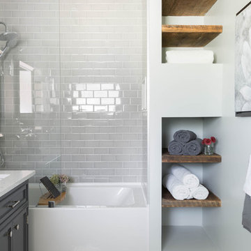
Bathroom - mid-sized contemporary master gray tile and subway tile marble floor and gray floor bathroom idea in Toronto with an undermount sink, recessed-panel cabinets, gray cabinets and gray walls
Bathroom - mid-sized contemporary master gray tile and subway tile marble floor and gray floor bathroom idea in Toronto with an undermount sink, recessed-panel cabinets, gray cabinets and gray walls
 Drury Design
The Setup
The homeowners of this Barrington Hills residence approached Drury Design with a clear vision: transform their existing kitchen into a space that would better serve their active family of four. With two young children who are homeschooled and love to bake with their mom, plus two dogs, this kitchen needed to function as the true heart of the home.
The existing kitchen was functional but didn’t maximize the potential of the beautiful natural light and scenic views available through the floor-to-ceiling windows. The space was locked between the dining room and family room, which limited structural modifications, but the homeowners wanted to create a more family-friendly environment that would complement the warm walnut built-ins and furnishings in the adjacent dining room while staying true to the home’s overall aesthetic.
Design Objectives:
Create a highly functional workspace that accommodates multiple family members cooking and gathering simultaneously
Maximize the connection to the beautiful outdoor scenery and natural light through thoughtful design choices
Establish a cohesive color palette that complements the existing walnut elements in the adjacent dining room without becoming too tone-on-tone (aka “matchy matchy”)
Improve the seating arrangement to take advantage of the stunning views (rather than facing away from the windows)
Work within the existing architectural constraints, including a curved soffit that could not be removed
Increase storage capacity while maintaining clean, uncluttered sightlines throughout the space
Design Challenges:
The curved soffit presented a design dilemma of whether to echo the curve throughout the kitchen or work with it in a more subtle way
The relatively low ceiling height required careful consideration to avoid making the space feel cramped or cave-like
The existing hardwood floor could not be refinished, which meant the new kitchen footprint had to match or exceed the original layout exactly
Finding the right balance of warm and neutral tones to complement both the existing walnut elements nearby and the natural outdoor views proved challenging
The refrigerator placement was constrained by door swing requirements, which affected the entire layout and prevented centering the sink on the back wall
Rethinking the original seating, which faced inward toward the kitchen (turning backs to the beautiful windows and outdoor views)
Pendant lighting from the previous kitchen obstructed views to the outdoors despite the abundant natural light available
The Renewed Space
Design Solutions:
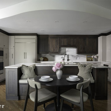
The curved soffit was embraced subtly through the full slab backsplash, which echoes the curve without requiring curved cabinetry or architectural elements that might feel forced
Low ceiling challenges were addressed by using lighter painted cabinets for some tall elements, including the double oven, pantries, and refrigerator area, creating an airy feel while reserving the darker stained walnut for the center section and island
The floor constraint was managed by designing the new layout to cover all previously unfinished areas while maintaining the exact footprint, with only minor touch-ups needed in a few areas
The color palette balances warm walnut stain (harmonizing with the dining room built-ins) with soft, neutral painted cabinets – avoiding stark white that wouldn’t complement the home’s warm aesthetic
Refrigerator placement was optimized with a slim pullout pantry to the left, allowing proper door clearance while maintaining the desired layout flow and enabling the main pantry to be positioned adjacently
The seating was completely reimagined with a built-in banquette facing the windows, allowing diners to enjoy the outdoor views while providing flexible seating for two to four people
Decorative pendant lighting was eliminated in favor of recessed can lights, preserving the unobstructed views to the beautiful outdoor scenery
This kitchen transformation demonstrates how thoughtful design can dramatically improve functionality for a busy family while honoring existing architectural elements. The children immediately began cooking and baking with their mother in the new space, and the window-facing banquette has become a favorite gathering spot where the family can enjoy both meals and the beautiful outdoor views.
 Drury Design
The Setup
The homeowners of this Barrington Hills residence approached Drury Design with a clear vision: transform their existing kitchen into a space that would better serve their active family of four. With two young children who are homeschooled and love to bake with their mom, plus two dogs, this kitchen needed to function as the true heart of the home.
The existing kitchen was functional but didn’t maximize the potential of the beautiful natural light and scenic views available through the floor-to-ceiling windows. The space was locked between the dining room and family room, which limited structural modifications, but the homeowners wanted to create a more family-friendly environment that would complement the warm walnut built-ins and furnishings in the adjacent dining room while staying true to the home’s overall aesthetic.
Design Objectives:
Create a highly functional workspace that accommodates multiple family members cooking and gathering simultaneously
Maximize the connection to the beautiful outdoor scenery and natural light through thoughtful design choices
Establish a cohesive color palette that complements the existing walnut elements in the adjacent dining room without becoming too tone-on-tone (aka “matchy matchy”)
Improve the seating arrangement to take advantage of the stunning views (rather than facing away from the windows)
Work within the existing architectural constraints, including a curved soffit that could not be removed
Increase storage capacity while maintaining clean, uncluttered sightlines throughout the space
Design Challenges:
The curved soffit presented a design dilemma of whether to echo the curve throughout the kitchen or work with it in a more subtle way
The relatively low ceiling height required careful consideration to avoid making the space feel cramped or cave-like
The existing hardwood floor could not be refinished, which meant the new kitchen footprint had to match or exceed the original layout exactly
Finding the right balance of warm and neutral tones to complement both the existing walnut elements nearby and the natural outdoor views proved challenging
The refrigerator placement was constrained by door swing requirements, which affected the entire layout and prevented centering the sink on the back wall
Rethinking the original seating, which faced inward toward the kitchen (turning backs to the beautiful windows and outdoor views)
Pendant lighting from the previous kitchen obstructed views to the outdoors despite the abundant natural light available
The Renewed Space
Design Solutions:
The curved soffit was embraced subtly through the full slab backsplash, which echoes the curve without requiring curved cabinetry or architectural elements that might feel forced
Low ceiling challenges were addressed by using lighter painted cabinets for some tall elements, including the double oven, pantries, and refrigerator area, creating an airy feel while reserving the darker stained walnut for the center section and island
The floor constraint was managed by designing the new layout to cover all previously unfinished areas while maintaining the exact footprint, with only minor touch-ups needed in a few areas
The color palette balances warm walnut stain (harmonizing with the dining room built-ins) with soft, neutral painted cabinets – avoiding stark white that wouldn’t complement the home’s warm aesthetic
Refrigerator placement was optimized with a slim pullout pantry to the left, allowing proper door clearance while maintaining the desired layout flow and enabling the main pantry to be positioned adjacently
The seating was completely reimagined with a built-in banquette facing the windows, allowing diners to enjoy the outdoor views while providing flexible seating for two to four people
Decorative pendant lighting was eliminated in favor of recessed can lights, preserving the unobstructed views to the beautiful outdoor scenery
This kitchen transformation demonstrates how thoughtful design can dramatically improve functionality for a busy family while honoring existing architectural elements. The children immediately began cooking and baking with their mother in the new space, and the window-facing banquette has become a favorite gathering spot where the family can enjoy both meals and the beautiful outdoor views.
 LeichtUSA
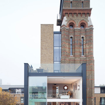
Attractive living as an architectural experiment: a 136-year-old water tower, a listed building with a spectacular 360-degree panorama view over the City of London. The task, to transform it into a superior residence, initially seemed an absolute impossibility. But when the owners came across architect Mike Collier, they had found a partner who was to make the impossible possible. The tower, which had been empty for decades, underwent radical renovation work and was extended by a four-storey cube containing kitchen, dining and living room - connected by glazed tunnels and a lift shaft. The kitchen, realised by Enclosure Interiors in Tunbridge Wells, Kent, with furniture from LEICHT is the very heart of living in this new building.
Shiny white matt-lacquered kitchen fronts (AVANCE-LR), tone-on-tone with the worktops, reflect the light in the room and thus create expanse and openness. The surface of the handle-less kitchen fronts has a horizontal relief embossing; depending on the light incidence, this results in a vitally structured surface. The free-standing preparation isle with its vertical side panels with a seamlessly integrated sink represents the transition between kitchen and living room. The fronts of the floor units facing the dining table were extended to the floor to do away with the plinth typical of most kitchens. Ceiling-high tall units on the wall provide plenty of storage space; the electrical appliances are integrated here invisible to the eye. Floor units on a high plinth which thus appear to be floating form the actual cooking centre within the kitchen, attached to the wall. A range of handle-less wall units concludes the glazed niche at the top.
LEICHT international: “Architecture and kitchen” in the centre of London. www.LeichtUSA.com
 Drury Design
The Setup
The homeowners of this Barrington Hills residence approached Drury Design with a clear vision: transform their existing kitchen into a space that would better serve their active family of four. With two young children who are homeschooled and love to bake with their mom, plus two dogs, this kitchen needed to function as the true heart of the home.
The existing kitchen was functional but didn’t maximize the potential of the beautiful natural light and scenic views available through the floor-to-ceiling windows. The space was locked between the dining room and family room, which limited structural modifications, but the homeowners wanted to create a more family-friendly environment that would complement the warm walnut built-ins and furnishings in the adjacent dining room while staying true to the home’s overall aesthetic.
Design Objectives:
Create a highly functional workspace that accommodates multiple family members cooking and gathering simultaneously
Maximize the connection to the beautiful outdoor scenery and natural light through thoughtful design choices
Establish a cohesive color palette that complements the existing walnut elements in the adjacent dining room without becoming too tone-on-tone (aka “matchy matchy”)
Improve the seating arrangement to take advantage of the stunning views (rather than facing away from the windows)
Work within the existing architectural constraints, including a curved soffit that could not be removed
Increase storage capacity while maintaining clean, uncluttered sightlines throughout the space
Design Challenges:
The curved soffit presented a design dilemma of whether to echo the curve throughout the kitchen or work with it in a more subtle way
The relatively low ceiling height required careful consideration to avoid making the space feel cramped or cave-like
The existing hardwood floor could not be refinished, which meant the new kitchen footprint had to match or exceed the original layout exactly
Finding the right balance of warm and neutral tones to complement both the existing walnut elements nearby and the natural outdoor views proved challenging
The refrigerator placement was constrained by door swing requirements, which affected the entire layout and prevented centering the sink on the back wall
Rethinking the original seating, which faced inward toward the kitchen (turning backs to the beautiful windows and outdoor views)
Pendant lighting from the previous kitchen obstructed views to the outdoors despite the abundant natural light available
The Renewed Space
Design Solutions:
The curved soffit was embraced subtly through the full slab backsplash, which echoes the curve without requiring curved cabinetry or architectural elements that might feel forced
Low ceiling challenges were addressed by using lighter painted cabinets for some tall elements, including the double oven, pantries, and refrigerator area, creating an airy feel while reserving the darker stained walnut for the center section and island
The floor constraint was managed by designing the new layout to cover all previously unfinished areas while maintaining the exact footprint, with only minor touch-ups needed in a few areas
The color palette balances warm walnut stain (harmonizing with the dining room built-ins) with soft, neutral painted cabinets – avoiding stark white that wouldn’t complement the home’s warm aesthetic
Refrigerator placement was optimized with a slim pullout pantry to the left, allowing proper door clearance while maintaining the desired layout flow and enabling the main pantry to be positioned adjacently
The seating was completely reimagined with a built-in banquette facing the windows, allowing diners to enjoy the outdoor views while providing flexible seating for two to four people
Decorative pendant lighting was eliminated in favor of recessed can lights, preserving the unobstructed views to the beautiful outdoor scenery
This kitchen transformation demonstrates how thoughtful design can dramatically improve functionality for a busy family while honoring existing architectural elements. The children immediately began cooking and baking with their mother in the new space, and the window-facing banquette has become a favorite gathering spot where the family can enjoy both meals and the beautiful outdoor views.
Sponsored
Delaware, OH

Buckeye Basements, Inc.
Central Ohio's Basement Finishing ExpertsBest Of Houzz '13-'21
 Drury Design
THE SETUP
While the existing layout wasn’t inherently flawed, this primary bathroom felt outdated and lacked the desired aesthetic appeal for our client. The goal was to revitalize the space, catering to her refined taste while ensuring a bright, inviting ambiance. The client wanted a comfortable and classy gender-neutral design that would retain its updated look and have broad appeal for eventual resale.
Design Objectives:
Create a spacious, luxurious shower enclosure
Incorporate ample storage for towels, linens and an extensive hair care collection
Embrace a transitional design style that blends contemporary and classic elements
Establish a harmonious color palette that complements the home’s new black window frames
Ensure a future-proof design to maximize resale potential
Design Challenges:
Integrating a spacious shower within the existing layout
Ensuring accessible towel and robe storage near the shower and tub areas
Providing ample lighting and mirror space without cluttering the vanity area
Finding dedicated storage for hair care essentials and accessories
Maximizing linen storage while minimizing clutter
Decluttering the tub niche area
Tall angled ceiling almost too dramatic
THE RENEWED SPACE
Design Solutions:
Frameless glass shower enclosure with a recessed niche (in the half wall) for body care products
Strategically placed robe/towel hooks on shower glass facing shower and tub
Illuminated, oversized mirrors with integrated lighting
Multiple large pull-out drawers with electrical outlets in the vanity
Dedicated base cabinet with countertop for towel/linen storage and decor
Single, spacious tub niche for products and decorative accents
Subtle horizontal trim lines at standard ceiling height to visually ground the space
This primary bathroom remodel seamlessly blends style and functionality, catering to the client’s discerning taste while ensuring adaptability for future needs. The harmonious fusion of contemporary and classic design elements, coupled with innovative storage solutions and thoughtful lighting choices, creates a timeless sanctuary that exudes elegance and comfort.
 Drury Design
THE SETUP
While the existing layout wasn’t inherently flawed, this primary bathroom felt outdated and lacked the desired aesthetic appeal for our client. The goal was to revitalize the space, catering to her refined taste while ensuring a bright, inviting ambiance. The client wanted a comfortable and classy gender-neutral design that would retain its updated look and have broad appeal for eventual resale.
Design Objectives:
Create a spacious, luxurious shower enclosure
Incorporate ample storage for towels, linens and an extensive hair care collection
Embrace a transitional design style that blends contemporary and classic elements
Establish a harmonious color palette that complements the home’s new black window frames
Ensure a future-proof design to maximize resale potential
Design Challenges:
Integrating a spacious shower within the existing layout
Ensuring accessible towel and robe storage near the shower and tub areas
Providing ample lighting and mirror space without cluttering the vanity area
Finding dedicated storage for hair care essentials and accessories
Maximizing linen storage while minimizing clutter
Decluttering the tub niche area
Tall angled ceiling almost too dramatic
THE RENEWED SPACE
Design Solutions:
Frameless glass shower enclosure with a recessed niche (in the half wall) for body care products
Strategically placed robe/towel hooks on shower glass facing shower and tub
Illuminated, oversized mirrors with integrated lighting
Multiple large pull-out drawers with electrical outlets in the vanity
Dedicated base cabinet with countertop for towel/linen storage and decor
Single, spacious tub niche for products and decorative accents
Subtle horizontal trim lines at standard ceiling height to visually ground the space
This primary bathroom remodel seamlessly blends style and functionality, catering to the client’s discerning taste while ensuring adaptability for future needs. The harmonious fusion of contemporary and classic design elements, coupled with innovative storage solutions and thoughtful lighting choices, creates a timeless sanctuary that exudes elegance and comfort.
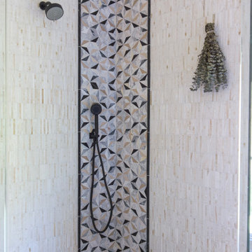 Drury Design
THE SETUP
While the existing layout wasn’t inherently flawed, this primary bathroom felt outdated and lacked the desired aesthetic appeal for our client. The goal was to revitalize the space, catering to her refined taste while ensuring a bright, inviting ambiance. The client wanted a comfortable and classy gender-neutral design that would retain its updated look and have broad appeal for eventual resale.
Design Objectives:
Create a spacious, luxurious shower enclosure
Incorporate ample storage for towels, linens and an extensive hair care collection
Embrace a transitional design style that blends contemporary and classic elements
Establish a harmonious color palette that complements the home’s new black window frames
Ensure a future-proof design to maximize resale potential
Design Challenges:
Integrating a spacious shower within the existing layout
Ensuring accessible towel and robe storage near the shower and tub areas
Providing ample lighting and mirror space without cluttering the vanity area
Finding dedicated storage for hair care essentials and accessories
Maximizing linen storage while minimizing clutter
Decluttering the tub niche area
Tall angled ceiling almost too dramatic
THE RENEWED SPACE
Design Solutions:
Frameless glass shower enclosure with a recessed niche (in the half wall) for body care products
Strategically placed robe/towel hooks on shower glass facing shower and tub
Illuminated, oversized mirrors with integrated lighting
Multiple large pull-out drawers with electrical outlets in the vanity
Dedicated base cabinet with countertop for towel/linen storage and decor
Single, spacious tub niche for products and decorative accents
Subtle horizontal trim lines at standard ceiling height to visually ground the space
This primary bathroom remodel seamlessly blends style and functionality, catering to the client’s discerning taste while ensuring adaptability for future needs. The harmonious fusion of contemporary and classic design elements, coupled with innovative storage solutions and thoughtful lighting choices, creates a timeless sanctuary that exudes elegance and comfort.
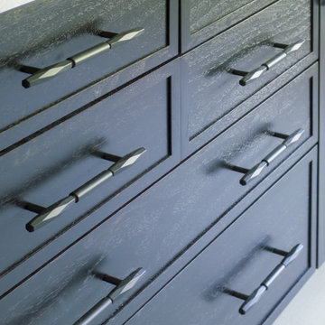 Drury Design
THE SETUP
While the existing layout wasn’t inherently flawed, this primary bathroom felt outdated and lacked the desired aesthetic appeal for our client. The goal was to revitalize the space, catering to her refined taste while ensuring a bright, inviting ambiance. The client wanted a comfortable and classy gender-neutral design that would retain its updated look and have broad appeal for eventual resale.
Design Objectives:
Create a spacious, luxurious shower enclosure
Incorporate ample storage for towels, linens and an extensive hair care collection
Embrace a transitional design style that blends contemporary and classic elements
Establish a harmonious color palette that complements the home’s new black window frames
Ensure a future-proof design to maximize resale potential
Design Challenges:
Integrating a spacious shower within the existing layout
Ensuring accessible towel and robe storage near the shower and tub areas
Providing ample lighting and mirror space without cluttering the vanity area
Finding dedicated storage for hair care essentials and accessories
Maximizing linen storage while minimizing clutter
Decluttering the tub niche area
Tall angled ceiling almost too dramatic
THE RENEWED SPACE
Design Solutions:
Frameless glass shower enclosure with a recessed niche (in the half wall) for body care products
Strategically placed robe/towel hooks on shower glass facing shower and tub
Illuminated, oversized mirrors with integrated lighting
Multiple large pull-out drawers with electrical outlets in the vanity
Dedicated base cabinet with countertop for towel/linen storage and decor
Single, spacious tub niche for products and decorative accents
Subtle horizontal trim lines at standard ceiling height to visually ground the space
This primary bathroom remodel seamlessly blends style and functionality, catering to the client’s discerning taste while ensuring adaptability for future needs. The harmonious fusion of contemporary and classic design elements, coupled with innovative storage solutions and thoughtful lighting choices, creates a timeless sanctuary that exudes elegance and comfort.
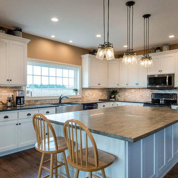

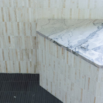 Drury Design
THE SETUP
While the existing layout wasn’t inherently flawed, this primary bathroom felt outdated and lacked the desired aesthetic appeal for our client. The goal was to revitalize the space, catering to her refined taste while ensuring a bright, inviting ambiance. The client wanted a comfortable and classy gender-neutral design that would retain its updated look and have broad appeal for eventual resale.
Design Objectives:
Create a spacious, luxurious shower enclosure
Incorporate ample storage for towels, linens and an extensive hair care collection
Embrace a transitional design style that blends contemporary and classic elements
Establish a harmonious color palette that complements the home’s new black window frames
Ensure a future-proof design to maximize resale potential
Design Challenges:
Integrating a spacious shower within the existing layout
Ensuring accessible towel and robe storage near the shower and tub areas
Providing ample lighting and mirror space without cluttering the vanity area
Finding dedicated storage for hair care essentials and accessories
Maximizing linen storage while minimizing clutter
Decluttering the tub niche area
Tall angled ceiling almost too dramatic
THE RENEWED SPACE
Design Solutions:
Frameless glass shower enclosure with a recessed niche (in the half wall) for body care products
Strategically placed robe/towel hooks on shower glass facing shower and tub
Illuminated, oversized mirrors with integrated lighting
Multiple large pull-out drawers with electrical outlets in the vanity
Dedicated base cabinet with countertop for towel/linen storage and decor
Single, spacious tub niche for products and decorative accents
Subtle horizontal trim lines at standard ceiling height to visually ground the space
This primary bathroom remodel seamlessly blends style and functionality, catering to the client’s discerning taste while ensuring adaptability for future needs. The harmonious fusion of contemporary and classic design elements, coupled with innovative storage solutions and thoughtful lighting choices, creates a timeless sanctuary that exudes elegance and comfort.
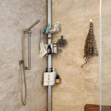 Drury Design
THE SETUP
While the existing layout wasn’t inherently flawed, this primary bathroom felt outdated and lacked the desired aesthetic appeal for our client. The goal was to revitalize the space, catering to her refined taste while ensuring a bright, inviting ambiance. The client wanted a comfortable and classy gender-neutral design that would retain its updated look and have broad appeal for eventual resale.
Design Objectives:
Create a spacious, luxurious shower enclosure
Incorporate ample storage for towels, linens and an extensive hair care collection
Embrace a transitional design style that blends contemporary and classic elements
Establish a harmonious color palette that complements the home’s new black window frames
Ensure a future-proof design to maximize resale potential
Design Challenges:
Integrating a spacious shower within the existing layout
Ensuring accessible towel and robe storage near the shower and tub areas
Providing ample lighting and mirror space without cluttering the vanity area
Finding dedicated storage for hair care essentials and accessories
Maximizing linen storage while minimizing clutter
Decluttering the tub niche area
Tall angled ceiling almost too dramatic
THE RENEWED SPACE
Design Solutions:
Frameless glass shower enclosure with a recessed niche (in the half wall) for body care products
Strategically placed robe/towel hooks on shower glass facing shower and tub
Illuminated, oversized mirrors with integrated lighting
Multiple large pull-out drawers with electrical outlets in the vanity
Dedicated base cabinet with countertop for towel/linen storage and decor
Single, spacious tub niche for products and decorative accents
Subtle horizontal trim lines at standard ceiling height to visually ground the space
This primary bathroom remodel seamlessly blends style and functionality, catering to the client’s discerning taste while ensuring adaptability for future needs. The harmonious fusion of contemporary and classic design elements, coupled with innovative storage solutions and thoughtful lighting choices, creates a timeless sanctuary that exudes elegance and comfort.
 Drury Design
The Setup
The homeowners of this Barrington Hills residence approached Drury Design with a clear vision: transform their existing kitchen into a space that would better serve their active family of four. With two young children who are homeschooled and love to bake with their mom, plus two dogs, this kitchen needed to function as the true heart of the home.
The existing kitchen was functional but didn’t maximize the potential of the beautiful natural light and scenic views available through the floor-to-ceiling windows. The space was locked between the dining room and family room, which limited structural modifications, but the homeowners wanted to create a more family-friendly environment that would complement the warm walnut built-ins and furnishings in the adjacent dining room while staying true to the home’s overall aesthetic.
Design Objectives:
Create a highly functional workspace that accommodates multiple family members cooking and gathering simultaneously
Maximize the connection to the beautiful outdoor scenery and natural light through thoughtful design choices
Establish a cohesive color palette that complements the existing walnut elements in the adjacent dining room without becoming too tone-on-tone (aka “matchy matchy”)
Improve the seating arrangement to take advantage of the stunning views (rather than facing away from the windows)
Work within the existing architectural constraints, including a curved soffit that could not be removed
Increase storage capacity while maintaining clean, uncluttered sightlines throughout the space
Design Challenges:
The curved soffit presented a design dilemma of whether to echo the curve throughout the kitchen or work with it in a more subtle way
The relatively low ceiling height required careful consideration to avoid making the space feel cramped or cave-like
The existing hardwood floor could not be refinished, which meant the new kitchen footprint had to match or exceed the original layout exactly
Finding the right balance of warm and neutral tones to complement both the existing walnut elements nearby and the natural outdoor views proved challenging
The refrigerator placement was constrained by door swing requirements, which affected the entire layout and prevented centering the sink on the back wall
Rethinking the original seating, which faced inward toward the kitchen (turning backs to the beautiful windows and outdoor views)
Pendant lighting from the previous kitchen obstructed views to the outdoors despite the abundant natural light available
The Renewed Space
Design Solutions:
The curved soffit was embraced subtly through the full slab backsplash, which echoes the curve without requiring curved cabinetry or architectural elements that might feel forced
Low ceiling challenges were addressed by using lighter painted cabinets for some tall elements, including the double oven, pantries, and refrigerator area, creating an airy feel while reserving the darker stained walnut for the center section and island
The floor constraint was managed by designing the new layout to cover all previously unfinished areas while maintaining the exact footprint, with only minor touch-ups needed in a few areas
The color palette balances warm walnut stain (harmonizing with the dining room built-ins) with soft, neutral painted cabinets – avoiding stark white that wouldn’t complement the home’s warm aesthetic
Refrigerator placement was optimized with a slim pullout pantry to the left, allowing proper door clearance while maintaining the desired layout flow and enabling the main pantry to be positioned adjacently
The seating was completely reimagined with a built-in banquette facing the windows, allowing diners to enjoy the outdoor views while providing flexible seating for two to four people
Decorative pendant lighting was eliminated in favor of recessed can lights, preserving the unobstructed views to the beautiful outdoor scenery
This kitchen transformation demonstrates how thoughtful design can dramatically improve functionality for a busy family while honoring existing architectural elements. The children immediately began cooking and baking with their mother in the new space, and the window-facing banquette has become a favorite gathering spot where the family can enjoy both meals and the beautiful outdoor views.
9