
Search results for "Potential difference" in Home Design Ideas
 GIBSON SOTHEBY’S INTERNATIONAL REALTY
 https://www.beangroup.com/homes/45-E-Andover-Road-Andover/ME/04216/AGT-2261431456-942410/index.html
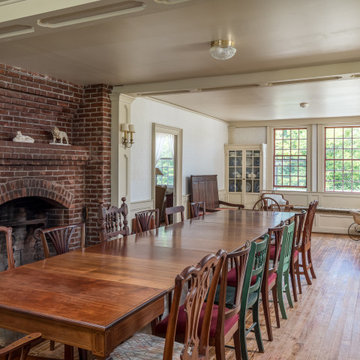
Merrill House is a gracious, Early American Country Estate located in the picturesque Androscoggin River Valley, about a half hour northeast of Sunday River Ski Resort, Maine. This baronial estate, once a trophy of successful American frontier family and railroads industry publisher, Henry Varnum Poor, founder of Standard & Poor’s Corp., is comprised of a grand main house, caretaker’s house, and several barns. Entrance is through a Gothic great hall standing 30’ x 60’ and another 30’ high in the apex of its cathedral ceiling and showcases a granite hearth and mantel 12’ wide.
Owned by the same family for over 225 years, it is currently a family retreat and is available for seasonal weddings and events with the capacity to accommodate 32 overnight guests and 200 outdoor guests. Listed on the National Register of Historic Places, and heralding contributions from Frederick Law Olmsted and Stanford White, the beautiful, legacy property sits on 110 acres of fields and forest with expansive views of the scenic Ellis River Valley and Mahoosuc mountains, offering more than a half-mile of pristine river-front, private spring-fed pond and beach, and 5 acres of manicured lawns and gardens.
The historic property can be envisioned as a magnificent private residence, ski lodge, corporate retreat, hunting and fishing lodge, potential bed and breakfast, farm - with options for organic farming, commercial solar, storage or subdivision.
Showings offered by appointment.
 Meridian Construction
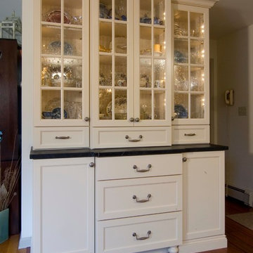
This Harleysville, PA Kitchen was a major overhaul. Meridian Construction opened up walls and created an entirely different layout for this remodel. Others had told the homeowner that a large island was not possible but Meridian saw the potential and helped the customer design an eleven foot island perfect for her baking needs. The beautiful Soapstone countertops and white cabinetry are a dream in this kitchen fit for a chef; complete with hidden spice racks, farmhouse sink, and baker’s table. With the customer, Meridian designed the custom-made Soapstone plaque showcasing the property’s prized pond. Check out the unimaginable “Before” shot in our Before & After Gallery. Design and Construction by Meridian.
 Metropolis Drafting and Construction Inc
An original 1930’s English Tudor with only 2 bedrooms and 1 bath spanning about 1730 sq.ft. was purchased by a family with 2 amazing young kids, we saw the potential of this property to become a wonderful nest for the family to grow.
The plan was to reach a 2550 sq. ft. home with 4 bedroom and 4 baths spanning over 2 stories.
With continuation of the exiting architectural style of the existing home.
A large 1000sq. ft. addition was constructed at the back portion of the house to include the expended master bedroom and a second-floor guest suite with a large observation balcony overlooking the mountains of Angeles Forest.
An L shape staircase leading to the upstairs creates a moment of modern art with an all white walls and ceilings of this vaulted space act as a picture frame for a tall window facing the northern mountains almost as a live landscape painting that changes throughout the different times of day.
Tall high sloped roof created an amazing, vaulted space in the guest suite with 4 uniquely designed windows extruding out with separate gable roof above.
The downstairs bedroom boasts 9’ ceilings, extremely tall windows to enjoy the greenery of the backyard, vertical wood paneling on the walls add a warmth that is not seen very often in today’s new build.
The master bathroom has a showcase 42sq. walk-in shower with its own private south facing window to illuminate the space with natural morning light. A larger format wood siding was using for the vanity backsplash wall and a private water closet for privacy.
In the interior reconfiguration and remodel portion of the project the area serving as a family room was transformed to an additional bedroom with a private bath, a laundry room and hallway.
The old bathroom was divided with a wall and a pocket door into a powder room the leads to a tub room.
The biggest change was the kitchen area, as befitting to the 1930’s the dining room, kitchen, utility room and laundry room were all compartmentalized and enclosed.
We eliminated all these partitions and walls to create a large open kitchen area that is completely open to the vaulted dining room. This way the natural light the washes the kitchen in the morning and the rays of sun that hit the dining room in the afternoon can be shared by the two areas.
The opening to the living room remained only at 8’ to keep a division of space.
Find the right local pro for your project
 Ben Trogdon Architects
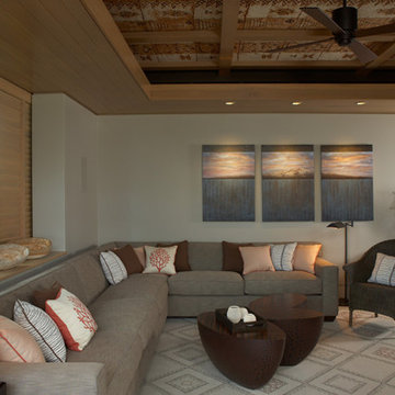
Inspiration for a large contemporary enclosed light wood floor and beige floor family room remodel in Seattle with white walls, no fireplace and no tv
 Klopf Architecture
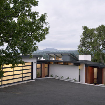
Set in a quiet neighborhood and framed by mature trees, this residence presented a unique opportunity: to thoughtfully evolve a custom mid-century modern home into a space that supports the everyday rhythms of a growing family. With a deep respect for the home’s original architecture, Klopf Architecture reimagined the house to better meet the needs of its owners—introducing functional improvements while preserving the spirit and character of its mid-century roots.
The clients approached Klopf Architecture with a clear vision: refresh their home while seamlessly integrating new programmatic elements. Key goals included clarifying and enhancing the entry sequence; connecting the detached garage to the main house with a practical yet architecturally intentional intervention; adding functional spaces such as a mudroom and laundry room; expanding and remodeling the primary suite’s bathroom and closet; and creating a more engaging outdoor space that capitalized on the site’s impressive views, featuring a fire pit and outdoor kitchen.
As a couple with distinct yet complementary perspectives—one focused on modern functionality and technology, and the other dedicated to preserving the home’s architectural integrity—their collaboration with Klopf Architecture resulted in a solution that harmonized both ideals. Their shared commitment to improving the livability of their home led to a design dialogue rooted in balance. This dynamic partnership shaped the direction of the renovation, ensuring that every decision honored the spirit of the original home while aligning with the practical needs of their growing family.
Designing within the constraints of the sloped site posed one of the project’s central challenges. The detached garage sat at a higher elevation than the main house, requiring a solution that ensured architectural and geometric compatibility between the two structures. Rather than create a purely utilitarian link, Klopf Architecture introduced an intentional connection that contributes to the overall architectural language. A notable pinch point in the plan—where differing geometries converged—was treated as a hinge point, turning a potentially awkward juncture into an architectural feature. This area now functions as both a transition and a moment of design interest that unifies the overall plan.
The design also addressed the underutilized outdoor area, which was located in a shadowed portion of the site with geometrical limitations. A new connection to the rear deck was created in this same area, making the outdoor space more useful and inviting. Klopf Architecture introduced carefully positioned openings and spatial improvements that forged a strong visual and functional connection between indoor and outdoor spaces. The outdoor area now reads as a deliberate extension of the home, embracing natural light and emphasizing the dramatic views.
Working through multiple design iterations, Klopf Architecture crafted a solution that preserved the architectural language of the original home while supporting the functional needs of modern life. The garage-to-house connection became more than a passage—it evolved into an architectural moment of transition. A new mudroom and laundry space enhanced convenience without compromising the clean lines of the design. The primary suite was expanded to create a private, serene retreat. The reimagined backyard, complete with fire pit and kitchen, now plays a vital role in the family’s daily routine and social life.
Outcomes and Lasting Impact
The result is a home that balances heritage with contemporary design, technical precision with design sensibility. The redesign not only met the clients’ initial goals but also exceeded expectations in its ability to seamlessly blend past and present, function and beauty, making the outdoor kitchen a favorite gathering place.
Beyond aesthetics, the renovation has significantly improved daily life for the family. The newly integrated garage connection has streamlined routines, providing a seamless transition between arriving home, storing belongings, and entering the main living spaces. The expanded primary suite offers a retreat-like atmosphere, creating a private space to unwind at the end of the day. The redesigned outdoor areas have also become an extension of their lifestyle—whether it's casual family dinners around the fire pit, entertaining friends in the outdoor kitchen, or simply enjoying the view from the reimagined backyard.
Through a thoughtful and strategic approach, the house has been successfully evolved into a home that remains true to its mid-century modern roots while enhancing livability, functionality, and the overall quality of life for the modern-day owners.
Klopf Architecture Team: Geoffrey Campen, Fernanda Bernardes
Architectural Interior Design: Klopf Architecture
Structural Engineer: Base Design Inc.
Contractor: Golden Snail Builders
Photography: Mariko Reed
Year Completed:2022
 Hylan Design, Ltd.
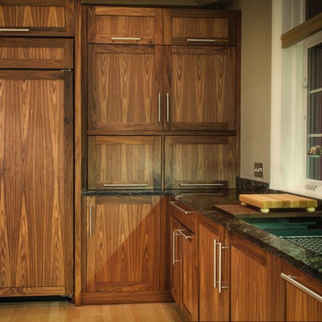
Thanks to a design team who are trained to listen and well‐targeted input
from the clients we were able to incorporate hidden details guaranteeing the kitchen would be used to
its greatest potential. Some of these hidden details include: pocket doors by the T.V. so as not to block
the view of the T.V.; pull‐outs above deep pot drawers for lid storage; double layered utensil drawers
with custom wood dividers for silverware and utensils; LeMans by Hafele for blind corner storage and a
Cervo operated waste receptacle to the left of the sink that makes cleaning up a breeze. The long
horizontal stainless steel handles were chosen to emphasize the lines of the kitchen and the stainless
appliances. The different but complimentary perimeter and island counters not only add another layer
of interest but also act as another warm and inviting design element.
 Klopf Architecture
Malibu Glass Box House by Klopf Architecture
Following the devastating Woolsey Fire of 2018, the site in Malibu offered a unique opportunity to rebuild not just a home, but a new architectural composition that highlighted the property’s potential while navigating strict fire-rebuild codes in the area. Designed by Klopf Architecture, this project embraced a set of limitations and translated them into an architectural asset.
The city’s fire-rebuild process required the new structure to remain close to the original footprint, size and bulk, a constraint that ultimately clarified the architectural direction. Perched near the front of a long, narrow lot, the new home frames and overlooks a private, park-like rear expanse, an uncommon luxury especially in this part of Malibu .
Without a fixed program, the design process allowed for a different kind of creative focus allowing Klopf Architecture the opportunity to explore how a modernist home could best respond to this site. The team approached the project not with a list of requirements, but with a question: How might a modernist live here? What spatial qualities would inspire calm, connection, and a sense of wonder in this setting? The process became less about problem-solving and more about architectural storytelling—letting the site, the light, and the principles of modern design guide the form and flow of the home.
The response emerged in the form of a glass-box pavilion, an open, Mid-Century Modern inspired living, dining, and kitchen space that floats at the edge of the property’s natural descent. Connected to the more enclosed, private areas of the home by a glass-walled hallway, the living pavilion becomes a distinct centerpiece of the design. It opens on all four sides to the landscape with decks and patios on the flanks, an internal garden and water feature to the north, and a dramatic unguarded view of the expansive backyard and ocean horizon to the south.
Because of the mandated footprint, careful planning was required to ensure every space could still engage with light, landscape, or both. Strategic voids in the form of atriums and courtyards allow daylight to filter deep into the home’s core, while offering moments of surprise and retreat. These design gestures allow natural light to filter deep into the interior, creating a sense of brightness and openness throughout the day. At the same time, they expand the perceptual boundaries between inside and out, making the home feel more expansive while anchoring its connection to the surrounding landscape.
The siting of the house is what gives it its unique character. Rather than receding into the backyard like the neighboring homes, the house holds a slight prominence. From the central living pavilion, stepping down into the landscape feels more like entering a secluded park where a separate existing accessory structure, trail, and recreational areas await. The home’s modest street presence gives way to this unfolding drama of space, view, and nature.
Fire-resilient materials and assemblies are integrated seamlessly throughout including triple-pane glazing, under-slab and roof insulation, and locally sourced fire-rated cladding ensure the house not only meets Calfornia’s rigorous wildland-urban interface (WUI) standards, but feels effortlessly aligned with them. While technical decisions like fire-hardening and mechanical systems presented some construction challenges, particularly around the cantilevered glass box, the team found a functional compromise that preserved the integrity of the design.
Inside, a restrained palette and exposed post and beam design celebrate the ethos of mid-century modernism. A central circulation spine extends from the entry to the rear glass wall, offering a continuous visual link from street to ocean. Spaces such as the library and office, though more intimate in scale, are never cut off from nature as each opens to its own unique courtyard or garden view.
Though born out of a strict regulatory framework and developed without a specific client, the rebuild design unfolded with remarkable clarity. Grounded in site logic, refined by limitations and an emphasis on timeless spatial relationships – light, proportion, and a strong connection to nature, the resulting design feels both effortless and uplifting. The home lives lightly on the land, opens generously to its surroundings, and strikes a careful balance between privacy, openness, and calm. For Klopf Architecture, it stands as a compelling case study in how site, code, and circumstantial constraints can inspire enduring, modernist architecture. With years of experience reimagining mid-century modern design for how people live today, the firm took the project’s limitations as an opportunity. The result is a home shaped by open, flowing spaces, strong indoor-outdoor connections, and a calm, clear sense of structure. It’s a good reminder that even with strict constraints, there’s still room for architecture to breathe—and for modernism to keep moving forward.
Klopf Architecture project team: Geoff Campen, John Klopf, AIA, and Sherry Tan
Structural Engineer: ZFA
Contractor: Maison D’Artiste
Photography: ©2025 Mariko Reed
Year Completed: 2023


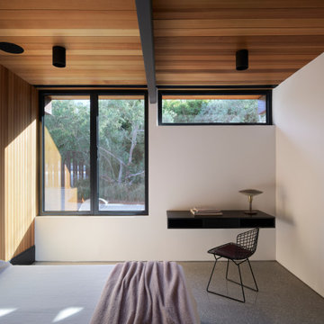 Klopf Architecture
Malibu Glass Box House by Klopf Architecture
Following the devastating Woolsey Fire of 2018, the site in Malibu offered a unique opportunity to rebuild not just a home, but a new architectural composition that highlighted the property’s potential while navigating strict fire-rebuild codes in the area. Designed by Klopf Architecture, this project embraced a set of limitations and translated them into an architectural asset.
The city’s fire-rebuild process required the new structure to remain close to the original footprint, size and bulk, a constraint that ultimately clarified the architectural direction. Perched near the front of a long, narrow lot, the new home frames and overlooks a private, park-like rear expanse, an uncommon luxury especially in this part of Malibu .
Without a fixed program, the design process allowed for a different kind of creative focus allowing Klopf Architecture the opportunity to explore how a modernist home could best respond to this site. The team approached the project not with a list of requirements, but with a question: How might a modernist live here? What spatial qualities would inspire calm, connection, and a sense of wonder in this setting? The process became less about problem-solving and more about architectural storytelling—letting the site, the light, and the principles of modern design guide the form and flow of the home.
The response emerged in the form of a glass-box pavilion, an open, Mid-Century Modern inspired living, dining, and kitchen space that floats at the edge of the property’s natural descent. Connected to the more enclosed, private areas of the home by a glass-walled hallway, the living pavilion becomes a distinct centerpiece of the design. It opens on all four sides to the landscape with decks and patios on the flanks, an internal garden and water feature to the north, and a dramatic unguarded view of the expansive backyard and ocean horizon to the south.
Because of the mandated footprint, careful planning was required to ensure every space could still engage with light, landscape, or both. Strategic voids in the form of atriums and courtyards allow daylight to filter deep into the home’s core, while offering moments of surprise and retreat. These design gestures allow natural light to filter deep into the interior, creating a sense of brightness and openness throughout the day. At the same time, they expand the perceptual boundaries between inside and out, making the home feel more expansive while anchoring its connection to the surrounding landscape.
The siting of the house is what gives it its unique character. Rather than receding into the backyard like the neighboring homes, the house holds a slight prominence. From the central living pavilion, stepping down into the landscape feels more like entering a secluded park where a separate existing accessory structure, trail, and recreational areas await. The home’s modest street presence gives way to this unfolding drama of space, view, and nature.
Fire-resilient materials and assemblies are integrated seamlessly throughout including triple-pane glazing, under-slab and roof insulation, and locally sourced fire-rated cladding ensure the house not only meets Calfornia’s rigorous wildland-urban interface (WUI) standards, but feels effortlessly aligned with them. While technical decisions like fire-hardening and mechanical systems presented some construction challenges, particularly around the cantilevered glass box, the team found a functional compromise that preserved the integrity of the design.
Inside, a restrained palette and exposed post and beam design celebrate the ethos of mid-century modernism. A central circulation spine extends from the entry to the rear glass wall, offering a continuous visual link from street to ocean. Spaces such as the library and office, though more intimate in scale, are never cut off from nature as each opens to its own unique courtyard or garden view.
Though born out of a strict regulatory framework and developed without a specific client, the rebuild design unfolded with remarkable clarity. Grounded in site logic, refined by limitations and an emphasis on timeless spatial relationships – light, proportion, and a strong connection to nature, the resulting design feels both effortless and uplifting. The home lives lightly on the land, opens generously to its surroundings, and strikes a careful balance between privacy, openness, and calm. For Klopf Architecture, it stands as a compelling case study in how site, code, and circumstantial constraints can inspire enduring, modernist architecture. With years of experience reimagining mid-century modern design for how people live today, the firm took the project’s limitations as an opportunity. The result is a home shaped by open, flowing spaces, strong indoor-outdoor connections, and a calm, clear sense of structure. It’s a good reminder that even with strict constraints, there’s still room for architecture to breathe—and for modernism to keep moving forward.
Klopf Architecture project team: Geoff Campen, John Klopf, AIA, and Sherry Tan
Structural Engineer: ZFA
Contractor: Maison D’Artiste
Photography: ©2025 Mariko Reed
Year Completed: 2023
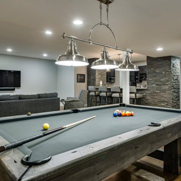
 Diane Bishop Interiors
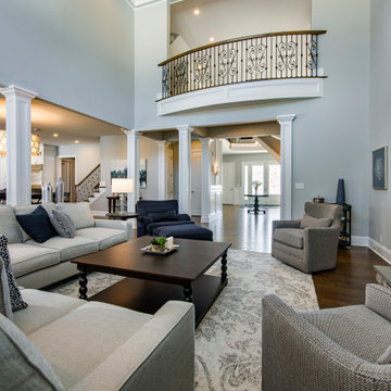
When we started this project it was our job to coax out the true character and potential hiding in this lovely home. Selecting a calming color palate and different textures throughout got us off to a great start.
Jay Greene Photography
 Diane Bishop Interiors
When we started this project it was our job to coax out the true character and potential hiding in this lovely home. Selecting a calming color palate and different textures throughout got us off to a great start.
Jay Greene Photography
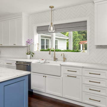
 Penn Contractors Inc
Details make a difference, especially when working with an open-concept floor plan. In this
Center Valley kitchen remodel, previous clients trusted us to update their
outdated space while bringing new life and purpose to a large, unused dining area.
Previously featuring dark wood cabinetry beneath low ceilings, the kitchen’s 90’s design was
ready for refresh. The area diagonal to the kitchen - a “breakfast room” sitting nearly empty, was
also redundant with the formal dining room nearby. Because of the open floor plan, the space
was noticeable immediately upon entering the home.
The clients knew that there was potential, but had never committed to transforming the extra
square footage into anything more than additional seating. Our designer’s idea was to extend
the kitchen into the dining area by adding cabinetry and a coffee bar, using the same custom
cabinets for a cohesive look. Navy blue paint defines the coffee bar, while touches of blue on the kitchen island, and the veining of the white quartz countertops tie the design together.
Other favorite features of the design include the chef oven with a custom hood, the farmhouse
sink from Blanco, and custom bench seating under the windows.
 Aegis Exteriors
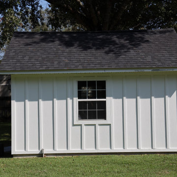
New siding make a massive difference to potential buyers, improves the appeal of the property, and protects your belongings from inclement weather.
Garden shed - small country detached garden shed idea
Garden shed - small country detached garden shed idea

 User
UserIn the early days of the 3d architectural visualisation studio, the focus was on creating photo-realistic images of buildings that didn't yet exist. This allowed potential buyers or renters to see what their future home or office would look like.
Nowadays, the role of the 3d architectural visualizer has evolved. While still involved in the sale or rental of property, they are also heavily involved in the design process. By using 3d architectural visualization, architects and designers can explore different design options and make sure that the final product meets the needs of the client.
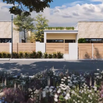
In this blog post, we will take a look at a recent project by a 3d architectural visualizer - the Visualize a Residential Colony in Meridian Idaho.
A 3D architectural visualisation is an important tool for architects and engineers. It allows them to create realistic images of their designs, which can be used to present their ideas to clients or investors.
The studio Visualize was commissioned to create a 3D visualisation of a proposed residential colony in Meridian, Idaho. The colony will be built on a site that is currently occupied by a golf course.
The studio used a variety of software to create the visualisation, including 3ds Max, V-Ray, and Photoshop. The finished product is a realistic and accurate representation of the proposed colony.
The 3D visualisation has been used to convince the local authorities to approve the project. It has also been used to help raise investment for the colony.
 Penn Contractors Inc
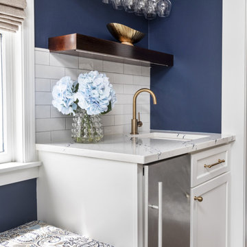
Details make a difference, especially when working with an open-concept floor plan. In this
Center Valley kitchen remodel, previous clients trusted us to update their
outdated space while bringing new life and purpose to a large, unused dining area.
Previously featuring dark wood cabinetry beneath low ceilings, the kitchen’s 90’s design was
ready for refresh. The area diagonal to the kitchen - a “breakfast room” sitting nearly empty, was
also redundant with the formal dining room nearby. Because of the open floor plan, the space
was noticeable immediately upon entering the home.
The clients knew that there was potential, but had never committed to transforming the extra
square footage into anything more than additional seating. Our designer’s idea was to extend
the kitchen into the dining area by adding cabinetry and a coffee bar, using the same custom
cabinets for a cohesive look. Navy blue paint defines the coffee bar, while touches of blue on the kitchen island, and the veining of the white quartz countertops tie the design together.
Other favorite features of the design include the chef oven with a custom hood, the farmhouse
sink from Blanco, and custom bench seating under the windows.
 Hinkle Outdoor Living
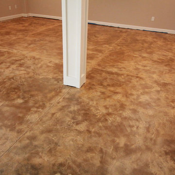
Finished basement floors with stained concrete, bar area, and kitchen
Trendy walk-out concrete floor basement photo in Kansas City with beige walls and no fireplace
Trendy walk-out concrete floor basement photo in Kansas City with beige walls and no fireplace
 Jon Allen Fine Metal Art
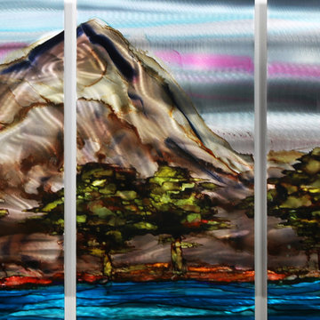
Terrain by Jon Allen - OOAK 137
The Jon Allen Collection is an exclusive, hand-selected group of my most personal work to date. Each piece is hand-painted on aluminum. My art itself and my chosen medium, aluminum, are blissfully married. You may not think of the word organic when you hear the word metal, but this is some of my most organic art and that’s simply because metal allows my work to achieve true sentience. Aluminum’s naturally reflective nature enables each color, shape, and stroke to reach its full potential. A new aspect of the painting will reveal itself to you as it basks in the light that surrounds, evades, or envelops it in that moment. When you see the piece from different angles, you will appreciate how vibrant, dynamic, and environmentally influenced these pieces are. What you may see and feel by morning is not what you’ll see or feel by dusk and in many ways, and as such I feel these pieces capture the ever-ebbing and complex nature of human emotion and perception.
Some of these pieces are truly abstract while others are modern takes on traditional landscapes, marine life, and portraits. I hope you enjoy them a fraction of how much I enjoyed creating them. If you have any questions, please don’t hesitate to reach out.
Number of Pieces: 1
Dimensions: 64" x 24" x 2" off the wall
Care & Cleaning: Clean with a soft cloth and plain soap & water
Other Features: Hardware is pre-installed for simple hanging and art will “float” 2” off the wall
 Jon Allen Fine Metal Art
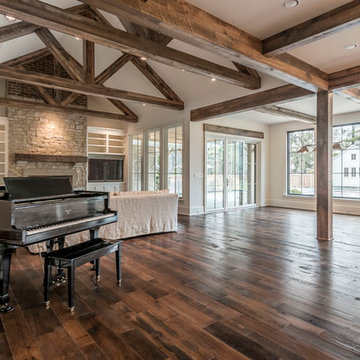
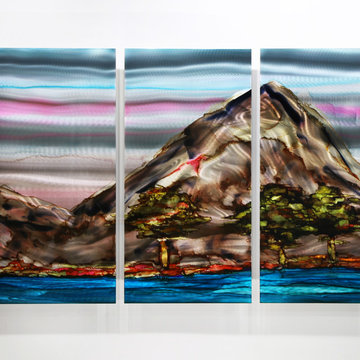
Terrain by Jon Allen - OOAK 137
The Jon Allen Collection is an exclusive, hand-selected group of my most personal work to date. Each piece is hand-painted on aluminum. My art itself and my chosen medium, aluminum, are blissfully married. You may not think of the word organic when you hear the word metal, but this is some of my most organic art and that’s simply because metal allows my work to achieve true sentience. Aluminum’s naturally reflective nature enables each color, shape, and stroke to reach its full potential. A new aspect of the painting will reveal itself to you as it basks in the light that surrounds, evades, or envelops it in that moment. When you see the piece from different angles, you will appreciate how vibrant, dynamic, and environmentally influenced these pieces are. What you may see and feel by morning is not what you’ll see or feel by dusk and in many ways, and as such I feel these pieces capture the ever-ebbing and complex nature of human emotion and perception.
Some of these pieces are truly abstract while others are modern takes on traditional landscapes, marine life, and portraits. I hope you enjoy them a fraction of how much I enjoyed creating them. If you have any questions, please don’t hesitate to reach out.
Number of Pieces: 1
Dimensions: 64" x 24" x 2" off the wall
Care & Cleaning: Clean with a soft cloth and plain soap & water
Other Features: Hardware is pre-installed for simple hanging and art will “float” 2” off the wall
 Saeed shenakhteh
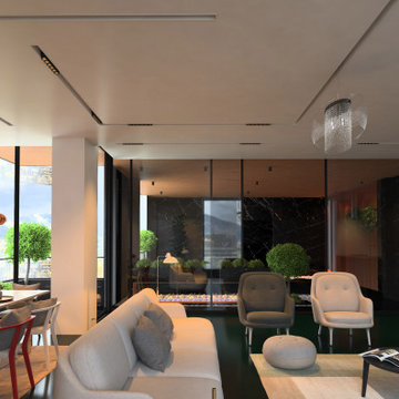
INSPIRATION: local settlements in northern Iran formed by a simple adaptation of the nature, geography and climate of that region. The local architecture of this place is so intertwined with nature and in harmony with the climate that it can be called naturalistic architecture. We are looking to redefining the region's former architecture, which needs protection, into today's language.
Unique properties: Extroverted architecture is a solution that is necessary to respond to the hot and humid climate of the location of this project. But in Iranian culture, introverted architecture is unavoidable therefore, in this residential apartment where several families live together and also have common spaces, providing a response to introversion and extroversion at the same time has been considered.
Description: Extreme use of the porch refers to the deep structures of the Iranian Architecture The "primitive cottage", which is a favorite of the residents of this small town, when converted into a contemporary apartment, must include several basic spaces to implement the residential scenario. Private and semi-private balconies are the most important of those spaces. Extensive vista is the potential of this project. because in addition to the forest view from the south and the beach view on the north side, the other two sides of the project have a unique view due to their height from the city.
Therefore, the location and type of openings affect the quality of the space. Each space has a pleasant view, light and proper air circulation. Roofed and non-roofed yards equally divided at different levels. These independent courtyards in the vertical surfaces seen as a vertical and integrated garden in the urban context.
CHALENGE: The value that the project pursues is to answer: How contemporary architecture can be faithful to culture, nature and context? How architecture can affect the audience without showing off?
this challenge arose for us when we noticed that the surrounding new buildings had nothing to do with local architecture except for adhering to a form such as a sloping roof. Audience tastes have also gone in a direction that is not compatible with contextual factors. So having a few touches of culture and context can be a turning point in the contemporary architecture of this Small scale area.
 Simply Home Decorating
This beautiful North Vancouver home belongs to a nature-loving and health-conscious couple, Emma and Vince (names changed), their two young children, and their dog, Jasper. When they contacted us about renovating and furnishing their kitchen and family room, we walked in and saw a world of potential waiting to be uncovered.
Before: Larkhall Crescent Home:
Like many original North Vancouver homes, the interior was definitely dated. We encountered late ‘80s finishes in powder pink and teal green, old carpet, and a kitchen that wasn’t maximized to suit this family’s modern-day lifestyle. However, the size of the rooms offered us a ton of space with which to get creative.
Knowing our clients’ love of cooking, need for work spaces (Emma and Vince both work remotely), and growing family, we developed a design concept that would increase usable space, optimize storage, and create intimacy in this large area. As for the style, we were inspired by their European roots, inventing a new and modern take on “Belgian Farmhouse” style. Now, the home is truly one-of-a-kind.
After: Warm & Cozy Family Room:
Fresh, bright, and comfortable, this living area has been transformed! We started with the fireplace as a focal point, selecting aged brick tiles for added texture and a crisp wood mantle. The taupe-coloured sectional infuses the room with visual warmth and serves the added purpose of separating the family room from the kitchen.
Emma and Vince were also keen on using non-toxic materials in their home, and we were happy to oblige. To meet their needs, we sourced natural wood elements and sought out Canadian-made products - that adhere to high health standards - whenever possible.
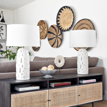
Look closer at the elements of this space, and you will find this stunning, honeycomb-patterned rug in earthy gold, beige, and charcoal tones. It’s plush to the touch and full of visual texture that brings this room’s colour palette together. We sourced these two-tone chairs with caning, petrified wood side table, black sconces, and botanical prints in greyscale from local artist, Heather Johnston.
We topped off the space with this dark wood and rattan console that offers storage facing the kitchen and presents an opportunity to display cherished items. The result is a cozy lounging space brimming with comfort and functionality. It’s perfect for enjoying quality family time, or Emma can simply slide the coffee table away to make room for her morning yoga practice.
Now, let’s turn around and give some attention to the kitchen. Do you remember what the original kitchen looked like? If not, scroll back up, because the transformation is shocking…
Moody & Welcoming Kitchen for Healthy Living:
This kitchen looks very different from how it started, right? Though we didn’t touch any walls, the kitchen has almost doubled in usable space! We created a long, extended island with storage, an outlet for small appliances, and seating for comfortable prep, after-school snacking, or mingling among friends.
On the other side of the island, the family has even more storage and an integrated dishwasher within easy reach of the sink, perfect for quick clean-up. From this angle, you can also see the expansive custom Shaker cabinetry in white and the integrated double ovens. These facilitate their cooking experience and gave us the opportunity to add an additional surprise…
A coffee garage station and more hidden storage! Keeping these items located along the perimeter allows them to be accessed by the family or their guests without someone getting under the cook’s feet. These are the little details that make everyday life easier and more enjoyable.
Moving deeper into the kitchen, the seamless induction cooktop topped with a freestanding concealed hood fan commands attention in a soft yet prominent way. The natural wood accent mirrors the fireplace mantle, and the choice of off-black wood-grain cabinets not only continues our black-and-white colour palette but adds a sense of depth and contrast. The corner sink is located to the right and perfectly positioned with a view of their thriving backyard.
To invite more of this family’s character into the space, we mixed metals for interest — matte black, dark pewter, and warm brass — and created open shelves in white oak for their plants and decor. You can also glimpse the tumbled edge of the backsplash tile, which echoes the rustic brick of the fireplace. It adds that farmhouse charm while still feeling timeless and sophisticated.
Last but not least, we designed this dining banquette in the bay window (with integrated bench storage, of course), where the family can share a meal together, the kids can do homework, or Emma and Vince can work and enjoy a change of scenery from their offices. Like the other spaces in the home, it was designed to be beautiful, multi-functional, and long-lasting.
Praise from Our Clients:
It is clear that we love this home, but what did our clients have to say?
“Lori is a visionary and masters execution to the finest detail all at the same time. When she first met us to know more about who we are and how we live, she could right away envision how we could use the space in our kitchen and living room…The results exceeded our expectations.
Lori and her team were also a delight to work with — coordination with all the trades, fast problem-solving, regular updates, professional and friendly attitude of her entire team — made it the dream team. Thank you SHD for making our space so beautiful!”
In turn, we are so grateful for this family’s trust, their open communication, and for being wonderful people with whom to work. (So, thank you!)
45