
Search results for "Potential difference" in Home Design Ideas
 Design Lifestyles, LLC
Photography: Michael Hunter
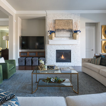
This project was to furnishing a newly constructed home – the living room specifically. The clients wanted an open-concept home in order to best utilize the space for everyday living, as well as entertaining. The goals of this project were to 1) maximize the space for the largest amount of seating, 2) present a transitional design style, mixing both traditional and modern elements, ensuring that the style mixes well with the other aspects of the open concept floorplan, and 3) provide a pleasant color palette. We designed the overall floorplan so that it provided maximum seating (potential for 14), while still providing a spacious ambiance. The U-shaped seating design in the room provides the ability for people to view the television from any seat and feel the warmth from the fireplace while also allowing for great conversational seating. The custom storage ottomans are on casters, so they can be pulled out to provide additional seating or a comfortable footrest for any seat. Upon entering the room, your eye can catch several different design features – the custom triptych artwork, the gold-framed mirrors, or even the split face quartz fireplace wall - each providing their own balanced focal point in the room. The main obstacle was balancing the focal point in the room between the fireplace and oversized television. The TV niche that was placed by the builder caused the seating arrangement to be somewhat offset in the space.
 Metropolis Drafting and Construction Inc
An original 1930’s English Tudor with only 2 bedrooms and 1 bath spanning about 1730 sq.ft. was purchased by a family with 2 amazing young kids, we saw the potential of this property to become a wonderful nest for the family to grow.
The plan was to reach a 2550 sq. ft. home with 4 bedroom and 4 baths spanning over 2 stories.
With continuation of the exiting architectural style of the existing home.
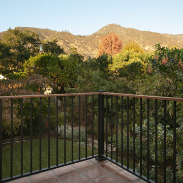
A large 1000sq. ft. addition was constructed at the back portion of the house to include the expended master bedroom and a second-floor guest suite with a large observation balcony overlooking the mountains of Angeles Forest.
An L shape staircase leading to the upstairs creates a moment of modern art with an all white walls and ceilings of this vaulted space act as a picture frame for a tall window facing the northern mountains almost as a live landscape painting that changes throughout the different times of day.
Tall high sloped roof created an amazing, vaulted space in the guest suite with 4 uniquely designed windows extruding out with separate gable roof above.
The downstairs bedroom boasts 9’ ceilings, extremely tall windows to enjoy the greenery of the backyard, vertical wood paneling on the walls add a warmth that is not seen very often in today’s new build.
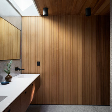
The master bathroom has a showcase 42sq. walk-in shower with its own private south facing window to illuminate the space with natural morning light. A larger format wood siding was using for the vanity backsplash wall and a private water closet for privacy.
In the interior reconfiguration and remodel portion of the project the area serving as a family room was transformed to an additional bedroom with a private bath, a laundry room and hallway.
The old bathroom was divided with a wall and a pocket door into a powder room the leads to a tub room.
The biggest change was the kitchen area, as befitting to the 1930’s the dining room, kitchen, utility room and laundry room were all compartmentalized and enclosed.
We eliminated all these partitions and walls to create a large open kitchen area that is completely open to the vaulted dining room. This way the natural light the washes the kitchen in the morning and the rays of sun that hit the dining room in the afternoon can be shared by the two areas.
The opening to the living room remained only at 8’ to keep a division of space.
 Klopf Architecture
Malibu Glass Box House by Klopf Architecture
Following the devastating Woolsey Fire of 2018, the site in Malibu offered a unique opportunity to rebuild not just a home, but a new architectural composition that highlighted the property’s potential while navigating strict fire-rebuild codes in the area. Designed by Klopf Architecture, this project embraced a set of limitations and translated them into an architectural asset.
The city’s fire-rebuild process required the new structure to remain close to the original footprint, size and bulk, a constraint that ultimately clarified the architectural direction. Perched near the front of a long, narrow lot, the new home frames and overlooks a private, park-like rear expanse, an uncommon luxury especially in this part of Malibu .
Without a fixed program, the design process allowed for a different kind of creative focus allowing Klopf Architecture the opportunity to explore how a modernist home could best respond to this site. The team approached the project not with a list of requirements, but with a question: How might a modernist live here? What spatial qualities would inspire calm, connection, and a sense of wonder in this setting? The process became less about problem-solving and more about architectural storytelling—letting the site, the light, and the principles of modern design guide the form and flow of the home.
The response emerged in the form of a glass-box pavilion, an open, Mid-Century Modern inspired living, dining, and kitchen space that floats at the edge of the property’s natural descent. Connected to the more enclosed, private areas of the home by a glass-walled hallway, the living pavilion becomes a distinct centerpiece of the design. It opens on all four sides to the landscape with decks and patios on the flanks, an internal garden and water feature to the north, and a dramatic unguarded view of the expansive backyard and ocean horizon to the south.
Because of the mandated footprint, careful planning was required to ensure every space could still engage with light, landscape, or both. Strategic voids in the form of atriums and courtyards allow daylight to filter deep into the home’s core, while offering moments of surprise and retreat. These design gestures allow natural light to filter deep into the interior, creating a sense of brightness and openness throughout the day. At the same time, they expand the perceptual boundaries between inside and out, making the home feel more expansive while anchoring its connection to the surrounding landscape.
The siting of the house is what gives it its unique character. Rather than receding into the backyard like the neighboring homes, the house holds a slight prominence. From the central living pavilion, stepping down into the landscape feels more like entering a secluded park where a separate existing accessory structure, trail, and recreational areas await. The home’s modest street presence gives way to this unfolding drama of space, view, and nature.
Fire-resilient materials and assemblies are integrated seamlessly throughout including triple-pane glazing, under-slab and roof insulation, and locally sourced fire-rated cladding ensure the house not only meets Calfornia’s rigorous wildland-urban interface (WUI) standards, but feels effortlessly aligned with them. While technical decisions like fire-hardening and mechanical systems presented some construction challenges, particularly around the cantilevered glass box, the team found a functional compromise that preserved the integrity of the design.
Inside, a restrained palette and exposed post and beam design celebrate the ethos of mid-century modernism. A central circulation spine extends from the entry to the rear glass wall, offering a continuous visual link from street to ocean. Spaces such as the library and office, though more intimate in scale, are never cut off from nature as each opens to its own unique courtyard or garden view.
Though born out of a strict regulatory framework and developed without a specific client, the rebuild design unfolded with remarkable clarity. Grounded in site logic, refined by limitations and an emphasis on timeless spatial relationships – light, proportion, and a strong connection to nature, the resulting design feels both effortless and uplifting. The home lives lightly on the land, opens generously to its surroundings, and strikes a careful balance between privacy, openness, and calm. For Klopf Architecture, it stands as a compelling case study in how site, code, and circumstantial constraints can inspire enduring, modernist architecture. With years of experience reimagining mid-century modern design for how people live today, the firm took the project’s limitations as an opportunity. The result is a home shaped by open, flowing spaces, strong indoor-outdoor connections, and a calm, clear sense of structure. It’s a good reminder that even with strict constraints, there’s still room for architecture to breathe—and for modernism to keep moving forward.
Klopf Architecture project team: Geoff Campen, John Klopf, AIA, and Sherry Tan
Structural Engineer: ZFA
Contractor: Maison D’Artiste
Photography: ©2025 Mariko Reed
Year Completed: 2023
Find the right local pro for your project
 Levitch Associates, Incorporated
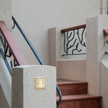
The client wanted to utilize the front yard better and replace their steep entry stairs. Levitch created a more graceful winding stair and added a small deck at the top that's a perfect spot to enjoy a cup of coffee or the sunset. We used minimal concrete over wood frame construction to reduce weight and potential waterproofing concerns while maintaining a traditional look in keeping with the home. Since the entry upgrades were done in conjunction with landscaping, the owner wanted something that looked organic. We introduced the owner to an architectural metalsmith and created different models for the railing before the owner chose a final design.
Photography by Treve Johnson
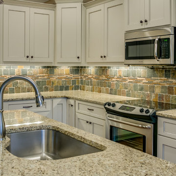
 McCoy Homes, Inc.
Unique craftsman style home that Billy and one of the Designers worked on to develop a cottage style exterior to this home plan. The interior has open floor concept in the family room, kitchen, and breakfast area. We tried a different look of the exterior features incorporating a band of shake between the lap siding and the board and batten. This look gives the home a desired look that was well received from potential buyers.
Philip Slowiak Photography
 Renovisions
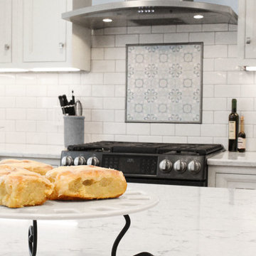
This client requested that we design her new kitchen space to look and function with her and her family’s usage in mind. She was not happy with her existing kitchen due to builder-grade ceramic flooring, lack of countertop space, poor lighting, inadequate and unorganized storage and the closed off feel of the area. Renovisions resolved all of these issues by designing and building an impressive, transitional styled kitchen; delivering a beautifully well thought-out space that provides a multi-functional approach and meets the needs of this busy and dynamic household.
Typically, we encounter challenges in every project, and this was no different. The upstairs bathroom plumbing ran across the entire length of the kitchen sink wall and it was necessary to work with it by moving the plumbing as far up as possible and then building a soffit to hide it.
Creating a space that has a more open feel was top of mind for our client. Installing a new wood floor that matched the existing dining room floor helped with this and in addition, warmed up the room. By relocating the refrigerator to the opposite wall and adding a bar area at the end toward the family room, the flow of traffic for family members and guests became more managed.
The open floor plan allowed for additional island cabinets to accommodate smart storage and better functionality when prepping meals, sitting to eat or gathering with friends and family. We believe having ample countertop surface space is a critical improvement in any renovation and this particular project now boasts a large countertop area with a stunning wide vein pattern that accentuates the design instead of overpowering it. The soft look of the Blanco Arabescato quartz enhances the space and looks lovely with the white inset styled cabinetry.
Beauty and function go hand-in-hand in this kitchen with several exceptional elements such as under-cabinet lighting with dimmers to control the mood light. Glass doors were added to the wall cabinets which flank the wine rack for displaying their decorative glassware and a beverage cooler below provided added convenience and access to cold beverages. The GE Café line of appliances in ‘Slate’ and ‘Stainless Steel’ finishes are a stunning contrast here.
The sensational looking decorative marble 6”x6” backsplash tile over the gas range and in the bar area creates nice focal points by creating a unique look for her that family and guests love.
Convenient and functional elements were added such as a blind corner pull-out for easier pot/pan storage, a sweep-o-vac under cabinet vacuum system for those constant quick clean-ups, a pull-out caddy under the sink base for storage of cleaning products and a protective mat to collect potential spills.
Our client let us know it was time for a change and we listened. She shared a few pictures she loved from a home magazine, we shared our insight and then designed/built the kitchen of her dreams! … A fabulous and functional space.
 Renovisions
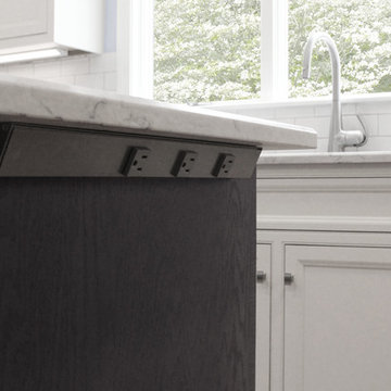
This client requested that we design her new kitchen space to look and function with her and her family’s usage in mind. She was not happy with her existing kitchen due to builder-grade ceramic flooring, lack of countertop space, poor lighting, inadequate and unorganized storage and the closed off feel of the area. Renovisions resolved all of these issues by designing and building an impressive, transitional styled kitchen; delivering a beautifully well thought-out space that provides a multi-functional approach and meets the needs of this busy and dynamic household.
Typically, we encounter challenges in every project, and this was no different. The upstairs bathroom plumbing ran across the entire length of the kitchen sink wall and it was necessary to work with it by moving the plumbing as far up as possible and then building a soffit to hide it.
Creating a space that has a more open feel was top of mind for our client. Installing a new wood floor that matched the existing dining room floor helped with this and in addition, warmed up the room. By relocating the refrigerator to the opposite wall and adding a bar area at the end toward the family room, the flow of traffic for family members and guests became more managed.
The open floor plan allowed for additional island cabinets to accommodate smart storage and better functionality when prepping meals, sitting to eat or gathering with friends and family. We believe having ample countertop surface space is a critical improvement in any renovation and this particular project now boasts a large countertop area with a stunning wide vein pattern that accentuates the design instead of overpowering it. The soft look of the Blanco Arabescato quartz enhances the space and looks lovely with the white inset styled cabinetry.
Beauty and function go hand-in-hand in this kitchen with several exceptional elements such as under-cabinet lighting with dimmers to control the mood light. Glass doors were added to the wall cabinets which flank the wine rack for displaying their decorative glassware and a beverage cooler below provided added convenience and access to cold beverages. The GE Café line of appliances in ‘Slate’ and ‘Stainless Steel’ finishes are a stunning contrast here.
The sensational looking decorative marble 6”x6” backsplash tile over the gas range and in the bar area creates nice focal points by creating a unique look for her that family and guests love.
Convenient and functional elements were added such as a blind corner pull-out for easier pot/pan storage, a sweep-o-vac under cabinet vacuum system for those constant quick clean-ups, a pull-out caddy under the sink base for storage of cleaning products and a protective mat to collect potential spills.
Our client let us know it was time for a change and we listened. She shared a few pictures she loved from a home magazine, we shared our insight and then designed/built the kitchen of her dreams! … A fabulous and functional space.
Sponsored
Delaware, OH

Buckeye Basements, Inc.
Central Ohio's Basement Finishing ExpertsBest Of Houzz '13-'21
 Heidi Reis / Abode Agency LLC
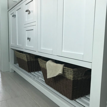
This Grant Park house was built in 1999. With that said, this bathroom was dated, builder grade with a tiny shower (3 ft x 3 ft) and a large jacuzzi-style 90s tub. The client was interested in a much larger shower, and he really wanted a sauna if squeeze it in there. Because this bathroom was tight, I decided we could potentially go into the large walk-in closet and expand to include a sauna. The client was looking for a refreshing coastal theme, a feel good space that was completely different than what existed.
This renovation was designed by Heidi Reis with Abode Agency LLC, she serves clients in Atlanta including but not limited to Intown neighborhoods such as: Grant Park, Inman Park, Midtown, Kirkwood, Candler Park, Lindberg area, Martin Manor, Brookhaven, Buckhead, Decatur, and Avondale Estates.
For more information on working with Heidi Reis, click here: https://www.AbodeAgency.Net/
 Keep Calm and Stage LLC
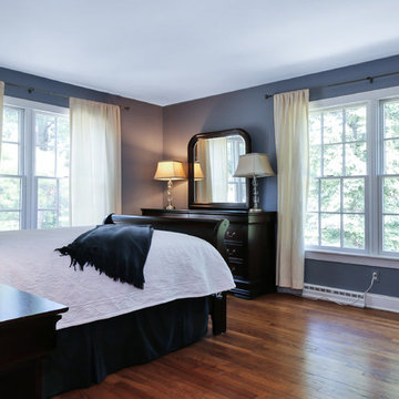
This is the AFTER picture of Bedroom 1.
This lovely home was in need of some Staging help when the owner decided it was time for him to sell his home in NJ and move to Vermont. His three children had left home and used their old bedrooms as storage facilities for all their unwanted "stuff". The rooms were small and cramped so we edited furniture, helped box up their belongings and introduced accessories to make the rooms appeal to potential buyers.
We made recommendations through the home which included painting a few of the rooms. We then edited furnishings and brought in some Turning Point accessories and small furnishings and within a week the home was ready for marketing.
 Penn Contractors Inc
Details make a difference, especially when working with an open-concept floor plan. In this
Center Valley kitchen remodel, previous clients trusted us to update their
outdated space while bringing new life and purpose to a large, unused dining area.
Previously featuring dark wood cabinetry beneath low ceilings, the kitchen’s 90’s design was
ready for refresh. The area diagonal to the kitchen - a “breakfast room” sitting nearly empty, was
also redundant with the formal dining room nearby. Because of the open floor plan, the space
was noticeable immediately upon entering the home.
The clients knew that there was potential, but had never committed to transforming the extra
square footage into anything more than additional seating. Our designer’s idea was to extend
the kitchen into the dining area by adding cabinetry and a coffee bar, using the same custom
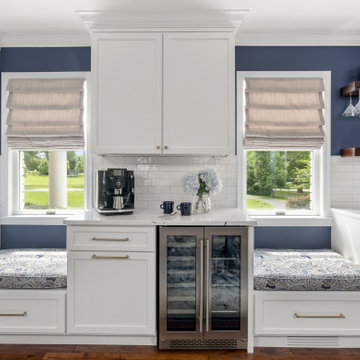
cabinets for a cohesive look. Navy blue paint defines the coffee bar, while touches of blue on the kitchen island, and the veining of the white quartz countertops tie the design together.
Other favorite features of the design include the chef oven with a custom hood, the farmhouse
sink from Blanco, and custom bench seating under the windows.

 One Kings Lane
Alex Reid, One Kings Lane's lead interior designer for client services, and Rebecca sit down in The Studio at One Kings Lane’s New York offices to pore over palettes and dream up layouts.
Stopping into The Studio: Any makeover takes a leap of faith, a willingness to free up yourself—and your space—for new ideas. To open up the full potential of this apartment, Rebecca and Alex met in The Studio in our Tribeca offices. There, everything is right at one’s fingertips: a full Pantone board and all sorts of furnishings you can test-drive on the spot. As Rebecca says, “It can make such a difference to touch and feel something.”
Photo by Manuel Rodriguez

 Jon Allen Fine Metal Art
JAC 140 - Twilight in Space by Jon Allen
The Jon Allen Collection is an exclusive, hand-selected group of my most personal work to date. Each piece is hand-painted on aluminum. My art itself and my chosen medium, aluminum, are blissfully married. You may not think of the word organic when you hear the word metal, but this is some of my most organic art and that’s simply because metal allows my work to achieve true sentience. Aluminum’s naturally reflective nature enables each color, shape, and stroke to reach its full potential. A new aspect of the painting will reveal itself to you as it basks in the light that surrounds, evades, or envelops it in that moment. When you see the piece from different angles, you will appreciate how vibrant, dynamic, and environmentally influenced these pieces are. What you may see and feel by morning is not what you’ll see or feel by dusk and in many ways, and as such I feel these pieces capture the ever-ebbing and complex nature of human emotion and perception.
Some of these pieces are truly abstract while others are modern takes on traditional landscapes, marine life, and portraits. I hope you enjoy them a fraction of how much I enjoyed creating them. If you have any questions, please don’t hesitate to reach out.
Number of Pieces: 1
Dimensions: 46" x 13" x 2" off the wall
Care & Cleaning: Clean with a soft cloth and plain soap & water
Other Features: Hardware is pre-installed for simple hanging and art will “float” 2” off the wall
 McCoy Homes, Inc.
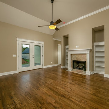
Unique craftsman style home that Billy and one of the Designers worked on to develop a cottage style exterior to this home plan. The interior has open floor concept in the family room, kitchen, and breakfast area. We tried a different look of the exterior features incorporating a band of shake between the lap siding and the board and batten. This look gives the home a desired look that was well received from potential buyers.
Philip Slowiak Photography

 OH LA LA !
Italian Different Concept
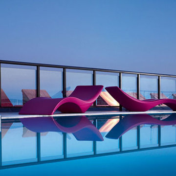
A real laboratory of ideas. Myyour is a reality where the most innovative design ideas are chosen and transformed into new and unique decorative solutions... solutions that are able to express elegance and color, functionality and aesthetics, versatility and prestige. A result that has been achieved thanks to the upshot of the series of research, assessments, studies and applications that have been carried out for each of the collections... An uninterrupted series of formal and technological trials to help us reach our final objective: a vanguard product that is best characterized as a perfect blend of craftsmanship and innovation and which is destined to become the protagonist of the most diverse spaces: a product designed to take over the scene by giving a touch of exclusivity and originality to the home, office, public setting...
The founding pillars of the Myyour philosophy are the surprising stateliness of its products and the distinction of a manufacturing process, which is meticulously followed as to ensure perfection; from the development of the project to the selection of the materials, but also from the execution of the project to the attention and care that are paid to every single minimum detail along the way. This is how the Myyour quality came to life. A must that is always more and more appreciated on an international level and by a clientele who has witnessed the potential artistic expression of these decorative creations. These solutions have managed to fill an empty space and are always in perfect harmony with their outside beauty and intrinsic functionalities. These creations always manage to trigger the creativity of individuals, architects, decorators and designers.
 McCoy Homes, Inc.
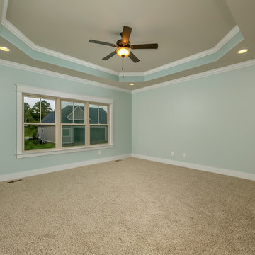
Unique craftsman style home that Billy and one of the Designers worked on to develop a cottage style exterior to this home plan. The interior has open floor concept in the family room, kitchen, and breakfast area. We tried a different look of the exterior features incorporating a band of shake between the lap siding and the board and batten. This look gives the home a desired look that was well received from potential buyers.
Philip Slowiak Photography
 DeHart Designs
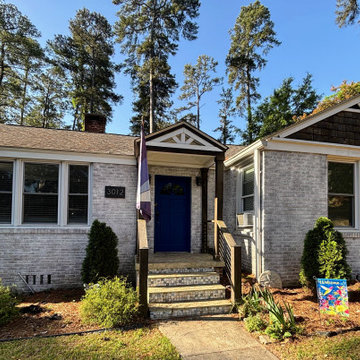
This family purchased this beautiful 1950's bungalow that had not been updated in decades. The front of the house demonstrated the bones of the house, but definitely did not live up to its potential. We whitewashed the brick, added tile to the steps and landing, painted the front door, added a house number, and built a gorgeous porch awning. What a difference!
 Metropolis Drafting and Construction Inc
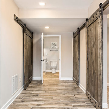
An original 1930’s English Tudor with only 2 bedrooms and 1 bath spanning about 1730 sq.ft. was purchased by a family with 2 amazing young kids, we saw the potential of this property to become a wonderful nest for the family to grow.
The plan was to reach a 2550 sq. ft. home with 4 bedroom and 4 baths spanning over 2 stories.
With continuation of the exiting architectural style of the existing home.
A large 1000sq. ft. addition was constructed at the back portion of the house to include the expended master bedroom and a second-floor guest suite with a large observation balcony overlooking the mountains of Angeles Forest.
An L shape staircase leading to the upstairs creates a moment of modern art with an all white walls and ceilings of this vaulted space act as a picture frame for a tall window facing the northern mountains almost as a live landscape painting that changes throughout the different times of day.
Tall high sloped roof created an amazing, vaulted space in the guest suite with 4 uniquely designed windows extruding out with separate gable roof above.
The downstairs bedroom boasts 9’ ceilings, extremely tall windows to enjoy the greenery of the backyard, vertical wood paneling on the walls add a warmth that is not seen very often in today’s new build.
The master bathroom has a showcase 42sq. walk-in shower with its own private south facing window to illuminate the space with natural morning light. A larger format wood siding was using for the vanity backsplash wall and a private water closet for privacy.
In the interior reconfiguration and remodel portion of the project the area serving as a family room was transformed to an additional bedroom with a private bath, a laundry room and hallway.
The old bathroom was divided with a wall and a pocket door into a powder room the leads to a tub room.
The biggest change was the kitchen area, as befitting to the 1930’s the dining room, kitchen, utility room and laundry room were all compartmentalized and enclosed.
We eliminated all these partitions and walls to create a large open kitchen area that is completely open to the vaulted dining room. This way the natural light the washes the kitchen in the morning and the rays of sun that hit the dining room in the afternoon can be shared by the two areas.
The opening to the living room remained only at 8’ to keep a division of space.
Sponsored
Sunbury, OH

J.Holderby - Renovations
Franklin County's Leading General Contractors - 2X Best of Houzz!
 Olympia Tile
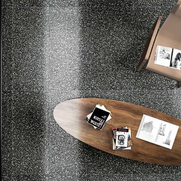
Venezia describes a vivid and elegant chromatic universe, with the sophisticated variations in the grain tone, that is typical of Venetian terrazo. The proposal in eight different colourings, to which the original Palladio version is added in the 24"x48" and 24"x24" large sizes and with two natural and lux finishes, multiplies the expressive potential at service of interior design, to be used freely for the floors and walls to embellish classic architectures as well as to design decidedly contemporary spaces.
 Tile Doctor Ltd
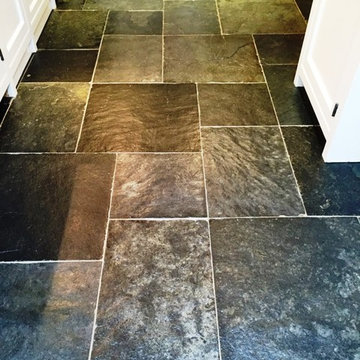
These photographs below are of a Slate Tiled Kitchen floor taken at a customer’s house in Henley-on-Thames which, as its name suggests, sits alongside the River Thames in Oxfordshire. My client’s Slate kitchen floor had recently been cleaned with unsuitable cleaning products which I suspect impacted the sealer leaving it looking dull. Sealers really to improve the look of a stone floor so unsurprisingly once the sealer had been damaged my client had been unable to find a cleaning product that could have any kind of positive effect on the tiles.
It’s fairly well known that many supermarket quality cleaners are only really designed for use on Ceramic or Porcelain tiled floors as they contain acids which strip away at sealers and acid sensitive stone floors, leaving the stone beneath vulnerable. So your select a cleaning product for your floor always read the small print on the back of the label and make sure you avoid anything that mentions not for use on acid sensitive stone; belter still Tile Doctor have a number of products for cleaning tiled floors including Neutral Cleaner and Stone Soap.
To clean the floor and remove any remaining sealer I first made a strong dilution of Tile Doctor Pro Clean which is a strong alkaline cleaner and then spread this over the floor, leaving it to dwell. This allows the cleaner to seep into the slate and get underneath, breakdown sealers and start to lift out ingrained dirt.
Following a dwelling period of roughly ten minutes, I agitated the floor periodically with a rotary machine fitted with a black scrubbing pad and scrubbed along the grout lines with a stiff grout brush. I then used a wet vacuum to extract the resultant slurry away and then followed up by rinsing the floor with clean water, and once again vacuumed up the residue.
Any stubborn areas were retreated until I was happy with the floor and then I left the floor to dry off completely overnight, in preparation for sealing the following day.
Upon my return to the house the following day, I ran some damp tests on different parts of the floor to check for any excess moisture which could potentially damage the performance of the sealer. Once I was satisfied that the floor was completely dry, I proceeded to seal the tiles using Tile Doctor Seal & Go. This will provide a robust surface seal for the future, along with an aesthetically pleasing low-sheen finish.
This sealer works particularly well on Slate tiles and, being a water-based sealant, additionally Seal & Go does not emit an unpleasant smell as it dries. Slate is quite a porous stone so I applied six coats of seal to provide long-lasting protection.
Barry Woodward
Oxfordshire Tile Doctor
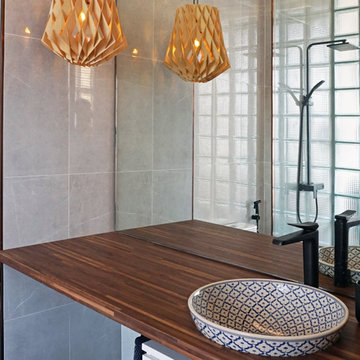
 regroup architecture
regroup architecture remodeled the space after reducing the old office to its bare shell. The basic design idea uses the central core provided by the kitchen and bathroom to separate the space into different zones. There is a more private zone behind the core for the bed, a living zone with a TV and sofa, and an in-between space for a multipurpose bar-height desk. This basic zoning could potentially also work for other functions like an artist atelier, yoga studio, exhibition space, or even for a small office once again.
48