
Search results for "Pots filled" in Home Design Ideas

 Robi Decking
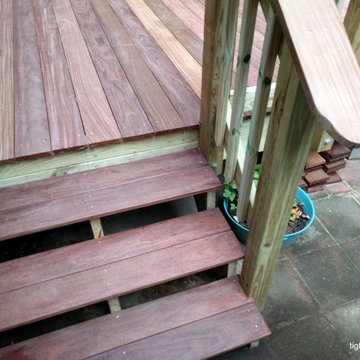
A boardwalk at the Brooklyn Children's Museum built with Black Locust wood and a wide range of materials supplied by Robi.
Products: Black Locust 5/4 x 6 decking, Black Locust 1 x 6 decking, Custom Milling, Robi® Oil, Robi® End Seal


Find the right local pro for your project

 Beth Dotolo, ASID, RID, NCIDQ
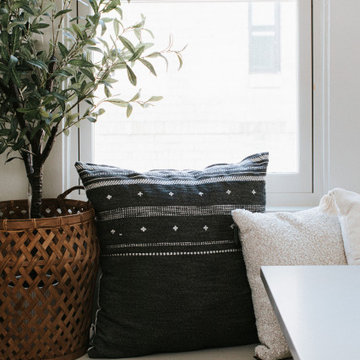
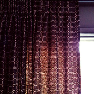
A modern home that exudes warmth, gives our homeowners the comfort to ‘do’ life in their space. This professional couple with a young daughter wanted to make their newly-purchased house an expression of their contemporary style, filled with warmth and personality. They didn’t want mix-and-match big-box retailer style and they needed pieces that would hold up to their little one. That’s where Pulp comes in. Beth and Carolina created a design that pushed their style boundaries, taking them from sleek contemporary to warm and modern using pattern, textural elements, and color. Though initially hesitant, some of the items that were the biggest leap of faith (such as the lighting and drapery) have come to be the pieces they love the most. With customized cleanable and wipeable pieces, they and their young one can live life in their space without fear.

 Moodscapes LLC
Design ideas for a large traditional full sun front yard brick formal garden in Boston.

 Showpiece Kitchen & Bath
Example of a small beach style kids' gray tile and ceramic tile porcelain tile and gray floor doorless shower design in Atlanta with flat-panel cabinets, white cabinets, a two-piece toilet, gray walls, an undermount sink, quartz countertops, a hinged shower door and white countertops

Sponsored
Plain City, OH

The Creative Kitchen Company
Columbus Area Kitchen Remodeling and Refacing Professional

 True Blue Pools
 Inc. installs custom pool mosaic tiles in Tempe, AZ.
Pool - traditional pool idea in Phoenix
Pool - traditional pool idea in Phoenix



 Skill Construction & Design, LLC
There are so many design elements to this kitchen, I almost don’t know where to start. Bright and airy with crisp clean white cabinets, the kitchen is open and welcoming. Still crisp but gently contrasting, the stainless steel appliance add depth amid the white. To keep this kitchen warm, natural oak covers the floors and a toasted wheat color washes the walls. And then there is the architectural elements. You know. That post and beam in the middle of the room. It’s the center of attention.
When you walk into a room your eyes roam around, establishing the size and shape of the room as your feet take you forward. From the front door of this home straight ahead you encountered this wall. The dining area to the right gives you a glimpse of things to come. Where there is a dining room you will usually find a kitchen.
The architecture of years gone by consistently hides the kitchen, the heart of the home, behind walls. I sympathize with my Mom, and all the other Moms, who have had to spend so much time tucked into a tight kitchen, away from the family. This wall had to go, but it was structural. We needed its support but not its bulk.
So we got rid of the bulk and only the bulk. Instead of a wall we have a post and beam, offering all of the structure we need. We could have installed a huge steel beam and reconfigure the joists to upset the beam, but why? The small beam and post add an incredible architectural element. It’s turning lemons into lemon, we simply made the most of what we had. It may be functional but it’s so fantastic. It looks like we created the effect just for the drama.
The original kitchen may have had a working triangle and some counter space, but it was fairly small, with each area only a step or two away. The dark cabinets made the space feel even smaller and the butcher block patterned laminate counter tops were very dated. The appliances were feeling their age as well, from a coil burner electric stove to a top freezer refrigerator. To keep this kitchen within its space, a half wall separated it from the dining area.
With the wall gone we borrowed some space from the living room and extended what was a U shaped kitchen into an L. At the living room window we start our new kitchen. We kept a small part of the wall to support the other end of our decorative beam. Sandwiched between a large pantry and our new French door refrigerator, the wall disappears. With our new open floor plan a sizable island was in order.
We split our cooking areas and installed a continuous grill gas cooktop into the island. A sleek island hood takes care of exhaust and adds an extra element to our architectural feature. Under the cooktop we added over-sized drawers for pots and pan storage. The frameless cabinets from New River Cabinetry are maple, painted white, with the Herndon door style. With the cooktop safely nestled into our island, we still had to add an oven.
We used the space where the old range sat for a large single oven of stainless steel and glass. If it worked for one, why not two? We created a home for a microwave in the wall cabinets. It’s perfect for heating leftovers so close to the refrigerator.
An important consideration for hot spots in your kitchen is landing zones. Each of our cooking areas have generous landing zones, one on each side of the cooktop and an entire counter area above or below the ovens, depending on which one you’re using.
We wanted to give the sink area more room so the half wall had to come out. We moved the trash and recycle cans into a cabinet, removed the heavy soffits and kept the sink under the window.
With that little bit of extra space we were able to add a larger cabinet above the dishwasher and slide it all down. This used to be where the carpeting met the vinyl floor, but all of it is gone. Long oak planks eliminate that final divide between the kitchen and the dining area, while adding visual length to the area. White wall cabinets on each side of the window reflect the sunlight for a brighter view.
With all of the darker cabinetry the backsplash walls had been painted white. Even still, there was a darkness in the corners and it wasn’t very exciting. We wanted to add visual interest and reflect the new under-cabinet lighting, eliminating the shadows in this corner.
With 1″x 2″ Arabescato Honed marble mosaics and those under-cabinet lights, we achieved the perfect balance. The marble has subtle swirls in gray and beige on a clean white background, but with the honed finish the light is softly reflected instead of glaring. For granite, we chose the soft gray tones of Luna Pearl. The speckles of gray and beige are a gentle contrast to the white cabinets and emulate the color of the stainless steel.
Between the carpet, red half wall, dark railing and dated light fixture, the dining area felt tired. Since the kitchen lacked sufficient storage, a large utility cabinet crowded the table space without adding any decorate elements.
Although it didn’t get any bigger, our dining area feels fresher and more open too. With the oak flooring joining the area to the rest of our space and the toasted wheat on the walls, the white table and chairs compliment the cabinetry while contrasting the warmer colors. We replaced the chandelier with recessed lighting and changed that railing too.
With our new open floor plan, we ended up with a fairly open area in between our foyer closet and the living room window. Not one to miss an opportunity, we filled the space with a multi-functional work space.
With the sunlight streaming in this bright corner works for anything this family needs.
There’s plenty of space for a chair under this large desk drawer. A closed cabinet below, glass doors above and lots of open shelving let you store and or showcase your belongings. We added a lite area at the top to keep away the darker corners.
The transformation is complete. This kitchen and all of its features are truly the center of attention in this home.
http://www.designsbyskill.com/
http://www.rjkconstructioninc.com/
 Skill Construction & Design, LLC
There are so many design elements to this kitchen, I almost don’t know where to start. Bright and airy with crisp clean white cabinets, the kitchen is open and welcoming. Still crisp but gently contrasting, the stainless steel appliance add depth amid the white. To keep this kitchen warm, natural oak covers the floors and a toasted wheat color washes the walls. And then there is the architectural elements. You know. That post and beam in the middle of the room. It’s the center of attention.
When you walk into a room your eyes roam around, establishing the size and shape of the room as your feet take you forward. From the front door of this home straight ahead you encountered this wall. The dining area to the right gives you a glimpse of things to come. Where there is a dining room you will usually find a kitchen.
The architecture of years gone by consistently hides the kitchen, the heart of the home, behind walls. I sympathize with my Mom, and all the other Moms, who have had to spend so much time tucked into a tight kitchen, away from the family. This wall had to go, but it was structural. We needed its support but not its bulk.
So we got rid of the bulk and only the bulk. Instead of a wall we have a post and beam, offering all of the structure we need. We could have installed a huge steel beam and reconfigure the joists to upset the beam, but why? The small beam and post add an incredible architectural element. It’s turning lemons into lemon, we simply made the most of what we had. It may be functional but it’s so fantastic. It looks like we created the effect just for the drama.
The original kitchen may have had a working triangle and some counter space, but it was fairly small, with each area only a step or two away. The dark cabinets made the space feel even smaller and the butcher block patterned laminate counter tops were very dated. The appliances were feeling their age as well, from a coil burner electric stove to a top freezer refrigerator. To keep this kitchen within its space, a half wall separated it from the dining area.
With the wall gone we borrowed some space from the living room and extended what was a U shaped kitchen into an L. At the living room window we start our new kitchen. We kept a small part of the wall to support the other end of our decorative beam. Sandwiched between a large pantry and our new French door refrigerator, the wall disappears. With our new open floor plan a sizable island was in order.
We split our cooking areas and installed a continuous grill gas cooktop into the island. A sleek island hood takes care of exhaust and adds an extra element to our architectural feature. Under the cooktop we added over-sized drawers for pots and pan storage. The frameless cabinets from New River Cabinetry are maple, painted white, with the Herndon door style. With the cooktop safely nestled into our island, we still had to add an oven.
We used the space where the old range sat for a large single oven of stainless steel and glass. If it worked for one, why not two? We created a home for a microwave in the wall cabinets. It’s perfect for heating leftovers so close to the refrigerator.
An important consideration for hot spots in your kitchen is landing zones. Each of our cooking areas have generous landing zones, one on each side of the cooktop and an entire counter area above or below the ovens, depending on which one you’re using.
We wanted to give the sink area more room so the half wall had to come out. We moved the trash and recycle cans into a cabinet, removed the heavy soffits and kept the sink under the window.
With that little bit of extra space we were able to add a larger cabinet above the dishwasher and slide it all down. This used to be where the carpeting met the vinyl floor, but all of it is gone. Long oak planks eliminate that final divide between the kitchen and the dining area, while adding visual length to the area. White wall cabinets on each side of the window reflect the sunlight for a brighter view.
With all of the darker cabinetry the backsplash walls had been painted white. Even still, there was a darkness in the corners and it wasn’t very exciting. We wanted to add visual interest and reflect the new under-cabinet lighting, eliminating the shadows in this corner.
With 1″x 2″ Arabescato Honed marble mosaics and those under-cabinet lights, we achieved the perfect balance. The marble has subtle swirls in gray and beige on a clean white background, but with the honed finish the light is softly reflected instead of glaring. For granite, we chose the soft gray tones of Luna Pearl. The speckles of gray and beige are a gentle contrast to the white cabinets and emulate the color of the stainless steel.
Between the carpet, red half wall, dark railing and dated light fixture, the dining area felt tired. Since the kitchen lacked sufficient storage, a large utility cabinet crowded the table space without adding any decorate elements.
Although it didn’t get any bigger, our dining area feels fresher and more open too. With the oak flooring joining the area to the rest of our space and the toasted wheat on the walls, the white table and chairs compliment the cabinetry while contrasting the warmer colors. We replaced the chandelier with recessed lighting and changed that railing too.
With our new open floor plan, we ended up with a fairly open area in between our foyer closet and the living room window. Not one to miss an opportunity, we filled the space with a multi-functional work space.
With the sunlight streaming in this bright corner works for anything this family needs.
There’s plenty of space for a chair under this large desk drawer. A closed cabinet below, glass doors above and lots of open shelving let you store and or showcase your belongings. We added a lite area at the top to keep away the darker corners.
The transformation is complete. This kitchen and all of its features are truly the center of attention in this home.
http://www.designsbyskill.com/
http://www.rjkconstructioninc.com/
Sponsored
Plain City, OH
The Creative Kitchen Company
Columbus Area Kitchen Remodeling and Refacing Professional

 Elizabeth Aldrich
10 Ideas for Turning Your Garage into a Modern Industrial Neighborhood Bar
By Elizabeth Aldrich
Host happy hours and cocktail parties worthy of a full page spread – in your own garage.
Leave the brick exposed, the concrete floors as is, and the wood unfinished and it costs more? The sophisticated older brother of the shabby-chic trend, urban industrial style, is taking over. Real estate agents are able to tack on a few extra grand to a flat if they can include “exposed brick” in their advertisements, and designer chefs and master mixologists are moving into warehouses and industrial districts in urban areas across the nation. A friend recently invited me to dinner at Portland, Oregon’s newest, hippest charcuterie spot, and when we pulled up to the building it was in a warehouse where I used to go to underground raves in high school.
These industrial style spaces that were once seen as unfinished or lacking in coziness are now seriously coveted. Their rawness is considered authentic, their grit a mark of character. But if you’re a homeowner, there’s a good chance you already have one of them built right into your house: your garage.
I like to preach about how much people underutilize their garage spaces, piling them full of storage bins they never touch. Whether you turn it into a workspace or a playroom, there’s a lot of value in a creatively-used garage space. For the overly ambitious, the design lover, or the hostess with the mostess, here’s one idea that blows the rest out of the water.
Turn your garage into a multi-purpose, urban industrial wonderland for work and play.
Originally outfitted for factories and warehouses, the industrial style facilitates productivity. Now that it’s also being appreciated as a great aesthetic for bars and restaurants, these rooms can serve both form and function, doubling as work and entertaining spaces. This is great for people who have always dreamed of having that extra basement space for hosting friends, complete with a wet bar and a billiards table, but lack the square footage. Just keep in mind that your friends might love it so much, they’ll start ditching their favorite happy hour spot and showing up at your doorstep instead.
Here are ten ideas forbuilding the perfect workshop by day and cocktail bar by night in your garage.
1. Clean out the space. Get rid of everything you don’t need. Part of the beauty of industrial style designs is their simplicity and abundance of open space. Excessive clutter can make people feel boxed in, and that’s not conducive to productivity or to social activity. Out of sight, out of mind. Build shelving up high for storing must-keep belongings, much like a warehouse.
For bonus points, store your belongings in wooden crates for aesthetic consistency. Or consider stacking them on a pallet, wrapping them in excessive amounts of plastic wrap, and loading them onto the next cross-country freighter. You won’t miss them.
2. Install storage for frequently used objects. The brilliant thing about the urban industrial look is that your tools, tool boxes, and tool storage cabinets already fit right in. Metal storage cabinets and file cabinets are perfect additions to the space. While grey is certainly the color pallet for this style, 50 shades might be a few too many. Mix it up by spray painting one of your cabinetsto add a pop of color. Make a small pegboard to hold up your tools and hang larger items such as bicycles and recreational equipment by pegs. If you have a lot of storage bins that you have to keep, look upward instead of storing them on the floor. Insert a tracking system onto your garage ceiling and slide the bins into place.
For extra credit, get an old locker to use as a coat closet when guests come over.
3. Heat the space.Since you’re not turning the garage into a full-time living space, such as a spare bedroom, you really don’t need to go through the work and additional cost of installing full-blown heating and insulation systems. If you don’t need to use the space when the temperature drops, or if you live in a consistently temperate climate, you might not need to do anything. But if you do want to be able to host people through the winter, a simple garage heater will suffice. Here are some good options for installing garage heating.
Take it one step further, and get a couple patio heaters to help with the next step.
4. Turn your driveway into a patio space. Even the best restaurants and cocktail bars are nothing in the summertime without a solid patio space. Leave the garage door open on warmer nights and invite your guests to go outdoors. Place some stylish folding chairs and a patio table out for comfort. Place a few potted plants here and there to make the space feel more inviting.
For a really lively patio scene, put a portable fire pit out on the driveway or front lawn and surround it with workbenches from your garage.
5. Build your bar. Pick a corner in your garage for the bar, and get started. You can build a bar pretty cheaply and easily with reclaimed pallets, and get some industrial-style barstools. Behind the bar, you’ll have both your tools and your liquor, and there’s no need to build expensive cabinetry. If you’re serving quality, why cover it up? Build shelving or open cubicles to house your liquor. Put out metal buckets filled with ice to chill beers.Be sure to serve up cocktails worthy of the space. The Hemingway Daiquiri served straight up is a unique way to dress down, or industrialize, a traditionally frou-frou cocktail.
To go the extra mile, build a bar with laid brick.Install an extra fridge in the garage so you can avoid having to trek into the kitchen to refill chilled drinks, and you can store dips, vegetables, and other hors d'oeuvres right at your fingertips.
6. Bring on the games. To really turn your hosting space into a fun time, be sure to offer ample play options. For the low on space, a dart board will suffice, whereas if you’ve got a five-car garage and can’t manage to fill the space, put in a couple billiard tables. Ping pong tables are ideal for most because they’re great fun and can easily be folded up and stored.
If you want to keep your guests playing until the wee hours of the morning, get an old pinball machine, a vintage arcade game, or a small Skee-Ball alley.
7. The heart of your space.Build along worktable that doubles as a table for your guests right in the center of your garage. It should be tall enough to be used while standing, although you can place a few barstools along with it. Having a table space for drinks but limited seating will encourage guests to walk around and mingle. Build it out of wood and make sure to maintain a natural finish.
Don’t be afraid to rough up the work table by day. The dings and marks created while you build will only lend authenticity to the piece.
8. Install lighting. Remember, the urban industrial style is all about function and showcasing materials in their raw form. There’s no need to buy expensive floor lamps or install a fancy lighting system. The most popular lighting in these types of spaces is exposed bulb lighting. Just open up the wiring on your current lighting system and drop down some bulbs.
For additional lighting, string up exposed bulb patio lights and place some vintage metal desk lamps on the tables and bar area.
9. Brand your space. Use the designs for the stuff you build by day as wall art. Blow up sketches, blueprints, schematics, and architectural drawings to hang up for decoration. Choose one wall that could use a splash of color, perhaps the wall behind your bar, and get a friend to paint a mural, or whip out the spray paint for a real urban feel.
Splurge a little and get a custom neon sign made of your last name or the word “bar” to hang behind the bar.
10. The garage door. For the finishing touch, and to really wow your guests, get a brand new modern, industrial style garage door installed. Look for the window-paneled types that restaurants use, like this contemporary aluminum and glass beauty. You can leave it half open when you want to utilize your driveway-patio space.
On nights when you have to close it all the way, the glass panels let your guests still look out onto the stars, making it feel like a patio space even when it’s too cold for one.
Once your garage bar is up and running, put on your denim suit and get ready to call yourself the Joneses. No one will be able to keep up with you.
 Skill Construction & Design, LLC
There are so many design elements to this kitchen, I almost don’t know where to start. Bright and airy with crisp clean white cabinets, the kitchen is open and welcoming. Still crisp but gently contrasting, the stainless steel appliance add depth amid the white. To keep this kitchen warm, natural oak covers the floors and a toasted wheat color washes the walls. And then there is the architectural elements. You know. That post and beam in the middle of the room. It’s the center of attention.
When you walk into a room your eyes roam around, establishing the size and shape of the room as your feet take you forward. From the front door of this home straight ahead you encountered this wall. The dining area to the right gives you a glimpse of things to come. Where there is a dining room you will usually find a kitchen.
The architecture of years gone by consistently hides the kitchen, the heart of the home, behind walls. I sympathize with my Mom, and all the other Moms, who have had to spend so much time tucked into a tight kitchen, away from the family. This wall had to go, but it was structural. We needed its support but not its bulk.
So we got rid of the bulk and only the bulk. Instead of a wall we have a post and beam, offering all of the structure we need. We could have installed a huge steel beam and reconfigure the joists to upset the beam, but why? The small beam and post add an incredible architectural element. It’s turning lemons into lemon, we simply made the most of what we had. It may be functional but it’s so fantastic. It looks like we created the effect just for the drama.
The original kitchen may have had a working triangle and some counter space, but it was fairly small, with each area only a step or two away. The dark cabinets made the space feel even smaller and the butcher block patterned laminate counter tops were very dated. The appliances were feeling their age as well, from a coil burner electric stove to a top freezer refrigerator. To keep this kitchen within its space, a half wall separated it from the dining area.
With the wall gone we borrowed some space from the living room and extended what was a U shaped kitchen into an L. At the living room window we start our new kitchen. We kept a small part of the wall to support the other end of our decorative beam. Sandwiched between a large pantry and our new French door refrigerator, the wall disappears. With our new open floor plan a sizable island was in order.
We split our cooking areas and installed a continuous grill gas cooktop into the island. A sleek island hood takes care of exhaust and adds an extra element to our architectural feature. Under the cooktop we added over-sized drawers for pots and pan storage. The frameless cabinets from New River Cabinetry are maple, painted white, with the Herndon door style. With the cooktop safely nestled into our island, we still had to add an oven.
We used the space where the old range sat for a large single oven of stainless steel and glass. If it worked for one, why not two? We created a home for a microwave in the wall cabinets. It’s perfect for heating leftovers so close to the refrigerator.
An important consideration for hot spots in your kitchen is landing zones. Each of our cooking areas have generous landing zones, one on each side of the cooktop and an entire counter area above or below the ovens, depending on which one you’re using.
We wanted to give the sink area more room so the half wall had to come out. We moved the trash and recycle cans into a cabinet, removed the heavy soffits and kept the sink under the window.
With that little bit of extra space we were able to add a larger cabinet above the dishwasher and slide it all down. This used to be where the carpeting met the vinyl floor, but all of it is gone. Long oak planks eliminate that final divide between the kitchen and the dining area, while adding visual length to the area. White wall cabinets on each side of the window reflect the sunlight for a brighter view.
With all of the darker cabinetry the backsplash walls had been painted white. Even still, there was a darkness in the corners and it wasn’t very exciting. We wanted to add visual interest and reflect the new under-cabinet lighting, eliminating the shadows in this corner.
With 1″x 2″ Arabescato Honed marble mosaics and those under-cabinet lights, we achieved the perfect balance. The marble has subtle swirls in gray and beige on a clean white background, but with the honed finish the light is softly reflected instead of glaring. For granite, we chose the soft gray tones of Luna Pearl. The speckles of gray and beige are a gentle contrast to the white cabinets and emulate the color of the stainless steel.
Between the carpet, red half wall, dark railing and dated light fixture, the dining area felt tired. Since the kitchen lacked sufficient storage, a large utility cabinet crowded the table space without adding any decorate elements.
Although it didn’t get any bigger, our dining area feels fresher and more open too. With the oak flooring joining the area to the rest of our space and the toasted wheat on the walls, the white table and chairs compliment the cabinetry while contrasting the warmer colors. We replaced the chandelier with recessed lighting and changed that railing too.
With our new open floor plan, we ended up with a fairly open area in between our foyer closet and the living room window. Not one to miss an opportunity, we filled the space with a multi-functional work space.
With the sunlight streaming in this bright corner works for anything this family needs.
There’s plenty of space for a chair under this large desk drawer. A closed cabinet below, glass doors above and lots of open shelving let you store and or showcase your belongings. We added a lite area at the top to keep away the darker corners.
The transformation is complete. This kitchen and all of its features are truly the center of attention in this home.
http://www.designsbyskill.com/
http://www.rjkconstructioninc.com/

200