Search results for "Practical objective" in Home Design Ideas

The Setup
When our clients decided to remodel their primary bathroom, the goal was to transform the space into a brighter, more open retreat tailored to their needs. The previous layout, with its enclosed zones and limited functionality, no longer met their needs. By reimagining the layout and introducing thoughtful design choices, we created a modern, elegant bathroom that serves their current and future lifestyle.
Design objectives:
- Create a brighter, more open bathroom while maintaining privacy.
- Provide functional storage solutions without relying on the old linen closet.
- Incorporate a freestanding tub, large shower, and a makeup area for added versatility.
- Retain natural light from existing windows.
- Introduce elegant finishes and accents for a timeless aesthetic.
The Remodel
Design challenges to be solved:
- Reconfiguring the layout while keeping the existing plumbing for the toilet.
- Creating storage that houses everything that resided within the linen closet.
- Designing clearance and functionality for a freestanding tub, shower, and makeup area within the limited space.
- Accommodating the client’s desire for a pocket door in the commode room despite spatial constraints.
Introducing accent tile and cabinetry colors that align with the client’s vision yet maintain a cohesive look with the rest of the home.
The Renewed Space
Design solutions:
- Reimagined Layout: Moved the shower from the back of the room, creating a more open feel with additional glass while preserving privacy with a wing wall and bench. The freestanding tub was angled to optimize space and enhance circulation, with textured tile behind it adding visual interest.
- Efficient Storage: Eliminated the original linen closet and incorporated functional base cabinet storage and a designated makeup area for added utility.
- Optimized Access: Adjusted the depth of the makeup vanity to provide sufficient walkway clearance, ensuring a comfortable flow around the tub.
- Tailored Features: Installed a smaller pocket door in the commode room to resolve framing and plumbing limitations.
- Elegant Accents: Introduced a subtle marble herringbone mosaic tile in the shower and textured tile behind the tub to enhance the monochromatic palette. Painted cabinetry in a dark gray finish provided a bold yet refined contrast to the light countertops.
Final Thoughts:
The reimagined primary bathroom is a true reflection of the client’s needs and style preferences. By thoughtfully reworking the layout and incorporating functional yet elegant design elements, we created a serene and practical space that serves as a personal retreat. The result is a timeless bathroom that supports their busy lifestyle while providing moments of tranquility.

We recently had the pleasure of completing a remarkable backyard makeover that presented us with some exciting challenges and opportunities for creativity. Our clients wanted to revamp their backyard, focusing on enhancing functionality and creating a low-maintenance, beautiful outdoor space.
One of the main objectives was to expand the usable patio area without the need to tear out and pour new concrete. To achieve this, we carefully considered the existing patio curves, respecting their unique shape and making the entire area look intentionally designed.
Additionally, drainage was a crucial concern. We took the initiative to install proper drainage solutions to prevent water pooling and ensure the longevity of the space.
Our client, an MMA enthusiast, had a specific request to elevate his training experience. To accommodate this, we designed a raised platform with putting-green turf, providing the ideal spot for his Body Opponent bag while maintaining a clean and mud-free training area.
For the plant-loving homeowner, we incorporated beautiful Austin limestone chopped block raised beds with a central irrigation system. This resulted in aesthetically pleasing and low-maintenance raised planters, adding vibrant greenery and a touch of nature to the backyard.
We utilized the pallet of paver bricks they already had on hand to create practical hardscape walking pads, connecting different areas of the backyard while seamlessly blending with the design.
Despite the challenges, we successfully turned their backyard into a fully functional and inviting outdoor retreat. The space now embraces their passions, meets their desires, and offers a tranquil escape for relaxation and enjoyment.

The Setup
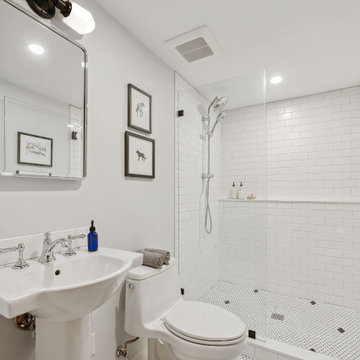
This hall bath renovation was for empty nesters whose grandkids frequently visit, making it a priority to update the space for both adult guests and young children. Originally, the bathroom was outdated with a large sheet mirror, heavy oak cabinets, and hexagon tile flooring, giving it a dark, underwhelming look. The goal was to create a fresh, inviting environment that balances elegance with practical features for a multi-generational household.
Design objectives:
Modernize finishes and materials to update the aesthetic
Provide accessible, kid-friendly storage and shower options
Artful lighting and maintain a timeless, neutral palette
The Remodel
Design challenges to be solved:
No structural changes – must keep the tub and wall structure
Ensure flexibility with storage for both adult and children’s items
Retain functionality for easier bath time with young children
The Renewed Space
Design solutions:
Updated Storage – Replaced the dated medicine cabinet with a sleek, mirrored version on the wall, offering accessible storage without sacrificing the streamlined look. The vanity now includes additional storage for essential items, keeping surfaces clutter-free and organized.
Neutral Palette with Subtle Details – To give the bathroom a timeless look, we used a soft, monochromatic color scheme throughout. The shower tile, with a subtle sheen and texture, adds depth and interest without overwhelming the space. The floor tile’s pattern brings a sense of movement that’s refined yet durable for a high-traffic bathroom.
Flexible Shower Setup – Opted to keep the shower curtain instead of glass doors, allowing easier access for bathing young children. A spacious shower niche was installed to hold essentials, adding functionality for both the homeowner and the grandkids.
The result is a timeless hall bath with just the right blend of modern sophistication and family-friendly functionality. The subtle yet striking tile details and upgraded lighting bring elegance to the room, making it the perfect refresh for any guest and a versatile space for all ages.
Find the right local pro for your project

Our client bought an older expansive bungalow in Manotick with a stunning waterfront backyard. This beautiful setting became the foundation for our open concept Kitchen and Family Room Design. Besides the usual great functional requirements, the client wanted a ‘Rockstar’ visual kitchen to complement an eclectic collection of Mid-Century Furniture and objects. The reclaimed Northern Wide plank Oak hardwood (colour: Mill creek, collection: Artifax), floor provides a rustic and comfortable grounding to the crisp modernism of the kitchen. The floor is especially practical as the inevitable scratches from the family dog can be easily corrected by the client.
The Kitchen features a ‘Bridge’ design of walnut cabinetry surrounding the pro-style fridge and freezer. Other appliances are clustered with demi-tall pantries and form an interesting linear definition that suits the ‘Long’ Room of Kitchen and Family Room. A walnut Eating Bar and walnut interior for the dish pantry complete the triad of walnut in the Kitchen. High gloss white cabinets featuring handle-free design are topped with gray quartz. The stunning Noble Grey light marble backsplash is installed with a Horizontal grain to complement the linear definition.
The Family Room features an offset linear fireplace that is balanced with a substantial walnut entertainment unit. The awkward and unmoveable doorway was incorporated into the design to create the effect of a unit that is much larger than it actually is. The walnut wood matches the Kitchen but is installed with a horizontal grain, repeating the character of the kitchen backsplash.

This 2017 Project begins with a wonderful Palo Alto family of four wanted to get more use of their backyard. Their existing backyard had served its purpose for many years when their children were young. Now their children in college, it was underused and in desperate need of an update.
Having lived in their home for 19 years, my clients communicated clearly with goals to take advantage of the reason they moved to Palo Alto in the first place. Both desire spending more time for themselves enjoying our year round climate in Northern California. By initially addressing the specific request to decrease the water usage and the accompanying utility bills, objective for addition of a fire pit to the existing spa destination; both sharing their spaces for also a new destination of the turf for the husband, and avid golfer. John had always wanted to practice in his own backyard. Viola! The perfect place to entertain, dine, relax and play!
NO RESERVATIONS REQUIRED!
A very comfortable, attractive and inviting new outdoor living room has been created!
Welcome Home!

We designed this cabinet to be the captivating center of of a luxurious California home. Its unique laser cut wood panel is totally original, beautiful , and hides a huge amount of storage. LED light strips do a great job of illuminating every item displayed, without any glare. Using adjustable shelves let us create cubbies of various heights, to hold wonderful art objects of many different shapes and sizes.

This bespoke modern media unit was designed and handcrafted for the living room of a private family residence in Surrey. We worked closely with our clients to develop the freestanding piece of uniquely elegant and highly practical furniture.
The bold, contemporary design featuring a stepped cornice has given their living room impressive structure and style.
Our clients wanted the furniture to make a stunning statement feature in the room. The TV screen is integrated into the design and surrounded by open shelving to display their favourite books and ornaments.
Uniquely designed and crafted for the space
We began by exploring ideas for the design of the unit, along with materials and finishes. We produced detailed CAD visuals so our clients could clearly envisage how the finished furniture design would look in the space.
Tailored display shelving and storage cabinets
For this TV unit in their Surrey home, our clients wanted to have open display areas for books and artworks, with lower cabinets for storage.
Finished in the latest Italian-designed Xylocleaf veneers, the backs of the open shelving have an impressive, decorative look.
The lower cupboards of this unit feature reeded panelled doors with a smooth, push to open, handle-free design. The reeded feature on the doors elevates the furniture design and adds an interesting texture to the unit.
High end, sophisticated paint finish
Colour was important for our clients. With a bespoke by Acorn media unit, you can have any paint colour you like and sheen from matte to high gloss. Our clients chose Farrow and Ball’s Railings. More blue than black, Railings has a velvety quality which adds a softness to the deep, strong colour. It’s dramatic yet has a cocooning quality and the opulent shade sets off artworks perfectly.
We used luxurious XyloCleaf boards for the open display backs. Together with the concealed LED lighting this achieves a visually stunning dimension and atmosphere.
Luxury laminated surfaces
At Acorn, we can offer you some of the finest materials and finishes for your bespoke media furniture. For this high-end contemporary look, our clients chose decorative back panels by Xylocleaf, which combine exceptional Italian flair with class-leading technical standards. The decorative panels are perfect for distinctive cabinetry and luxury interiors.
Bespoke LED lighting for the unit
The display shelving has been illuminated to add dimension and ambience. Integrated dimmable LED lighting puts our client’s beautiful objects in the spotlight and creates a warming glow.

Sponsored
Delaware, OH
Buckeye Basements, Inc.
Central Ohio's Basement Finishing ExpertsBest Of Houzz '13-'21

Photography by Caryn B. Davis
Located in the Cornfield Point area of Old Saybrook along Long Island Sound, this project brought a classic, yet forgotten beach house back to life. Through a little detective work and some creative ingenuity, we restored and enhanced the exterior to it’s former glory and transformed the interior to a highly efficient and functional home all the while uplifting its quaint cottage charm. On the exterior, we recreated a wonderful, airy front porch with cozy bench seats that look out to the water. The white cedar shingle siding is pre-bleached with a subtle flair at the bottom and a delicate break at mid-elevation. The asphalt shingles are not only beautifully matched with the siding, but offer superior reflective qualities to dissipate the heat of the summer sun. On the interior, we joined the front seasonal porch with the family room to form a larger, open living and dining space with paneled walls and ceilings anchored by the original round stone fireplace. In the rear, we carefully crafted a galley kitchen and laundry space with an adjacent first floor master suite. The diminutive house and property posed multiple practical and regulatory challenges which were overcome by a strong team effort, due diligence, and a commitment to the process.
John R. Schroeder, AIA is a professional design firm specializing in architecture, interiors, and planning. We have over 30 years experience with projects of all types, sizes, and levels of complexity. Because we love what we do, we approach our work with enthusiasm and dedication. We are committed to the highest level of design and service on each and every project. We engage our clients in positive and rewarding collaborations. We strive to exceed expectations through our attention to detail, our understanding of the “big picture”, and our ability to effectively manage a team of design professionals, industry representatives, and building contractors. We carefully analyze budgets and project objectives to assist clients with wise fund allocation.
We continually monitor and research advances in technology, materials, and construction methods, both sustainable and otherwise, to provide a responsible, well-suited, and cost effective product. Our design solutions are highly functional using both innovative and traditional approaches. Our aesthetic style is flexible and open, blending cues from client desires, building function, site context, and material properties, making each project unique, personalized, and enduring.

Project Details
Lake home features traditional cottage theme with a combination of stone, stucco and shake siding. Features include custom red wood garage doors, special order Marvin front entry system and custom alder cabinetry. The most unique part of this home was the butler’s pantry housing an extra refrigerator, dishwasher and pantry storage.
Client Objectives
The homeowners were looking for a contractor that could help them convert their dreams a building a practice lake home, ideal for the pro fisherman on Lake Minnetonka into reality. They wanted a cozy home for family gatherings while also keeping the ability for resale an option.
“I waited several years to find the right time and the right lot to build my lake home. After interviewing several contractors I turned to Jeff because he was able to take the plans that I had spent years working on and design something that fit my needs while also keep an eye on resale. I was impressed with his expertise and knowledge of Orono’s zoning regulations. In the end, we partnered together to build the lake home of my dreams.”

Free from all unnecessary objects with a clean, stylish, and uncluttered design, this contemporary kitchen is the minimalist's dream! This kitchen is also incredibly practical with the space-saving design innovations with built-in appliances and custom cabinets. Design features include large format porcelain tile, under-mount sink, flat-panel dark wood cabinets, quartz countertops, tile backsplash, integrated paneled appliances, an island, and smart home electoral system.

Every movement of the tea master is precise and defined. There are no random steps, gestures, or even breaths. This is not a ceremony, but rather a spiritual experience, like a prayer liturgy. This practice is at once an active meditation, a sensual experience, and the highest form of communication. "The art of tea is the art of life," says the host, and you make a subtle bow of respect.

The Poul Henningsen designed PH Bow Piano is a radical departure from the expectation of how a wooden-cased piano should be presented. It was Poul Henningsen’s innate belief that when designing a piece of furniture form should always follow function and that the practical performance of his creation was of paramount importance. PH also believed that it was possible to redesign many everyday objects and pieces of furniture in such away that not only would they function better but they would also be more aesthetically pleasing. The PH Bow Piano is no exception to this philosophy.

The overall design objective was to take advantage of every opportunity to experience the beauty of the lake, while providing all the comforts and conveniences of a modern luxury home. The steep, narrow site and its proximity to the lake presented many challenges during construction. The main living area focuses on entertaining family & guests, and includes a dining area with wet bar, study/guest room with guest bath and a gourmet kitchen. Custom cabinetry and built-ins throughout the house add a traditional touch and fill a practical storage need. The master bedroom has its own balcony view of the lake, while the lake level features a sauna, wine cellar and the soothing sounds of the lake lapping at the edge of a stone patio.

Sponsored
Columbus, OH
Hope Restoration & General Contracting
Columbus Design-Build, Kitchen & Bath Remodeling, Historic Renovations
The Ellis Mid Century Bookshelf is a handcrafted storage piece designed to bring warmth, structure, and practical organization into modern interiors. Built from 100% solid pine wood with a strong metal frame, it combines natural wood texture with a clean architectural silhouette.
Its open shelf design provides generous space for books, plants, framed photos, ceramics, office supplies, and decorative objects. The contrast between solid pine shelves and the slim metal frame gives Ellis a balanced look that works well in living rooms, home offices, bedrooms, entryways, and studio spaces.
Available in multiple widths and two height options, Ellis can adapt to both compact rooms and wider feature walls. The 5-shelf and 6-shelf configurations make it useful for different storage needs while keeping the overall design light, open, and visually organized.
With its mid-century modern character, natural wood grain, water-resistant matte finish, and easy assembly structure, Ellis is designed as both a functional bookcase and a stylish display piece for everyday interiors.

The Setup:
After purchasing this home, the homeowners faced a unique opportunity to reimagine their kitchen and nearby spaces. Water damage from a burst pipe had left much of the home’s interior in need of repair, and while the existing kitchen was functional and in relatively good shape, it didn’t align with the family’s vision for their new home. The layout included a peninsula that wasn’t ideal, and there were some druthers with the nearby pantry.
Since the space needed to be rebuilt anyway, the homeowners saw this as a chance to create a kitchen that was both highly functional for their four young children and timeless in its design. The project also included a refresh of the adjacent message center and dining room — spaces that play key roles in the family’s daily life. The goal was to create a cohesive flow between these areas, balancing modern functionality with the craftsman-inspired character of the rest of the home.
Design Objectives:
- Replace the outdated peninsula with a large island to maximize counter space and create new seating options.
- Open up the space visually by removing soffits and rethinking the cabinetry layout.
Incorporate concealed refrigeration and freezer units to provide significant storage for the family while maintaining a streamlined aesthetic.
- Integrate black cabinetry into the design without making the space feel harsh or heavy.
- Ensure the lighting plan balances functional task lighting with ambient accent lighting.
- Avoid visual clutter in the cabinetry design while still giving a nod to the craftsman aesthetic.
- Incorporate a slab backsplash as a key design feature.
Design Challenges:
- The outdated peninsula left dead space in the kitchen and lacked sufficient seating for the family.
- The cooktop wall was cramped, with small cabinets flanking the hood, limited storage, and soffits that made the space feel closed-in.
- The family needed significant refrigeration space (two refrigerators and a freezer) but wanted to avoid a cluttered look with visible stainless steel appliances.
- Adding black cabinetry risked making the space feel too dark or heavy.
- The original lighting plan was insufficient, particularly over the dining table where a decorative fixture proved too dim.
- The family wanted shaker-style drawer fronts to match the home’s arts-and-crafts design but worried that too much shaker cabinetry might look overly busy.
- Prioritizing a slab backsplash in the wish list priority planning.
The Renewed Space
Design Solutions:
- A functional island: The peninsula was replaced with a large island that provides continuous countertop space for prepping and serving. The island also features seating for four people, creating a central hub for informal meals and activities.
- Streamlined cooktop wall: The soffits were removed, and the upper cabinets on the cooktop wall were eliminated to create a more open, streamlined design. A custom oversized hood became the focal point of the wall, with the blower unit offset inside it to align with the cooktop while maintaining exterior visual symmetry.
- Concealed refrigeration: Two column refrigerators and one freezer were integrated into the cabinetry, concealing them behind wood paneling that blends seamlessly with the overall design.
- Warm black cabinetry: The black cabinetry was crafted from hickory with a visible grain, softening its appearance and adding warmth. The grain detail gives the cabinetry a rich, textured look that avoids feeling stark or overpowering.
- Additional lighting: In the dining area, recessed can lights were added during an additional installation phase to supplement the gorgeous decorative fixture’s dim output. The new lighting plan creates a layered effect, combining functional task lighting with softer ambient lighting.
- Simplified cabinetry details: Slab drawer fronts were used on the upper drawers, while five-piece shaker fronts (with slightly less prominent rail and stile pieces) were reserved for the middle and lower drawers. This approach simplified the overall look while maintaining the craftsman-inspired aesthetic.
- Slab backsplash priority: The slab backsplash was prioritized by making thoughtful adjustments elsewhere, like opting not to extend cabinetry to the ceiling, which also helped visually prioritize the gorgeous slab backsplash. This decision also enhanced the kitchen’s furniture-like feel, aligning with the home’s craftsman character.
- This kitchen perfectly balances practicality with timeless style. By addressing the family’s functional needs — ample seating, smart storage, and effective lighting — while incorporating thoughtful design elements like warm black cabinetry and a striking slab backsplash, Alicia created a space that works beautifully for a busy household. The result is a cohesive, inviting kitchen that honors the home’s craftsman roots and will serve the family well for years to come.

We helped Miki and David successfully execute a bathroom and kitchen remodel for their Co-op in New York City. The primary objective was to enhance the sense of space, functionality, and style while keeping the project on track and on budget.
To kickstart the project, Anna, the highly skilled project planner, conducted a thorough walkthrough with Miki and David. During the meeting, she captured their vision, outlined a realistic timeline, and carefully considered their budgetary restrictions.
Anna made sure to grasp their aspirations of modernizing the kitchen and bathroom, aiming to elevate both the aesthetics and practicality while incorporating a bespoke design tailored to their desires.
The design challenge was to modernize the outdated kitchen and bathroom while maintaining a budget-friendly approach. The clients opted for a Scandinavian style, featuring neutral olive green colors, stone, and natural wood materials. The designers explored various layouts to maximize functionality and accommodate the clients' preferences, providing Miki and David with multiple options. Eventually, the family made their design choices and felt assured as they entered the construction phase.
During the building phase, the construction team completed a gut renovation of the kitchen and bathroom, replacing ceilings, walls, floors, and all fixtures. The result was a stunning custom kitchen designed in the Scandinavian style featuring matte grey-green cabinetry, natural wood open shelving, a built-in pantry and appliances, and Vivid White Quartz countertops. The combination of sage base cabinets with grey undertones and modern, natural wood structures created a neutral and earthy impression, while the smooth white wall cabinets and countertops added a sleek and airy touch to the space.
The bathroom renovation encompassed a full remodel, with all fixtures being replaced. A custom-ordered vanity in a matching grey-green shade was installed, along with the Maiolica White Polished Ceramic Wall Tile and Kohler and Delta fixtures. Within a few short weeks, Miki and David's new kitchen and bathroom were transformed to align perfectly with their style and vision, while significantly enhancing functionality.

Nestled in the hills of Orinda, California, this 1951 residence is one of only seven extant homes, now known as “The Magnificent Seven”, designed by architect Olof Dahlstrand, a protégé of Frank Lloyd Wright. With its low-slung rooflines, natural materials, and deep integration with the sloping landscape, the home is a pristine example of mid-century modern design inspired by Wright’s organic principles. Over the years, prior homeowners have emphasized preservation, ensuring that the house remained relatively untouched. Each owner has respected the original architecture and stayed true to Dahlstrand’s intent. When a family of five—two college-aged sons and a middle school-aged daughter—acquired the property, they were captivated by its history, legacy of care, and architectural significance. While they appreciated Dahlstrand’s original vision, they also recognized the need to adapt the home for contemporary living while preserving its design integrity.
The remodel was conceived as a thoughtful response to the past—an effort to bring the house into the 21st century without compromising its soul. The primary mandate was to maintain architectural continuity while improving the functionality, comfort, and livability for a modern family. The design team—architects and contractor alike—worked with a shared reverence for the original architecture, allowing that mindset to guide even the most technical or pragmatic decisions.
A key objective was to increase natural light in the kitchen—a departure from Wrightian principles of enclosed, intimate cooking spaces—while maintaining the home’s architectural language. The kitchen was reconfigured to foster a stronger connection to adjacent living spaces while retaining the underlying concept of spatial separation. One of the most transformative architectural changes was the removal of a ridge beam that was originally planned to remain visible through the kitchen. During construction, the team collaborated on a better solution: a wide-flanged steel beam concealed within the roof envelope. This subtle move preserved the clean lines and ceiling continuity, a modern update carried out with utmost respect for the existing framework.
The home’s original powder room, previously accessible only through the kitchen, was relocated for better flow and privacy. A new powder room was carved out of former kitchen cabinetry—a narrow, interior space that could have felt dark and enclosed. To avoid this, the design extended the line of original transom windows into the new powder room and added a skylight above the vanity. The result is a bright and airy space that feels consistent with the rest of the home. Other updates included the installation of new solid-core interior doors with veneers carefully matched to the original mahogany, enhancing the continuity of the interiors. Even smaller decisions, such as placing the door knobs at 42 inches high, mirrored the original proportions. Every choice reflected a shared belief between the architect, contractor, and client: that new work should serve the integrity of the old.
The home’s extensive interior redwood millwork and paneling was meticulously restored. Where new materials were introduced—such as the replacement redwood soffit paneling—the contractor took pains to find finish nails that matched the original, rather than using modern equivalents. This level of craftsmanship and collaboration defined the project. It extended even to the detailing of a blind door to the new powder room, which had to disappear into the existing redwood board-and-batten wall. It was a team effort: the owner found a suitable handle, the architects devised the custom in-swing mechanism, and the contractor executed it so the door aligned precisely with the battens. Throughout, the homeowners were deeply engaged in the design process. One, a meticulous design enthusiast, focused on aesthetic integrity and historic detail. The other brought a practical and function-driven perspective, ensuring that new fixtures and materials would be durable and require minimal maintenance.
While the home’s location posed no major site challenges, sustainability was a key concern. The team upgraded the roof insulation, installed solar panels with battery storage, and added ductless mini-split cooling systems. Lighting was another area where modern technology was woven into a historic framework: new square LED fixtures echo the original custom perimeter soffit lights, maintaining the design language while offering advanced performance.
A planned expansion of a bedroom into suite with a bathroom had to be shelved due to budget constraints and the high cost of below-grade foundation work. Still, the team focused their efforts on making the most of the existing footprint, resolving constraints through design ingenuity rather than adding square footage. This renovation represents a collaborative achievement in preserving and evolving a historically significant home. Every decision was shaped by a shared ethos among clients, architects, and contractor: to maintain the home’s architectural soul while updating it for contemporary life. The result is a timeless modernist residence that continues Olof Dahlstrand’s legacy, remaining grounded in nature, craftsmanship, and human-scale design.
Klopf Architecture Team: John Klopf, AIA, Klara Kevane, Fernanda Bernardes
Interior Architectural Design: Klopf Architecture
Structural Engineer: Daniel Bastiao
Contractor: Don Larwood, Larwood Construction
Photography: Mariko Reed
Year Completed: 2022

Sponsored
Westerville, OH
Custom Home Works
Franklin County's Award-Winning Design, Build and Remodeling Expert

This full first-floor renovation transformed a family home in Northwest Indiana, originally built in the early 2000s, into a personalized, highly functional space that better reflects the lifestyle and taste of its four residents. The remodel included the kitchen, living room, a reimagined dining room turned sitting room, office, mudroom, and laundry room.
The clients’ main objective was to move beyond dated, builder-grade finishes and create a home that felt curated, warm, and distinctive—infused with layered textures, custom details, and a sense of ease. The living room posed the biggest design challenge, with awkward furniture placement due to two structural columns. We used these features to anchor a revised layout, integrating custom built-ins for storage and balance, and adding mixed metals and refined textures for visual depth.
A former dining room was transformed into a moody sitting room—contrasting the neutral palette used throughout the rest of the main floor, while still complementing it. The mudroom was reworked from a tight, underutilized space into a practical, polished drop zone with custom cabinetry and stylish utility.
Throughout the renovation, our team focused on improving flow, enhancing functionality, and blending each room’s unique character into a cohesive, elevated whole—resulting in a home that’s as livable as it is beautifully tailored.

Some rooms never quite find their purpose. That was the case with this space, which had gradually become a combination home office, pantry overflow area, pet zone, and general catch-all for daily life. While it offered plenty of square footage, it wasn’t helping the homeowners stay organized, and valuable storage was scattered between an overcrowded pantry closet and various pieces of furniture throughout the room.
Having previously partnered with Drury Design on a kitchen remodel, these homeowners once again turned to Senior Designer Samantha Schoell to help them rethink how their home could better support the way they actually live. What began as a conversation about adding some cabinetry quickly evolved into a comprehensive storage solution — one designed to accommodate everything from groceries and sports equipment to pet supplies and everyday household essentials.
Design Objectives:
Create Organization: Consolidate pantry overflow, household supplies, and everyday essentials into a single, highly functional space.
Support Family Life: Provide dedicated storage for coats, bags, sports equipment, and the routines of an active household.
Accommodate Pets: Incorporate thoughtful features for the family’s dogs while maintaining a clean, organized appearance.
Maximize Existing Space: Transform an underutilized room without expanding the home’s footprint.
Maintain Flexibility: Preserve the room’s long-term versatility and appeal for future homeowners.
Design Challenges:
Multiple Functions: The room was being used simultaneously as a home office, pantry, storage area, and pet space without a cohesive organizational strategy.
Insufficient Pantry Storage: The nearby pantry closet had become overcrowded and difficult to navigate.
Visual Clutter: Everyday items, pet supplies, and household necessities lacked dedicated storage locations.
Unused Potential: Despite its generous size, the room was not contributing meaningfully to the home’s overall functionality.
Balancing Practicality and Style: The homeowners wanted substantial storage without creating a space that felt overly utilitarian.
Design Solutions:
Purpose-Built Storage Plan: Custom cabinetry was designed to support multiple functions within a unified storage system, allowing the room to serve as a mudroom, pantry extension, household hub, and pet station.
Expanded Pantry Capacity: Floor-to-ceiling cabinetry, a secondary refrigerator, and extensive drawer storage dramatically increased food storage and organization capabilities.
Hidden Organization: Closed cabinetry conceals household items, sports gear, pet supplies, and everyday clutter, creating a calm and orderly appearance.
Full-Room Transformation: Rather than simply adding cabinets to one wall, the design reimagined the entire room, utilizing its footprint to create a true family command center.
Furniture-Inspired Cabinetry: Warm wood finishes, decorative hardware, open display shelving, and thoughtful detailing elevate the room beyond pure utility, helping it feel like a natural extension of the home’s design.
The most successful remodeling projects often solve problems homeowners have simply learned to live with. In this case, a room that once served several purposes — but excelled at none — was transformed into one of the hardest-working spaces in the home.
Today, groceries, pet supplies, seasonal gear, household essentials, and daily routines all have a designated place. Even the family’s dogs were thoughtfully considered, with a built-in resting area integrated into the cabinetry. The result is a room that feels remarkably organized despite supporting countless everyday activities — a reflection of how thoughtful design can bring clarity, efficiency, and calm to the busiest parts of family life.

Here are some practical tips for creating a beautiful, comfortable and thoughtful living room design.
The living room in the house is the place where, as the name suggests, receives guests. However, the owners themselves relax here, spending time in front of the TV or a book, with drinks, pleasant conversation and other activities. Therefore, the living room should be the most comfortable place in your home.
The place of the sofa in the design of the living room
The sofa does not need to be placed in a draft. This means that it should not be on an imaginary line from window to door - if you drew a floor plan, it will just be easy to trace.
1. The sofa in front of the TV, diagonally from the door, is a great location. As if inviting you to sit down :)
2. Sofa near the door. A good solution if you often have overnight guests.
3. Corner sofa in the living room. Best placed in the farthest corner from the door. This will make the room look more spacious.
Correct opening of the door in the living room. Inward or outward?
Open inward or outward? There is no clear rule here, because everything depends on the layout and on the furniture placed. The main thing is that the door leaf opens freely and does not interfere with entering and exiting the room. Also, the door should not interfere with free access to the closet or dressing room.
TV in living room size and location. Location.
The TV is placed on the wall opposite to the sofa - this is the most logical and reasonable place for it in the living room. Moreover, the distance to it does not really matter: modern TV models can be placed close to the sofa.
Cabinet or bracket? To your taste. The main thing is that the television zone looks neat and presentable. Provide in advance a cable channel in which all the wires and numerous sockets for the receiver, modem, set-top box, sound bar will hide. Nothing spoils a design like sticking wires!
Height from the floor. It is optimal to place the TV 1 m from the floor to the middle of the screen - this is exactly the level of the eyes of a seated person.
Diagonal size. If there is a financial opportunity, consider options from 50 inches - smaller screens look lonely and lonely on an empty wall.
Living room furniture.
Armchair. Often the chair becomes an accent item in the interior, then its shade, and sometimes its shape, differ from the rest of the furniture. When choosing a chair, be guided also by your habits: for example, it will be more convenient to climb up with your feet and read a book in an armchair with dimensions of 90x90 cm, and you can “just sit comfortably” in a fireplace chair with a high back, comfortable armrests and with a seat 80x80 cm.
TV stand. Large TV stands are no longer as relevant as they used to be, when it was necessary to store a player, cassettes and discs there. For now, a console table or a narrow elegant pedestal is enough.
Coffee table. Nice piece of furniture that creates a cozy atmosphere. Some models, if necessary, can be transformed into a more spacious table for receiving guests - however, finding comfortable and beautiful specimens is not easy, plus they usually cost a lot.
Rack. An extremely useful type of furniture. :) Firstly, a large number of decor items can be beautifully placed on the rack. And secondly, it can also play the role of a light through partition, which divides the room into zones and does not select light at the same time. This is a very big plus for small apartments.
Fireplace. Here we are talking about electric fireplaces. Some of them come with a humidifier and heated, so 3-in-1 models can be very helpful. Fireplace portals have different styles: classic, antique, modern. Inconsistency with the general style of the living room can greatly spoil the impression of the room, so be careful with creativity. Sizing is an important issue. A large wall with a high ceiling also needs a proportionate fireplace; in horror, a small portal will look lonely and ridiculous.
What do you think about our new living room project?
https://www.ferriss.co
#ferriss #We_bring_objects_to_life #3drendering #architecture #San_Francisco
11