
Search results for "Prioritize building" in Home Design Ideas
 M3Decks & Outdoor Living
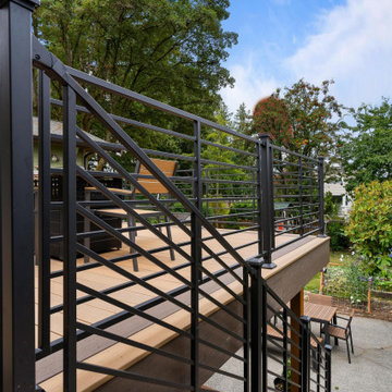
North Seattle Complete Design-Build Deck with Underdeck DrySpace Project
Project Overview
In North Seattle, M3Decks & Outdoor Living completed a comprehensive design-build project, transforming a residential backyard into a multi-functional outdoor living space. The project featured a modern elevated deck with an innovative underdeck DrySpace system, seamlessly blending practicality with aesthetic appeal to suit the Pacific Northwest climate.
Scope of Work
Design Phase: Created a custom design for an elevated deck, prioritizing open space for entertaining and a sheltered underdeck area. The design incorporated sleek railings and a natural aesthetic to complement the surrounding greenery.
Construction: Built the elevated deck using TimberTech composite decking and Fortress Steel Framing for durability. Installed a TimberTech DrySpace system beneath the deck to create a dry, usable space for additional outdoor living or storage.
Staircase and Lighting: Constructed a sturdy staircase with inset lighting on each step, ensuring safety and adding a warm ambiance for evening use. The staircase featured modern black railings to match the deck’s design.
Landscaping Integration: Worked with the existing landscape, preserving mature trees and adding native plants like hydrangeas to enhance the natural setting and create a cohesive outdoor environment.
Key Features
Elevated Deck: Spacious TimberTech composite deck with sleek black railings, designed for entertaining and enjoying the scenic views of North Seattle’s greenery.
Underdeck DrySpace: TimberTech DrySpace system installed to provide a weatherproof area beneath the deck, perfect for additional seating, storage, or future outdoor amenities.
Inset Lighting: Energy-efficient lighting integrated into the staircase and deck perimeter, enhancing safety and creating an inviting atmosphere for nighttime use.
Biophilic Design: Incorporated native plants and preserved existing trees to create a seamless connection with the natural surroundings, enhancing the outdoor experience.
Outcome
The North Seattle design-build project delivered a stunning and functional outdoor space that elevated the homeowners’ lifestyle. The elevated deck provides a perfect spot for entertaining, while the DrySpace system ensures the underdeck area remains dry and usable year-round, even in Seattle’s rainy climate. The modern design, combined with practical features like inset lighting and durable materials, resulted in a low-maintenance, high-value addition to the property that the homeowners can enjoy for years to come.
Location
North Seattle, WA
Project Type
Residential Design-Build with Underdeck System
 kul grilles
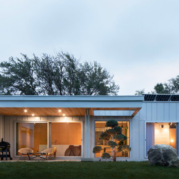
The image showcases a remarkable mid-century modern bungalow designed by Joel Tanner, the CEO and Creative Director of SMPL Design Studio. Known for their expertise in modern home designs, SMPL Design Studio aims to maximize the livability of spaces for their clients. With a wealth of experience, the firm has successfully completed over 1500 projects in their 12 years of operation, covering a wide range of properties including small infill lots, expansive country acreages, cottage country lakefronts, and complex lands.
SMPL Design Studio prioritizes sustainable practices and practical solutions in every project they undertake. Their commitment to environmentally conscious design ensures that the homes they create not only look exceptional but also minimize their impact on the planet. By incorporating sustainable materials, energy-efficient systems, and thoughtful design elements, SMPL Design Studio strives to create homes that are both aesthetically pleasing and environmentally friendly.
With their vast experience and commitment to sustainability, SMPL Design Studio has established themselves as a leading firm in delivering modern and livable spaces for their clients.
Photographer: Ozimek Photography
 Hoover Architecture, PLLC
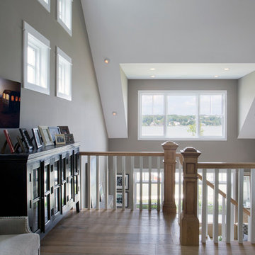
Entering the home, one is drawn into the bright open space by the view of the lake through the living room windows.
Philip Jensen Carter
Example of a large beach style light wood floor foyer design in New York with gray walls
Example of a large beach style light wood floor foyer design in New York with gray walls
Find the right local pro for your project
 Shah Nawaz Architects
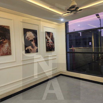
Continuing the seamless blend of luxury and spatial efficiency found throughout this 5 Marla modern home in Faisal Hills, Taxila, this bedroom design showcases how compact spaces can achieve an ultra-premium, boutique-hotel aesthetic. As seen in the project file mfh5m e.tif, the room prioritizes clean architectural lines, sophisticated wall treatments, and expansive views to create a serene retreat.
Design Highlights:
Floor-to-Ceiling Glazing: A large, minimalist black-framed window maximizes natural light and captures striking evening views, instantly making the room's footprint feel larger and deeply connected to the surrounding landscape.
Neoclassical Wall Paneling: The main accent wall features elegant, classic wainscoting and molding panels that frame a curated triptych of expressive fine art, adding deep texture, character, and sophistication to the space.
Ambient Lighting Design: A recessed false ceiling integrates hidden warm LED cove lighting alongside targeted spotlights, creating a soft, glare-free ambiance perfect for a restful evening environment.
Muted Color Palette: The smooth, neutral gray flooring tiles provide a clean, modern foundation, perfectly balancing the warm cream tones of the walls and dark accents of the window frames and baseboards.
 New Explode Construction
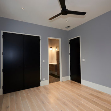
This bedroom strikes the perfect balance between modern sophistication and a welcoming sense of comfort. The matte black doors create a striking contrast against the soft gray wall color, instantly elevating the room's visual depth. Paired with the natural warmth of wide-plank light oak flooring, the result is a palette that feels both grounded and airy.
The large picture window invites ample daylight, enhancing the room's open, uncluttered feel. At night, the minimal ceiling fan offers both function and understated style, complementing the space without overwhelming it. The room's simplicity allows it to adapt to any design preference, from minimalist to richly layered decor.
Every design decision here prioritizes both aesthetics and practicality—ample closet space, an easy-to-clean floor finish, and a color scheme that stands the test of time. This is a bedroom that doesn't just serve as a place to sleep—it's a quiet retreat within the home, perfectly suited for rest, reflection, or simply enjoying the play of light across the walls throughout the day.
In a house where architectural details take center stage, this bedroom proves that even simple spaces can be deeply considered and beautifully executed.
 Architecture Zhang/Architekten ni zhang
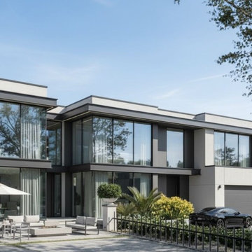
Contemporary Luxury Redefined: Where Minimalist Design Meets Maximum Comfort.
Transform your vision of modern living with this stunning 4,500 sq ft architectural
masterpiece. Our design philosophy? Less visual noise, more livable luxury.
What Makes This Project Special:
· 18-foot floor-to-ceiling glass walls- bringing 60% more natural light than traditional
homes
· Seamless indoor-outdoor integration with covered terraces for year-round entertaining
· Premiummaterials: Polished concrete, natural wood accents, German-engineered
windows
· Smarthomesystem integrated from foundation up
· Low-maintenance exterior = more time enjoying your space
The Result: A home that photographs like a magazine but lives like a dream. Our clients report
40% lower energy costs and constantly hear "I've never seen anything like this" from guests.
Project Details: ? 4,500 sq ft | 4 bed, 4.5 bath ⏱ 16-month design-to-completion timeline ?
Mid-range luxury budget with high-end results ? Featured in [Local Architecture Magazine]
Our Approach: We don't just draw pretty pictures. Our full design-build service means one
team, one vision, zero surprises.
step.
Perfect For: ✓ Families wanting sophisticated yet practical spaces ✓ Professionals who
entertain clients at home ✓ Anyone tired of cookie-cutter suburban designs ✓ Homeowners
prioritizing natural light
 Above And Beyond Builders
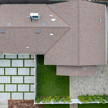
This aerial perspective captures the strategic execution behind this Sherman Oaks ADU development. The site was intentionally optimized to maximize usable outdoor square footage while maintaining privacy, accessibility, and visual order.
A contemporary grid-pattern hardscape integrates seamlessly with artificial turf, creating a clean architectural rhythm that enhances both curb structure and long-term durability. The defined perimeter fencing and structured landscaping provide separation and security, reinforcing the ADU as a fully independent living space.
Designed with real estate performance in mind, this layout prioritizes functionality, clean circulation paths, and low-maintenance materials, positioning the property as a smart, income-generating asset in the competitive Los Angeles ADU market.
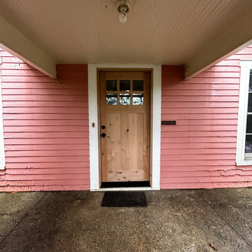
Integrated landscape lighting adds dimension and evening presence, highlighting architectural details while elevating security and usability. The covered entry porch delivers both charm and functional outdoor space, reinforcing the ADU as a high-performing, income-ready asset in the Los Angeles market.

 Maslar Design & Build, LLC
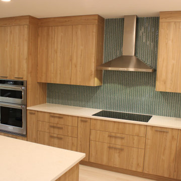
Organic Modern Kitchen with Mid-Century Flair
This stunning kitchen masterfully blends Japandi minimalism with Mid-Century Modern character. The design prioritizes clean lines and high-contrast textures to create a space that feels both cutting-edge and incredibly inviting.
Warm Wood Cabinetry: Custom flat-panel (slab) cabinets in a rift-cut white oak finish provide a seamless, vertical grain that anchors the room in natural warmth.
Architectural Backsplash: The focal point is a striking teal chevron mosaic, offering a sophisticated "pop" of color and geometric interest against the neutral palette.
Pro-Series Integration: High-performance stainless steel appliances—including a wall-mount chimney hood and built-in double ovens—are integrated for a streamlined, "chef’s kitchen" aesthetic.
Sleek Surfaces: Bright white quartz countertops offer a crisp, durable workspace that bounces light throughout the open-concept layout.
Minimalist Hardware: Slim satin nickel bar pulls emphasize the horizontal geometry of the custom drawer stacks.
 Hurst Design Build Remodel
Photo: Amy Rizer Photography © 2018 Houzz
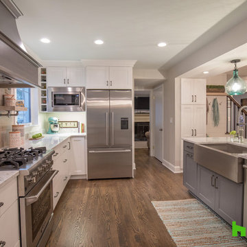
Transitional u-shaped dark wood floor and brown floor open concept kitchen photo with a farmhouse sink, shaker cabinets, white cabinets, brown backsplash, wood backsplash, stainless steel appliances, an island and white countertops
Transitional u-shaped dark wood floor and brown floor open concept kitchen photo with a farmhouse sink, shaker cabinets, white cabinets, brown backsplash, wood backsplash, stainless steel appliances, an island and white countertops
 Floor Specialists of Wellington, Inc.
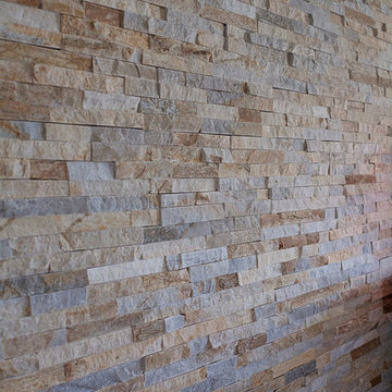
Example of a mid-sized transitional medium tone wood floor family room design in Miami with gray walls and no tv
 Tectonic Design Build
Design:
For this young Boulder family, the goal was simple: bring their home in Old North Boulder into alignment with their day-to-day.
The spaces were generous, but they felt dated and inefficient. The primary bathroom, in particular, had plenty of square footage but lacked intention. The mudroom functioned, but barely. As part of this Boulder home remodel, the focus wasn’t on adding more space; it was about using the space they already had more thoughtfully.
In the primary suite, the vision centered on creating a retreat that felt restorative and refined. A freestanding tub and shower brought softness and openness, but the true focal point was the custom sauna, a feature the homeowners were especially excited about. The design blends aesthetic warmth with everyday function, transforming what was once an oversized, underutilized bathroom into a spa-like escape.
Throughout the remodel, the guiding principle was balance: elevated design paired with real-life durability for a busy family household.
Build:
Because the rooms already existed, we maintained the original footprint and focused on improving flow and efficiency. This approach allowed us to modernize the home without unnecessary structural changes–a strategic move within this Boulder home remodel, and one that kept costs under control.
In the primary bathroom, we reworked the layout to better utilize the expansive square footage. The sauna was seamlessly integrated alongside the freestanding tub and shower, creating a cohesive, calming environment rather than disconnected features. Every element was positioned with purpose, turning a previously inefficient plan into a highly functional and luxurious daily retreat.
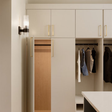
The mudroom was approached with equal intention. Designed for everyday transitions like coming in from the garage, managing backpacks, shoes, dog gear, and Colorado weather, the updated space prioritizes smart storage and organization. It now supports the rhythm of family life rather than working against it.
The result is an interior transformation that feels fresh, efficient, and deeply personal, a Boulder home remodel that proves meaningful change doesn’t always require expanding walls, just rethinking them.

 Griffin Architects, P.A.
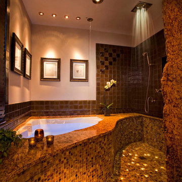
This unique bath in The Inn on Montford in Asheville utilizes space in a distinctive way. Fiber optic lighting enhances the glass tile floor and railhead shower. A chiseled granite partition seperates the shower from the toilet. The Inn's staff says this is the easiest to clean since there is no glass shower enclosure. The sink was located in the bedroom to allow more space in the spa like bath.
Phtographer : Michael Oppenheim
Sponsored
Columbus, OH

Hope Restoration & General Contracting
Columbus Design-Build, Kitchen & Bath Remodeling, Historic Renovations
 KURV Architecture DPC (Alex Hughes Architects)
Located in the heart of Manhattan’s Lower East Side, the building was erected on a shallow commercial lot between two 120 year old masonry buildings and a new residential rental building. 330 Grand Street is a mix of 725 SF 1BRs and 1050 SF 2BR apartments. It also contains a 1100 SF two story duplex as well as private and public rooftop space, large private balconies for most units and two large private terraces for the ground floor units.
330 Grand Street was originally designed and approved at the NYC DOB as a prefabricated modular building. During the pandemic, as shipping costs skyrocketed putting the project at risk, we suggested redesigning the building as a reinforced cast-in-place concrete structure. Concrete was readily available and prices had not been affected by the demand increase that many other materials suffered in the pandemic. We took this opportunity to raise floor to ceiling heights, enlarge high performance windows and redistribute the buildings MEPFS and Structural Systems to create very open floor plans.
The challenge was to create a luxurious sensorial living experience with very limited means. In a city with very high construction costs, low cost residential buildings in the area are usually devoid of good quality, design and character. Our approach was to aim high for the end user, prioritizing natural light, open space with long visual perspectives, high ceilings and as always, rejecting the use of predefined building templates.
Our biggest challenge was to ensure that the small spaces feel as clean cut, large and bright as possible. Several unique design decisions were made to ensure low cost and high quality;
Floor plans were laid out so that spaces were wide open and free of clutter from mechanical or structural interruptions. Therefore all infrastructure was placed in lateral demising walls, which in turn act as the unit’s storage and kitchen. The apartments feel wide open, are super quiet and have more storage space than any other comparable apartment in the city.
To solve the problem of the site’s shallow commercial lot which is typically prone to dark interior spaces we focused our attention on the building’s envelope. Instead of the usual small punched window openings, oversized high performance windows were designed to ensure that light penetrated as far as possible into the units. In the smaller 1BR units, the full 50’ depth of the lot is perceived by partitioning spaces with sliding pocket doors that can be retracted to allow deep visual perspectives, making the sight lines in the space feel longer, larger, more ample than normal. In addition to the full height glazing, each unit above the 2nd floor receives a 7 foot covered balcony, adding 120 to 240 sf to each apartment, something unusual in New York City buildings. The space is large enough for a full size dining table, when the weather permits being outside.
We also worked hard to ensure modularity. For example, all kitchen units are all identical throughout the building. The idea of modularity and the economy of the repetitive unit is exercised to the maximum through the building.
Hardware, appliances, flooring, wall coverings and material finishes are all carefully selected to feel bespoke, high quality and unique.
It was important to KURV that the result of this work manifest into something that would deeply connect with the end user and sustain relationships with the consumers of this space.
All images by KURV Architecture ©
 The Design House
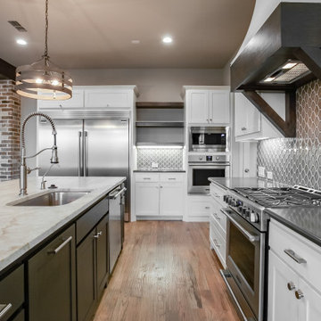
This full-scale kitchen remodeling project in Argyle, TX transforms a traditional space into a "rustic-luxe" masterpiece. The focal point is the massive Taj Mahal Quartzite island, which serves as both a prep station and a gathering hub. Because we own our fabrication shop (Stonemeyer Granite), we were able to cut this slab with zero seams and a custom mitered edge that you simply cannot get from big-box stores.
Project Highlights:
Countertops: Premium Taj Mahal Quartzite on the island paired with durable perimeter granite. Fabricated and installed by our in-house team at Stonemeyer Granite for a perfect fit.
Custom Cabinetry: A striking two-tone design featuring Sherwin Williams "Iron Ore" on the island and crisp "Alabaster" on the perimeter, anchored by a custom-stained wood vent hood.
Backsplash: A sophisticated arabesque mosaic tile that adds texture without overwhelming the stone.
The "One-Stop" Difference: This entire remodel—from the structural brick work to the plumbing fixtures—was managed under one contract. Our in-house team handled the design, material sourcing, and installation, ensuring the project stayed on timeline and on budget.
If you are looking for kitchen remodeling in Argyle, TX that prioritizes craftsmanship and accountability, visit our 10,000 sq ft showroom to view these exact materials.
 KURV Architecture DPC (Alex Hughes Architects)
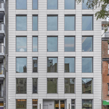
Located in the heart of Manhattan’s Lower East Side, the building was erected on a shallow commercial lot between two 120 year old masonry buildings and a new residential rental building. 330 Grand Street is a mix of 725 SF 1BRs and 1050 SF 2BR apartments. It also contains a 1100 SF two story duplex as well as private and public rooftop space, large private balconies for most units and two large private terraces for the ground floor units.
330 Grand Street was originally designed and approved at the NYC DOB as a prefabricated modular building. During the pandemic, as shipping costs skyrocketed putting the project at risk, we suggested redesigning the building as a reinforced cast-in-place concrete structure. Concrete was readily available and prices had not been affected by the demand increase that many other materials suffered in the pandemic. We took this opportunity to raise floor to ceiling heights, enlarge high performance windows and redistribute the buildings MEPFS and Structural Systems to create very open floor plans.
The challenge was to create a luxurious sensorial living experience with very limited means. In a city with very high construction costs, low cost residential buildings in the area are usually devoid of good quality, design and character. Our approach was to aim high for the end user, prioritizing natural light, open space with long visual perspectives, high ceilings and as always, rejecting the use of predefined building templates.
Our biggest challenge was to ensure that the small spaces feel as clean cut, large and bright as possible. Several unique design decisions were made to ensure low cost and high quality;
Floor plans were laid out so that spaces were wide open and free of clutter from mechanical or structural interruptions. Therefore all infrastructure was placed in lateral demising walls, which in turn act as the unit’s storage and kitchen. The apartments feel wide open, are super quiet and have more storage space than any other comparable apartment in the city.
To solve the problem of the site’s shallow commercial lot which is typically prone to dark interior spaces we focused our attention on the building’s envelope. Instead of the usual small punched window openings, oversized high performance windows were designed to ensure that light penetrated as far as possible into the units. In the smaller 1BR units, the full 50’ depth of the lot is perceived by partitioning spaces with sliding pocket doors that can be retracted to allow deep visual perspectives, making the sight lines in the space feel longer, larger, more ample than normal. In addition to the full height glazing, each unit above the 2nd floor receives a 7 foot covered balcony, adding 120 to 240 sf to each apartment, something unusual in New York City buildings. The space is large enough for a full size dining table, when the weather permits being outside.
We also worked hard to ensure modularity. For example, all kitchen units are all identical throughout the building. The idea of modularity and the economy of the repetitive unit is exercised to the maximum through the building.
Hardware, appliances, flooring, wall coverings and material finishes are all carefully selected to feel bespoke, high quality and unique.
It was important to KURV that the result of this work manifest into something that would deeply connect with the end user and sustain relationships with the consumers of this space.
All images by KURV Architecture ©
 KURV Architecture DPC (Alex Hughes Architects)
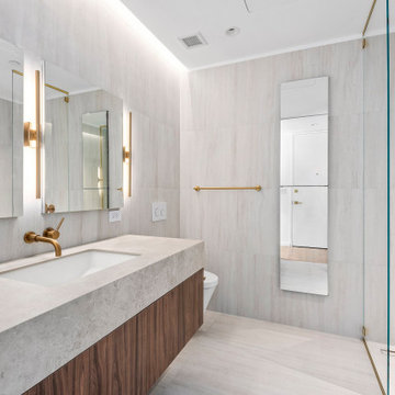
Located in the heart of Manhattan’s Lower East Side, the building was erected on a shallow commercial lot between two 120 year old masonry buildings and a new residential rental building. 330 Grand Street is a mix of 725 SF 1BRs and 1050 SF 2BR apartments. It also contains a 1100 SF two story duplex as well as private and public rooftop space, large private balconies for most units and two large private terraces for the ground floor units.
330 Grand Street was originally designed and approved at the NYC DOB as a prefabricated modular building. During the pandemic, as shipping costs skyrocketed putting the project at risk, we suggested redesigning the building as a reinforced cast-in-place concrete structure. Concrete was readily available and prices had not been affected by the demand increase that many other materials suffered in the pandemic. We took this opportunity to raise floor to ceiling heights, enlarge high performance windows and redistribute the buildings MEPFS and Structural Systems to create very open floor plans.
The challenge was to create a luxurious sensorial living experience with very limited means. In a city with very high construction costs, low cost residential buildings in the area are usually devoid of good quality, design and character. Our approach was to aim high for the end user, prioritizing natural light, open space with long visual perspectives, high ceilings and as always, rejecting the use of predefined building templates.
Our biggest challenge was to ensure that the small spaces feel as clean cut, large and bright as possible. Several unique design decisions were made to ensure low cost and high quality;
Floor plans were laid out so that spaces were wide open and free of clutter from mechanical or structural interruptions. Therefore all infrastructure was placed in lateral demising walls, which in turn act as the unit’s storage and kitchen. The apartments feel wide open, are super quiet and have more storage space than any other comparable apartment in the city.
To solve the problem of the site’s shallow commercial lot which is typically prone to dark interior spaces we focused our attention on the building’s envelope. Instead of the usual small punched window openings, oversized high performance windows were designed to ensure that light penetrated as far as possible into the units. In the smaller 1BR units, the full 50’ depth of the lot is perceived by partitioning spaces with sliding pocket doors that can be retracted to allow deep visual perspectives, making the sight lines in the space feel longer, larger, more ample than normal. In addition to the full height glazing, each unit above the 2nd floor receives a 7 foot covered balcony, adding 120 to 240 sf to each apartment, something unusual in New York City buildings. The space is large enough for a full size dining table, when the weather permits being outside.
We also worked hard to ensure modularity. For example, all kitchen units are all identical throughout the building. The idea of modularity and the economy of the repetitive unit is exercised to the maximum through the building.
Hardware, appliances, flooring, wall coverings and material finishes are all carefully selected to feel bespoke, high quality and unique.
It was important to KURV that the result of this work manifest into something that would deeply connect with the end user and sustain relationships with the consumers of this space.
All images by KURV Architecture ©
Sponsored
Columbus, OH
Hope Restoration & General Contracting
Columbus Design-Build, Kitchen & Bath Remodeling, Historic Renovations
 KURV Architecture DPC (Alex Hughes Architects)
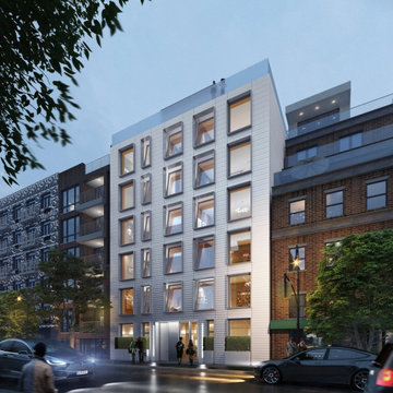
Located in the heart of Manhattan’s Lower East Side, the building was erected on a shallow commercial lot between two 120 year old masonry buildings and a new residential rental building. 330 Grand Street is a mix of 725 SF 1BRs and 1050 SF 2BR apartments. It also contains a 1100 SF two story duplex as well as private and public rooftop space, large private balconies for most units and two large private terraces for the ground floor units.
330 Grand Street was originally designed and approved at the NYC DOB as a prefabricated modular building. During the pandemic, as shipping costs skyrocketed putting the project at risk, we suggested redesigning the building as a reinforced cast-in-place concrete structure. Concrete was readily available and prices had not been affected by the demand increase that many other materials suffered in the pandemic. We took this opportunity to raise floor to ceiling heights, enlarge high performance windows and redistribute the buildings MEPFS and Structural Systems to create very open floor plans.
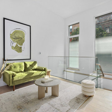
The challenge was to create a luxurious sensorial living experience with very limited means. In a city with very high construction costs, low cost residential buildings in the area are usually devoid of good quality, design and character. Our approach was to aim high for the end user, prioritizing natural light, open space with long visual perspectives, high ceilings and as always, rejecting the use of predefined building templates.
Our biggest challenge was to ensure that the small spaces feel as clean cut, large and bright as possible. Several unique design decisions were made to ensure low cost and high quality;
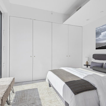
Floor plans were laid out so that spaces were wide open and free of clutter from mechanical or structural interruptions. Therefore all infrastructure was placed in lateral demising walls, which in turn act as the unit’s storage and kitchen. The apartments feel wide open, are super quiet and have more storage space than any other comparable apartment in the city.
To solve the problem of the site’s shallow commercial lot which is typically prone to dark interior spaces we focused our attention on the building’s envelope. Instead of the usual small punched window openings, oversized high performance windows were designed to ensure that light penetrated as far as possible into the units. In the smaller 1BR units, the full 50’ depth of the lot is perceived by partitioning spaces with sliding pocket doors that can be retracted to allow deep visual perspectives, making the sight lines in the space feel longer, larger, more ample than normal. In addition to the full height glazing, each unit above the 2nd floor receives a 7 foot covered balcony, adding 120 to 240 sf to each apartment, something unusual in New York City buildings. The space is large enough for a full size dining table, when the weather permits being outside.
We also worked hard to ensure modularity. For example, all kitchen units are all identical throughout the building. The idea of modularity and the economy of the repetitive unit is exercised to the maximum through the building.
Hardware, appliances, flooring, wall coverings and material finishes are all carefully selected to feel bespoke, high quality and unique.
It was important to KURV that the result of this work manifest into something that would deeply connect with the end user and sustain relationships with the consumers of this space.
All images by KURV Architecture ©
 KURV Architecture DPC (Alex Hughes Architects)
Located in the heart of Manhattan’s Lower East Side, the building was erected on a shallow commercial lot between two 120 year old masonry buildings and a new residential rental building. 330 Grand Street is a mix of 725 SF 1BRs and 1050 SF 2BR apartments. It also contains a 1100 SF two story duplex as well as private and public rooftop space, large private balconies for most units and two large private terraces for the ground floor units.
330 Grand Street was originally designed and approved at the NYC DOB as a prefabricated modular building. During the pandemic, as shipping costs skyrocketed putting the project at risk, we suggested redesigning the building as a reinforced cast-in-place concrete structure. Concrete was readily available and prices had not been affected by the demand increase that many other materials suffered in the pandemic. We took this opportunity to raise floor to ceiling heights, enlarge high performance windows and redistribute the buildings MEPFS and Structural Systems to create very open floor plans.
The challenge was to create a luxurious sensorial living experience with very limited means. In a city with very high construction costs, low cost residential buildings in the area are usually devoid of good quality, design and character. Our approach was to aim high for the end user, prioritizing natural light, open space with long visual perspectives, high ceilings and as always, rejecting the use of predefined building templates.
Our biggest challenge was to ensure that the small spaces feel as clean cut, large and bright as possible. Several unique design decisions were made to ensure low cost and high quality;
Floor plans were laid out so that spaces were wide open and free of clutter from mechanical or structural interruptions. Therefore all infrastructure was placed in lateral demising walls, which in turn act as the unit’s storage and kitchen. The apartments feel wide open, are super quiet and have more storage space than any other comparable apartment in the city.
To solve the problem of the site’s shallow commercial lot which is typically prone to dark interior spaces we focused our attention on the building’s envelope. Instead of the usual small punched window openings, oversized high performance windows were designed to ensure that light penetrated as far as possible into the units. In the smaller 1BR units, the full 50’ depth of the lot is perceived by partitioning spaces with sliding pocket doors that can be retracted to allow deep visual perspectives, making the sight lines in the space feel longer, larger, more ample than normal. In addition to the full height glazing, each unit above the 2nd floor receives a 7 foot covered balcony, adding 120 to 240 sf to each apartment, something unusual in New York City buildings. The space is large enough for a full size dining table, when the weather permits being outside.
We also worked hard to ensure modularity. For example, all kitchen units are all identical throughout the building. The idea of modularity and the economy of the repetitive unit is exercised to the maximum through the building.
Hardware, appliances, flooring, wall coverings and material finishes are all carefully selected to feel bespoke, high quality and unique.
It was important to KURV that the result of this work manifest into something that would deeply connect with the end user and sustain relationships with the consumers of this space.
All images by KURV Architecture ©
 KURV Architecture DPC (Alex Hughes Architects)
Located in the heart of Manhattan’s Lower East Side, the building was erected on a shallow commercial lot between two 120 year old masonry buildings and a new residential rental building. 330 Grand Street is a mix of 725 SF 1BRs and 1050 SF 2BR apartments. It also contains a 1100 SF two story duplex as well as private and public rooftop space, large private balconies for most units and two large private terraces for the ground floor units.
330 Grand Street was originally designed and approved at the NYC DOB as a prefabricated modular building. During the pandemic, as shipping costs skyrocketed putting the project at risk, we suggested redesigning the building as a reinforced cast-in-place concrete structure. Concrete was readily available and prices had not been affected by the demand increase that many other materials suffered in the pandemic. We took this opportunity to raise floor to ceiling heights, enlarge high performance windows and redistribute the buildings MEPFS and Structural Systems to create very open floor plans.
The challenge was to create a luxurious sensorial living experience with very limited means. In a city with very high construction costs, low cost residential buildings in the area are usually devoid of good quality, design and character. Our approach was to aim high for the end user, prioritizing natural light, open space with long visual perspectives, high ceilings and as always, rejecting the use of predefined building templates.
Our biggest challenge was to ensure that the small spaces feel as clean cut, large and bright as possible. Several unique design decisions were made to ensure low cost and high quality;
Floor plans were laid out so that spaces were wide open and free of clutter from mechanical or structural interruptions. Therefore all infrastructure was placed in lateral demising walls, which in turn act as the unit’s storage and kitchen. The apartments feel wide open, are super quiet and have more storage space than any other comparable apartment in the city.
To solve the problem of the site’s shallow commercial lot which is typically prone to dark interior spaces we focused our attention on the building’s envelope. Instead of the usual small punched window openings, oversized high performance windows were designed to ensure that light penetrated as far as possible into the units. In the smaller 1BR units, the full 50’ depth of the lot is perceived by partitioning spaces with sliding pocket doors that can be retracted to allow deep visual perspectives, making the sight lines in the space feel longer, larger, more ample than normal. In addition to the full height glazing, each unit above the 2nd floor receives a 7 foot covered balcony, adding 120 to 240 sf to each apartment, something unusual in New York City buildings. The space is large enough for a full size dining table, when the weather permits being outside.
We also worked hard to ensure modularity. For example, all kitchen units are all identical throughout the building. The idea of modularity and the economy of the repetitive unit is exercised to the maximum through the building.
Hardware, appliances, flooring, wall coverings and material finishes are all carefully selected to feel bespoke, high quality and unique.
It was important to KURV that the result of this work manifest into something that would deeply connect with the end user and sustain relationships with the consumers of this space.
All images by KURV Architecture ©
24