
Search results for "Problem solving" in Home Design Ideas
 Ashley Hopwood Farrar
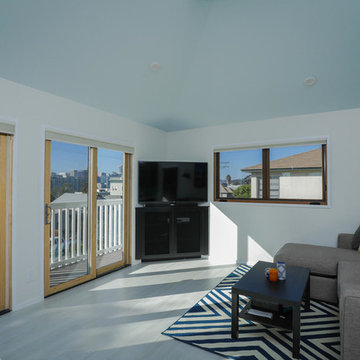
We wanted this narrow living room to face the gorgeous view but also have access to the TV. Tucking the entertainment center in the corner solved our problem! The client chose interior finishes, Meldrum Design created the floor plan and elevations.
 Black Rock Design | Build
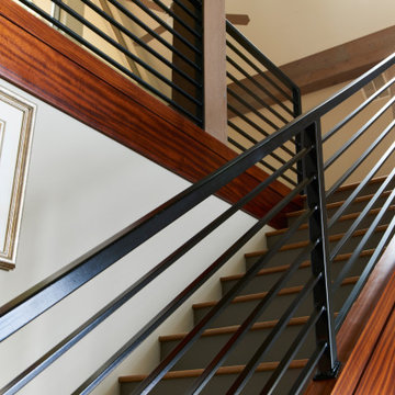
Purchased in a very dated style, these homeowners came to us to solve their remodeling problems! We redesigned the flow of the home to reflect their family's needs and desires. Now they have a masterpiece!
 Alan D. Holt, A.S.L.A., Landscape Architect
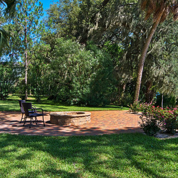
This is a simple addition to the back deck to create an outdoor kitchen and outdoor dining area. A fire pit by the water creates another seating area out in the lawn and gives a perfect place to watch the sun set. The steps and walls improve the access to the boat dock and solve an erosion problem.
Photographed by: Emerald Coast Real Estate Photography
Find the right local pro for your project
 Christy Collection International
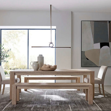
We deliver in 21 days. Our new QUICK Response program responds to the Supply Chain issues plaguing our industry. We set ourselves apart by QUICK SHIP and in STock programs that solve problems and create beautiful spaces for our clients in a hurry. Install within 21 days. ANYWHERE
 Kustom Home Design
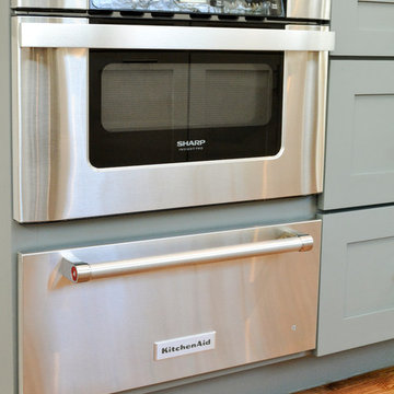
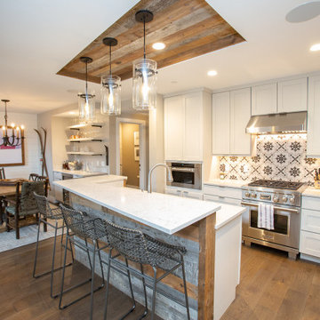
This amazing renovation focused on solving a series of problems that a previous kitchen expansion had created. By rearranging the appliance placement, updating the cabinetry, designing all new storage solutions and maximizing the amazing outdoor views; we cured the spit personality disorder plaguing the existing kitchen. The home now has a beautifully redesigned kitchen and living space perfect for entertaining, relaxing and enjoying the outside views. Vaulted ceilings with bright skylights, reflective glass wall tiles, sleek sophisticated Cambria quartz counter tops, fingerprint-free faucet, multi-functional Prolific kitchen sink by Kohler, stainless steel appliances, creative storage solutions, all new lighting and timeless shaker cabinets by Wellborn lend to the now bright, open, vivacious and flawless function of this newly renovated galley style kitchen. White base cabinets along the outside walls contrast perfectly with the dark grey island cabinets. Linear satin nickel door and drawer pulls coordinate with the stainless steel appliances and sink. An eclectic blend of vintage and modern furnishings, artwork and rugs create a comfortable balance that feels and looks timeless. Breathtaking backyard views are artfully framed by new Pella windows and doors with integral blinds between the glass. Calm, inviting neutral tones provide the perfect backdrop for this refined design.
Photos by: Kimberly Kerl

 Techo-Bloc
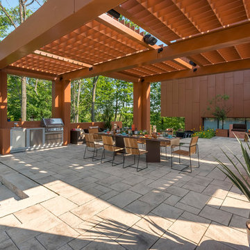
The Techo-Bloc Grill Island brings style to the BBQ by incorporating it into your backyard’s landscape design. For many years the BBQ has been a heavy mass that sits outside your patio door, looking like more of an eye sore than an intricate part of outdoor summer fun. The Techo-Bloc Grill Island solves this problem by transforming your BBQ into an impressive hardscape feature. A grocery list of Techo-Bloc materials and an assembly guide for easy installation is provided. Techo-Bloc preferred to offer the Grill Island this way, in order to leave room for the designer and homeowner’s own preferences and customizations.
 Shuler Architecture
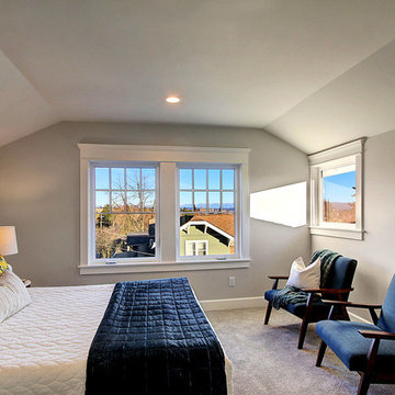
This urban infill project is a make-over of a decrepit structure that had been used as a student rental for close to 50 years. Situated on an elevated, 3300 sf lot, nothing in the original house was salvageable and the entire house was stripped down to the studs. Our challenge with this project was to then open up the original interiors, flood them with natural light while creating a design that appealed to the broadest buyer pool possible.
We solved this problem by organizing a compact floor plan that resulted in a 4 bedroom, 4 bath residence organized around a great room on the main level, a family room on the basement level and an additional 2 bedrooms with city views on the upper. By minimizing circulation space, we were able to re-purpose every square foot of floor area while creating a dramatic, light-filled staircase that tied all 3 levels of the house together into a unified living scheme. Clean lines and clean details, this is another of our attempts at a 'Not So Big House.'
Marketing of the final product lasted less than 10 days and resulted in 3 full priced offers that netted the developer a tidy profit.
 Kitchen Solvers of Columbus
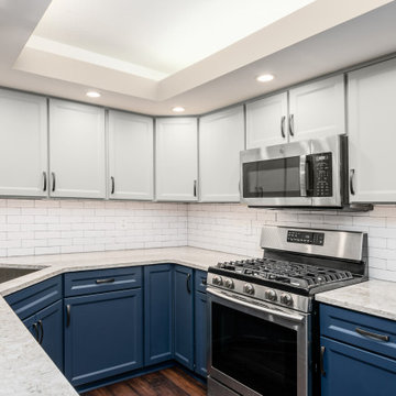
This small kitchen was updated by refacing the cabinets with two tone colors that gave enough contrast to bring the kitchen from an outdated space to a beautiful inviting space. To solve the storage problem, we installed a new pantry. The bead-board backing on the peninsula gave an added interest to the space. The upper cabinets were done in a mist color, while the lower cabinets were done in a midnight color. To finish the new look, we installed an Aria quartz countertop and an igloo ceramic subway tile backsplash. Now this kitchen is ready to be shared with their family and friends.
 Galaxy Homes
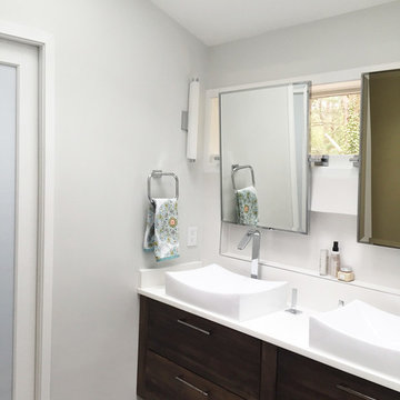
This is a 2-room luxury master bath designed and built by Galaxy Homes. The open and airy shower flows seamlessly from the vanity room with the help of a curb-less shower floor. The vanity is Ikea Godmorgon with custom reclaimed wood drawer fronts. A niche above the vanity solves the problem of needing extra counter space with vessel sinks.
 Coast to Coast Imports, LLC
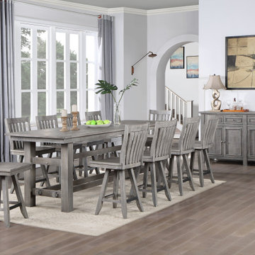
Do you have a large family? Do you struggle fitting everyone around your dining table during the holidays? Well, we have the perfect dining table to solve your problem! Our Keystone II counter height dining table is a whopping 109 inches long and 36 inches wide which is enough room to fit your large family with space to spare. Not only is it huge; it is also beautifully finished in our distressed Keystone Grey with a key and mortise style base with tenon crossbars.
 Exceptions Blinds and Shutters - Design and Repair
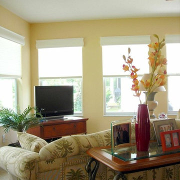
Solar heat gain accounts for up to 20% of your utility bill -- but keeping out the sun is only half of the energy equation. Let our knowledgeable staff help you solve your climate control problems without darkening your room!
Call 352-217-7556 to schedule your FREE in-home estimate.
 KURV Architecture DPC (Alex Hughes Architects)
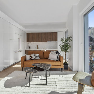
Located in the heart of Manhattan’s Lower East Side, the building was erected on a shallow commercial lot between two 120 year old masonry buildings and a new residential rental building. 330 Grand Street is a mix of 725 SF 1BRs and 1050 SF 2BR apartments. It also contains a 1100 SF two story duplex as well as private and public rooftop space, large private balconies for most units and two large private terraces for the ground floor units.
330 Grand Street was originally designed and approved at the NYC DOB as a prefabricated modular building. During the pandemic, as shipping costs skyrocketed putting the project at risk, we suggested redesigning the building as a reinforced cast-in-place concrete structure. Concrete was readily available and prices had not been affected by the demand increase that many other materials suffered in the pandemic. We took this opportunity to raise floor to ceiling heights, enlarge high performance windows and redistribute the buildings MEPFS and Structural Systems to create very open floor plans.
The challenge was to create a luxurious sensorial living experience with very limited means. In a city with very high construction costs, low cost residential buildings in the area are usually devoid of good quality, design and character. Our approach was to aim high for the end user, prioritizing natural light, open space with long visual perspectives, high ceilings and as always, rejecting the use of predefined building templates.
Our biggest challenge was to ensure that the small spaces feel as clean cut, large and bright as possible. Several unique design decisions were made to ensure low cost and high quality;
Floor plans were laid out so that spaces were wide open and free of clutter from mechanical or structural interruptions. Therefore all infrastructure was placed in lateral demising walls, which in turn act as the unit’s storage and kitchen. The apartments feel wide open, are super quiet and have more storage space than any other comparable apartment in the city.
To solve the problem of the site’s shallow commercial lot which is typically prone to dark interior spaces we focused our attention on the building’s envelope. Instead of the usual small punched window openings, oversized high performance windows were designed to ensure that light penetrated as far as possible into the units. In the smaller 1BR units, the full 50’ depth of the lot is perceived by partitioning spaces with sliding pocket doors that can be retracted to allow deep visual perspectives, making the sight lines in the space feel longer, larger, more ample than normal. In addition to the full height glazing, each unit above the 2nd floor receives a 7 foot covered balcony, adding 120 to 240 sf to each apartment, something unusual in New York City buildings. The space is large enough for a full size dining table, when the weather permits being outside.
We also worked hard to ensure modularity. For example, all kitchen units are all identical throughout the building. The idea of modularity and the economy of the repetitive unit is exercised to the maximum through the building.
Hardware, appliances, flooring, wall coverings and material finishes are all carefully selected to feel bespoke, high quality and unique.
It was important to KURV that the result of this work manifest into something that would deeply connect with the end user and sustain relationships with the consumers of this space.
All images by KURV Architecture ©
 Evervue USA Inc.
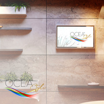
Ocea Style is a smart bathroom TV. It’s waterproof, Android Smart, easy to install, easy to use and easy to match with a wide choice of colors, designs and sizes.
 C&R Remodeling
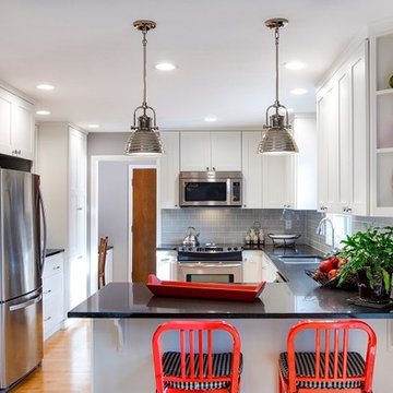
Our Interior Designers tell clients, “Be true to yourself, and you will love the results.” This kitchen remodel reflects that motto. The owners of this Salem area ranch home had a long-standing appreciation of the classic white, black, and red color combination. So when C&R Senior Interior Designer Linda Stewart selected the new color palette, she stayed close to that theme.
A challenge in nearly every older kitchen is the new refrigerator sizes. Remember the day when you could replace your refrigerator and the new one would fit perfectly in the existing space? Not anymore. Now, the super-sized refrigerators wreck havoc on most kitchen spaces. If, by luck, it happens to fit beneath the upper cabinet, it more than likely protrudes out into the room.
This kitchen had that issue. The refrigerator stuck out a good six inches from the cabinet edge, seriously affecting the visual flow. And with that much added depth, reaching the cabinet above was almost impossible.
C&R solved this problem with a custom cabinet and side pantry that extends the full depth of the refrigerator. This accomplished two good things: added architectural interest and a refrigerator proportional to the kitchen as a whole.
Terry Poe Photography
 Manchester Design Group
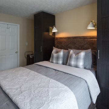
And then there was storage. A friendly trip to IKEA solved the problem. Of course I had to embellish the storage cabinet with lighting and strong sleek handles. We went from a tossed space to a sleek stay-cation.
 Ven Studio Architects
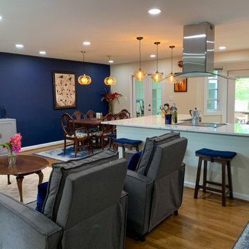
The kitchen, while spacious, was completely enclosed from the living and dining room spaces and did not utilize the space efficiently. Traffic flow between the indoors and outdoors was disjointed, and the new kitchen layout solves those problems. The new design eliminates the walls in the kitchen to create an open space for entertaining, and an exterior door was added off the kitchen to facilitate a better traffic flow to the outdoor entertaining space. New cabinets, countertops, flooring, appliances, light fixtures, and finishes help to brighten and modernize the space.
 Bridgewater
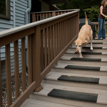
Craig Weber of Bridgewater Construction solved the problem by designing a unique custom staircase. He used the same building materials for both staircase and deck. But the stairs were both longer and wider than usual, making it easy for two or even three dogs to chase the same Frisbee at the same time. An unusual design objective, but it worked.
 Lagois Design Build Renovate
New windows, floors, powder room and basement:
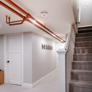
We gave the home new windows, new hardwood floors, and paint throughout. We created a new main floor powder room and a new finished basement containing a living area, three-piece bathroom and new bedroom with egress (tilt and turn) windows.
Flipped around and redesigned kitchen:
We created a new kitchen. The footprint of the kitchen stayed the same, but we flipped it around and redesigned it. Now it has a walk-in pantry area and more floorspace going in and out, which optimized the flow of traffic. We replaced the old non-functioning mudroom with a new one.
Disappearing balcony and drafty door:
To create a new space using a balcony in a bedroom, we extended the second storey out to line up with the first floor, and this increased the square footage. In that room we turned a drafty door into a window.
We reinstated the rear deck, using as many of the original pieces as we could:
There was a leaking roof problem because the original roof pitches were causing ice damming. We designed a new roof to prevent that in the future.
New windows, stucco, and the challenge of asbestos:
Another challenge was installing new windows in the original stucco finish, which contained asbestos. We waterproofed those properly, future proofing them from leaks.
We solved the situation by installing a 5-inch trim around the perimeter of the window. Specialists cut the asbestos back (we had to set up a containment perimeter around each window), and then we placed windows that are five inches wider than the window frames. We used special flashing tapes and sealed them all up behind the stucco.

79