
Search results for "Problem solving" in Home Design Ideas

 Mood Interieur
This house needed a total make-over. My clients wanted a solution between living room and serre which added more light and storing space. Mood Interieur was hired to suggest a new floor plan and to act as a sparring partner.
The wall with ceiling high sliding doors and a cupboard over the whole lenght of the wall in the serre solved the light and storing problem.
Mood Interieur also designed the tv cupboard and wardrobe closet.
All the dark colours were replaced by fresh, white colours combined with greige. A colour which beautifully interacts with the shabby-chic Flexform sofa en the greige blue Bomat carpet. The white and wood Arco tablet tables go perfectly with the white tv-cupboard and new doors.
Furniture and curtains are suggested and delivered by Mood Interieur.


 Keystone Homes
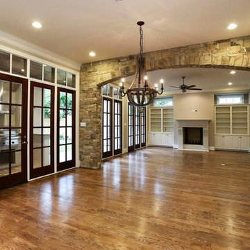
Mid-sized transitional formal and enclosed medium tone wood floor and brown floor living room photo in Houston with a standard fireplace and a concrete fireplace
Find the right local pro for your project
 Art & Smart Inc
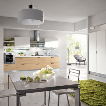
MELA is available in the WHITE, LIGHT OAK, LIGHT WALNUT, BROWN, EGGPLANT, GREY OAK, RED, LARIX, BUTTER, COFFEE and CREAM versions. A young kitchen in performing, suitable even for the most demanding clientele for it was created to solve any problems in use and composition. There are various functional wall hung Accessories and internal equipment. A wide range of tables and chairs is also available to personalised your own kitchen.
 TOUCH Architect Co., Ltd.
PROJECT | Duplicate-Duplex
TYPE | private residence / home-studio
LOCATION | Phayathai Rd., Bangkok, Thailand
OWNER | Ms. Najaree Ratanajiajaroen / Chanon Treenet
ARCHITECT | TOUCH Architect Co.,Ltd.
FLOOR AREA | 64 sq.m.
FLOOR AREA (by proposing) | 75 sq.m.
COMPLETION | 2018
PHOTOGRAPHER | Chalermwat Wongchompoo
CONTRACTOR | Legend Construction Group
A major pain point of staying in 64 sq.m. of duplex condominium unit, which is used for a home-studio for an animator and an artist, is that there is not enough space for dwelling. Moreover, a double-volume space of living area with a huge glass curtain wall, faces West. High temperature occurs all day long, since it allows direct sunlight to come inside.
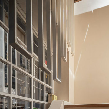
In order to solve both mentioned problems, three addition items are proposed which are, GRID PARTITION, EXTENSION DECK, and STEPPING SPACE.
A glass partition not only dividing space between kitchen and living, but also helps reduce electricity charge from air-condition. Grid-like of double glass frame is for stuff and stationery hanging, as to serve the owners’ activities.
Extension deck would help filtrating heat from direct sunlight, since an existing high glass facade facing West.
An existing staircase for going up to the second-floor bedroom, is added by a proposed space above, since this condominium unit has no enough space for dwelling or storage. In order to utilize the space in a small condominium, creating another staircase above the existing one helps increase the space.
The grid partition and the extension deck help ‘decrease’ the electricity charge, while the extension deck and the stepping space help ‘increase’ the space for 11 sq.m.
 Jarrett Design
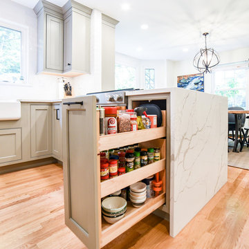
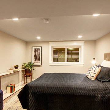
Entertaining friends and family doesn't work well when rooms are small and closed off. So when our clients decided to remodel, they knew they wanted to open up the space to accommodate large gatherings. Also important were ample storage and quality appliances that would hold up to the demands of cooking creative meals several nights a week. As is sometimes the case with remodeling, solving one problem can create another. Opening up the space involved removing a wall, which sacrificed critical square footage for cabinetry and appliances. We knew the wall needed to come down so we were challenged with making sure every available cabinet space in the kitchen was being utilized as thoughtfully and creatively as possible. A tall pantry was added next to the refrigerator to allow for storage of pots and pans, as well as food, while another pantry in the adjacent dining room housed all dishes and silverware. A small bar area was created in an unused section in the back of the home to store coffee and tea accessories and drinkware. Finally, a small island in the center of the kitchen offered the ideal location for the microwave and most-used pots and pans. With the expanded space, smart use of storage options and top-notch appliances, our clients are enjoying working in their new kitchen and have already hosted a ravioli-making class! Brandon Kahler Photography
 Shuler Architecture
This urban infill project is a make-over of a decrepit structure that had been used as a student rental for close to 50 years. Situated on an elevated, 3300 sf lot, nothing in the original house was salvageable and the entire house was stripped down to the studs. Our challenge with this project was to then open up the original interiors, flood them with natural light while creating a design that appealed to the broadest buyer pool possible.
We solved this problem by organizing a compact floor plan that resulted in a 4 bedroom, 4 bath residence organized around a great room on the main level, a family room on the basement level and an additional 2 bedrooms with city views on the upper. By minimizing circulation space, we were able to re-purpose every square foot of floor area while creating a dramatic, light-filled staircase that tied all 3 levels of the house together into a unified living scheme. Clean lines and clean details, this is another of our attempts at a 'Not So Big House.'
Marketing of the final product lasted less than 10 days and resulted in 3 full priced offers that netted the developer a tidy profit.
 Bellwether Windows, Siding & Doors
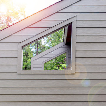
This Colorado mountain home had rotting cedar siding that was creating water intrusion issues. We solved these problems by removing all the siding and trim, as well as soffits and fascia, wrapping the house with HardieWrap, and installing James Hardie HardiePlank 7" lap siding and James Hardie HardieTrim trim. The homeowner selected Timber Bark for the both the siding and trim from the James Hardie ColorPlus Statement Collection, which has a 15-year finish warranty. How do you like the look?
 Deskins Group LLC
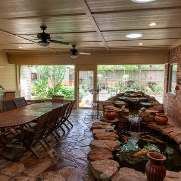
This project began with a beautiful Koi pond under a large patio cover, but the homeowner struggled with two major issues:
• Lack of privacy between the driveway and patio
• A breezeway roofline that didn’t align with the exterior brick, causing rainwater to pour into the gap and flood the patio during storms
As part of our exterior remodeling and water‑management correction, we redesigned the entire connection between the breezeway, patio, and driveway.
? Phase 1: Structural Fixes & Weather Protection
• Converted the original 4' brick wall and gate into a full‑height privacy wall with an exterior door, creating a secure, enclosed patio space.
• Extended and realigned the breezeway roofline to properly tie into the home’s brick, eliminating water intrusion and preventing patio flooding.
• Installed a solar tube to bring natural daylight into the pond area without adding heat — a perfect upgrade for shaded patios.
? Phase 2: Creating a Backyard Oasis
After seeing the transformation, the homeowner invited us back to complete the space with a custom screen wall across the backside of the patio. This addition created a private, breezy, bug‑free outdoor retreat, ideal for relaxing around the Koi pond.
? Serving Cypress, Tomball, Champions & Northwest Houston
This project is a great example of how we solve privacy issues, roofline and drainage problems, and patio enclosure upgrades to help homeowners get more out of their outdoor spaces.
 Kustom Home Design
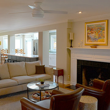
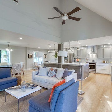
This amazing renovation focused on solving a series of problems that a previous kitchen expansion had created. By rearranging the appliance placement, updating the cabinetry, designing all new storage solutions and maximizing the amazing outdoor views; we cured the spit personality disorder plaguing the existing kitchen. The home now has a beautifully redesigned kitchen and living space perfect for entertaining, relaxing and enjoying the outside views. Vaulted ceilings with bright skylights, reflective glass wall tiles, sleek sophisticated Cambria quartz counter tops, fingerprint-free faucet, multi-functional Prolific kitchen sink by Kohler, stainless steel appliances, creative storage solutions, all new lighting and timeless shaker cabinets by Wellborn lend to the now bright, open, vivacious and flawless function of this newly renovated galley style kitchen. White base cabinets along the outside walls contrast perfectly with the dark grey island cabinets. Linear satin nickel door and drawer pulls coordinate with the stainless steel appliances and sink. An eclectic blend of vintage and modern furnishings, artwork and rugs create a comfortable balance that feels and looks timeless. Breathtaking backyard views are artfully framed by new Pella windows and doors with integral blinds between the glass. Calm, inviting neutral tones provide the perfect backdrop for this refined design.
Photos by: Kimberly Kerl
 Kitchen Solvers of Columbus
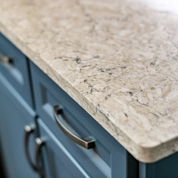
This small kitchen was updated by refacing the cabinets with two tone colors that gave enough contrast to bring the kitchen from an outdated space to a beautiful inviting space. To solve the storage problem, we installed a new pantry. The bead-board backing on the peninsula gave an added interest to the space. The upper cabinets were done in a mist color, while the lower cabinets were done in a midnight color. To finish the new look, we installed an Aria quartz countertop and an igloo ceramic subway tile backsplash. Now this kitchen is ready to be shared with their family and friends.
 Kitchen Solvers of Columbus
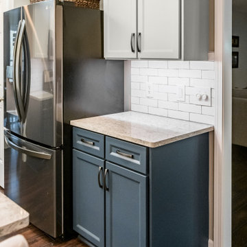
This small kitchen was updated by refacing the cabinets with two tone colors that gave enough contrast to bring the kitchen from an outdated space to a beautiful inviting space. To solve the storage problem, we installed a new pantry. The bead-board backing on the peninsula gave an added interest to the space. The upper cabinets were done in a mist color, while the lower cabinets were done in a midnight color. To finish the new look, we installed an Aria quartz countertop and an igloo ceramic subway tile backsplash. Now this kitchen is ready to be shared with their family and friends.
 Bellwether Windows, Siding & Doors
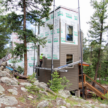
This Colorado mountain home had rotting cedar siding that was creating water intrusion issues. We solved these problems by removing all the siding and trim, as well as soffits and fascia, wrapping the house with HardieWrap, and installing James Hardie HardiePlank 7" lap siding and James Hardie HardieTrim trim. The homeowner selected Timber Bark for the both the siding and trim from the James Hardie ColorPlus Statement Collection, which has a 15-year finish warranty. How do you like the look?

 Noelle Johnson Landscape Consulting
Garden travels. Golden barrel cactuses thrive in a narrow planting area.
 Drury Design
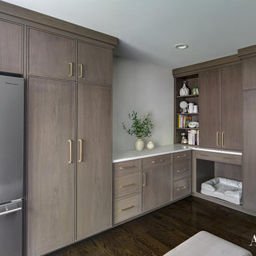
Some rooms never quite find their purpose. That was the case with this space, which had gradually become a combination home office, pantry overflow area, pet zone, and general catch-all for daily life. While it offered plenty of square footage, it wasn’t helping the homeowners stay organized, and valuable storage was scattered between an overcrowded pantry closet and various pieces of furniture throughout the room.
Having previously partnered with Drury Design on a kitchen remodel, these homeowners once again turned to Senior Designer Samantha Schoell to help them rethink how their home could better support the way they actually live. What began as a conversation about adding some cabinetry quickly evolved into a comprehensive storage solution — one designed to accommodate everything from groceries and sports equipment to pet supplies and everyday household essentials.
Design Objectives:
Create Organization: Consolidate pantry overflow, household supplies, and everyday essentials into a single, highly functional space.
Support Family Life: Provide dedicated storage for coats, bags, sports equipment, and the routines of an active household.
Accommodate Pets: Incorporate thoughtful features for the family’s dogs while maintaining a clean, organized appearance.
Maximize Existing Space: Transform an underutilized room without expanding the home’s footprint.
Maintain Flexibility: Preserve the room’s long-term versatility and appeal for future homeowners.
Design Challenges:
Multiple Functions: The room was being used simultaneously as a home office, pantry, storage area, and pet space without a cohesive organizational strategy.
Insufficient Pantry Storage: The nearby pantry closet had become overcrowded and difficult to navigate.
Visual Clutter: Everyday items, pet supplies, and household necessities lacked dedicated storage locations.
Unused Potential: Despite its generous size, the room was not contributing meaningfully to the home’s overall functionality.
Balancing Practicality and Style: The homeowners wanted substantial storage without creating a space that felt overly utilitarian.
Design Solutions:
Purpose-Built Storage Plan: Custom cabinetry was designed to support multiple functions within a unified storage system, allowing the room to serve as a mudroom, pantry extension, household hub, and pet station.
Expanded Pantry Capacity: Floor-to-ceiling cabinetry, a secondary refrigerator, and extensive drawer storage dramatically increased food storage and organization capabilities.
Hidden Organization: Closed cabinetry conceals household items, sports gear, pet supplies, and everyday clutter, creating a calm and orderly appearance.
Full-Room Transformation: Rather than simply adding cabinets to one wall, the design reimagined the entire room, utilizing its footprint to create a true family command center.
Furniture-Inspired Cabinetry: Warm wood finishes, decorative hardware, open display shelving, and thoughtful detailing elevate the room beyond pure utility, helping it feel like a natural extension of the home’s design.
The most successful remodeling projects often solve problems homeowners have simply learned to live with. In this case, a room that once served several purposes — but excelled at none — was transformed into one of the hardest-working spaces in the home.
Today, groceries, pet supplies, seasonal gear, household essentials, and daily routines all have a designated place. Even the family’s dogs were thoughtfully considered, with a built-in resting area integrated into the cabinetry. The result is a room that feels remarkably organized despite supporting countless everyday activities — a reflection of how thoughtful design can bring clarity, efficiency, and calm to the busiest parts of family life.

 Southern Maine Remodeling
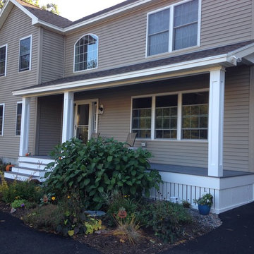
Remodeled a tired wood porch with no skirting and a very tired look. Now its less time to maintain. Vinyl wrapped columns, composite decking, open ceiling with added lighting, and solved a water problem where the garage roof used to dump into house
 2D3D Design, Inc.
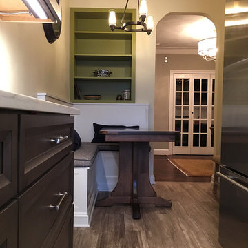
The best part of this banquette seating is the bookshelf that the customer requested. 2D3D Design, Inc. cleverly took space from a closet behind the wall to inset a custom bookshelf that the customer requested. Because of the lack of space in the kitchen, every inch was important. This solved the problem and created a unique look with inset bookcase and no space removed for seating. The closet behind is still very spacious.
 Outdoor Rooms by Design
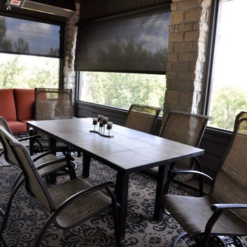
The owners of this sunroom had challenges with the sun being too bright at certain parts of the day. Motorized sun shades solved the problem without blocking the outside view, and provided a drop in temperature too! Photo Credit: Crystal French
 Harmonic Horticulture and Construction
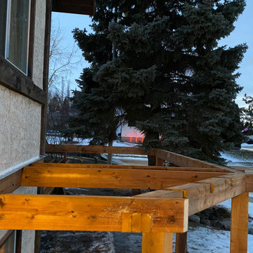
I think that many carpenters today consider nails and screws to be what holds a structure together. As a result, I think that many structures today are held together by little more than nails and screws. I often see knee braces bolted to the side of a post for a pergola when they should be positioned between the post and beam to take the load directly. Fasteners should not be load-bearing! They should be used to pin a piece of lumber into a position that allows it to shoulder the load directly.
Nails and screws are fast. When used appropriately, they can keep costs down by reducing the time it takes to build something. But they are not the answer to everything. Joist hangars do little to stop a deck from pulling away from a house, just as nailing from the side is not a replacement for putting a post directly under a beam.
On more than one occasion I've solved a challenging framing problem by employing lap-joints. I've used lap-jointed framing to build curves without having to bend wood, and in the example shown I've used them simply to avoid having to look at an unsightly beam underneath a raised section of deck.
I cut notches half way through my beam where the joists will go, then I cut a corresponding notch into each joist that allows it to fit into the notch in the beam. This allows the joists to cantilever 'through' the beam, which gives me a number of advantages. Using this technique, I can build deck frames tight to the ground without having to rim the structure with joist-hangared beams. I can also use the cantilever to sculpt the edge of the deck into nearly any shape.
As the lumber is locked in from every direction, it is also a far stronger joint than a joist-hangared butt-end, as it resists pulling away, and it is stronger than joist-on-beam because it does not allow for any twisting or 'flopping' of the joists. The beam and joist are locked together, and they each replace the missing pieces of one another, so there is no strength lost in either member.
-Tyler Collins, Operations Manager
92