
Search results for "Problem solving" in Home Design Ideas
 JM Kitchen & Bath Design
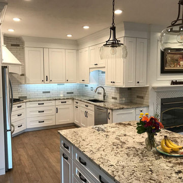
This remodel project started to solve the problem of a kitchen that was too small for the homeowner to have her weekly family dinners in. The kitchen designer Jennifer worked with the owner to balance her vision, her needs, and her budget. Together they made her dream come true. Featuring white shaker doors with bead detail, Tangier Granite, stacking molding, and a Wood Cove Hood, this kitchen has everything it needs to create memories.
The cabinets are Sterling White Shaker Boardwalk Maple, Tangier Granite Countertops, and hand cut Italian white subway tiles with pops of grey.
The hardware and lighting is matte black to contrast with the white and grey tones throughout.
Every detail of this kitchen remodel was thoroughly thought through. From the high stacking crown molding to the interior of the cabinets using rev-a-shelf accessories.
 New Generation Wallcovering Inc.
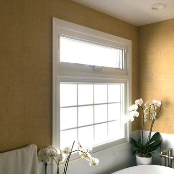
Grass cloth is not normally recommended in bathrooms because of moisture. This embossed vinyl wallpaper by Thibaut solves the problem by offering a realistic woven straw look and texture with the durability of a vinyl wallcovering,

Find the right local pro for your project
 Southern Maine Remodeling
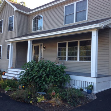
Remodeled a tired wood porch with no skirting and a very tired look. Now its less time to maintain. Vinyl wrapped columns, composite decking, open ceiling with added lighting, and solved a water problem where the garage roof used to dump into house
 ARK DESIGN
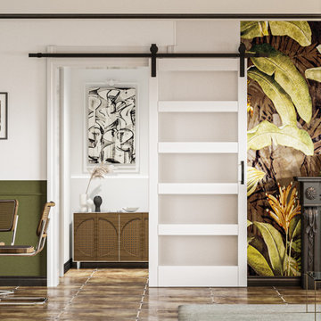
【High Quality Material】The door is made of MDF (medium-density fibreboard) and covered with PVC film. This finished surface improves the durability of the door and extends its service life.
【Upgraded Glass】 This door is made of 4mm tempered frosted glass, which is safe (SGCC certified) and can protect your privacy. The glass is designed to filter light and brighten your home.
【Durable Hardware】Our barn door hardware has passed 100,000 open & close tests, ensuring lifelong usage. We have strong confidence in our hardware quality and provide a 5-year full warranty on all hardware.
【Easy to Assemble】All door panels are pre-drilled/curved to ensure a tight fit. The package includes detailed installation instructions and tools, so you can easily install the panels yourself and enjoy a fun DIY project with your family.
【Widely Applicable】This barn door is perfect for classic American home decor. It's suitable for use in the living room, kitchen, bathroom, dining room, and more. The stylish design will blend in seamlessly with your home's aesthetic.
【Dedicated Service】We are dedicated to providing you with quality products and services. If you have any questions regarding your purchase, please feel free to contact us and we will do our best to help you solve the problem.
 2D3D Design, Inc.
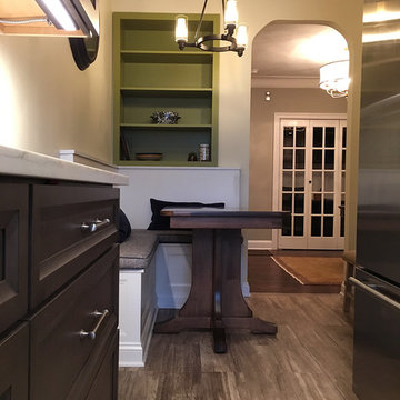
The best part of this banquette seating is the bookshelf that the customer requested. 2D3D Design, Inc. cleverly took space from a closet behind the wall to inset a custom bookshelf that the customer requested. Because of the lack of space in the kitchen, every inch was important. This solved the problem and created a unique look with inset bookcase and no space removed for seating. The closet behind is still very spacious.
 Santa Barbara Designs of the Interior
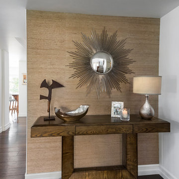
The first view from the front door of this home on the lake really needed to be more powerful, and our clients’ love of sculptural furniture inspired our solution. The dramatic console and carefully selected accessories made it interesting and personal to our homeowners, and heavily textured wallpaper visually raised the height of the wall. Great interior design can solve a multitude of shortcomings and problems, and we specialize in that!
 TR2 Architecture
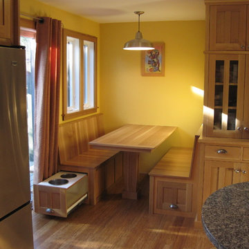
Another critical (or crittercal) space saving feature solved another problem - where to put the dog food bowls! Without this, there is no place for them. The drawer on the right has a bin that holds 50# of dog food in an airtight container, the drawer with the bowls has storage underneath for dog bones, towels, etc. I built all this but had some help from Mark Edmundson of Edmundson Fine Woodworking and James Cherry Wood Repurposing. Mark glued up the tabletop and created the joinery for the breadboard end, James sanded the table and bench parts with his timesaver. The bench on the right is engaged into the end of the pantry cabinet, this allowed both benches to be the same length
 Chester County Kitchen & Bath
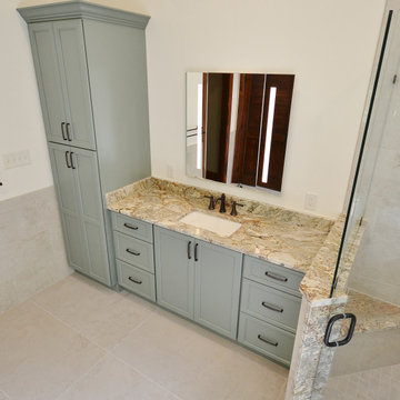
Large West Chester PA Master bath remodel. The clients wanted more storage, his and hers vanities, and no tub. A linen closet, plenty of drawers, and additional cabinetry storage were designed to solve that problem. Fieldstone cabinetry in the Moss Green painted finish really looks sharp. The floor was tiled in large 4’x4’ tiles for a clean look with minimal grout lines. The wainscoting and shower tile were also simple large tiles in a natural tone that tie in nicely with the beautiful granite countertops and shower wall caps. New trims, louvered toilet room and pocket entry door were added and stained to match the original trim throughout the home. ( Perfect match by our finisher ) Frameless glass shower surround, new lighted vanity mirrors, and additional recessed ceiling lights finish out the new look. Another awesome bathroom with happy clients.
 CRD Design Build
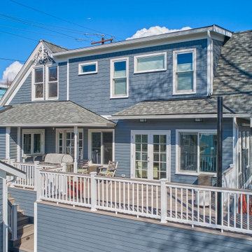
This house is in the perfect location for this family with two young children but was lacking space and storage - two necessities for a growing family! To solve this problem, we added a three-story bump out to their home. With the new addition, we were able to increase the basement size for a larger playroom and storage. On the main level, we increased the kitchen size, a new guest suite, and a family room. On the top floor, we added a primary suite with vaulted ceilings, a walk-in closet, and an en suite bathroom.
We believe it is important to maintain the character of the home when adding an addition, especially this house that has a wonderful gingerbread character with lots of period architectural details on the exterior. We were able to replicate the original details of the home on the new addition to keep the character and charm. A unique addition to this home is the bi-fold window in the expanded part of the kitchen that opens to the new patio. The window ledge makes it easy for passing food to and from the guests on the patio!
 Shuler Architecture
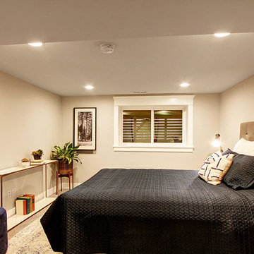
This urban infill project is a make-over of a decrepit structure that had been used as a student rental for close to 50 years. Situated on an elevated, 3300 sf lot, nothing in the original house was salvageable and the entire house was stripped down to the studs. Our challenge with this project was to then open up the original interiors, flood them with natural light while creating a design that appealed to the broadest buyer pool possible.
We solved this problem by organizing a compact floor plan that resulted in a 4 bedroom, 4 bath residence organized around a great room on the main level, a family room on the basement level and an additional 2 bedrooms with city views on the upper. By minimizing circulation space, we were able to re-purpose every square foot of floor area while creating a dramatic, light-filled staircase that tied all 3 levels of the house together into a unified living scheme. Clean lines and clean details, this is another of our attempts at a 'Not So Big House.'
Marketing of the final product lasted less than 10 days and resulted in 3 full priced offers that netted the developer a tidy profit.
 Bellwether Windows, Siding & Doors
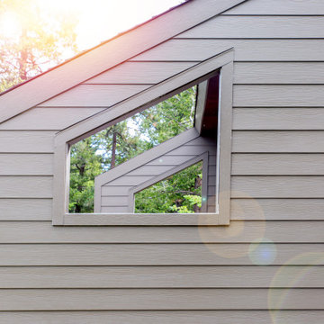
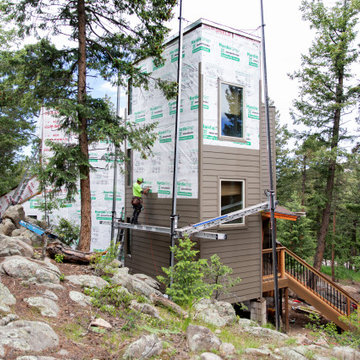
This Colorado mountain home had rotting cedar siding that was creating water intrusion issues. We solved these problems by removing all the siding and trim, as well as soffits and fascia, wrapping the house with HardieWrap, and installing James Hardie HardiePlank 7" lap siding and James Hardie HardieTrim trim. The homeowner selected Timber Bark for the both the siding and trim from the James Hardie ColorPlus Statement Collection, which has a 15-year finish warranty. How do you like the look?
 Bellwether Windows, Siding & Doors
This Colorado mountain home had rotting cedar siding that was creating water intrusion issues. We solved these problems by removing all the siding and trim, as well as soffits and fascia, wrapping the house with HardieWrap, and installing James Hardie HardiePlank 7" lap siding and James Hardie HardieTrim trim. The homeowner selected Timber Bark for the both the siding and trim from the James Hardie ColorPlus Statement Collection, which has a 15-year finish warranty. How do you like the look?
 Bennett Design Co.
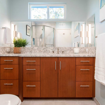
This couple's long-term water leak left their downstairs guest bathroom in disarray. It had gotten so bad that the toilet would actually rock due to the sub-floor deterioration. After the remodel, this small but mighty bathroom leaves a memorable impression on its guests, primarily because of its efficient footprint and bold use of color.
This project became necessary after a long- term water leak left the floor tile broken and the subfloor deteriorating.
Once underway, we set out to determine what other problems we could help solve in this guest bathroom. We explored several different floorplans for this space, but we ultimately decided that the general location of the fixtures worked well for these homeowners.
One of the primary concerns was to determine how we could include as much vanity storage as possible. Their old vanity included a shallow section next to the toilet, but it only had two shallow top drawers, making the bulk of the storage awkward and hard to access.
Although they liked the size of their old shower stall, the plastic insert was corroding. They also didn't have anywhere to place their shower products, and there was no place to hang a towel. We opted for a tiled shower and included a shampoo niche for their bath products. We also included a horizontal shower door handle, which doubles as a towel bar.
 Kitchen Solvers of Columbus
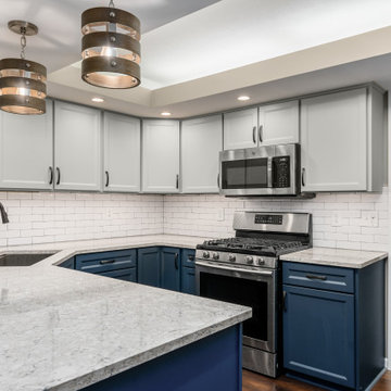
This small kitchen was updated by refacing the cabinets with two tone colors that gave enough contrast to bring the kitchen from an outdated space to a beautiful inviting space. To solve the storage problem, we installed a new pantry. The bead-board backing on the peninsula gave an added interest to the space. The upper cabinets were done in a mist color, while the lower cabinets were done in a midnight color. To finish the new look, we installed an Aria quartz countertop and an igloo ceramic subway tile backsplash. Now this kitchen is ready to be shared with their family and friends.
 Remodeling Contractors
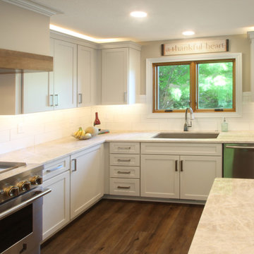
West Des Moines two story homes create challenges for homeowners with layouts including small rooms that don’t seem to flow together. The family that lives in this home found that entertaining and gathering in the kitchen was almost impossible with the current layout and asked for an addition to solve the problem. After listening to the challenges of that they faced and working with the homeowners, a new solution emerged without an addition, reducing the overall budget and allowing the whole main floor to be updated.
By removing the wall between the kitchen and dinning room, the team was able to design an island for family and friends to congregate around. Then by flanking the island with a large commercial range surrounded by a custom backsplash and custom hood a picture perfect kitchen was born. Lastly by repeating elements within the range hood, island and fireplace, the team was able to create unity throughout the space. This visually makes the space feel larger and feels like the addition was built
 Regal Plastics - San Antonio
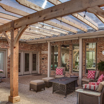
This homeowner was tired of Texas heat and thunderstorms pushing them indoors. They solved the problem by adding a Polygal covered pergola.
Large backyard patio photo in Austin with a pergola
Large backyard patio photo in Austin with a pergola
 KURV Architecture DPC (Alex Hughes Architects)
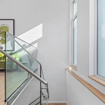
Located in the heart of Manhattan’s Lower East Side, the building was erected on a shallow commercial lot between two 120 year old masonry buildings and a new residential rental building. 330 Grand Street is a mix of 725 SF 1BRs and 1050 SF 2BR apartments. It also contains a 1100 SF two story duplex as well as private and public rooftop space, large private balconies for most units and two large private terraces for the ground floor units.
330 Grand Street was originally designed and approved at the NYC DOB as a prefabricated modular building. During the pandemic, as shipping costs skyrocketed putting the project at risk, we suggested redesigning the building as a reinforced cast-in-place concrete structure. Concrete was readily available and prices had not been affected by the demand increase that many other materials suffered in the pandemic. We took this opportunity to raise floor to ceiling heights, enlarge high performance windows and redistribute the buildings MEPFS and Structural Systems to create very open floor plans.
The challenge was to create a luxurious sensorial living experience with very limited means. In a city with very high construction costs, low cost residential buildings in the area are usually devoid of good quality, design and character. Our approach was to aim high for the end user, prioritizing natural light, open space with long visual perspectives, high ceilings and as always, rejecting the use of predefined building templates.
Our biggest challenge was to ensure that the small spaces feel as clean cut, large and bright as possible. Several unique design decisions were made to ensure low cost and high quality;
Floor plans were laid out so that spaces were wide open and free of clutter from mechanical or structural interruptions. Therefore all infrastructure was placed in lateral demising walls, which in turn act as the unit’s storage and kitchen. The apartments feel wide open, are super quiet and have more storage space than any other comparable apartment in the city.
To solve the problem of the site’s shallow commercial lot which is typically prone to dark interior spaces we focused our attention on the building’s envelope. Instead of the usual small punched window openings, oversized high performance windows were designed to ensure that light penetrated as far as possible into the units. In the smaller 1BR units, the full 50’ depth of the lot is perceived by partitioning spaces with sliding pocket doors that can be retracted to allow deep visual perspectives, making the sight lines in the space feel longer, larger, more ample than normal. In addition to the full height glazing, each unit above the 2nd floor receives a 7 foot covered balcony, adding 120 to 240 sf to each apartment, something unusual in New York City buildings. The space is large enough for a full size dining table, when the weather permits being outside.
We also worked hard to ensure modularity. For example, all kitchen units are all identical throughout the building. The idea of modularity and the economy of the repetitive unit is exercised to the maximum through the building.
Hardware, appliances, flooring, wall coverings and material finishes are all carefully selected to feel bespoke, high quality and unique.
It was important to KURV that the result of this work manifest into something that would deeply connect with the end user and sustain relationships with the consumers of this space.
All images by KURV Architecture ©
 Kustom Home Design
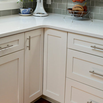
This amazing renovation focused on solving a series of problems that a previous kitchen expansion had created. By rearranging the appliance placement, updating the cabinetry, designing all new storage solutions and maximizing the amazing outdoor views; we cured the spit personality disorder plaguing the existing kitchen. The home now has a beautifully redesigned kitchen and living space perfect for entertaining, relaxing and enjoying the outside views. Vaulted ceilings with bright skylights, reflective glass wall tiles, sleek sophisticated Cambria quartz counter tops, fingerprint-free faucet, multi-functional Prolific kitchen sink by Kohler, stainless steel appliances, creative storage solutions, all new lighting and timeless shaker cabinets by Wellborn lend to the now bright, open, vivacious and flawless function of this newly renovated galley style kitchen. White base cabinets along the outside walls contrast perfectly with the dark grey island cabinets. Linear satin nickel door and drawer pulls coordinate with the stainless steel appliances and sink. An eclectic blend of vintage and modern furnishings, artwork and rugs create a comfortable balance that feels and looks timeless. Breathtaking backyard views are artfully framed by new Pella windows and doors with integral blinds between the glass. Calm, inviting neutral tones provide the perfect backdrop for this refined design.
Photos by: Kimberly Kerl
 E. Wyse Nurseries, Inc.
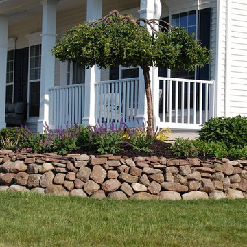
This simple wall is not only decorative but also functional. It solves the problem of a grade change while providing a nice bed area for a specimen tree and plantings. The stone is NY Fieldstone.
90