
Search results for "Proceeded" in Home Design Ideas
 AHD&Co
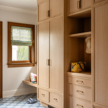
Mid-sized beach style ceramic tile and blue floor mudroom photo in New York with white walls and a medium wood front door

 Interiology Design Co.
It’s all about the view, with a seamless transition from outdoors to inside. We love the modern twist on the traditional waterfront theme, as the ocean is reflected in the hand woven turquoise and blue rug. A custom deep curved sofa provides plenty of family seating, angled for both conversation and a perfect view. The curved shapes of the sofa, coffee table and teal swivel chairs bring softer edges to the condo’s strong architectural angles. The wallpapered tray ceilings mirror the endless sky view from the surrounding windows.

 Mare Design
Inspiration for a transitional medium tone wood floor and brown floor great room remodel with white walls
Find the right local pro for your project

 Gina Sims Designs
Dining room - contemporary dark wood floor and brown floor dining room idea in Atlanta with beige walls

 ED Enterprises, Inc.
We understood the customer's dream to remove an existing closet and several walls.
We began with the removal of several structural walls and closet. We found that the previous contractor had incorrectly removed structural wood posts. We secured the structural integrity of the building with wood and steel.
We proceeded to expand the opening between
the Kitchen and Butler Pantry, which included relocating waste and water lines from the second floor.
We upgraded the existing electrical and installed a 440-volt electrical system for the entire home.
You can enjoy the illumination of the cabinetry and kitchen, by the pendant lights, recessed lights, under cabinet lights, and curio lights in the glass door cabinets,
Note the brick pattern Subway tile from the counter top to the ceiling, in the kitchen and the Butler Pantry. Take special notice of the decorative tile area above the range.
The chimney style hood was vented to the exterior.
The unique sitting area, near the rear entry, was finished with beadboard paneling and wall cabinets up to the ceiling., trimmed with crown molding.
General Contractor / Remodel: E D Enterprises, Inc.
Michael Alan Kaskel Photography

 DLA Architecture
Living room - rustic open concept medium tone wood floor and brown floor living room idea with beige walls

 Interior Affairs -- Vickie Daeley
Artistically Tuscan
Francesca called me, nearly 13 years ago, as she had seen one of our ads in the Orange County Living Magazine. In that particular ad, she fell in love with the mural work our artists had done for another home we designed in Huntington Beach, California. Although this was a newly built home in Portofira Estates neighborhood, in the city of Orange, both she and her husband knew they would eventually add to the existing square footage, making the family room and kitchen much bigger.
We proceeded with designing the house as her time frame and budget proceeded until we completed the entire home.
Then, about 5 years ago, Francesca and her husband decided to move forward with getting their expansion project underway. They moved the walls out in the family room and the kitchen area, creating more space. They also added a game room to the upstairs portion of their home. The results are spectacular!
This family room has a large angular sofa with a shaped wood frame. Two oversized chairs and ottomans on either side of the sofa to create a circular conversation and almost theatre like setting. A warm, wonderful color palette of deep plums, caramels, rich reds, burgundy, calming greens and accents of black make the entire home come together perfectly.
The entertainment center wraps the fireplace and nook shelving as it takes up the entire wall opposite the sofa. The window treatments consist of working balloon shades in a deep plum silk with valances in a rich gold silk featuring wrought iron rods running vertically through the fabric. The treatment frames the stunning panoramic view of all of Orange County.

 RAJ Kitchen and Bath, LLC
**Check out the video of this transformation on our website**
This small kitchen was way too small for this 2 bedrooms, 2 bathrooms apartment. Not only was it a very small kitchen, but the physical location of it made it very difficult to make it any bigger. There wasn't much that could have been done without incurring astronomical cost, which would get little or no return on the investment. The client wanted a kitchen that can be optimized in its current location to add a ton of value for resale.
This was difficult to do, because there was no moving of any mechanical around in the kitchen and even if we wanted to, the management of the building would not allow. For those of you who live in condos, co-ops or apartment building, you know how difficult it is to rework these foot prints. When we showed up, we saw the problems, but we also saw a huge opportunity where we can achieve those goals in the small space. This was accomplished by making some key changes and to incorporate some new things that was not possible when this kitchen was built years ago.
The crucial part of the design that would drive the entire new layout, was selecting the only appliance; that was the Refrigerator. Once we nailed down that refrigerator, we then proceeded to design the kitchen around it. We moved it to the other side of the wall where the sink was so that we can tap into the water line from the sink plumbing. It was crucial that it stays exactly 24" deep, not an inch more because we had to keep the entry as open as possible. Also, it was going to be directly in front of another big storage unit - The pantry. It is not ideal in most cases, but we needed the rest of the space to ramp up the design and open feel towards the side where all of the activities would take place, which happend to be the dining room and the view.
Once all that was figured out, we re-positioned the sink, dishwasher and the range and proceeded to wrap the cabinets around the columns to integrate them into the space. Thirty- six inches cabinets height was used so that they can be installed higher towards the ceiling height to give more room rather than the standard 18" required height between the counter tops. This was done to make the room feel a lot bigger than it really was. Not to mention, we also didn't want the faucet to be buried under the cabinets so that was also a necessary design detail for the space.
We then lowered both knee walls so that the counter top can sit on top of them, by removing that stop point that would have otherwise defined the kitchen area. This allowed us to pick up that extra footprint into the room for added prep space and enabled us to create the illusion of a kitchen that is looking longer than it really is. Every inch mattered when designing this kitchen and we made a conscious decision to use every one of that inch.
White cabinets were selected to do just what white cabinets are design to do; make a small or dark room appear bigger, brighter and more open. In this kitchen, this was amplified the more because of the kitchen location. It was perfect! We knew we did justice to the space because while we were there taking some photos, a few potential buyers walked in and went straight for the kitchen! They said its design just to fit the apartment.
Pantry roll out shelving, Double recycle bin, fancy handles, LED lighting, Quartz counter top, beautiful backslash tiles and grey linen floors finished off the kitchen which looked over a beautiful view of the George Washington Bridge from the top of this lovely 4th floor apartment.
Credit to Masterpiece Tile and Marble (Annmarie on the selection of Tiles and countertop and Val on the Construction to complete this project).
Davor Kokic Photography

 Appliances Connection
Whirlpool does more than help you run your house more easily, cleanly, and efficiently; Whirlpool is dedicated to developing more environmentally friendly appliances for your home. As we proceed into the twenty first century, and Whirlpool proceeds into its second, they've only expanded their initiatives toward cleaner technology, embracing the Energy Star efficiency banner and exceeding government requirements to ensure eco-friendly operation for all your home appliances. Whirlpool is dedicated to helping the home whether it's your home, or the home we all share: Planet Earth
 Interior Affairs -- Vickie Daeley
Artistically Tuscan
Francesca called me, nearly 13 years ago, as she had seen one of our ads in the Orange County Living Magazine. In that particular ad, she fell in love with the mural work our artists had done for another home we designed in Huntington Beach, California. Although this was a newly built home in Portofira Estates neighborhood, in the city of Orange, both she and her husband knew they would eventually add to the existing square footage, making the family room and kitchen much bigger.
We proceeded with designing the house as her time frame and budget proceeded until we completed the entire home.
Then, about 5 years ago, Francesca and her husband decided to move forward with getting their expansion project underway. They moved the walls out in the family room and the kitchen area, creating more space. They also added a game room to the upstairs portion of their home. The results are spectacular!
This family room has a large angular sofa with a shaped wood frame. Two oversized chairs and ottomans on either side of the sofa to create a circular conversation and almost theatre like setting. A warm, wonderful color palette of deep plums, caramels, rich reds, burgundy, calming greens and accents of black make the entire home come together perfectly.
The entertainment center wraps the fireplace and nook shelving as it takes up the entire wall opposite the sofa. The window treatments consist of working balloon shades in a deep plum silk with valances in a rich gold silk featuring wrought iron rods running vertically through the fabric. The treatment frames the stunning panoramic view of all of Orange County.
 RAJ Kitchen and Bath, LLC
**Check out the video of this transformation on our website**
This small kitchen was way too small for this 2 bedrooms, 2 bathrooms apartment. Not only was it a very small kitchen, but the physical location of it made it very difficult to make it any bigger. There wasn't much that could have been done without incurring astronomical cost, which would get little or no return on the investment. The client wanted a kitchen that can be optimized in its current location to add a ton of value for resale.
This was difficult to do, because there was no moving of any mechanical around in the kitchen and even if we wanted to, the management of the building would not allow. For those of you who live in condos, co-ops or apartment building, you know how difficult it is to rework these foot prints. When we showed up, we saw the problems, but we also saw a huge opportunity where we can achieve those goals in the small space. This was accomplished by making some key changes and to incorporate some new things that was not possible when this kitchen was built years ago.
The crucial part of the design that would drive the entire new layout, was selecting the only appliance; that was the Refrigerator. Once we nailed down that refrigerator, we then proceeded to design the kitchen around it. We moved it to the other side of the wall where the sink was so that we can tap into the water line from the sink plumbing. It was crucial that it stays exactly 24" deep, not an inch more because we had to keep the entry as open as possible. Also, it was going to be directly in front of another big storage unit - The pantry. It is not ideal in most cases, but we needed the rest of the space to ramp up the design and open feel towards the side where all of the activities would take place, which happend to be the dining room and the view.
Once all that was figured out, we re-positioned the sink, dishwasher and the range and proceeded to wrap the cabinets around the columns to integrate them into the space. Thirty- six inches cabinets height was used so that they can be installed higher towards the ceiling height to give more room rather than the standard 18" required height between the counter tops. This was done to make the room feel a lot bigger than it really was. Not to mention, we also didn't want the faucet to be buried under the cabinets so that was also a necessary design detail for the space.
We then lowered both knee walls so that the counter top can sit on top of them, by removing that stop point that would have otherwise defined the kitchen area. This allowed us to pick up that extra footprint into the room for added prep space and enabled us to create the illusion of a kitchen that is looking longer than it really is. Every inch mattered when designing this kitchen and we made a conscious decision to use every one of that inch.
White cabinets were selected to do just what white cabinets are design to do; make a small or dark room appear bigger, brighter and more open. In this kitchen, this was amplified the more because of the kitchen location. It was perfect! We knew we did justice to the space because while we were there taking some photos, a few potential buyers walked in and went straight for the kitchen! They said its design just to fit the apartment.
Pantry roll out shelving, Double recycle bin, fancy handles, LED lighting, Quartz counter top, beautiful backslash tiles and grey linen floors finished off the kitchen which looked over a beautiful view of the George Washington Bridge from the top of this lovely 4th floor apartment.
Credit to Masterpiece Tile and Marble (Annmarie on the selection of Tiles and countertop and Val on the Construction to complete this project).
Davor Kokic Photography

 G. Christianson Construction, Inc.
We have the experience to build in remote parts of Benton County. Our goal was to get as much of the construction done before the rains made the access road impassable to large trucks. We poured the foundation on an expedited contract and agreed on the rest of the details in early October. The framing and roofing proceeded quickly followed by the windows, siding and decking. By pushing to get the cabin “dried-in” before the rains started, we were able to proceed with the interior drywall and trim during the winter.
Carl Christianson/G. Christianson Construction
 RAJ Kitchen and Bath, LLC
**Check out the video of this transformation on our website**
This small kitchen was way too small for this 2 bedrooms, 2 bathrooms apartment. Not only was it a very small kitchen, but the physical location of it made it very difficult to make it any bigger. There wasn't much that could have been done without incurring astronomical cost, which would get little or no return on the investment. The client wanted a kitchen that can be optimized in its current location to add a ton of value for resale.
This was difficult to do, because there was no moving of any mechanical around in the kitchen and even if we wanted to, the management of the building would not allow. For those of you who live in condos, co-ops or apartment building, you know how difficult it is to rework these foot prints. When we showed up, we saw the problems, but we also saw a huge opportunity where we can achieve those goals in the small space. This was accomplished by making some key changes and to incorporate some new things that was not possible when this kitchen was built years ago.
The crucial part of the design that would drive the entire new layout, was selecting the only appliance; that was the Refrigerator. Once we nailed down that refrigerator, we then proceeded to design the kitchen around it. We moved it to the other side of the wall where the sink was so that we can tap into the water line from the sink plumbing. It was crucial that it stays exactly 24" deep, not an inch more because we had to keep the entry as open as possible. Also, it was going to be directly in front of another big storage unit - The pantry. It is not ideal in most cases, but we needed the rest of the space to ramp up the design and open feel towards the side where all of the activities would take place, which happend to be the dining room and the view.
Once all that was figured out, we re-positioned the sink, dishwasher and the range and proceeded to wrap the cabinets around the columns to integrate them into the space. Thirty- six inches cabinets height was used so that they can be installed higher towards the ceiling height to give more room rather than the standard 18" required height between the counter tops. This was done to make the room feel a lot bigger than it really was. Not to mention, we also didn't want the faucet to be buried under the cabinets so that was also a necessary design detail for the space.
We then lowered both knee walls so that the counter top can sit on top of them, by removing that stop point that would have otherwise defined the kitchen area. This allowed us to pick up that extra footprint into the room for added prep space and enabled us to create the illusion of a kitchen that is looking longer than it really is. Every inch mattered when designing this kitchen and we made a conscious decision to use every one of that inch.
White cabinets were selected to do just what white cabinets are design to do; make a small or dark room appear bigger, brighter and more open. In this kitchen, this was amplified the more because of the kitchen location. It was perfect! We knew we did justice to the space because while we were there taking some photos, a few potential buyers walked in and went straight for the kitchen! They said its design just to fit the apartment.
Pantry roll out shelving, Double recycle bin, fancy handles, LED lighting, Quartz counter top, beautiful backslash tiles and grey linen floors finished off the kitchen which looked over a beautiful view of the George Washington Bridge from the top of this lovely 4th floor apartment.
Credit to Masterpiece Tile and Marble (Annmarie on the selection of Tiles and countertop and Val on the Construction to complete this project).
Davor Kokic Photography
 Appliances Connection
Whirlpool does more than help you run your house more easily, cleanly, and efficiently; Whirlpool is dedicated to developing more environmentally friendly appliances for your home. As we proceed into the twenty first century, and Whirlpool proceeds into its second, they've only expanded their initiatives toward cleaner technology, embracing the Energy Star efficiency banner and exceeding government requirements to ensure eco-friendly operation for all your home appliances.
 Tile Doctor Ltd
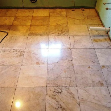
Windlestraw is a picturesque Edwardian manor hotel overlooking the Tweed Valley, near Walkerburn in the Scottish Borders area of Scotland. One of the bathrooms in the manor was in the process of being refurbished when two layers of floor tiles were removed, unveiling an original Marble tiled floor dating back to the 1920s.
After the top layers of tile had been removed the Marble was still covered in old adhesive and cement and although Marble is known for its quality and durability the hotel owner didn’t want the building contractor to proceed any further in case they damaged it. The owner was keen to restore the Marble floor as an original feature so we were called in to set the situation right.
To restore the floor I used two processes known as milling and burnishing. Milling literally involves grinding down uneven or rough surfaces using very coarse, diamond encrusted pads. The pads are usually used to resolve lippage issues on natural stone but in this case we needed to use the very coarse abrasive pads to grind off the adhesive and cement. I used a set of three coarse milling pads rinsing with water between each pad and starting with a 50 grit pad, before moving on to 100 and 200 grit pads. This process was very effective and ground off the cement and adhesive, while also removing any lippage in the tiles to leave a completely flat surface.
Milling leaves the surface of the Marble tiles clean but in a rough condition and this is where the second process Burnishing comes in. Similar to milling, burnishing focuses on achieving a polished finish with the application of ever finer grades of polishing pads and is often used to bring back the polish on Limestone and Travertine as well as Marble. Moving on to the burnishing, I worked my way through the four diamond encrusted pad system lubricating with a little water and again rinsing between each pad to remove the slurry. The grits go from Coarse (400 grit), Medium (800 grit), Fine (1500 grit) and then eventually Very Fine (3000 grit) and come in a 17” pad for use on a rotary floor machine and were applied twice in sequence to achieve a fantastic polished shine.
The floor was given a final rinse and then dried with a wet-vacuum before we proceeded to seal the floor using Tile Doctor Shine Powder which is a crystallizing powder that is applied directly to the floor and worked in using a buffing pad fitted to a rotary machine.
Shine Powder provides a very high shine (as you can see from the photos), along with a tough durable finish. On top of this, it is suitable for sealing all natural stone, including, of course, Marble, along with Limestone, Granite, Slate and Travertine.
The customer was absolutely delighted with the results as were we although it’s now up to them to ensure the bathroom fitters take appropriate care when completing the room which I’m sure will look absolutely fantastic when complete and no doubt add to the allure of this magnificent hotel in the Scottish Borders.
Thomas Wilson
Edinburgh Tile Doctor
4