
Search results for "Process data" in Home Design Ideas
 DHD Architecture and Interior Design
Photography by: Rodolfo Martinez
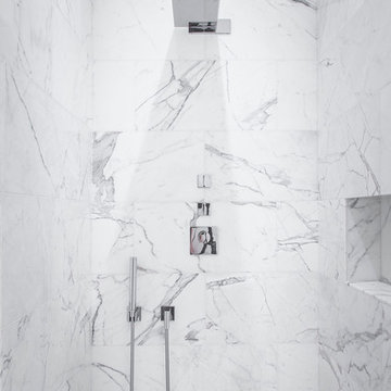
Example of a danish bathroom design in New York
Example of a danish bathroom design in New York
 Daniel Scerri Periti
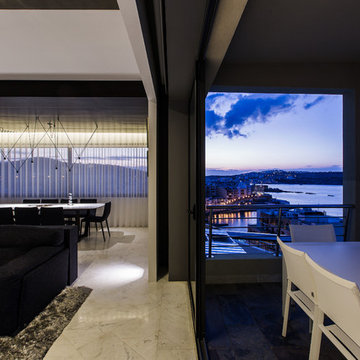
We were approached with a request to design the furnishings for an existing ‘finished’ apartment. The intention was to move in relatively fast, and the property already had an existing marble floor, kitchen and bathrooms which had to be kept. The property also boasted a fantastic 270 degree view, seen from most of the apartment. The clients had a very important role in the completion of the project. They were very involved during the design process and through various decoration choices. The final design was kept as a rigid guideline when faced with picking out all the different elements.
Once clear of all previous furniture, the space felt cold and bare; so we immediately felt the need for warmth, and raw, natural elements and textures to complement the cold marble floor while visually tying in the design of the whole apartment together.
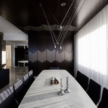
Since the existing kitchen had a touch of dark walnut stain, we felt this material was one we should add to the palette of materials to contest the stark materials. A raw cement finish was another material we felt would add an interesting contrast and could be used in a variety of ways, from cabinets to walls and ceilings, to tie up the design of various areas of the apartment.
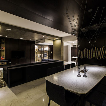
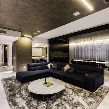
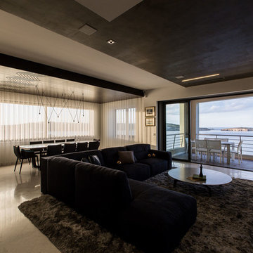
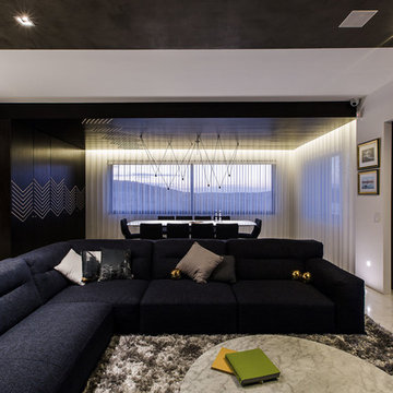
To warm up the living/dining area, keeping the existing marble floor but visually creating zones within the large living/dining area without hindering the flow, a dark timber custom-made soffit, continuous with a floor-to-ceiling drinks cabinet zones the dining area, giving it a degree of much-needed warmth.
The various windows with a stupendous 270 degree view needed to be visually tied together. This was done by introducing a continuous sheer [drape] which also doubled up as a sound-absorbing material along 2 of the 4 walls of the space.
A very large sofa was required to fill up the space correctly, also required for the size of the young family.
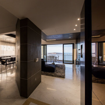
Services were integrated within the units and soffits, while a customized design in the corner between the kitchen and the living room took into consideration the viewpoints from the main areas to create a pantry without hindering the flow or views. A strategically placed floor-to-ceiling mirror doubles up the space and extends the view to the inner parts of the apartment.
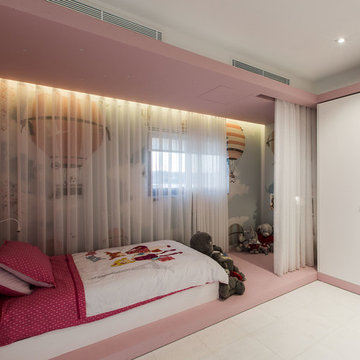
The daughter’s bedroom was a small challenge in itself, and a fun task, where we wanted to achieve the perception of a cozy niche with its own enclosed reading nook [for reading fairy tales], behind see-through curtains and a custom-ordered wall print sporting the girl’s favorite colors.
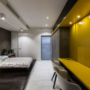
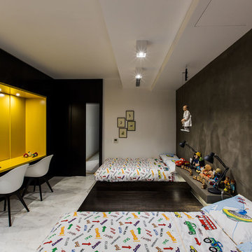
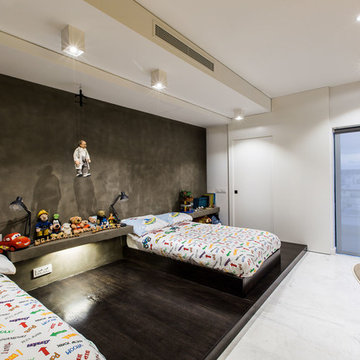
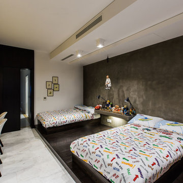
The sons’ bedroom had double the requirements in terms of space needed: more wardrobe, more homework desk space, a tv/play station area… “We combined a raised platform area between the boys’ beds to become an area with cushions where the kids can lay down and play, and face a hidden screen behind the homework desk’s sliding back panel for their play station”. The color of the homework desk was chosen in relation to the boys’ ages. A more masculine material palette was chosen for this room, in contrast to the light pastel palette of the girl’s bedroom. Again, this colour can easily be changed over time for a more mature look.
PROJECT DATA:
St. Paul’s Bay, Malta
DESIGN TEAM:
Perit Rebecca Zammit, Perit Daniel Scerri, Elyse Tonna
OTHER CREDITS:
Photography: Tonio Lombardi
Styling : TKS
 Daniel Scerri Periti
We were approached with a request to design the furnishings for an existing ‘finished’ apartment. The intention was to move in relatively fast, and the property already had an existing marble floor, kitchen and bathrooms which had to be kept. The property also boasted a fantastic 270 degree view, seen from most of the apartment. The clients had a very important role in the completion of the project. They were very involved during the design process and through various decoration choices. The final design was kept as a rigid guideline when faced with picking out all the different elements.
Once clear of all previous furniture, the space felt cold and bare; so we immediately felt the need for warmth, and raw, natural elements and textures to complement the cold marble floor while visually tying in the design of the whole apartment together.
Since the existing kitchen had a touch of dark walnut stain, we felt this material was one we should add to the palette of materials to contest the stark materials. A raw cement finish was another material we felt would add an interesting contrast and could be used in a variety of ways, from cabinets to walls and ceilings, to tie up the design of various areas of the apartment.
To warm up the living/dining area, keeping the existing marble floor but visually creating zones within the large living/dining area without hindering the flow, a dark timber custom-made soffit, continuous with a floor-to-ceiling drinks cabinet zones the dining area, giving it a degree of much-needed warmth.
The various windows with a stupendous 270 degree view needed to be visually tied together. This was done by introducing a continuous sheer [drape] which also doubled up as a sound-absorbing material along 2 of the 4 walls of the space.
A very large sofa was required to fill up the space correctly, also required for the size of the young family.
Services were integrated within the units and soffits, while a customized design in the corner between the kitchen and the living room took into consideration the viewpoints from the main areas to create a pantry without hindering the flow or views. A strategically placed floor-to-ceiling mirror doubles up the space and extends the view to the inner parts of the apartment.
The daughter’s bedroom was a small challenge in itself, and a fun task, where we wanted to achieve the perception of a cozy niche with its own enclosed reading nook [for reading fairy tales], behind see-through curtains and a custom-ordered wall print sporting the girl’s favorite colors.
The sons’ bedroom had double the requirements in terms of space needed: more wardrobe, more homework desk space, a tv/play station area… “We combined a raised platform area between the boys’ beds to become an area with cushions where the kids can lay down and play, and face a hidden screen behind the homework desk’s sliding back panel for their play station”. The color of the homework desk was chosen in relation to the boys’ ages. A more masculine material palette was chosen for this room, in contrast to the light pastel palette of the girl’s bedroom. Again, this colour can easily be changed over time for a more mature look.
PROJECT DATA:
St. Paul’s Bay, Malta
DESIGN TEAM:
Perit Rebecca Zammit, Perit Daniel Scerri, Elyse Tonna
OTHER CREDITS:
Photography: Tonio Lombardi
Styling : TKS
Find the right local pro for your project
 CairnsCraft Design & Remodel
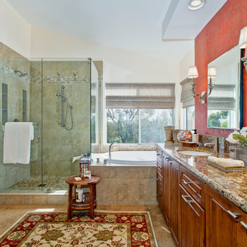
Great spacious bathroom with lot of amenities.
Photographer: Jon Upson
Large elegant master beige tile and porcelain tile drop-in bathtub photo in San Diego with an undermount sink, raised-panel cabinets, medium tone wood cabinets, granite countertops, beige walls and a two-piece toilet
Large elegant master beige tile and porcelain tile drop-in bathtub photo in San Diego with an undermount sink, raised-panel cabinets, medium tone wood cabinets, granite countertops, beige walls and a two-piece toilet
 Daniel Scerri Periti
We were approached with a request to design the furnishings for an existing ‘finished’ apartment. The intention was to move in relatively fast, and the property already had an existing marble floor, kitchen and bathrooms which had to be kept. The property also boasted a fantastic 270 degree view, seen from most of the apartment. The clients had a very important role in the completion of the project. They were very involved during the design process and through various decoration choices. The final design was kept as a rigid guideline when faced with picking out all the different elements.
Once clear of all previous furniture, the space felt cold and bare; so we immediately felt the need for warmth, and raw, natural elements and textures to complement the cold marble floor while visually tying in the design of the whole apartment together.
Since the existing kitchen had a touch of dark walnut stain, we felt this material was one we should add to the palette of materials to contest the stark materials. A raw cement finish was another material we felt would add an interesting contrast and could be used in a variety of ways, from cabinets to walls and ceilings, to tie up the design of various areas of the apartment.
To warm up the living/dining area, keeping the existing marble floor but visually creating zones within the large living/dining area without hindering the flow, a dark timber custom-made soffit, continuous with a floor-to-ceiling drinks cabinet zones the dining area, giving it a degree of much-needed warmth.
The various windows with a stupendous 270 degree view needed to be visually tied together. This was done by introducing a continuous sheer [drape] which also doubled up as a sound-absorbing material along 2 of the 4 walls of the space.
A very large sofa was required to fill up the space correctly, also required for the size of the young family.
Services were integrated within the units and soffits, while a customized design in the corner between the kitchen and the living room took into consideration the viewpoints from the main areas to create a pantry without hindering the flow or views. A strategically placed floor-to-ceiling mirror doubles up the space and extends the view to the inner parts of the apartment.
The daughter’s bedroom was a small challenge in itself, and a fun task, where we wanted to achieve the perception of a cozy niche with its own enclosed reading nook [for reading fairy tales], behind see-through curtains and a custom-ordered wall print sporting the girl’s favorite colors.
The sons’ bedroom had double the requirements in terms of space needed: more wardrobe, more homework desk space, a tv/play station area… “We combined a raised platform area between the boys’ beds to become an area with cushions where the kids can lay down and play, and face a hidden screen behind the homework desk’s sliding back panel for their play station”. The color of the homework desk was chosen in relation to the boys’ ages. A more masculine material palette was chosen for this room, in contrast to the light pastel palette of the girl’s bedroom. Again, this colour can easily be changed over time for a more mature look.
PROJECT DATA:
St. Paul’s Bay, Malta
DESIGN TEAM:
Perit Rebecca Zammit, Perit Daniel Scerri, Elyse Tonna
OTHER CREDITS:
Photography: Tonio Lombardi
Styling : TKS

 Daniel Scerri Periti
We were approached with a request to design the furnishings for an existing ‘finished’ apartment. The intention was to move in relatively fast, and the property already had an existing marble floor, kitchen and bathrooms which had to be kept. The property also boasted a fantastic 270 degree view, seen from most of the apartment. The clients had a very important role in the completion of the project. They were very involved during the design process and through various decoration choices. The final design was kept as a rigid guideline when faced with picking out all the different elements.
Once clear of all previous furniture, the space felt cold and bare; so we immediately felt the need for warmth, and raw, natural elements and textures to complement the cold marble floor while visually tying in the design of the whole apartment together.
Since the existing kitchen had a touch of dark walnut stain, we felt this material was one we should add to the palette of materials to contest the stark materials. A raw cement finish was another material we felt would add an interesting contrast and could be used in a variety of ways, from cabinets to walls and ceilings, to tie up the design of various areas of the apartment.
To warm up the living/dining area, keeping the existing marble floor but visually creating zones within the large living/dining area without hindering the flow, a dark timber custom-made soffit, continuous with a floor-to-ceiling drinks cabinet zones the dining area, giving it a degree of much-needed warmth.
The various windows with a stupendous 270 degree view needed to be visually tied together. This was done by introducing a continuous sheer [drape] which also doubled up as a sound-absorbing material along 2 of the 4 walls of the space.
A very large sofa was required to fill up the space correctly, also required for the size of the young family.
Services were integrated within the units and soffits, while a customized design in the corner between the kitchen and the living room took into consideration the viewpoints from the main areas to create a pantry without hindering the flow or views. A strategically placed floor-to-ceiling mirror doubles up the space and extends the view to the inner parts of the apartment.
The daughter’s bedroom was a small challenge in itself, and a fun task, where we wanted to achieve the perception of a cozy niche with its own enclosed reading nook [for reading fairy tales], behind see-through curtains and a custom-ordered wall print sporting the girl’s favorite colors.
The sons’ bedroom had double the requirements in terms of space needed: more wardrobe, more homework desk space, a tv/play station area… “We combined a raised platform area between the boys’ beds to become an area with cushions where the kids can lay down and play, and face a hidden screen behind the homework desk’s sliding back panel for their play station”. The color of the homework desk was chosen in relation to the boys’ ages. A more masculine material palette was chosen for this room, in contrast to the light pastel palette of the girl’s bedroom. Again, this colour can easily be changed over time for a more mature look.
PROJECT DATA:
St. Paul’s Bay, Malta
DESIGN TEAM:
Perit Rebecca Zammit, Perit Daniel Scerri, Elyse Tonna
OTHER CREDITS:
Photography: Tonio Lombardi
Styling : TKS
 Daniel Scerri Periti
We were approached with a request to design the furnishings for an existing ‘finished’ apartment. The intention was to move in relatively fast, and the property already had an existing marble floor, kitchen and bathrooms which had to be kept. The property also boasted a fantastic 270 degree view, seen from most of the apartment. The clients had a very important role in the completion of the project. They were very involved during the design process and through various decoration choices. The final design was kept as a rigid guideline when faced with picking out all the different elements.
Once clear of all previous furniture, the space felt cold and bare; so we immediately felt the need for warmth, and raw, natural elements and textures to complement the cold marble floor while visually tying in the design of the whole apartment together.
Since the existing kitchen had a touch of dark walnut stain, we felt this material was one we should add to the palette of materials to contest the stark materials. A raw cement finish was another material we felt would add an interesting contrast and could be used in a variety of ways, from cabinets to walls and ceilings, to tie up the design of various areas of the apartment.
To warm up the living/dining area, keeping the existing marble floor but visually creating zones within the large living/dining area without hindering the flow, a dark timber custom-made soffit, continuous with a floor-to-ceiling drinks cabinet zones the dining area, giving it a degree of much-needed warmth.
The various windows with a stupendous 270 degree view needed to be visually tied together. This was done by introducing a continuous sheer [drape] which also doubled up as a sound-absorbing material along 2 of the 4 walls of the space.
A very large sofa was required to fill up the space correctly, also required for the size of the young family.
Services were integrated within the units and soffits, while a customized design in the corner between the kitchen and the living room took into consideration the viewpoints from the main areas to create a pantry without hindering the flow or views. A strategically placed floor-to-ceiling mirror doubles up the space and extends the view to the inner parts of the apartment.
The daughter’s bedroom was a small challenge in itself, and a fun task, where we wanted to achieve the perception of a cozy niche with its own enclosed reading nook [for reading fairy tales], behind see-through curtains and a custom-ordered wall print sporting the girl’s favorite colors.
The sons’ bedroom had double the requirements in terms of space needed: more wardrobe, more homework desk space, a tv/play station area… “We combined a raised platform area between the boys’ beds to become an area with cushions where the kids can lay down and play, and face a hidden screen behind the homework desk’s sliding back panel for their play station”. The color of the homework desk was chosen in relation to the boys’ ages. A more masculine material palette was chosen for this room, in contrast to the light pastel palette of the girl’s bedroom. Again, this colour can easily be changed over time for a more mature look.
PROJECT DATA:
St. Paul’s Bay, Malta
DESIGN TEAM:
Perit Rebecca Zammit, Perit Daniel Scerri, Elyse Tonna
OTHER CREDITS:
Photography: Tonio Lombardi
Styling : TKS
 Daniel Scerri Periti
We were approached with a request to design the furnishings for an existing ‘finished’ apartment. The intention was to move in relatively fast, and the property already had an existing marble floor, kitchen and bathrooms which had to be kept. The property also boasted a fantastic 270 degree view, seen from most of the apartment. The clients had a very important role in the completion of the project. They were very involved during the design process and through various decoration choices. The final design was kept as a rigid guideline when faced with picking out all the different elements.
Once clear of all previous furniture, the space felt cold and bare; so we immediately felt the need for warmth, and raw, natural elements and textures to complement the cold marble floor while visually tying in the design of the whole apartment together.
Since the existing kitchen had a touch of dark walnut stain, we felt this material was one we should add to the palette of materials to contest the stark materials. A raw cement finish was another material we felt would add an interesting contrast and could be used in a variety of ways, from cabinets to walls and ceilings, to tie up the design of various areas of the apartment.
To warm up the living/dining area, keeping the existing marble floor but visually creating zones within the large living/dining area without hindering the flow, a dark timber custom-made soffit, continuous with a floor-to-ceiling drinks cabinet zones the dining area, giving it a degree of much-needed warmth.
The various windows with a stupendous 270 degree view needed to be visually tied together. This was done by introducing a continuous sheer [drape] which also doubled up as a sound-absorbing material along 2 of the 4 walls of the space.
A very large sofa was required to fill up the space correctly, also required for the size of the young family.
Services were integrated within the units and soffits, while a customized design in the corner between the kitchen and the living room took into consideration the viewpoints from the main areas to create a pantry without hindering the flow or views. A strategically placed floor-to-ceiling mirror doubles up the space and extends the view to the inner parts of the apartment.
The daughter’s bedroom was a small challenge in itself, and a fun task, where we wanted to achieve the perception of a cozy niche with its own enclosed reading nook [for reading fairy tales], behind see-through curtains and a custom-ordered wall print sporting the girl’s favorite colors.
The sons’ bedroom had double the requirements in terms of space needed: more wardrobe, more homework desk space, a tv/play station area… “We combined a raised platform area between the boys’ beds to become an area with cushions where the kids can lay down and play, and face a hidden screen behind the homework desk’s sliding back panel for their play station”. The color of the homework desk was chosen in relation to the boys’ ages. A more masculine material palette was chosen for this room, in contrast to the light pastel palette of the girl’s bedroom. Again, this colour can easily be changed over time for a more mature look.
PROJECT DATA:
St. Paul’s Bay, Malta
DESIGN TEAM:
Perit Rebecca Zammit, Perit Daniel Scerri, Elyse Tonna
OTHER CREDITS:
Photography: Tonio Lombardi
Styling : TKS
 Daniel Scerri Periti
We were approached with a request to design the furnishings for an existing ‘finished’ apartment. The intention was to move in relatively fast, and the property already had an existing marble floor, kitchen and bathrooms which had to be kept. The property also boasted a fantastic 270 degree view, seen from most of the apartment. The clients had a very important role in the completion of the project. They were very involved during the design process and through various decoration choices. The final design was kept as a rigid guideline when faced with picking out all the different elements.
Once clear of all previous furniture, the space felt cold and bare; so we immediately felt the need for warmth, and raw, natural elements and textures to complement the cold marble floor while visually tying in the design of the whole apartment together.
Since the existing kitchen had a touch of dark walnut stain, we felt this material was one we should add to the palette of materials to contest the stark materials. A raw cement finish was another material we felt would add an interesting contrast and could be used in a variety of ways, from cabinets to walls and ceilings, to tie up the design of various areas of the apartment.
To warm up the living/dining area, keeping the existing marble floor but visually creating zones within the large living/dining area without hindering the flow, a dark timber custom-made soffit, continuous with a floor-to-ceiling drinks cabinet zones the dining area, giving it a degree of much-needed warmth.
The various windows with a stupendous 270 degree view needed to be visually tied together. This was done by introducing a continuous sheer [drape] which also doubled up as a sound-absorbing material along 2 of the 4 walls of the space.
A very large sofa was required to fill up the space correctly, also required for the size of the young family.
Services were integrated within the units and soffits, while a customized design in the corner between the kitchen and the living room took into consideration the viewpoints from the main areas to create a pantry without hindering the flow or views. A strategically placed floor-to-ceiling mirror doubles up the space and extends the view to the inner parts of the apartment.
The daughter’s bedroom was a small challenge in itself, and a fun task, where we wanted to achieve the perception of a cozy niche with its own enclosed reading nook [for reading fairy tales], behind see-through curtains and a custom-ordered wall print sporting the girl’s favorite colors.
The sons’ bedroom had double the requirements in terms of space needed: more wardrobe, more homework desk space, a tv/play station area… “We combined a raised platform area between the boys’ beds to become an area with cushions where the kids can lay down and play, and face a hidden screen behind the homework desk’s sliding back panel for their play station”. The color of the homework desk was chosen in relation to the boys’ ages. A more masculine material palette was chosen for this room, in contrast to the light pastel palette of the girl’s bedroom. Again, this colour can easily be changed over time for a more mature look.
PROJECT DATA:
St. Paul’s Bay, Malta
DESIGN TEAM:
Perit Rebecca Zammit, Perit Daniel Scerri, Elyse Tonna
OTHER CREDITS:
Photography: Tonio Lombardi
Styling : TKS
 Daniel Scerri Periti
We were approached with a request to design the furnishings for an existing ‘finished’ apartment. The intention was to move in relatively fast, and the property already had an existing marble floor, kitchen and bathrooms which had to be kept. The property also boasted a fantastic 270 degree view, seen from most of the apartment. The clients had a very important role in the completion of the project. They were very involved during the design process and through various decoration choices. The final design was kept as a rigid guideline when faced with picking out all the different elements.
Once clear of all previous furniture, the space felt cold and bare; so we immediately felt the need for warmth, and raw, natural elements and textures to complement the cold marble floor while visually tying in the design of the whole apartment together.
Since the existing kitchen had a touch of dark walnut stain, we felt this material was one we should add to the palette of materials to contest the stark materials. A raw cement finish was another material we felt would add an interesting contrast and could be used in a variety of ways, from cabinets to walls and ceilings, to tie up the design of various areas of the apartment.
To warm up the living/dining area, keeping the existing marble floor but visually creating zones within the large living/dining area without hindering the flow, a dark timber custom-made soffit, continuous with a floor-to-ceiling drinks cabinet zones the dining area, giving it a degree of much-needed warmth.
The various windows with a stupendous 270 degree view needed to be visually tied together. This was done by introducing a continuous sheer [drape] which also doubled up as a sound-absorbing material along 2 of the 4 walls of the space.
A very large sofa was required to fill up the space correctly, also required for the size of the young family.
Services were integrated within the units and soffits, while a customized design in the corner between the kitchen and the living room took into consideration the viewpoints from the main areas to create a pantry without hindering the flow or views. A strategically placed floor-to-ceiling mirror doubles up the space and extends the view to the inner parts of the apartment.
The daughter’s bedroom was a small challenge in itself, and a fun task, where we wanted to achieve the perception of a cozy niche with its own enclosed reading nook [for reading fairy tales], behind see-through curtains and a custom-ordered wall print sporting the girl’s favorite colors.
The sons’ bedroom had double the requirements in terms of space needed: more wardrobe, more homework desk space, a tv/play station area… “We combined a raised platform area between the boys’ beds to become an area with cushions where the kids can lay down and play, and face a hidden screen behind the homework desk’s sliding back panel for their play station”. The color of the homework desk was chosen in relation to the boys’ ages. A more masculine material palette was chosen for this room, in contrast to the light pastel palette of the girl’s bedroom. Again, this colour can easily be changed over time for a more mature look.
PROJECT DATA:
St. Paul’s Bay, Malta
DESIGN TEAM:
Perit Rebecca Zammit, Perit Daniel Scerri, Elyse Tonna
OTHER CREDITS:
Photography: Tonio Lombardi
Styling : TKS
 Daniel Scerri Periti
We were approached with a request to design the furnishings for an existing ‘finished’ apartment. The intention was to move in relatively fast, and the property already had an existing marble floor, kitchen and bathrooms which had to be kept. The property also boasted a fantastic 270 degree view, seen from most of the apartment. The clients had a very important role in the completion of the project. They were very involved during the design process and through various decoration choices. The final design was kept as a rigid guideline when faced with picking out all the different elements.
Once clear of all previous furniture, the space felt cold and bare; so we immediately felt the need for warmth, and raw, natural elements and textures to complement the cold marble floor while visually tying in the design of the whole apartment together.
Since the existing kitchen had a touch of dark walnut stain, we felt this material was one we should add to the palette of materials to contest the stark materials. A raw cement finish was another material we felt would add an interesting contrast and could be used in a variety of ways, from cabinets to walls and ceilings, to tie up the design of various areas of the apartment.
To warm up the living/dining area, keeping the existing marble floor but visually creating zones within the large living/dining area without hindering the flow, a dark timber custom-made soffit, continuous with a floor-to-ceiling drinks cabinet zones the dining area, giving it a degree of much-needed warmth.
The various windows with a stupendous 270 degree view needed to be visually tied together. This was done by introducing a continuous sheer [drape] which also doubled up as a sound-absorbing material along 2 of the 4 walls of the space.
A very large sofa was required to fill up the space correctly, also required for the size of the young family.
Services were integrated within the units and soffits, while a customized design in the corner between the kitchen and the living room took into consideration the viewpoints from the main areas to create a pantry without hindering the flow or views. A strategically placed floor-to-ceiling mirror doubles up the space and extends the view to the inner parts of the apartment.
The daughter’s bedroom was a small challenge in itself, and a fun task, where we wanted to achieve the perception of a cozy niche with its own enclosed reading nook [for reading fairy tales], behind see-through curtains and a custom-ordered wall print sporting the girl’s favorite colors.
The sons’ bedroom had double the requirements in terms of space needed: more wardrobe, more homework desk space, a tv/play station area… “We combined a raised platform area between the boys’ beds to become an area with cushions where the kids can lay down and play, and face a hidden screen behind the homework desk’s sliding back panel for their play station”. The color of the homework desk was chosen in relation to the boys’ ages. A more masculine material palette was chosen for this room, in contrast to the light pastel palette of the girl’s bedroom. Again, this colour can easily be changed over time for a more mature look.
PROJECT DATA:
St. Paul’s Bay, Malta
DESIGN TEAM:
Perit Rebecca Zammit, Perit Daniel Scerri, Elyse Tonna
OTHER CREDITS:
Photography: Tonio Lombardi
Styling : TKS
 Daniel Scerri Periti
We were approached with a request to design the furnishings for an existing ‘finished’ apartment. The intention was to move in relatively fast, and the property already had an existing marble floor, kitchen and bathrooms which had to be kept. The property also boasted a fantastic 270 degree view, seen from most of the apartment. The clients had a very important role in the completion of the project. They were very involved during the design process and through various decoration choices. The final design was kept as a rigid guideline when faced with picking out all the different elements.
Once clear of all previous furniture, the space felt cold and bare; so we immediately felt the need for warmth, and raw, natural elements and textures to complement the cold marble floor while visually tying in the design of the whole apartment together.
Since the existing kitchen had a touch of dark walnut stain, we felt this material was one we should add to the palette of materials to contest the stark materials. A raw cement finish was another material we felt would add an interesting contrast and could be used in a variety of ways, from cabinets to walls and ceilings, to tie up the design of various areas of the apartment.
To warm up the living/dining area, keeping the existing marble floor but visually creating zones within the large living/dining area without hindering the flow, a dark timber custom-made soffit, continuous with a floor-to-ceiling drinks cabinet zones the dining area, giving it a degree of much-needed warmth.
The various windows with a stupendous 270 degree view needed to be visually tied together. This was done by introducing a continuous sheer [drape] which also doubled up as a sound-absorbing material along 2 of the 4 walls of the space.
A very large sofa was required to fill up the space correctly, also required for the size of the young family.
Services were integrated within the units and soffits, while a customized design in the corner between the kitchen and the living room took into consideration the viewpoints from the main areas to create a pantry without hindering the flow or views. A strategically placed floor-to-ceiling mirror doubles up the space and extends the view to the inner parts of the apartment.
The daughter’s bedroom was a small challenge in itself, and a fun task, where we wanted to achieve the perception of a cozy niche with its own enclosed reading nook [for reading fairy tales], behind see-through curtains and a custom-ordered wall print sporting the girl’s favorite colors.
The sons’ bedroom had double the requirements in terms of space needed: more wardrobe, more homework desk space, a tv/play station area… “We combined a raised platform area between the boys’ beds to become an area with cushions where the kids can lay down and play, and face a hidden screen behind the homework desk’s sliding back panel for their play station”. The color of the homework desk was chosen in relation to the boys’ ages. A more masculine material palette was chosen for this room, in contrast to the light pastel palette of the girl’s bedroom. Again, this colour can easily be changed over time for a more mature look.
PROJECT DATA:
St. Paul’s Bay, Malta
DESIGN TEAM:
Perit Rebecca Zammit, Perit Daniel Scerri, Elyse Tonna
OTHER CREDITS:
Photography: Tonio Lombardi
Styling : TKS
 Spire North
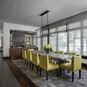
Tucked away in the backwoods of Torch Lake, this home marries “rustic” with the sleek elegance of modern. The combination of wood, stone and metal textures embrace the charm of a classic farmhouse. Although this is not your average farmhouse. The home is outfitted with a high performing system that seamlessly works with the design and architecture.
The tall ceilings and windows allow ample natural light into the main room. Spire Integrated Systems installed Lutron QS Wireless motorized shades paired with Hartmann & Forbes windowcovers to offer privacy and block harsh light. The custom 18′ windowcover’s woven natural fabric complements the organic esthetics of the room. The shades are artfully concealed in the millwork when not in use.
Spire installed B&W in-ceiling speakers and Sonance invisible in-wall speakers to deliver ambient music that emanates throughout the space with no visual footprint. Spire also installed a Sonance Landscape Audio System so the homeowner can enjoy music outside.
Each system is easily controlled using Savant. Spire personalized the settings to the homeowner’s preference making controlling the home efficient and convenient.
 Daniel Scerri Periti
We were approached with a request to design the furnishings for an existing ‘finished’ apartment. The intention was to move in relatively fast, and the property already had an existing marble floor, kitchen and bathrooms which had to be kept. The property also boasted a fantastic 270 degree view, seen from most of the apartment. The clients had a very important role in the completion of the project. They were very involved during the design process and through various decoration choices. The final design was kept as a rigid guideline when faced with picking out all the different elements.
Once clear of all previous furniture, the space felt cold and bare; so we immediately felt the need for warmth, and raw, natural elements and textures to complement the cold marble floor while visually tying in the design of the whole apartment together.
Since the existing kitchen had a touch of dark walnut stain, we felt this material was one we should add to the palette of materials to contest the stark materials. A raw cement finish was another material we felt would add an interesting contrast and could be used in a variety of ways, from cabinets to walls and ceilings, to tie up the design of various areas of the apartment.
To warm up the living/dining area, keeping the existing marble floor but visually creating zones within the large living/dining area without hindering the flow, a dark timber custom-made soffit, continuous with a floor-to-ceiling drinks cabinet zones the dining area, giving it a degree of much-needed warmth.
The various windows with a stupendous 270 degree view needed to be visually tied together. This was done by introducing a continuous sheer [drape] which also doubled up as a sound-absorbing material along 2 of the 4 walls of the space.
A very large sofa was required to fill up the space correctly, also required for the size of the young family.
Services were integrated within the units and soffits, while a customized design in the corner between the kitchen and the living room took into consideration the viewpoints from the main areas to create a pantry without hindering the flow or views. A strategically placed floor-to-ceiling mirror doubles up the space and extends the view to the inner parts of the apartment.
The daughter’s bedroom was a small challenge in itself, and a fun task, where we wanted to achieve the perception of a cozy niche with its own enclosed reading nook [for reading fairy tales], behind see-through curtains and a custom-ordered wall print sporting the girl’s favorite colors.
The sons’ bedroom had double the requirements in terms of space needed: more wardrobe, more homework desk space, a tv/play station area… “We combined a raised platform area between the boys’ beds to become an area with cushions where the kids can lay down and play, and face a hidden screen behind the homework desk’s sliding back panel for their play station”. The color of the homework desk was chosen in relation to the boys’ ages. A more masculine material palette was chosen for this room, in contrast to the light pastel palette of the girl’s bedroom. Again, this colour can easily be changed over time for a more mature look.
PROJECT DATA:
St. Paul’s Bay, Malta
DESIGN TEAM:
Perit Rebecca Zammit, Perit Daniel Scerri, Elyse Tonna
OTHER CREDITS:
Photography: Tonio Lombardi
Styling : TKS
 Daniel Scerri Periti
We were approached with a request to design the furnishings for an existing ‘finished’ apartment. The intention was to move in relatively fast, and the property already had an existing marble floor, kitchen and bathrooms which had to be kept. The property also boasted a fantastic 270 degree view, seen from most of the apartment. The clients had a very important role in the completion of the project. They were very involved during the design process and through various decoration choices. The final design was kept as a rigid guideline when faced with picking out all the different elements.
Once clear of all previous furniture, the space felt cold and bare; so we immediately felt the need for warmth, and raw, natural elements and textures to complement the cold marble floor while visually tying in the design of the whole apartment together.
Since the existing kitchen had a touch of dark walnut stain, we felt this material was one we should add to the palette of materials to contest the stark materials. A raw cement finish was another material we felt would add an interesting contrast and could be used in a variety of ways, from cabinets to walls and ceilings, to tie up the design of various areas of the apartment.
To warm up the living/dining area, keeping the existing marble floor but visually creating zones within the large living/dining area without hindering the flow, a dark timber custom-made soffit, continuous with a floor-to-ceiling drinks cabinet zones the dining area, giving it a degree of much-needed warmth.
The various windows with a stupendous 270 degree view needed to be visually tied together. This was done by introducing a continuous sheer [drape] which also doubled up as a sound-absorbing material along 2 of the 4 walls of the space.
A very large sofa was required to fill up the space correctly, also required for the size of the young family.
Services were integrated within the units and soffits, while a customized design in the corner between the kitchen and the living room took into consideration the viewpoints from the main areas to create a pantry without hindering the flow or views. A strategically placed floor-to-ceiling mirror doubles up the space and extends the view to the inner parts of the apartment.
The daughter’s bedroom was a small challenge in itself, and a fun task, where we wanted to achieve the perception of a cozy niche with its own enclosed reading nook [for reading fairy tales], behind see-through curtains and a custom-ordered wall print sporting the girl’s favorite colors.
The sons’ bedroom had double the requirements in terms of space needed: more wardrobe, more homework desk space, a tv/play station area… “We combined a raised platform area between the boys’ beds to become an area with cushions where the kids can lay down and play, and face a hidden screen behind the homework desk’s sliding back panel for their play station”. The color of the homework desk was chosen in relation to the boys’ ages. A more masculine material palette was chosen for this room, in contrast to the light pastel palette of the girl’s bedroom. Again, this colour can easily be changed over time for a more mature look.
PROJECT DATA:
St. Paul’s Bay, Malta
DESIGN TEAM:
Perit Rebecca Zammit, Perit Daniel Scerri, Elyse Tonna
OTHER CREDITS:
Photography: Tonio Lombardi
Styling : TKS
 Stonecreek Building Company, Inc.
Timmerman Photography
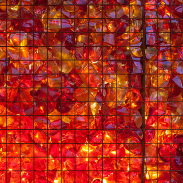
Sculpture by Mayme Kratz
This is a home we initially built in 1995 and after it sold in 2014 we were commissioned to come back and remodel the interior of the home.
We worked with internationally renowned architect Will Bruder on the initial design on the home. The goal of home was to build a modern hillside home which made the most of the vista upon which it sat. A few ways we were able to achieve this were the unique, floor-to-ceiling glass windows on the side of the property overlooking Scottsdale, a private courtyard off the master bedroom and bathroom, and a custom commissioned sculpture Mayme Kratz.
Stonecreek's particular role in the project were to work alongside both the clients and the architect to make sure we were able to perfectly execute on the vision and design of the project. A very unique component of this house is how truly custom every feature is, all the way from the window systems and the bathtubs all the way down to the door handles and other features.

 BAUFORMAT
Wavy mother of pearl porcelain tile, wavy white tile for bathroom shower or backsplash. Perfect for fireplace or accent wall
Example of a trendy bathroom design in Los Angeles
Example of a trendy bathroom design in Los Angeles

 Heritage Construction Companies, LLC.
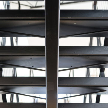
Example of a huge trendy metal floating open staircase design in Minneapolis
3