
Search results for "Process involves" in Home Design Ideas

 Irene Designs
This Master Suite while being spacious, was poorly planned in the beginning. Master Bathroom and Walk-in Closet were small relative to the Bedroom size. Bathroom, being a maze of turns, offered a poor traffic flow. It only had basic fixtures and was never decorated to look like a living space. Geometry of the Bedroom (long and stretched) allowed to use some of its' space to build two Walk-in Closets while the original walk-in closet space was added to adjacent Bathroom. New Master Bathroom layout has changed dramatically (walls, door, and fixtures moved). The new space was carefully planned for two people using it at once with no sacrifice to the comfort. New shower is huge. It stretches wall-to-wall and has a full length bench with granite top. Frame-less glass enclosure partially sits on the tub platform (it is a drop-in tub). Tiles on the walls and on the floor are of the same collection. Elegant, time-less, neutral - something you would enjoy for years. This selection leaves no boundaries on the decor. Beautiful open shelf vanity cabinet was actually made by the Home Owners! They both were actively involved into the process of creating their new oasis. New Master Suite has two separate Walk-in Closets. Linen closet which used to be a part of the Bathroom, is now accessible from the hallway. Master Bedroom, still big, looks stunning. It reflects taste and life style of the Home Owners and blends in with the overall style of the House. Some of the furniture in the Bedroom was also made by the Home Owners.
 Irene Designs
This Master Suite while being spacious, was poorly planned in the beginning. Master Bathroom and Walk-in Closet were small relative to the Bedroom size. Bathroom, being a maze of turns, offered a poor traffic flow. It only had basic fixtures and was never decorated to look like a living space. Geometry of the Bedroom (long and stretched) allowed to use some of its' space to build two Walk-in Closets while the original walk-in closet space was added to adjacent Bathroom. New Master Bathroom layout has changed dramatically (walls, door, and fixtures moved). The new space was carefully planned for two people using it at once with no sacrifice to the comfort. New shower is huge. It stretches wall-to-wall and has a full length bench with granite top. Frame-less glass enclosure partially sits on the tub platform (it is a drop-in tub). Tiles on the walls and on the floor are of the same collection. Elegant, time-less, neutral - something you would enjoy for years. This selection leaves no boundaries on the decor. Beautiful open shelf vanity cabinet was actually made by the Home Owners! They both were actively involved into the process of creating their new oasis. New Master Suite has two separate Walk-in Closets. Linen closet which used to be a part of the Bathroom, is now accessible from the hallway. Master Bedroom, still big, looks stunning. It reflects taste and life style of the Home Owners and blends in with the overall style of the House. Some of the furniture in the Bedroom was also made by the Home Owners.

Find the right local pro for your project

 Vanguard Development
The best interior designers & architects in NYC!
Residential interior design, Common area design, Hospitality design, Exterior design, Commercial design - any interior or architectural design basically from a unique design team :)
Our goal is to provide clients in Manhattan, New York, New Jersey & beyond with outstanding architectural & interior design services and installation management through a unique approach and unparalleled work quality.
Our mission is to create Dream Homes that change people's lives!
Working with us is a simple two step process - Design & Installation. The core is that all our design ideas (interior design of an apartment, restaurant, hotel design or architectural design of a building) are presented through exceptionally realistic images, delivering the exact look of your future interior/exterior, before you commit to investing. The Installation then abides to the paradigm of 'What I See Is What I Get', replicating the approved design. All together it gives you full control and eliminates the risk of having an unsatisfactory end product - no other interior designer or architect can offer.
Our team's passion, talent & professionalism brings you the best possible result, while our client-oriented philosophy & determination to make the process easy & convenient, saves you great deal of time and concern.
In short, this is Design as it Should be...
Other services: Lobby design, Store & storefront design, Hotel design, Restaurant design, House design
www.vanguard-development.com
 Jennifer Gardner Design
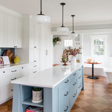
A classic Seattle craftsman home is reimagined and restored. We cherished the opportunity to help a young couple in Seattle develop a materials, fixtures and lighting package for their beloved home remodel. The master bathroom is layered with a mix of white and black marble hex mosaic floor tile, classic white offset brick pattern subway wall tile, and beautifully crafted wood wainscoting. Kohler's Artifacts plumbing trim collection brings fresh vintage style to the vanity and shower. An easy to care for quartz counter and backsplash adds a bright contrast to the a gorgeous providence blue custom vanity. The powder room which doubles as a guest bathroom is dressed in Pratt and Larson's ceramic mosaic floor tile and paired with a space saving pedestal sink by American Standard. Wall niches lined with white quartz are incorporated into both showers creating a dedicated place to store bathing amenities. The checkboard cork floor in the kitchen adds a FUN pop of personality. Custom mudroom cubbies and a built in eating nook were beautifully crafted and finished in a crisp white paint. Light fixtures by Rejuvenation bathe the room in beautiful period appropriate light. Clever storage hides small appliances and a stand mixer. This project was a labor of love for he homeowners who took an active part in the process and a joy for our team to be involved in!
Interior Design (Materials, Fixtures and Lighting Package) by Jennifer Gardner Design
Architecture by Gant Nychay Architecture
Custom Mudroom, Kitchen Table and Eating Nook Built-ins: Hosburgh Custom Woodwork
Photography by Emily Keeney
 Irene Designs
This Master Suite while being spacious, was poorly planned in the beginning. Master Bathroom and Walk-in Closet were small relative to the Bedroom size. Bathroom, being a maze of turns, offered a poor traffic flow. It only had basic fixtures and was never decorated to look like a living space. Geometry of the Bedroom (long and stretched) allowed to use some of its' space to build two Walk-in Closets while the original walk-in closet space was added to adjacent Bathroom. New Master Bathroom layout has changed dramatically (walls, door, and fixtures moved). The new space was carefully planned for two people using it at once with no sacrifice to the comfort. New shower is huge. It stretches wall-to-wall and has a full length bench with granite top. Frame-less glass enclosure partially sits on the tub platform (it is a drop-in tub). Tiles on the walls and on the floor are of the same collection. Elegant, time-less, neutral - something you would enjoy for years. This selection leaves no boundaries on the decor. Beautiful open shelf vanity cabinet was actually made by the Home Owners! They both were actively involved into the process of creating their new oasis. New Master Suite has two separate Walk-in Closets. Linen closet which used to be a part of the Bathroom, is now accessible from the hallway. Master Bedroom, still big, looks stunning. It reflects taste and life style of the Home Owners and blends in with the overall style of the House. Some of the furniture in the Bedroom was also made by the Home Owners.
 Irene Designs
This Master Suite while being spacious, was poorly planned in the beginning. Master Bathroom and Walk-in Closet were small relative to the Bedroom size. Bathroom, being a maze of turns, offered a poor traffic flow. It only had basic fixtures and was never decorated to look like a living space. Geometry of the Bedroom (long and stretched) allowed to use some of its' space to build two Walk-in Closets while the original walk-in closet space was added to adjacent Bathroom. New Master Bathroom layout has changed dramatically (walls, door, and fixtures moved). The new space was carefully planned for two people using it at once with no sacrifice to the comfort. New shower is huge. It stretches wall-to-wall and has a full length bench with granite top. Frame-less glass enclosure partially sits on the tub platform (it is a drop-in tub). Tiles on the walls and on the floor are of the same collection. Elegant, time-less, neutral - something you would enjoy for years. This selection leaves no boundaries on the decor. Beautiful open shelf vanity cabinet was actually made by the Home Owners! They both were actively involved into the process of creating their new oasis. New Master Suite has two separate Walk-in Closets. Linen closet which used to be a part of the Bathroom, is now accessible from the hallway. Master Bedroom, still big, looks stunning. It reflects taste and life style of the Home Owners and blends in with the overall style of the House. Some of the furniture in the Bedroom was also made by the Home Owners.
 Irene Designs
This Master Suite while being spacious, was poorly planned in the beginning. Master Bathroom and Walk-in Closet were small relative to the Bedroom size. Bathroom, being a maze of turns, offered a poor traffic flow. It only had basic fixtures and was never decorated to look like a living space. Geometry of the Bedroom (long and stretched) allowed to use some of its' space to build two Walk-in Closets while the original walk-in closet space was added to adjacent Bathroom. New Master Bathroom layout has changed dramatically (walls, door, and fixtures moved). The new space was carefully planned for two people using it at once with no sacrifice to the comfort. New shower is huge. It stretches wall-to-wall and has a full length bench with granite top. Frame-less glass enclosure partially sits on the tub platform (it is a drop-in tub). Tiles on the walls and on the floor are of the same collection. Elegant, time-less, neutral - something you would enjoy for years. This selection leaves no boundaries on the decor. Beautiful open shelf vanity cabinet was actually made by the Home Owners! They both were actively involved into the process of creating their new oasis. New Master Suite has two separate Walk-in Closets. Linen closet which used to be a part of the Bathroom, is now accessible from the hallway. Master Bedroom, still big, looks stunning. It reflects taste and life style of the Home Owners and blends in with the overall style of the House. Some of the furniture in the Bedroom was also made by the Home Owners.

 Lewis Design-Build-Remodel
Adjustable pullout basket shelves
Example of a large trendy l-shaped dark wood floor eat-in kitchen design in San Francisco with a farmhouse sink, shaker cabinets, medium tone wood cabinets, quartz countertops, stainless steel appliances and a peninsula
Example of a large trendy l-shaped dark wood floor eat-in kitchen design in San Francisco with a farmhouse sink, shaker cabinets, medium tone wood cabinets, quartz countertops, stainless steel appliances and a peninsula
 Irene Designs
This Master Suite while being spacious, was poorly planned in the beginning. Master Bathroom and Walk-in Closet were small relative to the Bedroom size. Bathroom, being a maze of turns, offered a poor traffic flow. It only had basic fixtures and was never decorated to look like a living space. Geometry of the Bedroom (long and stretched) allowed to use some of its' space to build two Walk-in Closets while the original walk-in closet space was added to adjacent Bathroom. New Master Bathroom layout has changed dramatically (walls, door, and fixtures moved). The new space was carefully planned for two people using it at once with no sacrifice to the comfort. New shower is huge. It stretches wall-to-wall and has a full length bench with granite top. Frame-less glass enclosure partially sits on the tub platform (it is a drop-in tub). Tiles on the walls and on the floor are of the same collection. Elegant, time-less, neutral - something you would enjoy for years. This selection leaves no boundaries on the decor. Beautiful open shelf vanity cabinet was actually made by the Home Owners! They both were actively involved into the process of creating their new oasis. New Master Suite has two separate Walk-in Closets. Linen closet which used to be a part of the Bathroom, is now accessible from the hallway. Master Bedroom, still big, looks stunning. It reflects taste and life style of the Home Owners and blends in with the overall style of the House. Some of the furniture in the Bedroom was also made by the Home Owners.
 Irene Designs
This Master Suite while being spacious, was poorly planned in the beginning. Master Bathroom and Walk-in Closet were small relative to the Bedroom size. Bathroom, being a maze of turns, offered a poor traffic flow. It only had basic fixtures and was never decorated to look like a living space. Geometry of the Bedroom (long and stretched) allowed to use some of its' space to build two Walk-in Closets while the original walk-in closet space was added to adjacent Bathroom. New Master Bathroom layout has changed dramatically (walls, door, and fixtures moved). The new space was carefully planned for two people using it at once with no sacrifice to the comfort. New shower is huge. It stretches wall-to-wall and has a full length bench with granite top. Frame-less glass enclosure partially sits on the tub platform (it is a drop-in tub). Tiles on the walls and on the floor are of the same collection. Elegant, time-less, neutral - something you would enjoy for years. This selection leaves no boundaries on the decor. Beautiful open shelf vanity cabinet was actually made by the Home Owners! They both were actively involved into the process of creating their new oasis. New Master Suite has two separate Walk-in Closets. Linen closet which used to be a part of the Bathroom, is now accessible from the hallway. Master Bedroom, still big, looks stunning. It reflects taste and life style of the Home Owners and blends in with the overall style of the House. Some of the furniture in the Bedroom was also made by the Home Owners.

 Klopf Architecture
 and Jesse Ososki Art remodeled an existing Eichler atrium home into a brighter, more open, and more functional version of its original self.
The goals were to preserve the Eichler look and feel without the need to strictly adhere to it. The scope of work included re-configuring the master bedroom/bath, the kitchen, and the hall bath/laundry area, as well as updating interior finishes throughout to be more sophisticated.
The owners are detail-oriented and were very involved in the design process, down to the selection of lighting controls and stainless steel faceplates.Their design aesthetic leans toward the Scandinavian — light and bright, with simple straight lines and pure geometric shapes.
The finish flooring is large porcelain tile (24” x 24”) in a neutral grey tone, providing a uniform backdrop against which other materials can stand out. The same tile continues into the shower floor (with a different finish texture for slip-resistance) and up the shower/tub walls (in a smaller size). Heath Classic Field ceramic tile in Modern Blue was used sparingly, to add color at the hall bath vanity backsplash and at the shampoo niches in both bathrooms. Back-painted soda glass in pale blue to match the Heath tile was used at the kitchen backsplash. This same accent color was also used at the front entry atrium door. Kitchen cabinetry, countertops, appliances, and light fixtures are all white, making the kitchen feel more airy and light. Countertops are Caesarstone Blizzard.
The owners chose to keep some of the original Eichler elements: the concrete masonry fireplace; the stained tongue-and-groove redwood ceiling decking; and the luan wall paneling. The luan paneling was lightly sanded, cleaned, and re-stained. The owners also kept an added element that was installed by a previous owner: sliding shoji panels at all bedroom windows and sliding glass doors, for both privacy and sun control. Grooves were cut into the new tile flooring for the shoji panels to slide in, creating a more integrated look. Walnut was used to add warmth and contrast at the kitchen bar top and niche, the bathroom vanities, and the window sill/ledge under the kitchen window.
This Burlingame Eichler Remodel is a 2,121 sf, 4 bedroom/2 bath home located in the heart of Silicon Valley.
Klopf Architecture Project Team: John Klopf, Klara Kevane and Yegvenia Torres Zavala
Contractor: Jesse Ososki Art
Structural Engineer: Emmanuel Pun
Photography ©2018 Mariko Reed
Location: Burlingame, CA
Year completed: 2017
 Metropolitan Custom Homes
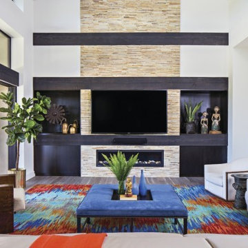
PRIMARY COLORS The Noakeses are not afraid of color, which found an outlet in the brilliant red, orange and blue of the Tufenkian Borealis Pacific Fire rug anchoring the living room. On the following spread, the homeowners’ art hangs on a dining room wall and is the soulmate to the living room rug’s deeply saturated colors as well as to the bright oranges in the wool and silk rug under the dining table.
Glamour is a driving force in the house, but it never overwhelms. As a backdrop in the dining room, golden Lori Weitzner wallpaper lines the display shelf where Perry and Suzy Noakes display treasures from their travels.
In the kitchen, a grouping of seeded blown glass cylinder pendants illuminates Bright Group stools and a generously proportioned island that’s big enough to seat eight guests.
The entry’s bright-red lacquered console is a place for the homeowners’ Buddha collection to get attention.
Pieces from Laura Britt’s sustainable furniture line Vervano populate the bedroom, including the Noakeses use for media storage.
Pieces from Laura Britt’s sustainable furniture line Vervano populate the bedroom, including the chair underneath the windows
The gray theme continues in the master bath, where vein-cut travertine slabs on the floor set off the sculptural flair of the bathtub.
“Homes didn’t mean anything to us,” says Perry Noakes, “except as a place to put our keys and get ready for the next journey.” The retired high-tech company executive and his wife, Suzy, are avid globe-trotters. The couple had also lived in Asia for 15 years as part of Perry’s work. Finding a place to live was a well-rehearsed exercise that figured into their system for settling in to a foreign country. But all that changed when Perry and Suzy decided to downsize to a new house in Austin. A friend told them about a spec house under construction, the project of a dream team of Austin-based design professionals that included builder Keith Husbands, architect Bob Wetmore of Cornerstone Architects, and interior designer Laura Britt and her staff. “We went to see it,” says Perry, “and loved it.” The couple quickly bought the framed-out 5,800-square-foot building.
The fact that the two-story dwelling was near a golf course was a bonus for the two golfers, but the low-slung four-bedroom, four-bath house also backs up onto a nature preserve. “The land offered us great opportunity to nestle the house into the topography, giving us both privacy and stunning views,” says Wetmore, who had to negotiate his design for the native stone, stucco and metal house to fit onto the steeply sloping and oddly elongated lot. The Hill Country contemporary house stretches out just below the rim of the slope, comfortably settled into the topography courtesy of terraced landscaping that defines the front approach to the house. “We turned a negative into a positive,” says Wetmore about the difficult site. The rough-and-ready landscape accounts for the building’s quiet dynamics, which Wetmore chronicled with the roofline, a series of horizontal areas that correspond to transitional spaces inside, interrupted by a clerestory that caps the entry and living room.
The process of taking a house from the framing stage to completion was a new experience for the couple. “We had never participated in the building process,” says Suzy. They threw themselves into it as if it were just another one of their adventures. “I think of it as my first project after I retired,” says Perry.
The budding design enthusiast so endeared himself to Britt that she and her staff awarded him with a beret to wear to design meetings, in honor of his artistic verve. “We were able to redesign a lot of the house since we came into the process so early,” says Suzy. “The house started as a spec house,” says Britt, “but it quickly became a custom home with the Noakeses’ involvement.”
Britt started the process by helping the couple select materials and lighting, opting for an earthy glamour that became the touchstone of the house. For pure wow factor, the living room’s stone and steel fireplace—sliced horizontally by three massive wood beams—is a tour de force of drama. In the kitchen, an oversize island (big enough to seat eight) is topped with a slab of dramatically veined marble; the countertops are a quieter quartzite. In the master bath, bold vein-cut travertine pavers on the floor are a counterpoint to the linear-cut mosaic tiles that back the vanity and reach all the way to the skylit ceiling. The pièce de résistance is the shimmering white pebble wall behind the free-standing tub that creates the effect of water frozen in free fall.
Britt used contrast as a backdrop to all the drama, opting for a forged metal chandelier in the shape of a lotus leaf in the entry—a worthy match to the darkened-steel front door. She designed a dining room table (through Vervano, her furniture design company) topped with patinaed steel; overhead, a massive steel-framed drum pendant with mica panels casts a delicate glow over the room. The designer was careful to leave wall space for the homeowners’ art collection, as well as to add space wherever possible. The dining room’s asymmetrical built-in is a place to display Buddhas and other pieces the couple has collected in their travels.
“We wanted this house to be about us and who we are,” says Suzy. That’s understandable since, after 16 previous homes that were really just places to live, the freedom of expression is obviously a thrill. Maybe even too much of a thrill—although this house is the couple’s dream home, they were completely enthralled with the design process. Could house No. 17 be the best and last? Maybe not. But if there is another house in the Noakeses’ future, one thing is certain, says Perry: “We won’t make a move without consulting Laura first.”
https://modernluxury.com/interiors-texas/story/smooth-move
 Irene Designs
This Master Suite while being spacious, was poorly planned in the beginning. Master Bathroom and Walk-in Closet were small relative to the Bedroom size. Bathroom, being a maze of turns, offered a poor traffic flow. It only had basic fixtures and was never decorated to look like a living space. Geometry of the Bedroom (long and stretched) allowed to use some of its' space to build two Walk-in Closets while the original walk-in closet space was added to adjacent Bathroom. New Master Bathroom layout has changed dramatically (walls, door, and fixtures moved). The new space was carefully planned for two people using it at once with no sacrifice to the comfort. New shower is huge. It stretches wall-to-wall and has a full length bench with granite top. Frame-less glass enclosure partially sits on the tub platform (it is a drop-in tub). Tiles on the walls and on the floor are of the same collection. Elegant, time-less, neutral - something you would enjoy for years. This selection leaves no boundaries on the decor. Beautiful open shelf vanity cabinet was actually made by the Home Owners! They both were actively involved into the process of creating their new oasis. New Master Suite has two separate Walk-in Closets. Linen closet which used to be a part of the Bathroom, is now accessible from the hallway. Master Bedroom, still big, looks stunning. It reflects taste and life style of the Home Owners and blends in with the overall style of the House. Some of the furniture in the Bedroom was also made by the Home Owners.
 Irene Designs
This Master Suite while being spacious, was poorly planned in the beginning. Master Bathroom and Walk-in Closet were small relative to the Bedroom size. Bathroom, being a maze of turns, offered a poor traffic flow. It only had basic fixtures and was never decorated to look like a living space. Geometry of the Bedroom (long and stretched) allowed to use some of its' space to build two Walk-in Closets while the original walk-in closet space was added to adjacent Bathroom. New Master Bathroom layout has changed dramatically (walls, door, and fixtures moved). The new space was carefully planned for two people using it at once with no sacrifice to the comfort. New shower is huge. It stretches wall-to-wall and has a full length bench with granite top. Frame-less glass enclosure partially sits on the tub platform (it is a drop-in tub). Tiles on the walls and on the floor are of the same collection. Elegant, time-less, neutral - something you would enjoy for years. This selection leaves no boundaries on the decor. Beautiful open shelf vanity cabinet was actually made by the Home Owners! They both were actively involved into the process of creating their new oasis. New Master Suite has two separate Walk-in Closets. Linen closet which used to be a part of the Bathroom, is now accessible from the hallway. Master Bedroom, still big, looks stunning. It reflects taste and life style of the Home Owners and blends in with the overall style of the House. Some of the furniture in the Bedroom was also made by the Home Owners.
 Tile Doctor Ltd
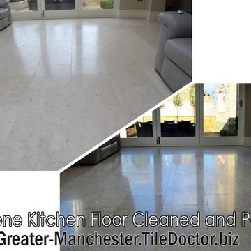
This beautiful Limestone kitchen tiled floor at a property in Peel Green was only a year old and, while it wasn’t in too bad of a state, the customer told me the floor had not been sealed properly due to issues with retaining moisture. The lack of an adequate sealer had allowed the Limestone to become duller over time after exposure to dirt and muck. It also had some more obvious marks and stains in some place and needed some grouting to be done around the corners and edges of the room.
I travelled to the property in Peel Green, which is within the Greater City of Salford in Greater Manchester, to see what could be done to restore the condition of the tiles.
Upon closer inspection of the tiles, I recommended to the customer that we proceed with the process known as burnishing, which we use primarily on Limestone, Marble, and Travertine. Burnishing, which involves the application of diamond encrusted burnishing pads, breaks down old sealers, gets rid of marks, stains and ingrained dirt, and gradually builds and evens out the polish on the tiles.
I started burnishing the Limestone kitchen tiles straight away when I arrived at the property as it was a big area and would require lots of hard work to achieve the desired results within the space of a day.
Our burnishing system consists of four diamond encrusted pads: Coarse, Medium, a Fine and Very Fine. Each pad was applied to the Limestone in sequence in tandem with a small amount of water to act as lubrication, gradually smoothing and polishing the surface of the tiles. After every pad, I also used my wet vac machine to remove any dirty water left on the floor and, after the Fine pad I rinsed the floor thoroughly to remove any dirt left on floor. I then left it to dry.
When I was satisfied that the floor was completely dry, it was time to seal the Limestone tiles. However, I first went over the floor with Very Fine grit pad to provide a final polish before sealing.
My choice of sealer was the impregnating Tile Doctor Colour Grow, a product which enhances the natural colours in the stone whilst also offering robust protection against dirt and stains. Remembering that the tiles had never been properly sealed, I applied plenty of sealer and left it to dry for 10 minutes. Following this, I carefully removed any excess sealer left on the surface with a dry cotton cloth. After sealing I went over the floor once final time with the Very Fine pad, just to smoothen things down and leave an exceptionally neat finish.
When the job was finished, I gave the owner some tips and recommendations on the cleaning of the floor going forward and a complimentary bottle of neutral cleaner to get them started.
The customer was very pleased with the finish, so much so that she opted and take up the Tile Doctor Maintenance Plan to keep the floor looking good for years to come! This involves popping round every 6-12 months to top up the sealer and give the floor a quick polish.
Tony Olmet
Greater Manchester Tile Doctor
 Tile Doctor Ltd
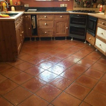
This Terracotta tiled floor was installed in the kitchen of a cottage in the small village of Maidford near Towcester. The tiles were not looking their best and the owner of the property realised it was time to do something about it and contacted Tile Doctor to have the floor stripped and resealed. Stripping and Sealing tile and stone floors is our bread and butter so I was more than happy to pop round and survey the floor which was approximately 9m2.
The grout had darkened with dirt and the previous tile sealer was failing so dirt was now getting ingrained in the Terracotta making it difficult to clean in places and leading to a patchy appearance. We discussed the work involved, my quote was accepted, and a date agreed for me to return and complete the work which would take two days, one to clean and one to seal.
After tidying up the Kitchen and removing the kickboards from underneath the kitchen units I set about working on cleaning and stripping the Terracotta floor of old sealers. To start I tested a small area with a strong dilution of Tile Doctor Wax Away. Wax was quite often used on Terracotta so I figured this product would be a good place to start. My suspicions were proved correct, and I found this to be the best product for removing the many layers of sealant on the floor. Wax Away is a new alkaline product by Tile Doctor and ideal for cleaning clay-based tiles such as Terracotta.
With my sights set on the rest of the floor Wax Away was scrubbed into the tile using a 17” rotary floor scrubbing machine and a black scrubbing pad running on a slow speed which helps to reduce splashing. This activity soon brought the dirt off the floor and the soiled cleaning solution was removed using a wet vacuum and the floor was rinsed down with clean water. The cleaning process was repeated a couple of times until I was happy with the floor, a stiff hand brush was then used along the grout lines with a dilution of Tile Doctor Pro-Clean to clean up the grout.
After rinsing and extracting the floor again the floor was inspected, and I noticed there were a few stubborn paint splashes on the tiles. I managed to remove these and these by spot treating the affected area with Tile Doctor Remove and Go and a steamer to lift the stain out of the clay tile. Once happy the floor was clean it was given a thorough rinse to neutralise it and remove any trace of cleaning products and then left it to dry.
I allowed the floor to dry for several days before returning to seal the Terracotta using numerous coats of Tile Doctor Seal and Go which is an ideal sealer for Terracotta and provides durable stain protection together with a low sheen finish. Terracotta is by its nature very porous and so it’s not unknown for it to take up to nine coats of sealer, which can take some time to apply as like paint you have to wait until it’s dry before it will take the next coat.
The customer was so impressed by the results I achieved in their kitchen they decided to go ahead and book me in to carry out this process throughout the whole of the ground floor which included lounge, study and hallway.
Phil Vissian
Northamptonshire Tile Doctor
 Irene Designs
This Master Suite while being spacious, was poorly planned in the beginning. Master Bathroom and Walk-in Closet were small relative to the Bedroom size. Bathroom, being a maze of turns, offered a poor traffic flow. It only had basic fixtures and was never decorated to look like a living space. Geometry of the Bedroom (long and stretched) allowed to use some of its' space to build two Walk-in Closets while the original walk-in closet space was added to adjacent Bathroom. New Master Bathroom layout has changed dramatically (walls, door, and fixtures moved). The new space was carefully planned for two people using it at once with no sacrifice to the comfort. New shower is huge. It stretches wall-to-wall and has a full length bench with granite top. Frame-less glass enclosure partially sits on the tub platform (it is a drop-in tub). Tiles on the walls and on the floor are of the same collection. Elegant, time-less, neutral - something you would enjoy for years. This selection leaves no boundaries on the decor. Beautiful open shelf vanity cabinet was actually made by the Home Owners! They both were actively involved into the process of creating their new oasis. New Master Suite has two separate Walk-in Closets. Linen closet which used to be a part of the Bathroom, is now accessible from the hallway. Master Bedroom, still big, looks stunning. It reflects taste and life style of the Home Owners and blends in with the overall style of the House. Some of the furniture in the Bedroom was also made by the Home Owners.

 Natural Stone Institute
When United Marble Fabricators was hired by builders Adams & Beasley Associates to furnish, fabricate, and install all of the stone and tile in this unique two-story penthouse within the Four Seasons in Boston’s Back
Bay, the immediate focus of nearly all parties involved was more on the stunning views of Boston Common than of the stone and tile surfaces that would eventually adorn the kitchen and bathrooms. That entire focus,
however, would quickly shift to the meticulously designed first floor wet bar nestled into the corner of the two-story living room.
Lewis Interiors and Adams & Beasley Associates designed a wet bar that would attract attention, specifying ¾ inch Honey Onyx for the bar countertop and full-height backsplash. LED panels would be installed
behind the backsplash to illuminate the entire surface without creating
any “hot spots” traditionally associated with backlighting of natural stone.
As the design process evolved, it was decided that the originally specified
glass shelves with wood nosing would be replaced with PPG Starphire
ultra-clear glass that was to be rabbeted into the ¾ inch onyx backsplash
so that the floating shelves would appear to be glowing as they floated,
uninterrupted by moldings of any other materials.
The team first crafted and installed the backsplash, which was fabricated
from shop drawings, delivered to the 15th floor by elevator, and installed
prior to any base cabinetry. The countertops were fabricated with a 2 inch
mitered edge with an eased edge profile, and a 4 inch backsplash was
installed to meet the illuminated full-height backsplash.
The spirit of collaboration was alive and well on this project as the skilled
fabricators and installers of both stone and millwork worked interdependently
with the singular goal of a striking wet bar that would captivate any and
all guests of this stunning penthouse unit and rival the sweeping views of
Boston Common
 Tile Doctor Ltd
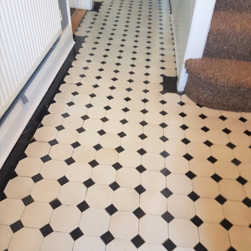
This enquiry from Neath came from an elderly gentleman who was moving into a care home in the near future and wanted his Victorian tiled hallway renovated before the property went on the market. He mentioned he didn’t think it was that dirty however it could do with a clean and reseal.
We arranged to call in one morning and take a look at the tiles and whilst there we completed a test clean so we could provide an accurate price for renovating the floor. For the clean I applied Tile Doctor Pro-Clean, the purpose of this was to see whether and how fast the dirt would shift and also to get an idea of the condition of the floor beneath the layer of dirt.
The test clean went well and the owner was happy to accept our price and suggested that as we had already made a start we might as well continue. Fortunately, there were two of us that day and I only had a couple of other quotes in the area, so I was able to crack on. I should mention this work was done at the beginning of 2020 before the COVID-19 lockdown.
All sorts of detritus gets walked into hallways so we began by using a hand held scraper to take off any anything that sat upon/above the floors surface. This also makes the cleaning process that little bit easier for us. The earlier test clean had enabled us to establish which cleaning methods and products would work best on the floor so it was just a question of putting the plan into action.
The process involved applying a strong dilution of Tile Doctor Pro-Clean to the floor, leaving it to soak in for ten minutes and then working it with a coarse 400-grit diamond pad fitted to a rotary buffer. More water was applied for lubrication where required and the soil produced afterwards was rinsed off and extracted with a wet vacuum. The pad is encrusted with industrial diamonds and cuts into the tile and removes a very thin layer leaving the tile very clean.
After extracting the soil, the floor was inspected, and we noticed that there were a few tiles throughout the floor that needed more work. To deal with these we used hand-held diamond blocks of varying grits to remove the ingrained dirt and bring the tiles back to life.
The client was over the moon with the results of the cleaning and we scheduled a date of the following week to come back and seal the tiles. We also discussed sealers and he had asked if we could leave the floor with a shiny finish. With that in mind we recommended Tile Doctors Seal and Go which works really well on Victorian tiles. It is also water based and so doesn’t produce a smell as it dries.
On our return the floor was given a quick wipe down and once dry sealed with four coats of Tile Doctor Seal and Go which will add protection and make them easy to keep clean.
Once complete the floor looked great and very welcoming, just what you need when selling a property as initial impressions always count.
Adrian Iacono
Swansea Tile Doctor
55