
Search results for "Process involves" in Home Design Ideas
 Klopf Architecture
Built for the Bluff, A Sea Ranch Home is Remade from the Inside Out
The house had always been grounded, on an ocean bluff at The Sea Ranch. It sits unencumbered, adjacent to one of the most dramatic stretches of the Sonoma coast with protected commons meadow to the east, uninterrupted Pacific views to the west, and a bluff trail running alongside. What it lacked was the feeling of home, one that could hold up its own against the natural landscape.
The owners are entrepreneurs with deep involvement across tech, real estate, and development and they know how things are built. The Sea Ranch house had been in their lives for years, a second residence and a place for family to gather. Built for a different time, it felt more compromising than comfortable. Sitting in a closed off nook, the kitchen fit one cook at a time and turned its back on the rest of the house. The entry was dim and compressed, divided by a structural column that presented itself at exactly the wrong moment. The primary suite was small relative to the view outside it. A large rear bedroom sat behind a lowered ceiling with a bathroom that had never been added. The house was certainly worth the trouble of doing it right.
What followed was not one project but four, each with its own design challenge, each addressed over a period of time.
Where the House Meets the Ocean
The most complex piece of the project, in both structural and spatial terms, was the kitchen expansion. The existing room was a single-person galley squeezed in as an afterthought with no meaningful connection to the dining room, the living space, or the deck outside. To make it useful for a family that cooks and gathers, it needed to grow outward into an existing patio and flow into the rooms around it.
A big challenge was the roofline. Several planes at different pitches and angles converged directly where additional volume was needed. A new form had to join that geometry without reading as a correction. The solution found the simplest possible connection between the existing angles, a roofline that from outside the structure, appears entirely original. From the bluff trail where the addition is visible, there is no discernible seam.
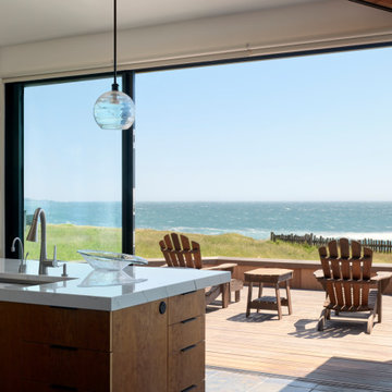
Inside, the kitchen is now open to the living and dining rooms without interruption. A large sliding glass door connects the space onto the rear deck. The deck itself was expanded and oriented so that the body of the house shields it from the coastal wind which is a common consideration that determines whether outdoor space at The Sea Ranch actually gets used. The result is a room that works for large family gatherings where no one feels cutoff, and one that makes the boundary between being inside and outside easy to ignore.
Welcoming Light
A structural column stood at the convergence of eight distinct roof planes in the entry. It was load-bearing, but it was also the reason the entry had always felt like a hallway rather than a welcoming arrival.
With the structural engineer, a custom steel connector was designed to receive beams from six separate directions, redistributing the load through a single new continuous beam. The column was surgically removed. Three triangular skylights were then cut into the roof above, their shapes drawn from the
existing geometry of the planes around them. The entry is now bright and open. The skylights feel native to the structure because they follow the logic already present in the roof.
Two Suites, Two Views
At opposite ends of the house, the two bedroom suites were each reconfigured, and each found a different way to introduce more of the landscape into the room.
An addition to the primary suite extended the structure outward to create a wraparound plan with a loop from the bedroom through bath and closet that had not been possible before. The expansion opened a slot view from the tub and shower toward the ocean. The view is precise and private. The ocean view is present and deliberate.
The rear bedroom absorbed an adjacent storage room to transform it into a full second suite with a vaulted ceiling, a large bathroom with a tub, a shower, and a sauna. A private fenced garden courtyard sits just beyond the glass bringing the outdoors inside. The tub was placed so that, looking past the courtyard and through the bedroom beyond, the ocean is visible at the far end. It is a long view and it makes the room feel larger and more settled than its footprint would suggest.
Glass on Four Sides, Fire at the Center
The main living and gathering room had always been caught between two competing facts: glass on four sides meant exceptional views but at The Sea Ranch, it also meant a cold room. A 360-degree cylindrical fireplace was added at the center on a raised stone base, providing radiant heat in every direction and giving the room a focal point around which a group naturally orients itself, whether that means two people at the end of the day or the whole family after dinner.
Owners Who Picked Up the Tools
The owner was not a passive client. they came with construction knowledge, specific ideas, and the desire to be an active part of the process, a dynamic that other architects may had found difficult, which Klopf Architecture accepted as an asset. They took it upon themselves to complete some of the work during construction, including the installation of a new radiant heating system beneath the floors.
The radiant system added to the older and less-desirable forced-air setup. At The Sea Ranch, that change matters as the house sits close enough to the ocean and moving air competes with the sound of it, where radiant heat does not. Solar panels were added to the roof as part of the new system. Insulation was upgraded throughout the walls, roof, and crawl space. The house that had always had the right setting now holds warmth the way a house on the bluff should.
They were also deeply involved in the design and selections throughout, and the finished house reflects both of them in ways that are specific rather than generic. The process took longer and moved through more iterations than a more arms-length relationship might have allowed. The result is more defined and personal because of it.
The Landscape Holds Priority
Every exterior decision was shaped by The Sea Ranch Design Standards, which require that buildings defer to the landscape around them rather than compete with it. Because this house sits on the bluff and is visible from the public trail, the additions faced a close review. Existing materials were matched. Geometries were resolved. The additions had to become indistinguishable from the original building.
From the trail, the house reads exactly as it always has — low, cedar-clad, secondary to the meadow and the water. The setting holds priority. Inside, the house has been remade.
Klopf Architecture Project Team: Geoff Campen and Trenton Jewett
Contractor: Shawn Bettega Construction
Photography: ©2025 Mariko Reed
Year Completed: 2023
Location: The Sea Ranch, CA
 Klopf Architecture
Built for the Bluff, A Sea Ranch Home is Remade from the Inside Out
The house had always been grounded, on an ocean bluff at The Sea Ranch. It sits unencumbered, adjacent to one of the most dramatic stretches of the Sonoma coast with protected commons meadow to the east, uninterrupted Pacific views to the west, and a bluff trail running alongside. What it lacked was the feeling of home, one that could hold up its own against the natural landscape.
The owners are entrepreneurs with deep involvement across tech, real estate, and development and they know how things are built. The Sea Ranch house had been in their lives for years, a second residence and a place for family to gather. Built for a different time, it felt more compromising than comfortable. Sitting in a closed off nook, the kitchen fit one cook at a time and turned its back on the rest of the house. The entry was dim and compressed, divided by a structural column that presented itself at exactly the wrong moment. The primary suite was small relative to the view outside it. A large rear bedroom sat behind a lowered ceiling with a bathroom that had never been added. The house was certainly worth the trouble of doing it right.
What followed was not one project but four, each with its own design challenge, each addressed over a period of time.
Where the House Meets the Ocean
The most complex piece of the project, in both structural and spatial terms, was the kitchen expansion. The existing room was a single-person galley squeezed in as an afterthought with no meaningful connection to the dining room, the living space, or the deck outside. To make it useful for a family that cooks and gathers, it needed to grow outward into an existing patio and flow into the rooms around it.
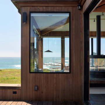
A big challenge was the roofline. Several planes at different pitches and angles converged directly where additional volume was needed. A new form had to join that geometry without reading as a correction. The solution found the simplest possible connection between the existing angles, a roofline that from outside the structure, appears entirely original. From the bluff trail where the addition is visible, there is no discernible seam.
Inside, the kitchen is now open to the living and dining rooms without interruption. A large sliding glass door connects the space onto the rear deck. The deck itself was expanded and oriented so that the body of the house shields it from the coastal wind which is a common consideration that determines whether outdoor space at The Sea Ranch actually gets used. The result is a room that works for large family gatherings where no one feels cutoff, and one that makes the boundary between being inside and outside easy to ignore.
Welcoming Light
A structural column stood at the convergence of eight distinct roof planes in the entry. It was load-bearing, but it was also the reason the entry had always felt like a hallway rather than a welcoming arrival.
With the structural engineer, a custom steel connector was designed to receive beams from six separate directions, redistributing the load through a single new continuous beam. The column was surgically removed. Three triangular skylights were then cut into the roof above, their shapes drawn from the
existing geometry of the planes around them. The entry is now bright and open. The skylights feel native to the structure because they follow the logic already present in the roof.
Two Suites, Two Views
At opposite ends of the house, the two bedroom suites were each reconfigured, and each found a different way to introduce more of the landscape into the room.
An addition to the primary suite extended the structure outward to create a wraparound plan with a loop from the bedroom through bath and closet that had not been possible before. The expansion opened a slot view from the tub and shower toward the ocean. The view is precise and private. The ocean view is present and deliberate.
The rear bedroom absorbed an adjacent storage room to transform it into a full second suite with a vaulted ceiling, a large bathroom with a tub, a shower, and a sauna. A private fenced garden courtyard sits just beyond the glass bringing the outdoors inside. The tub was placed so that, looking past the courtyard and through the bedroom beyond, the ocean is visible at the far end. It is a long view and it makes the room feel larger and more settled than its footprint would suggest.
Glass on Four Sides, Fire at the Center
The main living and gathering room had always been caught between two competing facts: glass on four sides meant exceptional views but at The Sea Ranch, it also meant a cold room. A 360-degree cylindrical fireplace was added at the center on a raised stone base, providing radiant heat in every direction and giving the room a focal point around which a group naturally orients itself, whether that means two people at the end of the day or the whole family after dinner.
Owners Who Picked Up the Tools
The owner was not a passive client. they came with construction knowledge, specific ideas, and the desire to be an active part of the process, a dynamic that other architects may had found difficult, which Klopf Architecture accepted as an asset. They took it upon themselves to complete some of the work during construction, including the installation of a new radiant heating system beneath the floors.
The radiant system added to the older and less-desirable forced-air setup. At The Sea Ranch, that change matters as the house sits close enough to the ocean and moving air competes with the sound of it, where radiant heat does not. Solar panels were added to the roof as part of the new system. Insulation was upgraded throughout the walls, roof, and crawl space. The house that had always had the right setting now holds warmth the way a house on the bluff should.
They were also deeply involved in the design and selections throughout, and the finished house reflects both of them in ways that are specific rather than generic. The process took longer and moved through more iterations than a more arms-length relationship might have allowed. The result is more defined and personal because of it.
The Landscape Holds Priority
Every exterior decision was shaped by The Sea Ranch Design Standards, which require that buildings defer to the landscape around them rather than compete with it. Because this house sits on the bluff and is visible from the public trail, the additions faced a close review. Existing materials were matched. Geometries were resolved. The additions had to become indistinguishable from the original building.
From the trail, the house reads exactly as it always has — low, cedar-clad, secondary to the meadow and the water. The setting holds priority. Inside, the house has been remade.
Klopf Architecture Project Team: Geoff Campen and Trenton Jewett
Contractor: Shawn Bettega Construction
Photography: ©2025 Mariko Reed
Year Completed: 2023
Location: The Sea Ranch, CA
 Klopf Architecture
Built for the Bluff, A Sea Ranch Home is Remade from the Inside Out
The house had always been grounded, on an ocean bluff at The Sea Ranch. It sits unencumbered, adjacent to one of the most dramatic stretches of the Sonoma coast with protected commons meadow to the east, uninterrupted Pacific views to the west, and a bluff trail running alongside. What it lacked was the feeling of home, one that could hold up its own against the natural landscape.
The owners are entrepreneurs with deep involvement across tech, real estate, and development and they know how things are built. The Sea Ranch house had been in their lives for years, a second residence and a place for family to gather. Built for a different time, it felt more compromising than comfortable. Sitting in a closed off nook, the kitchen fit one cook at a time and turned its back on the rest of the house. The entry was dim and compressed, divided by a structural column that presented itself at exactly the wrong moment. The primary suite was small relative to the view outside it. A large rear bedroom sat behind a lowered ceiling with a bathroom that had never been added. The house was certainly worth the trouble of doing it right.
What followed was not one project but four, each with its own design challenge, each addressed over a period of time.
Where the House Meets the Ocean
The most complex piece of the project, in both structural and spatial terms, was the kitchen expansion. The existing room was a single-person galley squeezed in as an afterthought with no meaningful connection to the dining room, the living space, or the deck outside. To make it useful for a family that cooks and gathers, it needed to grow outward into an existing patio and flow into the rooms around it.
A big challenge was the roofline. Several planes at different pitches and angles converged directly where additional volume was needed. A new form had to join that geometry without reading as a correction. The solution found the simplest possible connection between the existing angles, a roofline that from outside the structure, appears entirely original. From the bluff trail where the addition is visible, there is no discernible seam.
Inside, the kitchen is now open to the living and dining rooms without interruption. A large sliding glass door connects the space onto the rear deck. The deck itself was expanded and oriented so that the body of the house shields it from the coastal wind which is a common consideration that determines whether outdoor space at The Sea Ranch actually gets used. The result is a room that works for large family gatherings where no one feels cutoff, and one that makes the boundary between being inside and outside easy to ignore.
Welcoming Light
A structural column stood at the convergence of eight distinct roof planes in the entry. It was load-bearing, but it was also the reason the entry had always felt like a hallway rather than a welcoming arrival.
With the structural engineer, a custom steel connector was designed to receive beams from six separate directions, redistributing the load through a single new continuous beam. The column was surgically removed. Three triangular skylights were then cut into the roof above, their shapes drawn from the
existing geometry of the planes around them. The entry is now bright and open. The skylights feel native to the structure because they follow the logic already present in the roof.
Two Suites, Two Views
At opposite ends of the house, the two bedroom suites were each reconfigured, and each found a different way to introduce more of the landscape into the room.
An addition to the primary suite extended the structure outward to create a wraparound plan with a loop from the bedroom through bath and closet that had not been possible before. The expansion opened a slot view from the tub and shower toward the ocean. The view is precise and private. The ocean view is present and deliberate.
The rear bedroom absorbed an adjacent storage room to transform it into a full second suite with a vaulted ceiling, a large bathroom with a tub, a shower, and a sauna. A private fenced garden courtyard sits just beyond the glass bringing the outdoors inside. The tub was placed so that, looking past the courtyard and through the bedroom beyond, the ocean is visible at the far end. It is a long view and it makes the room feel larger and more settled than its footprint would suggest.
Glass on Four Sides, Fire at the Center
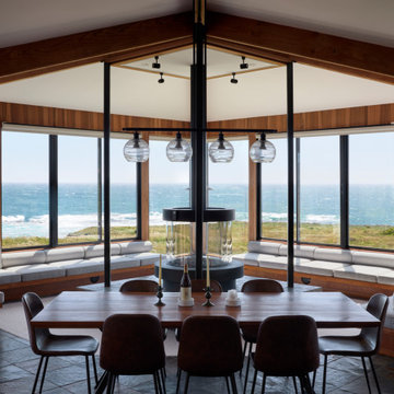
The main living and gathering room had always been caught between two competing facts: glass on four sides meant exceptional views but at The Sea Ranch, it also meant a cold room. A 360-degree cylindrical fireplace was added at the center on a raised stone base, providing radiant heat in every direction and giving the room a focal point around which a group naturally orients itself, whether that means two people at the end of the day or the whole family after dinner.
Owners Who Picked Up the Tools
The owner was not a passive client. they came with construction knowledge, specific ideas, and the desire to be an active part of the process, a dynamic that other architects may had found difficult, which Klopf Architecture accepted as an asset. They took it upon themselves to complete some of the work during construction, including the installation of a new radiant heating system beneath the floors.
The radiant system added to the older and less-desirable forced-air setup. At The Sea Ranch, that change matters as the house sits close enough to the ocean and moving air competes with the sound of it, where radiant heat does not. Solar panels were added to the roof as part of the new system. Insulation was upgraded throughout the walls, roof, and crawl space. The house that had always had the right setting now holds warmth the way a house on the bluff should.
They were also deeply involved in the design and selections throughout, and the finished house reflects both of them in ways that are specific rather than generic. The process took longer and moved through more iterations than a more arms-length relationship might have allowed. The result is more defined and personal because of it.
The Landscape Holds Priority
Every exterior decision was shaped by The Sea Ranch Design Standards, which require that buildings defer to the landscape around them rather than compete with it. Because this house sits on the bluff and is visible from the public trail, the additions faced a close review. Existing materials were matched. Geometries were resolved. The additions had to become indistinguishable from the original building.
From the trail, the house reads exactly as it always has — low, cedar-clad, secondary to the meadow and the water. The setting holds priority. Inside, the house has been remade.
Klopf Architecture Project Team: Geoff Campen and Trenton Jewett
Contractor: Shawn Bettega Construction
Photography: ©2025 Mariko Reed
Year Completed: 2023
Location: The Sea Ranch, CA
Find the right local pro for your project
 Klopf Architecture
Built for the Bluff, A Sea Ranch Home is Remade from the Inside Out
The house had always been grounded, on an ocean bluff at The Sea Ranch. It sits unencumbered, adjacent to one of the most dramatic stretches of the Sonoma coast with protected commons meadow to the east, uninterrupted Pacific views to the west, and a bluff trail running alongside. What it lacked was the feeling of home, one that could hold up its own against the natural landscape.
The owners are entrepreneurs with deep involvement across tech, real estate, and development and they know how things are built. The Sea Ranch house had been in their lives for years, a second residence and a place for family to gather. Built for a different time, it felt more compromising than comfortable. Sitting in a closed off nook, the kitchen fit one cook at a time and turned its back on the rest of the house. The entry was dim and compressed, divided by a structural column that presented itself at exactly the wrong moment. The primary suite was small relative to the view outside it. A large rear bedroom sat behind a lowered ceiling with a bathroom that had never been added. The house was certainly worth the trouble of doing it right.
What followed was not one project but four, each with its own design challenge, each addressed over a period of time.
Where the House Meets the Ocean
The most complex piece of the project, in both structural and spatial terms, was the kitchen expansion. The existing room was a single-person galley squeezed in as an afterthought with no meaningful connection to the dining room, the living space, or the deck outside. To make it useful for a family that cooks and gathers, it needed to grow outward into an existing patio and flow into the rooms around it.
A big challenge was the roofline. Several planes at different pitches and angles converged directly where additional volume was needed. A new form had to join that geometry without reading as a correction. The solution found the simplest possible connection between the existing angles, a roofline that from outside the structure, appears entirely original. From the bluff trail where the addition is visible, there is no discernible seam.
Inside, the kitchen is now open to the living and dining rooms without interruption. A large sliding glass door connects the space onto the rear deck. The deck itself was expanded and oriented so that the body of the house shields it from the coastal wind which is a common consideration that determines whether outdoor space at The Sea Ranch actually gets used. The result is a room that works for large family gatherings where no one feels cutoff, and one that makes the boundary between being inside and outside easy to ignore.
Welcoming Light
A structural column stood at the convergence of eight distinct roof planes in the entry. It was load-bearing, but it was also the reason the entry had always felt like a hallway rather than a welcoming arrival.
With the structural engineer, a custom steel connector was designed to receive beams from six separate directions, redistributing the load through a single new continuous beam. The column was surgically removed. Three triangular skylights were then cut into the roof above, their shapes drawn from the
existing geometry of the planes around them. The entry is now bright and open. The skylights feel native to the structure because they follow the logic already present in the roof.
Two Suites, Two Views
At opposite ends of the house, the two bedroom suites were each reconfigured, and each found a different way to introduce more of the landscape into the room.
An addition to the primary suite extended the structure outward to create a wraparound plan with a loop from the bedroom through bath and closet that had not been possible before. The expansion opened a slot view from the tub and shower toward the ocean. The view is precise and private. The ocean view is present and deliberate.
The rear bedroom absorbed an adjacent storage room to transform it into a full second suite with a vaulted ceiling, a large bathroom with a tub, a shower, and a sauna. A private fenced garden courtyard sits just beyond the glass bringing the outdoors inside. The tub was placed so that, looking past the courtyard and through the bedroom beyond, the ocean is visible at the far end. It is a long view and it makes the room feel larger and more settled than its footprint would suggest.
Glass on Four Sides, Fire at the Center
The main living and gathering room had always been caught between two competing facts: glass on four sides meant exceptional views but at The Sea Ranch, it also meant a cold room. A 360-degree cylindrical fireplace was added at the center on a raised stone base, providing radiant heat in every direction and giving the room a focal point around which a group naturally orients itself, whether that means two people at the end of the day or the whole family after dinner.
Owners Who Picked Up the Tools
The owner was not a passive client. they came with construction knowledge, specific ideas, and the desire to be an active part of the process, a dynamic that other architects may had found difficult, which Klopf Architecture accepted as an asset. They took it upon themselves to complete some of the work during construction, including the installation of a new radiant heating system beneath the floors.
The radiant system added to the older and less-desirable forced-air setup. At The Sea Ranch, that change matters as the house sits close enough to the ocean and moving air competes with the sound of it, where radiant heat does not. Solar panels were added to the roof as part of the new system. Insulation was upgraded throughout the walls, roof, and crawl space. The house that had always had the right setting now holds warmth the way a house on the bluff should.
They were also deeply involved in the design and selections throughout, and the finished house reflects both of them in ways that are specific rather than generic. The process took longer and moved through more iterations than a more arms-length relationship might have allowed. The result is more defined and personal because of it.
The Landscape Holds Priority
Every exterior decision was shaped by The Sea Ranch Design Standards, which require that buildings defer to the landscape around them rather than compete with it. Because this house sits on the bluff and is visible from the public trail, the additions faced a close review. Existing materials were matched. Geometries were resolved. The additions had to become indistinguishable from the original building.
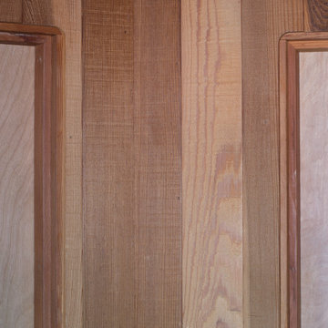
From the trail, the house reads exactly as it always has — low, cedar-clad, secondary to the meadow and the water. The setting holds priority. Inside, the house has been remade.
Klopf Architecture Project Team: Geoff Campen and Trenton Jewett
Contractor: Shawn Bettega Construction
Photography: ©2025 Mariko Reed
Year Completed: 2023
Location: The Sea Ranch, CA
 Tile Doctor Ltd
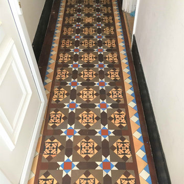
This client owned a property in Haringey, North London, which had a classic Victorian tiled floor laid in the hallway. Unfortunately, the floor was in a bad state, the tiles were dull and dirty and there was a missing section by the bottom of the stairs that had been back filled with cement. Fortunately for him however his neighbour decided to remove their front path which was made with matching tiles and so he was able acquire replacements from him. He then contacted us to see if we could use those tiles to fill in the missing ones and revive the whole floor with a clean and seal at the same time.
Before quoting for the restoration work, I paid a visit to the property to survey the floor. I can give quotes from photographs, but much prefer to visit and conduct a test clean, and in this case, I was able to check the spare tiles he had acquired. From that I emailed a quote which the client was happy with, so we arranged a date to return and do the work.
This was a large job, so I teamed up with Jackson Davis the Central London Tile Doctor and whilst Jackson started on cleaning the floor, I took the reclaimed tiles outside and carefully grinded off the excess cement and adhesive from them and cleaned them by hand. We managed to do this by about 3pm. Jackson and I work on a lot of jobs together so it made sense to work as a bubble from the beginning of Covid so we could continue to work together, with two of us on the job it also means we can get the job done quicker.
Cleaning the floor involved applying a 200-grit diamond burnishing pad to the tile lubricated with a strong dilution of Tile Doctor Remove and Go, the slurry was then rinsed off the floor with more water and then extracted with an industrial vacuum. The process was repeated on stubborn areas until we were satisfied the tiles were really clean.
We then moved onto carefully removing the cement from the floor at the bottom of the stairs and cleaning up the base. Once done the newly renovated replacement tiles were laid in place using a rapid setting adhesive which meant they could be grouted later that day before heading home. The floor was then left overnight to dry off.
We then returned the following day and took some moisture readings with the damp meter. The readings were within the expected range, so we were good to go ahead and apply the sealer. If the floor is not dry the seal will not cure properly, and this can lead to a patchy finish.
Three coats of Tile Doctor Colour Grow were applied to seal the tiles. This is a colour intensifying impregnating sealer that works from with and will gives the Victorian tiles durable protection, ideal for a high traffic area such as the hallway. In addition, Colour Grow is a fully breathable sealer so it will allow for moisture to rise through the tile and evaporate, this is critical for floors of this age that will not have the benefit of a damp proof membrane installed under the floor.
The hallway is now looking transformed by the work we did, we certainly thought so, but more importantly our client was very happy with the result and now has the floor he hoped for.
Andrew Newstead
North London Tile Doctor
 RTA Cabinet Supply LLC
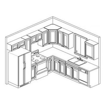
Most modern kitchens are larger than 10X10 and most 10X10 kitchens cost more than the above set because they usually include moldings, glass doors, taller wall cabinets, pantry cabinets and other items not included in the set above. Please consider 10X10 kitchen as a cost measure to get ideas on how much product line costs more or less over the other. Each kitchen is unique and usually requires custom set of cabinets.
 Tile Doctor Ltd
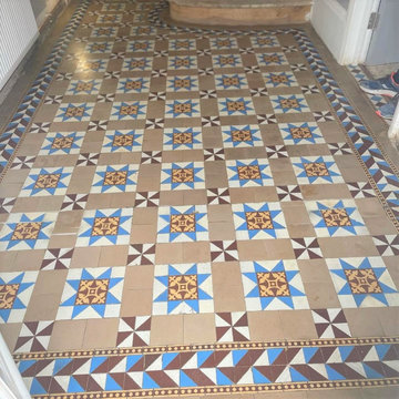
These pictures of a Victorian Tiled Hallway are from a property in Canterbury that was once a nursing home and was now being renovated to become a children’s home. The building was being gutted and extended at the same time and when the carpet was pulled up in the hallway, they were surprised to find a relatively intact Victorian tiled floor underneath.
Whilst they thought it bizarre that anyone would want to cover up such an attractive floor the carpet had protected it over the years. They realized it would make a marvellous feature at the entrance to the property, but professional restoration would be needed to do it justice. After a bit of research, they came across Tile Doctor and got in touch.
Canterbury comes under my North Kent designation, so I went to visit the property and survey the floor and quote for doing the restoration. There were a few missing and loose tiles that would need replacing and refixing also there was a lot of ingrained dirt so a deep clean and application of a new sealer would be required. I gave them a price for the work which they readily accepted, and we arranged a suitable time to carry out the work. Subject to the building schedule I had calculated the floor would take three days to restore.
On the first day I set about replacing and re-fixing the missing, broken, and loose tiles. This is delicate work as you need to extract the old tile without disturbing its neighbours and then clean up the area ready for its replacement. Being a Tile Doctor I keep a selection of stock tiles for repairs, some are reclaimed, and some are replica. Also, there are several companies still making Victorian style tiles so I can usually source what I need.
After the individual missing and broken tiles had been replaced and the adhesive had set, it was then a matter of renovating the floor as a whole. The tiles were covered in a thick layer of carpet adhesive which needed a combination of specialist tools and products to remove. First, a liberal layer of Tile Doctor Remove and Go was applied and left to dwell for thirty minutes. Next, Tile Doctor Pro-Clean was added and scrubbed in with a black pad.
This process softened the adhesive sufficiently in readiness for the next stage which involves using a set of diamond burnishing pads on a weighted buffing machine. Several applications were needed, each time with a successively finer grade of diamond pad and rinsing off the slurry in between. The tiles were first milled using a very coarse 50-grit pad, followed by 100, 200 and finally burnished with a 400-grit burnishing pads. This removed all the adhesive and dirt in the tiles, which was cleaned up using the wet vacuum.
Old Victorian floors like this do not have a damp proof membrane installed under the floor, and with a lot of water being used in the cleaning process I was concerned White efflorescence salts could appear later as the floor dried. To counter this, I gave the floor an acid wash using Tile Doctor Acid Gel to counter and dissolve the salts, it also gives the tiles another clean and will remove any old grout smears further improving the appearance of the tiles. Once done the floor was left to dry overnight.
On my return I tested the floor was dry by taking several moisture readings around the floor with a damp meter. Applying sealer to a damp floor is never advised and can lead to clouding and an unwanted finish.
Happy that the tiles were dry, a single coat of Tile Doctor Colour Grow sealer was applied. This is an impregnating sealer with a colour enhancing component to ‘lift’ the stronger colours of the floor. Colour Grow however does leave a matt appearance and as the client had asked for a shiny finish it was topped up with five coats of Tile Doctor Seal and Go. This is a compatible topical sealer which added a mid to high sheen.
By the end of the third day the Victorian floor looked brand new, and I received the following feedback from the client. Its rare to receive feedback from commercial customers so they were clearly overwhelmed with the transformation.
Did not think this glued covered bad old floor could look sooooo good Fabulous Fantastic job Looks Amazing Thank you
For aftercare I recommend the use of Tile Doctor Neutral Cleaner which isn’t as harsh as many of the products you find in supermarket. Stronger products can actually strip off the sealer over time leaving it vulnerable to dirt and detracting from its appearance.
Graham Davis
North Kent Tile Doctor

 Gallery KBNY
This brownstone renovation was a full gut project in every sense of the word. On top of installing new floors, a kitchen and bath renovation, and all the typical restoration and refinishing involved in a brownstone built in 1899, we also completely updated the exterior, constructed a balcony that was not originally there, and converted the space from a single-family home into an an owner’s triplex. A newly separated studio rental on the garden level offers the opportunity for supplemental income, an uncommon and welcome addition to a New York brownstone.
A TRANSITIONAL GEM
The result is a two-family brownstone that perfectly combines classic townhouse living with today’s modern needs, including SmartHome technology that we installed to control Bluetooth speakers, Nest thermostats, and the security system.
The overall aesthetic goal was to pay homage to the historical periods the brownstone has lived through in a cohesive way that is the hallmark of modern transitional style.
In the kitchen, white Shaker-style cabinetry, a subway tile backsplash, and marble rather than quartz countertops bring a classically upscale sensibility. To modernize the space further, we opened up the back wall to create floor-to-ceiling windows that are also doors, opening up into the newly built balcony.
TIMELY TOUCHES
This brownstone renovation included many quintessential elements, such as millwork like the ceiling medallions. We restored some and custom built others, perfectly recreating their original appearance.
The heated master bathroom is now serene, with a walk-in shower featuring a subtly modern linear drain. A herringbone Carrera marble tiled floor and marble slab sink complete the scene. In the powder room, we embraced a contemporary look by pairing dark hexagonal floors with light chevron tiles, accented with dramatic navy blue wallpaper. With its clear-cut 1920s-style, we selected the wall sconce to reference one of the brownstone’s earlier eras.
DESIGN DETAILS
Natural oak herringbone floors we installed throughout the entire home bring a modern yet warm touch. We restored the wood-burning marble fireplace, which is fully functioning. An elegant staircase with a custom-crafted black wooden banister and white balusters winds up and down alongside a real brick interior wall that we restored and refinished.
In this brownstone renovation, we were also able to create ceiling height, an unexpected yet aesthetically pleasing side benefit. When working on the joists and beams to level out the floors (a common issue in pre-war renovations) we added ceiling height in the main parlor floor by taking the second floor and raising the ceiling an entire foot. The end result is a main floor with stunning 9-foot ceilings.
SOME HIGHLIGHTS
- Solid natural oak herringbone floors throughout
- A fully restored, refinished, and functioning wood burning fireplace with a marble mantle
- Complete exterior renovation of the facade, cornices, windows, mouldings, and even the ironwork, including the railings leading up to the stoop and those facing the street
- A brand new central air and heating system with uniquely modern vents – look above the couch in the living room with the fuzzy rug and large painting
Considering a brownstone renovation? Contact us today! We specialize in brownstone renovations in New York as well as all pre-war apartments. When you work with a design-and-build firm like Gallery to renovate your brownstone, you get the full range of our expertise in working with all the finest details and pre-war architectural elements of these classic New York spaces. We also handle every step of the process, from filing permits and organizing schedules to sourcing custom pieces and building entirely new rooms (or even balconies). Call us for a free initial consultation when you’re ready.

 Concepts The Cabinet Shop
Morgan Albers
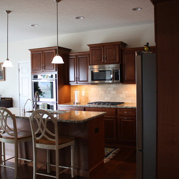
Eat-in kitchen - mid-sized traditional l-shaped dark wood floor eat-in kitchen idea in Indianapolis with an undermount sink, raised-panel cabinets, medium tone wood cabinets, granite countertops, beige backsplash, stainless steel appliances and an island
Eat-in kitchen - mid-sized traditional l-shaped dark wood floor eat-in kitchen idea in Indianapolis with an undermount sink, raised-panel cabinets, medium tone wood cabinets, granite countertops, beige backsplash, stainless steel appliances and an island

 Daniel Scerri Periti
We were approached with a request to design the furnishings for an existing ‘finished’ apartment. The intention was to move in relatively fast, and the property already had an existing marble floor, kitchen and bathrooms which had to be kept. The property also boasted a fantastic 270 degree view, seen from most of the apartment. The clients had a very important role in the completion of the project. They were very involved during the design process and through various decoration choices. The final design was kept as a rigid guideline when faced with picking out all the different elements.
Once clear of all previous furniture, the space felt cold and bare; so we immediately felt the need for warmth, and raw, natural elements and textures to complement the cold marble floor while visually tying in the design of the whole apartment together.
Since the existing kitchen had a touch of dark walnut stain, we felt this material was one we should add to the palette of materials to contest the stark materials. A raw cement finish was another material we felt would add an interesting contrast and could be used in a variety of ways, from cabinets to walls and ceilings, to tie up the design of various areas of the apartment.
To warm up the living/dining area, keeping the existing marble floor but visually creating zones within the large living/dining area without hindering the flow, a dark timber custom-made soffit, continuous with a floor-to-ceiling drinks cabinet zones the dining area, giving it a degree of much-needed warmth.
The various windows with a stupendous 270 degree view needed to be visually tied together. This was done by introducing a continuous sheer [drape] which also doubled up as a sound-absorbing material along 2 of the 4 walls of the space.
A very large sofa was required to fill up the space correctly, also required for the size of the young family.
Services were integrated within the units and soffits, while a customized design in the corner between the kitchen and the living room took into consideration the viewpoints from the main areas to create a pantry without hindering the flow or views. A strategically placed floor-to-ceiling mirror doubles up the space and extends the view to the inner parts of the apartment.
The daughter’s bedroom was a small challenge in itself, and a fun task, where we wanted to achieve the perception of a cozy niche with its own enclosed reading nook [for reading fairy tales], behind see-through curtains and a custom-ordered wall print sporting the girl’s favorite colors.
The sons’ bedroom had double the requirements in terms of space needed: more wardrobe, more homework desk space, a tv/play station area… “We combined a raised platform area between the boys’ beds to become an area with cushions where the kids can lay down and play, and face a hidden screen behind the homework desk’s sliding back panel for their play station”. The color of the homework desk was chosen in relation to the boys’ ages. A more masculine material palette was chosen for this room, in contrast to the light pastel palette of the girl’s bedroom. Again, this colour can easily be changed over time for a more mature look.
PROJECT DATA:
St. Paul’s Bay, Malta
DESIGN TEAM:
Perit Rebecca Zammit, Perit Daniel Scerri, Elyse Tonna
OTHER CREDITS:
Photography: Tonio Lombardi
Styling : TKS
 Daniel Scerri Periti
We were approached with a request to design the furnishings for an existing ‘finished’ apartment. The intention was to move in relatively fast, and the property already had an existing marble floor, kitchen and bathrooms which had to be kept. The property also boasted a fantastic 270 degree view, seen from most of the apartment. The clients had a very important role in the completion of the project. They were very involved during the design process and through various decoration choices. The final design was kept as a rigid guideline when faced with picking out all the different elements.
Once clear of all previous furniture, the space felt cold and bare; so we immediately felt the need for warmth, and raw, natural elements and textures to complement the cold marble floor while visually tying in the design of the whole apartment together.
Since the existing kitchen had a touch of dark walnut stain, we felt this material was one we should add to the palette of materials to contest the stark materials. A raw cement finish was another material we felt would add an interesting contrast and could be used in a variety of ways, from cabinets to walls and ceilings, to tie up the design of various areas of the apartment.
To warm up the living/dining area, keeping the existing marble floor but visually creating zones within the large living/dining area without hindering the flow, a dark timber custom-made soffit, continuous with a floor-to-ceiling drinks cabinet zones the dining area, giving it a degree of much-needed warmth.
The various windows with a stupendous 270 degree view needed to be visually tied together. This was done by introducing a continuous sheer [drape] which also doubled up as a sound-absorbing material along 2 of the 4 walls of the space.
A very large sofa was required to fill up the space correctly, also required for the size of the young family.
Services were integrated within the units and soffits, while a customized design in the corner between the kitchen and the living room took into consideration the viewpoints from the main areas to create a pantry without hindering the flow or views. A strategically placed floor-to-ceiling mirror doubles up the space and extends the view to the inner parts of the apartment.
The daughter’s bedroom was a small challenge in itself, and a fun task, where we wanted to achieve the perception of a cozy niche with its own enclosed reading nook [for reading fairy tales], behind see-through curtains and a custom-ordered wall print sporting the girl’s favorite colors.
The sons’ bedroom had double the requirements in terms of space needed: more wardrobe, more homework desk space, a tv/play station area… “We combined a raised platform area between the boys’ beds to become an area with cushions where the kids can lay down and play, and face a hidden screen behind the homework desk’s sliding back panel for their play station”. The color of the homework desk was chosen in relation to the boys’ ages. A more masculine material palette was chosen for this room, in contrast to the light pastel palette of the girl’s bedroom. Again, this colour can easily be changed over time for a more mature look.
PROJECT DATA:
St. Paul’s Bay, Malta
DESIGN TEAM:
Perit Rebecca Zammit, Perit Daniel Scerri, Elyse Tonna
OTHER CREDITS:
Photography: Tonio Lombardi
Styling : TKS
 Daniel Scerri Periti
We were approached with a request to design the furnishings for an existing ‘finished’ apartment. The intention was to move in relatively fast, and the property already had an existing marble floor, kitchen and bathrooms which had to be kept. The property also boasted a fantastic 270 degree view, seen from most of the apartment. The clients had a very important role in the completion of the project. They were very involved during the design process and through various decoration choices. The final design was kept as a rigid guideline when faced with picking out all the different elements.
Once clear of all previous furniture, the space felt cold and bare; so we immediately felt the need for warmth, and raw, natural elements and textures to complement the cold marble floor while visually tying in the design of the whole apartment together.
Since the existing kitchen had a touch of dark walnut stain, we felt this material was one we should add to the palette of materials to contest the stark materials. A raw cement finish was another material we felt would add an interesting contrast and could be used in a variety of ways, from cabinets to walls and ceilings, to tie up the design of various areas of the apartment.
To warm up the living/dining area, keeping the existing marble floor but visually creating zones within the large living/dining area without hindering the flow, a dark timber custom-made soffit, continuous with a floor-to-ceiling drinks cabinet zones the dining area, giving it a degree of much-needed warmth.
The various windows with a stupendous 270 degree view needed to be visually tied together. This was done by introducing a continuous sheer [drape] which also doubled up as a sound-absorbing material along 2 of the 4 walls of the space.
A very large sofa was required to fill up the space correctly, also required for the size of the young family.
Services were integrated within the units and soffits, while a customized design in the corner between the kitchen and the living room took into consideration the viewpoints from the main areas to create a pantry without hindering the flow or views. A strategically placed floor-to-ceiling mirror doubles up the space and extends the view to the inner parts of the apartment.
The daughter’s bedroom was a small challenge in itself, and a fun task, where we wanted to achieve the perception of a cozy niche with its own enclosed reading nook [for reading fairy tales], behind see-through curtains and a custom-ordered wall print sporting the girl’s favorite colors.
The sons’ bedroom had double the requirements in terms of space needed: more wardrobe, more homework desk space, a tv/play station area… “We combined a raised platform area between the boys’ beds to become an area with cushions where the kids can lay down and play, and face a hidden screen behind the homework desk’s sliding back panel for their play station”. The color of the homework desk was chosen in relation to the boys’ ages. A more masculine material palette was chosen for this room, in contrast to the light pastel palette of the girl’s bedroom. Again, this colour can easily be changed over time for a more mature look.
PROJECT DATA:
St. Paul’s Bay, Malta
DESIGN TEAM:
Perit Rebecca Zammit, Perit Daniel Scerri, Elyse Tonna
OTHER CREDITS:
Photography: Tonio Lombardi
Styling : TKS


 Margot Hartford Photography
Photo: Margot Hartford © 2015 Houzz
Example of a trendy dining room design in Amsterdam
Example of a trendy dining room design in Amsterdam

 PropertyLark
The Pros and Cons of Fix and Flip Real Estate Investment
Last week, we covered The Pros and Cons of Buy and Hold Real Estate Investment for rental property investors. This week, we want to talk about the other most common type of real estate investment: “fix and flip.”
The Appeal of House Flipping
We all love the house flipping shows on HGTV and other reality channels. They’re great and they make the prospect of buying, renovating and flipping homes for big profits seem super sexy and fun. However, any experienced real estate investor will tell you it’s not quite as easy as they make it look. There’s a lot of work that goes into a successful fix and flip investment.
The basic premise of a fix and flip investment is pretty simple. You buy a property, usually one that needs some work and is available at a great price. You renovate the property, making the necessary repairs and upgrades to maximize its resale value. Then, you sell the property on the open market for the highest possible price. You get in and out as quickly as possible. Full-time flippers will move from property to property or will have multiple properties being worked on at the same time. Rather than the “buy and hold” strategy where you keep the house while earning rental income and equity over time, you are looking for the quick sale to earn your profits.
If you are going to explore house flipping—whether as a full-time career or just a side hustle—you will want to know exactly what you are getting into. That is why we are going to cover the pros and cons of fix and flip real estate investment in this article.
The Pros of Fix and Flip
Here are some of the pros of fix and flip investing:
Faster Return on Investment—The biggest appeal of fix and flip investing is that it gives you a quicker return on investment. Buy and hold will take you longer to see your ROI. House flipping allows you to see your full profit (hopefully) as soon as the house sells. The average house flip for an experienced investor is around six months. It may take longer for a first-timer who is just learning how to do certain things.
Fairly Safe Investment—As long as you do all your projections and calculations carefully and avoid any major problems along the way, house flipping is a relatively safe investment strategy compared to something as turbulent as the stock market. Real estate markets are generally predictable and the short time frame of a flip helps you avoid losses if the property happens to depreciate over a longer period of time.
Exciting—There is a reason why there are so many reality shows based around flipping and none based on buy and hold investing. It’s an exciting process to buy a home, gut it and completely renovate it. Then, you get the ultimate reward of selling it and collecting the profits—as long as you do things right.
The Cons of Fix and Flip
Here are some of the cons of fix and flip investing:
Upfront Expenses—A house flip will require a lot of upfront expenses. We’re not only talking about financing the house itself, but all the renovation costs and other expenses involved in the flip. You are laying out all that money at the beginning and only seeing your returns when the property sells. This can create cash flow issues and stress if you fall being schedule or go above your initial budget.
Taxes—House flips will usually create dramatic swings in income year over year, and that can increase your tax bill. You have to pace things correctly to take advantage of specific capital gains tax rules. Capital gains taxes are higher on any property owned less than a year, so you have to find that balance of how long you own any specific investment properties and how long it takes to complete the renovation and sale. Before you get too deep into fix and flip investing, you will want to talk with your tax advisor to make sure you have the right plan in place.
Surprises—All real estate investment is susceptible to surprises. You don’t always know what lies behind the walls until you start the renovation process. You cannot plan for everything as a real estate investor, but you have to be prepared for anything. It is a good idea to add some wiggle room in your budget and overestimate your renovation expenses/timeline to cover any surprises that may come up.
These are some of the biggest pros and cons of fix and flip real estate investment. Of course, there are other things you need to know as an investor, so be sure and do your homework in order to get the most out of your investment portfolio. Both fix and flip and buy and hold strategies can be highly lucrative if you do things right. There are no wrong answers, but there are wrong ways of doing things if you truly want to be successful in this field.
If you are looking for great investment properties to fix and flip, join the exclusive PropertyLark home buyers’ network. If you qualify, you’ll have access to our exclusive off-market deals and analytics tools that will help you identify the best investments and get the highest possible ROI. Fill out the contact form and questionnaire on the PropertyLark buyer’s site to apply!
 Tile Doctor Ltd
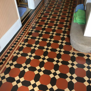
This Victorian floor in Twickenham, Middlesex was in good physical condition for its age but needed a good deep clean. Our customer had informed us that they had never cleaned or sealed the floor in the sixteen years that they had lived there so it was well overdue.
I went over to survey the floor and completed a test clean on a small section of tiling to see which products/techniques would work best. I like to do this as it demonstrates to the client what can be done, and it allows me to come up with an accurate price for doing the work.
As you can see from the pictures, there was quite a difference in the test patch compared to the rest of the floor. Years of foot traffic from the street had taken its’ toll and the floor was very dirty. Luckily, the floor was in very good condition and had not worn too badly.
Once they had seen the test patch, they were confident that it would be worth go ahead with my quote. It would ensure that the period feature was retained for many years to come. The colours on the floor were quite faded so it would be nice to get it restored.
I started the cleaning process by first taping up the surrounding skirting boards and doors to ensure they were protected from potential splashing. Cleaning involved spraying the Victorian tiles with a strong dilution of Tile Doctor Pro-Clean which is a dedicated Tile and Grout cleaning product. This was left to soak in for about ten minutes and then scrubbed in using a black pad fitted to a heavy-duty rotary scrubber.
This gives the floor a good mechanical scrub and works wonders releasing the ground-in dirt and soil from the tiles. The strong dilution of Pro-Clean will also remove any remaining sealers from the tile, however after sixteen years I doubted there would much trace of sealer left. Once done the floor was rinsed with water and all the soils removed with a wet vacuum.
Following the initial clean the colours were already much stronger. Next step however was to improve on that by giving the floor an acid rinse using Tile Doctor Grout Clean-Up. This removes mineral deposits and generally brightens up the appearance of the tile. After another round of scrubbing the floor was rinsed with our high-pressure washer and then vacuumed, extracting all of the dirty water and dirt away in one go. The floor was looking a lot better and was left to dry overnight.
After allowing the floor to dry overnight, we returned the next day to seal the floor. First, checking the floor was dry using the damp meter. Floors of this age can take a little longer to dry as there is no damp-proof membrane so it’s always worth checking as applying a sealer to damp tiles is not a good idea.
Once I was satisfied it was dry eight coats of Tile Doctor Seal and Go sheen finish sealer were applied. This takes a while to do as each coat needs to dry before applying the next. The sealer will protect the Victorian tiles for dirt and stains, it also enhanced the colours in the tile and will make it easier to keep the floor clean going forward.
My client was very pleased with the floor and mentioned that they should have called me in sooner! For aftercare cleaning I recommended Tile Doctor Neutral Clean which is an effective cleaner with a neutral pH, its designed for cleaning tiles without degrading the sealer.
Jonathan Oldham
South Middlesex Tile Doctor
 Daniel Scerri Periti
We were approached with a request to design the furnishings for an existing ‘finished’ apartment. The intention was to move in relatively fast, and the property already had an existing marble floor, kitchen and bathrooms which had to be kept. The property also boasted a fantastic 270 degree view, seen from most of the apartment. The clients had a very important role in the completion of the project. They were very involved during the design process and through various decoration choices. The final design was kept as a rigid guideline when faced with picking out all the different elements.
Once clear of all previous furniture, the space felt cold and bare; so we immediately felt the need for warmth, and raw, natural elements and textures to complement the cold marble floor while visually tying in the design of the whole apartment together.
Since the existing kitchen had a touch of dark walnut stain, we felt this material was one we should add to the palette of materials to contest the stark materials. A raw cement finish was another material we felt would add an interesting contrast and could be used in a variety of ways, from cabinets to walls and ceilings, to tie up the design of various areas of the apartment.
To warm up the living/dining area, keeping the existing marble floor but visually creating zones within the large living/dining area without hindering the flow, a dark timber custom-made soffit, continuous with a floor-to-ceiling drinks cabinet zones the dining area, giving it a degree of much-needed warmth.
The various windows with a stupendous 270 degree view needed to be visually tied together. This was done by introducing a continuous sheer [drape] which also doubled up as a sound-absorbing material along 2 of the 4 walls of the space.
A very large sofa was required to fill up the space correctly, also required for the size of the young family.
Services were integrated within the units and soffits, while a customized design in the corner between the kitchen and the living room took into consideration the viewpoints from the main areas to create a pantry without hindering the flow or views. A strategically placed floor-to-ceiling mirror doubles up the space and extends the view to the inner parts of the apartment.
The daughter’s bedroom was a small challenge in itself, and a fun task, where we wanted to achieve the perception of a cozy niche with its own enclosed reading nook [for reading fairy tales], behind see-through curtains and a custom-ordered wall print sporting the girl’s favorite colors.
The sons’ bedroom had double the requirements in terms of space needed: more wardrobe, more homework desk space, a tv/play station area… “We combined a raised platform area between the boys’ beds to become an area with cushions where the kids can lay down and play, and face a hidden screen behind the homework desk’s sliding back panel for their play station”. The color of the homework desk was chosen in relation to the boys’ ages. A more masculine material palette was chosen for this room, in contrast to the light pastel palette of the girl’s bedroom. Again, this colour can easily be changed over time for a more mature look.
PROJECT DATA:
St. Paul’s Bay, Malta
DESIGN TEAM:
Perit Rebecca Zammit, Perit Daniel Scerri, Elyse Tonna
OTHER CREDITS:
Photography: Tonio Lombardi
Styling : TKS
 Daniel Scerri Periti
We were approached with a request to design the furnishings for an existing ‘finished’ apartment. The intention was to move in relatively fast, and the property already had an existing marble floor, kitchen and bathrooms which had to be kept. The property also boasted a fantastic 270 degree view, seen from most of the apartment. The clients had a very important role in the completion of the project. They were very involved during the design process and through various decoration choices. The final design was kept as a rigid guideline when faced with picking out all the different elements.
Once clear of all previous furniture, the space felt cold and bare; so we immediately felt the need for warmth, and raw, natural elements and textures to complement the cold marble floor while visually tying in the design of the whole apartment together.
Since the existing kitchen had a touch of dark walnut stain, we felt this material was one we should add to the palette of materials to contest the stark materials. A raw cement finish was another material we felt would add an interesting contrast and could be used in a variety of ways, from cabinets to walls and ceilings, to tie up the design of various areas of the apartment.
To warm up the living/dining area, keeping the existing marble floor but visually creating zones within the large living/dining area without hindering the flow, a dark timber custom-made soffit, continuous with a floor-to-ceiling drinks cabinet zones the dining area, giving it a degree of much-needed warmth.
The various windows with a stupendous 270 degree view needed to be visually tied together. This was done by introducing a continuous sheer [drape] which also doubled up as a sound-absorbing material along 2 of the 4 walls of the space.
A very large sofa was required to fill up the space correctly, also required for the size of the young family.
Services were integrated within the units and soffits, while a customized design in the corner between the kitchen and the living room took into consideration the viewpoints from the main areas to create a pantry without hindering the flow or views. A strategically placed floor-to-ceiling mirror doubles up the space and extends the view to the inner parts of the apartment.
The daughter’s bedroom was a small challenge in itself, and a fun task, where we wanted to achieve the perception of a cozy niche with its own enclosed reading nook [for reading fairy tales], behind see-through curtains and a custom-ordered wall print sporting the girl’s favorite colors.
The sons’ bedroom had double the requirements in terms of space needed: more wardrobe, more homework desk space, a tv/play station area… “We combined a raised platform area between the boys’ beds to become an area with cushions where the kids can lay down and play, and face a hidden screen behind the homework desk’s sliding back panel for their play station”. The color of the homework desk was chosen in relation to the boys’ ages. A more masculine material palette was chosen for this room, in contrast to the light pastel palette of the girl’s bedroom. Again, this colour can easily be changed over time for a more mature look.
PROJECT DATA:
St. Paul’s Bay, Malta
DESIGN TEAM:
Perit Rebecca Zammit, Perit Daniel Scerri, Elyse Tonna
OTHER CREDITS:
Photography: Tonio Lombardi
Styling : TKS
 Tile Doctor Ltd
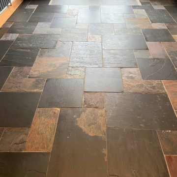
The pictures below are of Chinese Slate floor in the Kitchen of a property in the small village of Clifton just south of Penrith. We often get asked what the difference is between Rough and Semi Riven Slate, and this floor was a mixture of both.
If you look closely at the pictures and check out the darker parts of the floor you will see these smoother Semi Riven Slate, whereas the light copper-coloured parts of the floor were of the rougher textured variety. It’s not that unusual for stone to be mixed in this fashion as it can be supplied from different quarries in order to achieve a particular look.
The blend of different slates makes little difference when it comes to cleaning as the process is essentially the same. I would advise though if you intend to clean the floor using a mop then you should opt for Semi Riven Slate as Rough Slate can shred your mops and make it harder to maintain. We tend to use industrial floor buffing machines which work well on both surfaces so are less effected.
There was a bit of wax on this floor so to remove this Tile Doctor Wax Away was applied. The product was left to stand for fifteen minutes before being scrubbed into the stone, rinsed and then the soil extracted with a wet vacuum.
We then finished the cleaning with an Acid Rinse which involves scrubbing the Slate with Tile Doctor Grout Clean-up. This not only works well at cleaning up the stone and grout but also neutralises the alkaline pH left over from using Wax Away. I am very wary of the pH level of the floor as it could have an impact on the new sealer, giving the floor an acid rinse before sealing also ensures a better bond with the sealer.
Naturally, you can’t leave a strong product like Grout Clean-up on the Stone for long as it could etch the surface so once done the floor was thoroughly rinsed with water and extracted again with a wet vacuum. A mop and bucket and lots of sponges won’t do the job on a large area like this.
Once we finished the clean, we left it to dry off overnight and came back the next day to apply the sealer. We were originally going to apply a satin finish sealer, but the client had a big dog with sharp claws which could of scratched and marked the sealer so decided against it. I advised the client to use an Impregnating sealer called Tile Doctor Colour Grow, which lifts the natural colours in the stone, but is not a topical shiny sealer as the seal soaks into the Slate and leaves a a nice matt finish instead. Only two coats of sealer were needed, and the floor looked like new again.
My client was very happy with the difference in the appearance of the stone and how much cleaner the grout was, so much so they the following feedback for us, which is always appreciated.
“Totally impressed with the team they couldn’t have been more professional and even left me with some cleaner. My horrible 12 year old slate tiles look fabulous”
As usual we left a free bottle of Tile Doctor Neutral Tile Cleaner for aftercare, it’s very important not to undo all that hard work by using a product which will damage the seal, using a pH neutral cleaner will keep the seal looking sharp and fresh for years to come.
Heidi Taylor
North Cumbria Tile Doctor
67