
Search results for "Processing officer" in Home Design Ideas
 4th Edition Design
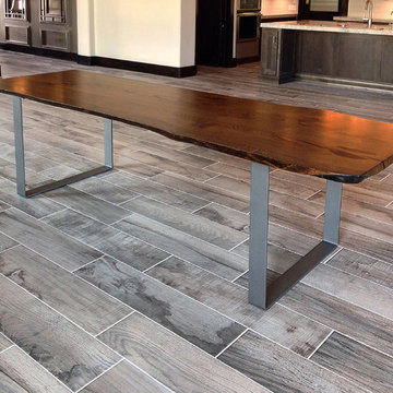
Custom glass insert with base in Goldluck finish
Minimalist dining room photo in Austin
Minimalist dining room photo in Austin
 Klopf Architecture
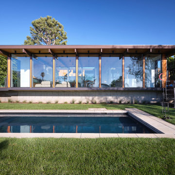
Malibu Glass Box House by Klopf Architecture
Following the devastating Woolsey Fire of 2018, the site in Malibu offered a unique opportunity to rebuild not just a home, but a new architectural composition that highlighted the property’s potential while navigating strict fire-rebuild codes in the area. Designed by Klopf Architecture, this project embraced a set of limitations and translated them into an architectural asset.
The city’s fire-rebuild process required the new structure to remain close to the original footprint, size and bulk, a constraint that ultimately clarified the architectural direction. Perched near the front of a long, narrow lot, the new home frames and overlooks a private, park-like rear expanse, an uncommon luxury especially in this part of Malibu .
Without a fixed program, the design process allowed for a different kind of creative focus allowing Klopf Architecture the opportunity to explore how a modernist home could best respond to this site. The team approached the project not with a list of requirements, but with a question: How might a modernist live here? What spatial qualities would inspire calm, connection, and a sense of wonder in this setting? The process became less about problem-solving and more about architectural storytelling—letting the site, the light, and the principles of modern design guide the form and flow of the home.
The response emerged in the form of a glass-box pavilion, an open, Mid-Century Modern inspired living, dining, and kitchen space that floats at the edge of the property’s natural descent. Connected to the more enclosed, private areas of the home by a glass-walled hallway, the living pavilion becomes a distinct centerpiece of the design. It opens on all four sides to the landscape with decks and patios on the flanks, an internal garden and water feature to the north, and a dramatic unguarded view of the expansive backyard and ocean horizon to the south.
Because of the mandated footprint, careful planning was required to ensure every space could still engage with light, landscape, or both. Strategic voids in the form of atriums and courtyards allow daylight to filter deep into the home’s core, while offering moments of surprise and retreat. These design gestures allow natural light to filter deep into the interior, creating a sense of brightness and openness throughout the day. At the same time, they expand the perceptual boundaries between inside and out, making the home feel more expansive while anchoring its connection to the surrounding landscape.
The siting of the house is what gives it its unique character. Rather than receding into the backyard like the neighboring homes, the house holds a slight prominence. From the central living pavilion, stepping down into the landscape feels more like entering a secluded park where a separate existing accessory structure, trail, and recreational areas await. The home’s modest street presence gives way to this unfolding drama of space, view, and nature.
Fire-resilient materials and assemblies are integrated seamlessly throughout including triple-pane glazing, under-slab and roof insulation, and locally sourced fire-rated cladding ensure the house not only meets Calfornia’s rigorous wildland-urban interface (WUI) standards, but feels effortlessly aligned with them. While technical decisions like fire-hardening and mechanical systems presented some construction challenges, particularly around the cantilevered glass box, the team found a functional compromise that preserved the integrity of the design.
Inside, a restrained palette and exposed post and beam design celebrate the ethos of mid-century modernism. A central circulation spine extends from the entry to the rear glass wall, offering a continuous visual link from street to ocean. Spaces such as the library and office, though more intimate in scale, are never cut off from nature as each opens to its own unique courtyard or garden view.
Though born out of a strict regulatory framework and developed without a specific client, the rebuild design unfolded with remarkable clarity. Grounded in site logic, refined by limitations and an emphasis on timeless spatial relationships – light, proportion, and a strong connection to nature, the resulting design feels both effortless and uplifting. The home lives lightly on the land, opens generously to its surroundings, and strikes a careful balance between privacy, openness, and calm. For Klopf Architecture, it stands as a compelling case study in how site, code, and circumstantial constraints can inspire enduring, modernist architecture. With years of experience reimagining mid-century modern design for how people live today, the firm took the project’s limitations as an opportunity. The result is a home shaped by open, flowing spaces, strong indoor-outdoor connections, and a calm, clear sense of structure. It’s a good reminder that even with strict constraints, there’s still room for architecture to breathe—and for modernism to keep moving forward.
Klopf Architecture project team: Geoff Campen, John Klopf, AIA, and Sherry Tan
Structural Engineer: ZFA
Contractor: Maison D’Artiste
Photography: ©2025 Mariko Reed
Year Completed: 2023
 Klopf Architecture
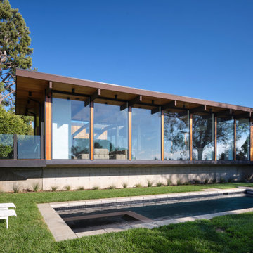
Malibu Glass Box House by Klopf Architecture
Following the devastating Woolsey Fire of 2018, the site in Malibu offered a unique opportunity to rebuild not just a home, but a new architectural composition that highlighted the property’s potential while navigating strict fire-rebuild codes in the area. Designed by Klopf Architecture, this project embraced a set of limitations and translated them into an architectural asset.
The city’s fire-rebuild process required the new structure to remain close to the original footprint, size and bulk, a constraint that ultimately clarified the architectural direction. Perched near the front of a long, narrow lot, the new home frames and overlooks a private, park-like rear expanse, an uncommon luxury especially in this part of Malibu .
Without a fixed program, the design process allowed for a different kind of creative focus allowing Klopf Architecture the opportunity to explore how a modernist home could best respond to this site. The team approached the project not with a list of requirements, but with a question: How might a modernist live here? What spatial qualities would inspire calm, connection, and a sense of wonder in this setting? The process became less about problem-solving and more about architectural storytelling—letting the site, the light, and the principles of modern design guide the form and flow of the home.
The response emerged in the form of a glass-box pavilion, an open, Mid-Century Modern inspired living, dining, and kitchen space that floats at the edge of the property’s natural descent. Connected to the more enclosed, private areas of the home by a glass-walled hallway, the living pavilion becomes a distinct centerpiece of the design. It opens on all four sides to the landscape with decks and patios on the flanks, an internal garden and water feature to the north, and a dramatic unguarded view of the expansive backyard and ocean horizon to the south.
Because of the mandated footprint, careful planning was required to ensure every space could still engage with light, landscape, or both. Strategic voids in the form of atriums and courtyards allow daylight to filter deep into the home’s core, while offering moments of surprise and retreat. These design gestures allow natural light to filter deep into the interior, creating a sense of brightness and openness throughout the day. At the same time, they expand the perceptual boundaries between inside and out, making the home feel more expansive while anchoring its connection to the surrounding landscape.
The siting of the house is what gives it its unique character. Rather than receding into the backyard like the neighboring homes, the house holds a slight prominence. From the central living pavilion, stepping down into the landscape feels more like entering a secluded park where a separate existing accessory structure, trail, and recreational areas await. The home’s modest street presence gives way to this unfolding drama of space, view, and nature.
Fire-resilient materials and assemblies are integrated seamlessly throughout including triple-pane glazing, under-slab and roof insulation, and locally sourced fire-rated cladding ensure the house not only meets Calfornia’s rigorous wildland-urban interface (WUI) standards, but feels effortlessly aligned with them. While technical decisions like fire-hardening and mechanical systems presented some construction challenges, particularly around the cantilevered glass box, the team found a functional compromise that preserved the integrity of the design.
Inside, a restrained palette and exposed post and beam design celebrate the ethos of mid-century modernism. A central circulation spine extends from the entry to the rear glass wall, offering a continuous visual link from street to ocean. Spaces such as the library and office, though more intimate in scale, are never cut off from nature as each opens to its own unique courtyard or garden view.
Though born out of a strict regulatory framework and developed without a specific client, the rebuild design unfolded with remarkable clarity. Grounded in site logic, refined by limitations and an emphasis on timeless spatial relationships – light, proportion, and a strong connection to nature, the resulting design feels both effortless and uplifting. The home lives lightly on the land, opens generously to its surroundings, and strikes a careful balance between privacy, openness, and calm. For Klopf Architecture, it stands as a compelling case study in how site, code, and circumstantial constraints can inspire enduring, modernist architecture. With years of experience reimagining mid-century modern design for how people live today, the firm took the project’s limitations as an opportunity. The result is a home shaped by open, flowing spaces, strong indoor-outdoor connections, and a calm, clear sense of structure. It’s a good reminder that even with strict constraints, there’s still room for architecture to breathe—and for modernism to keep moving forward.
Klopf Architecture project team: Geoff Campen, John Klopf, AIA, and Sherry Tan
Structural Engineer: ZFA
Contractor: Maison D’Artiste
Photography: ©2025 Mariko Reed
Year Completed: 2023
Find the right local pro for your project
 Gallery KBNY
Kitchen from condo renovation in Upper West Side, Manhattan.
ABOUT THE RENOVATION
Very often, getting what you want is simply about timing. After years of owning her Upper West Side co-op in Lincoln Square and making various small renovations along the way, our client decided to go all-out and advance with her dream renovation after being eased into the significant decision by our full-service design-build approach, extensive pre-planning process, out of the box design strategy, and thorough estimate. The results of this stunning renovation speak for themselves.
SPACIOUS CENTERPIECE KITCHEN
With many condos in Manhattan, the kitchen is the home’s focal point. In this case, the client’s goal was to reinvigorate this critical space via a classic interior design style with modern and contemporary touches. Beyond introducing updated appliances and pendant lighting, we added immaculate natural stone countertops and backsplash, along with opaque Tribeca shaker cabinets throughout the space.
TWO BATHROOMS, TWICE AS NICE
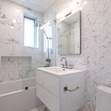
When the opportunity to add a bathroom to your Manhattan condo presents itself, you take advantage. Part of our renovation of this USW condo included an additional bathroom, in addition to a total overhaul of the ensuite bathroom. For the main bath, we turned the dreary old space into a soft and elegant sanctuary that’s warming as the sunlight beaming in, thanks to the sleek nickel-finish fixtures and custom marble tile. In the newly-created guest bathroom, we delivered an upscale, timeless design incorporating gleaming subway tiles, bold brass fixtures, and exquisite deco hexagon flooring.
PERMA-WFH OFFICE WITH CUSTOM MURPHY BED & STORAGE
After being thrust into a permanent work from home schedule due to the pandemic, our client decided to incorporate more of a formal home office space into her guest bedroom - a space where she also required additional storage. The problem was she didn't want to give up the practicality of a spare bedroom. To maintain the added bedroom availability and also provide a proper office space, we created a custom Murphy bed and desk area with custom millwork for enhanced organization with a perfectly narrow personal desk area nestled to the left of the large built-in.
ADDITIONAL HIGHLIGHTS
- We Incorporated Various Square/hexagon Features Throughout The Space, Per Client Preference
- Laundry Relocation For Added Space And Preference
 Advance Design Studio, Ltd.
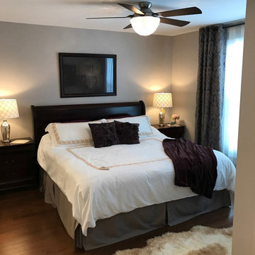
The couple who embarked on this Lake Zurich Illinois home renovation spent years planning a move from Virginia to the rolling hills of Northern Illinois when their first grandchild was born. Wanting to be closer to their grown children so they could enjoy their new role, they first embarked upon finding the right realtor and the right home. They settled on the “perfect” home; perfect that is to transform.
The seriously outdated 1,800 square foot ranch had a closed outdated kitchen, 3 bedrooms, a living room with a fireplace, a full basement and 2 baths. Although it had “good bones”, it was straight out of a builder’s catalog with wall to wall carpet, standard tile and honey oak everywhere you looked. But this couple had big plans for this home.
In tandem with their home purchase, they began the search for the just the right renovation company. The team they chose needed to be cohesive, as the whole house renovation would be designed hundreds of miles from their home several states away. She found Advance Design Studio, Ltd. online, and was quickly enamored by the team and by Common Sense Remodeling, simply by studying the website. Her decision to choose Advance Design to partner on this complete ranch renovation was confirmed quickly upon her first face to face meeting with owner Todd Jurs, and later by Advance’s designer, Nicole Ryan.
Three bedrooms were converted into a one master suite with ample bath and walk in closet, laundry, and a 2nd multi-purpose room designed for movies and entertainment, a home office, and a guest room all in one. A doorway leading to the garage was reconfigured to create a foyer area, and allowed for a better flow to an open modern kitchen complete with a large island for cooking and entertaining, which included a wide bench seat overlooking the back yard and opening onto an eating area flanked with a fireplace and TV.
The piece de resistance culminated with 3 walls of full glass anchored by a striking fireplace in the new four season’s room where the homeowners enjoy coffee every morning while gazing at the current day’s mid-western landscape. The open floorplan encourages living in “one space” throughout the day.
Ryan worked with the couple remotely, exchanging 3D color renderings and floorplans with detailed budget updates until the project took on the very image they had envisioned. “Working with them was a change from our normal meeting process since they were literally in a different state. We conducted meetings by phone, while reviewing materials and drawings via computer. It was a fun process that necessitated lots of detail and careful coordination, but we made it happen and the process was as smooth as if they were right here like normal”, says Nicole. During a stressful time planning their move, the constant interaction with Nicole assured the couple that all was being addressed by the Advance team and they could relax and focus on other important things (like moving cross country).
The new master bath incorporated heated flooring, a walk in shower with seating and custom shower niches, and an elegant double sink vanity with ample space for two. “The layout of each of the rooms is exactly what I envisioned,” the client said. “Advance’s attention to details such as light switch placement, electrical outlets, and many other minute details you wouldn’t even think of was the icing on the cake. If I didn’t think of it first, they certainly did,” said the happy homeowner. Small details like the crown molding, the custom designed fireplace mantle, the under-cabinet lighting and etched door glass, and even subtle rhinestones shimmering like delicate jewelry in the tile backsplash brought the whole project together. The clients were extremely happy with the way the Advance team made sure these small things were executed perfectly.
“It’s just gorgeous,” they said at a celebratory event in their home hosted shortly after completion for the entire Advance Design team that made it happen. “The entire crew at Advance Design was a pleasure to work with. We couldn’t have done this with a lesser team,” they concluded.
 Infinite Home
Custom Home Built for Real Life
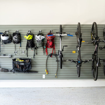
Our clients came to us with a clear vision: a home that could adapt to their lifestyle and growing family. They needed a home built with intention, designed with the future in mind, and built around the routines they loved and the people they loved more.
Open-Concept Living With Hosting in Mind
Our clients hosted often and lived actively, so the main level had to be flexible for all of life’s moments. The goal was a space that felt grand without losing its warmth.
Cooking together as a family mattered to our clients – the Wolf range, farmhouse sink, integrated appliances, and large island gave them a kitchen that flowed effortlessly while looking beautiful. This space also served as the bridge between other parts of the main level so that they would stay in view of the next. This created the perfect environment for gathering where everyone had their own spot without ever feeling apart from the whole group.
For the living room, our clients wanted space that felt open without losing its warmth. Soaring ceilings created that sense of scale, while warm tones and materials, like the wood coffered ceiling and fireplace wall, kept it grounded. That same warmth carried outside, where an outdoor lounge with a fireplace and dining area made sure guests felt welcomed the moment they stepped out.
A Backyard Built for Real Rest
Every corner of the backyard was designed with one goal: to be the ultimate outdoor retreat. The elevated, white-brick-framed pool and integrated spa hot tub gave them a place to truly exhale. As the sun set, the fire pit lounge next to the pool became the hangout spot when they hosted their youth groups and family gatherings.
Room to Grow
With kids in the house, “custom” had to also mean flexible. Our clients had 2 young sons and needed their rooms to grow with them through the years. The two bedrooms and a full bath sat beside a loft that served as both their hangout-and-homework spot. The guest suite sat on the same level where a four-poster bed, floor-to-ceiling wood-look tile, and a frameless glass shower welcomed their guests from day one.
A Retreat That’s Actually Theirs
Between hosting and raising kids, this couple needed a suite that felt like a true escape. The wood-planked tray ceiling and French doors grounded the room in warmth the moment you walked in, while the ensuite bathroom carried a spa-like feeling with a freestanding soaking tub, custom double vanity, and a glass-enclosed shower.
This Is What Approachable Luxury Looks Like
The approachable luxury experience meant starting with conversations about how they wanted their space to live with them – how they hosted, how their kids played, how they wanted to feel walking through their own front door, and how we took their goals and experience and used it as the foundation of every decision that was made from start to finish. We wanted our clients to feel taken care of through the process and, most importantly, feel heard.
 Moss Building & Design
The MOSS design team sat down with the homeowners and went through every single option. With COVID and the distance from the job site to the MOSS office, most sessions were virtual and set to align with the clients’ work schedules. The homeowners felt all of their ideas were brought to life and the design team added interesting pieces and ideas they really liked.
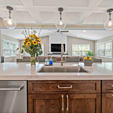
Early in the design process, they decided a focus wall would be amazing. The client loves shiplap but didn’t want anything that looked too country. Our designer and project manager worked together to create a fireplace wall that combined tile, shiplap and a custom mantel for a result that has become one of the most gorgeous parts of the remodel.
With young, active kids, the clients needed a space that could serve as a dump zone for backpacks and sports gear. Combining an underutilized carport shed and a low-functioning pantry resulted in a beautiful, very useful mudroom.
The homeowners expressed that one of the most exciting parts of the process was working with the designers and coming up with new ideas. For example, there was an odd area on one side of the kitchen and our designer suggested making it a double-door pantry. The client’s jaw dropped because she never envisioned having enough storage space to conceal all of her appliances and backstock. She said “It is one of those surprises that came through the design process that we were not expecting and is now one of our favorite parts of the kitchen. We wanted out-of-the-box thinking and that’s what we got.”



 Klopf Architecture
Malibu Glass Box House by Klopf Architecture
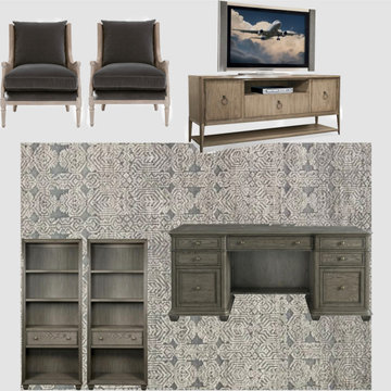
Following the devastating Woolsey Fire of 2018, the site in Malibu offered a unique opportunity to rebuild not just a home, but a new architectural composition that highlighted the property’s potential while navigating strict fire-rebuild codes in the area. Designed by Klopf Architecture, this project embraced a set of limitations and translated them into an architectural asset.
The city’s fire-rebuild process required the new structure to remain close to the original footprint, size and bulk, a constraint that ultimately clarified the architectural direction. Perched near the front of a long, narrow lot, the new home frames and overlooks a private, park-like rear expanse, an uncommon luxury especially in this part of Malibu .
Without a fixed program, the design process allowed for a different kind of creative focus allowing Klopf Architecture the opportunity to explore how a modernist home could best respond to this site. The team approached the project not with a list of requirements, but with a question: How might a modernist live here? What spatial qualities would inspire calm, connection, and a sense of wonder in this setting? The process became less about problem-solving and more about architectural storytelling—letting the site, the light, and the principles of modern design guide the form and flow of the home.
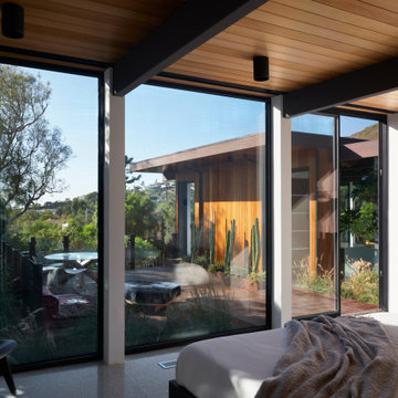
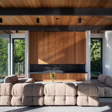
The response emerged in the form of a glass-box pavilion, an open, Mid-Century Modern inspired living, dining, and kitchen space that floats at the edge of the property’s natural descent. Connected to the more enclosed, private areas of the home by a glass-walled hallway, the living pavilion becomes a distinct centerpiece of the design. It opens on all four sides to the landscape with decks and patios on the flanks, an internal garden and water feature to the north, and a dramatic unguarded view of the expansive backyard and ocean horizon to the south.
Because of the mandated footprint, careful planning was required to ensure every space could still engage with light, landscape, or both. Strategic voids in the form of atriums and courtyards allow daylight to filter deep into the home’s core, while offering moments of surprise and retreat. These design gestures allow natural light to filter deep into the interior, creating a sense of brightness and openness throughout the day. At the same time, they expand the perceptual boundaries between inside and out, making the home feel more expansive while anchoring its connection to the surrounding landscape.
The siting of the house is what gives it its unique character. Rather than receding into the backyard like the neighboring homes, the house holds a slight prominence. From the central living pavilion, stepping down into the landscape feels more like entering a secluded park where a separate existing accessory structure, trail, and recreational areas await. The home’s modest street presence gives way to this unfolding drama of space, view, and nature.
Fire-resilient materials and assemblies are integrated seamlessly throughout including triple-pane glazing, under-slab and roof insulation, and locally sourced fire-rated cladding ensure the house not only meets Calfornia’s rigorous wildland-urban interface (WUI) standards, but feels effortlessly aligned with them. While technical decisions like fire-hardening and mechanical systems presented some construction challenges, particularly around the cantilevered glass box, the team found a functional compromise that preserved the integrity of the design.
Inside, a restrained palette and exposed post and beam design celebrate the ethos of mid-century modernism. A central circulation spine extends from the entry to the rear glass wall, offering a continuous visual link from street to ocean. Spaces such as the library and office, though more intimate in scale, are never cut off from nature as each opens to its own unique courtyard or garden view.
Though born out of a strict regulatory framework and developed without a specific client, the rebuild design unfolded with remarkable clarity. Grounded in site logic, refined by limitations and an emphasis on timeless spatial relationships – light, proportion, and a strong connection to nature, the resulting design feels both effortless and uplifting. The home lives lightly on the land, opens generously to its surroundings, and strikes a careful balance between privacy, openness, and calm. For Klopf Architecture, it stands as a compelling case study in how site, code, and circumstantial constraints can inspire enduring, modernist architecture. With years of experience reimagining mid-century modern design for how people live today, the firm took the project’s limitations as an opportunity. The result is a home shaped by open, flowing spaces, strong indoor-outdoor connections, and a calm, clear sense of structure. It’s a good reminder that even with strict constraints, there’s still room for architecture to breathe—and for modernism to keep moving forward.
Klopf Architecture project team: Geoff Campen, John Klopf, AIA, and Sherry Tan
Structural Engineer: ZFA
Contractor: Maison D’Artiste
Photography: ©2025 Mariko Reed
Year Completed: 2023
 4th Edition Design
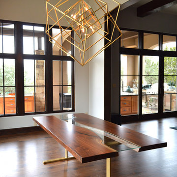
Custom glass insert with base in Goldluck finish
Minimalist dining room photo in Austin
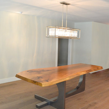
Minimalist dining room photo in Austin
 Klopf Architecture
Malibu Glass Box House by Klopf Architecture
Following the devastating Woolsey Fire of 2018, the site in Malibu offered a unique opportunity to rebuild not just a home, but a new architectural composition that highlighted the property’s potential while navigating strict fire-rebuild codes in the area. Designed by Klopf Architecture, this project embraced a set of limitations and translated them into an architectural asset.
The city’s fire-rebuild process required the new structure to remain close to the original footprint, size and bulk, a constraint that ultimately clarified the architectural direction. Perched near the front of a long, narrow lot, the new home frames and overlooks a private, park-like rear expanse, an uncommon luxury especially in this part of Malibu .
Without a fixed program, the design process allowed for a different kind of creative focus allowing Klopf Architecture the opportunity to explore how a modernist home could best respond to this site. The team approached the project not with a list of requirements, but with a question: How might a modernist live here? What spatial qualities would inspire calm, connection, and a sense of wonder in this setting? The process became less about problem-solving and more about architectural storytelling—letting the site, the light, and the principles of modern design guide the form and flow of the home.
The response emerged in the form of a glass-box pavilion, an open, Mid-Century Modern inspired living, dining, and kitchen space that floats at the edge of the property’s natural descent. Connected to the more enclosed, private areas of the home by a glass-walled hallway, the living pavilion becomes a distinct centerpiece of the design. It opens on all four sides to the landscape with decks and patios on the flanks, an internal garden and water feature to the north, and a dramatic unguarded view of the expansive backyard and ocean horizon to the south.
Because of the mandated footprint, careful planning was required to ensure every space could still engage with light, landscape, or both. Strategic voids in the form of atriums and courtyards allow daylight to filter deep into the home’s core, while offering moments of surprise and retreat. These design gestures allow natural light to filter deep into the interior, creating a sense of brightness and openness throughout the day. At the same time, they expand the perceptual boundaries between inside and out, making the home feel more expansive while anchoring its connection to the surrounding landscape.
The siting of the house is what gives it its unique character. Rather than receding into the backyard like the neighboring homes, the house holds a slight prominence. From the central living pavilion, stepping down into the landscape feels more like entering a secluded park where a separate existing accessory structure, trail, and recreational areas await. The home’s modest street presence gives way to this unfolding drama of space, view, and nature.
Fire-resilient materials and assemblies are integrated seamlessly throughout including triple-pane glazing, under-slab and roof insulation, and locally sourced fire-rated cladding ensure the house not only meets Calfornia’s rigorous wildland-urban interface (WUI) standards, but feels effortlessly aligned with them. While technical decisions like fire-hardening and mechanical systems presented some construction challenges, particularly around the cantilevered glass box, the team found a functional compromise that preserved the integrity of the design.
Inside, a restrained palette and exposed post and beam design celebrate the ethos of mid-century modernism. A central circulation spine extends from the entry to the rear glass wall, offering a continuous visual link from street to ocean. Spaces such as the library and office, though more intimate in scale, are never cut off from nature as each opens to its own unique courtyard or garden view.
Though born out of a strict regulatory framework and developed without a specific client, the rebuild design unfolded with remarkable clarity. Grounded in site logic, refined by limitations and an emphasis on timeless spatial relationships – light, proportion, and a strong connection to nature, the resulting design feels both effortless and uplifting. The home lives lightly on the land, opens generously to its surroundings, and strikes a careful balance between privacy, openness, and calm. For Klopf Architecture, it stands as a compelling case study in how site, code, and circumstantial constraints can inspire enduring, modernist architecture. With years of experience reimagining mid-century modern design for how people live today, the firm took the project’s limitations as an opportunity. The result is a home shaped by open, flowing spaces, strong indoor-outdoor connections, and a calm, clear sense of structure. It’s a good reminder that even with strict constraints, there’s still room for architecture to breathe—and for modernism to keep moving forward.
Klopf Architecture project team: Geoff Campen, John Klopf, AIA, and Sherry Tan
Structural Engineer: ZFA
Contractor: Maison D’Artiste
Photography: ©2025 Mariko Reed
Year Completed: 2023
 John Knight Architect
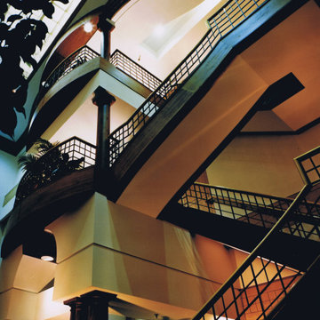
Shortly after starting my firm in 1982 one of my neighbors in Historic Fourth Ward asked if I would design the renovation of a three story 1890's building in downtown Charlotte for use by his law firm. The building had been stripped of al of it's historic features and was finished with stucco. Due to the size of the project I worked in the offices of Reg Narmour. My first order of business was to create a three story lobby with a monumental stair. During the design process the Owner and i traveled to New York City and Connecticut in search of architectural elements for inside and out. There we found bronze doors and light fixtures, paneling from the 17th Century and countless other historic artifacts. By the time the renovation was complete I had renovated a two story walk up next door for my offices.
Sponsored
Columbus, OH

Snider & Metcalf Interior Design, LTD
Leading Interior Designers in Columbus, Ohio & Ponte Vedra, Florida
 Moss Building & Design
The MOSS design team sat down with the homeowners and went through every single option. With COVID and the distance from the job site to the MOSS office, most sessions were virtual and set to align with the clients’ work schedules. The homeowners felt all of their ideas were brought to life and the design team added interesting pieces and ideas they really liked.
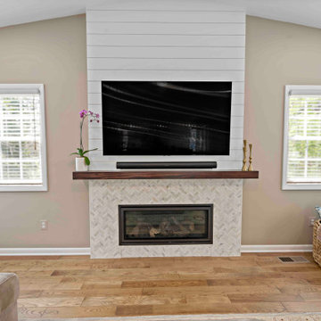
Early in the design process, they decided a focus wall would be amazing. The client loves shiplap but didn’t want anything that looked too country. Our designer and project manager worked together to create a fireplace wall that combined tile, shiplap and a custom mantel for a result that has become one of the most gorgeous parts of the remodel.
With young, active kids, the clients needed a space that could serve as a dump zone for backpacks and sports gear. Combining an underutilized carport shed and a low-functioning pantry resulted in a beautiful, very useful mudroom.
The homeowners expressed that one of the most exciting parts of the process was working with the designers and coming up with new ideas. For example, there was an odd area on one side of the kitchen and our designer suggested making it a double-door pantry. The client’s jaw dropped because she never envisioned having enough storage space to conceal all of her appliances and backstock. She said “It is one of those surprises that came through the design process that we were not expecting and is now one of our favorite parts of the kitchen. We wanted out-of-the-box thinking and that’s what we got.”
 Moss Building & Design
The MOSS design team sat down with the homeowners and went through every single option. With COVID and the distance from the job site to the MOSS office, most sessions were virtual and set to align with the clients’ work schedules. The homeowners felt all of their ideas were brought to life and the design team added interesting pieces and ideas they really liked.
Early in the design process, they decided a focus wall would be amazing. The client loves shiplap but didn’t want anything that looked too country. Our designer and project manager worked together to create a fireplace wall that combined tile, shiplap and a custom mantel for a result that has become one of the most gorgeous parts of the remodel.
With young, active kids, the clients needed a space that could serve as a dump zone for backpacks and sports gear. Combining an underutilized carport shed and a low-functioning pantry resulted in a beautiful, very useful mudroom.
The homeowners expressed that one of the most exciting parts of the process was working with the designers and coming up with new ideas. For example, there was an odd area on one side of the kitchen and our designer suggested making it a double-door pantry. The client’s jaw dropped because she never envisioned having enough storage space to conceal all of her appliances and backstock. She said “It is one of those surprises that came through the design process that we were not expecting and is now one of our favorite parts of the kitchen. We wanted out-of-the-box thinking and that’s what we got.”
 AoDK Inc.
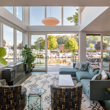
A couple wanted a weekend retreat without spending a majority of their getaway in an automobile. Therefore, a lot was purchased along the Rocky River with the vision of creating a nearby escape less than five miles away from their home. This 1,300 sf 24’ x 24’ dwelling is divided into a four square quadrant with the goal to create a variety of interior and exterior experiences while maintaining a rather small footprint.
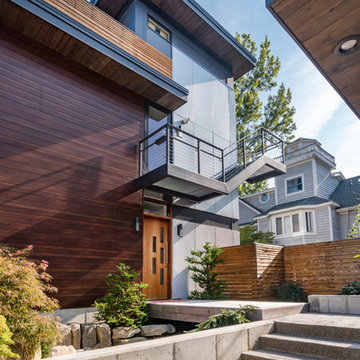
Typically, when going on a weekend retreat one has the drive time to decompress. However, without this, the goal was to create a procession from the car to the house to signify such change of context. This concept was achieved through the use of a wood slatted screen wall which must be passed through. After winding around a collection of poured concrete steps and walls one comes to a wood plank bridge and crosses over a Japanese garden leaving all the stresses of the daily world behind.
The house is structured around a nine column steel frame grid, which reinforces the impression one gets of the four quadrants. The two rear quadrants intentionally house enclosed program space but once passed through, the floor plan completely opens to long views down to the mouth of the river into Lake Erie.
On the second floor the four square grid is stacked with one quadrant removed for the two story living area on the first floor to capture heightened views down the river. In a move to create complete separation there is a one quadrant roof top office with surrounding roof top garden space. The rooftop office is accessed through a unique approach by exiting onto a steel grated staircase which wraps up the exterior facade of the house. This experience provides an additional retreat within their weekend getaway, and serves as the apex of the house where one can completely enjoy the views of Lake Erie disappearing over the horizon.
Visually the house extends into the riverside site, but the four quadrant axis also physically extends creating a series of experiences out on the property. The Northeast kitchen quadrant extends out to become an exterior kitchen & dining space. The two-story Northwest living room quadrant extends out to a series of wrap around steps and lounge seating. A fire pit sits in this quadrant as well farther out in the lawn. A fruit and vegetable garden sits out in the Southwest quadrant in near proximity to the shed, and the entry sequence is contained within the Southeast quadrant extension. Internally and externally the whole house is organized in a simple and concise way and achieves the ultimate goal of creating many different experiences within a rationally sized footprint.
Photo: Sergiu Stoian
 Valentini Kids Furniture Brooklyn NY
Contact our office concerning price or customization of this Kids Bedroom Set. 347-492-55-55
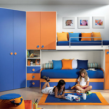
This kids bedroom furniture set is made in Italy from the fines materials available on market. This bedroom set is a perfect solution for those looking for high quality kids furniture with great storage capabilities to embellish and organize the children`s bedroom. This Italian bedroom set also does not take lots of space in the room, using up only the smallest space required to provide room with storage as well as plenty of room for your kids to play. All the pieces within this kids furniture collection are made with a durable and easy to clean melamine on both sides, which is available for ordering in a variety of matt colors that can be mixed and matched to make your kids bedroom bright and colorful.
Please contact our office concerning details on customization of this kids bedroom set.
The starting price is for the "As Shown" composition that includes the following elements:
1 Composition Bridge Loft. Top bed with internal dimensions W31.5" x D75" (requires special size mattress)
1 Bottom Twin size Storage or Trundle bed (bed fits US standard Twin size mattress 39" x 75")
1 Corner Wardrobe
1 Ladder
1 Top Bed Safety Bar
Please Note: Room/bed decorative accessories and the mattresses are not included in the price.
MATERIAL/CONSTRUCTION:
E1-Class ecological panels, which are produced exclusively through a wood recycling production process
Bases 0.7" thick melamine
Back panels 0.12" thick MDF
Doors 0.7" thick melamine
Front drawers 0.7" thick melamine
Dimensions:
Composition Bridge Loft: W118" x D 21"/33.5" x H84"
Top Bed with internal dimensions: W31.5" x D75" (Requires Special Size Mattress)
Corner Wardrobe: W(46" x 46") x D21" x H84"
Bottom Twin size bed frame with internal dimensions W39" x D75" (US Standard)


 AoDK Inc.
A couple wanted a weekend retreat without spending a majority of their getaway in an automobile. Therefore, a lot was purchased along the Rocky River with the vision of creating a nearby escape less than five miles away from their home. This 1,300 sf 24’ x 24’ dwelling is divided into a four square quadrant with the goal to create a variety of interior and exterior experiences while maintaining a rather small footprint.
Typically, when going on a weekend retreat one has the drive time to decompress. However, without this, the goal was to create a procession from the car to the house to signify such change of context. This concept was achieved through the use of a wood slatted screen wall which must be passed through. After winding around a collection of poured concrete steps and walls one comes to a wood plank bridge and crosses over a Japanese garden leaving all the stresses of the daily world behind.
The house is structured around a nine column steel frame grid, which reinforces the impression one gets of the four quadrants. The two rear quadrants intentionally house enclosed program space but once passed through, the floor plan completely opens to long views down to the mouth of the river into Lake Erie.
On the second floor the four square grid is stacked with one quadrant removed for the two story living area on the first floor to capture heightened views down the river. In a move to create complete separation there is a one quadrant roof top office with surrounding roof top garden space. The rooftop office is accessed through a unique approach by exiting onto a steel grated staircase which wraps up the exterior facade of the house. This experience provides an additional retreat within their weekend getaway, and serves as the apex of the house where one can completely enjoy the views of Lake Erie disappearing over the horizon.
Visually the house extends into the riverside site, but the four quadrant axis also physically extends creating a series of experiences out on the property. The Northeast kitchen quadrant extends out to become an exterior kitchen & dining space. The two-story Northwest living room quadrant extends out to a series of wrap around steps and lounge seating. A fire pit sits in this quadrant as well farther out in the lawn. A fruit and vegetable garden sits out in the Southwest quadrant in near proximity to the shed, and the entry sequence is contained within the Southeast quadrant extension. Internally and externally the whole house is organized in a simple and concise way and achieves the ultimate goal of creating many different experiences within a rationally sized footprint.
Photo: Sergiu Stoian
 Board & Vellum
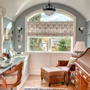
The owner of this 1960s, low-slung house challenged Board & Vellum to give it a major overhaul. Located across from Puget Sound, the house already had a lot to offer but the dated style, low ceilings, tight spaces and interior walls that blocked Sound views kept it from fulfilling its full potential.
Board & Vellum gutted and reimagined the whole house, giving it a more traditional style. The interior—previously quite dark, thanks to brick- and wood panel-clad walls—was transformed with white trim, bright detailing (such as the hand-glazed tile in the kitchen), and plenty of built-in casework for the homeowner to display the travel mementos she collected throughout her career in the airline industry. Removing a fireplace in the center of the house and opening up the floorplan through to the staircase and entryway lets light flood in and allows for water views from across the main living area and kitchen.
The exterior of the house received a dose of character with brick, corbels, and a curved eyebrow roof above the front entry, which also gave the home office area its distinctive barrel ceiling.
Photo by John Wilbanks.
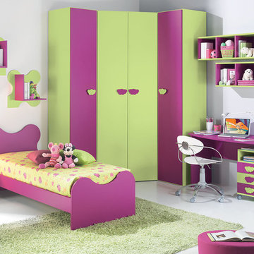 Valentini Kids Furniture Brooklyn NY
Contact our office concerning price or customization of this Kids Bedroom Set. 347-492-55-55
This kids bedroom furniture set is made in Italy from the fines materials available on market. This bedroom set is a perfect solution for those looking for high quality kids furniture with great storage capabilities to embellish and organize the children`s bedroom. This Italian bedroom set also does not take lots of space in the room, using up only the smallest space required to provide room with storage as well as plenty of room for your kids to play. All the pieces within this kids furniture collection are made with a durable and easy to clean melamine on both sides, which is available for ordering in a variety of matt colors that can be mixed and matched to make your kids bedroom bright and colorful.
Please contact our office concerning details on customization of this kids bedroom set.
The starting price is for the "As Shown" composition that includes the following elements:
1 Corner Wardrobe
2 Wardrobes (1 Door)
1 Twin platform bed (bed fits US standard Twin size mattress 39" x 75")
1 Nightstand
1 Computer Desk
1 File Cabinet
3 Wall Shelves
2 Horizontal Hanging Open Units
The Computer Chair is not included in the price and can be purchased separately.
Please Note: Room/bed decorative accessories and the mattress are not included in the price.
MATERIAL/CONSTRUCTION:
E1-Class ecological panels, which are produced exclusively through a wood recycling production process
Bases 0.7" thick melamine
Back panels 0.12" thick MDF
Doors 0.7" thick melamine
Front drawers 0.7" thick melamine
Dimensions:
Corner Wardrobe: W(46" x 46") x D21" x H84"
Wardrobe (1 Door): W18.5" x D21" x H84"
Twin bed frame with internal dimensions W39" x D75" (US Standard)
Full bed frame with internal dimensions W54" x D75" (US Standard)
Nightstand: W17.7" x D14.2" x H17"
Computer Desk: W49" x D19.9"/28.7" x H29.1"
File Cabinet: W14.2" x D17.5" x H25.6"
Wall Shelf: W20" x D9.5" x H20"
Horizontal Hanging Open Unit: W36.4" x D12.6" x H12.6"
38