
Search results for "Profitable" in Home Design Ideas
 Prodigy Homes Inc.
Karen Jackson Photography
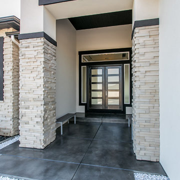
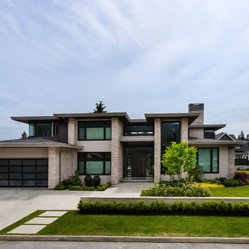
Inspiration for a large contemporary white two-story stucco house exterior remodel in Seattle with a hip roof and a shingle roof
Inspiration for a large contemporary white two-story stucco house exterior remodel in Seattle with a hip roof and a shingle roof
 Home At Last Decor
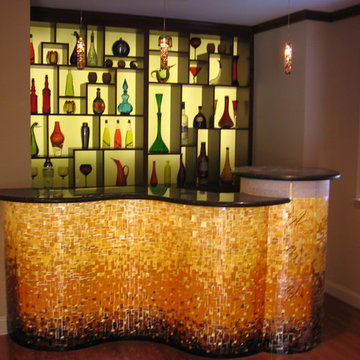
This unique bar uses back-lit glass tiles on the front in a graduated color scheme, complimented by a back=lit glass panel display wall to showcase the glass bottle collections.
 TAM INTERIORS LLC
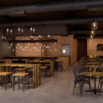
Renovated an optometry office into a casual quick service restaurant.
Minimalist home design photo in Denver
Minimalist home design photo in Denver
Find the right local pro for your project
 Cabinet-S-Top
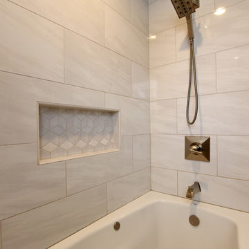
In this bathroom, a Medallion Gold Providence Vanity with Classic Paint Irish Crème was installed with Zodiaq Portfolio London Sky Corian on the countertop and on top of the window seat. A regular rectangular undermount sink with Vesi widespread lavatory faucet in brushed nickel. A Cardinal shower with partition in clear glass with brushed nickel hardware. Mansfield Pro-fit Air Massage bath and Brizo Transitional Hydrati shower with h2Okinetic technology in brushed nickel. Kohler Cimarron comfort height toilet in white.
 Greenleaf Services, Inc.
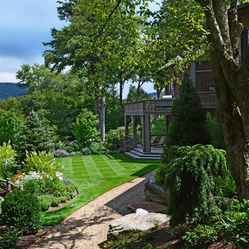
Photo of a huge traditional partial sun backyard landscaping in Other with decking.
 Brock White Construction Materials
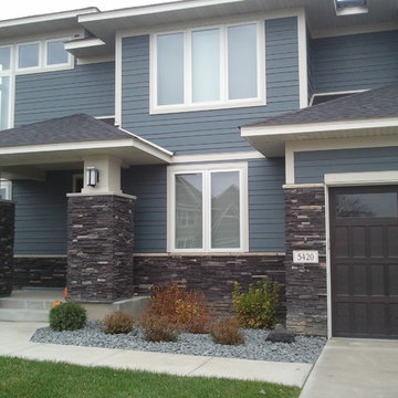
Alpine Ledgestone Black Rundle
Inspiration for a timeless exterior home remodel in Minneapolis
Inspiration for a timeless exterior home remodel in Minneapolis


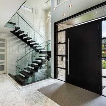
 SGDI - Sarah Gallop Design Inc.
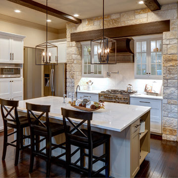
The objective was to create a warm neutral space to later customize to a specific colour palate/preference of the end user for this new construction home being built to sell. A high-end contemporary feel was requested to attract buyers in the area. An impressive kitchen that exuded high class and made an impact on guests as they entered the home, without being overbearing. The space offers an appealing open floorplan conducive to entertaining with indoor-outdoor flow.
Due to the spec nature of this house, the home had to remain appealing to the builder, while keeping a broad audience of potential buyers in mind. The challenge lay in creating a unique look, with visually interesting materials and finishes, while not being so unique that potential owners couldn’t envision making it their own. The focus on key elements elevates the look, while other features blend and offer support to these striking components. As the home was built for sale, profitability was important; materials were sourced at best value, while retaining high-end appeal. Adaptations to the home’s original design plan improve flow and usability within the kitchen-greatroom. The client desired a rich dark finish. The chosen colours tie the kitchen to the rest of the home (creating unity as combination, colours and materials, is repeated throughout).
Photos- Paul Grdina
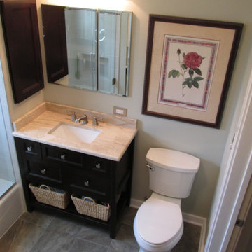
Small trendy master white tile and porcelain tile porcelain tile tub/shower combo photo in Chicago with an undermount sink, recessed-panel cabinets, dark wood cabinets, marble countertops, a two-piece toilet and beige walls
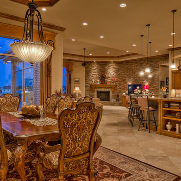
 Arjay Builders Inc.
Home Built by Arjay Builders, Inc.
Photo by Amoura Productions
Cabinetry Provided by Eurowood Cabinetry, Inc.
Kitchen/dining room combo - large traditional porcelain tile kitchen/dining room combo idea in Omaha with brown walls, a corner fireplace and a stone fireplace
Kitchen/dining room combo - large traditional porcelain tile kitchen/dining room combo idea in Omaha with brown walls, a corner fireplace and a stone fireplace
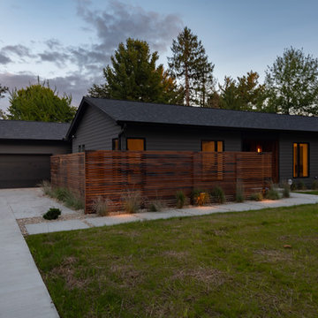
 Susan Yeley Homes
This gem of a house was built in the 1950s, when its neighborhood undoubtedly felt remote. The university footprint has expanded in the 70 years since, however, and today this home sits on prime real estate—easy biking and reasonable walking distance to campus.
When it went up for sale in 2017, it was largely unaltered. Our clients purchased it to renovate and resell, and while we all knew we'd need to add square footage to make it profitable, we also wanted to respect the neighborhood and the house’s own history. Swedes have a word that means “just the right amount”: lagom. It is a guiding philosophy for us at SYH, and especially applied in this renovation. Part of the soul of this house was about living in just the right amount of space. Super sizing wasn’t a thing in 1950s America. So, the solution emerged: keep the original rectangle, but add an L off the back.
With no owner to design with and for, SYH created a layout to appeal to the masses. All public spaces are the back of the home--the new addition that extends into the property’s expansive backyard. A den and four smallish bedrooms are atypically located in the front of the house, in the original 1500 square feet. Lagom is behind that choice: conserve space in the rooms where you spend most of your time with your eyes shut. Put money and square footage toward the spaces in which you mostly have your eyes open.
In the studio, we started calling this project the Mullet Ranch—business up front, party in the back. The front has a sleek but quiet effect, mimicking its original low-profile architecture street-side. It’s very Hoosier of us to keep appearances modest, we think. But get around to the back, and surprise! lofted ceilings and walls of windows. Gorgeous.
 Design Vision Studio
IDS (Interior Design Society) Designer of the Year - National Competition - 3rd Place award winning Living Spaces ($30,000 & Under category)
Photo by: Shawn St. Peter Photography -
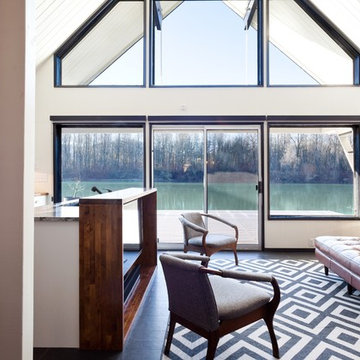
What designer could pass on the opportunity to buy a floating home like the one featured in the movie Sleepless in Seattle? Well, not this one! When I purchased this floating home from my aunt and uncle, I undertook a huge out-of-state remodel. Up for the challenge, I grabbed my water wings, sketchpad, & measuring tape. It was sink or swim for Patricia Lockwood to finish before the end of 2014. The big reveal for the finished houseboat on Sauvie Island will be in the summer of 2015 - so stay tuned.
 SGDI - Sarah Gallop Design Inc.
The objective was to create a warm neutral space to later customize to a specific colour palate/preference of the end user for this new construction home being built to sell. A high-end contemporary feel was requested to attract buyers in the area. An impressive kitchen that exuded high class and made an impact on guests as they entered the home, without being overbearing. The space offers an appealing open floorplan conducive to entertaining with indoor-outdoor flow.
Due to the spec nature of this house, the home had to remain appealing to the builder, while keeping a broad audience of potential buyers in mind. The challenge lay in creating a unique look, with visually interesting materials and finishes, while not being so unique that potential owners couldn’t envision making it their own. The focus on key elements elevates the look, while other features blend and offer support to these striking components. As the home was built for sale, profitability was important; materials were sourced at best value, while retaining high-end appeal. Adaptations to the home’s original design plan improve flow and usability within the kitchen-greatroom. The client desired a rich dark finish. The chosen colours tie the kitchen to the rest of the home (creating unity as combination, colours and materials, is repeated throughout).
Photos- Paul Grdina
 Isla Homes
Ryan Gamma Photography
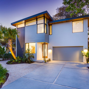
Small minimalist gray two-story mixed siding exterior home photo in Tampa with a shed roof
Small minimalist gray two-story mixed siding exterior home photo in Tampa with a shed roof

 SGDI - Sarah Gallop Design Inc.
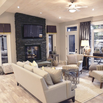
The objective was to create a warm neutral space to later customize to a specific colour palate/preference of the end user for this new construction home being built to sell. A high-end contemporary feel was requested to attract buyers in the area. An impressive kitchen that exuded high class and made an impact on guests as they entered the home, without being overbearing. The space offers an appealing open floorplan conducive to entertaining with indoor-outdoor flow.
Due to the spec nature of this house, the home had to remain appealing to the builder, while keeping a broad audience of potential buyers in mind. The challenge lay in creating a unique look, with visually interesting materials and finishes, while not being so unique that potential owners couldn’t envision making it their own. The focus on key elements elevates the look, while other features blend and offer support to these striking components. As the home was built for sale, profitability was important; materials were sourced at best value, while retaining high-end appeal. Adaptations to the home’s original design plan improve flow and usability within the kitchen-greatroom. The client desired a rich dark finish. The chosen colours tie the kitchen to the rest of the home (creating unity as combination, colours and materials, is repeated throughout).
Photos- Paul Grdina

 Prodigy Homes Inc.
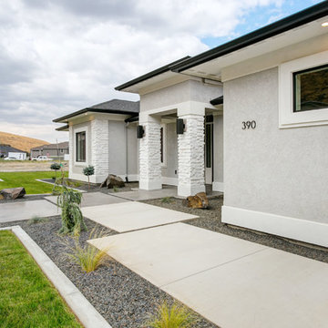
Mid-sized transitional gray one-story stucco house exterior idea in Seattle with a hip roof and a shingle roof
 SGDI - Sarah Gallop Design Inc.
The objective was to create a warm neutral space to later customize to a specific colour palate/preference of the end user for this new construction home being built to sell. A high-end contemporary feel was requested to attract buyers in the area. An impressive kitchen that exuded high class and made an impact on guests as they entered the home, without being overbearing. The space offers an appealing open floorplan conducive to entertaining with indoor-outdoor flow.
Due to the spec nature of this house, the home had to remain appealing to the builder, while keeping a broad audience of potential buyers in mind. The challenge lay in creating a unique look, with visually interesting materials and finishes, while not being so unique that potential owners couldn’t envision making it their own. The focus on key elements elevates the look, while other features blend and offer support to these striking components. As the home was built for sale, profitability was important; materials were sourced at best value, while retaining high-end appeal. Adaptations to the home’s original design plan improve flow and usability within the kitchen-greatroom. The client desired a rich dark finish. The chosen colours tie the kitchen to the rest of the home (creating unity as combination, colours and materials, is repeated throughout).
Photos- Paul Grdina
15