
Search results for "Prohibition" in Home Design Ideas

Mahonia aquifolium / Oregon grape
Photo: Nacho, via Flickr, licensed under Creative Commons Attribution-2.0 Generic. Modified from the original by Debbie Ballentine.

 Case Architects & Remodelers
Project Developer TJ Monahan
http://www.houzz.com/pro/tj-monahan/tj-monahan-case-design-remodeling-inc
Designer Melissa Cooley
http://www.houzz.com/pro/melissacooley04/melissa-cooley-udcp-case-design-remodeling-inc
Photography by Stacy Zarin Goldberg

Find the right local pro for your project
 Crystal Kitchen + Bath
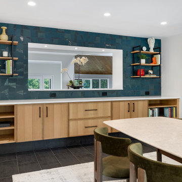
The homeowners wanted to transform their dining room into a more open, functional, and visually connected space while honoring the home’s modern, mid-century style. Their main goals included removing the massive wall of rough-textured cabinetry, adding a view of the backyard from the front door, creating a serving area with multiple outlets for small appliances, incorporating deep drawers for linens, and adding display space. They also wanted quarter sawn oak cabinetry with hardware instead of the nail breaking routed pocket pulls, black accents, and a backsplash tile in a fun color or shape.
Originally, the wall separating the dining room from the kitchen was slated for removal, but engineering requirements made this cost prohibitive. Instead, we collaborated with an architect and engineer to design a passthrough that maintained structural integrity. During construction, hidden HVAC was discovered, prompting us to build the wall out further, resulting in a deeper 16" passthrough; a happy accident that created an ideal display area with puck lighting.
The cabinetry features Crystal Cabinet Works’ Encore frameless line in Quarter Sawn White Oak with a Natural matte finish, paired with matte black ladder shelves for display. A tiled, extra-deep toekick covered in matching floor tile gives the appearance of floating cabinetry while ensuring easy, mop-friendly maintenance. The wall is finished in matte square Nemo tile with glossy accents, adding vibrant color and texture. Cambria’s Smithfield quartz countertops provide a durable serving surface, while black floor tile with a metallic finish grounds the design.
Now, the dining room serves as a hub for entertaining, with ample space for serving dishes, convenient power access, and a direct sightline from the kitchen to the backyard.
Ready for a dining space that serves looks as well as dinner? Pull up a chair and let’s talk.
 Crystal Kitchen + Bath
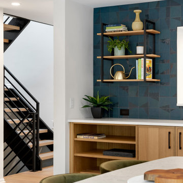
The homeowners wanted to transform their dining room into a more open, functional, and visually connected space while honoring the home’s modern, mid-century style. Their main goals included removing the massive wall of rough-textured cabinetry, adding a view of the backyard from the front door, creating a serving area with multiple outlets for small appliances, incorporating deep drawers for linens, and adding display space. They also wanted quarter sawn oak cabinetry with hardware instead of the nail breaking routed pocket pulls, black accents, and a backsplash tile in a fun color or shape.
Originally, the wall separating the dining room from the kitchen was slated for removal, but engineering requirements made this cost prohibitive. Instead, we collaborated with an architect and engineer to design a passthrough that maintained structural integrity. During construction, hidden HVAC was discovered, prompting us to build the wall out further, resulting in a deeper 16" passthrough; a happy accident that created an ideal display area with puck lighting.
The cabinetry features Crystal Cabinet Works’ Encore frameless line in Quarter Sawn White Oak with a Natural matte finish, paired with matte black ladder shelves for display. A tiled, extra-deep toekick covered in matching floor tile gives the appearance of floating cabinetry while ensuring easy, mop-friendly maintenance. The wall is finished in matte square Nemo tile with glossy accents, adding vibrant color and texture. Cambria’s Smithfield quartz countertops provide a durable serving surface, while black floor tile with a metallic finish grounds the design.
Now, the dining room serves as a hub for entertaining, with ample space for serving dishes, convenient power access, and a direct sightline from the kitchen to the backyard.
Ready for a dining space that serves looks as well as dinner? Pull up a chair and let’s talk.
 Crystal Kitchen + Bath
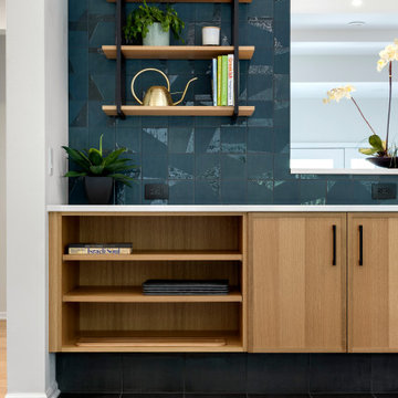
The homeowners wanted to transform their dining room into a more open, functional, and visually connected space while honoring the home’s modern, mid-century style. Their main goals included removing the massive wall of rough-textured cabinetry, adding a view of the backyard from the front door, creating a serving area with multiple outlets for small appliances, incorporating deep drawers for linens, and adding display space. They also wanted quarter sawn oak cabinetry with hardware instead of the nail breaking routed pocket pulls, black accents, and a backsplash tile in a fun color or shape.
Originally, the wall separating the dining room from the kitchen was slated for removal, but engineering requirements made this cost prohibitive. Instead, we collaborated with an architect and engineer to design a passthrough that maintained structural integrity. During construction, hidden HVAC was discovered, prompting us to build the wall out further, resulting in a deeper 16" passthrough; a happy accident that created an ideal display area with puck lighting.
The cabinetry features Crystal Cabinet Works’ Encore frameless line in Quarter Sawn White Oak with a Natural matte finish, paired with matte black ladder shelves for display. A tiled, extra-deep toekick covered in matching floor tile gives the appearance of floating cabinetry while ensuring easy, mop-friendly maintenance. The wall is finished in matte square Nemo tile with glossy accents, adding vibrant color and texture. Cambria’s Smithfield quartz countertops provide a durable serving surface, while black floor tile with a metallic finish grounds the design.
Now, the dining room serves as a hub for entertaining, with ample space for serving dishes, convenient power access, and a direct sightline from the kitchen to the backyard.
Ready for a dining space that serves looks as well as dinner? Pull up a chair and let’s talk.

 Riverside Construction, LLC
Challenge
This Lafayette kitchen was dark and poorly-lit due to the unsightly soffits that hindered adequate lighting throughout the space. A bulky microwave cabinet impeded the homeowners’ ability to use the counter space below it, and the full range cooktop on the center island took up valuable prep space. Additional space was lost in an unused desk area that had no functional purpose. To make matters worse, a leaky appliance damaged their beautiful hardwood floors. Needless to say, these Lafayette homeowners were ready to remodel. With insurance check in hand, they contacted Riverside Construction to help them design and build a kitchen that would solve all of their functional challenges.
Solution
By removing the soffits, Riverside Construction was able to design the cabinets to reach all the way to the ceiling. This allowed for ample storage, and the ability for the homeowner to display her pretty dishes and other kitchen collectibles along one wall.
A non-removable pipe along the second wall and above the sink prohibited Riverside Construction from adding glass panels. However, we were still able to attach a standard cabinet door instead and preserve the seamless look that the homeowner was looking for.
The appliances were rearranged to make better use of the workspace and create better traffic flow.
Luckily, we were able to locate the same hardwood flooring that had been laid in their kitchen (not always feasible). This allowed us to repair the damaged wood and blend it seamlessly with the existing floor.
Although required by code, the homeowner didn’t like the outlets disrupting the visual appeal of the backsplash. She wanted Riverside Construction to figure out a way to hide all of the outlets. Our solution was to install power strips that mounted under the cabinets at a slight angle where the cabinet met the wall, making them less visible but still easily accessible.
Results
The homeowners were thrilled they didn’t need to pay for the cost of an entire new floor. They were also pleased with a beautiful new kitchen that met all of their needs exactly.
 Crystal Kitchen + Bath
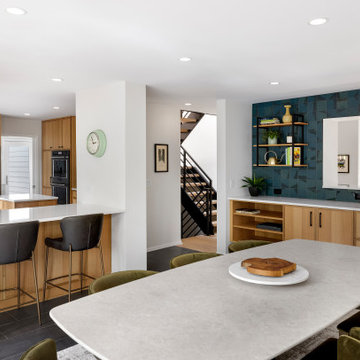
The homeowners wanted to transform their dining room into a more open, functional, and visually connected space while honoring the home’s modern, mid-century style. Their main goals included removing the massive wall of rough-textured cabinetry, adding a view of the backyard from the front door, creating a serving area with multiple outlets for small appliances, incorporating deep drawers for linens, and adding display space. They also wanted quarter sawn oak cabinetry with hardware instead of the nail breaking routed pocket pulls, black accents, and a backsplash tile in a fun color or shape.
Originally, the wall separating the dining room from the kitchen was slated for removal, but engineering requirements made this cost prohibitive. Instead, we collaborated with an architect and engineer to design a passthrough that maintained structural integrity. During construction, hidden HVAC was discovered, prompting us to build the wall out further, resulting in a deeper 16" passthrough; a happy accident that created an ideal display area with puck lighting.
The cabinetry features Crystal Cabinet Works’ Encore frameless line in Quarter Sawn White Oak with a Natural matte finish, paired with matte black ladder shelves for display. A tiled, extra-deep toekick covered in matching floor tile gives the appearance of floating cabinetry while ensuring easy, mop-friendly maintenance. The wall is finished in matte square Nemo tile with glossy accents, adding vibrant color and texture. Cambria’s Smithfield quartz countertops provide a durable serving surface, while black floor tile with a metallic finish grounds the design.
Now, the dining room serves as a hub for entertaining, with ample space for serving dishes, convenient power access, and a direct sightline from the kitchen to the backyard.
Ready for a dining space that serves looks as well as dinner? Pull up a chair and let’s talk.
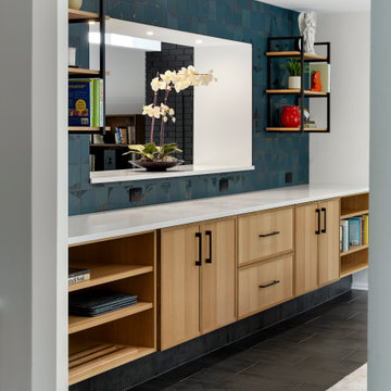 Crystal Kitchen + Bath
The homeowners wanted to transform their dining room into a more open, functional, and visually connected space while honoring the home’s modern, mid-century style. Their main goals included removing the massive wall of rough-textured cabinetry, adding a view of the backyard from the front door, creating a serving area with multiple outlets for small appliances, incorporating deep drawers for linens, and adding display space. They also wanted quarter sawn oak cabinetry with hardware instead of the nail breaking routed pocket pulls, black accents, and a backsplash tile in a fun color or shape.
Originally, the wall separating the dining room from the kitchen was slated for removal, but engineering requirements made this cost prohibitive. Instead, we collaborated with an architect and engineer to design a passthrough that maintained structural integrity. During construction, hidden HVAC was discovered, prompting us to build the wall out further, resulting in a deeper 16" passthrough; a happy accident that created an ideal display area with puck lighting.
The cabinetry features Crystal Cabinet Works’ Encore frameless line in Quarter Sawn White Oak with a Natural matte finish, paired with matte black ladder shelves for display. A tiled, extra-deep toekick covered in matching floor tile gives the appearance of floating cabinetry while ensuring easy, mop-friendly maintenance. The wall is finished in matte square Nemo tile with glossy accents, adding vibrant color and texture. Cambria’s Smithfield quartz countertops provide a durable serving surface, while black floor tile with a metallic finish grounds the design.
Now, the dining room serves as a hub for entertaining, with ample space for serving dishes, convenient power access, and a direct sightline from the kitchen to the backyard.
Ready for a dining space that serves looks as well as dinner? Pull up a chair and let’s talk.
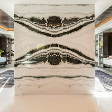
 Whipple Russell Architects
Bundy Drive Brentwood, Los Angeles modern home luxury marble wall primary bathroom. Photo by Simon Berlyn.
Bathroom - huge modern master black and white tile and marble tile white floor and tray ceiling bathroom idea in Los Angeles with multicolored walls
Bathroom - huge modern master black and white tile and marble tile white floor and tray ceiling bathroom idea in Los Angeles with multicolored walls

 GALAXY OUTDOOR LLC
Alpha Wellness Sensations is an international leader, pioneer and trendsetter in the high-end wellness industry for decades, supplying a wide range of exceptional quality steam baths, sunbeds, traditional and infrared saunas. The company specializes in custom-built spa, rejuvenation and wellness solutions.

 RAJ Kitchen and Bath, LLC
There were a few difficulties in making this kitchen any better than how it was. There was a separate staircase that had access to the second floor which was located in the kitchen. This left just enough room to push the dining room to one side. Then, there was the porch. A really nice panoramic view of the back, but was somehow under-used by the family during the summer months. Then, it was the size of the kitchen. It simply was way too small for a growing family, and while it had a peninsular in place, the flow just didn’t work. I remember watching them one day demonstrating how awkward it was using the kitchen. We got it! We had our marching orders to go and figure out how to make this kitchen work for this family.
Everything in the room was fair play. The design was done to make the kitchen very open. For a few ideas, we incorporated the porch in the kitchen by using the nana wall idea but it ended up being too cost prohibitive to do so. We then decided to do a permanent fix by using a commercial glass wall application. Once we figured that out, we moved back inside and removed the staircase. This gave us two added benefits. One allowed us to really reconfigure the kitchen and the other opened up the second floor for a huge built in closet system.
We relocated the windows, added a fire place with a built In TV above. From there, it was onto the kitchen itself which contained a huge Island with seating, large kitchen sink and built in appliances which was set up in a way to take advantage of the new layout. We re-positioned the kitchen facing the beautiful views outside rather than looking towards a wall. Now, when you enter the house up the entry stairs, the kitchen now draws you into the magnificent new open space. This is now setup for entertaining, relaxation, hanging out and most of all, preparing meals in a room where you only have to leave if you want to.
This one was all about the design. Design was what made this space. Setting this space up for success was crucial, and this kitchen is a great example of how design can cover a multitude of sins in Kitchen designs.
… Just close your eyes for a second and imagine waking up one winter morning and having a cup of coffee and watching the snow fall through those huge windows, leaning up against those 3D feature walls while watching the kids sitting around the table enjoying those warm radiant heated floors in this spacious kitchen…..
 RAJ Kitchen and Bath, LLC
There were a few difficulties in making this kitchen any better than how it was. There was a separate staircase that had access to the second floor which was located in the kitchen. This left just enough room to push the dining room to one side. Then, there was the porch. A really nice panoramic view of the back, but was somehow under-used by the family during the summer months. Then, it was the size of the kitchen. It simply was way too small for a growing family, and while it had a peninsular in place, the flow just didn’t work. I remember watching them one day demonstrating how awkward it was using the kitchen. We got it! We had our marching orders to go and figure out how to make this kitchen work for this family.
Everything in the room was fair play. The design was done to make the kitchen very open. For a few ideas, we incorporated the porch in the kitchen by using the nana wall idea but it ended up being too cost prohibitive to do so. We then decided to do a permanent fix by using a commercial glass wall application. Once we figured that out, we moved back inside and removed the staircase. This gave us two added benefits. One allowed us to really reconfigure the kitchen and the other opened up the second floor for a huge built in closet system.
We relocated the windows, added a fire place with a built In TV above. From there, it was onto the kitchen itself which contained a huge Island with seating, large kitchen sink and built in appliances which was set up in a way to take advantage of the new layout. We re-positioned the kitchen facing the beautiful views outside rather than looking towards a wall. Now, when you enter the house up the entry stairs, the kitchen now draws you into the magnificent new open space. This is now setup for entertaining, relaxation, hanging out and most of all, preparing meals in a room where you only have to leave if you want to.
This one was all about the design. Design was what made this space. Setting this space up for success was crucial, and this kitchen is a great example of how design can cover a multitude of sins in Kitchen designs.
… Just close your eyes for a second and imagine waking up one winter morning and having a cup of coffee and watching the snow fall through those huge windows, leaning up against those 3D feature walls while watching the kids sitting around the table enjoying those warm radiant heated floors in this spacious kitchen…..
 RAJ Kitchen and Bath, LLC
There were a few difficulties in making this kitchen any better than how it was. There was a separate staircase that had access to the second floor which was located in the kitchen. This left just enough room to push the dining room to one side. Then, there was the porch. A really nice panoramic view of the back, but was somehow under-used by the family during the summer months. Then, it was the size of the kitchen. It simply was way too small for a growing family, and while it had a peninsular in place, the flow just didn’t work. I remember watching them one day demonstrating how awkward it was using the kitchen. We got it! We had our marching orders to go and figure out how to make this kitchen work for this family.
Everything in the room was fair play. The design was done to make the kitchen very open. For a few ideas, we incorporated the porch in the kitchen by using the nana wall idea but it ended up being too cost prohibitive to do so. We then decided to do a permanent fix by using a commercial glass wall application. Once we figured that out, we moved back inside and removed the staircase. This gave us two added benefits. One allowed us to really reconfigure the kitchen and the other opened up the second floor for a huge built in closet system.
We relocated the windows, added a fire place with a built In TV above. From there, it was onto the kitchen itself which contained a huge Island with seating, large kitchen sink and built in appliances which was set up in a way to take advantage of the new layout. We re-positioned the kitchen facing the beautiful views outside rather than looking towards a wall. Now, when you enter the house up the entry stairs, the kitchen now draws you into the magnificent new open space. This is now setup for entertaining, relaxation, hanging out and most of all, preparing meals in a room where you only have to leave if you want to.
This one was all about the design. Design was what made this space. Setting this space up for success was crucial, and this kitchen is a great example of how design can cover a multitude of sins in Kitchen designs.
… Just close your eyes for a second and imagine waking up one winter morning and having a cup of coffee and watching the snow fall through those huge windows, leaning up against those 3D feature walls while watching the kids sitting around the table enjoying those warm radiant heated floors in this spacious kitchen…..
 RAJ Kitchen and Bath, LLC
There were a few difficulties in making this kitchen any better than how it was. There was a separate staircase that had access to the second floor which was located in the kitchen. This left just enough room to push the dining room to one side. Then, there was the porch. A really nice panoramic view of the back, but was somehow under-used by the family during the summer months. Then, it was the size of the kitchen. It simply was way too small for a growing family, and while it had a peninsular in place, the flow just didn’t work. I remember watching them one day demonstrating how awkward it was using the kitchen. We got it! We had our marching orders to go and figure out how to make this kitchen work for this family.
Everything in the room was fair play. The design was done to make the kitchen very open. For a few ideas, we incorporated the porch in the kitchen by using the nana wall idea but it ended up being too cost prohibitive to do so. We then decided to do a permanent fix by using a commercial glass wall application. Once we figured that out, we moved back inside and removed the staircase. This gave us two added benefits. One allowed us to really reconfigure the kitchen and the other opened up the second floor for a huge built in closet system.
We relocated the windows, added a fire place with a built In TV above. From there, it was onto the kitchen itself which contained a huge Island with seating, large kitchen sink and built in appliances which was set up in a way to take advantage of the new layout. We re-positioned the kitchen facing the beautiful views outside rather than looking towards a wall. Now, when you enter the house up the entry stairs, the kitchen now draws you into the magnificent new open space. This is now setup for entertaining, relaxation, hanging out and most of all, preparing meals in a room where you only have to leave if you want to.
This one was all about the design. Design was what made this space. Setting this space up for success was crucial, and this kitchen is a great example of how design can cover a multitude of sins in Kitchen designs.
… Just close your eyes for a second and imagine waking up one winter morning and having a cup of coffee and watching the snow fall through those huge windows, leaning up against those 3D feature walls while watching the kids sitting around the table enjoying those warm radiant heated floors in this spacious kitchen…..
 RAJ Kitchen and Bath, LLC
There were a few difficulties in making this kitchen any better than how it was. There was a separate staircase that had access to the second floor which was located in the kitchen. This left just enough room to push the dining room to one side. Then, there was the porch. A really nice panoramic view of the back, but was somehow under-used by the family during the summer months. Then, it was the size of the kitchen. It simply was way too small for a growing family, and while it had a peninsular in place, the flow just didn’t work. I remember watching them one day demonstrating how awkward it was using the kitchen. We got it! We had our marching orders to go and figure out how to make this kitchen work for this family.
Everything in the room was fair play. The design was done to make the kitchen very open. For a few ideas, we incorporated the porch in the kitchen by using the nana wall idea but it ended up being too cost prohibitive to do so. We then decided to do a permanent fix by using a commercial glass wall application. Once we figured that out, we moved back inside and removed the staircase. This gave us two added benefits. One allowed us to really reconfigure the kitchen and the other opened up the second floor for a huge built in closet system.
We relocated the windows, added a fire place with a built In TV above. From there, it was onto the kitchen itself which contained a huge Island with seating, large kitchen sink and built in appliances which was set up in a way to take advantage of the new layout. We re-positioned the kitchen facing the beautiful views outside rather than looking towards a wall. Now, when you enter the house up the entry stairs, the kitchen now draws you into the magnificent new open space. This is now setup for entertaining, relaxation, hanging out and most of all, preparing meals in a room where you only have to leave if you want to.
This one was all about the design. Design was what made this space. Setting this space up for success was crucial, and this kitchen is a great example of how design can cover a multitude of sins in Kitchen designs.
… Just close your eyes for a second and imagine waking up one winter morning and having a cup of coffee and watching the snow fall through those huge windows, leaning up against those 3D feature walls while watching the kids sitting around the table enjoying those warm radiant heated floors in this spacious kitchen…..

 Lowcountry Custom Pool and Spa
Inground concrete swimming pool with elevated hot tub spa, automatic pool cover, Travertine pool coping and decking in a basket weave pattern. Outdoor loungers with Sunbrella fabric as well as a covered outdoor living space.
Photo credit: Charleston Home and Design
 RAJ Kitchen and Bath, LLC
There were a few difficulties in making this kitchen any better than how it was. There was a separate staircase that had access to the second floor which was located in the kitchen. This left just enough room to push the dining room to one side. Then, there was the porch. A really nice panoramic view of the back, but was somehow under-used by the family during the summer months. Then, it was the size of the kitchen. It simply was way too small for a growing family, and while it had a peninsular in place, the flow just didn’t work. I remember watching them one day demonstrating how awkward it was using the kitchen. We got it! We had our marching orders to go and figure out how to make this kitchen work for this family.
Everything in the room was fair play. The design was done to make the kitchen very open. For a few ideas, we incorporated the porch in the kitchen by using the nana wall idea but it ended up being too cost prohibitive to do so. We then decided to do a permanent fix by using a commercial glass wall application. Once we figured that out, we moved back inside and removed the staircase. This gave us two added benefits. One allowed us to really reconfigure the kitchen and the other opened up the second floor for a huge built in closet system.
We relocated the windows, added a fire place with a built In TV above. From there, it was onto the kitchen itself which contained a huge Island with seating, large kitchen sink and built in appliances which was set up in a way to take advantage of the new layout. We re-positioned the kitchen facing the beautiful views outside rather than looking towards a wall. Now, when you enter the house up the entry stairs, the kitchen now draws you into the magnificent new open space. This is now setup for entertaining, relaxation, hanging out and most of all, preparing meals in a room where you only have to leave if you want to.
This one was all about the design. Design was what made this space. Setting this space up for success was crucial, and this kitchen is a great example of how design can cover a multitude of sins in Kitchen designs.
… Just close your eyes for a second and imagine waking up one winter morning and having a cup of coffee and watching the snow fall through those huge windows, leaning up against those 3D feature walls while watching the kids sitting around the table enjoying those warm radiant heated floors in this spacious kitchen…..
 RAJ Kitchen and Bath, LLC
There were a few difficulties in making this kitchen any better than how it was. There was a separate staircase that had access to the second floor which was located in the kitchen. This left just enough room to push the dining room to one side. Then, there was the porch. A really nice panoramic view of the back, but was somehow under-used by the family during the summer months. Then, it was the size of the kitchen. It simply was way too small for a growing family, and while it had a peninsular in place, the flow just didn’t work. I remember watching them one day demonstrating how awkward it was using the kitchen. We got it! We had our marching orders to go and figure out how to make this kitchen work for this family.
Everything in the room was fair play. The design was done to make the kitchen very open. For a few ideas, we incorporated the porch in the kitchen by using the nana wall idea but it ended up being too cost prohibitive to do so. We then decided to do a permanent fix by using a commercial glass wall application. Once we figured that out, we moved back inside and removed the staircase. This gave us two added benefits. One allowed us to really reconfigure the kitchen and the other opened up the second floor for a huge built in closet system.
We relocated the windows, added a fire place with a built In TV above. From there, it was onto the kitchen itself which contained a huge Island with seating, large kitchen sink and built in appliances which was set up in a way to take advantage of the new layout. We re-positioned the kitchen facing the beautiful views outside rather than looking towards a wall. Now, when you enter the house up the entry stairs, the kitchen now draws you into the magnificent new open space. This is now setup for entertaining, relaxation, hanging out and most of all, preparing meals in a room where you only have to leave if you want to.
This one was all about the design. Design was what made this space. Setting this space up for success was crucial, and this kitchen is a great example of how design can cover a multitude of sins in Kitchen designs.
… Just close your eyes for a second and imagine waking up one winter morning and having a cup of coffee and watching the snow fall through those huge windows, leaning up against those 3D feature walls while watching the kids sitting around the table enjoying those warm radiant heated floors in this spacious kitchen…..
 RAJ Kitchen and Bath, LLC
There were a few difficulties in making this kitchen any better than how it was. There was a separate staircase that had access to the second floor which was located in the kitchen. This left just enough room to push the dining room to one side. Then, there was the porch. A really nice panoramic view of the back, but was somehow under-used by the family during the summer months. Then, it was the size of the kitchen. It simply was way too small for a growing family, and while it had a peninsular in place, the flow just didn’t work. I remember watching them one day demonstrating how awkward it was using the kitchen. We got it! We had our marching orders to go and figure out how to make this kitchen work for this family.
Everything in the room was fair play. The design was done to make the kitchen very open. For a few ideas, we incorporated the porch in the kitchen by using the nana wall idea but it ended up being too cost prohibitive to do so. We then decided to do a permanent fix by using a commercial glass wall application. Once we figured that out, we moved back inside and removed the staircase. This gave us two added benefits. One allowed us to really reconfigure the kitchen and the other opened up the second floor for a huge built in closet system.
We relocated the windows, added a fire place with a built In TV above. From there, it was onto the kitchen itself which contained a huge Island with seating, large kitchen sink and built in appliances which was set up in a way to take advantage of the new layout. We re-positioned the kitchen facing the beautiful views outside rather than looking towards a wall. Now, when you enter the house up the entry stairs, the kitchen now draws you into the magnificent new open space. This is now setup for entertaining, relaxation, hanging out and most of all, preparing meals in a room where you only have to leave if you want to.
This one was all about the design. Design was what made this space. Setting this space up for success was crucial, and this kitchen is a great example of how design can cover a multitude of sins in Kitchen designs.
… Just close your eyes for a second and imagine waking up one winter morning and having a cup of coffee and watching the snow fall through those huge windows, leaning up against those 3D feature walls while watching the kids sitting around the table enjoying those warm radiant heated floors in this spacious kitchen…..
56