
Search results for "Prohibitive" in Home Design Ideas
 Riverside Construction, LLC
Challenge
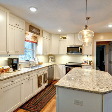
This Lafayette kitchen was dark and poorly-lit due to the unsightly soffits that hindered adequate lighting throughout the space. A bulky microwave cabinet impeded the homeowners’ ability to use the counter space below it, and the full range cooktop on the center island took up valuable prep space. Additional space was lost in an unused desk area that had no functional purpose. To make matters worse, a leaky appliance damaged their beautiful hardwood floors. Needless to say, these Lafayette homeowners were ready to remodel. With insurance check in hand, they contacted Riverside Construction to help them design and build a kitchen that would solve all of their functional challenges.
Solution
By removing the soffits, Riverside Construction was able to design the cabinets to reach all the way to the ceiling. This allowed for ample storage, and the ability for the homeowner to display her pretty dishes and other kitchen collectibles along one wall.
A non-removable pipe along the second wall and above the sink prohibited Riverside Construction from adding glass panels. However, we were still able to attach a standard cabinet door instead and preserve the seamless look that the homeowner was looking for.
The appliances were rearranged to make better use of the workspace and create better traffic flow.
Luckily, we were able to locate the same hardwood flooring that had been laid in their kitchen (not always feasible). This allowed us to repair the damaged wood and blend it seamlessly with the existing floor.
Although required by code, the homeowner didn’t like the outlets disrupting the visual appeal of the backsplash. She wanted Riverside Construction to figure out a way to hide all of the outlets. Our solution was to install power strips that mounted under the cabinets at a slight angle where the cabinet met the wall, making them less visible but still easily accessible.
Results
The homeowners were thrilled they didn’t need to pay for the cost of an entire new floor. They were also pleased with a beautiful new kitchen that met all of their needs exactly.
 AIBD - American Institute of Building Design
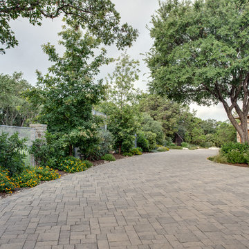
The designers were forced by site constraints to place the front door substantially pointed at the side of the neighbor's property. Deed restrictions prohibited a conventional privacy fence, and a fortress-like barrier was undesirable. The designer only had a little space to fit both plantings and the new metal screening. They worked out a patchwork of interesting metal mesh and other metal panels, along with more conventional iron fence pales and stock wire, to visually tie the new metal screening to fences found elsewhere on the property.
An ARDA for Design Details goes to
Hobbs’ Ink
Designer: Janet Hobbs
From: Bee cave, Texas

 Jennifer Hutton
Exposed brick ...................................................................................................................................................................................................................................................................................................................................... . . These photographs are protected by Untied States and International copyright laws. Reproduction and/or distribution of any of these photographs without explicit written permission of Jennifer Hutton is prohibited. For reproduction permission, please contact the owner. All rights reserved
Find the right local pro for your project
 Rochman Design Build
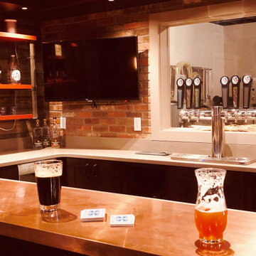
In this project, Rochman Design Build converted an unfinished basement of a new Ann Arbor home into a stunning home pub and entertaining area, with commercial grade space for the owners' craft brewing passion. The feel is that of a speakeasy as a dark and hidden gem found in prohibition time. The materials include charcoal stained concrete floor, an arched wall veneered with red brick, and an exposed ceiling structure painted black. Bright copper is used as the sparkling gem with a pressed-tin-type ceiling over the bar area, which seats 10, copper bar top and concrete counters. Old style light fixtures with bare Edison bulbs, well placed LED accent lights under the bar top, thick shelves, steel supports and copper rivet connections accent the feel of the 6 active taps old-style pub. Meanwhile, the brewing room is splendidly modern with large scale brewing equipment, commercial ventilation hood, wash down facilities and specialty equipment. A large window allows a full view into the brewing room from the pub sitting area. In addition, the space is large enough to feel cozy enough for 4 around a high-top table or entertain a large gathering of 50. The basement remodel also includes a wine cellar, a guest bathroom and a room that can be used either as guest room or game room, and a storage area.
 Jennifer Hutton
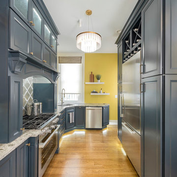
Bold eclectic kitchen. Navy blue cabinets. -------------------------------------------------------------------------------------------------------------------------------------------------------------------------------------------------------------------------------------These photographs are protected by Untied States and International copyright laws. Reproduction and/or distribution of any of these photographs without explicit written permission of Jennifer Hutton is prohibited. For reproduction permission, please contact the owner. All rights reserved. (C)
 Jennifer Hutton
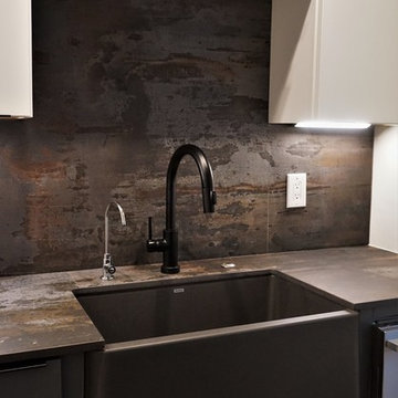
Farm sink -------------------------------------------------------------------------------------------------------------------------------------------------------------------------------------------------------------------------------------These photographs are protected by Untied States and International copyright laws. Reproduction and/or distribution of any of these photographs without explicit written permission of Jennifer Hutton is prohibited. For reproduction permission, please contact the owner. All rights reserved. (C)
 Jennifer Hutton
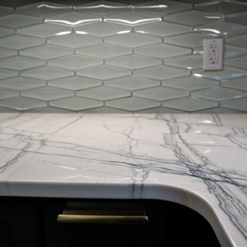
Countertop details -------------------------------------------------------------------------------------------------------------------------------------------------------------------------------------------------------------------------------------These photographs are protected by Untied States and International copyright laws. Reproduction and/or distribution of any of these photographs without explicit written permission of Jennifer Hutton is prohibited. For reproduction permission, please contact the owner. All rights reserved. (C)
 TVL Creative Ltd.
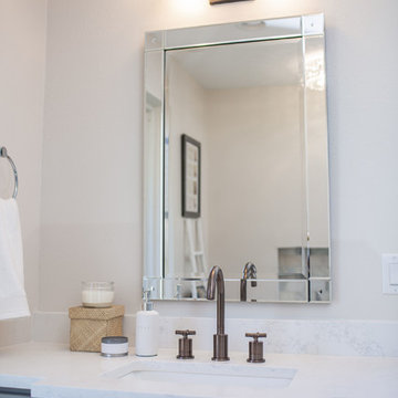
Our clients, two NYC transplants, were excited to have a large yard and ample square footage, but their 1959 ranch featured an en-suite bathroom that was more big-apple-tiny and certainly not fit for two. The original goal was to build a master suite addition on to the south side of the house, but the combination of contractor availability and Denver building costs made the project cost prohibitive. So we turned our attention to how we could maximize the existing square footage to create a true master with walk-in closet, soaking tub, commode room, and large vanity with lots of storage. The south side of the house was converted from two bedrooms, one with the small en-suite bathroom, to a master suite fit for our client’s lifestyle. We used the existing bathroom footprint to place a large shower which hidden niches, a window, and a built-in bench. The commode room took the place of the old shower. The original ‘master’ bedroom was divided in half to provide space for the walk-in closet and their new master bathroom. The clients have, what we dubbed, a classy eclectic aesthetic and we wanted to embrace that with the materials. The 3 x 12 ceramic tile is Fireclay’s Tidewater glaze. The soft variation of a handmade tile plus the herringbone pattern installation makes for a real show stopper. We chose a 3 x 6 marble subway with blue and green veining to compliment the feature tile. The chrome and oil-rubbed bronze metal mix was carefully planned based on where we wanted to add brightness and where we wanted contrast. Chrome was a no-brainer for the shower because we wanted to let the Fireclay tile shine. Over at the vanity, we wanted the fixtures to pop so we opted for oil-rubbed bronze. Final details include a series of robe hook- which is a real option with our dry climate in Colorado. No smelly, damp towels!- a magazine rack ladder and a few pops of wood for warmth and texture.

 EcoHaven
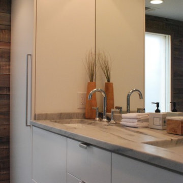
We debated just building a closet at the end of the vanity to save money, but was so glad we went for the custom cabinet. What a statement it makes! We designed it to fit under the 7ft dropped down ceiling that houses the ducts on that floor of the house (something we tried so hard to remove in the design but would have been cost prohibitive to do!)
 Jennifer Hutton
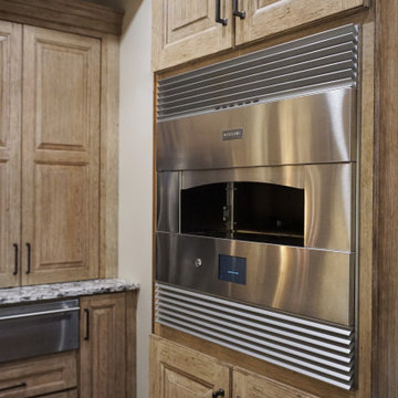
11. Monogram hearth oven -------------------------------------------------------------------------------------------------------------------------------------------------------------------------------------------------------------------------------------These photographs are protected by Untied States and International copyright laws. Reproduction and/or distribution of any of these photographs without explicit written permission of Jennifer Hutton is prohibited. For reproduction permission, please contact the owner. All rights reserved. (C)
 TVL Creative Ltd.
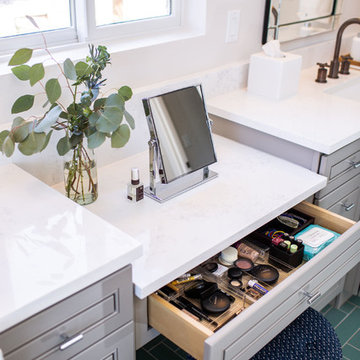
Our clients, two NYC transplants, were excited to have a large yard and ample square footage, but their 1959 ranch featured an en-suite bathroom that was more big-apple-tiny and certainly not fit for two. The original goal was to build a master suite addition on to the south side of the house, but the combination of contractor availability and Denver building costs made the project cost prohibitive. So we turned our attention to how we could maximize the existing square footage to create a true master with walk-in closet, soaking tub, commode room, and large vanity with lots of storage. The south side of the house was converted from two bedrooms, one with the small en-suite bathroom, to a master suite fit for our client’s lifestyle. We used the existing bathroom footprint to place a large shower which hidden niches, a window, and a built-in bench. The commode room took the place of the old shower. The original ‘master’ bedroom was divided in half to provide space for the walk-in closet and their new master bathroom. The clients have, what we dubbed, a classy eclectic aesthetic and we wanted to embrace that with the materials. The 3 x 12 ceramic tile is Fireclay’s Tidewater glaze. The soft variation of a handmade tile plus the herringbone pattern installation makes for a real show stopper. We chose a 3 x 6 marble subway with blue and green veining to compliment the feature tile. The chrome and oil-rubbed bronze metal mix was carefully planned based on where we wanted to add brightness and where we wanted contrast. Chrome was a no-brainer for the shower because we wanted to let the Fireclay tile shine. Over at the vanity, we wanted the fixtures to pop so we opted for oil-rubbed bronze. Final details include a series of robe hook- which is a real option with our dry climate in Colorado. No smelly, damp towels!- a magazine rack ladder and a few pops of wood for warmth and texture.
 Jennifer Hutton
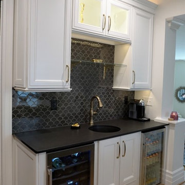
Wet bar -------------------------------------------------------------------------------------------------------------------------------------------------------------------------------------------------------------------------------------These photographs are protected by Untied States and International copyright laws. Reproduction and/or distribution of any of these photographs without explicit written permission of Jennifer Hutton is prohibited. For reproduction permission, please contact the owner. All rights reserved. (C)
 Jennifer Hutton
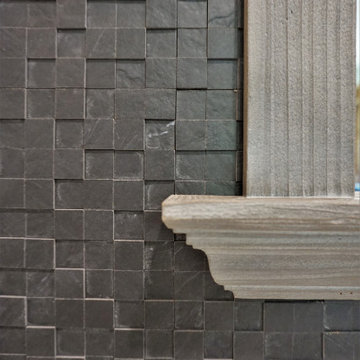
3. Stone backsplash -------------------------------------------------------------------------------------------------------------------------------------------------------------------------------------------------------------------------------------These photographs are protected by Untied States and International copyright laws. Reproduction and/or distribution of any of these photographs without explicit written permission of Jennifer Hutton is prohibited. For reproduction permission, please contact the owner. All rights reserved. (C)
 Rebecca Quandt Interiors
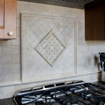
A custom backsplash design was creatively designed by combining the various tile sizes, accents, borders, and trim pieces available in the same natural travertine stone. Natural stone backsplashes can be prohibitively expensive depending on the retailer, but by purchasing the tile through my Designer Trade Account, the natural stone travertine cost a fraction of retail, thus making it an affordable option within the budget.
Rebecca Quandt
 TVL Creative Ltd.
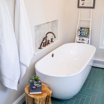
Our clients, two NYC transplants, were excited to have a large yard and ample square footage, but their 1959 ranch featured an en-suite bathroom that was more big-apple-tiny and certainly not fit for two. The original goal was to build a master suite addition on to the south side of the house, but the combination of contractor availability and Denver building costs made the project cost prohibitive. So we turned our attention to how we could maximize the existing square footage to create a true master with walk-in closet, soaking tub, commode room, and large vanity with lots of storage. The south side of the house was converted from two bedrooms, one with the small en-suite bathroom, to a master suite fit for our client’s lifestyle. We used the existing bathroom footprint to place a large shower which hidden niches, a window, and a built-in bench. The commode room took the place of the old shower. The original ‘master’ bedroom was divided in half to provide space for the walk-in closet and their new master bathroom. The clients have, what we dubbed, a classy eclectic aesthetic and we wanted to embrace that with the materials. The 3 x 12 ceramic tile is Fireclay’s Tidewater glaze. The soft variation of a handmade tile plus the herringbone pattern installation makes for a real show stopper. We chose a 3 x 6 marble subway with blue and green veining to compliment the feature tile. The chrome and oil-rubbed bronze metal mix was carefully planned based on where we wanted to add brightness and where we wanted contrast. Chrome was a no-brainer for the shower because we wanted to let the Fireclay tile shine. Over at the vanity, we wanted the fixtures to pop so we opted for oil-rubbed bronze. Final details include a series of robe hook- which is a real option with our dry climate in Colorado. No smelly, damp towels!- a magazine rack ladder and a few pops of wood for warmth and texture.
 RAJ Kitchen and Bath, LLC
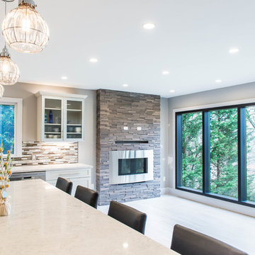
There were a few difficulties in making this kitchen any better than how it was. There was a separate staircase that had access to the second floor which was located in the kitchen. This left just enough room to push the dining room to one side. Then, there was the porch. A really nice panoramic view of the back, but was somehow under-used by the family during the summer months. Then, it was the size of the kitchen. It simply was way too small for a growing family, and while it had a peninsular in place, the flow just didn’t work. I remember watching them one day demonstrating how awkward it was using the kitchen. We got it! We had our marching orders to go and figure out how to make this kitchen work for this family.
Everything in the room was fair play. The design was done to make the kitchen very open. For a few ideas, we incorporated the porch in the kitchen by using the nana wall idea but it ended up being too cost prohibitive to do so. We then decided to do a permanent fix by using a commercial glass wall application. Once we figured that out, we moved back inside and removed the staircase. This gave us two added benefits. One allowed us to really reconfigure the kitchen and the other opened up the second floor for a huge built in closet system.
We relocated the windows, added a fire place with a built In TV above. From there, it was onto the kitchen itself which contained a huge Island with seating, large kitchen sink and built in appliances which was set up in a way to take advantage of the new layout. We re-positioned the kitchen facing the beautiful views outside rather than looking towards a wall. Now, when you enter the house up the entry stairs, the kitchen now draws you into the magnificent new open space. This is now setup for entertaining, relaxation, hanging out and most of all, preparing meals in a room where you only have to leave if you want to.
This one was all about the design. Design was what made this space. Setting this space up for success was crucial, and this kitchen is a great example of how design can cover a multitude of sins in Kitchen designs.
… Just close your eyes for a second and imagine waking up one winter morning and having a cup of coffee and watching the snow fall through those huge windows, leaning up against those 3D feature walls while watching the kids sitting around the table enjoying those warm radiant heated floors in this spacious kitchen…..
 Jennifer Hutton
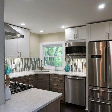
Two toned kitchen -------------------------------------------------------------------------------------------------------------------------------------------------------------------------------------------------------------------------------------These photographs are protected by Untied States and International copyright laws. Reproduction and/or distribution of any of these photographs without explicit written permission of Jennifer Hutton is prohibited. For reproduction permission, please contact the owner. All rights reserved. (C)
 TVL Creative Ltd.
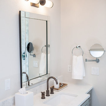
Our clients, two NYC transplants, were excited to have a large yard and ample square footage, but their 1959 ranch featured an en-suite bathroom that was more big-apple-tiny and certainly not fit for two. The original goal was to build a master suite addition on to the south side of the house, but the combination of contractor availability and Denver building costs made the project cost prohibitive. So we turned our attention to how we could maximize the existing square footage to create a true master with walk-in closet, soaking tub, commode room, and large vanity with lots of storage. The south side of the house was converted from two bedrooms, one with the small en-suite bathroom, to a master suite fit for our client’s lifestyle. We used the existing bathroom footprint to place a large shower which hidden niches, a window, and a built-in bench. The commode room took the place of the old shower. The original ‘master’ bedroom was divided in half to provide space for the walk-in closet and their new master bathroom. The clients have, what we dubbed, a classy eclectic aesthetic and we wanted to embrace that with the materials. The 3 x 12 ceramic tile is Fireclay’s Tidewater glaze. The soft variation of a handmade tile plus the herringbone pattern installation makes for a real show stopper. We chose a 3 x 6 marble subway with blue and green veining to compliment the feature tile. The chrome and oil-rubbed bronze metal mix was carefully planned based on where we wanted to add brightness and where we wanted contrast. Chrome was a no-brainer for the shower because we wanted to let the Fireclay tile shine. Over at the vanity, we wanted the fixtures to pop so we opted for oil-rubbed bronze. Final details include a series of robe hook- which is a real option with our dry climate in Colorado. No smelly, damp towels!- a magazine rack ladder and a few pops of wood for warmth and texture.
 NanaWall
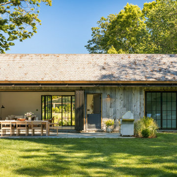
Nestled in the lush landscape, a modern reinterpretation of a once-fallen barn now features a charming guest cottage with stylish details and contemporary amenities. Situated along a narrow lot in Germantown, New York, the cottage completes a cluster of existing buildings, forming an intimate courtyard on one side. Steel effect folding patio doors fully open the living areas to the expansive fields and the Catskill Mountains beyond.
The homeowners, a young family with parents living abroad, envisioned a cozy yet modern ADU for extended stays. Designed by Lauren Cawse, AIA, architect and partner at The Art of Building, the year-round retreat draws inspiration from traditional local barns while embracing a seamless indoor-outdoor connection.
Captivating Guest Cottage Design Enhances the Senses with Steel Effect Folding Patio Doors
The modern ADU design started with the site itself. Positioned between residential and commercial neighbors, the elongated property required a careful balance of privacy and openness. Architect Lauren Cawse approached the layout by redefining the existing house and garage as the east and west sides of an outdoor room, with the new cottage forming its southern boundary. This arrangement created a clear courtyard near the main residence while directing the 800-square-foot guest house toward the open meadow and the distant Catskill Mountains.
“The unique character of the site and its history inspired the architectural direction,” says Cawse. “The intent was to create a secondary structure in the compound in clear contrast to the modern farmhouse style of the house and garage.”
A Barn-Inspired Exterior Adds Visual Flair
The exterior envelope evokes a traditional barn with a simple gable shape, weathered wood siding, cedar shingles, and a foundation veneer made of local fieldstone. A large sliding barn door adds a complementary feature to the courtyard-facing side, creating a dynamic opening that maintains uninterrupted views through the cottage to the meadow beyond.
Steel effect folding patio doors surrounding the structure add a modern touch of transparency, and simulated divided lites allow the contemporary glass wall systems to harmonize with the traditional elements of the modern ADU design.
“The goal was to fully open the living areas to the outdoors, framing views to the meadows and mountains,” says Cawse. “The positioning of the NanaWall systems frames the views and, when open, dissolves the boundary between inside and out.”
Interior Design That Mirrors Nature’s Tranquility
Inside, the design program features a simple layout with one bedroom, a full bath, a kitchenette, and a living area with a wood-burning stove. The interior, a collaboration between The Art of Building and the homeowners, is defined by an understated palette and tactile materials that reflect the natural setting. Color is introduced through the framed glass views on all sides of the structure. Reclaimed timber collar ties span the ceiling overhead, while stone surfaces and naturally patinated metal accents add quiet texture throughout.
Custom hand-painted Delft tiles along the kitchen backsplash add personal detail, and terra cotta flooring in the bathroom brings warmth and old-world charm. Soaring ceilings and abundant daylight create a peaceful play of light and shadow, shifting subtly with the seasons and emphasizing the cottage’s connection to the natural landscape outside.
Sleek Steel Effect Folding Patio Doors Elevate the Modern ADU Design Aesthetic
Three customized steel effect folding patio doors define the living space, each aligned to respond to a different edge of the site. The largest, spanning nearly 20 feet wide and just under eight feet tall, opens directly onto the stone patio, allowing the main gathering area to extend fully into the landscape. Along the side of the living room, a smaller 10-foot-wide system introduces more light and ventilation, nearly creating an open corner condition if not for the structural post that supports the façade and roofline.
At the rear, a fourth ten-foot-wide system features a French door swing panel configuration that opens toward the courtyard, strengthening the design connection to the main residence. All steel effect folding patio doors were specified with a low-maintenance, water-rated Performance Sill to safeguard against inclement weather while providing a seamless, barrier-free transition to the outdoor patio.
Unique Customizations for Visual Appeal and a Steel Effect
Each folding patio door system is configured to open outward, maximizing usable floor space in the compact interior and allowing furniture placement to remain uninterrupted. By stacking outward, the steel effect folding patio doors, specified in a SE Classic Bronze powder coat, ensure every inch of the cottage is optimized. Simulated divided lites create a consistent rhythm across windows and doors, maintaining alignment with the traditional barn-inspired exterior.
In the bedroom, a three-panel, 10-foot-wide system mirrors these customizations, matching the steel effect divided-lite pattern and outward-opening configuration, extending the indoor-outdoor connection while preserving visual continuity throughout the ADU.
“The divided lites were crucial to the architectural vision, and while budget prohibited a steel and glass system, NanaWall Systems’ thin frames provide the open and airy feeling we hoped to attain,” says Cawse. “Simulated divided lites transition the thoroughly modern element of the glass walls to remain in harmony with the otherwise traditional palette.”
Matching Windows and Doors: Create a Cohesive Design Program
Alongside the larger openings in the living areas and bedroom, a smaller 3-foot-tall NanaWall tilt turn window was added to the bathroom. This window-sized NanaWall system perfectly matches the divided lite panels and sleek frames of the steel effect folding patio doors, creating a cohesive modern ADU design throughout. The compact opening provides ventilation and natural light, enhancing the spa-like atmosphere along with natural stone flooring. The matching glass lines and sleek profiles of the NanaWall Generation 4 comprehensive product line further unify visual consistency, allowing each system to fit into the architectural style seamlessly.
“This project had three bifold glass walls, a pair of double French doors with sidelites, and a single tilt turn window,” says architect Lauren Cawse. “Being able to work with a single manufacturer provided aesthetic cohesiveness and simplified coordination.”
Sustainability Where It Matters Most
New York weather can vary from hot 85-degree summers to cold 26-degree winters. Creating an efficient living space was a primary goal. To achieve this, the design included Timber HP-insulated walls and floors with a heat pump system for effective heating and cooling. Additionally, the steel effect folding patio doors and windows were specified with double-glazed panels to ensure a tight building envelope.
Indoor-Outdoor Living Spaces for Relaxing and Entertaining
In-house landscape designer Liz Pulver worked closely with the team to conceive open-air spaces that enhanced the connection between inside and outside. To the south end of the lot, the landscape transitions into an “enhanced meadow,” allowing the cottage to feel embedded within the surrounding fields rather than set apart from them. A circular pool was designed to mimic a natural pond with a modest footprint. Around it, a minimalist fence and sunken stone ha-ha wall offer discreet safety for young children.
Limited space due to existing infrastructure and zoning setbacks left only a small footprint for the swimming pool, prompting the designer to propose a circular form that maximized the usable swimming area. “We felt that the perfect way to integrate a pool into the property and to honor the landscape would be to treat the pool as a piece of art itself,” says Pulver. “The result is a beautiful round pool that serves as both a functional retreat and a sculptural moment.”
Final Thoughts: A Barn-Inspired Design for Contemporary Living
This modern ADU design skillfully combines modern features with the enduring charm of traditional barns. The outcome is a welcoming living space that stands out amid a stunning landscape. Natural materials that mimic the beauty of the outdoors, expansive steel effect folding patio doors that fill the space with fresh air and natural light, and a restrained interior design work together to create an inviting retreat for everyday living, throughout the seasons.
“When entering the site, the cottage feels as though it was always there,” says Cawse. “It achieves its two opposing goals by creating a feeling of intimacy and enclosure near the house while also functioning as a threshold to the expansive fields and views beyond.”
Explore how NanaWall folding patio doors elevate other ADU spaces in our inspiring project photo gallery!
Frequently Asked Questions (FAQs)
What is Slimline Steel Effect?
Steel Effect is a folding patio door design option that replicates the appearance of traditional steel-framed glass doors. It combines the look of steel with the performance benefits of aluminum, including energy efficiency, low maintenance, greater design flexibility, and lower cost.
How does a NanaWall Steel Effect aluminum system compare to traditional steel-framed glass doors?
NanaWall Slimline Steel Effect folding patio doors replicate the narrow frames of traditional steel doors with improved weather and thermal performance and easier operation. They are lighter, more corrosion-resistant, and feature a thermally broken design for better energy efficiency and lower long-term maintenance.
What are the benefits of Steel Effect folding glass walls?
Steel Effect folding glass walls deliver the narrow sightlines and grid patterns of traditional steel, combined with the performance and low maintenance of aluminum. The slimline steel effect option offers all the benefits of our Generation 4 product line, including the FourFold / SixFold floating panel set option and smooth operation with Gothic arch stainless steel rollers on a stainless steel track.
Can Slimline Steel Effect glass walls be customized?
Yes, these systems offer a high level of customization to suit different architectural styles, including simulated divided lites specified in various patterns, popular SE colors for a true steel effect look, and a contemporary glass stop option for a refined look. Contact your local NanaWall representative for additional options here.
How energy-efficient and weather-resistant are Slimline Steel Effect folding patio doors?
Steel effect folding systems are engineered for strong thermal and weather performance. Thermally broken frames and high-performance glazing help improve energy efficiency. Each NanaWall system has been independently tested for air, water, structural integrity, and forced entry with excellent results.
46