
Search results for "Proper rest" in Home Design Ideas
 Kitchen Solvers of Spring Hill
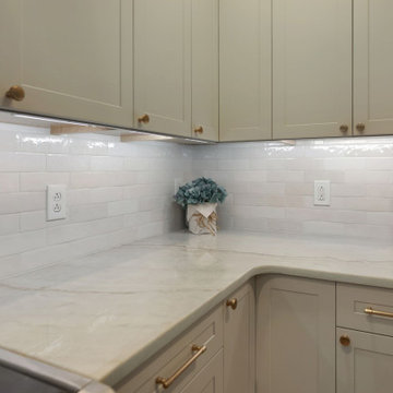
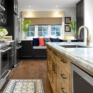
This family has hated their kitchen for years and it had gotten to the point of starting to fall apart. This is their forever home, so it was time to make it finally fit their lifestyle and the rest of their home. Though they had a cute makeshift island by clipping the corner by the pantry it opened up enough space to have a proper island. We also, removed the wall next to the fridge to a more open and roomier space and opened up the doorway into the living room! Now the flow matches with the rest of the house and seems almost twice as big! The closet pantry was retro fitted to be two double door pantries where they can hide their countertop microwave. Another special feature is the custom matching quartzite windowsill. The stain and paint create a monochromatic look but with depth and dimension that pairs so beautifully with the gold tone hardware bring this kitchen to a gorgeous level of perfection!
 My Kitchen And Bath
A complete kitchen and powder room remodel in Herndon, Virginia, designed around two clear priorities: open up the kitchen to the rest of the main level, and create an experience that felt warm and timeless rather than trendy.
The original layout had a wall separating the kitchen from the dining room and an awkward fridge wall that limited both storage and traffic flow. Our solution involved removing the dividing wall (confirmed non-load-bearing), tightening the new dining room opening to 66 inches, and extending the fridge wall 25 inches into the kitchen to create a proper full-height pantry run. The result is a kitchen that breathes — open to the dining and living areas, with clear sight lines from the island to the bay windows at the far end.
Design Approach
The clients came in knowing they didn't want white. They didn't want navy. They wanted something with real wood character — the kind of finish that ages well and looks more like furniture than stock kitchen cabinetry. Cherry was the answer to that question.
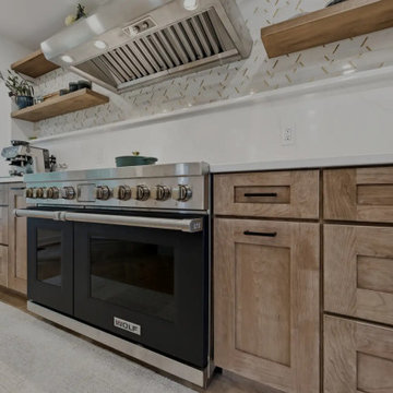
We anchored the room around contrast: warm cherry cabinetry against clean white walls and white quartz, black hardware grounding the cherry's warmth, and a single waterfall island acting as the architectural focal point. Stainless appliances, brushed gold pendant accents, and the herringbone hardwood floor pull the room together without any one element shouting for attention.
The Cabinetry
Medallion Gold Line Sonoma Cappuccino — a stained cherry finish that catches light differently throughout the day. All-plywood box construction, solid wood doors and drawer fronts, soft close everywhere, US-made with a lifetime warranty. Four pull-out drawers built into the pantry bottoms keep the deep storage actually usable rather than a black hole.
Cabinet hardware is Top Knobs Riverside Pulls in flat black — 40 pulls across drawers and doors, plus three longer pulls on the 36-inch base drawers. The black was a deliberate decision: with cherry and stainless already providing warm and cool tones, brass or gold would have been one warm tone too many. Black grounds the cabinetry and gives the kitchen its architectural definition.
The Island and Countertops
MSI Calacatta Miraggio Gold quartz throughout — perimeter counters, island, waterfall ends, and the powder room. The Gold variant has subtle warm veining that pairs with cherry where cooler whites would have fought the wood tone.
The island gets a full waterfall edge — slabs book-matched, miters precise, the finished edge essentially seamless. Treating the island as architectural sculpture rather than just functional storage. The black undermount farmhouse-style sink ties back to the hardware throughout the rest of the kitchen.
The Backsplash
MSI Metro Gold tile — small format white and gold tiles in a herringbone-adjacent pattern with intermittent gold accents. Full height, continuous behind the floating shelves and behind the hood.
Four custom floating shelves are spaced above a 3-inch countertop ledge: first shelf 18 inches above the ledge, second shelf 9 inches above that, third 18 inches above the second. The shelves are stained to match the cabinetry. The backsplash continues behind the shelves and behind the hood, so the wall reads as a continuous textured surface that the shelves and hood float in front of.
The Appliances
This is a serious cooking kitchen. The clients chose a 48-inch Wolf gas range, a Sub-Zero built-in refrigerator integrated into the cherry cabinet wall, a Wolf microwave drawer in the island base, and a Bosch dishwasher. For ventilation, we installed a 1200 CFM hood paired with a make-up air system to balance the negative pressure that hood pulls. New ducting was routed through the exterior siding on the side of the house.
The Flooring
MSI engineered hardwood throughout the entire main level — approximately 800 square feet — installed in a Bramlett herringbone pattern. Herringbone adds roughly 15-20 percent to material and labor costs because of the angled cuts and waste factor, but the result is a floor that reads as more considered and luxurious than standard plank flooring. Finished with 4.5-inch white wood baseboards throughout.
The Powder Room
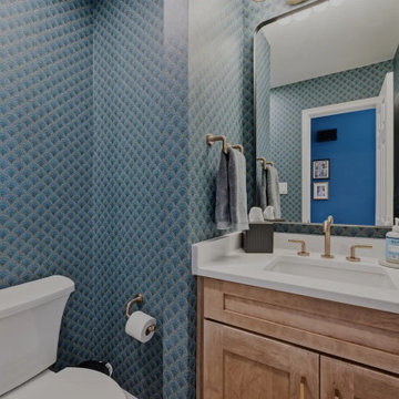
A small room with a big personality. The clients chose a deep blue and teal scallop pattern wallpaper (client-supplied, we installed) and paired it with the same Sonoma Cappuccino cherry vanity used in the kitchen — material continuity between the spaces.
Powder room countertop is the same MSI Calacatta Miraggio Gold quartz from the kitchen with a rectangular white undermount sink. Hardware on the powder room vanity is Top Knobs Riverside in honey bronze rather than the kitchen's flat black — the warm bronze pulls the brass tones from the faucet into the millwork and complements the wallpaper. New sconce, kept the existing toilet (refinishing or replacing a working toilet is wasted money in a powder room remodel), and a Panasonic Whisper Green exhaust fan.
Project Specs
Location: Herndon, Virginia
Project type: Combined kitchen and powder room remodel
Project duration: Approximately 4 to 6 weeks
Style: Transitional, Modern Farmhouse, Warm Wood Contemporary
Color palette: Cherry, white, black, brushed gold, deep blue (powder room)
Materials
Cabinetry (kitchen and powder room): Medallion Gold Line Sonoma Cappuccino cherry, Shaker-style, all-plywood box construction, lifetime warranty
Kitchen hardware: Top Knobs Riverside Pulls in flat black (TK1014BLK and TK1017BLK)
Powder room hardware: Top Knobs Riverside Pulls in honey bronze (TK1012HB)
Counter tops: MSI Calacatta Miraggio Gold Quartz, pencil edge, waterfall island
Backsplash: MSI Metro Gold tile, full height
Floating shelves: 4 custom shelves at 48" by 9", stained to match cabinets
Range: 48-inch Wolf gas range
Refrigerator: Sub-Zero built-in
Microwave: Wolf microwave drawer (island base)
Hood: 1200 CFM with make-up air system
Kitchen sink: Kohler farmhouse-style, 36-inch base, black
Kitchen faucet: Brizo (homeowner-supplied)
Flooring: MSI engineered hardwood in Bramlett herringbone pattern, approximately 800 sq ft
Baseboards: 4.5-inch white wood throughout
Powder room wallpaper: Client-supplied scallop pattern in blues and teals
Powder room exhaust fan: Panasonic Whisper Green
Paint: Benjamin Moore
Designed and built by My Kitchen and Bath out of our Herndon showroom at 285 Sunset Park Drive. We've been designing and building kitchens, bathrooms, and full home renovations across Northern Virginia and the DMV since 1994.
 My Kitchen And Bath
A complete kitchen and powder room remodel in Herndon, Virginia, designed around two clear priorities: open up the kitchen to the rest of the main level, and create an experience that felt warm and timeless rather than trendy.
The original layout had a wall separating the kitchen from the dining room and an awkward fridge wall that limited both storage and traffic flow. Our solution involved removing the dividing wall (confirmed non-load-bearing), tightening the new dining room opening to 66 inches, and extending the fridge wall 25 inches into the kitchen to create a proper full-height pantry run. The result is a kitchen that breathes — open to the dining and living areas, with clear sight lines from the island to the bay windows at the far end.
Design Approach
The clients came in knowing they didn't want white. They didn't want navy. They wanted something with real wood character — the kind of finish that ages well and looks more like furniture than stock kitchen cabinetry. Cherry was the answer to that question.
We anchored the room around contrast: warm cherry cabinetry against clean white walls and white quartz, black hardware grounding the cherry's warmth, and a single waterfall island acting as the architectural focal point. Stainless appliances, brushed gold pendant accents, and the herringbone hardwood floor pull the room together without any one element shouting for attention.
The Cabinetry
Medallion Gold Line Sonoma Cappuccino — a stained cherry finish that catches light differently throughout the day. All-plywood box construction, solid wood doors and drawer fronts, soft close everywhere, US-made with a lifetime warranty. Four pull-out drawers built into the pantry bottoms keep the deep storage actually usable rather than a black hole.
Cabinet hardware is Top Knobs Riverside Pulls in flat black — 40 pulls across drawers and doors, plus three longer pulls on the 36-inch base drawers. The black was a deliberate decision: with cherry and stainless already providing warm and cool tones, brass or gold would have been one warm tone too many. Black grounds the cabinetry and gives the kitchen its architectural definition.
The Island and Countertops
MSI Calacatta Miraggio Gold quartz throughout — perimeter counters, island, waterfall ends, and the powder room. The Gold variant has subtle warm veining that pairs with cherry where cooler whites would have fought the wood tone.
The island gets a full waterfall edge — slabs book-matched, miters precise, the finished edge essentially seamless. Treating the island as architectural sculpture rather than just functional storage. The black undermount farmhouse-style sink ties back to the hardware throughout the rest of the kitchen.
The Backsplash
MSI Metro Gold tile — small format white and gold tiles in a herringbone-adjacent pattern with intermittent gold accents. Full height, continuous behind the floating shelves and behind the hood.
Four custom floating shelves are spaced above a 3-inch countertop ledge: first shelf 18 inches above the ledge, second shelf 9 inches above that, third 18 inches above the second. The shelves are stained to match the cabinetry. The backsplash continues behind the shelves and behind the hood, so the wall reads as a continuous textured surface that the shelves and hood float in front of.
The Appliances
This is a serious cooking kitchen. The clients chose a 48-inch Wolf gas range, a Sub-Zero built-in refrigerator integrated into the cherry cabinet wall, a Wolf microwave drawer in the island base, and a Bosch dishwasher. For ventilation, we installed a 1200 CFM hood paired with a make-up air system to balance the negative pressure that hood pulls. New ducting was routed through the exterior siding on the side of the house.
The Flooring
MSI engineered hardwood throughout the entire main level — approximately 800 square feet — installed in a Bramlett herringbone pattern. Herringbone adds roughly 15-20 percent to material and labor costs because of the angled cuts and waste factor, but the result is a floor that reads as more considered and luxurious than standard plank flooring. Finished with 4.5-inch white wood baseboards throughout.
The Powder Room
A small room with a big personality. The clients chose a deep blue and teal scallop pattern wallpaper (client-supplied, we installed) and paired it with the same Sonoma Cappuccino cherry vanity used in the kitchen — material continuity between the spaces.
Powder room countertop is the same MSI Calacatta Miraggio Gold quartz from the kitchen with a rectangular white undermount sink. Hardware on the powder room vanity is Top Knobs Riverside in honey bronze rather than the kitchen's flat black — the warm bronze pulls the brass tones from the faucet into the millwork and complements the wallpaper. New sconce, kept the existing toilet (refinishing or replacing a working toilet is wasted money in a powder room remodel), and a Panasonic Whisper Green exhaust fan.
Project Specs
Location: Herndon, Virginia
Project type: Combined kitchen and powder room remodel
Project duration: Approximately 4 to 6 weeks
Style: Transitional, Modern Farmhouse, Warm Wood Contemporary
Color palette: Cherry, white, black, brushed gold, deep blue (powder room)
Materials
Cabinetry (kitchen and powder room): Medallion Gold Line Sonoma Cappuccino cherry, Shaker-style, all-plywood box construction, lifetime warranty
Kitchen hardware: Top Knobs Riverside Pulls in flat black (TK1014BLK and TK1017BLK)
Powder room hardware: Top Knobs Riverside Pulls in honey bronze (TK1012HB)
Counter tops: MSI Calacatta Miraggio Gold Quartz, pencil edge, waterfall island
Backsplash: MSI Metro Gold tile, full height
Floating shelves: 4 custom shelves at 48" by 9", stained to match cabinets
Range: 48-inch Wolf gas range
Refrigerator: Sub-Zero built-in
Microwave: Wolf microwave drawer (island base)
Hood: 1200 CFM with make-up air system
Kitchen sink: Kohler farmhouse-style, 36-inch base, black
Kitchen faucet: Brizo (homeowner-supplied)
Flooring: MSI engineered hardwood in Bramlett herringbone pattern, approximately 800 sq ft
Baseboards: 4.5-inch white wood throughout
Powder room wallpaper: Client-supplied scallop pattern in blues and teals
Powder room exhaust fan: Panasonic Whisper Green
Paint: Benjamin Moore
Designed and built by My Kitchen and Bath out of our Herndon showroom at 285 Sunset Park Drive. We've been designing and building kitchens, bathrooms, and full home renovations across Northern Virginia and the DMV since 1994.
Find the right local pro for your project
 CRS Renovation & Design
Once CRS was brought in to finish the basement, the previous work was corrected and the rest of the space followed suit.
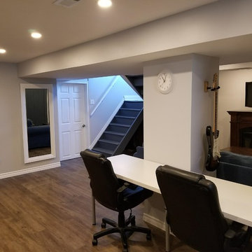
The majority of the basement was designed to have an open concept with a small living room and a large office space. A small utility room was created with additional storage and a small fridge, separated from the rest of the basement by a sliding barn door. Additional power outlets and new pot lights in the ceiling required a pony box to be installed, providing enough power for the new additions.
New stairs and proper support for the basement landing made the basement safe for everyone to enjoy and doors were added to hide the workspaces from the main living area. The laundry room had it’s original concrete sink demolished and removed to allow for a sleek modern replacement with storage. The layout of the laundry machines was also altered to create a better flow and functionality to the room.
The homeowners requested the window boxes remain unfinished throughout the basement to allow more flexibility in the future when the windows are replaced.
 Drury Design
THE SETUP
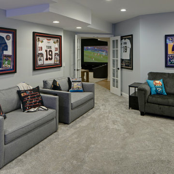
When we first encountered this basement for a family with three boys, we saw a space with untapped potential. Though previously remodeled, it lacked a cohesive design strategy. The expansive area housed various entertainment pieces (a shuffleboard table, air hockey, foosball, etc.) scattered haphazardly throughout the space.
While the basement included a workout room and a rudimentary kitchen area, it lacked a dedicated game room or proper bar. Excessive storage closets along the back wall consumed valuable real estate that could be repurposed for more engaging uses.
In essence, the basement was spacious but disjointed—functional for family use but falling short as an entertainment hub. It didn’t align with the sophistication of the rest of the home. Our clients envisioned a transformation: a fresh, organized space that would not only serve their family’s needs but also shine as an inviting arena for entertaining friends and hosting gatherings – especially sports-focused gatherings!
Design Objectives:
Reimagine the basement layout, creating distinct zones for varied activities.
Expand the workout area to accommodate new equipment, including a Smith machine.
Implement a multi-screen setup inspired by high-end sports bars, allowing guests to follow multiple games while socializing.
Enhance existing features while developing new areas:
Optimize a workout space for all equipment needs
Establish a dedicated children’s space with guest room capabilities
Create an integrated bar and entertainment area
Retain and incorporate the existing projector setup
Design Challenges:
Navigate layout constraints in the new workout room due to fixed utility areas.
Carve out a distinct space for kids within the open plan.
Revitalize an underutilized section of the basement.
Elevate the existing big screen area with purposeful design elements.
Develop a full-fledged bar area while maintaining kitchen functions applicable for hangout snacking.
Work around immovable structural elements (soffits, load-bearing support columns)
THE RENEWED SPACE
Design Solutions:
Install a stylish barn door for the utility area of the new workout space, improving aesthetics and accessibility.
Repurpose the former workout room into a dedicated game room for kids, utilizing couches with pull-out beds so the area can double as overflow guest accommodations.
Transform the unused area into a vibrant pub-style area for card and table games.
Enhance the big screen area with elegant wainscoting and ambient theatre-style lighting.
Design a multi-functional wet bar area featuring varied seating, prep areas, and a microwave.
Base the bar sink area width off the soffit above it.
In the big screen area, use the soffit to inform the width of a wainscoting section.
For the immovable support columns, dress one up to match the wainscoting of the nearby big screen wall. Hide the other one in a new wall.
Final Thoughts:
The reimagined basement has exceeded our clients’ expectations, evolving into the ultimate entertainment hub. With seven strategically placed screens, it’s perfect for gatherings focused on major sporting events and casual gatherings, as well. The space strikes a balance between adult sophistication and family-friendly functionality, featuring distinct zones for various activities.
The new design not only maximizes functionality for modern, multi-screen entertainment but also elevates the aesthetic appeal. It integrates flawlessly with the rest of the home’s transitional style while allowing each basement section to maintain its unique character. The result is a versatile space that caters to both intimate family time and large-scale entertaining.
 Kitchen Solvers of Spring Hill
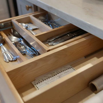
This family has hated their kitchen for years and it had gotten to the point of starting to fall apart. This is their forever home, so it was time to make it finally fit their lifestyle and the rest of their home. Though they had a cute makeshift island by clipping the corner by the pantry it opened up enough space to have a proper island. We also, removed the wall next to the fridge to a more open and roomier space and opened up the doorway into the living room! Now the flow matches with the rest of the house and seems almost twice as big! The closet pantry was retro fitted to be two double door pantries where they can hide their countertop microwave. Another special feature is the custom matching quartzite windowsill. The stain and paint create a monochromatic look but with depth and dimension that pairs so beautifully with the gold tone hardware bring this kitchen to a gorgeous level of perfection!
 My Kitchen And Bath
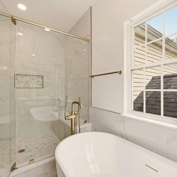
A complete primary bathroom remodel in Springfield, Virginia, designed around three priorities our clients came in with: a real walk-in shower, a freestanding tub by the windows, and a proper double vanity with storage that actually worked.
The original layout had everything in the wrong place. The tub sat against an interior wall away from the natural light. A small stall shower took up real estate across the room. The vanity was squeezed into whatever space was left over. Three windows on the back wall were doing nothing for the room because the layout was fighting them. Our solution involved knocking down the dividing wall between the old shower and vanity area, relocating plumbing for both the tub and the new vanities, and placing the freestanding tub directly under the bay of windows so morning light became part of the experience.
Design Approach
We anchored the room around contrast: deep navy cabinetry against soft white walls, warm brushed gold against cool marble tile, sharp Shaker lines against the curved silhouette of the freestanding tub. Navy was the design decision the rest of the room was built around — the clients knew they wanted color but didn't want anything that would feel dated in five years. Navy reads bold without being loud, pairs with virtually any metal finish, and has staying power that trendier choices don't.
We used Fabuwood Galaxy Indigo for the vanities — all-plywood construction with solid wood doors and drawer fronts, soft close throughout. Shaker-style flat panels keep the navy from feeling heavy. The brushed gold (Jeffrey Alexander 635-96SBZ in satin bronze) shows up across hardware, faucets, lighting, the tub filler, and the shower trim, creating a quiet continuity throughout the room.
The Shower
Removing the wall between the old shower and old vanity area created room for a proper walk-in. We tiled the entire shower floor to ceiling in Decovita Calacatta Suave 24x48" porcelain — large format installed in a 50% offset horizontal pattern, with cement board and redgard underneath. The marble-look porcelain gives the visual depth of natural marble without the maintenance.
A built-in shower bench, custom-built into the corner, is wrapped in the same wall tile on the front with a quartz top matching the vanity counter. The shower niche is detailed with MSI Arabescato Carrara 2" honed hex mosaic at the back, the same tile used on the shower floor. All tile edges are finished with Schluter in satin bronze to match the room's metal finishes. The shower door is custom frameless 3/8" tempered glass with a satin bronze pull — no metal frame interrupting the sight line.
The Vanities and Countertops
The new double vanity gives both clients their own space for morning routines. Counter tops are MSI Calacatta Miraggio Cielo quartz with pencil edging and a 4" backsplash — a soft white with subtle gray veining that reads like real Calacatta marble without the porosity issues. Two undermount square porcelain sinks finish the surface cleanly.
The Tub
A 60" freestanding soaker tub sits under the bay of three windows. The floor-mounted tub filler is satin bronze with a handheld sprayer. We relocated the drain and supply lines to make the centered placement work. The tub is the room's quietest feature and its strongest — clients tell us they use this bathroom differently than they used the old one.
Flooring
MSI Sande Ivory 12x24" matte porcelain runs throughout the bathroom floor in a 50% offset pattern parallel to the vanity wall. Cement board underneath, 4" white wood baseboard, Whisper Grey grout that handles daily use without showing wear.
Paint and Lighting
Walls are Benjamin Moore Chantilly Lace 2121-70 in satin — a true crisp white that doesn't lean cool or warm. The ceiling uses Benjamin Moore Aura Bath and Spa White, which is formulated to resist mildew in high-humidity spaces. Lighting is layered: three new 6" LED recessed lights on a dimmer, two satin bronze vanity sconces above the mirrors, and the existing three windows providing the daytime ambient light.
Project Specs
Location: Springfield, Virginia
Project type: Full primary bathroom remodel
Project duration: Approximately 5 weeks
Style: Modern, Transitional
Color palette: Navy, white, brushed gold, marble
Materials
Cabinetry: Fabuwood Galaxy Indigo, Shaker-style flat panel maple, all-plywood construction
Cabinet hardware: Jeffrey Alexander 635-96SBZ Satin Bronze pulls
Vanity counter and bench top: MSI Calacatta Miraggio Cielo Quartz, pencil edge with 4" backsplash
Sinks: Undermount white porcelain BR-202 square (x2)
Wall tile: Decovita Calacatta Suave 24x48" porcelain
Floor tile: MSI Sande Ivory 12x24" matte porcelain
Shower floor + niche back: MSI Arabescato Carrara 2" honed hex mosaic marble
Edge trim: Schluter satin bronze
Shower door: Custom frameless 3/8" tempered glass
Tub: 60" freestanding acrylic soaker (Ferguson)
Tub filler: Floor-mounted satin bronze (Ferguson)
Vanity faucets, mirrors, sconces, toilet: Satin bronze coordinated finishes (Ferguson)
Wall paint: Benjamin Moore Chantilly Lace 2121-70 Satin
Ceiling paint: Benjamin Moore Aura Bath and Spa White
Grout: Whisper Grey (floor), Standard White (walls and shower)
Designed and built by My Kitchen and Bath out of our Alexandria showroom at 5710 General Washington Drive. We've been designing and building kitchens, bathrooms, and full home renovations across Northern Virginia and the DMV since 1994.

Sponsored
Fredericksburg, OH

High Point Cabinets
Columbus' Experienced Custom Cabinet Builder | 4x Best of Houzz Winner
 Interior Groups
In the world of wigs, convenience and realism are two of the most sought-after qualities. Women want wigs that not only look natural but also require minimal effort to wear and style. Enter wear and go wigs combined with bleached knots—a powerful duo that transforms the wig-wearing experience. These wigs offer a flawless, natural hairline and are ready to wear immediately, making them ideal for busy lifestyles without sacrificing beauty.
What Are Wear and Go Wigs?
Wear and go wigs are pre-styled wigs designed for instant wear. Unlike traditional wigs that require lace trimming, knot bleaching, or customization, wear and go wigs come ready for action right out of the box.
Key Features:
- Pre-plucked hairline and baby hairs
- Glueless design with adjustable straps and combs for secure fit
- Available in various textures such as straight, curly, and wavy
- Made with 100% human hair for authentic look and feel
- Often pre-styled into trendy cuts and shapes
- Time Saver: Perfect for women with busy schedules who want instant glam
- User-Friendly: No professional installation needed—ideal for beginners
- Protective Styling: Allows your natural hair to rest and grow healthy
- Versatile: Can be styled further with heat tools or left as is
- Reusable: Durable with proper care, lasting several months
- Lightened knots on lace for a natural scalp appearance
- Available in lace front, full lace, and 360 lace varieties
- Made with high-quality 100% human hair
- Pre-plucked hairline often accompanies bleached knots
- Customizable with parting styles and baby hairs
- Ultra-Realistic: Mimics the natural scalp for an undetectable hairline
- Styling Freedom: Allows for multiple parting options and updos
- Comfortable: Breathable lace cap keeps the scalp cool
- Protective: Keeps your natural hair shielded from heat and damage
- Long-Lasting: When cared for properly, can maintain a fresh look for months
 Drury Design
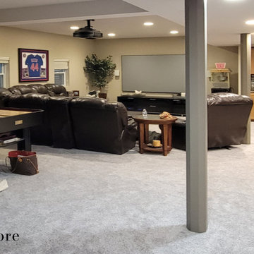
THE SETUP
When we first encountered this basement for a family with three boys, we saw a space with untapped potential. Though previously remodeled, it lacked a cohesive design strategy. The expansive area housed various entertainment pieces (a shuffleboard table, air hockey, foosball, etc.) scattered haphazardly throughout the space.
While the basement included a workout room and a rudimentary kitchen area, it lacked a dedicated game room or proper bar. Excessive storage closets along the back wall consumed valuable real estate that could be repurposed for more engaging uses.
In essence, the basement was spacious but disjointed—functional for family use but falling short as an entertainment hub. It didn’t align with the sophistication of the rest of the home. Our clients envisioned a transformation: a fresh, organized space that would not only serve their family’s needs but also shine as an inviting arena for entertaining friends and hosting gatherings – especially sports-focused gatherings!
Design Objectives:
Reimagine the basement layout, creating distinct zones for varied activities.
Expand the workout area to accommodate new equipment, including a Smith machine.
Implement a multi-screen setup inspired by high-end sports bars, allowing guests to follow multiple games while socializing.
Enhance existing features while developing new areas:
Optimize a workout space for all equipment needs
Establish a dedicated children’s space with guest room capabilities
Create an integrated bar and entertainment area
Retain and incorporate the existing projector setup
Design Challenges:
Navigate layout constraints in the new workout room due to fixed utility areas.
Carve out a distinct space for kids within the open plan.
Revitalize an underutilized section of the basement.
Elevate the existing big screen area with purposeful design elements.
Develop a full-fledged bar area while maintaining kitchen functions applicable for hangout snacking.
Work around immovable structural elements (soffits, load-bearing support columns)
THE RENEWED SPACE
Design Solutions:
Install a stylish barn door for the utility area of the new workout space, improving aesthetics and accessibility.
Repurpose the former workout room into a dedicated game room for kids, utilizing couches with pull-out beds so the area can double as overflow guest accommodations.
Transform the unused area into a vibrant pub-style area for card and table games.
Enhance the big screen area with elegant wainscoting and ambient theatre-style lighting.
Design a multi-functional wet bar area featuring varied seating, prep areas, and a microwave.
Base the bar sink area width off the soffit above it.
In the big screen area, use the soffit to inform the width of a wainscoting section.
For the immovable support columns, dress one up to match the wainscoting of the nearby big screen wall. Hide the other one in a new wall.
Final Thoughts:
The reimagined basement has exceeded our clients’ expectations, evolving into the ultimate entertainment hub. With seven strategically placed screens, it’s perfect for gatherings focused on major sporting events and casual gatherings, as well. The space strikes a balance between adult sophistication and family-friendly functionality, featuring distinct zones for various activities.
The new design not only maximizes functionality for modern, multi-screen entertainment but also elevates the aesthetic appeal. It integrates flawlessly with the rest of the home’s transitional style while allowing each basement section to maintain its unique character. The result is a versatile space that caters to both intimate family time and large-scale entertaining.
 Kitchen Solvers of Spring Hill
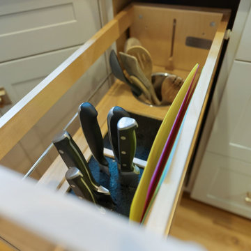
This family has hated their kitchen for years and it had gotten to the point of starting to fall apart. This is their forever home, so it was time to make it finally fit their lifestyle and the rest of their home. Though they had a cute makeshift island by clipping the corner by the pantry it opened up enough space to have a proper island. We also, removed the wall next to the fridge to a more open and roomier space and opened up the doorway into the living room! Now the flow matches with the rest of the house and seems almost twice as big! The closet pantry was retro fitted to be two double door pantries where they can hide their countertop microwave. Another special feature is the custom matching quartzite windowsill. The stain and paint create a monochromatic look but with depth and dimension that pairs so beautifully with the gold tone hardware bring this kitchen to a gorgeous level of perfection!
 Vetter Architects
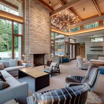
The owners requested a Private Resort that catered to their love for entertaining friends and family, a place where 2 people would feel just as comfortable as 42. Located on the western edge of a Wisconsin lake, the site provides a range of natural ecosystems from forest to prairie to water, allowing the building to have a more complex relationship with the lake - not merely creating large unencumbered views in that direction. The gently sloping site to the lake is atypical in many ways to most lakeside lots - as its main trajectory is not directly to the lake views - allowing for focus to be pushed in other directions such as a courtyard and into a nearby forest.
The biggest challenge was accommodating the large scale gathering spaces, while not overwhelming the natural setting with a single massive structure. Our solution was found in breaking down the scale of the project into digestible pieces and organizing them in a Camp-like collection of elements:
- Main Lodge: Providing the proper entry to the Camp and a Mess Hall
- Bunk House: A communal sleeping area and social space.
- Party Barn: An entertainment facility that opens directly on to a swimming pool & outdoor room.
- Guest Cottages: A series of smaller guest quarters.
- Private Quarters: The owners private space that directly links to the Main Lodge.
These elements are joined by a series green roof connectors, that merge with the landscape and allow the out buildings to retain their own identity. This Camp feel was further magnified through the materiality - specifically the use of Doug Fir, creating a modern Northwoods setting that is warm and inviting. The use of local limestone and poured concrete walls ground the buildings to the sloping site and serve as a cradle for the wood volumes that rest gently on them. The connections between these materials provided an opportunity to add a delicate reading to the spaces and re-enforce the camp aesthetic.
The oscillation between large communal spaces and private, intimate zones is explored on the interior and in the outdoor rooms. From the large courtyard to the private balcony - accommodating a variety of opportunities to engage the landscape was at the heart of the concept.
Overview
Chenequa, WI
Size
Total Finished Area: 9,543 sf
Completion Date
May 2013
Services
Architecture, Landscape Architecture, Interior Design
 Vetter Architects
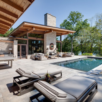
The owners requested a Private Resort that catered to their love for entertaining friends and family, a place where 2 people would feel just as comfortable as 42. Located on the western edge of a Wisconsin lake, the site provides a range of natural ecosystems from forest to prairie to water, allowing the building to have a more complex relationship with the lake - not merely creating large unencumbered views in that direction. The gently sloping site to the lake is atypical in many ways to most lakeside lots - as its main trajectory is not directly to the lake views - allowing for focus to be pushed in other directions such as a courtyard and into a nearby forest.
The biggest challenge was accommodating the large scale gathering spaces, while not overwhelming the natural setting with a single massive structure. Our solution was found in breaking down the scale of the project into digestible pieces and organizing them in a Camp-like collection of elements:
- Main Lodge: Providing the proper entry to the Camp and a Mess Hall
- Bunk House: A communal sleeping area and social space.
- Party Barn: An entertainment facility that opens directly on to a swimming pool & outdoor room.
- Guest Cottages: A series of smaller guest quarters.
- Private Quarters: The owners private space that directly links to the Main Lodge.
These elements are joined by a series green roof connectors, that merge with the landscape and allow the out buildings to retain their own identity. This Camp feel was further magnified through the materiality - specifically the use of Doug Fir, creating a modern Northwoods setting that is warm and inviting. The use of local limestone and poured concrete walls ground the buildings to the sloping site and serve as a cradle for the wood volumes that rest gently on them. The connections between these materials provided an opportunity to add a delicate reading to the spaces and re-enforce the camp aesthetic.
The oscillation between large communal spaces and private, intimate zones is explored on the interior and in the outdoor rooms. From the large courtyard to the private balcony - accommodating a variety of opportunities to engage the landscape was at the heart of the concept.
Overview
Chenequa, WI
Size
Total Finished Area: 9,543 sf
Completion Date
May 2013
Services
Architecture, Landscape Architecture, Interior Design

 TKS Design Group
Download our free ebook, Creating the Ideal Kitchen. DOWNLOAD NOW
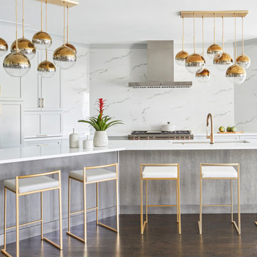
This client was referred to us from a past client. They are a busy 2-career household with young children and enjoy entertaining friends and family in their home. They have a beautiful open concept home but unfortunately the kitchen was not fitting for the rest of the home. They were not quite sure what to do with the space. We talked about trying to refresh it or do more of a minor remodel, but in the end they decided a full gut would get them to where they wanted to be.
One problem was there was no place for guests to hang out other than the large and awkward banquette area. The brick wall and tiled hood area were feeling a bit dated and tired. The space was just not functional for their lifestyle. There was no prep space near the cooktop and no landing area for items coming out of the ovens or refrigerator, plus a big dead zone in the center of the room.
Banquettes, like the one they previously had in the space, are great for small spaces, but when they get really large like this one, it makes getting in and out of the seating area awkward and uncomfortable. Plus, there was room for a large table, so we eliminated the awkward built in.
We started by removing the faux brick wall between the kitchen and back entry. We relocated the entry to the garage over a couple feet in order to get every last inch out of the new kitchen. We also made the decision to close up the primary window that faced the pretty ho hum brick wall of the neighbor’s house. There was plenty of light coming in from the seating area, so we just didn’t feel the window was adding much to the room.
Construction went smoothy. There was a bit of rework with electrical, flooring and HVAC, but in the end, we think it was well worth it.
The clients really wanted a sleek contemporary look, and we originally had planned for a full height slab backsplash, but due to it’s size, it was a budget buster. Instead, we got creative and settled on large format porcelain tiles that have a similar feel but were a fraction of the cost. We made sure the wall was plumb and level so that the fit and finish would mimic that of slab material.
The final space was quite a change. A large prep sink sits directly across from the new pro-style range with plenty additional prep space on the large island. The refrigerator and ovens now have miles of landing space, and a nice tight work triangle makes cooking a breeze.
Since we wanted a more contemporary feel, not many wall cabinets were included. Instead, we outfitted some of the drawers for dish storage with a peg system. Two large pantries flanking the refrigerator hold baking supplies and small appliances. Large drawers by the cooktop hold pots and pans, and an appliance garage tucked away to the left of the range hides away miscellaneous items. The large island also houses a microwave drawer and tons of storage, most of which is drawers offering maximum convenience.
The island now seats 5-6 people comfortably along with the new table in the seating area which can seat up to 8. Entertaining will be a breeze in this space. With such a clean backdrop, we knew we would need some drama with the lighting, so we chose two sets of staggered pendants, which we adjusted for the right visual balance above the island.
We also included a small coffee station to the right of the main kitchen, which helps keep the coffee clutter out of the kitchen proper. Two tones of complimentary gray are featured in this kitchen. The perimeter is a light gray that reads almost white. The island is a gray stain that adds some depth and interest with the visible wood texture. The countertops are clean white quartz, and the hardware, barstools and light fixtures add warm brass tones. I see lots of cooking and entertaining with family and friends in the near future in this bright and airy new space.
Designed by: Susan Klimala, CKD, CBD
Photography by: Michael Kaskel
For more information on kitchen and bath design ideas go to: www.kitchenstudio-ge.com
 Amazing Spaces
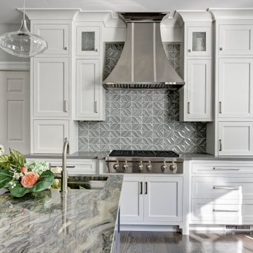
Inspiration for a large timeless u-shaped porcelain tile and gray floor eat-in kitchen remodel in New York with a double-bowl sink, flat-panel cabinets, white cabinets, quartzite countertops, green backsplash, ceramic backsplash, stainless steel appliances, an island and gray countertops
 Bucks Country Gardens
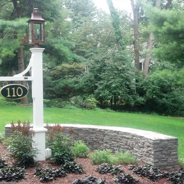
Make a statement with this lantern/address post combination.
The Walpole products featured in this installation are an Oxford Lantern Post with a sign bracket and a 10" x 18" Double-sided Mahogany Sign with gold numbers. The lantern is from the owner's own collection.
 Vetter Architects
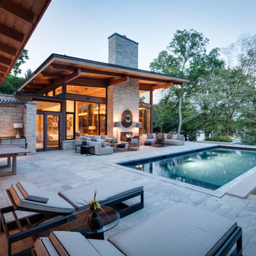
The owners requested a Private Resort that catered to their love for entertaining friends and family, a place where 2 people would feel just as comfortable as 42. Located on the western edge of a Wisconsin lake, the site provides a range of natural ecosystems from forest to prairie to water, allowing the building to have a more complex relationship with the lake - not merely creating large unencumbered views in that direction. The gently sloping site to the lake is atypical in many ways to most lakeside lots - as its main trajectory is not directly to the lake views - allowing for focus to be pushed in other directions such as a courtyard and into a nearby forest.
The biggest challenge was accommodating the large scale gathering spaces, while not overwhelming the natural setting with a single massive structure. Our solution was found in breaking down the scale of the project into digestible pieces and organizing them in a Camp-like collection of elements:
- Main Lodge: Providing the proper entry to the Camp and a Mess Hall
- Bunk House: A communal sleeping area and social space.
- Party Barn: An entertainment facility that opens directly on to a swimming pool & outdoor room.
- Guest Cottages: A series of smaller guest quarters.
- Private Quarters: The owners private space that directly links to the Main Lodge.
These elements are joined by a series green roof connectors, that merge with the landscape and allow the out buildings to retain their own identity. This Camp feel was further magnified through the materiality - specifically the use of Doug Fir, creating a modern Northwoods setting that is warm and inviting. The use of local limestone and poured concrete walls ground the buildings to the sloping site and serve as a cradle for the wood volumes that rest gently on them. The connections between these materials provided an opportunity to add a delicate reading to the spaces and re-enforce the camp aesthetic.
The oscillation between large communal spaces and private, intimate zones is explored on the interior and in the outdoor rooms. From the large courtyard to the private balcony - accommodating a variety of opportunities to engage the landscape was at the heart of the concept.
Overview
Chenequa, WI
Size
Total Finished Area: 9,543 sf
Completion Date
May 2013
Services
Architecture, Landscape Architecture, Interior Design
 Marquise Pools
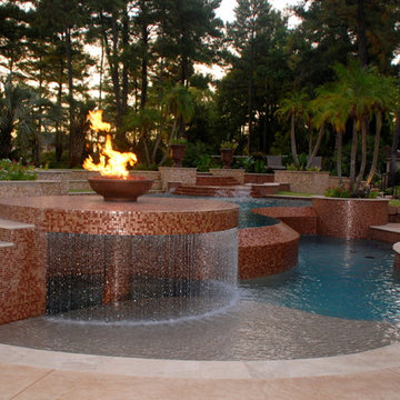
This pool has four different levels with the spa being the high point of the project 30" above finish floor of the house, level two is the glass tile wet deck just below spa spillway, level 3 is the main pool, level four is the lower trough which is at rear patio level. Homes that do not have the proper slopes for vanishing edges, can reverse the topo and create the negative edge that faces the house for a dramatic view, and create wonderful flows of water running towards the house and create incredible views
 Vetter Architects
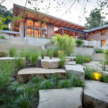
The owners requested a Private Resort that catered to their love for entertaining friends and family, a place where 2 people would feel just as comfortable as 42. Located on the western edge of a Wisconsin lake, the site provides a range of natural ecosystems from forest to prairie to water, allowing the building to have a more complex relationship with the lake - not merely creating large unencumbered views in that direction. The gently sloping site to the lake is atypical in many ways to most lakeside lots - as its main trajectory is not directly to the lake views - allowing for focus to be pushed in other directions such as a courtyard and into a nearby forest.
The biggest challenge was accommodating the large scale gathering spaces, while not overwhelming the natural setting with a single massive structure. Our solution was found in breaking down the scale of the project into digestible pieces and organizing them in a Camp-like collection of elements:
- Main Lodge: Providing the proper entry to the Camp and a Mess Hall
- Bunk House: A communal sleeping area and social space.
- Party Barn: An entertainment facility that opens directly on to a swimming pool & outdoor room.
- Guest Cottages: A series of smaller guest quarters.
- Private Quarters: The owners private space that directly links to the Main Lodge.
These elements are joined by a series green roof connectors, that merge with the landscape and allow the out buildings to retain their own identity. This Camp feel was further magnified through the materiality - specifically the use of Doug Fir, creating a modern Northwoods setting that is warm and inviting. The use of local limestone and poured concrete walls ground the buildings to the sloping site and serve as a cradle for the wood volumes that rest gently on them. The connections between these materials provided an opportunity to add a delicate reading to the spaces and re-enforce the camp aesthetic.
The oscillation between large communal spaces and private, intimate zones is explored on the interior and in the outdoor rooms. From the large courtyard to the private balcony - accommodating a variety of opportunities to engage the landscape was at the heart of the concept.
Overview
Chenequa, WI
Size
Total Finished Area: 9,543 sf
Completion Date
May 2013
Services
Architecture, Landscape Architecture, Interior Design
 Vetter Architects
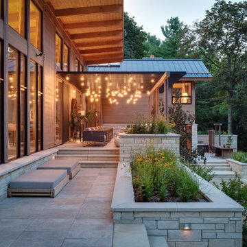
The owners requested a Private Resort that catered to their love for entertaining friends and family, a place where 2 people would feel just as comfortable as 42. Located on the western edge of a Wisconsin lake, the site provides a range of natural ecosystems from forest to prairie to water, allowing the building to have a more complex relationship with the lake - not merely creating large unencumbered views in that direction. The gently sloping site to the lake is atypical in many ways to most lakeside lots - as its main trajectory is not directly to the lake views - allowing for focus to be pushed in other directions such as a courtyard and into a nearby forest.
The biggest challenge was accommodating the large scale gathering spaces, while not overwhelming the natural setting with a single massive structure. Our solution was found in breaking down the scale of the project into digestible pieces and organizing them in a Camp-like collection of elements:
- Main Lodge: Providing the proper entry to the Camp and a Mess Hall
- Bunk House: A communal sleeping area and social space.
- Party Barn: An entertainment facility that opens directly on to a swimming pool & outdoor room.
- Guest Cottages: A series of smaller guest quarters.
- Private Quarters: The owners private space that directly links to the Main Lodge.
These elements are joined by a series green roof connectors, that merge with the landscape and allow the out buildings to retain their own identity. This Camp feel was further magnified through the materiality - specifically the use of Doug Fir, creating a modern Northwoods setting that is warm and inviting. The use of local limestone and poured concrete walls ground the buildings to the sloping site and serve as a cradle for the wood volumes that rest gently on them. The connections between these materials provided an opportunity to add a delicate reading to the spaces and re-enforce the camp aesthetic.
The oscillation between large communal spaces and private, intimate zones is explored on the interior and in the outdoor rooms. From the large courtyard to the private balcony - accommodating a variety of opportunities to engage the landscape was at the heart of the concept.
Overview
Chenequa, WI
Size
Total Finished Area: 9,543 sf
Completion Date
May 2013
Services
Architecture, Landscape Architecture, Interior Design
14