
Search results for "Prototype result" in Home Design Ideas

 Vermont Custom Cabinetry
Prototype cabinets for our wine cubbie. Standard size bottles to the right, Larger to the left. We did decide to inset the interior supports. Very happy with the result!
 EXD ARCHITECTURE
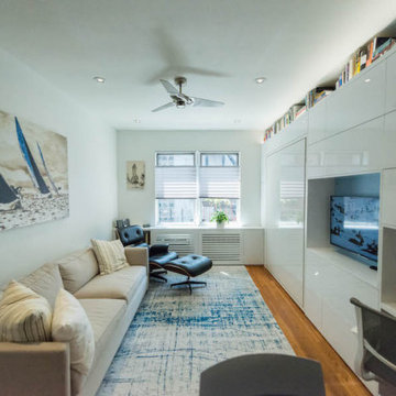
Single Wall Design Solution:
Problem: 650 sq. ft. 1 bedroom apartment needed to be redesigned to allow the new child to take the bedroom, and the parents to live, work, and entertain in the former living room.
Solution: Prototype 1.0 is the Single Wall Design Solution, designed to optimize space along a wall, 18" deep, to be used in a single room and provide a bedroom, office, living room, bar, and storage. It allows for the family's daily needs for 24 hours in their small apartment. Fully integrated and changeable, things are made available when they are needed and hidden when they are not.
Results:
We used the least amount of square footage to maximize the arrangement of the family's home, which resulted in less time wasted, performing activities, or looking for things as there is a place for everything.
Our prototype is financially savvy because it allows the living room to do more in a 24-hour span, showing that we only need our bed and night tables for 8 hours of the day, and the other hours of the day we pay for square footage not used.
These pieces were designed to be standard sizes so they could be interchangeable, providing a custom layout per client. Life is dynamic, and so space should be too. Our prototype 1.0 introduces a new lifestyle to its users, encouraging wellbeing by design.

 Lauren Levant
Large trendy master gray tile gray floor and concrete floor double shower photo with flat-panel cabinets, medium tone wood cabinets, a one-piece toilet, gray walls, a vessel sink, a hinged shower door, black countertops and concrete countertops
Find the right local pro for your project
 GOAT
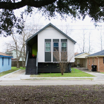
GOATGOAT designed the St. Roch Avenue Shotgun House as an affordable single-family housing prototype. To date, three homes have been constructed in New Orleans by SBP with teams of volunteers.
The houses were designed to continue the evolution of the city’s residential architecture while responding to the concerns of neighborhood residents regarding context, familiarity, and affordability. The resulting three homes, built on the same block in the Milneburg neighborhood of Gentilly, establish a case study in how modern architecture can meet the challenges of neighborhood revitalization with sensitivity. By relating to the scale, rhythm and texture of the traditional New Orleans neighborhood, the St. Roch Avenue Shotgun is reminiscent of a traditional New Orleans home. By incorporating modern materials and construction methods, vaulting interior spaces, adjusting the historic shotgun layout, and adding some contemporary flair, it functions like a modern home.
 GOAT
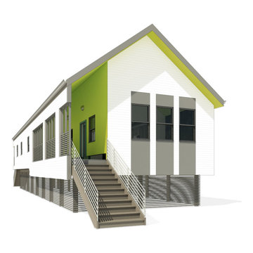
GOATGOAT designed the St. Roch Avenue Shotgun House as an affordable single-family housing prototype. To date, three homes have been constructed in New Orleans by SBP with teams of volunteers.
The houses were designed to continue the evolution of the city’s residential architecture while responding to the concerns of neighborhood residents regarding context, familiarity, and affordability. The resulting three homes, built on the same block in the Milneburg neighborhood of Gentilly, establish a case study in how modern architecture can meet the challenges of neighborhood revitalization with sensitivity. By relating to the scale, rhythm and texture of the traditional New Orleans neighborhood, the St. Roch Avenue Shotgun is reminiscent of a traditional New Orleans home. By incorporating modern materials and construction methods, vaulting interior spaces, adjusting the historic shotgun layout, and adding some contemporary flair, it functions like a modern home.

 Aquatica Plumbing Group
The True Ofuro Mini came about as the direct result of your requests. It too is inspired by the ancient traditions of Japanese bathing that led to the development of our incredibly popular True Ofuro. It too draws on the best ergonomic principles to sculpt a bath with internal seating and built-in headrest, made available in a very compact footprint to fit into even the smallest bathrooms. In fact, Aquatica’s clever designers have managed to create this ‘small and tall’ tub, deep enough for full body soaking in a footprint of just 43”.
Now we have made one more important innovation to the Ofuro Mini - the addition of a stunning graphite black option, using our award-winning and ground-breaking AquateX™ solid surface composite. Just think how that might look in your bathroom!
It is taller and deeper and features a slightly elevated rim for improved neck and head support, as well as a convenient ergonomic built-in seat, allowing the body to comfortably emerge to maximum water capacity. The height of the True Ofuro Mini Japanese style soaking bathtub is substantially taller than the original True Ofuro bathtub, and therefore we recommend people who are shorter than 170cm also purchase our stylish teak wood step.
Aquatica’s international industrial design team, used advanced CAD tools, modeling and repeated testing with real size prototype units so that we could reach the optimal balance between ergonomic comfort and visual appeal.
Our AquateX™ material is the star in this Japanese soaking tub as it retains heat much longer and also has a silky and velvety surface. This bathtub is currently one of our most space conscious bathtubs at a size of 43" x 43" (1090x1090mm), making the freestanding and petite construction of this Japanese style bathtub easy to be installed in any sized bathroom.

 Advance Design Studio, Ltd.
Jennifer and Dan have lived in their Deer Park Illinois home for 15 years, slowly making minor fixes like painting and decorating; but they had a new plan for their kitchen the entire time. An awkwardly placed garage door, and an island cooktop with a terrible downdraft made a full-scale kitchen remodel an absolute must. Jennifer had many ideas in mind and wanted to work with a company that could provide high-end work, while partnering with a designer that would tailor the kitchen to her ideas.
She was intrigued by the phrase “Common Sense Remodeling” in Advance Design’s feature she discovered while perusing an issue of the community’s Quintessential Barrington Magazine. Doing further research on the company’s website, as she looked through project profiles and read about Advance Design’s “Common Sense Remodeling” philosophy, she promptly scheduled an appointment to see if the people and ideas she read about were truly who they said they were. The more she read, the more she knew that the “Common Sense” approach to remodeling they described was exactly the type of company she was looking for.
The partnership was sealed after an initial consultation with Owner Todd Jurs and Project Designer Michelle Lecinski. They displayed a combination of friendliness, professionalism and respect that was unmatched by any of the other companies Jennifer talked to. She knew that with Advance Design, she would be able to retain the vision that she had in mind with high-quality craftsmanship.
“I reached out to Advance Design because of the ‘Common Sense Remodeling’ tagline,” Jennifer said. “That’s what lingered for me”. “Advance Design was the most respectful- of the house and of my design ideas, and the most professional of the handful of companies that looked at my project”.
Soon after the meeting Jennifer began working with Michelle on the project design. They quickly developed chemistry. Jennifer loved how Michelle researched and located every detail that Jennifer wanted for the kitchen. Between the two of them, every concept and idea was worked through and perfected. “Jennifer had definite ideas about what she wanted the new kitchen to look like, she just didn’t know how to bring it all together. We worked together really well to make her ideas into the practical reality necessary for a well-functioning kitchen, with the look and feel that she had envisioned”, says Michelle.
“Michelle was wonderful in using the CAD system she would show me new drawings every time we changed the layout while working through the design,” Jennifer said. “She was a really wonderful partner in execution, she made sure everything happened quickly and easily.”
The finished design drew out elements of Jennifer’s style and personality. The pair call the look “sophisticated farmhouse” to describe the kitchen renovation to family and friends. The result was a beautifully crafted, authentic-feeling space that satisfied Jennifer’s dreams 15 years in the making. The whole project consisted of a kitchen remodel, mudroom upgrade with powder room, and garage entry relocation. “The projects I personally like the best, are the ones that put the client’s dreams on display,” Project Designer Michelle said. “And this is one of those projects.”
The main focal point of the kitchen is custom zinc and brass ventilation hood with a vintage sheen, which was hand made to order by a small company in Indiana named Vogler Metalworking. “It’s like sculpture, a true work of art”, says Jennifer. Your eye is immediately drawn towards this elegant yet practical hood that eliminated the home’s downdraft problem and added a striking conversation piece at the same time. The carpenters had to use special gloves when transporting and installing it, so they didn’t smudge it with fingerprints. The beautiful hood centers proudly over the stunning black enamel and brass LaCornue Range. “I had a friend who had a LaCornue range and after learning how easy it was to cook perfect meals, I was convinced I wanted to have one”, says Jennifer. This unique, breathtaking combination anchors the entire kitchen and is apparent immediately as you walk into the great room the surrounds the space.
DuraSupreme Crestwood cabinets with a Kendall Panel add function and sophistication. A custom gray paint color paired with a storm blue was developed so that the new kitchen looked like it belonged to the existing space. Unlacquered brass faucets and hardware were important to Jennifer because she wanted the living finishes to age over time. Remarkable brass diamond mesh cabinet door inserts imported from the UK continue to add this one-of-a-kind kitchen renovation; giving it a “you won’t see this everywhere” quality. The use of old railcar flooring for the coffee bar countertop and reclaimed oak for the open shelving gives an authenticity to the space uncommon in kitchens today.
Jennifer and Michelle fell in love with the Limestone Grey Stone while they were investigating unique island countertop ideas. They liked the fact that the limestone as a living finish will age and change over time. Calcutta Miel Quartz countertops made for an excellent pairing around the perimeter, as it’s durable and perfect for cooking preparations. A textured white subway tile backsplash that runs to the ceiling keeps your eye moving towards the open shelving, and to the main focal point of the stunning range hood combination.
“The kitchen functions beautifully, and it’s gorgeous,” beams Jennifer as she gestures with both hands while smiling ear to ear. “The most important thing was I wanted a kitchen that had a wonderful flow, cooked beautiful meals and was a great gathering place for family and friends, and this space does that perfectly! Beauty wise, it turned out exactly how I had envisioned. I felt the function part was the hardest part, and that was nailed”!
Relocating the garage entry to the new mudroom was a huge priority and has finally separated the family’s arriving home functions from their kitchen. Now coats and shoes and bags have their own area for dropping once members arrive home. Matching gray DuraSupreme cabinetry helped create gorgeous, purposeful lockers for the family. A reclaimed vintage sink and custom wall paper were added to the tiny powder room to beautify the once previously only functional space. Advance Design was even able to create a custom space for their dog to sleep while the family is away.
“It was unbelievable that a project of this size was completed in such a short time, and I think that’s because of the large amount of planning and preparation that went into it,” Jennifer marveled, “When we started, we were ready, and everything was prepared”.
When it came to execution, Project Manager Justin Davis and his crew were quick, accessible, and organized. Projects like this kitchen are typically completed in as little as 8-10 weeks. Jennifer’s kitchen however despite the relocation of some challenging HVAC in a soffit and moving of an exterior door was completed remarkably fast in part because the team was working with an existing tile floor that ran throughout the first floor that the client really loved.
“You get to know these people really well because they’re living in your house while you’re living in your house. They were so fast and really good, it didn’t take as long as even planned” reported Jennifer. “I would text Justin and he always responded almost immediately. I got to know all the guys who were working in our house and they were all wonderful people”.
Details in a customized kitchen like this one require skill and care from the people who install it. “All the guys on the job were skilled at what the did. I wanted small details like little feet to look like furniture, that is where their carpentry skill came in to make these all perfect”, said Jennifer. “The tile guys were wonderful. They even let me determine how I wanted the texture with the grout to appear for a salt and pepper look; now that is a very skilled trade person making it custom”.
In Jennifer’s interview, she continued to reference Advance Design’s “Common Sense Remodeling”, so I took a minute to ask her exactly what that phrase meant to her and how it played out in her experience with her project and the Advance Design team. Here is what she said: “I was intrigued about Common Sense Remodeling and in my head that there would be clear costs and prices, great communication between the design team, the execution team and me”, said Jennifer. They did deliver on that, it was so clear about the cost breakdown, what I could expect from everyone who came to my house, and everything that we had ordered. That to me is the Common Sense”!
It’s great to see a client take literally our assertion that a well-planned remodeling project is simply “Common Sense”! She anticipated each step of the way would be clear, concise, and predictable, all the while protecting the outcome due to the careful upfront planning. “Advance Design delivered on their ‘Common Sense Remodeling’ promise,” Jennifer said. “From the design team, to the execution team - everything was straight forward like I imagined. The project turned out exactly how I envisioned, I enjoyed this process and absolutely would recommend Advance Design Studio to anyone.”

 The Galante Architecture Studio, Inc.
Originally built in 1972, these eight interlocked residential units and the accompanying House Master’s Residence won an AIA award for their unique spatial complexity, balancing standard units of construction with volumetric interplay, all while bringing natural light into living spaces. However, nearly 40 years later
These 1970’s era, interlocked faculty housing units won an AIA award when first completed. They were unique in spatial complexity, By early 2,000’s they were showing signs of age, and had become outdated on many levels. Working with project management for the Faculty of Arts & Sciences, we prepared one prototype design to bring the buildings into the 21st century. New insulated skylights, standing seam metal siding, cedar decks and trellises, exchanging black roofs for well insulated white roofs, were all part of a larger planning program to renovate all nine units. The prototype was implemented in 2012, to great approval and result. In 2013 a few more units were done. In 2014 the “House Masters” unit was done, with the remaining four units planned for future budgets.
Sustainable features include re-use of most materials on site, (former siding was able to become sheathing below metal panels), implementing the Stretch Energy Code for insulation, and putting new white roof membranes in place. Using FSC certified wood for decks and trellises, and using Rheinzink siding, a “200 year material” according to the manufacturer.
After nearly 40 years, Ronald Gourley’s AIA award winning Faculty Housing (1972) was beginning to show its age – plywood siding was delaminating, wooden decks splintering, and custom windows failing. Therefore, the opportunity to reinvent a piece of Mid-Century Modernism presented itself when two of the building’s eight alternating rooftop designs were to be rebuilt as prototypes for the remainder of the structure.
The strength of the original design was its rectilinear and symmetrical arrangement of internal and external spaces, but the difference between the two had become blurred over the decades. New zinc siding, mahogany decking, and stainless steel railings accentuate the defining elements and more clearly articulate the living spaces, breathing new life into the building and reinvigorating the surrounding campus.
Furthermore, the renovation also provided a chance to bring the structure up to modern energy standards and help meet Harvard’s lofty environmental goals. Insulation within the ceilings was more than tripled, white TPO roofing reduces the heat island effect, construction waste was minimized by recasting the siding as sheathing, and materials were selected not only for aesthetics, but for their longevity and ability to be recycled as well.
Harvard’s energy standards brought an uncharacteristic level of environmental care to this building. Roof structures are triple insulated, allowing separating interior from exterior in the most thermally efficient manner. North facing triple insulated skylights and white TPO roofing reduces the heat gain, but allows natural light to pour in. Materials were selected not only for aesthetics, but for their longevity. Zinc, for example, is made of 100% recycled material, and has duration of 200 years. Uncharacteristic levels of environmental care were common on this project.

 PB Kitchen Design
Our client is a college French instructor, spends considerable time in and loves all things French. French Country in particular- A casual, less ornate form. While this kitchen’s layout and placement of the major elements was determined early in the client / designer relationship, many hours were subsequently spent studying styling and considering forms and details; tweaking and re-tweaking in plan, 3 D modeling, prototype and even as we built out the space. The result is a truly one of a kind kitchen that the client loves and is a source of pride for the design team.
This kitchen is truly one of a kind! The hand-formed hood and rustic table island are anchor statements in this unique and tastefully designed kitchen - which completely reflect the style of this young suburban family. The homeowner, a confessed Francophile, takes her love of all things French to another level. The combination of colors and textures provides a restful and beautiful environment, and brings to mind long walks in Provence surrounded by a flurry of lavender.
Project specs: Premier Custom-Built cabinets, antique white perimeter cabinets, island is fumed oak with a brushed texture. Island Countertop is hammered zinc with an integrated zinc sink. Rocky Mountain faucet, Ann Sacks tile. Wide plank oak floor by Apex Wood Floors. Perimeter countertops are limestone. Sub Zero 48” built in refrigerator and Wolf 48” range.
 The Galante Architecture Studio, Inc.
Originally built in 1972, these eight interlocked residential units and the accompanying House Master’s Residence won an AIA award for their unique spatial complexity, balancing standard units of construction with volumetric interplay, all while bringing natural light into living spaces. However, nearly 40 years later
These 1970’s era, interlocked faculty housing units won an AIA award when first completed. They were unique in spatial complexity, By early 2,000’s they were showing signs of age, and had become outdated on many levels. Working with project management for the Faculty of Arts & Sciences, we prepared one prototype design to bring the buildings into the 21st century. New insulated skylights, standing seam metal siding, cedar decks and trellises, exchanging black roofs for well insulated white roofs, were all part of a larger planning program to renovate all nine units. The prototype was implemented in 2012, to great approval and result. In 2013 a few more units were done. In 2014 the “House Masters” unit was done, with the remaining four units planned for future budgets.
Sustainable features include re-use of most materials on site, (former siding was able to become sheathing below metal panels), implementing the Stretch Energy Code for insulation, and putting new white roof membranes in place. Using FSC certified wood for decks and trellises, and using Rheinzink siding, a “200 year material” according to the manufacturer.
After nearly 40 years, Ronald Gourley’s AIA award winning Faculty Housing (1972) was beginning to show its age – plywood siding was delaminating, wooden decks splintering, and custom windows failing. Therefore, the opportunity to reinvent a piece of Mid-Century Modernism presented itself when two of the building’s eight alternating rooftop designs were to be rebuilt as prototypes for the remainder of the structure.
The strength of the original design was its rectilinear and symmetrical arrangement of internal and external spaces, but the difference between the two had become blurred over the decades. New zinc siding, mahogany decking, and stainless steel railings accentuate the defining elements and more clearly articulate the living spaces, breathing new life into the building and reinvigorating the surrounding campus.
Furthermore, the renovation also provided a chance to bring the structure up to modern energy standards and help meet Harvard’s lofty environmental goals. Insulation within the ceilings was more than tripled, white TPO roofing reduces the heat island effect, construction waste was minimized by recasting the siding as sheathing, and materials were selected not only for aesthetics, but for their longevity and ability to be recycled as well.
Harvard’s energy standards brought an uncharacteristic level of environmental care to this building. Roof structures are triple insulated, allowing separating interior from exterior in the most thermally efficient manner. North facing triple insulated skylights and white TPO roofing reduces the heat gain, but allows natural light to pour in. Materials were selected not only for aesthetics, but for their longevity. Zinc, for example, is made of 100% recycled material, and has duration of 200 years. Uncharacteristic levels of environmental care were common on this project.
 The Galante Architecture Studio, Inc.
Originally built in 1972, these eight interlocked residential units and the accompanying House Master’s Residence won an AIA award for their unique spatial complexity, balancing standard units of construction with volumetric interplay, all while bringing natural light into living spaces. However, nearly 40 years later
These 1970’s era, interlocked faculty housing units won an AIA award when first completed. They were unique in spatial complexity, By early 2,000’s they were showing signs of age, and had become outdated on many levels. Working with project management for the Faculty of Arts & Sciences, we prepared one prototype design to bring the buildings into the 21st century. New insulated skylights, standing seam metal siding, cedar decks and trellises, exchanging black roofs for well insulated white roofs, were all part of a larger planning program to renovate all nine units. The prototype was implemented in 2012, to great approval and result. In 2013 a few more units were done. In 2014 the “House Masters” unit was done, with the remaining four units planned for future budgets.
Sustainable features include re-use of most materials on site, (former siding was able to become sheathing below metal panels), implementing the Stretch Energy Code for insulation, and putting new white roof membranes in place. Using FSC certified wood for decks and trellises, and using Rheinzink siding, a “200 year material” according to the manufacturer.
After nearly 40 years, Ronald Gourley’s AIA award winning Faculty Housing (1972) was beginning to show its age – plywood siding was delaminating, wooden decks splintering, and custom windows failing. Therefore, the opportunity to reinvent a piece of Mid-Century Modernism presented itself when two of the building’s eight alternating rooftop designs were to be rebuilt as prototypes for the remainder of the structure.
The strength of the original design was its rectilinear and symmetrical arrangement of internal and external spaces, but the difference between the two had become blurred over the decades. New zinc siding, mahogany decking, and stainless steel railings accentuate the defining elements and more clearly articulate the living spaces, breathing new life into the building and reinvigorating the surrounding campus.
Furthermore, the renovation also provided a chance to bring the structure up to modern energy standards and help meet Harvard’s lofty environmental goals. Insulation within the ceilings was more than tripled, white TPO roofing reduces the heat island effect, construction waste was minimized by recasting the siding as sheathing, and materials were selected not only for aesthetics, but for their longevity and ability to be recycled as well.
Harvard’s energy standards brought an uncharacteristic level of environmental care to this building. Roof structures are triple insulated, allowing separating interior from exterior in the most thermally efficient manner. North facing triple insulated skylights and white TPO roofing reduces the heat gain, but allows natural light to pour in. Materials were selected not only for aesthetics, but for their longevity. Zinc, for example, is made of 100% recycled material, and has duration of 200 years. Uncharacteristic levels of environmental care were common on this project.
 The Galante Architecture Studio, Inc.
Originally built in 1972, these eight interlocked residential units and the accompanying House Master’s Residence won an AIA award for their unique spatial complexity, balancing standard units of construction with volumetric interplay, all while bringing natural light into living spaces. However, nearly 40 years later
These 1970’s era, interlocked faculty housing units won an AIA award when first completed. They were unique in spatial complexity, By early 2,000’s they were showing signs of age, and had become outdated on many levels. Working with project management for the Faculty of Arts & Sciences, we prepared one prototype design to bring the buildings into the 21st century. New insulated skylights, standing seam metal siding, cedar decks and trellises, exchanging black roofs for well insulated white roofs, were all part of a larger planning program to renovate all nine units. The prototype was implemented in 2012, to great approval and result. In 2013 a few more units were done. In 2014 the “House Masters” unit was done, with the remaining four units planned for future budgets.
Sustainable features include re-use of most materials on site, (former siding was able to become sheathing below metal panels), implementing the Stretch Energy Code for insulation, and putting new white roof membranes in place. Using FSC certified wood for decks and trellises, and using Rheinzink siding, a “200 year material” according to the manufacturer.
After nearly 40 years, Ronald Gourley’s AIA award winning Faculty Housing (1972) was beginning to show its age – plywood siding was delaminating, wooden decks splintering, and custom windows failing. Therefore, the opportunity to reinvent a piece of Mid-Century Modernism presented itself when two of the building’s eight alternating rooftop designs were to be rebuilt as prototypes for the remainder of the structure.
The strength of the original design was its rectilinear and symmetrical arrangement of internal and external spaces, but the difference between the two had become blurred over the decades. New zinc siding, mahogany decking, and stainless steel railings accentuate the defining elements and more clearly articulate the living spaces, breathing new life into the building and reinvigorating the surrounding campus.
Furthermore, the renovation also provided a chance to bring the structure up to modern energy standards and help meet Harvard’s lofty environmental goals. Insulation within the ceilings was more than tripled, white TPO roofing reduces the heat island effect, construction waste was minimized by recasting the siding as sheathing, and materials were selected not only for aesthetics, but for their longevity and ability to be recycled as well.
Harvard’s energy standards brought an uncharacteristic level of environmental care to this building. Roof structures are triple insulated, allowing separating interior from exterior in the most thermally efficient manner. North facing triple insulated skylights and white TPO roofing reduces the heat gain, but allows natural light to pour in. Materials were selected not only for aesthetics, but for their longevity. Zinc, for example, is made of 100% recycled material, and has duration of 200 years. Uncharacteristic levels of environmental care were common on this project.
 The Galante Architecture Studio, Inc.
Originally built in 1972, these eight interlocked residential units and the accompanying House Master’s Residence won an AIA award for their unique spatial complexity, balancing standard units of construction with volumetric interplay, all while bringing natural light into living spaces. However, nearly 40 years later
These 1970’s era, interlocked faculty housing units won an AIA award when first completed. They were unique in spatial complexity, By early 2,000’s they were showing signs of age, and had become outdated on many levels. Working with project management for the Faculty of Arts & Sciences, we prepared one prototype design to bring the buildings into the 21st century. New insulated skylights, standing seam metal siding, cedar decks and trellises, exchanging black roofs for well insulated white roofs, were all part of a larger planning program to renovate all nine units. The prototype was implemented in 2012, to great approval and result. In 2013 a few more units were done. In 2014 the “House Masters” unit was done, with the remaining four units planned for future budgets.
Sustainable features include re-use of most materials on site, (former siding was able to become sheathing below metal panels), implementing the Stretch Energy Code for insulation, and putting new white roof membranes in place. Using FSC certified wood for decks and trellises, and using Rheinzink siding, a “200 year material” according to the manufacturer.
After nearly 40 years, Ronald Gourley’s AIA award winning Faculty Housing (1972) was beginning to show its age – plywood siding was delaminating, wooden decks splintering, and custom windows failing. Therefore, the opportunity to reinvent a piece of Mid-Century Modernism presented itself when two of the building’s eight alternating rooftop designs were to be rebuilt as prototypes for the remainder of the structure.
The strength of the original design was its rectilinear and symmetrical arrangement of internal and external spaces, but the difference between the two had become blurred over the decades. New zinc siding, mahogany decking, and stainless steel railings accentuate the defining elements and more clearly articulate the living spaces, breathing new life into the building and reinvigorating the surrounding campus.
Furthermore, the renovation also provided a chance to bring the structure up to modern energy standards and help meet Harvard’s lofty environmental goals. Insulation within the ceilings was more than tripled, white TPO roofing reduces the heat island effect, construction waste was minimized by recasting the siding as sheathing, and materials were selected not only for aesthetics, but for their longevity and ability to be recycled as well.
Harvard’s energy standards brought an uncharacteristic level of environmental care to this building. Roof structures are triple insulated, allowing separating interior from exterior in the most thermally efficient manner. North facing triple insulated skylights and white TPO roofing reduces the heat gain, but allows natural light to pour in. Materials were selected not only for aesthetics, but for their longevity. Zinc, for example, is made of 100% recycled material, and has duration of 200 years. Uncharacteristic levels of environmental care were common on this project.
 The Galante Architecture Studio, Inc.
Originally built in 1972, these eight interlocked residential units and the accompanying House Master’s Residence won an AIA award for their unique spatial complexity, balancing standard units of construction with volumetric interplay, all while bringing natural light into living spaces. However, nearly 40 years later
These 1970’s era, interlocked faculty housing units won an AIA award when first completed. They were unique in spatial complexity, By early 2,000’s they were showing signs of age, and had become outdated on many levels. Working with project management for the Faculty of Arts & Sciences, we prepared one prototype design to bring the buildings into the 21st century. New insulated skylights, standing seam metal siding, cedar decks and trellises, exchanging black roofs for well insulated white roofs, were all part of a larger planning program to renovate all nine units. The prototype was implemented in 2012, to great approval and result. In 2013 a few more units were done. In 2014 the “House Masters” unit was done, with the remaining four units planned for future budgets.
Sustainable features include re-use of most materials on site, (former siding was able to become sheathing below metal panels), implementing the Stretch Energy Code for insulation, and putting new white roof membranes in place. Using FSC certified wood for decks and trellises, and using Rheinzink siding, a “200 year material” according to the manufacturer.
After nearly 40 years, Ronald Gourley’s AIA award winning Faculty Housing (1972) was beginning to show its age – plywood siding was delaminating, wooden decks splintering, and custom windows failing. Therefore, the opportunity to reinvent a piece of Mid-Century Modernism presented itself when two of the building’s eight alternating rooftop designs were to be rebuilt as prototypes for the remainder of the structure.
The strength of the original design was its rectilinear and symmetrical arrangement of internal and external spaces, but the difference between the two had become blurred over the decades. New zinc siding, mahogany decking, and stainless steel railings accentuate the defining elements and more clearly articulate the living spaces, breathing new life into the building and reinvigorating the surrounding campus.
Furthermore, the renovation also provided a chance to bring the structure up to modern energy standards and help meet Harvard’s lofty environmental goals. Insulation within the ceilings was more than tripled, white TPO roofing reduces the heat island effect, construction waste was minimized by recasting the siding as sheathing, and materials were selected not only for aesthetics, but for their longevity and ability to be recycled as well.
Harvard’s energy standards brought an uncharacteristic level of environmental care to this building. Roof structures are triple insulated, allowing separating interior from exterior in the most thermally efficient manner. North facing triple insulated skylights and white TPO roofing reduces the heat gain, but allows natural light to pour in. Materials were selected not only for aesthetics, but for their longevity. Zinc, for example, is made of 100% recycled material, and has duration of 200 years. Uncharacteristic levels of environmental care were common on this project.
 Brooklyn City Furniture
Design: Jens Juul Eilersen
Quick ship : FABRIC: PLINDY 0016
Compare Tub to a cloud of down or a foamy mug of beer.
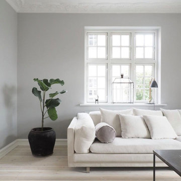
Jens Juul Eilersen has created a gigantic "sofa bathtub", which is an orgy of soft foam, down and pillows. Tub is the coolest and softest sofa yet in the Eilersen universe of floaters. And the contrast between the slim, tight outer shell and the interior heaven of foam and down creates dynamism in the language of form.
Like sitting on a soft bed.
"My goal was to create a well-being sofa where you can sit as if on a soft bed. And I succeeded! I actually fell asleep the first time I leaned back into the prototype, which was the deepest version," tells Jens Juul Eilersen. "When I woke up, I could certainly see that I had to develop a variation of the model in which people could stay awake". This resulted in a further 2 different depths where you sit more upright but still comfortably. Compared to Eilersen's other floater, Tub differentiates itself by the frame. Tub does not have a heavy frame, which is part of the comfort. But on the other hand a thin shell, which keeps the large, soft pillows in place. Externally, the lines are straight and tight and internally, the upholstery and pillows result in organic lines.
"The entire sitting comfort in Tub lies in the foam, which seems softer due to the large depth. This provides a feeling of elevation and larger submersion than in any of our other sofas. It is actually just like sitting in a large mug of foaming beer or on a cloud of down" says Jens Juul Eilersen who promises that even though Tub is soft, inviting and provoking, it cannot become flat. Tub is available in three depths and the series contains corner, end and centre sections, which can be combined as desired.
Quick ship : FABRIC: PLINDY 0016
For other fabric choices Email : info@cityfurnitureshop.com * Difference in shipping will vary
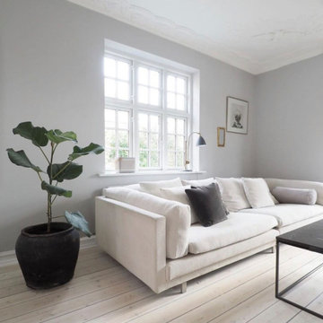 Brooklyn City Furniture
Design: Jens Juul Eilersen
Quick ship : FABRIC: PLINDY 0016
Compare Tub to a cloud of down or a foamy mug of beer.
Jens Juul Eilersen has created a gigantic "sofa bathtub", which is an orgy of soft foam, down and pillows. Tub is the coolest and softest sofa yet in the Eilersen universe of floaters. And the contrast between the slim, tight outer shell and the interior heaven of foam and down creates dynamism in the language of form.
Like sitting on a soft bed.
"My goal was to create a well-being sofa where you can sit as if on a soft bed. And I succeeded! I actually fell asleep the first time I leaned back into the prototype, which was the deepest version," tells Jens Juul Eilersen. "When I woke up, I could certainly see that I had to develop a variation of the model in which people could stay awake". This resulted in a further 2 different depths where you sit more upright but still comfortably. Compared to Eilersen's other floater, Tub differentiates itself by the frame. Tub does not have a heavy frame, which is part of the comfort. But on the other hand a thin shell, which keeps the large, soft pillows in place. Externally, the lines are straight and tight and internally, the upholstery and pillows result in organic lines.
"The entire sitting comfort in Tub lies in the foam, which seems softer due to the large depth. This provides a feeling of elevation and larger submersion than in any of our other sofas. It is actually just like sitting in a large mug of foaming beer or on a cloud of down" says Jens Juul Eilersen who promises that even though Tub is soft, inviting and provoking, it cannot become flat. Tub is available in three depths and the series contains corner, end and centre sections, which can be combined as desired.
Quick ship : FABRIC: PLINDY 0016
For other fabric choices Email : info@cityfurnitureshop.com * Difference in shipping will vary


 OMNIA Group Architects
On site with one of the nicest actors/handyman of Extreme Makeover. For more pictures visit www.theomniagroup.com
When Ken Dewey called and asked us if we would be interested in working with Dewey Homes for their Extreme Makeover: Home Edition in Philadelphia, we said yes without knowing what we were getting into. It turned out to be one of the greatest experiences of our lives. Unfamiliar with the show, we listened one morning to the concept, heard the family’s compelling story, identified the site characteristics and were sketching by noon.
Late that night, we rejoined the Dewey team with floor plans after an intense design and drawing effort back at our office. In the ensuing days, we worked with scores of people - suppliers and sub-contractors led by the incredible Dewey team – under extraordinary pressure to help bring the vision to hard reality. The spirit, teamwork and results in this preparation stage were rewarding enough but paled in comparison to the intensity of “the build.” Someone from OMNIA was on-site 24 hours a day to facilitate the construction of this prototype. And the whole OMNIA team took the 1 am to 7 am shift on a cold, rainy Sunday morning to hammer and saw and carry and sweep. To see so many people, from all walks of life, singularly and selflessly focused on one worthy goal was a unique experience that we will remember forever. To see five months of work compressed into less than five days was truly awesome. To see the inexhaustible Ken and John Dewey lead such a gargantuan effort was inspirational. And to see the look of astonishment and delight on the faces of the Py family was unforgettable and heart-wrenching. It was truly a pleasure and an honor to be part of Extreme Makeover: Home Edition in Philadelphia


 Greystone Homes LLC
Unique pivot front door with frosted glass.
Front door - large contemporary dark wood floor front door idea with beige walls and a glass front door
Front door - large contemporary dark wood floor front door idea with beige walls and a glass front door
1