
Search results for "Puzzle piece" in Home Design Ideas
 Drury Design
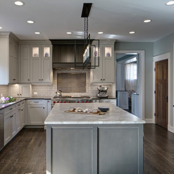
There were some druthers with the kitchen and there was a desire to make certain rooms more grown-up again. Unlike some of our clients who get rid of their formal dining rooms, this family wanted to keep theirs. They saw it as good space for entertaining and doing work – why not make it more stylish and purposeful?
THE REMODEL
Design Objectives
Keep the craftsman style of the home but make it more modern
Update the dining room to be more formal for entertaining and provide storage for china, stemware, wine, etc.
Open up the kitchen to improve flow
Incorporate new decorative lighting throughout the home to accent the home’s style
Transform the staircase into a statement piece that greets visitors – redesign it with arts & crafts details in the balusters, newel posts and handrails
Design Challenges:
Open up the dining room window for more light and a better view of the backyard. The previous window felt closed in with heavy shutters.
Improve kitchen flow without making the footprint larger
Make the entire home feel updated and cohesive while staying true to the house’s style.
THE RENEWED SPACES
We bumped out the dining room window to make a new bay window. The glass mullion design mimics the craftsman style, setting the tone for the room while letting plenty of light in. It really opened up that end of the dining room. The view of the backyard is much bigger now, too. It’s also a great nook for playing board games, doing puzzles and playing with Legos.
We actually got rid of a walk-in pantry that had cut off a corner of the kitchen, and were able to keep all the main walls intact. The old pantry room is where the fridge is now, as well as a tall pantry cabinet, some additional cabinets and a new countertop surface. The flow is much better and it’s roomy now, with a kitchen table that’s great for informal meals, homework and kids seating when adults are entertaining in the dining room.
The cabinet, tile and countertop colors are still neutral but offer a more muted palette. To bring in the craftsman style, simple architectural details were added such as the hood and window valance, decorative furniture toes, a shaker door on the perimeter cabinets and a more modern cabinet door style on the island, pantry and refrigerator areas. New decorative lighting was added in the kitchen, dining room, living room, foyer and second-floor hallway to make the entire first floor feel updated. Also, the entire staircase was revamped. The existing hardwood was kept in place but stained medium brown to bring in some warmth.
“The Drury process made this project turn out better than we imagined,” one of the homeowners told us during the final photoshoot. “There were so many features we didn’t know about – like charging drawers – and ways of going about the remodel that didn’t come to us naturally. We’re so glad Alicia had so much experience and so many checklists. We got to think through everything and arrive at the best possible design for our family.”
 Schenck and Company
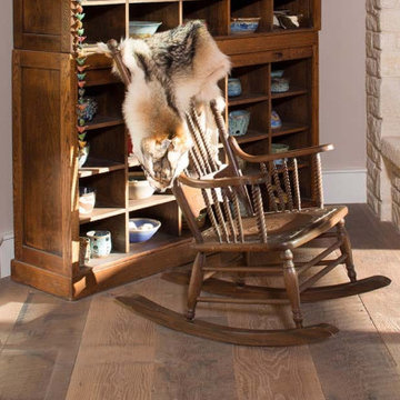
The majority of the flooring in this Hill Country home has been crafted from aged and weathered reclaimed white oak beams. The vestibule, shown in the foreground, is a mix of woods. It was crafted onsite like a jigsaw puzzle, using leftover end pieces from beams installed in the home’s living areas and porches.
 Robin's Nest Interiors
It was a pleasure to help this single dad transform a previous French Country motif into a Handsome Space with Masculine Vibe. The homeowner loves the blues you find in the Caribbean so we used those as accent colors throughout the rooms.
Entry
We painted the walls Sherwin Williams’ Latte (SW6108) to add warmth. We accessorized the homeowner’s beautiful burl wood cabinet with vibrant artwork and whimsical Chinese horses. I always recommend task lighting in a Foyer, if possible, and the rectangular lamp shade is the perfect shape to fit on the small end of the cabinet.
Powder Room
I adore the Candace Olson wallpaper we used in the Powder Room. The blocks look like sections of wood. It works great with the existing granite. Other examples of wallpaper here and here.
Great Room
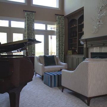
We touched every surface in this Great Room from painting the walls Nomadic Desert (SW6107) to painting the ceiling Double Latte (SW9108) to make the room feel cozier to replacing the carpet with this transitional style with striated pattern to painting the white built-ins.
Furniture placement was a real challenge because the grand piano needed to stay without blocking the traffic flow through the space. The homeowner also wanted us to incorporate his chess table and chairs. We centered a small seating area in front of the fireplace utilizing two oversized club chairs and an upholstered ottoman with a wood tray that slides. The wood bases on the chairs helps their size not overpower the room. The velvet ottoman fabric with navy, azure, and teal blues is a showstopper.
We used the homeowner’s wonderful collection of unique puzzle boxes to accessorize the built-ins. We just added some pops of blues, greens and silver. The homeowner loves sculptural objects so the nickel twig wall decor was the perfect focal point above the mantle. We opted not to add anything to the mantle so it would not distract from the art piece.
We added decorative drapery panels installed on short rods between each set of doors. The homeowner was open to this abstract floral pattern in greens and blues!
We reupholstered the cushions for the chess table chairs in a fun geometric fabric that coordinates with the panel fabric. The homeowner does not use this set of doors to access the deck so we were able to position the table directly in front of them.
Kelly Sisler of Kelly Faux Creations worked her magic on the built-ins. We used Sherwin Williams’ Mega Greige (SW7031) as the base and then applied a heavy bronze glaze. It completely transformed the Great Room. Other examples of painting built-ins here and here.
We hoped you enjoyed this Handsome Space with Masculine Vibe. It was quite a transformation!
Find the right local pro for your project
 Drury Design
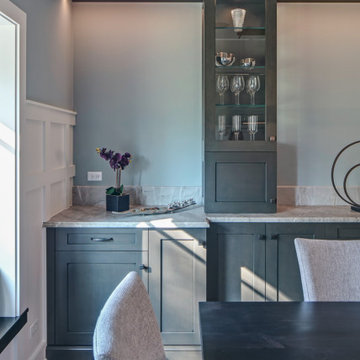
There were some druthers with the kitchen and there was a desire to make certain rooms more grown-up again. Unlike some of our clients who get rid of their formal dining rooms, this family wanted to keep theirs. They saw it as good space for entertaining and doing work – why not make it more stylish and purposeful?
THE REMODEL
Design Objectives
Keep the craftsman style of the home but make it more modern
Update the dining room to be more formal for entertaining and provide storage for china, stemware, wine, etc.
Open up the kitchen to improve flow
Incorporate new decorative lighting throughout the home to accent the home’s style
Transform the staircase into a statement piece that greets visitors – redesign it with arts & crafts details in the balusters, newel posts and handrails
Design Challenges:
Open up the dining room window for more light and a better view of the backyard. The previous window felt closed in with heavy shutters.
Improve kitchen flow without making the footprint larger
Make the entire home feel updated and cohesive while staying true to the house’s style.
THE RENEWED SPACES
We bumped out the dining room window to make a new bay window. The glass mullion design mimics the craftsman style, setting the tone for the room while letting plenty of light in. It really opened up that end of the dining room. The view of the backyard is much bigger now, too. It’s also a great nook for playing board games, doing puzzles and playing with Legos.
We actually got rid of a walk-in pantry that had cut off a corner of the kitchen, and were able to keep all the main walls intact. The old pantry room is where the fridge is now, as well as a tall pantry cabinet, some additional cabinets and a new countertop surface. The flow is much better and it’s roomy now, with a kitchen table that’s great for informal meals, homework and kids seating when adults are entertaining in the dining room.
The cabinet, tile and countertop colors are still neutral but offer a more muted palette. To bring in the craftsman style, simple architectural details were added such as the hood and window valance, decorative furniture toes, a shaker door on the perimeter cabinets and a more modern cabinet door style on the island, pantry and refrigerator areas. New decorative lighting was added in the kitchen, dining room, living room, foyer and second-floor hallway to make the entire first floor feel updated. Also, the entire staircase was revamped. The existing hardwood was kept in place but stained medium brown to bring in some warmth.
“The Drury process made this project turn out better than we imagined,” one of the homeowners told us during the final photoshoot. “There were so many features we didn’t know about – like charging drawers – and ways of going about the remodel that didn’t come to us naturally. We’re so glad Alicia had so much experience and so many checklists. We got to think through everything and arrive at the best possible design for our family.”

 Truitt and White Window and Door Showroom
This hillside home in Piedmont, CA was remodeled to change the style from a 1940's rancher with eight foot ceilings and dark interiors, into a modern geometric composition with vast white interiors for casual living and generous daylighting for displaying the artist-owner's works.
In a city known for rigorous and difficult design review, an addition, two variances, and a full stylistic change were unanimously approved on the first round. All sloped roofs and attics were eliminated and replaced by a series of stacked and overlapping flat roofs. This made the house taller on the inside and shorter on the outside, which helped earn design review cooperation in the community. Windows were concentrated toward the rear yard views or moved up high on the side walls for daylight and privacy, benefitting the owners as well as the neighbors.
At the start, the owner husband was so enthusiastic and engaged in transforming his house into something modern that he presented the architect with a scaled foamcore model, rather than the usual magazine clippings and wish list. He participated in the design decisions throughout the process. The owner wife is the artist who did all the artwork in the house. She had been craving a display space with large walls and good natural light. Both of them loved the location and great views.
The project was an opportunity to transform the style of an older traditional home into a modern one, while solving numerous problems. By rebuilding the 1800 ft2 top of the 3-story home it was possible to change the style of the whole building, since the lower floors were a neutral base, and also to change the lifestyle of the owners, who wanted to move their master suite upstairs and live primarily on the top floor as empty nesters.
Going into the project, the architect knew there were multiple encroachments into the setbacks and potential privacy issues with close by neighbors. He approached this as a complex puzzle made up of architectural and political pieces which all had to fit together elegantly. It took many careful moves, small and large, to arrive at a serene and cohesive result that tied old and new together seamlessly.
The design-build contractor worked closely with the owners and handled all of the construction phase documents and design adjustments, adding ideas of their own to make the project really sing.
The project was a collaboration in three acts. The owner had a strong design concept from the start. The architect developed it into a realistic project and garnered the design approvals. Then the contractor executed brilliantly
 Lumar Interiors
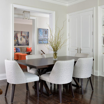
A gorgeous mix of traditional and contemporary style in this Toronto home! We were able to pair old furnishings with new, neutral tones with vibrant ones, and wall decor with exciting new artwork! Since we have worked with these clients before, we knew their design style to the T. The couple was moving from the suburbs to the city, so we wanted to take their usual style (which errs more on the traditional side) and throw in some exciting and bold new elements — new chapter, new look!
The design turned out light and airy which is balanced by the vibrant color accents, large artwork, wall coverings, and, one of our favorite pieces, a glamorous puzzle table!
Home located in Summerhill, Toronto. Designed by Lumar Interiors who also serve Richmond Hill, Aurora, Nobleton, Newmarket, King City, Markham, Thornhill, York Region, and the Greater Toronto Area.
For more about Lumar Interiors, click here: https://www.lumarinteriors.com/
To learn more about this project, click here: https://www.lumarinteriors.com/portfolio/summerhill/
 Naturescapes Landscape Specialists, Ltd
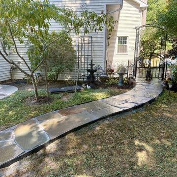
This project in Downingtown focused on refreshing a rear patio while preserving a natural, organic look that blends seamlessly with the surrounding landscape.
Building a Strong, Natural Foundation
We began by carefully grading and leveling the patio area to create a stable base for the installation. To reinforce the perimeter and maintain long-term durability, small boulders were tightly placed along the edges. This approach not only enhances the natural aesthetic but also helps prevent the loss of base material over time.
With the foundation prepared, we installed irregular flagstone, cutting and fitting each piece with precision. The result is a clean, tightly joined surface that resembles a natural stone puzzle, structured yet organic in appearance.
Bringing It All Together
To improve flow throughout the yard, stepping stone pathways were added on both sides of the patio. These pathways create smooth, intuitive transitions to other areas of the rear garden while maintaining the same natural design language.
To complete the project, we constructed a flagstone walkway connecting the driveway to the rear garden. This addition enhances accessibility and ties the entire outdoor space together, creating a cohesive, functional environment that feels both intentional and effortlessly natural.
If you’re looking to create a natural, beautifully crafted patio or walkway in Downingtown or anywhere around Chester County, our team is here to help. From thoughtful design to precise installation, we bring outdoor spaces to life with lasting quality and care. Contact us today to schedule a consultation and start planning your transformation.
Sponsored
Sunbury, OH

J.Holderby - Renovations
Franklin County's Leading General Contractors - 2X Best of Houzz!
 Interior Maata
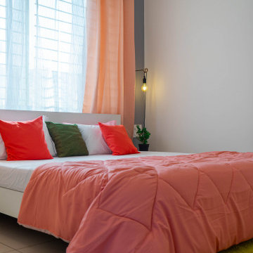
Last piece of the puzzle !! The Bedroom .
How to Design a Small Bedroom ?
•Color - Don’t introduce more than 3 colours in the same place. Here we have used Pastel pink , grey and some green . Too many Color’s can be overwhelming in a small space . .
.
• Furniture : It is suggested to keep the furniture’s light in colour . Also keep them flexible , low in hight and don’t make them heavy by placing too many storage’s .
.
•Soft Furnishing : You can introduce Color through soft furnishing to a space. Add your favourite color cushion , curtains ,throws and sheets and done. You can have a bright and happening home without dark walls. Best part is , you can change them with seasons
 Joe McGuire Design
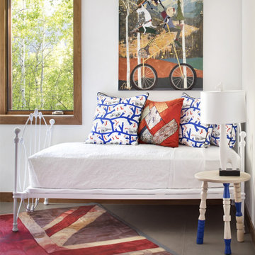
Embracing the challenge of grounding this open, light-filled space, our Aspen studio focused on comfort, ease, and high design. The built-in lounge is flanked by storage cabinets for puzzles and games for this client who loves having people over. The high-back Living Divani sofa is paired with U-Turn Benson chairs and a "Rabari" rug from Nanimarquina for casual gatherings. The throw pillows are a perfect mix of Norwegian tapestry fabric and contemporary patterns. In the child's bedroom, we added an organically shaped Vitra Living Tower, which also provides a cozy reading niche. Bold Marimekko fabric colorfully complements more traditional detailing and creates a contrast between old and new. We loved collaborating with our client on an eclectic bedroom, where everything is collected and combined in a way that allows distinctive pieces to work together. A custom walnut bed supports the owner's tatami mattress. Vintage rugs ground the space and pair well with a vintage Scandinavian chair and dresser.
Combining unexpected objects is one of our favorite ways to add liveliness and personality to a space. In the little guest bedroom, our client (a creative and passionate collector) was the inspiration behind an energetic and eclectic mix. Similarly, turning one of our client's favorite old sweaters into pillow covers and popping a Native American rug on the wall helped pull the space together. Slightly eclectic and invitingly cozy, the twin guestroom beckons for settling in to read, nap or daydream. A vintage poster from Omnibus Gallery in Aspen and an antique nightstand add period whimsy.
 Truitt and White Window and Door Showroom
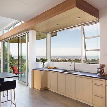
This hillside home in Piedmont, CA was remodeled to change the style from a 1940's rancher with eight foot ceilings and dark interiors, into a modern geometric composition with vast white interiors for casual living and generous daylighting for displaying the artist-owner's works.
In a city known for rigorous and difficult design review, an addition, two variances, and a full stylistic change were unanimously approved on the first round. All sloped roofs and attics were eliminated and replaced by a series of stacked and overlapping flat roofs. This made the house taller on the inside and shorter on the outside, which helped earn design review cooperation in the community. Windows were concentrated toward the rear yard views or moved up high on the side walls for daylight and privacy, benefitting the owners as well as the neighbors.
At the start, the owner husband was so enthusiastic and engaged in transforming his house into something modern that he presented the architect with a scaled foamcore model, rather than the usual magazine clippings and wish list. He participated in the design decisions throughout the process. The owner wife is the artist who did all the artwork in the house. She had been craving a display space with large walls and good natural light. Both of them loved the location and great views.
The project was an opportunity to transform the style of an older traditional home into a modern one, while solving numerous problems. By rebuilding the 1800 ft2 top of the 3-story home it was possible to change the style of the whole building, since the lower floors were a neutral base, and also to change the lifestyle of the owners, who wanted to move their master suite upstairs and live primarily on the top floor as empty nesters.
Going into the project, the architect knew there were multiple encroachments into the setbacks and potential privacy issues with close by neighbors. He approached this as a complex puzzle made up of architectural and political pieces which all had to fit together elegantly. It took many careful moves, small and large, to arrive at a serene and cohesive result that tied old and new together seamlessly.
The design-build contractor worked closely with the owners and handled all of the construction phase documents and design adjustments, adding ideas of their own to make the project really sing.
The project was a collaboration in three acts. The owner had a strong design concept from the start. The architect developed it into a realistic project and garnered the design approvals. Then the contractor executed brilliantly
 Drury Design
There were some druthers with the kitchen and there was a desire to make certain rooms more grown-up again. Unlike some of our clients who get rid of their formal dining rooms, this family wanted to keep theirs. They saw it as good space for entertaining and doing work – why not make it more stylish and purposeful?
THE REMODEL
Design Objectives
Keep the craftsman style of the home but make it more modern
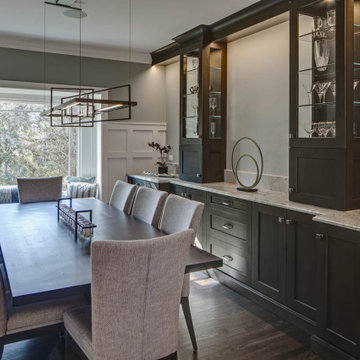
Update the dining room to be more formal for entertaining and provide storage for china, stemware, wine, etc.
Open up the kitchen to improve flow
Incorporate new decorative lighting throughout the home to accent the home’s style
Transform the staircase into a statement piece that greets visitors – redesign it with arts & crafts details in the balusters, newel posts and handrails
Design Challenges:
Open up the dining room window for more light and a better view of the backyard. The previous window felt closed in with heavy shutters.
Improve kitchen flow without making the footprint larger
Make the entire home feel updated and cohesive while staying true to the house’s style.
THE RENEWED SPACES
We bumped out the dining room window to make a new bay window. The glass mullion design mimics the craftsman style, setting the tone for the room while letting plenty of light in. It really opened up that end of the dining room. The view of the backyard is much bigger now, too. It’s also a great nook for playing board games, doing puzzles and playing with Legos.
We actually got rid of a walk-in pantry that had cut off a corner of the kitchen, and were able to keep all the main walls intact. The old pantry room is where the fridge is now, as well as a tall pantry cabinet, some additional cabinets and a new countertop surface. The flow is much better and it’s roomy now, with a kitchen table that’s great for informal meals, homework and kids seating when adults are entertaining in the dining room.
The cabinet, tile and countertop colors are still neutral but offer a more muted palette. To bring in the craftsman style, simple architectural details were added such as the hood and window valance, decorative furniture toes, a shaker door on the perimeter cabinets and a more modern cabinet door style on the island, pantry and refrigerator areas. New decorative lighting was added in the kitchen, dining room, living room, foyer and second-floor hallway to make the entire first floor feel updated. Also, the entire staircase was revamped. The existing hardwood was kept in place but stained medium brown to bring in some warmth.
“The Drury process made this project turn out better than we imagined,” one of the homeowners told us during the final photoshoot. “There were so many features we didn’t know about – like charging drawers – and ways of going about the remodel that didn’t come to us naturally. We’re so glad Alicia had so much experience and so many checklists. We got to think through everything and arrive at the best possible design for our family.”
 M|R Walls
Custom Scales Design
Mario Romano Walls Corian Solid Surface
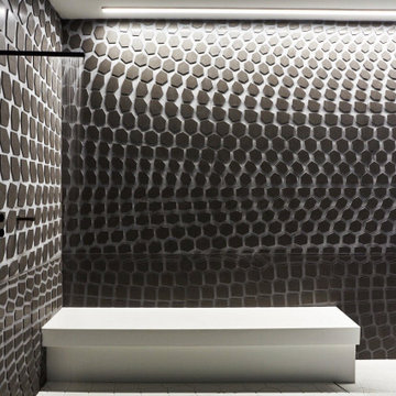
Grout-free, seamless, antimicrobial, nonporous, mold-free, and class A fire-rated.
Created in Santa Monica, California by blending our patented parametric software with CNC Technology, M|R Walls offers an exclusive line of textured, non-repetitive, etched and multidimensional seamless wall surfaces made from Solid Surface material. Each piece is unique, and connects to one another like a large puzzle with massive scale potential.
 Coast to Coast Imports, LLC
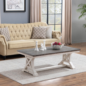
Set the stage for casual entertaining with our Cocktail Table finished in a light Bar Harbor Cream with a top of natural wood grained plank construction. The trestle style base has an X cross design on the legs and a lower crossbar, and the spacious surface provides plenty of room for games, puzzles or snacks. Perfect alone, but we also offer many coordinating pieces for you to pick and choose from in order to create the family fun room you have always wanted!

 Karen Berkemeyer Home
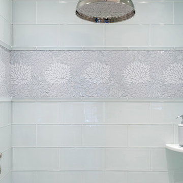
Kitchen and bath designer, Amy Eisenberg, recommended a glass collection with 6’ x 12’ glossy pale aqua glass tile for the shower walls and banded it with a gorgeous glass floral mosaic. The glass pencil works to transition the very thin glass mosaic and the thicker glass field tile. So much detail goes into the plan with tile design than the just selection of materials. A great installer is key. Places where materials transition, corner and change thicknesses create challenging puzzles and require experts. Challenging and intricate mosaic patterns are well worth the extra planning. They offer unparalleled impact. Amy embellished the floor with diagonally set glass pieces inserted into the larger Thassos stone tile on the main floor and used the same small square mosaic on the entire shower floor. The small matching 1” x 1” glass mosaic for the shower floor is perfect choice for friction and functions well to create the necessary floor pitch for proper drainage.
Kitchen and bath design by Amy Eisenberg
Photography by David Sloane Photography
 M|R Walls
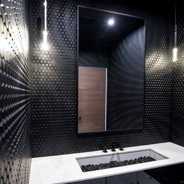
Mario Romano Walls - Hexagon Design
Grout-free, seamless, antimicrobial, nonporous, mold-free, and class A fire-rated.
Created in Santa Monica, California by blending our patented parametric software with CNC Technology, M|R Walls offers an exclusive line of textured, non-repetitive, etched and multidimensional seamless wall surfaces made from Solid Surface material. Each piece is unique, and connects to one another like a large puzzle with massive scale potential.
 Susan Nelson Interiors
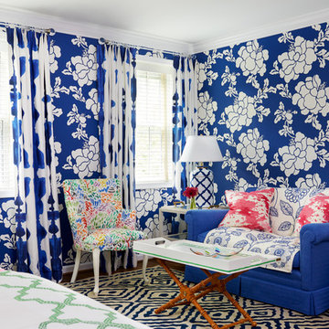
Example of a transitional guest medium tone wood floor bedroom design in DC Metro with blue walls
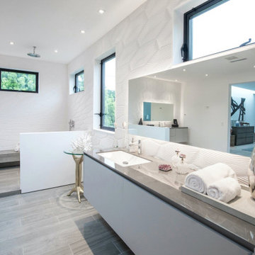 M|R Walls
Mario Romano Walls - Honey Design
Grout-free, seamless, antimicrobial, nonporous, mold-free, and class A fire-rated.
Created in Santa Monica, California by blending our patented parametric software with CNC Technology, M|R Walls offers an exclusive line of textured, non-repetitive, etched and multidimensional seamless wall surfaces made from Solid Surface material. Each piece is unique, and connects to one another like a large puzzle with massive scale potential.


 Olympic Rockeries
ModernWeb
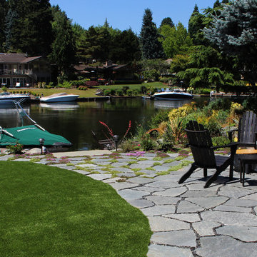
Inspiration for a large transitional partial sun backyard stone landscaping in Seattle for summer.
Inspiration for a large transitional partial sun backyard stone landscaping in Seattle for summer.
 M|R Walls
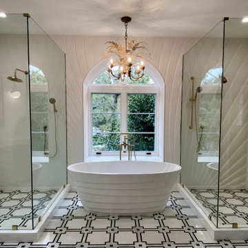
Reeds Design applied on the Walls and shower niches. Seamless finish, continuation of design from wall to wall and into the niches without stoppage.
Grout-free, seamless, antimicrobial, nonporous, mold-free, and class A fire-rated.
Created in Santa Monica, California by blending our patented parametric software with CNC Technology, M|R Walls offers an exclusive line of textured, non-repetitive, etched and multidimensional seamless wall surfaces made from Solid Surface material. Each piece is unique, and connects to one another like a large puzzle with massive scale potential.
21