
Search results for "Quick decisions" in Home Design Ideas
 Benbow & Associates
Kevin Meechan Photographer
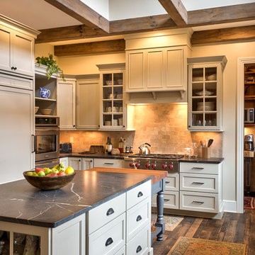
Example of a farmhouse l-shaped dark wood floor eat-in kitchen design in Other with soapstone countertops, two islands, shaker cabinets, white cabinets, beige backsplash, stainless steel appliances, an undermount sink and limestone backsplash
Example of a farmhouse l-shaped dark wood floor eat-in kitchen design in Other with soapstone countertops, two islands, shaker cabinets, white cabinets, beige backsplash, stainless steel appliances, an undermount sink and limestone backsplash


 dSPACE Studio Architecture
Tony Soluri Photography
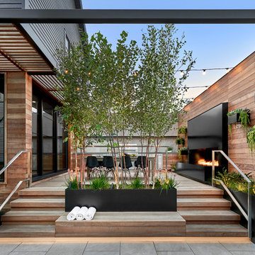
Example of a trendy backyard deck design in Chicago with a bbq area
Example of a trendy backyard deck design in Chicago with a bbq area
Find the right local pro for your project
 LMK INTERIOR DESIGN
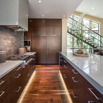
Scott Zimmerman, Modern kitchen with walnut cabinets and quartz counter top.
Example of a large trendy dark wood floor kitchen design in Salt Lake City with flat-panel cabinets, dark wood cabinets, quartzite countertops, gray backsplash, stone tile backsplash, paneled appliances and an island
Example of a large trendy dark wood floor kitchen design in Salt Lake City with flat-panel cabinets, dark wood cabinets, quartzite countertops, gray backsplash, stone tile backsplash, paneled appliances and an island
 Mierop Design, FAPLD
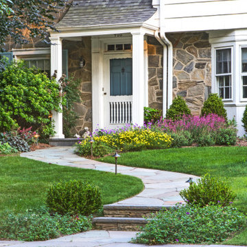
Romantic front entry with serpentine bluestone walkway graced with color long performing perennials: coreopsis, geranium, agastache
Design ideas for a mid-sized traditional front yard landscaping in New York.
Design ideas for a mid-sized traditional front yard landscaping in New York.


 AM Interior Design
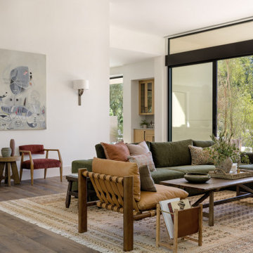
Living room - huge southwestern open concept medium tone wood floor and brown floor living room idea in Seattle with white walls, a standard fireplace and a tile fireplace
 TZS Design
Traditional custom kitchen
Photo by Marcel Page Photography
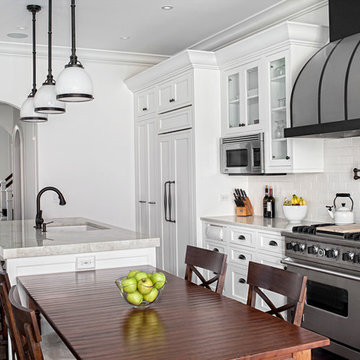
Eat-in kitchen - large traditional galley dark wood floor eat-in kitchen idea in Chicago with white cabinets, quartzite countertops, white backsplash, subway tile backsplash, stainless steel appliances, an island and recessed-panel cabinets
Eat-in kitchen - large traditional galley dark wood floor eat-in kitchen idea in Chicago with white cabinets, quartzite countertops, white backsplash, subway tile backsplash, stainless steel appliances, an island and recessed-panel cabinets
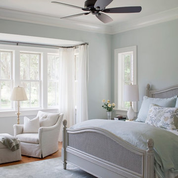
 Pearce Scott
French Country style bedroom - Pearce Scott Architects
Bedroom - mid-sized traditional guest medium tone wood floor bedroom idea in Other with blue walls
Bedroom - mid-sized traditional guest medium tone wood floor bedroom idea in Other with blue walls

 Klopf Architecture
From Mid-Century Classic to the Present
An iconic design updated with comfort, function, and flow for today.
A Remodel That Balances Past and Present
What started as a desire to update a classic Eichler soon became an exploration of how Mid-Century Modern design can successfully evolve for today. The client, a tech professional with a passion for scuba diving and underwater photography, wanted a home that would both honor its original character and feel tailored to his daily life. A lifelong technology enthusiast, he still owns the very first Mac desktop he saved up for as a teenager working at Radio Shack, a detail that underscores his appreciation for design that melds function and form.
Honoring Separation While Expanding Possibility
Unlike many contemporary remodels where walls are opened up to create expansive living spaces, this project took a more restrained approach. The client valued the defined rooms of the original plan and wanted to preserve as much wall space as possible for displaying his large-format underwater photography. The emphasis was not on dramatic spatial reinvention, but on thoughtful refinements. Klopf Architecture shaped a gallery-like backdrop while also expanding the primary suite, modernizing materials and fixtures throughout the home, and improving the functionality and layout of the kitchen. The finished home feels at once timeless and renewed, an Eichler that continues to inspire while fully supporting the lifestyle of its present-day owner.
A major turning point came mid-design. The original project brief had not included an addition, but as the reconfiguration of the primary bedroom and bath unfolded, it became clear that an expansion was the best approach to achieve the client’s vision of a more spacious suite. Fortunately, the adjustment came at a stage when revisions were still manageable and was integrated seamlessly, showing how thoughtful course corrections can strengthen a project rather than hinder it.
Navigating Challenges With Precision
The design development included multiple conceptual rounds, balancing preservation with subtle expansion. During construction, an existing post previously thought to be load-bearing turned out not to be. The structural engineer was able to pivot quickly, and both the post and the cross beam that had been intended to replace it could be omitted, allowing the original rhythm of the Eichler beam bays to be preserved.
Sustainability was not just a checklist item, but a way to align the home with the client’s values of simplicity, efficiency, and long-term functionality. R-38 roof insulation reduced energy usage, solar panels with battery storage provided independence and resilience, and passive comfort strategies eliminated the need forenergy-intensive air conditioning. An electric vehicle charger and an on-demand hot water recirculation system (with call buttons as opposed to having constant circulation) add to the home’s long-term efficiency factors. Together, these moves created a home that is quieter, more comfortable, and better equipped for the future, qualities that supported the client’s pragmatic approach to design and living lightly.
Details That Respect the Eichler DNA
The remodel carries forward the Eichler’s original spirit while introducing new layers of modern livability. Originally, the house was approached along a deep, narrow walk, with the garage on one side and the house on the other, leaving the front door tucked far back within this chasm-like space. By pulling the entry forward, the design reshaped the arrival experience, creating a clearer threshold and a natural drop-off zone for bags, shoes, and keys. This shift also made room for a custom bench at the entry that extends seamlessly through the glass sidelight. The bench and drop-off zone now work together as a single, integrated sequence that supports everyday living while offering a tactile reminder of Eichler’s philosophy of connectedness.
At the client’s request, Klopf reintroduced a classic Eichler gesture by extending the exterior siding into the entry and living room. The detail reinforces a sense of indoor/outdoor continuity while providing a subtle architectural surface that allows the client’s photography to take visual precedence.
The signature concrete masonry wall at the front was reconstructed using blocks sourced to match the originals, now strengthened with rebar for seismic resilience while maintaining a private outdoor courtyard, visually extending the kitchen outward. A decorative trellis element, a detail borrowed from a neighboring Eichler, restores a familiar mid-century modern architectural motif. At the courtyard entry door, a custom etched glass sidelight with an ocean-themed design featuring kelp and jellyfish serves as a subtle homage to the client’s passion for deep-sea diving.
Landscaping became an integral part of the overall transformation. The homeowner engaged landscape architect Randi Johnsen of Third Nature Studio to shape a series of calm, inviting outdoor rooms that read as a natural extension of the interiors. While technically outside of the core construction scope, the landscape design proved central to achieving a sense of completeness and connectedness across the property. Such whole-property considerations often emerge as design ideas take shape, underscoring the importance of flexibility in planning and budgeting, as well as close collaboration among the design team starting early in the process.
The Value of Evolving Scope
As with many custom residential projects, the scope evolved during the design process. What began as a targeted remodel grew to include a new/expanded primary suite, a rebuilt CMU patio wall for strength and longevity, and a solar panel array and battery storage for energy resilience and carbon-reduction. Each thoughtful decision represented a conscious investment in the home’s performance and character, rather than a cost overrun.
The result was a project delivered on schedule, tailored precisely to the client’s lifestyle, and positioned to add long-term value both functionally and aesthetically. By embracing scope evolution as an opportunity rather than a challenge, and relying on good design paired with transparent communication, this remodel demonstrates how Eichler homes can be adapted for contemporary living without erasing their DNA.
Klopf Architecture project team: John Klopf, AIA, and Klara Kevane, Elise Webb and Nicholas LaNasa.
Contractor: Golden Cove Construction
Landscape Design: Third Nature Studio
Structural Engineer: Daniel Bastiao Design
Photography: ©2025 Mariko Reed
Year Completed: 2024
Location: Sunnyvale, CA
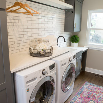
 Advance Design Studio, Ltd.
After six years of living in their Huntley IL home, Chris and Meghan were tired of their dark, dingy, outdated kitchen and it was finally time for a long-anticipated change. “The kitchen is the place where we live, it’s where we do everything,” Meghan said. “It was important that it be a space where we wanted to be.” Meghan loves cooking and enjoys including their girls in healthy meal prepping, this led them to want a brighter, more enjoyable kitchen with increased functionality and improved storage.
For Chris especially, the laundry room was an entirely dysfunctional eyesore. “We had a washer and a dryer, but it was all kind-of cobbled together!” Chris said. “There were always laundry piles everywhere, we weren’t really sure what we wanted to do in there, but it was time for us to make a change.” The mess of the space was stressful every time they walked in the door from the garage each day. Kids’ backpacks and shoes piled up haphazardly in the makeshift boot-bench closet left the family feeling disorganized and stressed. They needed space for folding clothes and locker cubbies to help keep the family organized.
Having known Christine and Todd in the Huntley community for years, Chris and Meghan were familiar with their work. “We already trusted them personally and having seen their projects for years we knew they did top notch work. After we reviewed the initial round of designs, we knew that hiring them was definitely the right choice,” Meghan and Chris said. Although Chris had done a lot of work in their home himself, the kitchen and laundry room renovation was such a large undertaking that he didn’t want to steal time away from his family to spend what would surely be many long weekends doing the job himself. “That would not have been a wise choice for us,” Chris laughed.
“Our designer, Michelle was very, very, easy to work with; anything we wanted to see or weren’t sure about, she went above and beyond to make this easy for us. She was easy to get hold of and always quick to respond,” the couple said. Michelle pulled ideas that mirrored the couple’s taste and style and was adept at directing the couple to limited choices that didn’t overwhelm them and kept the process moving. “I have a hard time making decisions. Michelle made the decision-making process so easy. I loved how she listened to what I liked and then presented three great options for me to choose from,” Meghan said.
The main objectives for the kitchen were better storage solutions, they wanted the space to reflect their lifestyle and taste, and they wanted it to last for years with low maintenance. One of the first steps in creating a more functional kitchen was relocating the refrigerator, creating an improved workflow for the busy family.
“We didn’t know that we could even move the refrigerator to a new location where it is now, that was something that we never would have thought of,” Chris said. “The new refrigerator location makes the kitchen feel so much bigger. We didn’t add any space, but our whole kitchen with the new design just seems like it’s so much larger than before!” Meghan said.
The perimeter mist colored cabinets helped warm and brighten the entire room, while the graphite colored cabinets on the island added contrast. Using this fresh, clean color palette satisfied the couple’s desire for a bright space that was the exact opposite of what they had before. Organization accessories were also added to the cabinets such as a spice drawer tray and roll outs to create hidden convenience.
“I absolutely love the hidden spices – it makes cooking so much more enjoyable!” Chris said. “And all the pull outs, and the double trash bin, who would think you could get so excited about organization!” the couple said in unison.
One thing they hated in their original kitchen was how dark the space felt. Added lighting on the ceiling with the new light fixtures combined with the lighter cabinetry colors throughout solved this problem. “Our new kitchen has this warm, almost cozy feeling that our old kitchen never had, it’s just a space that I love spending my time in now,” Meghan said. The light airy feeling was accentuated with the use of floating white shelves on either side of the decorative range hood. “We have so much cabinetry space, the new design is amazing we actually have more storage space than we will ever need,” Meghan said.
The island was extended to create more work surface and added space for stool seating. “The new island changes how we live. Now the kids can be in the kitchen with us, doing homework, eating breakfast, and the three of us have special dinners there when Chris is working late,” Meghan said.
The Carrara Marmi Quartz countertops were chosen because they are, not only beautiful, but are made from hard-working material that doesn’t require maintenance. The white subway tile backsplash that wraps to the ceiling behind the focal point cooktop range/hood compliments the crisp white countertops perfectly, while brushed brass hardware and light fixtures keep the design fresh and new.
The couple had a few fears at the beginning of the project, as most homeowners do. Their biggest fear was being out of their kitchen and laundry room for an extended time. The crew made it very easy for the family to work in a limited space keeping the washer and dryer hooked up the majority of the time, and also getting appliances working with minimal downtime.
“They above and beyond accommodated us to get us through the process,” Meghan said. “They did a great job making sure we were as comfortable as possible throughout the process,” Chris added.
“Our project manager DJ did a great job. He was very good at updating us on schedule changes, getting guys in as quickly as possible. Everyone that stepped in the house was nice and did great work,” said Chris. They thought Advance’s carpenter was phenomenal and were impressed when he took a conceptual idea from a photograph and worked with designer Michelle to create a one of a kind range/hood that has become the topic of conversation with friends and family who visit the new kitchen. “He was in our house literally every day for several weeks. He was easy to work with and good at what he did,” Meghan and Chris said.
The focal point of the kitchen; a hand-crafted, custom-built ventilation hood was clad with handpicked reclaimed barnwood. Advance Design’s carpenter built the framework and the cladding to create a one-of-a-kind design element that the couple loves.
“I think it was especially fun for him to create something unique from scratch, showcasing his talent in this area,” Meghan said. “I love that my kitchen is not like everyone else’s. I got to pick out the wood on my hood and watch it being built and was able to choose what pieces of wood went where on it. It’s totally unique.”
Red Oak flooring was toothed-in throughout the kitchen and the rest of the first floor anywhere changes were made. Then the whole floor was refinished to tone down the orange undertones in the existing floor stain, ultimately changing the color complexion of the entire first floor. The result is a completely new feeling to the entire home.
Renovating the laundry room was extremely important to Meghan and Chris, but they had trouble visualizing what the possibilities were for the seemingly small space. Michelle produced beautiful 3D illustrations that helped them envision the space in a whole new way.
“I must have told Michelle 100 times that I am a visual person, seeing the designs in 3D made it so easy to make decisions and see what we could really do with our space,” Meghan said.
A dividing wall and doorway were removed between the existing laundry room and hallway formerly containing a coat closet, providing space to design specialized graphite colored cabinetry matching the kitchen island to house custom storage cubbies for each family member. Adding the tall utility cabinetry in the new laundry area helped solve the storage issue, tucking away cleaning supplies, household items, and even the cat got its own cubby.
“I love how everything is now hidden in its own space. I can’t tell you how much I hated coming home and seeing everything sitting around on counters,” Chris said.
Electrical outlets were planned for the inside of utility cabinets, so devices could charge in hidden locations. Stacking the washer and dryer allowed for wider countertop space to provide a folding area and a special space for clothes to hang. “The way I do laundry has been completely transformed! I can actually fold clothes and hang them now right out of the washer and dryer,” Meghan said.
“The end result in the kitchen and the laundry/mud room was an updated light and bright space, with a smarter work flow that better meets the needs of this family,” Michelle said.
“I would totally recommend Advance Design,” Meghan said. “Sometimes I sit and just look at my kitchen and laundry room and think ‘Wow, I can’t believe I get to live here!’ It’s an understatement to say we love our new space.”
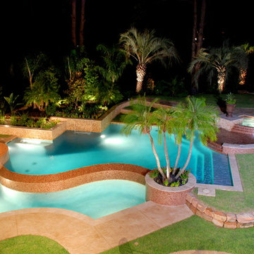
 Marquise Pools
This pool has four different levels with the spa being the high point of the project 30" above finish floor of the house, level two is the glass tile wet deck just below spa spillway, level 3 is the main pool, level four is the lower trough which is at rear patio level. Homes that do not have the proper slopes for vanishing edges, can reverse the topo and create the negative edge that faces the house for a dramatic view, and create wonderful flows of water running towards the house and create incredible views
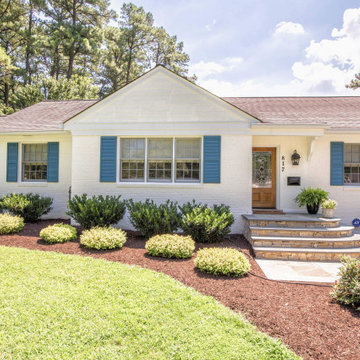
 Widespread Solutions
This beautiful one-story brick rancher located in Henrico County is impressive. Painting brick can be a
hard decision to make but it’s a tried and true way of updating your home’s exterior without replacing
the masonry. While some brick styles have stood the test of time, others have become dated more
quickly. Moreover, many homeowners prefer a solid color for their home as compared to the natural
variety of brick. This home was painted with Benjamin Moore’s Mayonnaise, a versatile bright white
with a touch of creamy yellow.
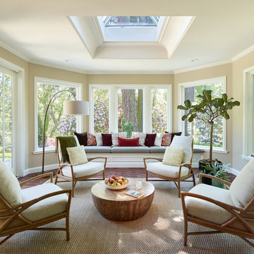
 Jenni Leasia Interior Design
The light filled Sunroom is the perfect spot for entertaining or reading a good book at the window seat.
Project by Portland interior design studio Jenni Leasia Interior Design. Also serving Lake Oswego, West Linn, Vancouver, Sherwood, Camas, Oregon City, Beaverton, and the whole of Greater Portland.
For more about Jenni Leasia Interior Design, click here: https://www.jennileasiadesign.com/
To learn more about this project, click here:
https://www.jennileasiadesign.com/crystal-springs
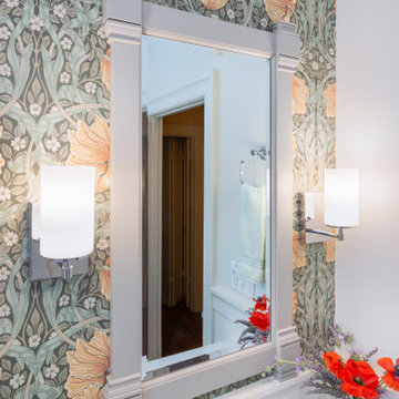
 Kathleen Jennison
An Arts & Crafts Bungalow is one of my favorite styles of homes. We have quite a few of them in our Stockton Mid-Town area. And when C&L called us to help them remodel their 1923 American Bungalow, I was beyond thrilled.
As per usual, when we get a new inquiry, we quickly Google the project location while we are talking to you on the phone. My excitement escalated when I saw the Google Earth Image of the sweet Sage Green bungalow in Mid-Town Stockton. "Yes, we would be interested in working with you," I said trying to keep my cool.
But what made it even better was meeting C&L and touring their home, because they are the nicest young couple, eager to make their home period perfect. Unfortunately, it had been slightly molested by some bad house-flippers, and we needed to bring the bathroom back to it "roots."
We knew we had to banish the hideous brown tile and cheap vanity quickly. But C&L complained about the condensation problems and the constant fight with mold. This immediately told me that improper remodeling had occurred and we needed to remedy that right away.
The Before: Frustrations with a Botched Remodel
The bathroom needed to be brought back to period appropriate design with all the functionality of a modern bathroom. We thought of things like marble countertop, white mosaic floor tiles, white subway tile, board and batten molding, and of course a fabulous wallpaper.
This small (and only) bathroom on a tight budget required a little bit of design sleuthing to figure out how we could get the proper look and feel. Our goal was to determine where to splurge and where to economize and how to complete the remodel as quickly as possible because C&L would have to move out while construction was going on.
The Process: Hard Work to Remedy Design and Function
During our initial design study, (which included 2 hours in the owners’ home), we noticed framed images of William Morris Arts and Crafts textile patterns and knew this would be our design inspiration. We presented C&L with three options and they quickly selected the Pimpernel Design Concept.
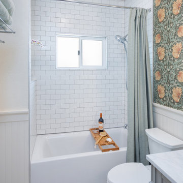
We had originally selected the Black and Olive colors with a black vanity, mirror, and black and white floor tile. C&L liked it but weren’t quite sure about the black, We went back to the drawing board and decided the William & Co Pimpernel Wallpaper in Bayleaf and Manilla color with a softer gray painted vanity and mirror and white floor tile was more to their liking.
After the Design Concept was approved, we went to work securing the building permit, procuring all the elements, and scheduling our trusted tradesmen to perform the work.
We did uncover some shoddy work by the flippers such as live electrical wires hidden behind the wall, plumbing venting cut-off and buried in the walls (hence the constant dampness), the tub barely balancing on two fence boards across the floor joist, and no insulation on the exterior wall.
All of the previous blunders were fixed and the bathroom put back to its previous glory. We could feel the house thanking us for making it pretty again.
The After Reveal: Cohesive Design Decisions
We selected a simple white subway tile for the tub/shower. This is always classic and in keeping with the style of the house.
We selected a pre-fab vanity and mirror, but they look rich with the quartz countertop. There is much more storage in this small vanity than you would think.
The Transformation: A Period Perfect Refresh
We began the remodel just as the pandemic reared and stay-in-place orders went into effect. As C&L were already moved out and living with relatives, we got the go-ahead from city officials to get the work done (after all, how can you shelter in place without a bathroom?).
All our tradesmen were scheduled to work so that only one crew was on the job site at a time. We stayed on the original schedule with only a one week delay.
The end result is the sweetest little bathroom I've ever seen (and I can't wait to start work on C&L's kitchen next).
Thank you for joining me in this project transformation. I hope this inspired you to think about being creative with your design projects, determining what works best in keeping with the architecture of your space, and carefully assessing how you can have the best life in your home.

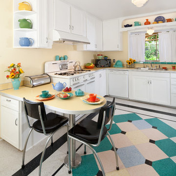
 Margie Grace - Grace Design Associates
Sunny Yellow Retro Kitchen remodel. We Designed and laid the floors ourselves!
Inspiration for a mid-sized mid-century modern u-shaped linoleum floor and multicolored floor kitchen remodel in Santa Barbara with white cabinets, laminate countertops, white appliances, shaker cabinets, a double-bowl sink, an island and white countertops
Inspiration for a mid-sized mid-century modern u-shaped linoleum floor and multicolored floor kitchen remodel in Santa Barbara with white cabinets, laminate countertops, white appliances, shaker cabinets, a double-bowl sink, an island and white countertops
 Carl Mattison Design
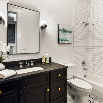
Inspiration for a transitional 3/4 white tile and subway tile mosaic tile floor, multicolored floor and single-sink bathroom remodel in Atlanta with recessed-panel cabinets, black cabinets, a two-piece toilet, white walls, an undermount sink, black countertops, a niche and a built-in vanity
 Kathleen Jennison
An Arts & Crafts Bungalow is one of my favorite styles of homes. We have quite a few of them in our Stockton Mid-Town area. And when C&L called us to help them remodel their 1923 American Bungalow, I was beyond thrilled.
As per usual, when we get a new inquiry, we quickly Google the project location while we are talking to you on the phone. My excitement escalated when I saw the Google Earth Image of the sweet Sage Green bungalow in Mid-Town Stockton. "Yes, we would be interested in working with you," I said trying to keep my cool.
But what made it even better was meeting C&L and touring their home, because they are the nicest young couple, eager to make their home period perfect. Unfortunately, it had been slightly molested by some bad house-flippers, and we needed to bring the bathroom back to it "roots."
We knew we had to banish the hideous brown tile and cheap vanity quickly. But C&L complained about the condensation problems and the constant fight with mold. This immediately told me that improper remodeling had occurred and we needed to remedy that right away.
The Before: Frustrations with a Botched Remodel
The bathroom needed to be brought back to period appropriate design with all the functionality of a modern bathroom. We thought of things like marble countertop, white mosaic floor tiles, white subway tile, board and batten molding, and of course a fabulous wallpaper.
This small (and only) bathroom on a tight budget required a little bit of design sleuthing to figure out how we could get the proper look and feel. Our goal was to determine where to splurge and where to economize and how to complete the remodel as quickly as possible because C&L would have to move out while construction was going on.
The Process: Hard Work to Remedy Design and Function
During our initial design study, (which included 2 hours in the owners’ home), we noticed framed images of William Morris Arts and Crafts textile patterns and knew this would be our design inspiration. We presented C&L with three options and they quickly selected the Pimpernel Design Concept.
We had originally selected the Black and Olive colors with a black vanity, mirror, and black and white floor tile. C&L liked it but weren’t quite sure about the black, We went back to the drawing board and decided the William & Co Pimpernel Wallpaper in Bayleaf and Manilla color with a softer gray painted vanity and mirror and white floor tile was more to their liking.
After the Design Concept was approved, we went to work securing the building permit, procuring all the elements, and scheduling our trusted tradesmen to perform the work.
We did uncover some shoddy work by the flippers such as live electrical wires hidden behind the wall, plumbing venting cut-off and buried in the walls (hence the constant dampness), the tub barely balancing on two fence boards across the floor joist, and no insulation on the exterior wall.
All of the previous blunders were fixed and the bathroom put back to its previous glory. We could feel the house thanking us for making it pretty again.
The After Reveal: Cohesive Design Decisions
We selected a simple white subway tile for the tub/shower. This is always classic and in keeping with the style of the house.
We selected a pre-fab vanity and mirror, but they look rich with the quartz countertop. There is much more storage in this small vanity than you would think.
The Transformation: A Period Perfect Refresh
We began the remodel just as the pandemic reared and stay-in-place orders went into effect. As C&L were already moved out and living with relatives, we got the go-ahead from city officials to get the work done (after all, how can you shelter in place without a bathroom?).
All our tradesmen were scheduled to work so that only one crew was on the job site at a time. We stayed on the original schedule with only a one week delay.
The end result is the sweetest little bathroom I've ever seen (and I can't wait to start work on C&L's kitchen next).
Thank you for joining me in this project transformation. I hope this inspired you to think about being creative with your design projects, determining what works best in keeping with the architecture of your space, and carefully assessing how you can have the best life in your home.
1